Erin Sarofsky started her career at Digital Kitchen in 2001. She has worked on titles such as MONA LISA SMILE, GHOST WHISPERER or STICK IT. In 2008, she founded her studio Sarofsky.
What is your background?
I have been working in design, animation and live action production since 2001 when I started as a young designer at Digital Kitchen. I worked there until 2006 and I learned the scope of this very specialized craft during that time… incorporating design, animation, live action production, CG, editorial and finishing together.
How did you get involved in this movie?
We got the call for GUARDIANS OF THE GALAXY a few weeks after we wrapped the main-on-ends for CAPTAIN AMERICA: THE WINTER SOLDIER. The executives at Marvel enjoyed working with us so they asked us to come in to meet James Gunn and pitch them some ideas for how to handle the movie’s titles.
How was the collaboration with director James Gunn?
James was great. He had a clear point of view, which made it easier for us to focus on details a lot earlier in the process than normal. He is also very clear, respectful and just a solid guy.
What was his approach and expectations about the main title?
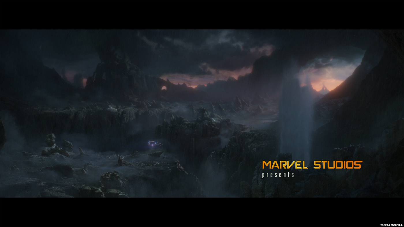
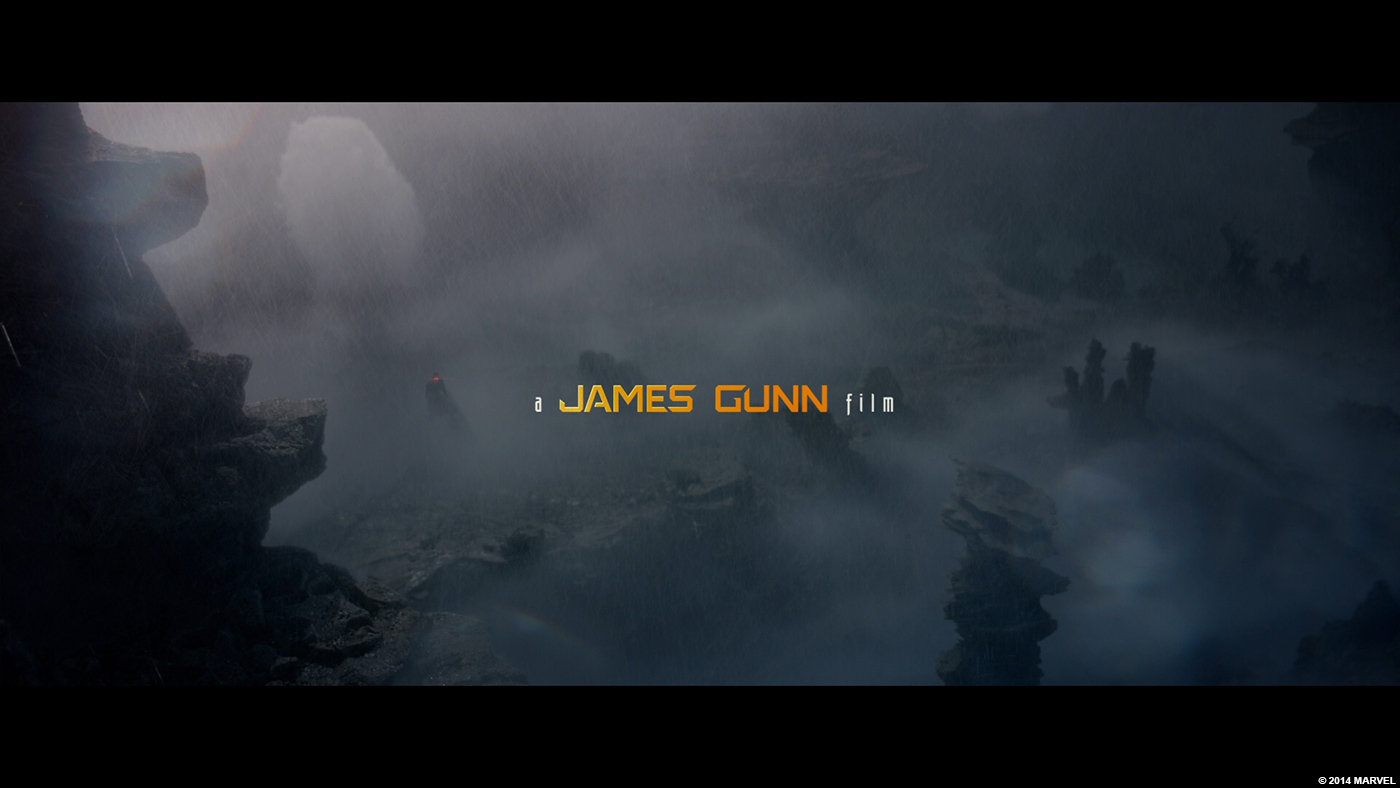
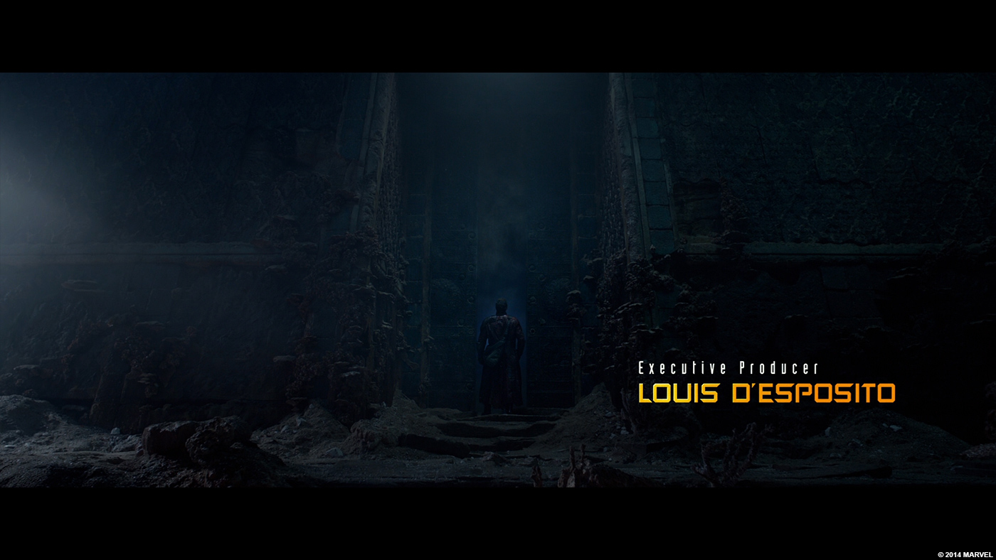
James had already shot an opening sequence, so he definitely had a very specific point of view. When he was shooting, he was mindful to keep a lot of negative space for typography… but in general, the typography needed to take a backseat to the story that we are watching unfold.
As a designer, that’s a very interesting position to be put in, because most title sequences are all about calling extra attention to the typography. In this case, it was clear that we had to make it legible, but not pull focus away from the action. It proved to be a unique balancing act.
Did he give you specific indications and references for the main title?
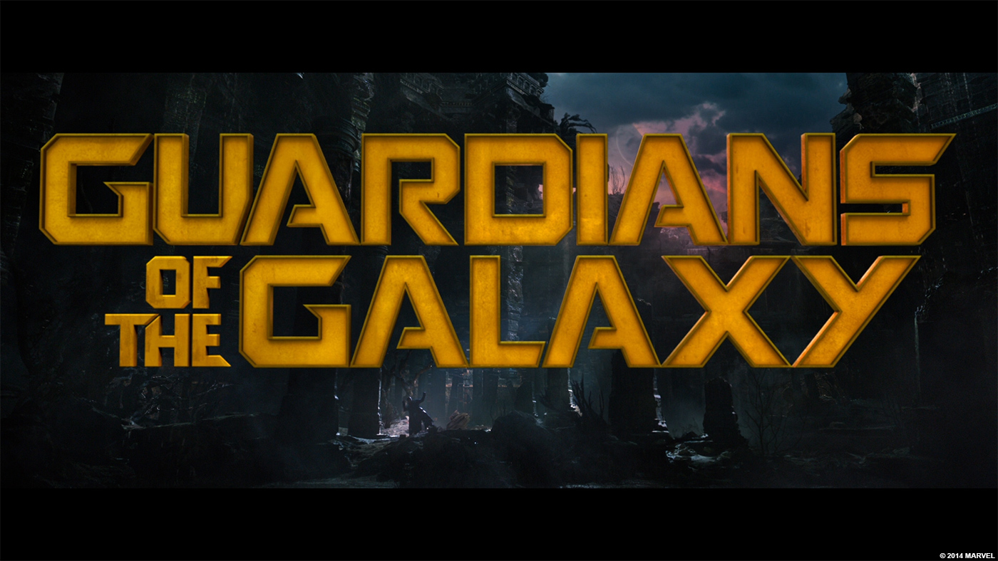
For the pitch, there were no specific references given. However, we wanted to explore at least one solution that was similar typographically to the logo they developed for their trailers. There was no font out there like it, so we created a custom typeface and rebuilt the logo so it fit better into the composition of the title plate.
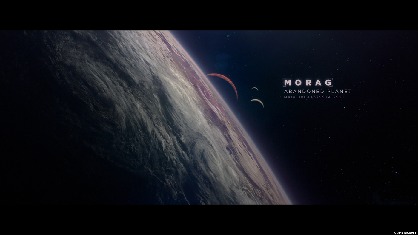
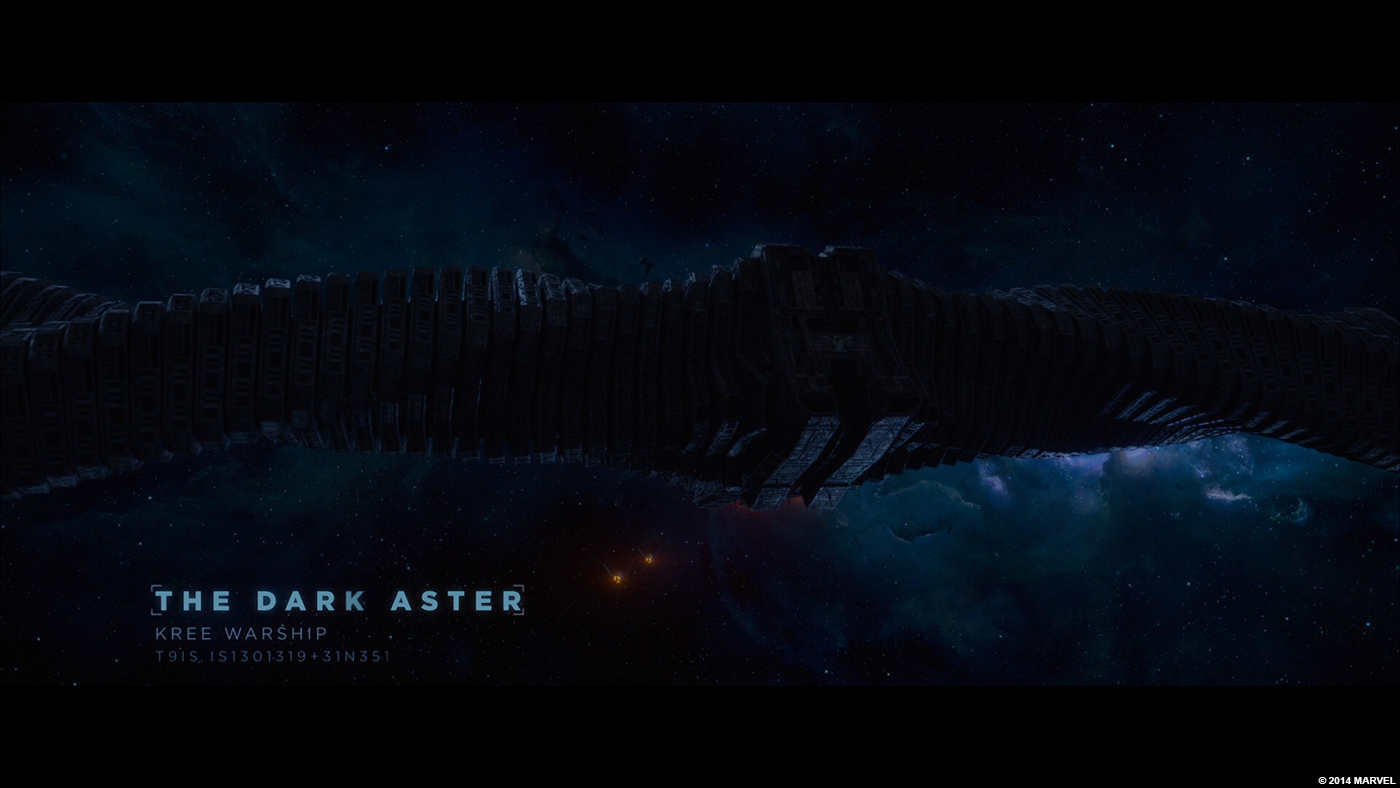
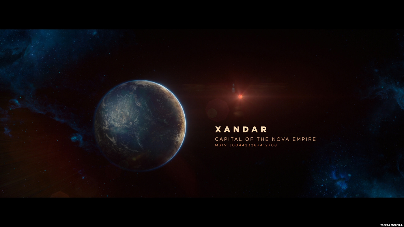
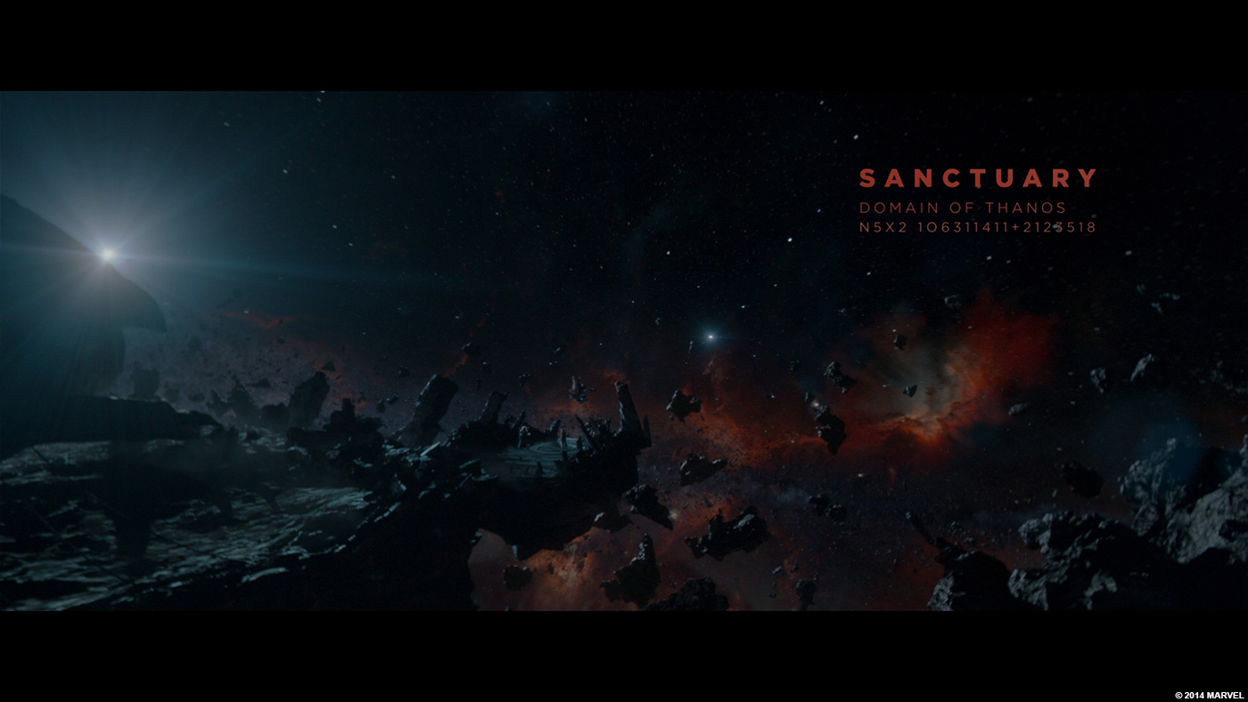
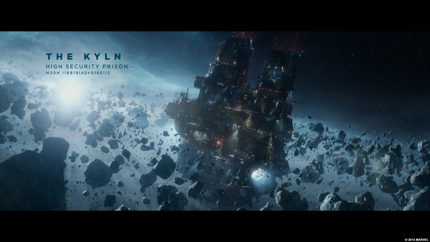
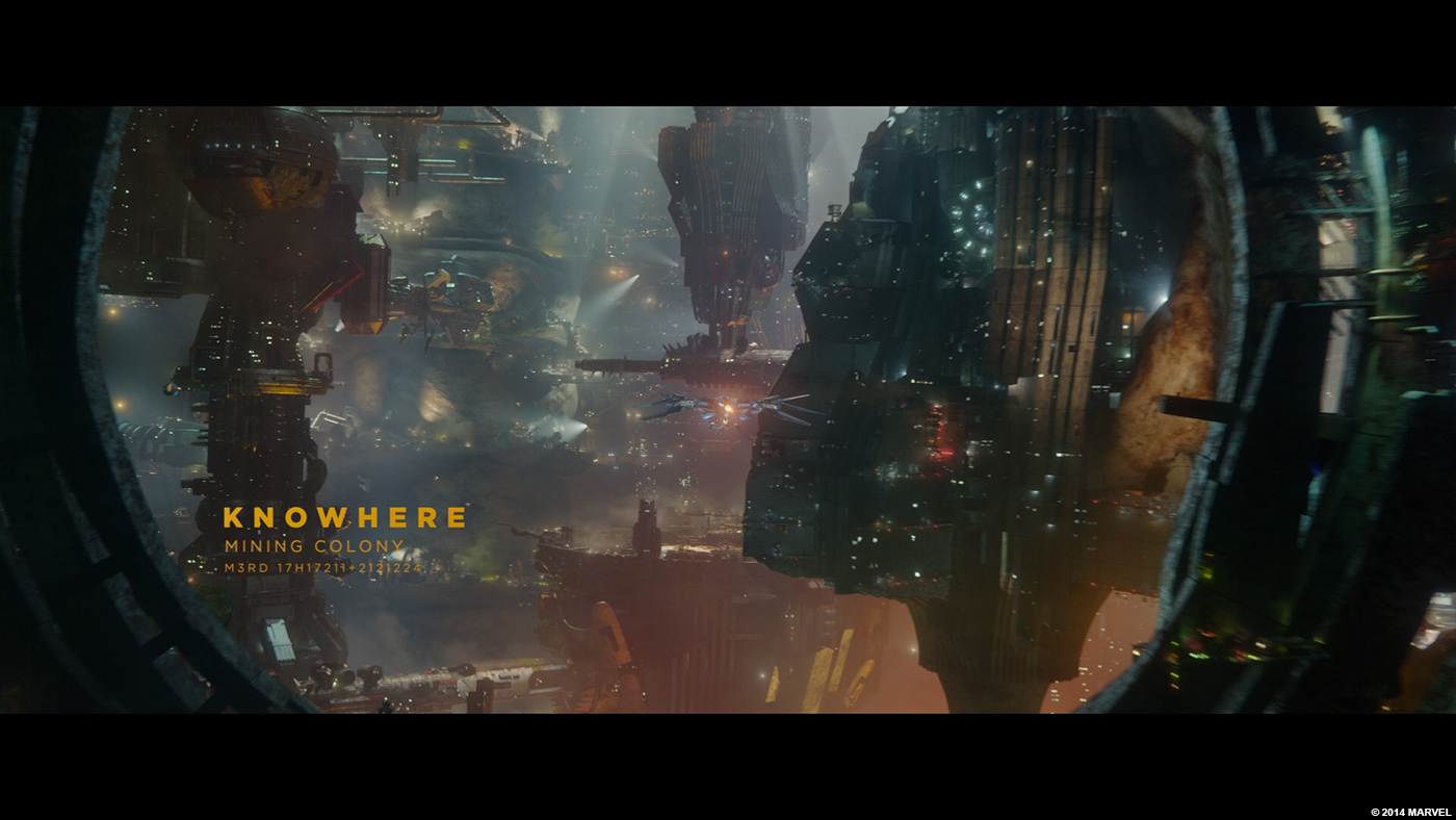
We also presented other options… one of which became the foundation of the locator cards throughout the movie.
How did you design the various typos?
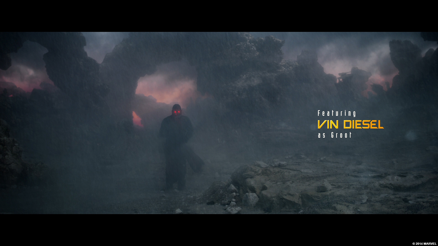
We built the typeface as a foundation, but then each name is custom done. The way the letters ultimately nest together had to be done by hand.
How did you find this range of orange colors?
Yellow/orange was kind of an obvious choice after we saw the movie. The film itself is certainly not afraid of color. And the titles had to be legible on the footage, which was in the grey/blue territory.
There is a really nice animation for the apparition of the titles. Can you tell us more about its design and creation?
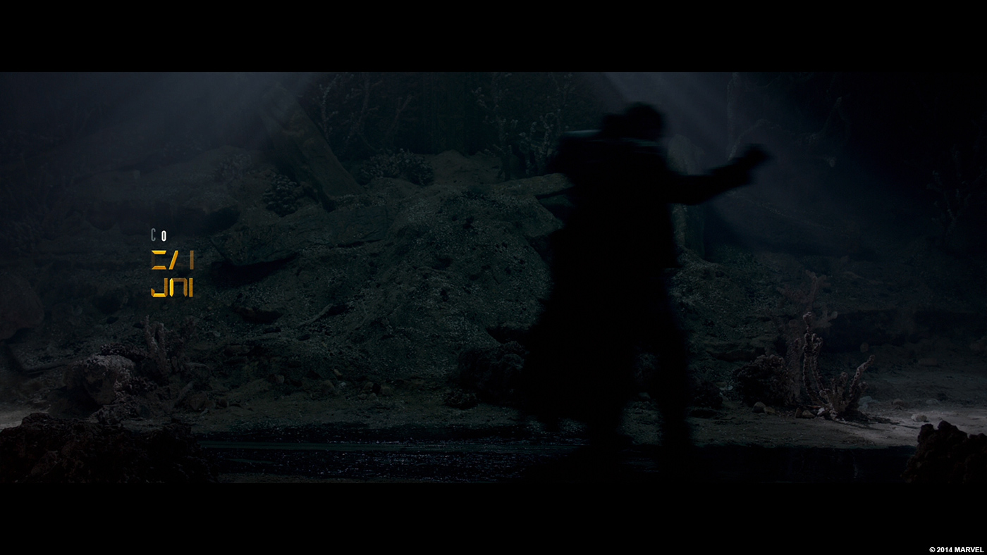
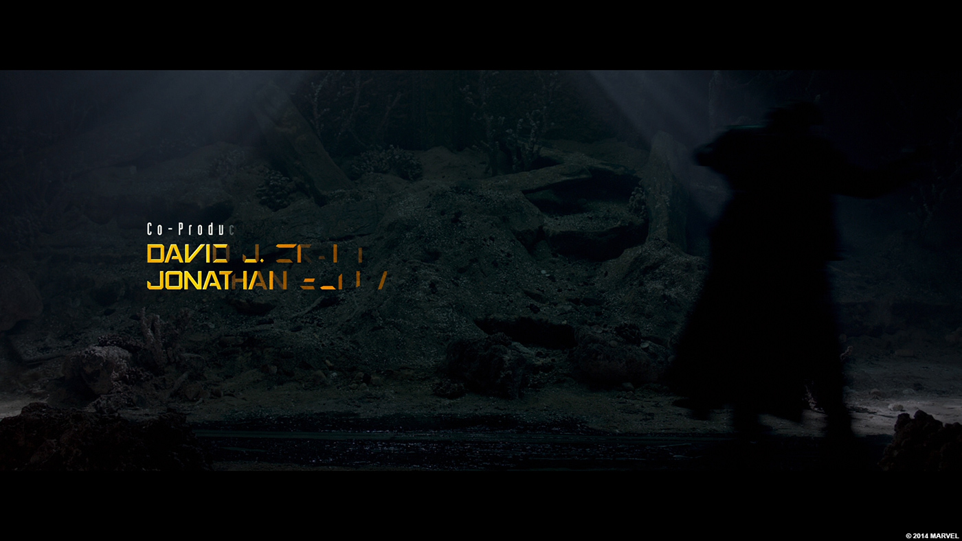
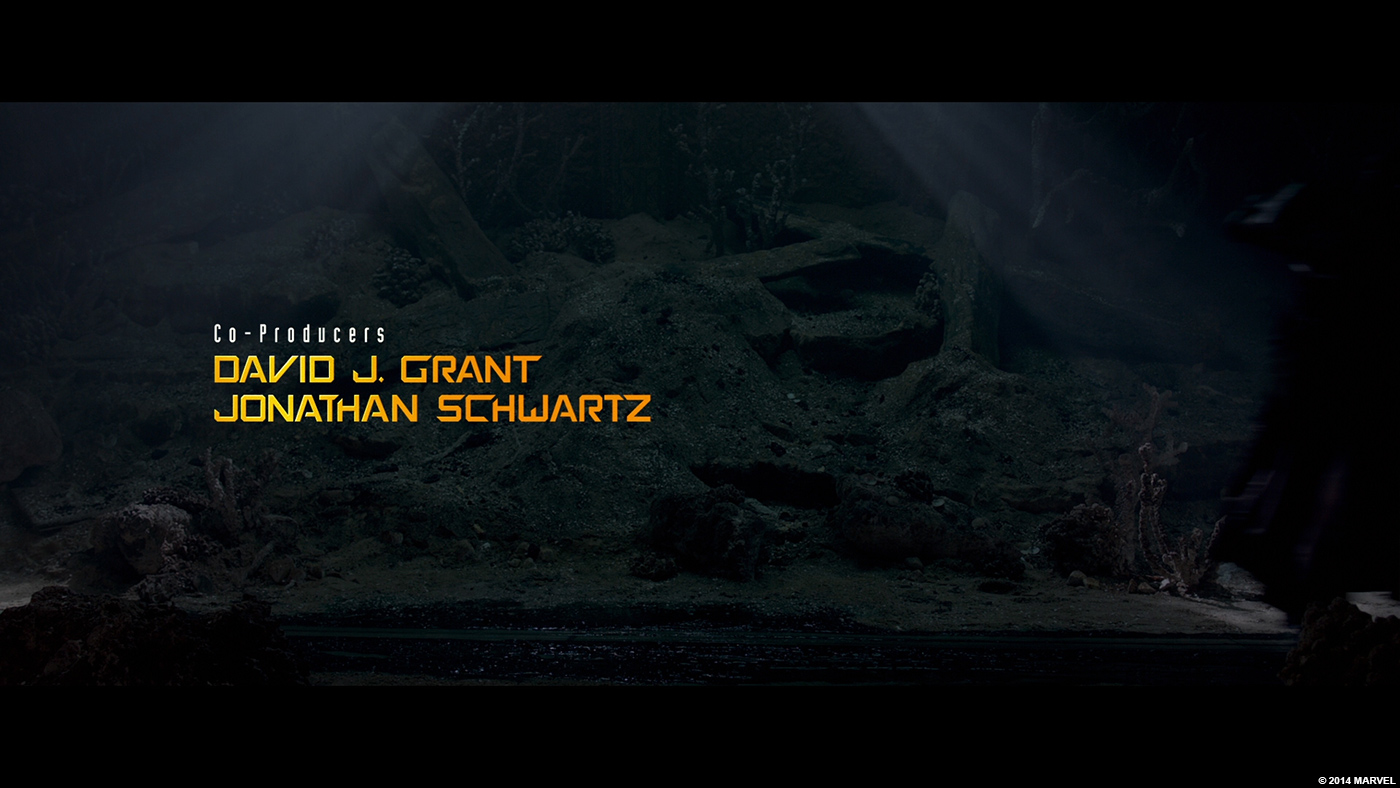
We started off with animation tests fairly similar to what was in the finished piece. So the animation process was actually more about refining and simplifying. We did have the audio/song to start, which made it easier to get the movement working right off the bat.
There was a somewhat big change that happened during the process. Initially, we planned to have the type animating before the Walkman turned on. But in the end, James decided to have the type mimic the vibe of the footage and have simple fades. It totally works, too. When the Walkman turns on and the type starts animating, it feels like it is dancing along with Peter Quill.
Who wouldn’t want to animate to Come and Get Your Love? Best. Assignment. Ever.
There are many locator cards during the movie. Can you tell us more about it?
As I mentioned above, we provided a number of solutions for the main title typography. One of those solutions got repurposed for the locator cards. So our assignment on the film expanded right before our eyes. Honestly, though, there’s nothing more rewarding than to just be a trusted resource for these incredibly talented filmmakers. If we keep up the good work, it’s inevitable that our role expands in the process.
How have you organized the work amongst your studio?
We have a separate security protocol when working on features. Because of that, the artists are segregated and work on machines only connected to that server. We call it “island mode.” The only data that is accessible is what we create or specifically put there. There is no way to connect to it from the Internet or external devices. As a result, no external artists can work on the project.
Can you tell us more about your software pipeline?
The logo was created and rendered in Maya, then composited in Nuke, and we used After Effects for all the type animation. All the AE renders were conformed in Autodesk Smoke. We use Smoke heavily on all our Marvel work, as it’s one of the few tools that can play down large resolution stereoscopic files in real-time while applying a Look Up Table.
What was the main challenge on this movie and how did you achieve it?
Our main challenge was showing restraint. It’s easy for us to get carried away and be over the top. So every round was more about refining and omitting. Ultimately, I think we found the sweet spot and really made James happy.
What do you keep from this experience?
I was amazed to find out that the close up dancing crotch shot is actually James Gunn, not Chris Pratt. That makes me love and appreciate him even more.
How long have you worked on this movie?
Approximately 10 to 12 weeks from development to finishing.
What are the four movies that gave you the passion for cinema?
Well, I have many that affected me, but I decided to take a poll from around the office about what movies influenced my colleagues as children. Here is the list: THE WIZARD OF OZ, STAR WARS, CLOSE ENCOUNTERS OF THE THIRD KIND, FERRIS BUELLER’S DAY OFF, FEARLESS VAMPIRE KILLERS, HACKERS, CHARADE, E.T., MAD MAX, ANYTHING BY ALMODÓVAR and THE LITTLE MERMAID.
A big thanks for your time.
// WANT TO KNOW MORE?
– Sarofsky: Dedicated page about GUARDIANS OF THE GALAXY on Sarofsky website.
GUARDIANS OF THE GALAXY – Sarofsky work
© Vincent Frei – The Art of VFX – 2014


