Espen Nordahl began his career in the visual effects in 2005 at Storm Studios. He has worked on many films such as TROLLHUNTER, JOHN CARTER, IRON MAN 3 and MAN OF STEEL. He returns to Storm Studios in 2013 and takes care of the effects of films like PIXELS and THE FATE OF THE FURIOUS.
What is your background?
I started my career at Storm Studios back when I was 17 years old, so I have been here almost from the start. At the beginning I was doing render wrangling and roto, before I moved into comp, then most things CG. I worked a few years abroad at Image Engine, MPC and Weta – before moving back to Storm as Head of CG, and later VFX supervisor.
How did you and Storm Studios get involved on this show?
Storm Studios has over the last few years shifted our focus to work on bigger international productions and we’ve been fortunate enough to help out with FX heavy sequences on some super cool projects lately.
I think the timing was just right for everyone on BLACK PANTHER. Before moving back to Norway and Storm, our VFX producer Thomas Reppen worked with both Geoff Baumann and Lisa Beroud at Digital Domain in Los Angeles. There was a lot of established trust in place already, so when they reached out to us, everyone already felt very comfortable and we could jump right into production without having to spend time getting to know each other first.
What was your feeling to be back in the Marvel universe?
Doing work in the Marvel universe is always a ton of fun. Both Thomas and I had worked on Marvel movies in the past, but this was our first time doing so “back home” at Storm. We had a blast working on this one, particularly when given as much artistic freedom as we did.
How was the collaboration with director Ryan Coogler and VFX Supervisor Geoffrey Baumann?
We mostly communicated with Geoff and the Marvel team, and they relayed notes from Ryan to us. With all the great information and feedback they provided us, the weekly CineSync sessions with them were really all we needed to do our job. They also let us do our thing without micromanaging the process and were super cool and open to our ideas and suggestion. It really felt like a creative collaboration rather than just giving them exactly what they asked for.
What are the sequences made by Storm Studios?
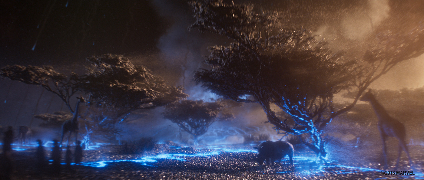
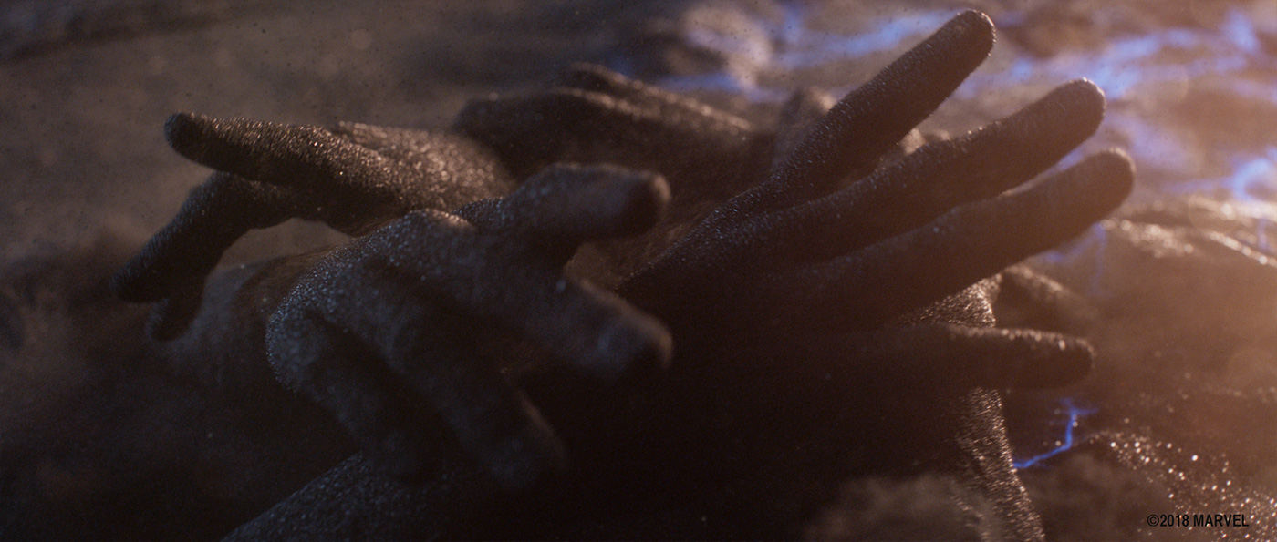
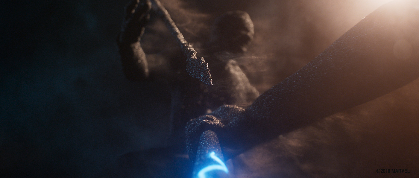
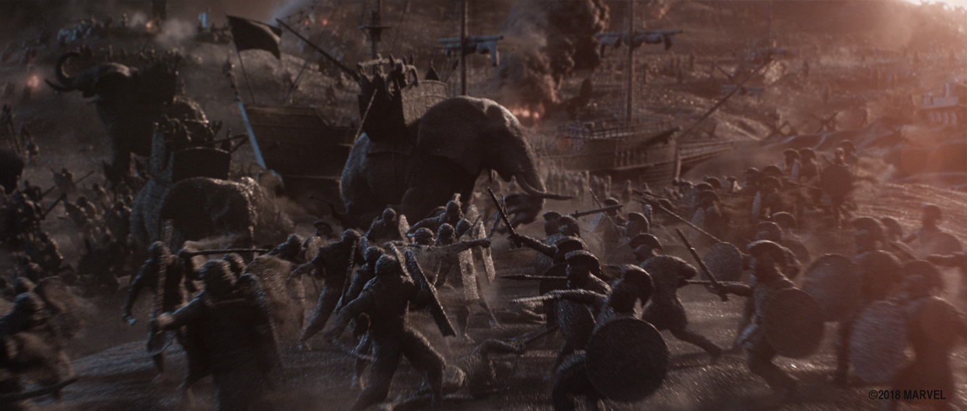
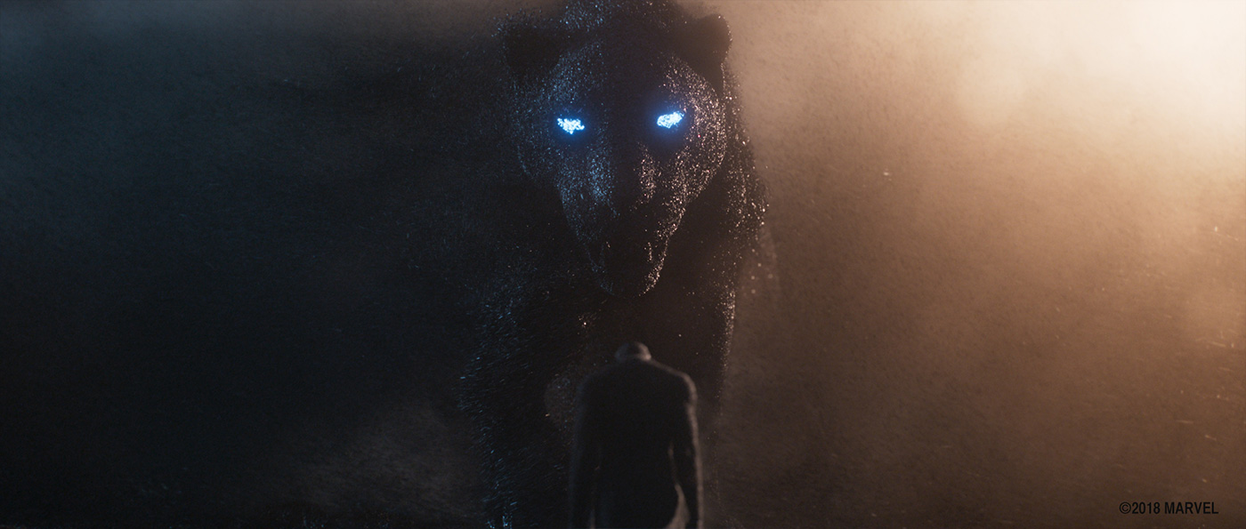
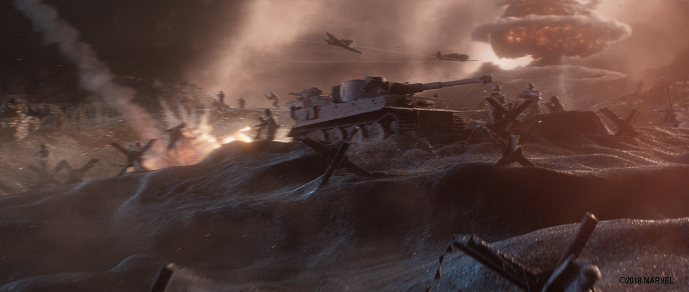
We made the prologue, an almost 2 minute long sequence which tells the origin story of Wakanda. It is a stylized, full CG sequence where everything is made out of black sand. The camera travels through numerous stages of the history of Wakanda and the origin of the Black Panther.
How did you organize the work with your VFX Producer and at Storm Studios?
One thing that made this sequence challenging to plan out and organize was the fact that it’s one long, continuous shot. The camera moves through many different locations and events, without clear places to hide transitions.
We still needed to split the work into manageable chunks, with teams responsible for separate parts of the sequence. This enabled us to lessen the impact of changes in one section cascading through the entire rest of the shot – although that was certainly still one of the main challenges of a sequence like this. For the last stretch of production, this also enabled us to get final client approval for sections of the shot at the time, which meant we didn’t have to re render all 2500 frames any time a note was given.
Since we came on late in the game, we were also able to leverage a lot of the existing assets which other vendors had done. Several events happening in the prologue are references to events or locations in the movie, which meant that a lot of assets like the modern city of Wakanda, tribespeople, rhinos etc were already built by other vendors, which gave us a big head start.
What references and indications did you received for the Prologue?
When we were brought on, there was already a lot of work that had been done on the prologue by the amazing team at Perception. There was a previs, concept art, mood boards and a selection of short film references for animation style, lighting, atmosphere etc.
How did you approach this beautiful sequence?
Based on the reference we received we wanted to explore a stylized, miniature world. Looking at reference photography, we found sand looked the most interesting when viewed up close, where you can make out individual grains. For this reason, we pushed for a macro feel, but with slow motion movement and FX. We wanted lots of particles and atmosphere in the air, with wispy sand always trailing off of everything.
How did you work with the art department for the design of the Prologue?
In addition to all the material specific to the prologue we received from Perception, we were also given an amazing document from the art department called “The Wakandan Bible”. This had pages and pages of production design and back story for every aspect of the movie. Since our sequence hit on so many different themes and locations from the Black Panther universe, this document was invaluable to us as a style guide for our assets.
As soon as we were brought on, we also started doing concept art of our own vision of the sequence, exploring lighting, character design and atmosphere, and bounced these off of Geoff and the rest of the team at Marvel.
Can you explain step by step about the creation of this sequence?
Prior to us being tasked with creating the prologue, it had been reduced in length from when the original previs had been made. Our first task was to create a new previs based on the edited old one, where we removed all cuts to make it one seamless shot.
Since the schedule was so tight, we needed to hit the ground running before the previs was locked. Therefore we split the production into two stages: Previs, asset creation and FX lookdev all happening in parallel, then shot production with animation, FX, lighting and comp. While this meant we sometimes had to throw out asset work when story beats changed during previs work, it also meant that by the time the previs was done, we were already done with the assets and could jump straight to shot production.
We split two FX TDs, one lighting TD and a concept artist into a lookdev team, which explored visual sand looks as well as technical approaches to the sand, using whatever assets were available at the very beginning of production. We set up a contrived shot involving all the types of sand interaction we figured were needed, plus turntables of a couple of early assets, and used these with Geoff and the rest of the team at Marvel to get a buyoff on the look and feel of both the sand and lighting.
Animation and FX went hand in hand for this one. Every asset went through a “sandification” step in Houdini, where we replaced all the geometry with particles. We also trailed wispy sand off of everything – with the wind magically always blowing screen right for nicer silhouettes. For all of the hero interaction events like giant hands or the city of Wakanda rising up from the ground we did hero FX sims, using Houdini’s sand solvers as well as our own tools.
Lighting and comp was fairly straight forward pipeline wise, with the most challenging aspect being how to split up the work in a way that both made sense workload wise and enabled us to fit everything together seamlessly. We lit and comped the sequence in eight separate sections, before bringing each section into an assembly script to combine it and add glare, distortion, noise and everything else that comes with shooting with real lenses and cameras. Deep rendering and compositing helped us make sure everything integrated correctly without involving hundreds of holdout renders.
How did you develop the specific look of the sand?
The look of the sand was what we initially thought would be the biggest challenge of this project, but we were fortunate to land on a style both we and Marvel really liked early on – before even the previs and asset work was done. This allowed us to focus on execution and not worry about look for shot production, which took a lot of pressure off the latter half of the production schedule.
The lookdev team used some assets and mocap we had lying around from an earlier production, and started playing with different approaches to achieve this style. Initially we were afraid that a purely brute force approach would be way too costly and time consuming both to generate and render. In order to not get bogged down with pipeline during lookdev, the plan was to first develop the look using naive, brute force techniques. Once we got approval on the look, we would try out various ideas we had for simplifying the amount geometry and process, and see which one would match the look the best.
To our surprise, our initial brute force approach scaled way better than we had thought, and we ended up sticking with it even for background assets. This unified way of creating all the assets and FX made the process a lot simpler and predictable, albeit pretty data heavy.
Our process for “sandifying” an asset was to instance millions of sculpted sand grains all over the surface. We developed a tool in Houdini to control the density, size distribution, distribution of sharp vs smooth grains, plus various controls to jitter the position of the grains for additional texture and breakup. The base models themselves also had a sculpting pass where we added breakup and mimic the way sand piles up in dunes. In the shader, we broke up the look more by varying between rough and glossy grains, to get natural glints as the camera moves through the environment.
We found that sand looked the most like sand when it’s viewed at a certain distance. Too far away and it tended to look like velvet or concrete, but if you got too close it looked like gravel or rocks. So rather than lock in on a consistent grain size for everything, or lock into one in asset production, we fine tuned the grain size for each asset in shots, based on how close it was to the camera and how well we needed to make out details in the model.
Can you tell us more about the animation work?
As with the look, the animation is pretty stylized. In order to help with clarity, we went for a slow motion approach whenever the camera is moving a lot, and a more regular speed where there are slower camera moves and when we needed to hit story beats involving movement.
Sand wise we found that we needed to treat characters slightly different from environment assets, as any amount of surface breakup quickly led to mushy facial features or strange anatomy. We also had to dial back on the sand blowing off of characters for the same reason.
The exception to this was the panther goddess stepping through the tornado. Here we developed a one-off system for having sand grains blow off of her, merge with the tornado, then get pulled back into the body again, so she wouldn’t disintegrate throughout the shot. Again we ended up pulling back on this effect for the face and fully disable the effect for the eyes, for readability.
How did you handle the lighting aspect?
Lighting is particularly challenging when the entire world and everything in it is all made of the same material. In some ways it’s almost puristic, because you can’t rely on texture or material differences to tell you what is going on in the scene, but have to really make sure the lighting brings out the geometry of the scene and helps guide the eye to what is important.
We relied heavily on strong silhouettes, atmosphere and rim lighting to achieve this. The camera does a lot of full 360 turns around objects, so in some cases we parented the light rig to the rotation of the camera, before transitioning back to a more grounded lighting style where we are looking at landscapes with backgrounds resembling skies.
Can you tell us more about the rendering process?
We lit everything in Maya and rendered it with Arnold, using HtoA to get FX elements from Houdini into our Maya pipeline. As with everything else, we needed to split the sequence into manageable chunks for rendering, as well as layers to allow comp further control of the look. Most elements were rendered as deep to let us be more flexible with holdouts etc all the way to the end.
What was the main challenge and how did you achieve it?
I would say the main challenge in this sequence was clarity, and I’m not sure I can say we fully achieved it for the entire sequence. With a lot of things happening in a short amount of time, it is challenging to have each story beat register fully before moving onto the next one. We were conscious of this throughout every step of the pipeline, and hopefully this comes across in the final product.
Overall, we’re super excited about how the Prologue came out in the end. But you always wish you had a few more weeks, or even months, to keep adding details and polishing the images further.
What is your best memory on this show?
I really liked that we were given a lot of autonomy and trust when it came to fleshing out the look of the sequence. Exploring different styles and technical solutions to how to accomplish them is something I enjoy a lot, and the first few weeks of the project were all about that.
How long have you worked on this show?
From October to January, so about 4 months.
What’s the VFX shots count?
One 🙂
Technically we split the shot into several chunks for tracking purposes, but in practice it was a continuous 2500 frame shot.
What was the size of your team?
We were around 20 people on this one.
What is your next project?
We are currently working on an unannounced American movie and a Danish fantasy movie.
What are the four movies that gave you the passion for cinema?
It’s hard to pick just four, but I’d say JURASSIC PARK, STAR WARS, BLADE RUNNER and THE LION KING are all movies I have very fond memories of watching over and over again as a kid.
A big thanks for your time.
// WANT TO KNOW MORE?
Storm Studios: Official website of Storm Studios.
© Vincent Frei – The Art of VFX – 2018


