In 2013, Glenn Melenhorst had explained to us about his work on THE WOLVERINE. He then take care of the effects for the documentary DEEPSEA CHALLENGE 3D. Now he talks about the Iloura‘s work on THE SPONGEBOB MOVIE: SPONGE OUT OF WATER.
How did you get involved on this show?
Our introductions to Paramount and the SPONGEBOB project in particular were effected through our sister company Stereo D whose managing director Aaron Parry had an existing relationship to Paramount through the first SPONGEBOB movie. As a strong character house, it was suggested that Iloura submit tests along with other vendors being considered for the CG character work. Excited by the prospect of bringing the characters to CG life, Iloura set up a small team and over a period 6 weeks built a CG SpongeBob and had him say some lines rendered and lit in a photo real environment. This certainly piqued the interest of the studio who urged for a more action based sequence to be delivered involving the super hero characters. It was a much bigger task but it paid off as based on the merit of the test, Iloura was awarded the CG component of the show.
How was your collaboration with director Paul Tibbett and SpongeBob creator Stephen Hillenburg?
We met with Paul and Steve early on in the production during the time we were testing for the show. Several vendors were invited to submit a test for the work so we flew to LA to meet with them and try to understand their take on the CGI adaption of SpongeBob and crew.
During post we talked several times a week via cineSync, reviewing dailies, drawing all over the frames and refining our animation. It was great to understand their approach to animating and staging. They were very collaborative and complimentary. I think it was a very happy experience for us all.
What was their approach about the visual effects?
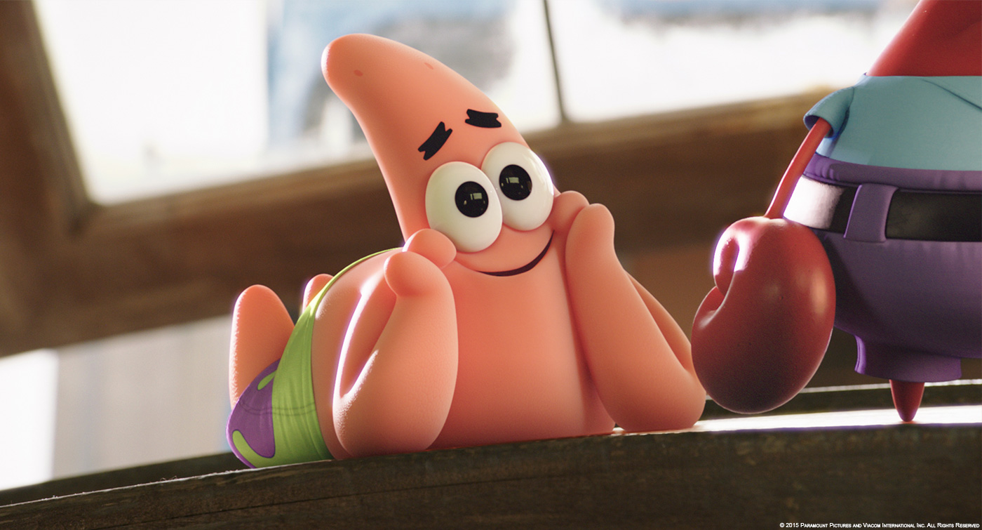
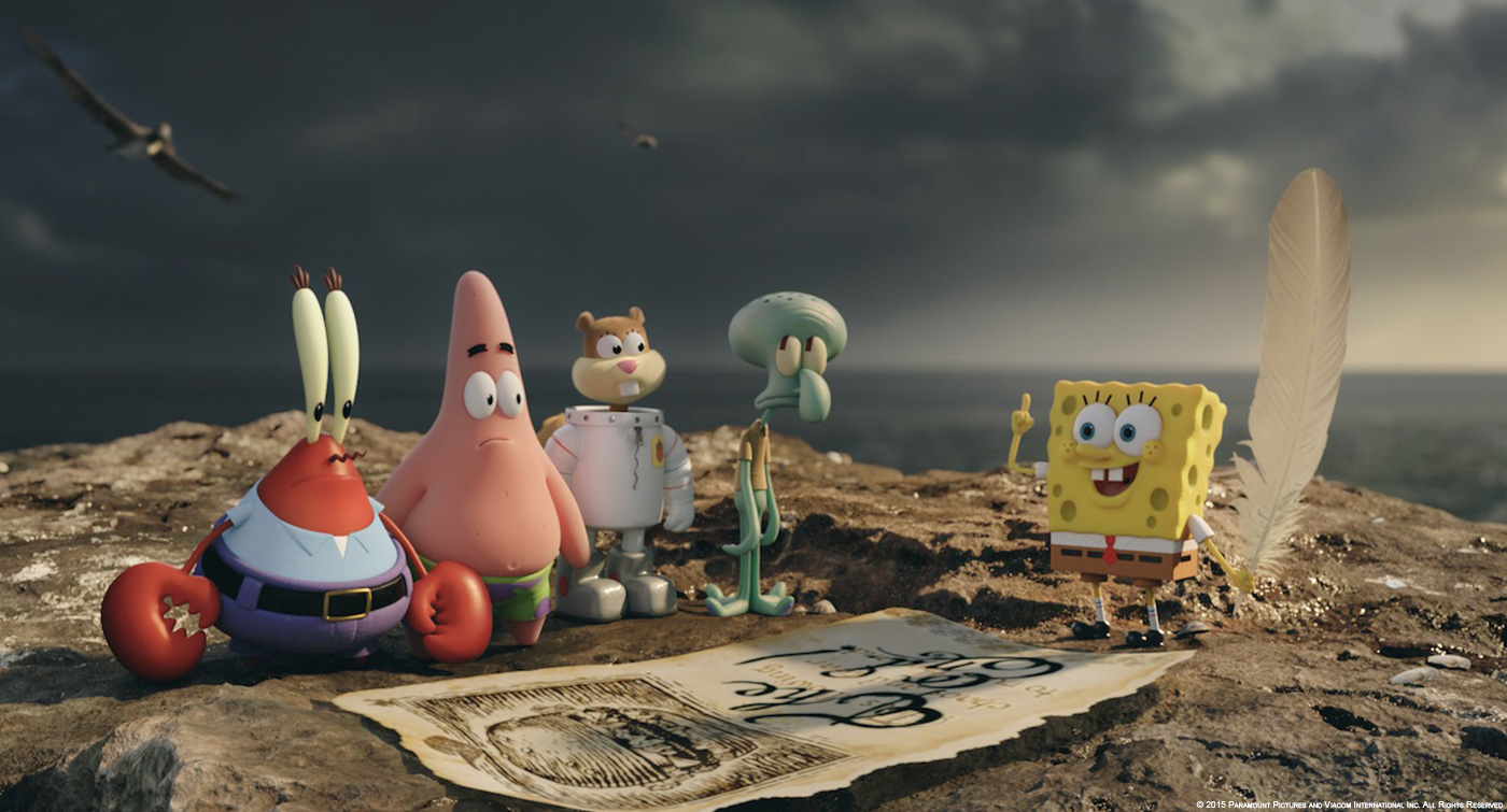
Paul and Steve were very clear on what they didn’t want from CGI which was valuable. It also neatly dovetailed into our vision for the characters which was to be as faithful to the performance and strength of silhouette as the original art. They wanted the characters to be faithful and realistic without looking like PVC toys. As for the other characters, the seagulls, pelicans, six foot Sandy and skeleton, they provided reference for species or mockups for costume then deferred to us to bring them to life.
Can you describe one of your typical day on-set and then during the post?
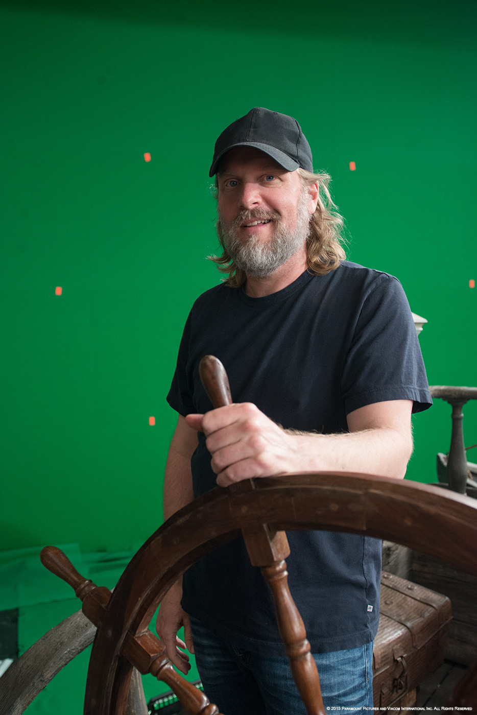
On set was pretty simple really. We had maquettes made for each of the small characters, and full size human stand-ins for when the characters were full sized. For each shot we worked with Mike Mitchell and Paul Tibbitt to set up blue screens where needed, and discuss camera angles before puppeteering the characters through frame. We surveyed each set with Lidar and heaps of SLR photography, shooting witness cams where needed and taking video reference.
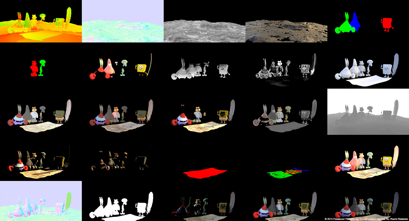
During post we spent each day following the shots through our pipeline starting with tracking and match move, cleanup and roto, then blocking anim through to final and onto FX, lighting and comp. Each shot passed through many hands before emerging as a final shot. Along with the characters we had to model or simulate anything they touched like water, sand, bubbles, cannon balls and ice-cream. The list of assets was quite long but necessary to make the characters feel as though they belonged in the frame. Much of the time for me and the other supervisors was also spent in screening rooms, reviewing dailies and taking notes and passing those notes on to the team. Meetings and reviews chew up a large part of the day.
How did you approach the challenge to create the famous characters in 3D?
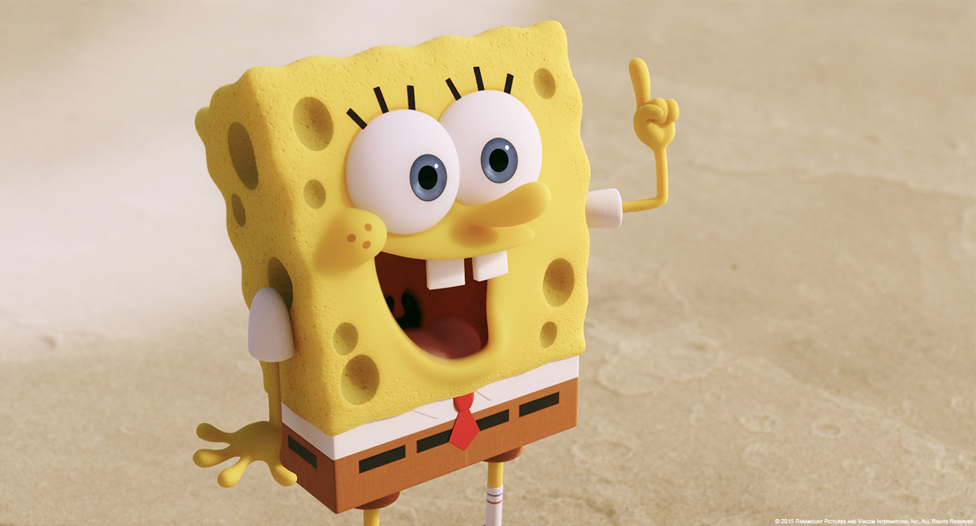
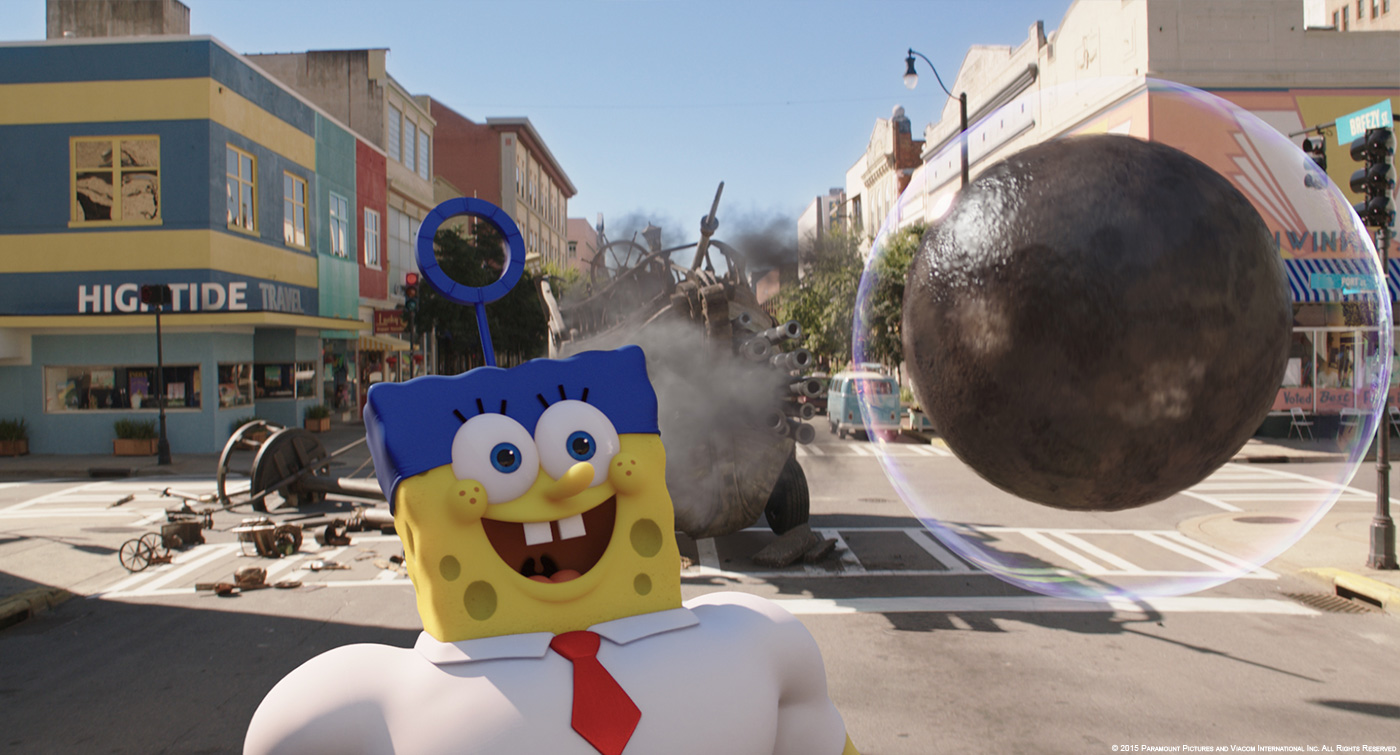
While our ZBrush maquettes for all characters and their variants were being refined, we set our sights on understanding the rules for animating them. We wanted to stay very faithful to the original 2d animation, this was always the top priority. To ensure we met this goal, we amassed a large body of reference material and carefully started to break down the timings, silhouettes and proportions of all the characters in many different states of action. We then systematically started replicating and adjusting these findings to suit our 3d characters.
Can you tell us more about the design and R&D process?
Design was very important to ensure we stayed true to the essence of the characters. Recognizing that SpongeBob has lived on TV with a huge fan base of adults and children for more than 15 years, it was vital that we didn’t stray from those endearing qualities. But we often found that what worked in 2d did not directly translate successfully to 3d, so we developed a large knowledge base on how to apply the SpongeBob ‘feel’. A key part of this was limiting the amount of perspective shift we saw in any given shot. We tried to treat the 3d characters as a 2d image, so whenever we needed to shift the orientation/perspective of the character, we would do so in a very simple snappy manner to emulate what a traditional 2d SpongeBob animator would do.
Adding to that, was making sure that the 3d characters interacted naturally in their environments. They are on land when they become 3d, so we added texture to make them feel less digital with finishes including pores in SpongeBob’s sponge, tiny bumps on Patrick, weave and stitches on socks and shoes etc. We also used varying amounts of SSS (Sub surface scattering) to add realism and give warmth of tone.
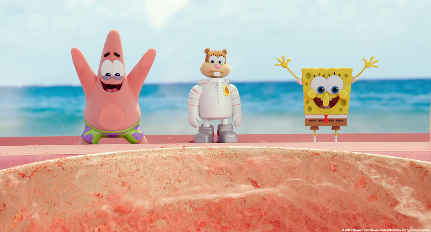
A lot of R&D was applied for rigging, rendering and animation and particularly for props and fluids. For example, in the sequence where Patrick devours the ice cream, we built super viscous fluids in the shape of ice-cream that pushed and expanded when he interacted with it. Houdini was used for most of this work, but for some we had to go back-to-basics and built some effects out of morph targets in Max.
We also designed and built many environment such as streetscapes, Burger Beard’s ship and Pelican Island.
How did you handle their modeling and rigging?
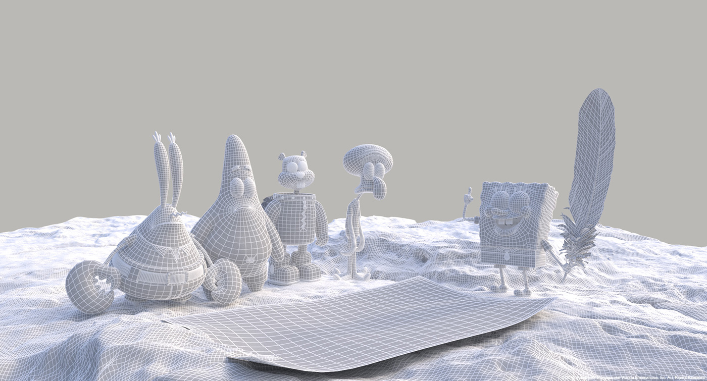
The modeling was done first as posed sculpted digital maquettes by our lead modeler Sam Jensen. We went to lengths to capture the essence of the 2d designs in 3d. Once those were approved we re-modeled in a more neutral, T-pose, ready for surfacing and rigging.
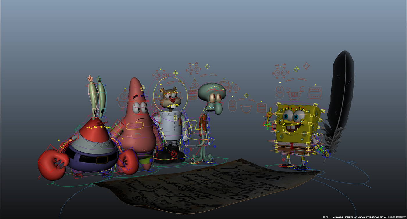
The rigging was generally broken into 2 main stages – body and face. We had to adapt many aspects of our rigging which were more tailored for realistic and creature animation. We had to make sure these characters could stretch and contort in ways we hadn’t done before. The faces were a particular challenge. Although these characters appear to be quite simple we put a lot of work and R&D into figuring out how to deform the faces in a way that was flexible enough but also remained ‘on-model’ at all times. An added complication was that the shapes we needed to achieve changed depending on the angle to camera. For example, when looking at SpongeBob front on, the structure of his lips and cheeks is different to when he is side, or ¾ on. We had controls for moving just about any part of the characters including each of SpongeBob’s holes, and the freckles on his cheeks. If we couldn’t get what we wanted from the rig, we would often do one off sculpts to get us there.
Most shots went through a shot-sculpting (shot finalling) step where we were able to sculpt custom shapes, add interesting effects (such as muscle bulging or wrinkles), or just tidy up parts of the model that had been too distorted by the posing of the rig. We were able to do this on very high resolution versions of the models allowing us achieve a very high level of detail. This step was critical for achieving some of the custom shapes and effects not normally associated with 3d animation.
Can you tell us more about the animation challenges?
SpongeBob Squarepants presented a unique animation challenge for Iloura. Translating the spontaneous, creative 2d style proved to be deceptively tricky, demanding careful study, research and animation testing. The characters were required to be able to change their proportions and silhouettes wildly depending on the needs of a shot. This meant very close collaboration with the rigging department was essential to the process.
How their presences were simulated on-set?
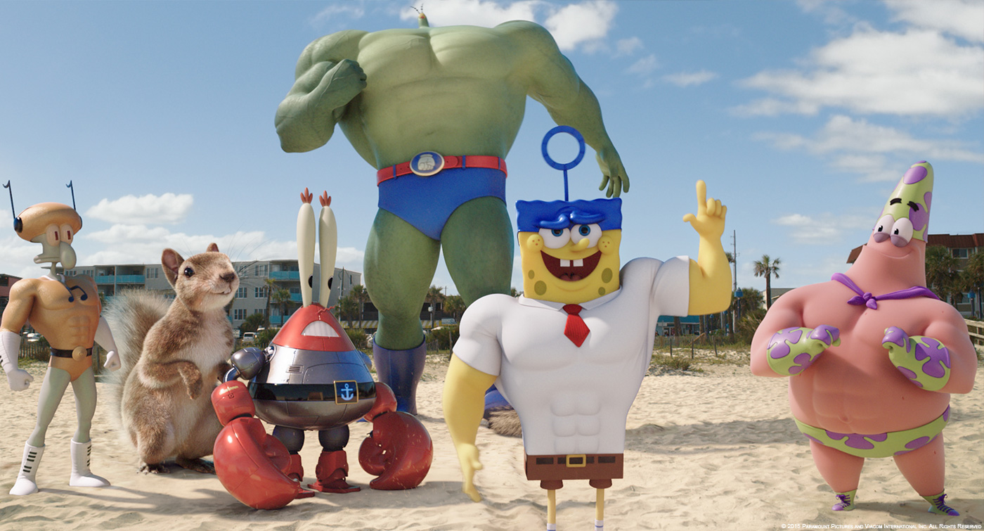
We had two complete sets of the characters built as maquettes by Gentle Giant for the small scale characters, and costumes worn by human stand-ins for the superhero versions of the characters. Plankton was so tall we simulated his scale with a large green plywood shape mounted on extendable poles.
Can you tell us more about their super-heroes version?
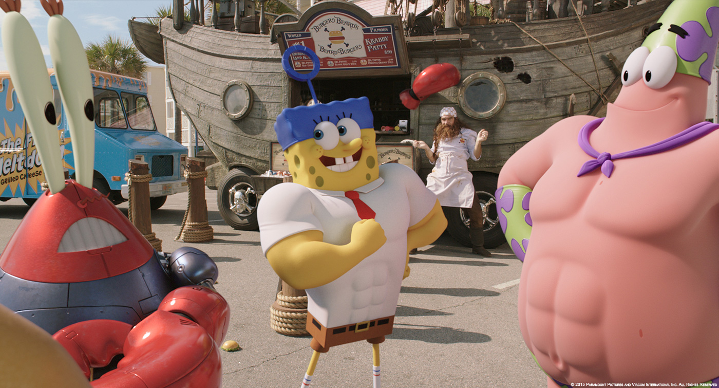
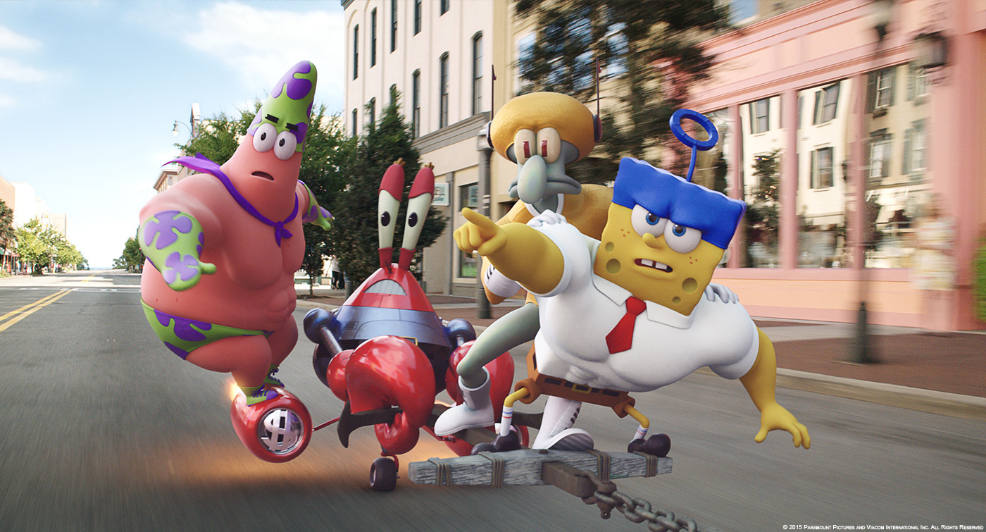
We developed two different animation styles to support the wildly different character designs between the original characters and their super hero counterparts. The original characters were animated in snappy, super sharp timings while the Superheroes needed to have a greater sense of weight and overlap while still feeling like cartoon characters.
The heroes are evolving on beach and streets. How did you created these environments?
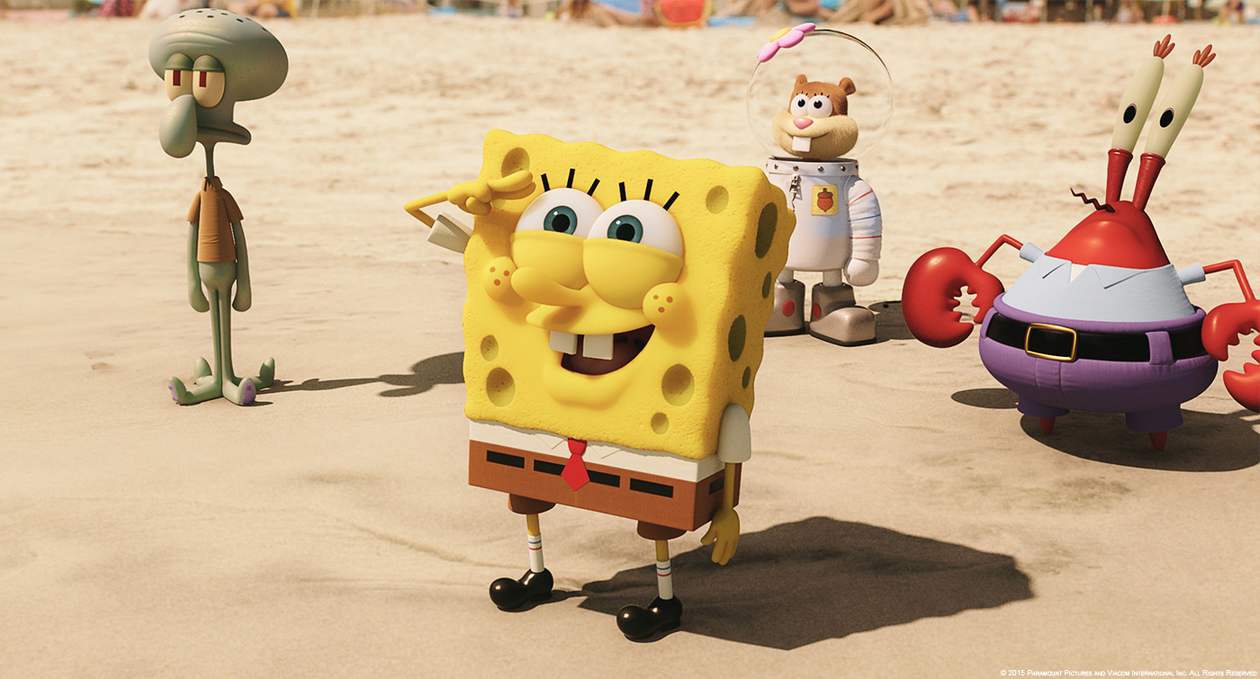
The Lidar, HDRI and on-set photography was key to us lighting and integrating the characters seamlessly. Every set and prop form the shoot was faithfully built, textured and projected with HDRi inside our 3D software. This way, the whole set and streetscape could be accurately reflected in High gloss surfaces like Krab’s paintwork. The set also provided geometry to cast occluding shadows and environmental bounce light. Over and above the digital set, water simulations and sand simulations were used often to help the characters and the Pirate ship emerge onto the beach. We used a mix of Houdini and Maya and Max for our FX work, we don’t limit our software, preferring to use whatever is best to get the job done right.
How did you approach and created the Pelican Island?
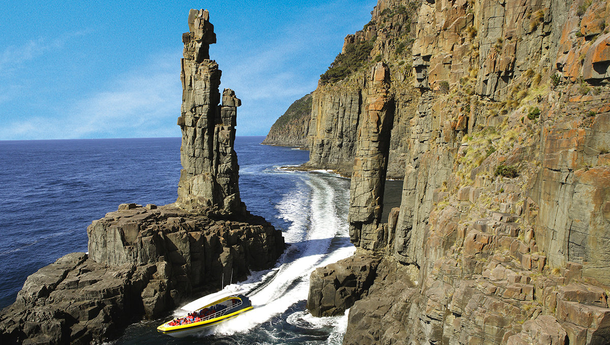
I had recently taken a trip to Bruny Island in Tasmania which has the steepest sea cliffs in the world (I think). The whole landscape is very spectacular and funnily enough a few weeks later we needed to begin work on Pelican Island and the natural rock formations there provided a great inspiration for the work.
I created some concept art for the rock which became the blueprint for the asset. The assets for the wide shots of the rock was sculpted in ZBrush while the detailed top of the rock was a mix of photo-scan details taken from our seaside rock formations here in Melbourne and Tasmania. The water was a combination of Max, Naiad and Phoenix’s vector displaced water rendered through Vray.
Can you tell us more about the skeleton pirate creation?
The skeleton design was provided to us as it had to be built both practically and digitally. The film starts with a real prop skeleton and once Antonio Banderas takes the book from its hands, it becomes CGI. We took many hundreds of photographs of the actual prop skeleton on set as our digital version had to match it completely. From a performance point of view, we needed the skeleton to initially appear threatening but then turns humorous when Antonio and he begin to box. It’s a small part of the film and while the cloth simulation and key frame animation proved a challenge, our team of artists really enjoyed working on it.
How did you handle its animation and rigging?
The skeleton was rigged in several layers. The base was made with our standard Iloura human rig. On top of that we had individual controls for each bone. From there were able to key frame those elements and simulate the bones when needed, eg. Collapsing and falling to the ground. The last layer was the clothing rig. This has some simple controls which could be used to guide an nCloth simulation within Maya.
The movie features many animals such as seagulls and pelicans. How did you create them?
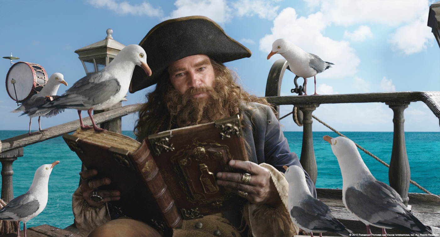
The seagulls and pelicans didn’t require anything too hyper-real in design, so we worked off traditional species and spent some time studying bird anatomy and behavior. For rigging we used a combination of Maya rigging, custom plugins and simulation to help us achieve the various feather effects. The pelican also had dynamics run on the loose skin under its beak.
Can you tell us more about their feathers creation?
We spent a lot of time studying bird anatomy trying to understand the structure of the wings and feathers. We used Yeti to distribute the main body and head feathers, and hand modelled and placed all the wing feathers, as well as specific feathers around the eyes and mouth.
What was the main challenges on the show and how did you achieve it?
The main challenge was staying true to the 2d essence in terms of character personalities and being respectful of fan-base expectations. It did feel like a huge responsibility to take SpongeBob and team into a 3D-world for the first time, but it was also an honor.
Was there a shot or a sequence that prevented you from sleep?
No, not really. There were some long days in there, so I had no trouble sleeping!
What do you keep from this experience?
This was truly a fantastic experience. From Paul and Steve, and everyone at Paramount and Nickelodeon, they were great to work with, it was a dream job. It was a very collaborative experience, challenging and fun. And my team here at Iloura were exceptional as always.
How long have you worked on this show?
About 2 years from testing through to delivery.
How many shots have you done?
In all we worked on 868 shots – including post-vis.
Around 580 of these shots made it through the pipeline as final shots to be used in the film.
What was the size of your team?
At our peak we would had around 120 artists working on the film + our admin staff.
What is your next project?
Iloura is currently finishing MAD MAX: FURY ROAD for George Miller.
We also have 800 shots for Universal’s TED 2 with Seth MacFarlane directing to be delivered in May 2015, and GODS OF EGYPT, Alex Proyas directing, for Lions Gate.
A big thanks for your time.
// WANT TO KNOW MORE?
– Iloura: Dedicated page about THE SPONGEBOB MOVIE – SPONGE OUT OF WATER on Iloura website.
© Vincent Frei – The Art of VFX – 2015


