Arundi Asregadoo is in visual effects for over 10 years. He worked at Framestore and then at MPC where he worked on films like TROY, X-MEN: THE LAST STAND or HARRY POTTER AND THE ORDER OF THE PHOENIX.
How did MPC get involved in this show?
We have a great relationship with Tim Burton from working on SWEENEY TODD, CORPSE BRIDE and CHARLIE AND THE CHOCOLATE FACTORY and with Angus Bickerton on THE CHRONICLES OF NARNIA: VOYAGE OF THE DAWN TREADER, ANGELS & DEMONS and THE DA VINCI CODE.
How was the collaboration with director Tim Burton?
It was a fascinating experience working with such a creative director. He has an incredible imagination and a very clear vision of what he wants. He would focus on particular parts of the image, once he feel you have achieved this, he’d leave you to complete the image
What was his approach about visual effects?
Tim is very VFX savvy director. He is very aware of what is capable within visual effects. For him, DARK SHADOWS was more about the performance. The VFX was more of a dressing to what he was shooting and he wanted to have that flexibility to make changes in the post production phase of the making of the film. A great deal of time was spent on very elaborate set builds and miniatures, with minimal greenscreens.
How did you collaborate with Production VFX Supervisor Angus Bickerton?
Angus is an old friend of MPC. He brings huge amount of creative, technical and methodology experience to the table and it’s always an amazing experience working with him. From the first set of meetings we had, he would present us with a vast array of reference material he had collated, from old film clips to paintings as well as suggesting different methodology on how we could approach the challenges we faced.
What have you done on this movie?
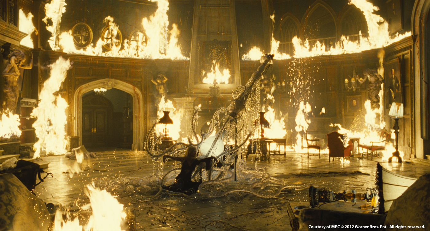
MPC was awarded several sequences. MPC Vancouver completed work on the establishing shots of Liverpool which open the film and two sequences set in and around a 200 foot high sea-side cliff and pine forest referred to as Widow’s Hill. MPC London completed the supernatural showdown in the grand foyer at Collinwood manor between Barnabas Collins and his scorned ex-lover, the witch Angelique, wooden statues (caryatids) coming to life, Angelique’s gradually cracking skin, a vengeful ghost and of course no horror film would be complete without a werewolf. In addition the team also had to augment the scene with various destruction elements including bleeding walls, floors cracking and flowers dying.
Can you tell us more about the establishing shots of Liverpool and the Providence ship?
With the exception of the family boarding a walkway on a green screen set, this work was entirely CG. The Providence Boat was re-purposed and re-textured, forming the focus of the shot. An entire CG dock was built using digital props and buildings cobbled from various other shows. Finally basic CG water, fog and mist were built onto cards to set the scene.
How did you create the Widow’s Hill and Pine forest for the two periods?
The cliff itself was comprised of seven large slices of rock-face, all built at different resolutions depending on their usage in the movie. The cliff edge, where much of the action takes place, needed to match a set piece built during production. This is where the first and highest LOD slice of cliff resided. Several other promontories were then built along the coastline. These were mainly featured in large establishing shots of the area.
For all of the cliff shots a combination approach was taken splitting the tasks between DMP/Env and traditional assets. The rough shape of the cliff was built, and some portions of it were sculpted in Z-brush to help add detail. It was lit in such a way to pull as much topology as felt natural. This was then married with a bespoke set of Env textures that were projected onto the slices. Above the cliff was a pine forest and the Manor that held the Collins family. The forest was built by seeding individual trees using VUE software and then painting over the top. This allowed a lot of natural variation and parallax on the moving shots.
Can you tell us more about the final fight between Barnabas and Angelique?
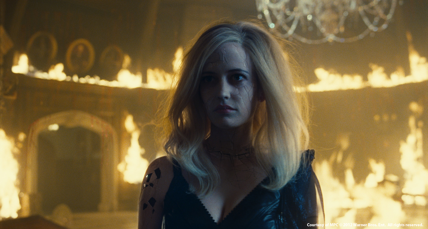
In this sequence Angelique battles with the Collins family. In the scene the room almost starts to breath, the walls start to bleed and crack, and wooden statues come to life. We also see Carolyn transform into a werewolf to battle Angelique. But the main duel is between Angelique and Barnabas! Angelique is unveiled as a porcelain doll and as the battle become more in intense, the more cracks are revealed.
At a moment Angelique skin begins to crack like a porcelain. How did you design and create this beautiful effect?
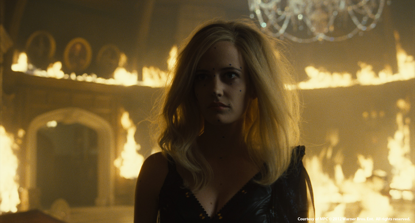
We started with the concept art. There were lots of ideas on how the cracks would look and what would be revealed once she started to crack. Would we see a 200 year old hag or would she maintain her beauty? Tim, Dermot and MPC’s Concept Artist Mark Tompkins created a series of images which showed the stages of change within her face and body. These were then projected onto a hi res model we had created of Angelique. This gave us a 3D form of the concept images which we were then able to use to work out how to articulate the cracks.
What were the challenges with these effects?
Eve Green’s performance was amazing in the sequence and we wanted to make sure that the CG work didn’t take anything away from that. It was therefore crucial that the roto animation was perfect. Tim wanted to have as much control over the cracks as possible including the way the cracks moved and the size and direction of cracking. For this amount of articulation, Sam Berry, our lead rigger came up with a very complex and flexible rig.
The big challenge was the integration of the CG renders of Angelique and the live action performance of Eva Green. Digital Supervisor Kevin Hahn, CG Supervisor Sheldon Stopsack and 2D Supervisor Axel Bonami came up with a solution, where we rendered a number of passes. We started by creating a digital double of Angelique. We then worked out that there were 6 stages which depicted the destruction of Angelique; each cracked version had to followed the concept we layered out with Angus. These were then rendered and passed onto comp, with additional passes and then combined with the plate. It was crucial to keep the surface of the cracks, looking as close, as possible to the skin.
Can you tell us more about the impressive shot in which Angelique is pulling her heart out from her body?
The look and design of the heart was an on going process. Tim wanted something magical. We went through a series of different concepts at MPC, from a heart made of feathers, to metal and even the possibility of it being a bug. The reference we went with in the end was actually closer to a real heart, but with the luminescence of a jellyfish.
The final look was a collaboration between CG Supervisor Sheldon Stopsack and 2D Supervisor Jeremy Sawyer who created the glowing heart you see on screen.
The breaking up of the heart, however needed to feel like it was made of porcelain. Using Kali, our in house finite element destruction tool, we created a simulation of the heart cracking and falling into pieces.
How did you create the wooden statues?
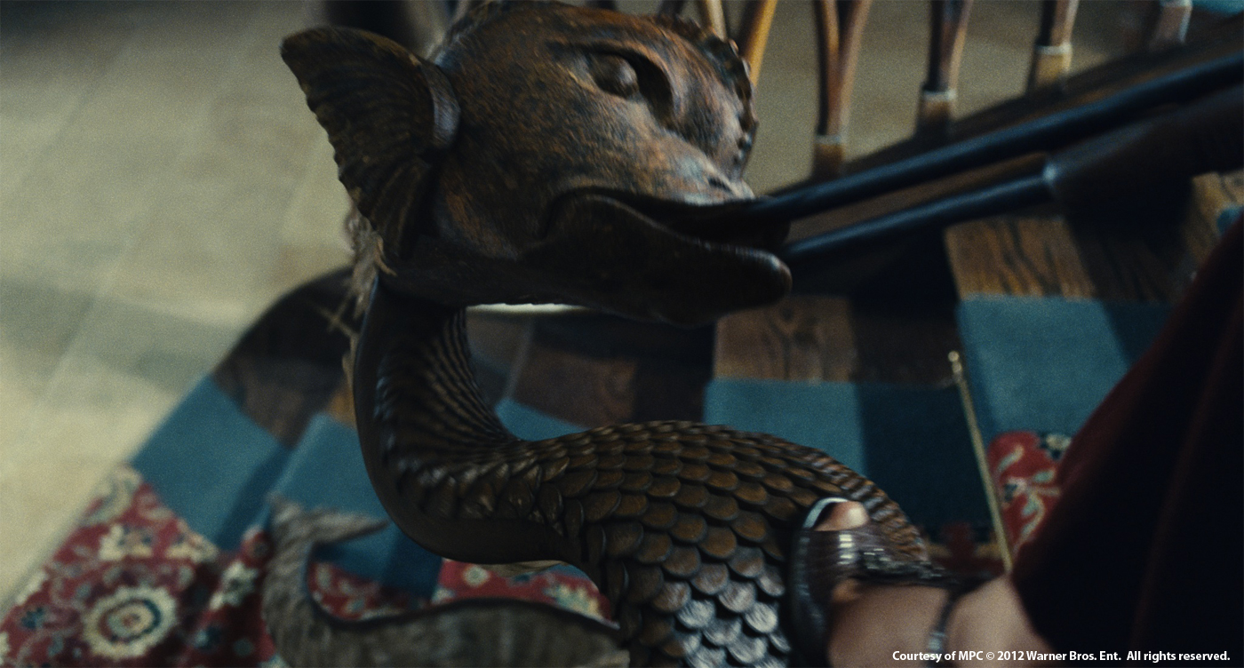
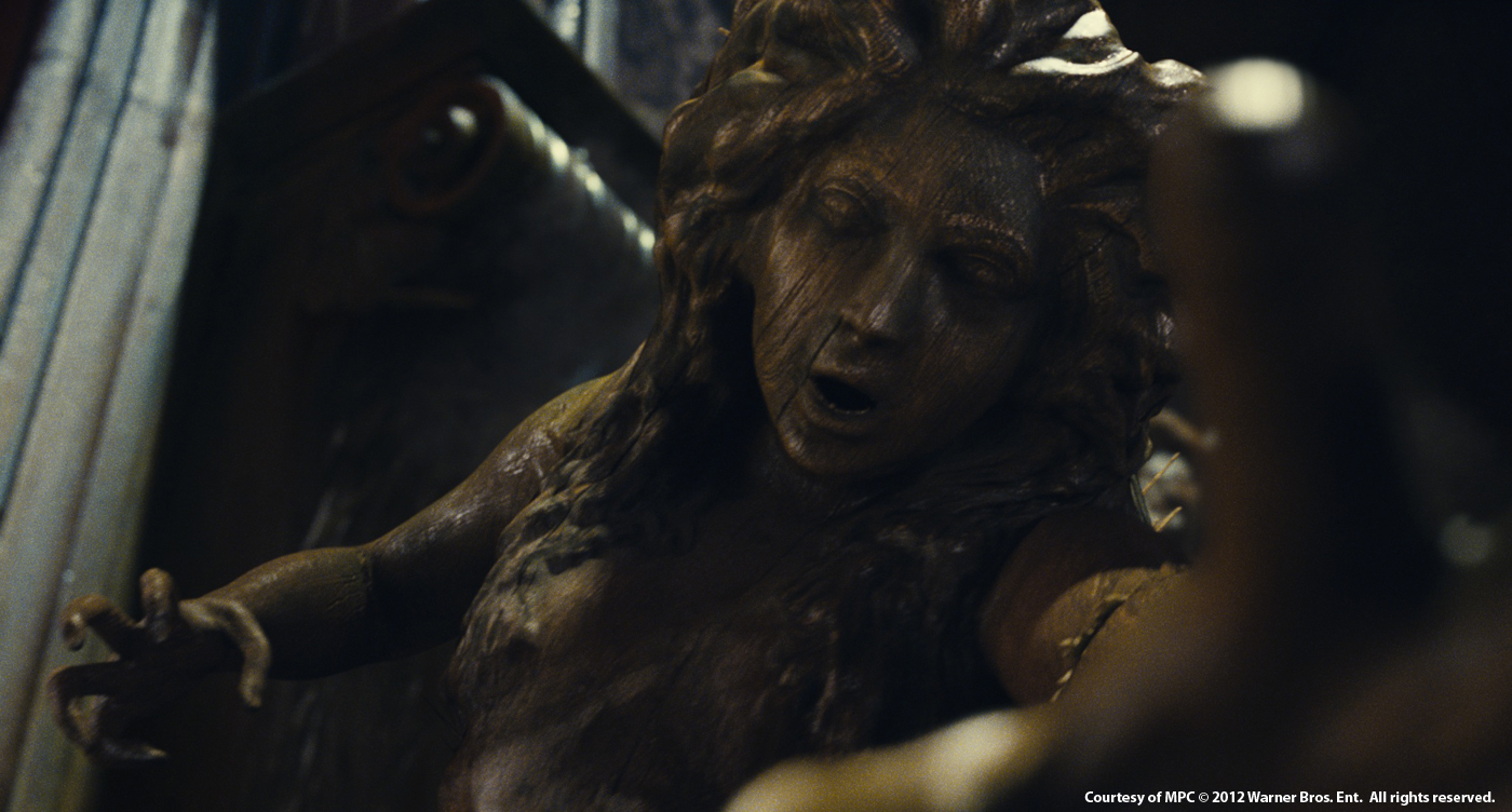
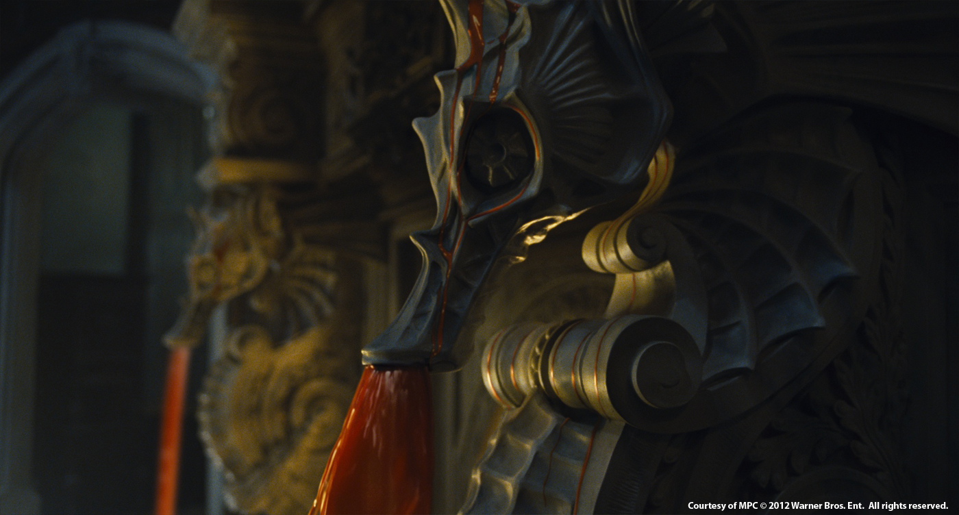
The wooden statues, are some of the weapons Angelique uses to attack the Collins family at the manor. When Elizabeth (Michelle Pfeiffer) starts shooting at Angelique, she commands the coiled serpent around the foot of the stairs to come to life, rips itself away from the banister and grab the Shotgun from her hands.
To make the statues we started by creating a series of concepts with Mark Tompkins, which included time-lapse sketches to help with the animation of the sea serpent statue. Tim Burton was clear from the beginning that he wanted the statues to be almost stop motion in feel and Angus Bickerton would often reference Ray Harryhausen. The set for the grand foyer, where the battle takes place was an incredible build, designed by set designer Rick Heinrichs and the team were able to cyber-scan the onset statues, to help us build the hi-res CG models. The main aim for the animation team, led by Peta Bailey, was to convey the heaviness and stiffness of the statues through their movement. The animation had to feel staccato, as if animated on twos. In addition, the team created splinted breakaway areas at the back of the statues and the elbows, so that we had the ability to animate the statues holding and grabbing. In one scene Elizabeth shoots at a statue blowing its head off. To create the destruction of the head, we again used our in house destruction tool Kali to create splintering wood, simulating the impact of the gun shot. Finally, in comp we added extra layers of dust and weathering to the statues.
Can you tell us more about the Werewolf?
From the outset Tim did not want Chloe Moretz wearing prosthetic makeup as he felt it would hide her performance, so during filming, tracking markers were applied to her face, as well as green leggings so our team could create CG wolf legs. Working together Dermot Power and Tim Burton came up with some really striking images for the werewolf.
Using this as a starting point, we gathered reference images of wolfs and foxes, and studied the way the fur looked and the structure of their legs and feet. Tim asked that we kept her looking elegant as possible, so the groom had to have a well-kept look and feel.
We used our in house tool Furtility, to create the groom. The fur had to follow the sculpture of the form of the body and a hi-res model build of the legs and face were created. The final development of the look was created in lighting and comp. The fur needed to look soft and the eyes were created in nuke.
How did you create the ghost in the corridor?
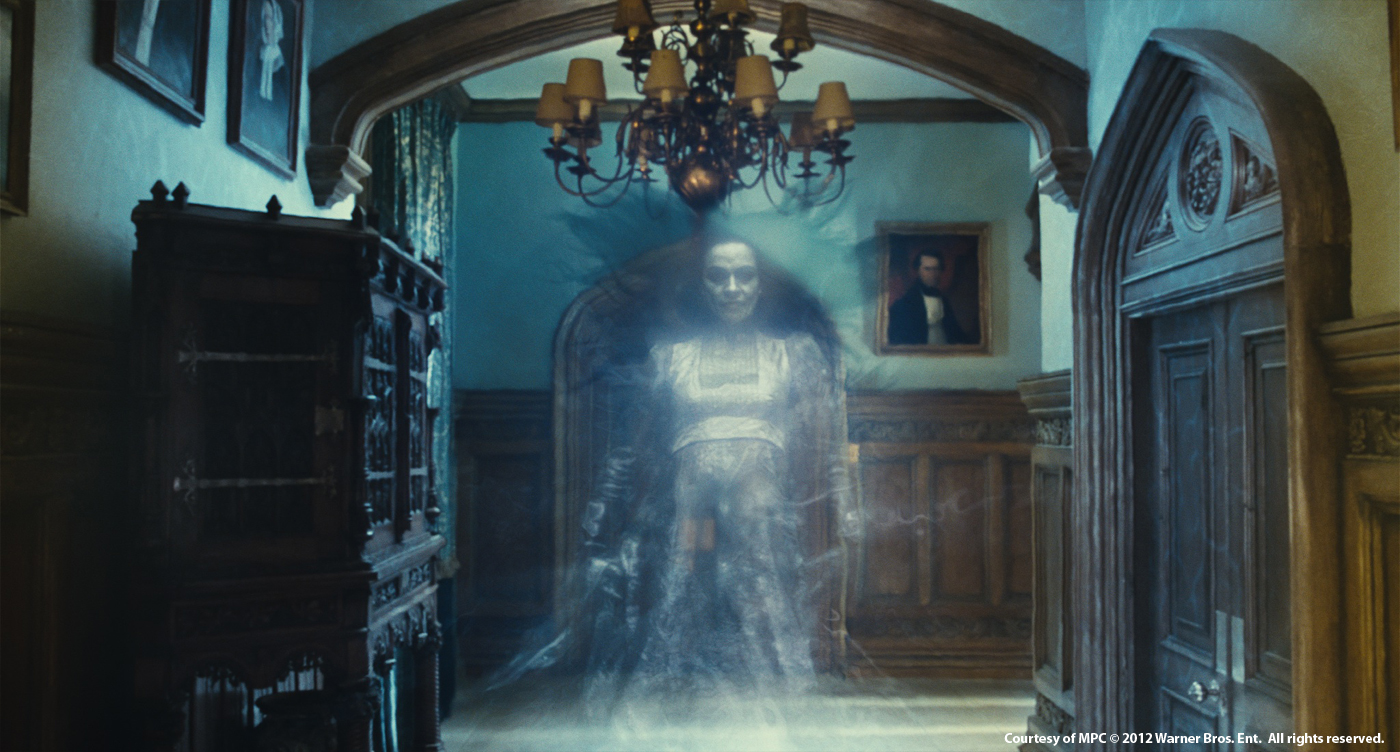
In the script, David loses his mother at sea, so we wanted to use this theme for the look of the ghost. Early into production, Angus shot a series of tests, using a stunt double on a greenscreen with a couple of fans blowing onto the artist. The footage was shot over-cranked to help create the flowing effect. The results were great, but to achieve what we needed, we also had to shoot the artist underwater. There was however a drawback to the underwater footage. The effect of the water pressure on the artists face/skin, did not give us the desired look. To resolve this Comp artist Anthony Peck combined the two extreme elements, together with other practical elements to create the ghostly look.
Can you tell us more about the destruction elements in the room like the bleeding wall, floors cracking and the dying flowers?
In the story, Angelique takes control of the room. We started with the painting of Barnabas bleeding. Tim had a clear idea how he wanted the blood to look and flow. This was achieved using two methods; first Angus shot blood elements again a green surface which replicated the wall in the room. These elements were used for close up shots. For the wide shots, we used a different methodology. The Environment team led by Isabella Rousselle used the lidar scan of the grand foyer, Jerome Martinez created a 360 degree geometry of the room and the dmp of blood and cracks on the wall was then projected onto the geo surface. These elements were finally integrated into the plate by the comp team.
Was there a shot or a sequence that prevented you from sleep?
The biggest challenge was to keep Angelique’s beauty even with the cracking of the skin.
Which branches of MPC have worked on this show?
MPC London, Vancouver and Bangalore.
What do you keep from this experience?
We had extremely complex work to achieve in quite a short space of time. This could not have been achieved without huge effort and dedication from a great team at MPC.
How long have you worked on this film?
We worked on the show for 8 months, of which we were in post for 5 months
How many shots have you done?
We completed 350 shots.
What was the size of your team?
Worldwide the team totaled over 300
What is your next project?
The latest Bond movie, SKYFALL.
What are the four movies that gave you the passion for cinema?
There are lots of films but maybe DUNE , 1984 , ALIENS, SLEEPLY HOLLOW, DAYS OF HEAVEN.
A big thanks for your time.
// WANT TO KNOW MORE?
– MPC: Dedicated page about DARK SHADOWS on MPC website.
© Vincent Frei – The Art of VFX – 2012


