During his last interview, Nicolas Aithadi explained in details the work of MPC on 47 RONIN. He is back with the space opera of Marvel, GUARDIANS OF THE GALAXY.
How did you got involved on this show?
I joined the show in August 2013. An MPC team also worked on the Comicon teaser before I came on board.
How was the collaboration with director James Gunn?
James was very involved in the whole project. During production, we didn’t have much interaction as he was very busy making the movie, but he still found time to review assets and concept work. Once the shoot had wrapped we would talk to him twice a week, along with the rest of the Marvel team.
What was his approach about the visual effects?
On this project the first thing we considered was what was going to be the best method to complete all of the work, as it was such a massive undertaking. The plan was to break it down to smaller more manageable tasks. We had a very short deadline and finding ways of streamlining processes was paramount.
How did you work with Production VFX Supervisor Stephane Ceretti?
I knew Stephane from before, we collaborated on ALEXANDER when he was at Buf and he later came to work at MPC to supervise the VFX on PRINCE OF PERSIA. So we knew each other’s backgrounds.
What are the sequences done by MPC?
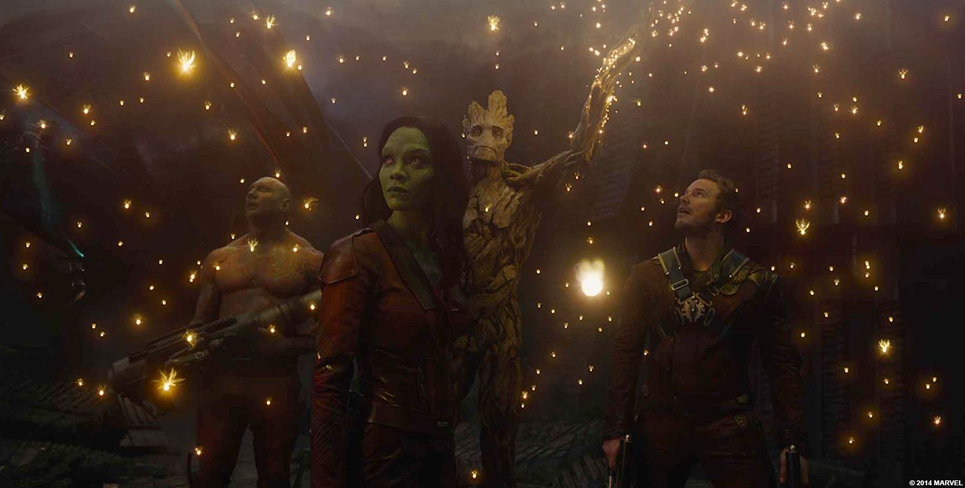
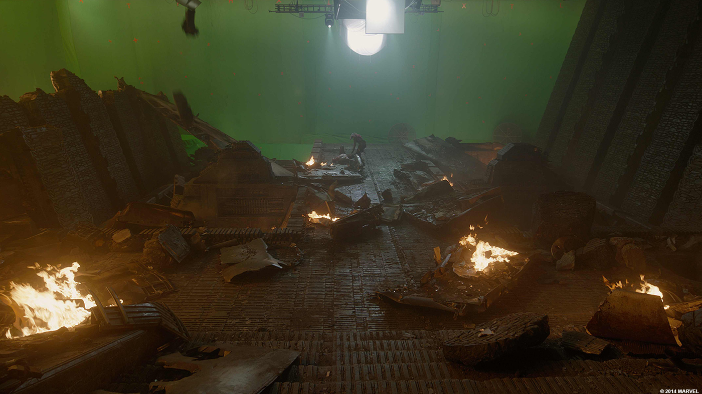
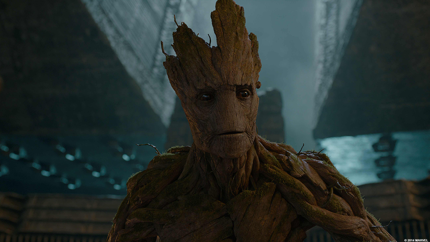
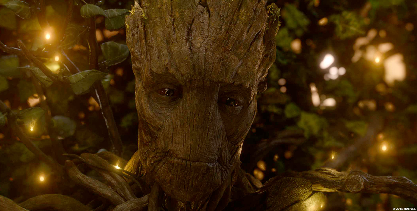
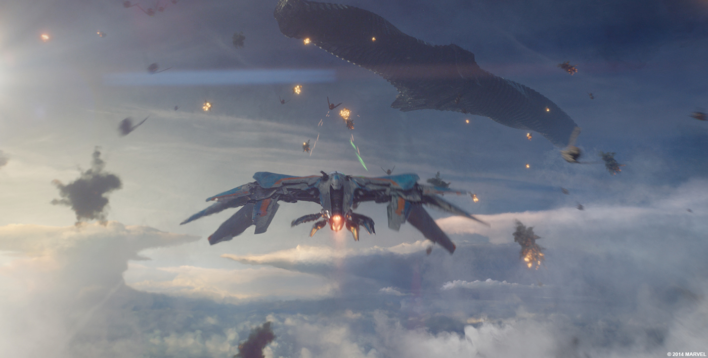
MPC worked on 857 shots including 170 Groot shots (we created Groot), 180 Rocket shots and 490 Final battle shots. We worked on the Morag sequence, Xandar Mall fight where Quill, Gamora, Groot and Rocket meet for the first time, and the majority of the third act shots, including the “12 % plan”, the aerial battle, the Milano crashing in the Dark Aster, the spores sequence. the cocoon sequence and the Dark Aster crash. Just a couple of things!
Can you describe one of your day on-set and then during the post?
Early in the schedule my day was spent doing reviews of the various departments work with MPC DFX Supervisor Daniele Bigi and CG Supervisor Sheldon Stopsack, but quickly the ratio changed in favour of Comp. I was reviewing CG work in the morning and then I was spending the rest of the day with Marian Mavrovic and Richard Little (Our two compositing supervisors) reviewing the comps of the day.
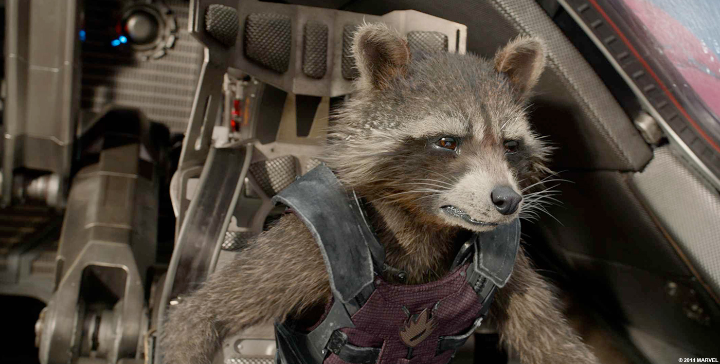
Can you tell us more about Rocket and his fur challenge?
Framestore took the lead on Rocket dev. Once they and James were happy with the design they sent us the model, some renders and an Alembic cache of the fur distribution. Daniele Bigi, our DFX Sup, took the information and worked with R&D as well with David Mayhew our Groom Lead to integrate the data into our pipeline. The difficulty came from the fact that we were two companies with very different pipeline trying to create an asset that needed to be identical. We were working with Prman and our proprietary tool Furtility and they were using Arnold and their own fur technology. We also wanted to make sure that we were keeping control over the hair all along and that we were able to change the groom if need be. Rob Pieke our Lead R&D on the show was task to facilitate the process. It took some time, but we ended up with a pretty identical Rocket. We showed a daily one day of both MPC and Framestore Rocket side by side, without labelling them and it was pretty darn difficult to tell the difference.
Let’s talk about Groot. How did you approach his design and creation?
As always, it starts with a concept. Around April 13 we were asked to do a test. A proof of concept of the characters. We could choose to do Groot or Rocket or both. We chose to focus on Groot only. We used the concepts that Marvel provided us and we build our first Groot ever. That was that early model that ended up in the test. Focusing on doing Groot well paid off and we were asked to take the lead on that character, credit must go to MPC’s Gary Brozenich who supervised that test.
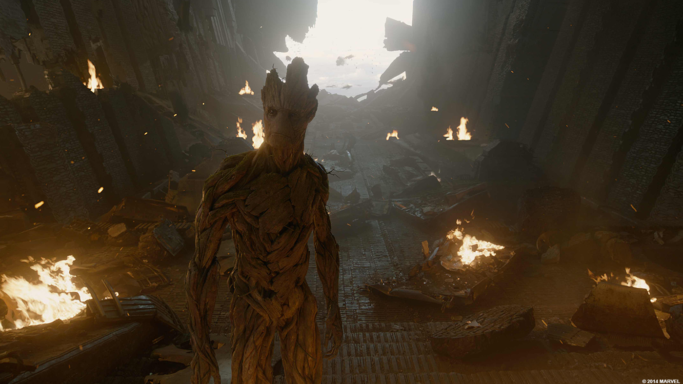
Our next task was to create some shots for a Comicon piece. That’s when we started to change Groot’s design. As good as the original concepts were, they showed a Groot that was too much of a tree. James Gunn from the first day was saying how much he wanted the audience to fall in love with Groot and Rocket, that if they didn’t work the film wouldn’t work. So we though that it was important that people would relate to Groot. We started to humanize him, changing slightly the proportions adding details and removing others. Senior Modeler Abner Marin started sculpting on Groot and was joined later by Leandre Lagrange, it was so complex and we had so little time, that we needed two very skilled artists working on it. We made him a bit more symmetrical and gave him a gentler face, trying to make him a likeable character without loosing the fact that he was a tree. It took 6 to 7 months of design work and reviews with James to finally come up with the Groot we see in the movie. It was a real labour of love. We had a dedicated team working exclusively on him, he was a real movie star!
Can you explain in details about his rigging and animation?
Once we had the model, we had to rig it. Groot is one of the most complex rigging tasks we have ever had. Benjamin Jones was our Lead Rigger on the show and was the main rigger on Groot. We decided that Groot should be made of lots of individual branches, all connected together. We didn’t want him to look like a totem, like it was sculpted out of a single tree. That gave us a great design, but also created amazing challenges. Ben created a rig where every branch was connected at various places across the body, so you could move an arm and you would see branches moving and sliding on the neck and as far as the back. that gave us tremendous visual complexity, which is the key in visual effects. An aspect of animating fleshy characters is that muscle and skin deformations give you the movement you need to breath life into the characters. With a wooden character it is not that obvious. Ben’s rigging actually gave us something similar to muscle and skin movement and all these branches moving and sliding kept Groot alive.
But we didn’t stop at that very complex body rig, we went further and decided that having a flexible face wasn’t working for Groot. It made him look like a guy with a rubber mask. We had the idea to break up the face into little plates following the details of the modeling and texturing, these plates would then be rigged to slide and move across the face thus replicating the effect of facial muscles. It was important that doing so we wouldn’t change the design of Groot’s face. We spent so long getting it to where it was and everybody from Marvel to the director loved him, we didn’t want to jeopardize it. Leandre Lagrange our lead modeler who was in charge of Groot’s build was tasked with sculpting those plates. He made it so that when Groot was saying something subtle like “I am Groot” we wouldn’t see it break up, but the face was ever so slightly moving around and that detail was bringing it to life. But then if Groot was screaming or being very angry the plates would open up so much that his face would look very scary and it was great because it was amplifying the effect.
For the animation, contrary to what I’ve read on the internet and magazines we didn’t use Motion Capture for Groot or Rocket. The idea was raised and discarded at the beginning of the show. MPC Animation Supervisors Greg Fisher and Gabriele Zucchelli were in charge. Early in the beginning of the design phase James’ brief was to be subtle with the animation, James was concerned about over animating Groot or Rocket. While we were building our model the animators were working with a temp build to find out who Groot was, how he was moving and emoting and more importantly how he would deliver those three words “I am Groot”. The first problem we had was that we didn’t have a voice for Groot yet. Vin Diesel wasn’t cast yet. Greg Fisher became the voice of Groot for a while, first he did it internally for animation purposes and later he was recorded in a studio to be used as a place holder for the edit. We then created some animation studies that we would regularly present to James and Marvel. We took inspiration from moments from the previz and we would create quite advanced pieces of animation that slowly but surely defined Groot’s personality. We tried everything; walking, running, sitting down, breathing, screaming and obviously talking.
A very important aspect of Groot that became a focus for our team was the eyes. Daniele Bigi our DFX sup took the lead on that and with the help of Michael Hipp in Lookdev they developed the look of Groot’s eyes. We built the eyes differently than we have done for characters in the past. Daniele and the team spent time looking at medical books analysing what makes a real eye real. We added a new tissue called limbus to make the transition between the iris and the sclera, we of course used caustics and refraction to the shading of the eyes. Daniele decided that we would need to model and displace the intricate ridges inside the iris which gave more detailed shadows inside the eyes. All of this contributed to some beautiful looking eyes, but it wasn’t enough. What made the eyes really work was the way they were posed and animated. The animators offset the eyes direction ever so slightly. It gave Groot a asymmetrical look and an extra realism boost.
Did you received specific indications from James Gunn for their animation?
Very specific. James had a very clear idea of how Rocket and Groot were supposed to act. As I said his biggest fear was that we would over animate those characters. At the beginning we had some notes where James asked us to dial down the animation. He would say “If he was an actor I would tell him to be careful with this or that”.
Another interesting aspect of how James treated those two characters was how they were presented in shots where they weren’t the focus. Usually we avoid to have heavy CG characters or assets in a shot if it’s not really the point of the shot, but in GUARDIANS we had shots where you would see a slither of Groot’s shoulder or an arm or the tip of Rocket’s ear. I think that it helps sell them as real characters.
What was the main challenge with Groot?
The main challenge was the lack of dialogue, the animation had to be able to convey what Groot meant every time he was saying “I am Groot” The other thing was to make him move in a recognizable way, without looking like a guy in a suit.
Can you tell us more about the dancing Baby Groot?
We built several versions of Groot for GUARDIANS. There is the Groot, who we see throughout most of the movie. There is Groot Cocoon, when the Dark Aster is crashing and Groot decides to sacrifice himself, turning himself into a wooden cocoon. We had to put together a rig that would grow branches and shape them into a ball. Again Ben Jones was instrumental to the success of the sequence. There was also Groot Twig, after the crash Rocket holds a twig in his hands and cries, great work from our animation team there. The branch he’s holding is not just any branch, it was art directed by James Gunn, we build it and showed him a turntable and he gave us notes that we integrated. James wanted to make sure that we weren’t giving away the fact that Groot was coming back, so they shouldn’t be any green visible, for him green meant life. Groot Bloom was the small groot waking up in the pot on Rocket’s lap.
Finally Groot Tiny (Aka Baby Groot). This is one of my favourite shots in the film. This was another of James’ ideas. We got some concepts from the art department, but as it always happens some changes were made at modeling and texturing stage. The modeling and rigging of Tiny Groot was quite straightforward. the main challenge was the animation. James shot himself acting out the dance and sent us the video. He didn’t want Groot to be a coordinated dancer, he wanted it to be more of an instinctive, messy response to the music, like he doesn’t know how to dance, but just lets himself go. Greg Fisher and his team used James’ video as a reference and created that weird happy and carefree dance routine you see in the film.
How did you collaborate with Framestore for Rocket and Groot?
I have to say, beside the challenge of sharing two very complex hero character, the collaboration with Framestore was great. As I explained we were tasked to develop Groot and Framestore was task with developing Rocket, but both of us would have to use those assets in our respective shots. To do so, each facility had to send each other the assets. Once James and Marvel were happy with Groot’s design, model and texture we would package it up to be sent to Framestore. We would send them the models, the textures, some rendered turntables showing the full body and close ups on the face, some animation clips as well as some technical dailies showing how the rig would work. Being proprietary technology we couldn’t send them the rigs and shaders (they weren’t using the same renderer anyway). When they were getting all this, they would go away and rig it and shade it and would use it in their shots. The main issue is that every time we would have a note to change the design or alter a texture or the modeling we would have to re-package and resend.
The same was true for Rocket, Framestore and us had the same deadline to deliver to the other facility both characters and they would send us the same kind of packages we sent them for Groot. The complexity with Groot lied in the rigging, as I was explaining it was a very complex character to rig. With Rocket the complexity was coming from the fur. Framestore was using their own proprietary fur systems and they were rendering with Arnold, we on the other hand were using our own Furtility fur systems and we use Renderman. So getting the two Rockets to match was a very difficult task
The Guardians have a really cool ship, the Milano. Can you tell us more about it?
The Milano was another challenge on this project. Like most things it started with concepts and on this ship in particular there was quite a lot of concepts. It was very clear from the get go that it would be a very complex model with a crazy amount of detail. We decided to list all the shots where the Milano would be featured and made sure that all these views were part of the approval process for modeling and texturing. It was a more intensive way of looking at an asset, but it proved to be an essential part of the build. We were assured that we could cover pretty much every shots James could throw at us.
The design itself was already pretty much done and was provided to us as a series of images showing the Milano in various action, but those various images didn’t show the same Milano, they was differences between them, small or big and we had to select some which details to use and which to leave out, and we would submit the model to James and Marvel and we would get approval or notes to address. We actually worked on the Milano till the end of the project, we were constantly adding or remove things. Up-resing areas that wouldn’t hold for that shot or this moment. we added damage to it and we built the brand new one, which was pretty much the same but with straightened lines and cleaner textures.
Once we had the model done, we started the texturing process, again, the level of detail of the modeling meant that the work on the textures would be quite extreme. The Milano is shown in wide views and very close up, so the textures had to hold up at pretty much any resolutions. We ended up with a couple of hundred textures covering the ship. With variable dirtiness that we could dial up and down as needed in the shots. Add to that painted displacement for the dents and scratches as well as procedural displacement for the wobbliness of the metal. In all we work on the Milano the whole time as a parallel task, it was around 13 months of work and adjustments.
How did you manage its lighting?
It was a very complex object to Light and Shade. its colour was the first challenge. It was Orange and Blue, which are not colours you associate with Spaceships usually and they are not colours you would use when you’re trying to create something photoreal. Our obsession was scale. We were always trying to get the ship as big as it should be. The Milano is the size of a 737, It’s a big ship. We would make sure that we had enough visible details when it was flying, which was the second challenge. The Milano reached unprecedented speeds and it made it very difficult to maintain details whilst it was flying. Another challenge was to maintain a metallic look without being too shiny, which is very difficult when the ship was flying very fast.
Can you tell us more about the animation challenges with the Milano and the others spaceships?
Beside animating Groot and Rocket, the animation team were in charge of animating 9 different ships. From the Nova corp Starblasters to the Sakaaran’s Necrocraft, Ronan’s Giant Dark Aster and the slightly smaller Eclector ship. When we were trying to get our heads around how Groot would move by doing all of those animation studies, another group of animators was tasked to do the same with the ships.
We focused primarily on the ships that would take part in the final battle, namely the Ravagers, Necrocrafts and Starblasters. The idea was to create a vocabulary of flight behaviour that would be used across the shots. The Ravagers ships including the Milano and Starblasters were the most straightforward, if the Ravagers were the ‘muscle cars of that universe’ (How James Gunn would describe them) The Starblasters were the Ferrari or Lamborghini of Xandar. The shape and design of these two ships helped drive the flight, the Ravager ship were like airplanes with attitude and the Starblaster were borrowing from squid or jellyfish. We presented these studies and after a while we had something that James was happy with. The same couldn’t be said of all of the ships.
The Necrocraft was the ship we struggled the most with. Its shape was so different from a traditional spaceship or what you imagine a traditional spaceship would look like and James really wanted them to fly in a strange way, not at all something conventional. We tried several things, but nothing was really working, it was either strange but not looking cool or good looking, but too normal. One day Greg showed me a video they found on the web, showing slow motion flies, we thought that’s it, that’s how they should fly and we showed that to James. He really liked it and we used that video as a reference for how the Necrocrafts flew.
The hardest thing with regard to animation, was the way Peter Quill flies the Milano, James said from the beginning that Peter Quill was a great pilot and that he could do stuff with his ship that no other pilot could even dream of doing. That gave us a couple of shots where we had to animate the Milano in a very unorthodox way, forgetting about some of the rules of animation we are used to. James wanted very fast paced animation and this is something that we were a little concerned about as in CG we have a tendency to slow down things to infuse weight. In this case we had to speed up some movement and it was scary. That said when you see it in context of the sequence it makes sense and you understand why James wanted that effect.
We visit many locations such as Morag or Xandar. How did you proceed to create these locations?
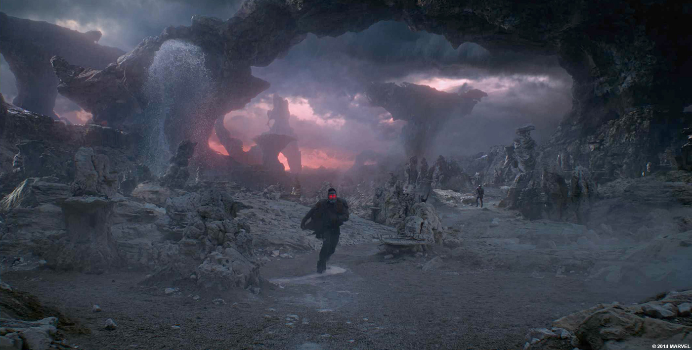
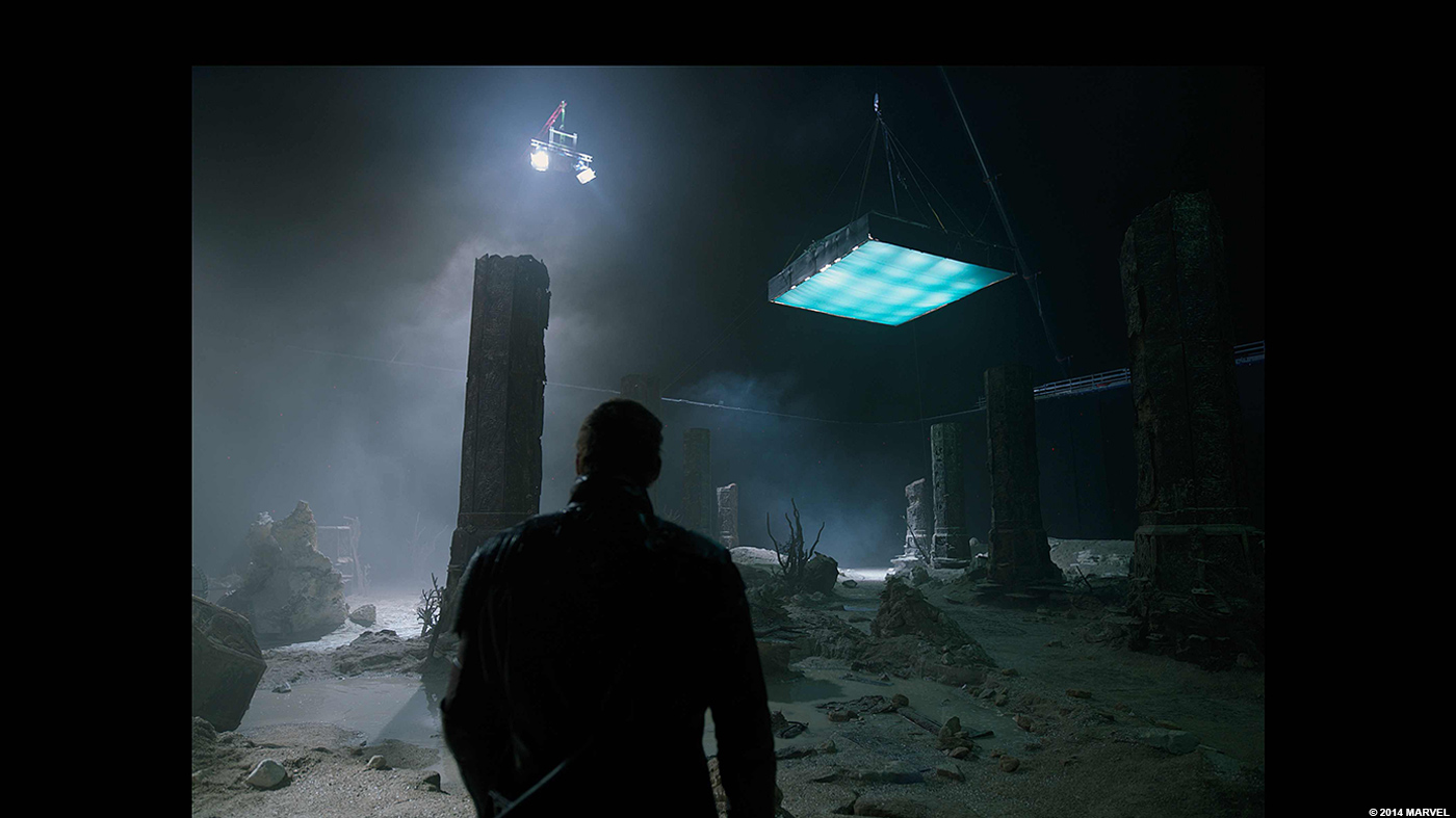
Morag, was technically the most straightforward sequence we had to create VFX for. It was mainly environment. I say straightforward, but not easy. There was a couple of challenges involved in the creation of that world.
There was a large set that was used to shoot all the live action plates of Peter Quill on the surface of Morag and we had to extend it quite a bit. We started to gather material that was shot by Stephane Ceretti and Olivier Dumont in Egypt and in Arizona and we created quick concepts showing what the world could look like. Our environment artists Marco Rolandi and Thomas Mouraille were responsible for that sequence. We thought that the concepts weren’t threatening enough, and James Gunn wanted Morag to be quite a scary and unfriendly place so we tried a different avenue and decided that we would have to build the whole environment in CG. Thomas and Marco came up with the idea of Giant arches and very sharp spires and rock formations which gave an aggressive feel to the planet. Even though there a fair amount of live action rain photographed on the day, we added a lot more as well as very thick layers of mist and fog. James asked us to colour the sky with a red/orange tint. Again it was to create a sense of contrast, having a very rugged threatening planet surface and a beautiful and textured sky.
Can you explain in details the creation process of the beautiful city of Xandar?
Xandar was by far the most difficult and time consuming chunk of work we tackled on this project. It started with very nice concepts provided to by the production team. It included several detailed views of the city as well as what we called the “Google map”. A top down view of the whole city showing the shape of the island. Of course those concepts, although beautiful, were lacking the technical detailing that would be necessary to build the city, but it gave us a good understanding of what Stephane and James were looking for in terms of look and feel. Early in the process we discussed the fact that really Xandar was a sort of alien Singapore and we discussed the idea of organizing a helicopter and photo shoot there, as well as going to Dubai and Shangai.
When we came back from all those places we had a good library of buildings. We said early on that we would be using all of those elements as inspirational material only and in no circumstances we would create a building that someone could recognize as a real building from Dubai, Shanghai or Singapore. What Marco Rolandi did with the help of the art department led by Ravi Bansal was to create original Xandarian buildings made up of elements and details from the real world buildings. They created a collection of very cool non human structures that we then passed onto the modeling department to build as proper geometry that were then textured and shaded.
We used the Google map concept and the layout department led by Stanley Dellimore and Thomas Dow. They laid out all the buildings and thousands of trees, bridges, docks etc… overall 39 billion polygons was necessary for the city of Xandar.
The layout team also dressed the hero high res buildings with Plants and furnitures. MPC’s Alexandru Popescu and his team started to work on the look and lighting of the city using V-ray as the main rendering engine, Prman was used when the building we being destroyed.
What was the most complicated location to create and why?
Xandar was the hardest because of the different way we had to showcase it, we had a city that was seen from the sky, a city for close up, where the buildings were very close to the camera, a city from the ground up to be used as a background and we also had the city with perishable building for the attack sequence. All of those assets made Xandar one the most complex environments we’ve ever done.
The final battle have an amazing amount of elements. How have you handled so many assets?
We have publishing tools that help us keep track of those various elements, but we also have a fantastic production team making sure that nothing falls through the cracks, not forgetting the CG sups and Departments leads. all these people are doing there part so we don’t leave anything out.
What was the biggest challenge on this project and how did you achieve it?
Scope and variety, these are the words I would use to describe the challenge of GUARDIANS OF THE GALAXY. Scope because of the shear size of the worlds we were creating and the number of assets that would populate those worlds. Variety for the amount of different effects we were dealing, there was so many type of very difficult effects and sometime they would appear in a single shot. Yes, Scope and Variety.
How did you split the work amongst the various MPC offices?
We usually split by sequences, MPC Vancouver took charge of the net sequence, supervised by Stephane Paris and Montreal took charge of a couple of Xandar shots, London being the main facility dealing with the bulk of the work.
Was there a shot or a sequence that kept you awake at night?
All of it, it was a long sleepless series of months. No seriously It was all very difficult, but one thing that kept us on our toes was the fact that we had to match a hero character that was created by another facility. Matching the fur, the clothing was tricky.
What do you keep from this experience?
Whatever doesn’t kill you makes you stronger. (laughs)
It was a very hard and challenging project, but it was worth it when you watch the movie. It’s great to see that people appreciated the work we put in Groot and Rocket and the world they inhabit.
How long have you worked on this film?
I personally worked on it for under 11 months, overall it lasted more than 18 months.
How many shots have you done?
We worked on 857 very complex shots!
What was the size of your team?
The whole team was around 700 people across the world.
What is your next project?
I’m working on a very cool project called MONSTER TRUCKS but I can’t talk about it yet.
Take a look at MPC’s website for all the movies we are working on.
A big thanks for your time.
// WANT TO KNOW MORE?
– MPC: Dedicated page about GUARDIANS OF THE GALAXY on MPC website.
© Vincent Frei – The Art of VFX – 2014


