Malcolm Humphreys boasts more than 23 years of expertise in visual effects. His career includes stints at several renowned studios such as Rising Sun Pictures and DNEG before he became a part of ILM in 2016. His portfolio features work on notable films like Jurassic World: Fallen Kingdom, The Mandalorian, The Batman, and Ant-Man and the Wasp: Quantumania.
What is your background?
I started getting into Visual Effects in the late 90s. Before this I was working at a web design company, doing design and programming which I had a huge interest in as I loved doing art but also liked science. When the dot.com bubble burst, lucky for me I found a gig through a friend at a film processing company. It wasn’t flashy work, my first project was digitally fixing every splice of a film at 4k (which was a major undertaking in 2000), and at the same time we had to paint out all the dust for the entire film so it could be printed back out onto celluloid. The rest is history, over many years I have moved through the majority of all the other VFX departments having a blast. Visual Effects continues to be a super engaging field for me where it is a fantastic eclectic mix of people from all over the world, technology, science, and art.
What was your feeling about being part of the A Quiet Place universe?
I felt super fortunate to collaborate in this universe. Scott Farrar who supervised the first two films is a giant in the VFX field and getting to take on the mantle was a bit daunting but also super exciting. I absolutely love creature work, but this film had a bit of everything that really pushed me and the rest of the team.
How was the collaboration with Director Michael Sarnoski?
Michael was fantastic to collaborate with. He has a fantastic vision for what he wants to get out of a scene, but at the same time leaves a space for you to bring your ideas into the mix and collaborate. This is an ideal space for the entire team on the show, as that trust allows you to make some really special moments in the film.
How did you organize the work with your VFX Producer and among the ILM offices?
The technique I always try to use is to organize work so an office or a team can have as much autonomy as possible. The hope is that teams in the same location can have more ownership but also can work together without getting stuck while waiting for someone to wake up on the other side of the world.
How did you use the ILM experience on the previous A Quiet Place movies?
We pulled all the creature work from the last two films, this was a fantastic reference so that we could keep our performances in line with what has been established with John Krasinski and Scott Farrar in Part One and Part Two.
Michael Lum who was our ILM Animation Supervisor on Day One was in contact with Rick O’Connor. Rick supervised the animation on the previous films so he was a valuable resource for us to hit the ground running.
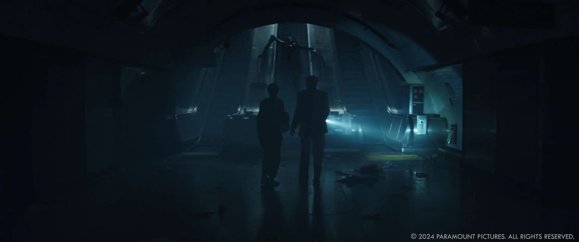
What was the initial concept or inspiration behind the design of the creatures?
I wasn’t a part of the original team but I think you can feel Giger’s work on Aliens as a strong influence on the creature’s design.
How did the design of the creatures evolve from the previous films to “A Quiet Place: Day One”?
We did design a new very large mother creature as well as some baby creatures for the construction site scene. Along with the food fungi they eat.
Can you describe the process of creating the creatures from initial sketches to final renders?
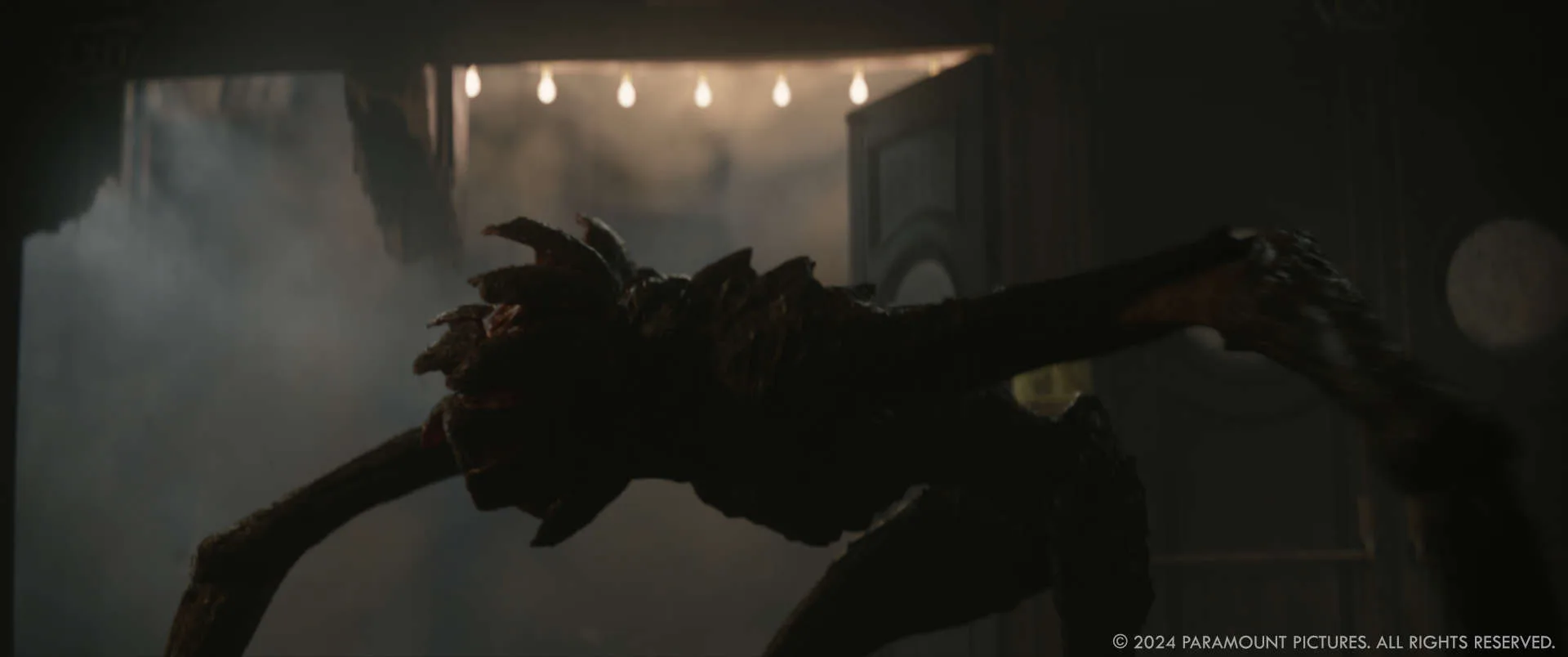
Early on we engaged with Jason Horley and the ILM Art Department to help resolve some of the creative challenges on the film. In terms of creatures, Jason’s team helped flesh out the design and feel of what we were calling the ‘Dinner Bell’ scene at the construction site.
Part of this was to flesh out the visual language of the scene which included a large mother creature, smaller baby creatures, their food and environment.
Michael was very keen on making the food have a thick outer skin that only the mother was strong enough to open with a juicy inner layer with white milk for the other creatures to eat. To give the Mother a bit of history we caked white deposits of the milk of the food that had dried and become hard on her skin.
With the babies, we exaggerated the sizes of the heads and gave them a smoother overall appearance than the adult creatures.
In post, we continued to flesh out all these ideas and work into the details.
For the fungi food, we wanted the feeling they have grown and have a thick fibrous skin. We had sculpted a form during pre-production which we had 3D printed, so we could have it with us during the shoot. Frodo actually licks this print in one of the shots which we later replaced with our fully fleshed digital version. For the digital version, we used this 3D form to grow and groom long fibers both inside and outside to produce a surface. This resulted in a final asset that would look hard and thick at a distance but also soft when seen closeup when light can scatter through.
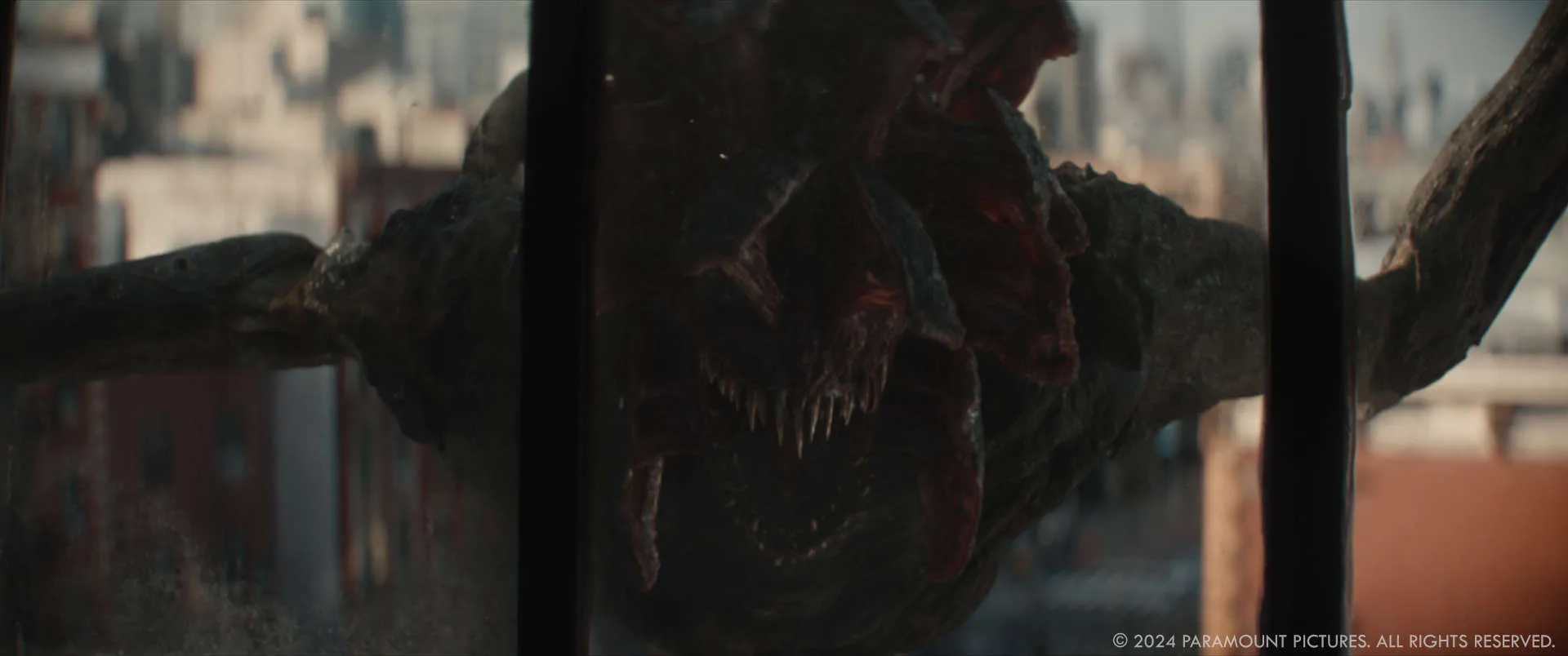
How did you ensure the creatures remained terrifying while also showing their evolution?
A lot of this comes down to pacing and refining the performance to get that feel and timing just right. During shooting I continued to talk to Michael about each scene and how he wanted the audience to feel. Michael was really keen on using the creature’s plates in a more delicate way as a finer, more tactile interaction than the echo location we have seen before.
Were there any new challenges in animating the creatures for “A Quiet Place: Day One” compared to the previous films?
In Day One the creatures move faster, and have much greater interaction with their environment. For the first time we see them working in a stamped mode. The proportions of the long arms and short legs was definitely a challenge for some of the shots, when you see the creatures for longer it’s very easy for them to start to look clumsy or gangly.
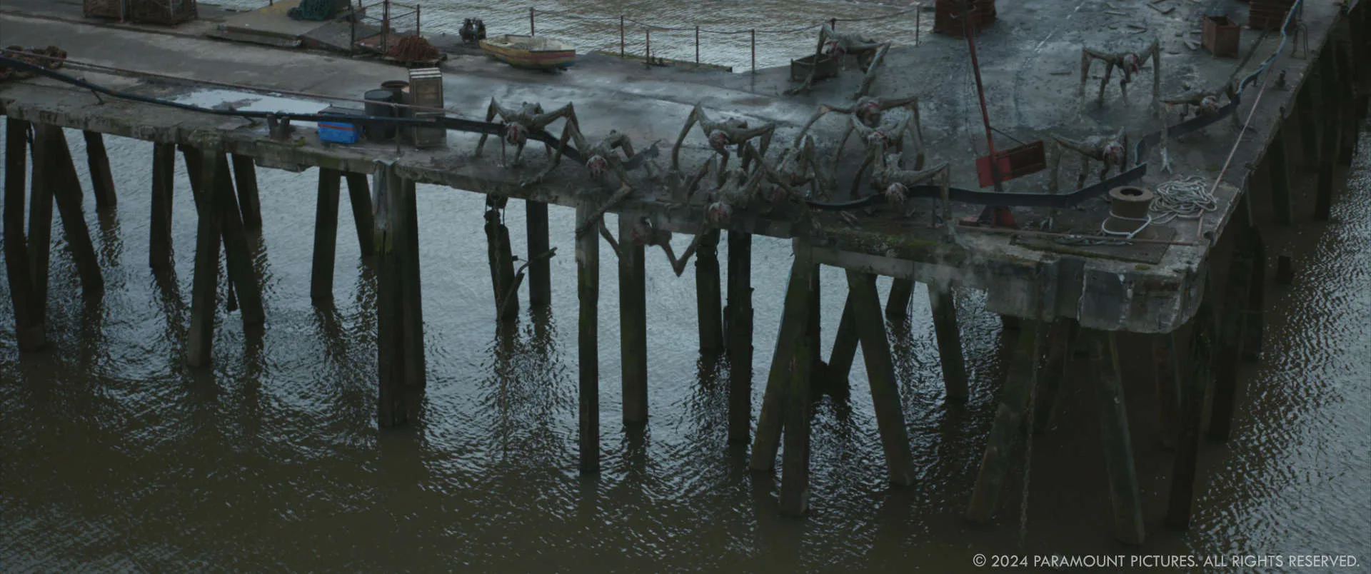
How did you achieve the lifelike textures and movements of the creatures?
We looked at loads of reference material – All manner of animal and creature movements so we could hone in on the exact performance Michael was looking for for each scene giving the performance the best impact.
What role did practical effects and CG play in bringing the creatures to life?
Michael is very keen on trying to approach shooting in a practical manner. We can do pretty much anything digitally these days so I’m totally in the mindset of always trying to capture a scene with as many practical elements as possible. Unless it makes it impossible to do the work later in post or there isn’t the time on the shoot day. Capture as much in-camera as possible, that’s my guiding principle.
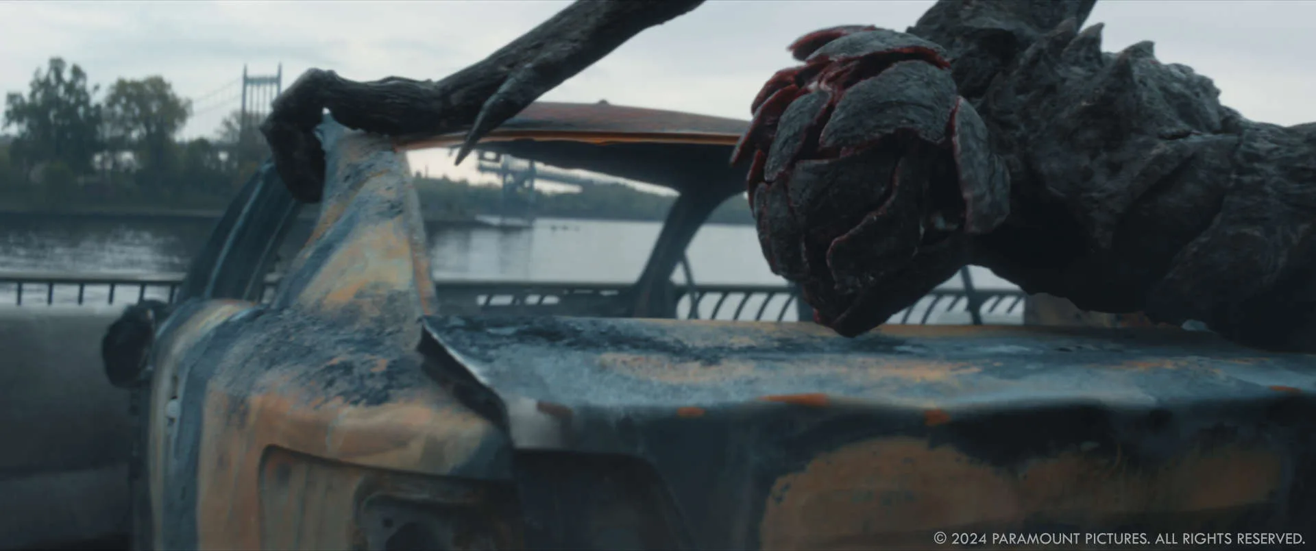
For example, there’s the theater lobby scene where a creature smashes through a door and interacts with a body, this is just before the face-to-face with Reuben. With this setup there is an approachability for the entire shoot team having a physical SFX door smash, having one of Paul Herbert’s stunt team in blue performing the scene for actors to see and respond to. Arguably it made the VFX more involved in terms of cleanup and digital rebuild of the doors and lobby set along with all the additional smash effects.
The production value of attempting the scene practically feels correct, versus shooting empty plates where the cast and crew don’t feel as engaged to what is happening during each shot. While later in post editorial we can start cutting the scene way before we start doing any postvis and animation.
Can you discuss any new techniques or technologies that were utilized?
We upgraded the creature assets from the previous shows to ILM’s latest layered shading system and the project allowed us to push on our new environment asset system. As some of the shots are very long and required substantial rotoscoping, we also used machine learning techniques like image segmentation so that we could start shots while waiting for the finer and more detailed roto to be completed.
For one shot that ultimately didn’t make it into the final cut, we made use of ILM’s purpose-built capture studio in Townsend in London to shoot elements utilizing our LED wall and the ILM StageCraft system. This allowed us to line up and light elements matching into plates we had already tracked.

Can you talk about the importance of lighting and shadow in creating the creatures’ eerie and suspenseful appearances?
We are all scared of the dark. It’s a core human emotion to be fearful of the unknown. We all try to suppress that feeling as we get older but it’s still there.
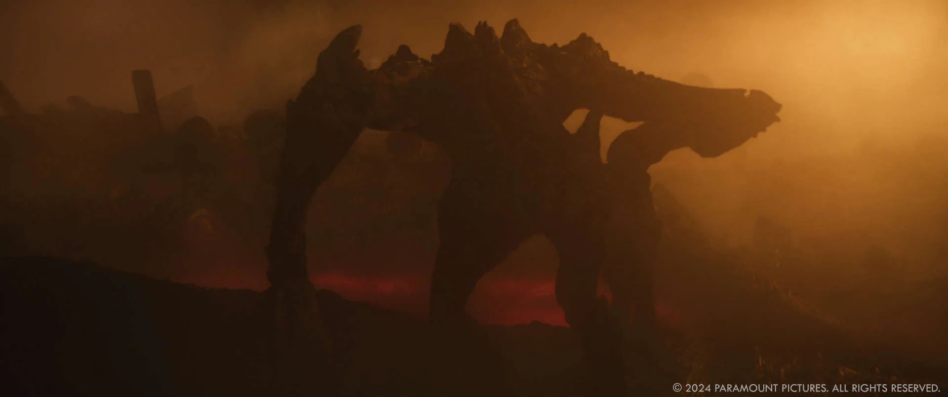
Michael Lum our Animation Supervisor spent a lot of time with his team making sure the key silhouettes and slow pacing were eliciting the right emotional feel for the moment. If you can achieve the right feeling even with a simple 3D playblast you know once we move into lighting and shading the shots are really going to work.
Steve Hardy, our CG Supervisor like me, was previously a Lighter. It was our happy place working with the lighters to help shape the creatures. A lot of the finer work in lighting is so that some of the more visceral parts of the creature stand out like the teeth while other parts drop away into darkness.
Wesley Roberts who was our Compositing Supervisor worked tirelessly with such a fantastic team of Compositors who take the performance and lighting and really make the integration work for what you see in the final film.
How did you collaborate with the director and other departments to ensure the creatures fit seamlessly into the film’s environment?
It’s just constant communication with Michael and Susan MacLeod during prep on areas that are important for VFX or that we should discuss with other departments.
Paul Herbet was a key collaborator in terms of creature and camera performance. His stunt performers not only played the creatures but also had real people pulled on wires or slapped into the ground to really embed the creatures into the environment.
Can you describe the process of creating the large-scale destruction scenes in New York and what specific challenges did your team face?
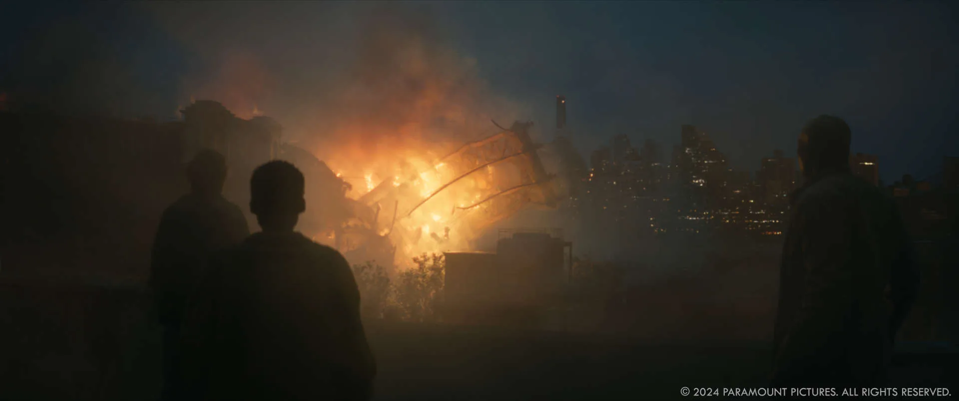
The Manhattan Bridge destruction when Sam is on the rooftop in Chinatown was a fun shot to do. ILM has extensive experience in mass destruction and a state-of-the-art toolset for that type of work so wasn’t something I was particularly worried about.
Michael and Pat like to tell the story from the perspective of principal actors rather than popping out too wide. I also like this composition as it provides a shot that has more of a connection with the audience vs taking you out of the moment.
With this particular shot, we actually slowed down the foreground element of the performers, this is so that we could live in the shot for longer and really let the moment of destruction sink in before we turned around for the reaction shots on the cast.
We spent time going back and forth with Michael to get that feeling to really connect.
How did the visual effects team ensure the destruction sequences in New York felt realistic and immersive for the audience?
We have a massive repository of reference material and elements to pull from and match. It’s our main job to watch the sequences with Michael, listen to his concerns and observations, and offer solutions for how to make each moment resonate more.
For me, destruction shots have so much going on in terms of detail. It’s important to approach the shots in stages of what’s visually important and what you’re going to feel on a first viewing (you can’t take it all in). We start with the big forms first and then workout how to rig the simulation to get that to work. After you have the right impact of the large forms, the team can then work on adding in all the secondary detail elements to support that so that it looks and feels realistic.
What techniques or technologies were used to simulate the destruction of iconic New York landmarks in the film?
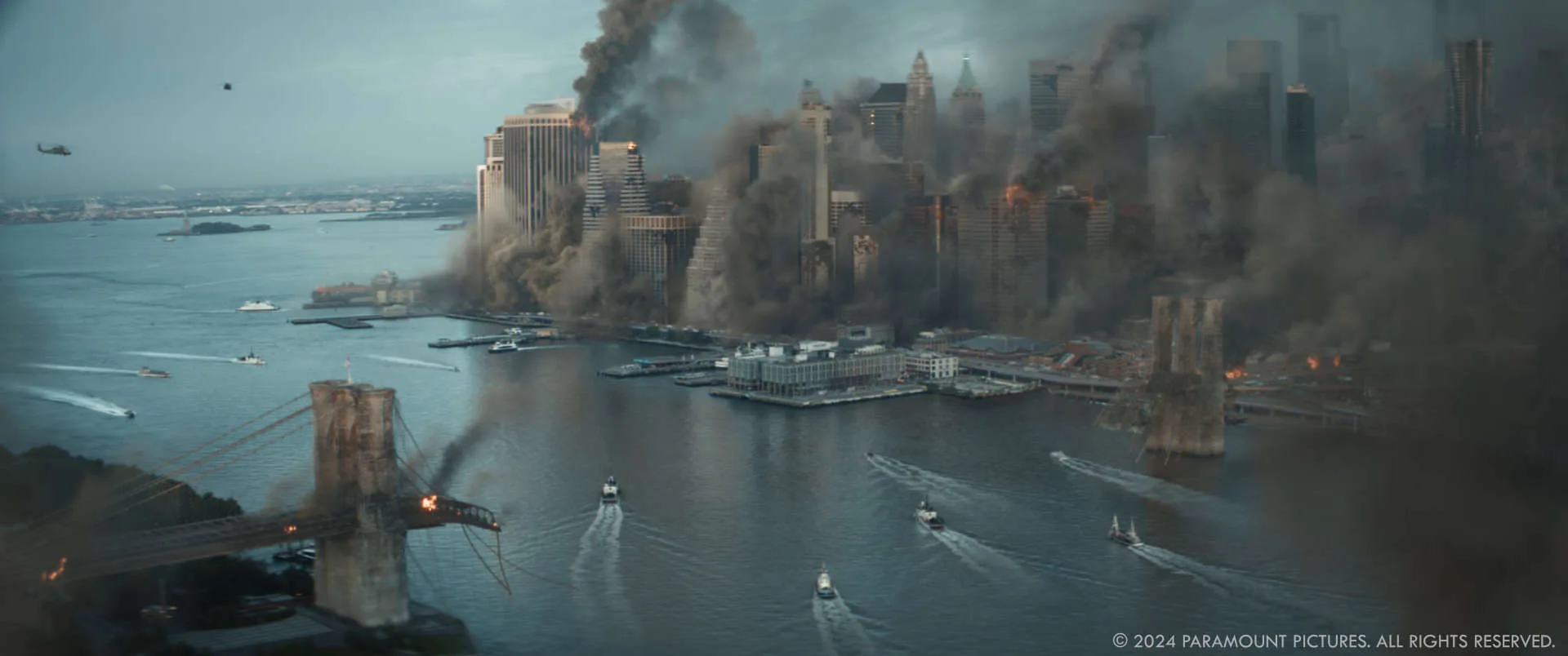
We used ILM’s Houdini destruction pipeline, which has now been in development for many years. It’s still a lot of work to realistically destroy things. You have to build all the internals both so they can be rigged but also rendered.
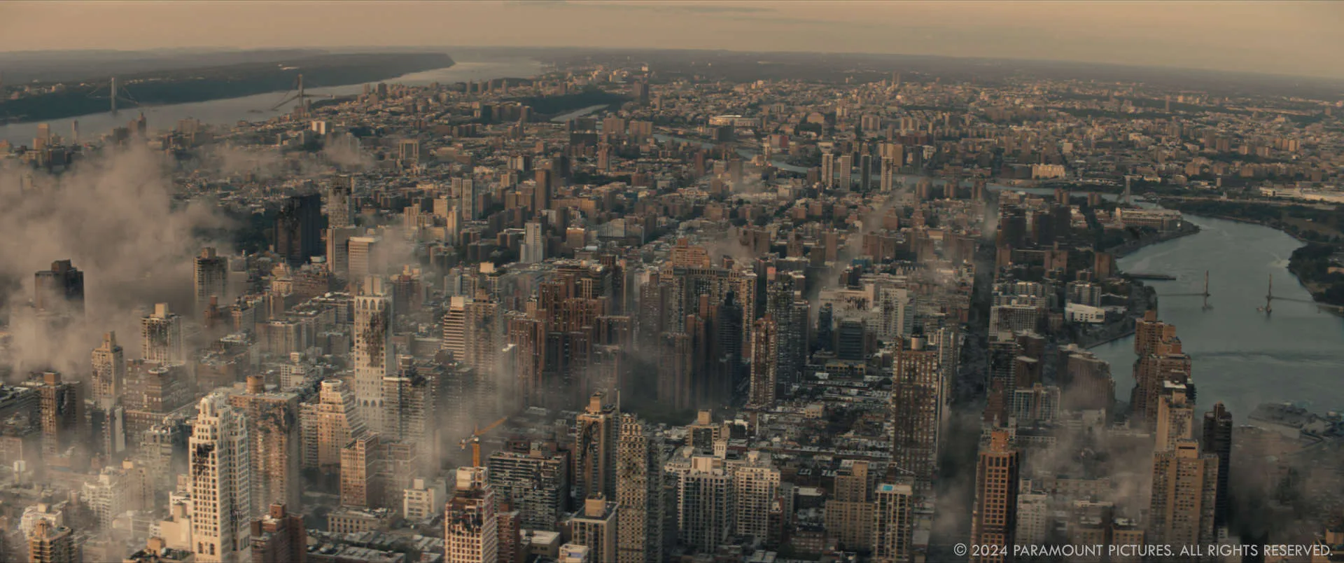
Other than the Manhattan Bridge destruction, the other shots were mostly post-destruction which required us to simulate very large and long running smoke plumes which were then integrated by either our environment or generalists teams.
How did you manage the continuity and coherence of the destruction scenes across different parts of New York throughout the film?
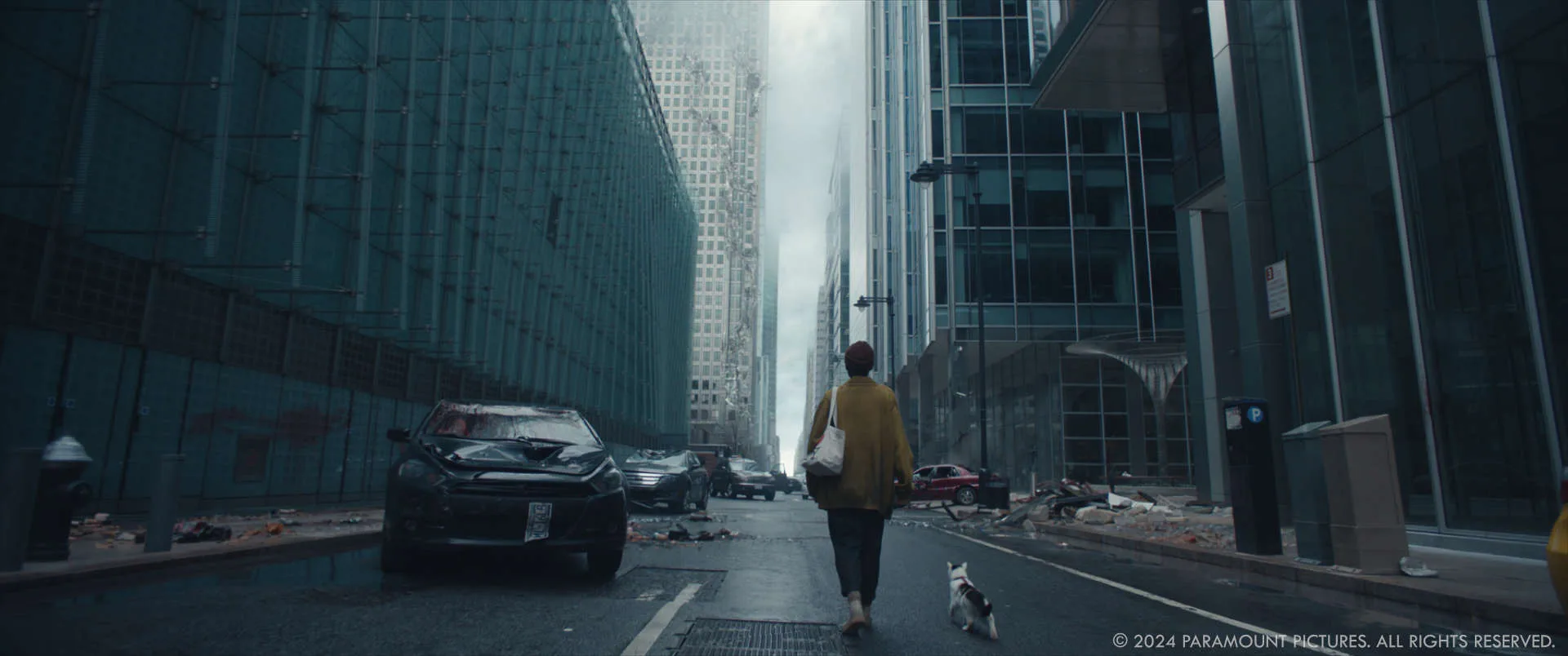
The overall destruction story came from Michael, where he wanted the maximum damage to be centered around Chinatown and as we traveled to Harlem we saw less and less of it.
Simon Bowles’ team matched this visual story in the set pieces. Which we matched or further augmented.
We ended up adding more destruction to the areas in lower Manhattan, some of the artists scanned their own clothes and bags etc., and used these to scatter around, for some more ground-level chaos.
Looking back on the project, what aspects of the visual effects are you most proud of?
I think I’m most proud of the variety of types of effects work and how the VFX team approached each of the unique challenges. I personally really enjoyed leaning on my previous experiences on other projects and getting to bring them all together on this one.
Tricky question, what is your favorite shot or sequence?
It’s either the long shot of Eric walking through the upper east side with the sun peaking through the buildings with all the destruction around him or it’s the final shot in the film.
The final shot of Sam walking into the center of Lexington Ave and East 104th St required us to capture a full 3 blocks of the real location at the same time of day to use as material to build out the environment asset.
I particularly like these shots, as they are both single shots which change the rhythm and structure of the physical backlot we primarily shot on. And help to support the journey as we travel through Manhattan.
How long have you worked on this show?
I started in January 2023 and finished in June 2024.
What’s the VFX shots count?
The final cut ended up with around 455 shots.
What is your next project?
I’m going to be spending some time with my family before jumping back into something new.
What are the four movies that gave you the passion for cinema?
Only 4 there are so many to pick from…
- All Summer in a Day (short film)
- Jurassic Park
- 12 Monkeys
- Dark City
A big thanks for your time.
WANT TO KNOW MORE?
ILM: Dedicated page about A Quiet Place: Day One on ILM website.
© Vincent Frei – The Art of VFX – 2024


