Back in 2019, Lindy DeQuattro explained the visual effects process for Dora and the Lost City of Gold. She then went on to work on Cops and Robbers.
How did you get involved on this movie?
Kerry Shea, who knew of me from MPC, is one of the VFX executives over at Netflix, and she had been looking for an opportunity for me over there. Kerry gave my name to Jeff Fierson (the producer) and Brad. They liked my work on Pacific Rim especially given that there was some overlap with the type of VFX between Pac Rim and Atlas (giant mechs, epic battles, CG environments, etc). I loved the idea of working on a big budget Sci-Fi film with a female lead. I had a couple of zoom calls with each of Brad and Jeff (during Covid). We all felt like we shared our desired approach to the VFX work, and we vibed well, so we decided it was a good fit!
How was this new collaboration Director Brad Peyton?
I love working with Brad. He is the ideal kind of director for big VFX projects because he meticulously plans, boards, and preps for every shot in the film and then doesn’t deviate tremendously from those plans on the day. He also has a lot of experience doing big VFX films so he speaks our language, he understands what is possible given the time/money constraints we may be under, and he’s very reasonable when concessions need to be made. He’s also very open to good ideas no matter where they come from so that allowed me to have a lot more creative impact than I sometimes do.
How did you organize the work with your VFX Producer?
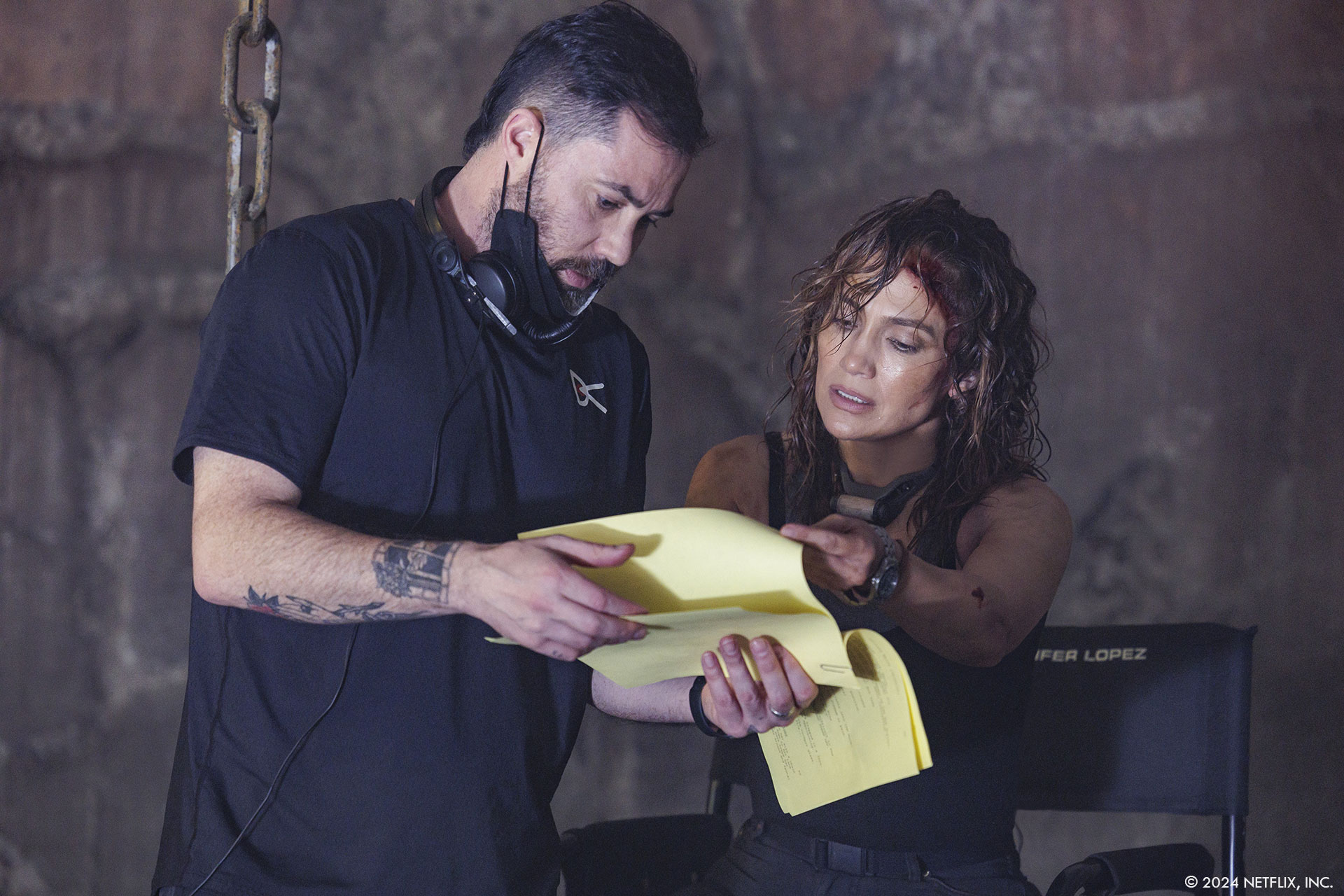
Blondel Aidoo (VFX Producer) and William Marlett (VFX Assoc Producer) are a well-oiled machine. Those guys have worked together on several projects, and they are total pros. They interfaced mostly with the studio (Netflix) and with the film’s producers, as well as the vendor VFX producers. I interfaced with Brad, Bob Ducsay (editor) and his team, and all the other HODs as well as the internal VFX supes at each of the vendors. And then of course Blondel, Willie, and I were in constant contact with each other to make sure the finances and the creative were compatible with one another. We attended all reviews together. We met with the studio together weekly. We were either in the same office or zooming each other daily. In general, Blondel handled the money, and I handled the creative, but if there was a shot Blondel didn’t like or if I was asking for something we couldn’t afford, he would let me know. Alternatively, if there was something I felt very strongly about, he found the money to get it done. It was a very collaborative relationship.
How did you choose the various vendors and split the work amongst them?
We previs’d almost the entire film on Atlas. It was a huge amount of previs and techvis to do in a relatively short amount of time. We briefly considered splitting it up, but I really wanted the continuity of using one vendor on the whole thing. I had worked with Halon before and luckily, they had the bandwidth to take on the whole project. They did a great job and brought lots of great ideas and fun camera work to the all-CG beats. They also generated all the techvis that we used to program the motion base and to direct the camera work on set. We even brought them back in post to do postvis.
At the beginning of the project, we had Territory Studio doing all the graphics, but once we got into post, we kept adding more and more graphics shots and elements, so it became clear that we needed to bring on another vendor to handle the increase in scope. Blondel and Willie had worked with Cantina Creative before and had great things to say about them, so I agreed to give them a try. They knocked it out of the park.
For the big 3D work, we initially split it 50-50 between MPC and Scanline VFX, but the project grew from about 900 projected VFX shots at greenlight to over 1600 shots in post so we decided to bring on ILM to handle a lot of the growth. On the one hand, it was great that our characters are constantly traveling through new environments, so we didn’t have to share any of those across vendors. However, it was a bit tricky that some of the main characters like Smith appear in every sequence throughout the film. Our saving grace was that Smith evolves over the course of the film. At the beginning he looks more pristine, but he is super awkward in his movements because Atlas isn’t synched with him yet. Towards the end, he is super beat up looking but his movements are much more fluid and agile because Atlas has achieved full synch. This allowed us to break up the work by sequence without having to worry too much about continuity of look or performance.
I gave Scanline the first third of the work down on planet GR39, MPC did the middle third of the work down on GR39, and ILM did the final third of the work on GR39. We had each vendor do a paintover of what Smith would like in terms of damage at the beginning and end of their body of work. Once we had Brad sign off on those, we passed them along to the next vendor to do the same. This way, we didn’t have each vendor waiting on a 3D turntable which would have put ILM way behind in the schedule in terms of asset building since their sequences were at the end of the film. MPC also handled all the big 3D VFX in Space and they did the futuristic views of downtown LA and the ICN headquarters. Scanline handled the Hollywood sign opening beat. We also had a large team of In-House compositors and 3D generalists to fill in all the gaps like the gunfight in the rundown apartment building at the beginning of the film.
What is your role on set and how do you work with other departments?
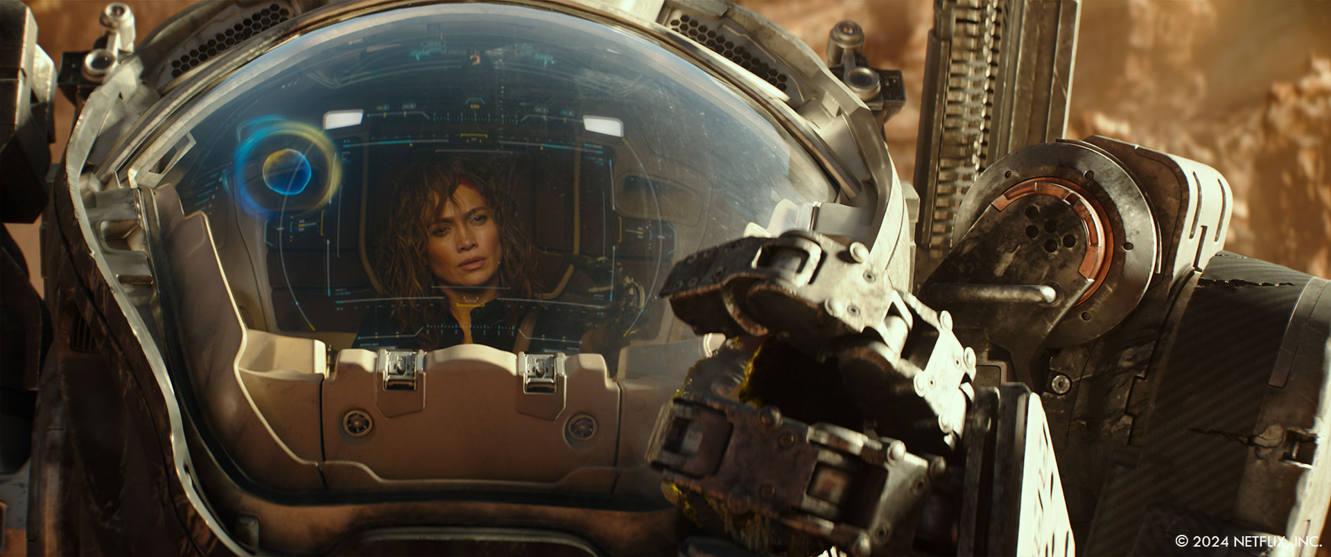
During prep there was a lot of back and forth about which department would handle which aspects of each sequence, so I worked especially closely with John Schwartzman (DP), Barry Chusid (production designer), Al Poppleton (stunt coordinator), and JD Schwalm (SFX supervisor). My desire was always to do things practically if possible. In my mind VFX is a very powerful tool, but it should only be used when something is too expensive, too dangerous, or impossible to do practically…so that’s how we approached everything. Oftentimes we would bid things both ways and then of course the producers would vote for whichever method cost less. Sometimes that would be fine, or sometimes Brad and I would push to still do it another way if we felt there was a clear creative benefit. There was a lot of that type of negotiating that happened before we locked on the final budget and started filming. Once I’m on set, I have a few different roles.
First of all, I’m there to make sure we collect all the data we need to execute the work in post and to make sure that we are shooting the plates as needed for the VFX work to be successful. That means clean plates, chrome spheres, HDRIs, lidar, photogrammetry, texture ref, etc, etc. All the usual VFX stuff. Second, I’m there to problem solve when things don’t go according to plan. For example, if we programmed the motion base to do a certain action but then Jennifer’s team isn’t comfortable with the amount of movement, or Jennifer or Brad have a new idea on what Smith might be doing, or a piece of equipment breaks, etc, etc. Whenever we need to pivot, I’m there to come up with the best solution. We had a situation on set with the oxygen mask where Jennifer put it on the first time and it wouldn’t stay in place, it fogged up, and she found it uncomfortable and restrictive. We had to make a quick decision on what to do. I gave them three options: either we remove the glass portion of the mask and we replace it digitally in post (very expensive), we remove the entire mask and say that she is actually able to breathe on the planet (major story change), or we remove just the glass portion of the mask and say there is some futuristic technology that allows it to deliver oxygen to her that we don’t know of and we don’t need to explain to the audience. (After weighing all the pros and cons, we decided to go with option three.) And finally, my job is to be a security blanket of sorts to the director, the producers, and all the other departments on set. Most people don’t understand how the VFX work. They don’t understand the data we are collecting or why, and they feel unsure that the end result is going to be successful given that what they are seeing on set is generally not what they want the final shots to look like. I’m there to talk them through it, answer questions, and try to alleviate everyone’s concerns about the technology.
Can you describe the initial concept and inspiration behind the visual effects in Atlas?
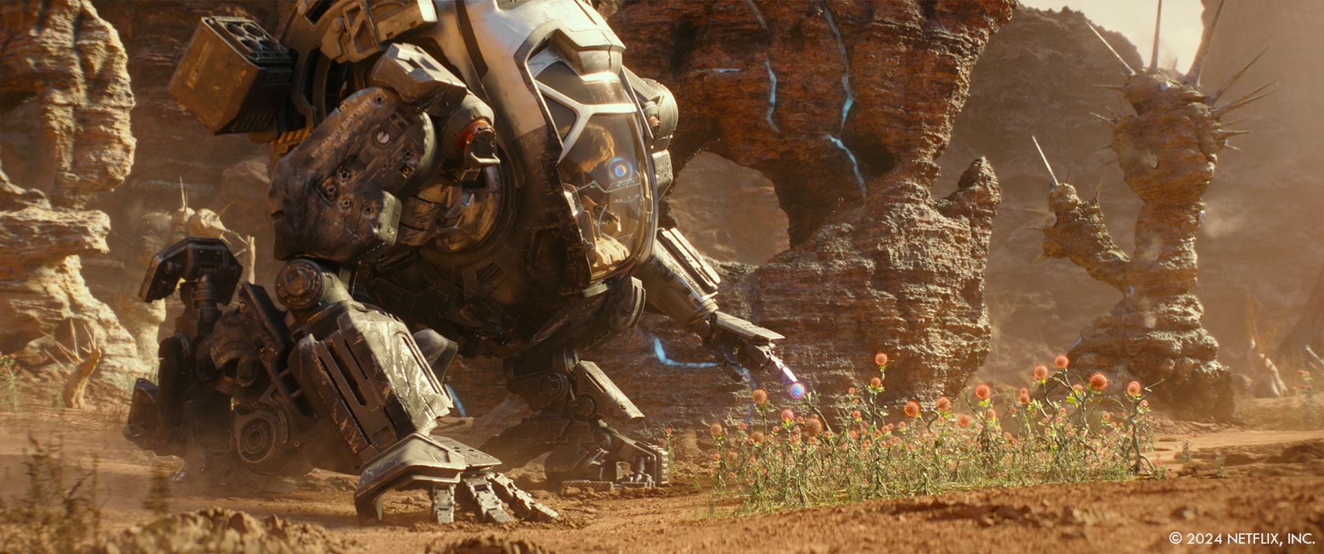
Brad initially pitched the feel of Atlas to me as a mix between Pacific Rim and Alien. Barry had already done some mood concepts for most of the environments and the complete design for Smith before I came on the show. Based on Barry’s designs and a Pinterest board that Brad put together of a bunch of different references that he liked, we came up with the term retro-futuristic to describe the overall aesthetic of the film. We wanted the tech to have a ‘brutalist’ feel and be very grounded. To that end we stayed away from the cool tones and the white, bright, shiny, new look that you normally see in the tech of a lot of sci-fi films. We went with warm retro tones like yellows, browns, oranges, avocado green and we went with heavier, bulkier robotics, but we wanted to stay away from the post-apocalyptic feel of Blade Runner for example. We wanted it to feel grounded in today’s reality. Brad liked the idea that the technology for the ICN forces felt very different from the technology for Harlan and his centurion forces. The ICN tech was more polished, new, and straight off the assembly line, while Harlan’s forces had stolen parts from older tech all over the world and then kluged it together, so their tech was much rougher and older looking with visible welds and damage and rust. For the environments, we referenced Forbidden Planet and Fantastic Planet as well as the Star Wars universe and lots of individual artists that Brad had collected. For Smith, while Barry had already completed the overall design, there were a lot of discussions about how big exactly he should be. At one point we were thinking of having him much larger, but in the end, we calculated how large the cockpit would have to be to fit Jennifer and achieve the shots Brad wanted to get, and then we made Smith as small as we could but still accommodate that cockpit so that he would be more relatable and his scenes with Atlas more intimate.
What were some of the biggest challenges you faced during the visual effects production for Atlas?
Technically the shots of Jennifer in the cockpit were the most difficult. We decided to for go motion control so that we could use that money in other areas. Instead, we had to rely on techvis and good camera operators to shoot multiple plates that would still lock together well. For every shot of Jennifer in the cockpit we first did previs. Once that was signed off by Brad, we did the techvis: one for the camera, and one to program the motion base. Then we tested the motion base action with a stunt performer and finessed it until they determined that it was smooth enough for Jennifer. Next, we taped out a giant grid on the floor that matched our grid in the camera techvis and each night we would tape out the camera moves for the next day. In the morning, I would review the camera techvis with the camera team and we’d rehearse a few times before loading Jennifer into the cockpit and shooting. We spent 23 shoot days in the cockpit on a green stage. In addition to all that, Brad determined early on that he got the best performances from Jennifer when he used 4 cameras on every setup and then just let her run through the whole scene, rather than shooting a master and then coverage. This meant that at least one of the cameras was always shooting off the set so we ended up with a lot more set extensions than we had originally planned for. It also made it harder to direct Jennifer’s actions in terms of eyelines and hand movements for the graphics, so we had to kind of scrap all our original layouts and just retrofit everything to her actions on a per shot basis once we got into post.
How did you approach the creation of the film’s futuristic environments?
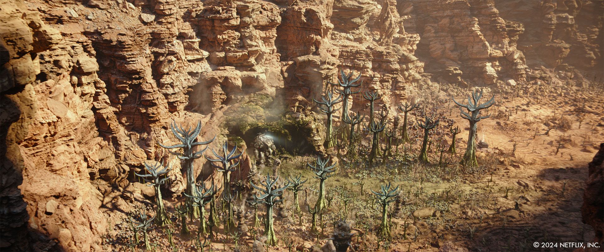
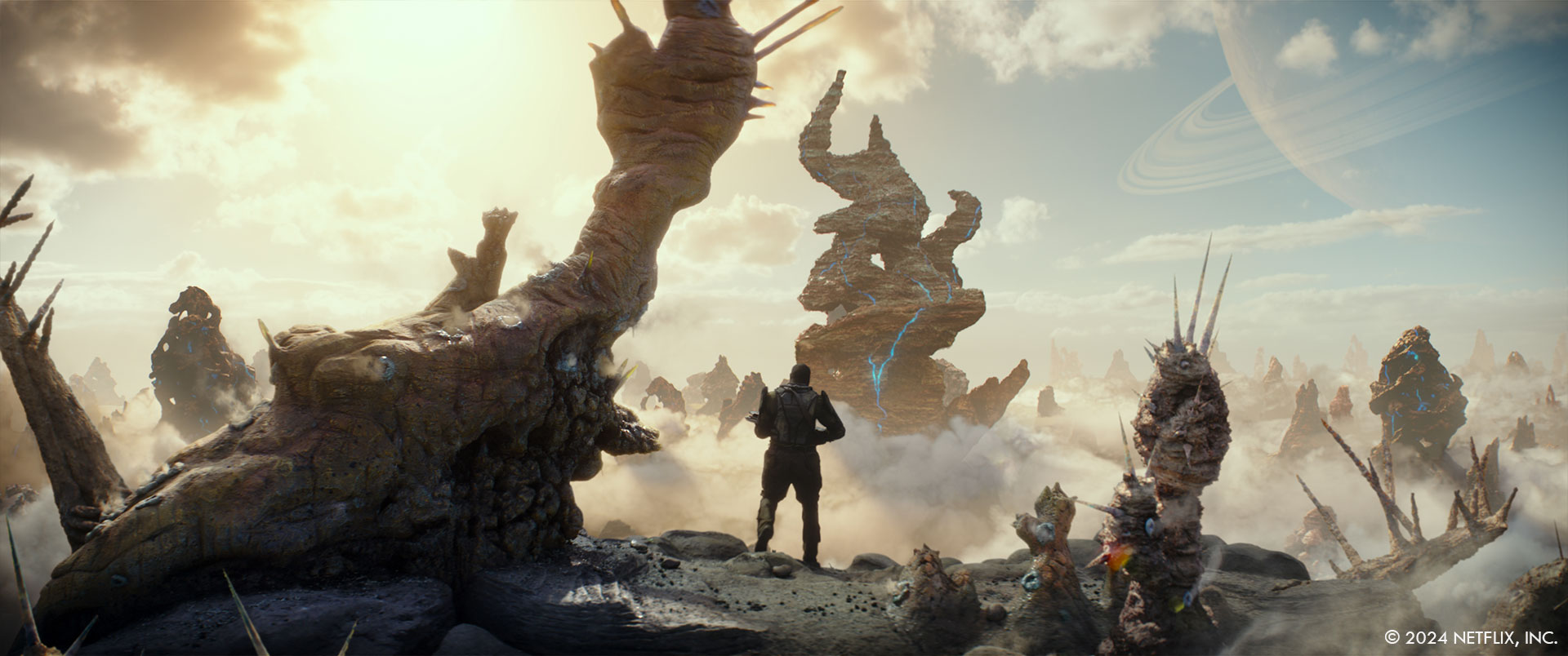
We started with 2D artwork for each environment. Barry Chusid is an amazing production designer, and he came up with some beautiful and varied looks for each of the environments. It was important to Brad that the alien planet had scope, and having Smith and Atlas move through several different environments was the best way to achieve that. Originally our philosophy was to try to shoot plates for every environment and then augment them with VFX to feel more futuristic or alien. We used this technique with all the Earth locations (Hollywood, LA, ICN hangar) as well as some of the environments on GR39 (the forest, Harlan’s compound, and the final fight area). Because of restrictions in our shooting radius due to the rules of the California tax credit, there were some environments that ended up being all CG (the sinkhole, the cave, the canyons, and the swamp) but we referenced real world locations for everything and even the alien plants that we added were based on actual underwater plant life or other bizarre and unusual plants.
How did the design of the futuristic environments evolve from the initial concepts to the final version?
In most cases we just added more elements to the original designs. Brad wanted the planet to feel very hostile and he’s kind of a ‘more is better’ guy so we just kept layering things in. Some of the environments really didn’t change much at all. The swamp looks pretty much like the original artwork. The cave was originally done more in cool blues and had more bioluminescent elements, but Brad didn’t want it to look ‘pretty’. He wanted Atlas and Smith to be fighting against the planet as much as they were fighting against Harlan. Also, we wanted the environments to feel like they related to one another and since the cave was under the canyons (which were based off the red soil of Bryce Canyon), we wanted to carry that same palette into the caves. We added breathing geysers and vines from the ceiling so that it made the audience stop and think ‘is that a living thing or not?’ For all the environments that were based off actual plates, those evolved the most since the artwork was done before location scouting and we had to reimagine a lot of things to make sense with the chosen locations. For example with the forest, in keeping with the idea that the alien planet was very hostile, we added spikes to the tree trunks that were already in our forest plates. We added ground fog and poisonous pollen spores (modeled after covid spores), and then we sprinkled in an assortment of alien plants that we designed as a mash up of various real-life foliage and reference from Fantastic Planet.
How did you manage the scale and complexity of the futuristic cityscapes?
We started by consulting with a futurist. We wanted to get a sense of what kind of evolution our cities are likely to experience in the not-too-distant future. This led to us pursuing two main concepts with our designs. First, resources are going to get more and more sparse so how will that affect the way we live, work, and travel. Second, how will these changes mesh into what we currently experience. In other words, we wanted to interlace current technology with futuristic technology to show that one slowly evolves from the other rather than being so far in the future that nothing is familiar. To this end you see lots of giant solar arrays and wind turbines providing power to the cities, the cars, and the buildings. You see both flying cars and cars on wheels because not everybody has yet switched over to flying cars. You see the cities are more densely populated (hence the existence of DTLA2) and apartment living has taken over from single family homes. The wealthier communities are still lush, and the air is clean while the lower income neighborhoods are smoggier and the giant turbines loom over them. If you look carefully at the Hollywood sign at the very beginning of the film, you can see that the original Hollywood sign is still there, but it’s been reduced to being signage over the parking garage entrance and the huge HOLLYWOOD shaped buildings loom up behind it. To pull off these concepts, we shot plates for all the cityscapes including a day and night aerial shoots all around LA with Fred North. Then we did paint over style concept work on the selects. Once Brad bought off on those, we began adding 3D elements (vehicles, buildings, set dressing, etc).
Can you walk us through the process of designing the Mecha in Atlas?
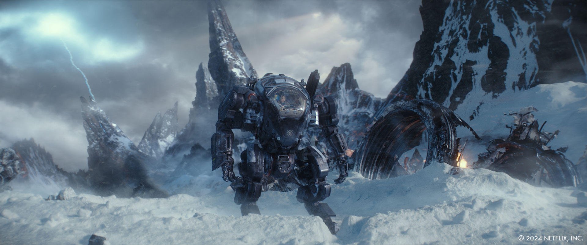
I can’t take any credit for the original design of the Mecha (or ‘ARC Suits’ as we call them in the film). Barry was well on his way to the final design before I came on board. We did have a lot of discussions about how large they should be, but at its core, Atlas is a film about relationships, and we wanted to keep it as intimate as possible so we made the ARC suits as small as we could. Fun fact that the cockpit interior does not actually fit inside the ARC Suit. Brad wanted to have the footwell be large enough that he could get some shots of the feet and some low angles of Atlas. Because of this, the cockpit interior would penetrate outside of the ‘neck’ area on the exterior if we merged the two sets together, but I think we get away with the cheat.
How did you ensure the Mecha felt realistic and believable within the futuristic setting of Atlas?
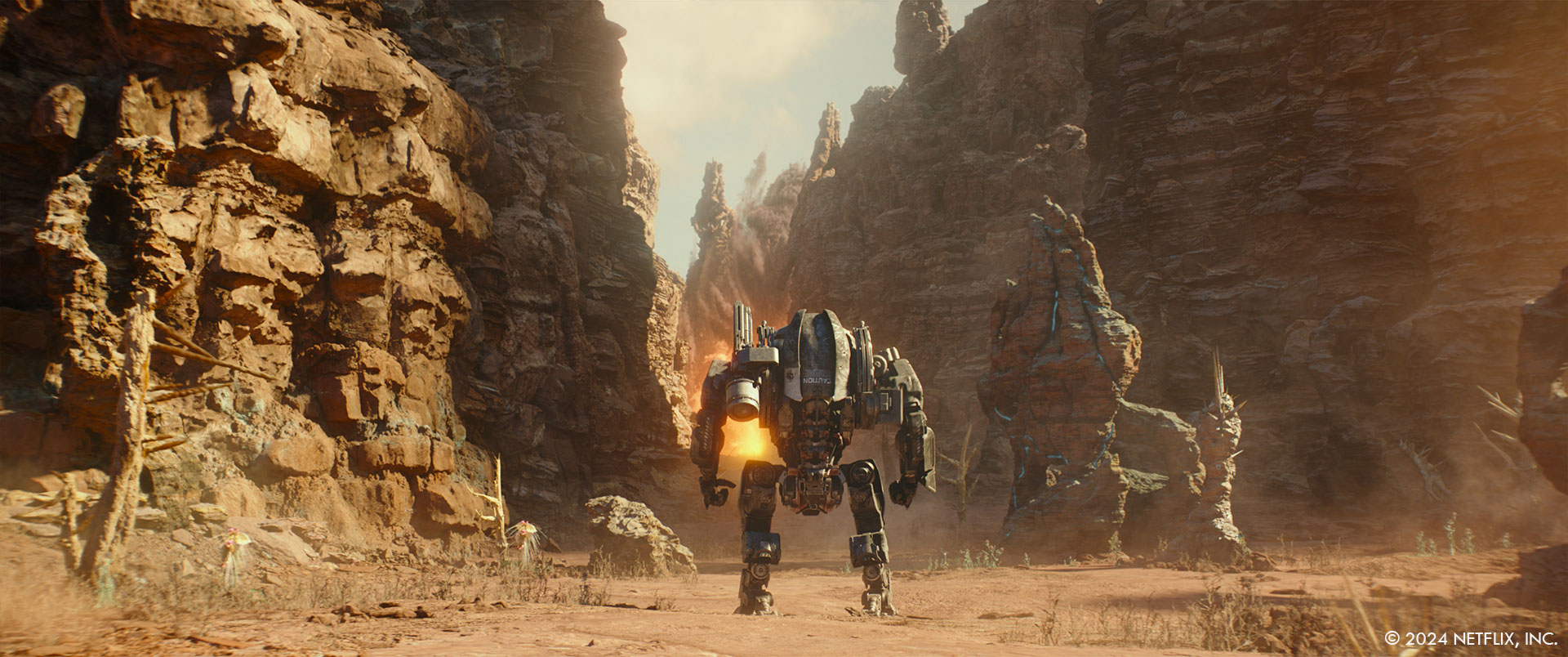
The key to the realism of the ARC Suits, or any 3D CG element, really comes down to animation and lighting. If you nail those two components then you’re most of the way there. We did a lot of tests to refine the walk and run cycles and the various gestures at each stage of the film because Smith gets more coordinated and nimbler the more Atlas synchs with him. It was important to sell that evolution to the audience. After that we sprinkled in some interactive FX (i.e. dust hits from the footfalls, etc) and some great compositing to lock it in.
What techniques were used to create the dynamic and interactive elements of the Mecha?
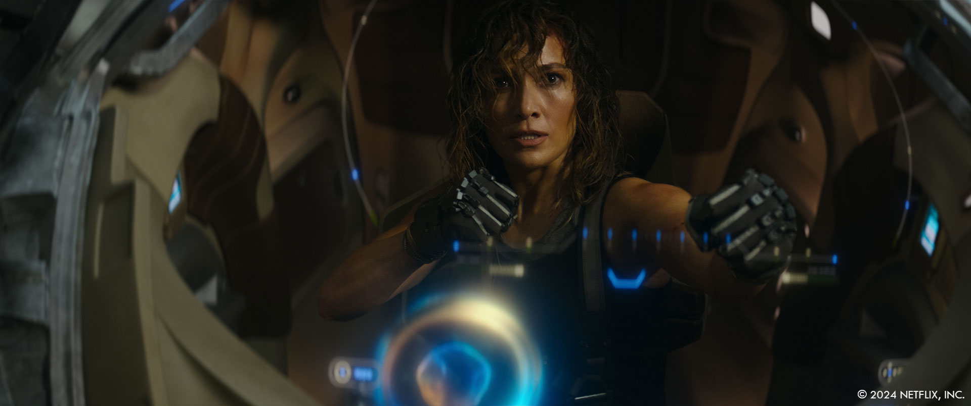
Of course, all the graphics and holograms were VFX, but most of the cockpit interiors were entirely practical. The biggest exception is probably the med system that comes out of a closed compartment and operates on Atlas’ leg. We basically just pointed to the panel where we wanted it to come out and gave rough timings to the camera operator for speed and then did it all in post. Brad wanted it to feel like the unit you’d find in a dentist’s office so Scanline used that as reference for the asset design. Brad loves it when things are gory so we pushed it as far as we could while keeping our PG-13 rating. We had a line around Atlas pants that we pulled so that the pants went taut where the clamp grabs her, and we cut a hole in the pants and dressed in the leg wound and the foam for the ‘post-surgery’ look. Everything else was done in VFX.
What role did pre-visualization play in planning the visual effects for Atlas?
Previs was a huge component of the Atlas shoot. We prevised just about every VFX shot in the film, and we generated techvis for every shot on the motion base. There is especially no way we would have been able to achieve the cockpit shots of Atlas without it. Everybody on set referred to the previs for lighting, camera, set dressing, timings, etc. It was essential.
What were some of the key influences and references for the look and feel of the Mecha and the environments?
Most of the initial designs for the ARC suits and the environments were done by Barry before I came on board.
How did you handle the lighting and rendering to ensure a cohesive look between the practical and digital elements?
No real tricks here, we just took lots of great lighting and texture reference at each location and then used that to recreate the lighting in post. We also shot plates at each environment and even if we ended up replacing almost everything in the plate, those plates served as excellent lighting reference for what the overall feel should be. After that it was a matter of iterating until we had a match.
Can you describe the initial design process for the look and feel of the motion graphics for the various screens?
I really left it up to Territory and Cantina to pitch ideas to us. I feel like you get the best work out of people when they have creative freedom. I don’t want to hire a bunch of amazing artists and then treat them like they are an extra set of hands for me. I want to see what they can bring to the table, and then I’m there to finesse the idea or jump in when things aren’t going the right direction. Brad and I would do an initial turnover and outline the story point and the general guidelines for each scene, but then I really wanted to see what the teams came up with. For example with the chess game in Atlas’ apartment, Cantina really came up with that look all by themselves. They showed us a couple different styles of chess pieces and they showed us a couple different rendering styles including the iridescent look that we went with. Same idea for the security scanner that Territory did at the ICN HQ. They pitched a couple different styles, and we just chose one.
What were some of the key challenges you faced while creating and animating the motion graphics and how did you overcome them to ensure seamless integration into the film?
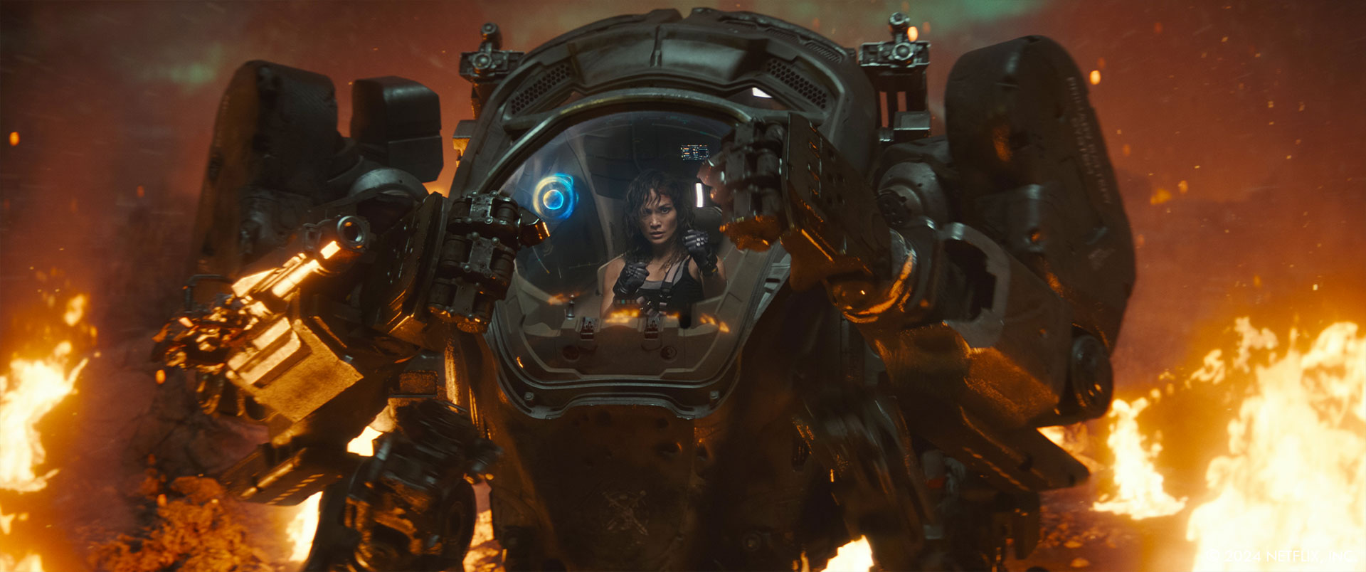
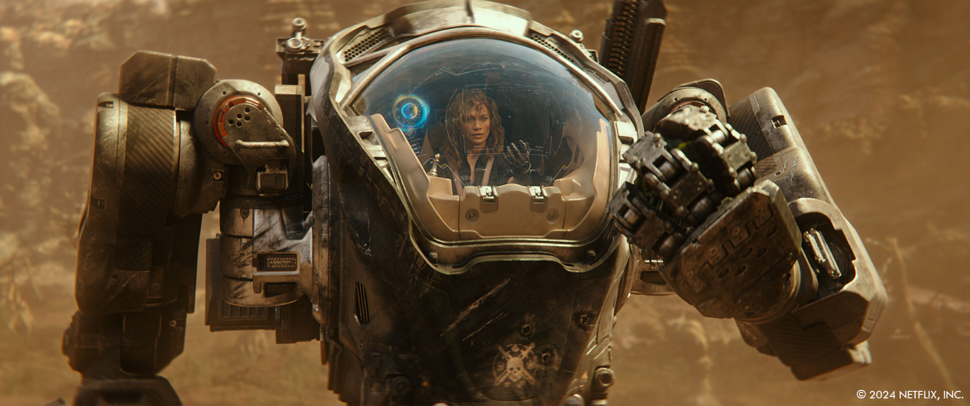
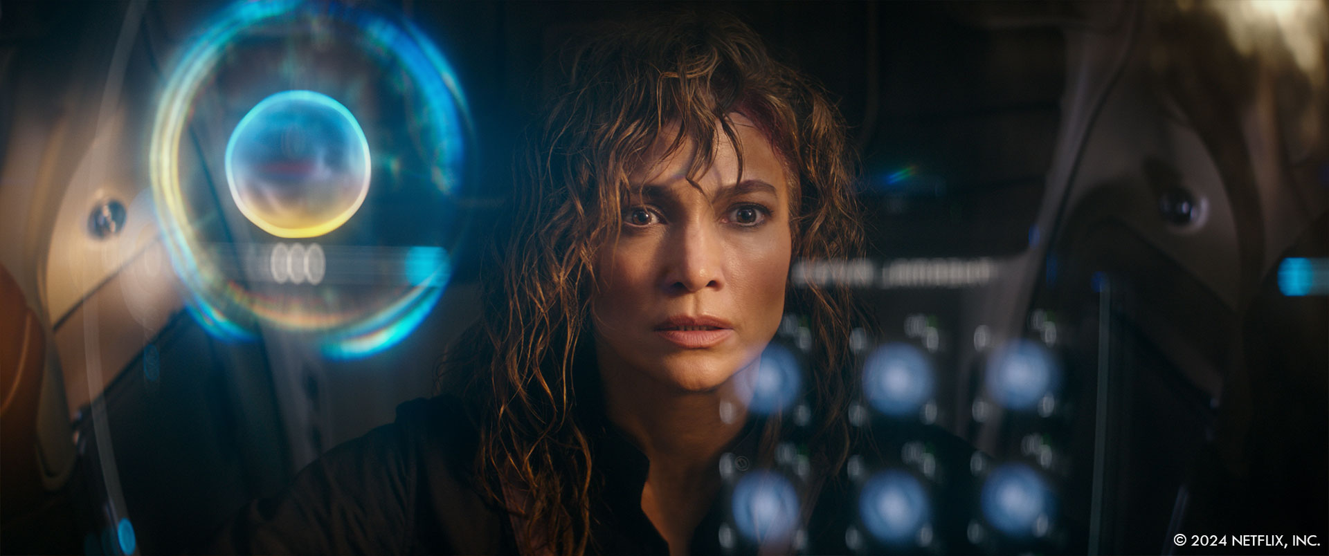
Probably the biggest issue with the graphics is that there were so many of them that we had to split them up across a lot of vendors. The HUD and the Smith avatar inside Smith’s cockpit were comped by Territory, Cantina, Scanline, MPC, ILM, and our In-House compositors. Making sure there was continuity of the look across all the vendors was tricky and took multiple iterations. There were also scheduling issues when one vendor was creating the content for the graphic, but a different vendor was comping it. We tried to be fluid with moving final comps around to accommodate everyone’s schedules, but it was a total headache for production to keep track of all that. In addition, we needed to move the placement of some of the HUD components around based on how Bob put the cut together, so we had to throw out the idea of having a standard layout mapped on the glass and instead treated everything as a standalone hologram that could float around anywhere inside the cockpit.
How did you collaborate with the directors and other departments (such as production design and cinematography) to ensure the motion graphics complemented the overall aesthetic and narrative?
Barry and I came to an agreement early on that we would work together to oversee the graphics during prep and then I’d take them over in post. The initial work consisted mostly of screens that were on the various monitors in the cockpit, in Harlan’s compound, and in the ICN HQ because we needed those for on set playback during the shoot. On set, I basically just told our DP what color the holograms were going to be in each scene, and he programmed LEDs to match so we had some appropriate interactive light contamination. In post we developed the designs for all the holographic elements including the cockpit HUD and the Smith avatar. For the Smith avatar we liked the idea of the avatar pulling color from the exterior paint job of each ARC suit so for example Smith’s avatar is yellow and blue, while Zoe’s is pink and blue. Initially the avatar just had a generic motion for budgetary reasons but eventually we decided that it was necessary for the animation to match the dialog, so we had to ask Netflix for more money to make that adjustment and luckily they agreed. For the graphics used by Harlan and his team, we referenced machine learning visualizations. We liked the idea that the mechs wouldn’t need the polished up UI and it would be more like 2 computers talking to each other so we went with black and white, lots of assembly language code, and abstract patterns. For the ICN tech, we stuck with our retro-futuristic color palette and made the UI a bit more human-friendly.
Could you walk us through the technical tools and software used in the creation of the motion graphics and explain how these technologies contributed to achieving the final visual effects?
Both Territory and Cantina primarily use AfterEffects to achieve their amazing graphics. For most of Territory’s graphics we had them delivered as an asset and then the work of actually compositing them into shots was either done by our In-House team or by the 3D vendors. This was basically a budgetary and scheduling decision so we wouldn’t be duplicating resources on camera matchmoves or having one vendor delayed by a delivery from another vendor. Cantina ended up doing most of their own comps on the shots they worked on. There are definitely things that are easier to do in AE, like the lip synching, that would have been a much bigger pain in Nuke. It also seems to be easier to do some of the bokeh and flare effects that we struggled to match in our Nuke comps.
Can you share any behind-the-scenes stories or anecdotes about the visual effects production?
A lot of times Jennifer just wanted to power through a whole scene without stopping and resetting but she was supposed to be sweaty and bleeding, so we had to constantly spritz her with water and touch up her wounds. Unfortunately, she was all the way up in the cockpit on the motion base raised up in the air and it wasn’t safe for anyone to approach the motion base while it was active so at first we had the camera operator (who was strapped to the cockpit) trying to hand stuff to her, but eventually we setup a pool net on a 30 foot pole with a mirror, her water spritzer, and anything else she needed to touch up her look. We’d hand it up to her between takes so she could keep going. We stuck a picture of the camera operator (Ross Coscia) onto the side of it as kind of a joke and we called it Ross for the rest of the shoot.
I always keep a list of on set quotes during plate photography. I started doing it when I worked with Guillermo Del Toro on Pacific Rim. He just made me laugh every day, so I started writing everything down. I’ll give you a few examples from Atlas:
- ‘Don’t put your foot through a Picasso’ – John Schwartzman (DP) in response to someone asking for a lighting change
- ‘Time Suck is going to be my new time travel movie. It’s all about a motion base.’ – Jeff Fierson (Producer)
- ‘Lay very still. You’re technically dead…so very still would be great.’ – Brad Peyton (Director) to one of the rangers.
- ‘It was great on the middle half, but the first half and the third half need to be halved.’ – Brad about the # of extras in the drop bay on the Dhiib
We put in such long hours on set, and everyone is working so hard, that I think it’s really important to remember to laugh and have fun together too.
Were there any memorable moments or scenes from the movie that you found particularly rewarding or challenging to work on from a visual effects standpoint?
The alpine forest on GR39 was one of the toughest sequences. It had a lot going against it from the beginning. Brad never really particularly liked the location (Mt Waterman outside LA), but we had to choose something in Southern California by the rules of our tax credit, and Barry and I thought we could make it work. For Brad, it looked too familiar and Earthbound. There was nothing particularly interesting or alien about it. Because of scheduling conflicts, Brad had to rely on a 2nd unit director to shoot the plates for him and the camera work was not exactly as he would have done it. Also, we had very limited time at the location, so we had to shoot all day for 2 days. Because of this, we couldn’t cherry pick the best lighting directions. We were also banned from using any pyrotechnic SFX because of the fire danger. So in the end we just had a handful of stunties running around on a somewhat bare alpine hill. After the first assembly, everyone was really down on the sequence because it was pretty underwhelming without the VFX. It was a long, hard road to get it to where it ended up and to reverse the negative feelings of the director and the producers. However, in the end they all loved the sequence (Scanline did a great job) and it definitely won the ‘most improved’ award.
Looking back on the project, what aspects of the visual effects are you most proud of?
That’s like trying to choose your favorite child. They are all my babies, but I have a special fondness for ideas that I pitched like the giant sinkhole, the underground lava tubes, and the sword turning into an electrified whip in the final battle. We also designed the pollen spores in the forest after Covid spores so there is a little Easter Egg that viewers can look for.
How long have you worked on this show?
I started in April of 2021, and we delivered in April of 2024 so almost exactly 3 years.
What’s the VFX shots count?
1610.
What is your next project?
I’m taking the summer off and then I’ll let you know 😉
A big thanks for your time.
WANT TO KNOW MORE?
ILM: Dedicated page about Atlas on ILM website.
Netflix: You can now watch Atlas on Netflix.
© Vincent Frei – The Art of VFX – 2024


