Marti Romances has spent more than 10 years at Territory Studio, where he has worked on a wide array of projects including Ex Machina, Avengers: Endgame, The Gray Man, and Bullet Train.
With more than 13 years of experience at Cantina Creative, Aaron Eaton has worked on projects such as The Lord of the Rings: The Rings of Power, Black Adam, Bloodshot, and Avengers: Endgame.
####
Marti Romances // Co-founder & Creative Director – Territory Studio, San Francisco
What is your background?
After spending 4 years in VFX for commercials and film in Barcelona, I moved to the UK to work with Activision and Nintendo for another 3 years. Then as a Creative Director at Territory, growing our first office in London, mixing disciplines for Films and Games, we started working closely with Digital Product, which prompted starting our second office in San Francisco and further expansion in Barcelona and now Los Angeles and Vancouver adding Cantina Creative to the Territory Group. Currently with over 220 people, we serve the Entertainment, Brands and Digital industries with a unique angle that combines Design, Storytelling and Technology.
How did you and Territory Studio get involved on this show?
We have been working with Netflix for over 8 years now, helping them with on set screen graphics, VFX, Title Design, Advertising and now Games. This project came out of a meeting with their teams in Los Angeles where we presented our technology patents for a Virtual Production Interactive Screen solutions for film and broadcast. At that time, they were just revising the scripts for what 3 years after concluded with the Atlas film in their platform. By the time we were discussing this new project, we were finishing the VFX on The Gray Man, directed by the Russo Brothers, whom we previously worked with in Avengers: Infinity War and Avengers:Endgame.
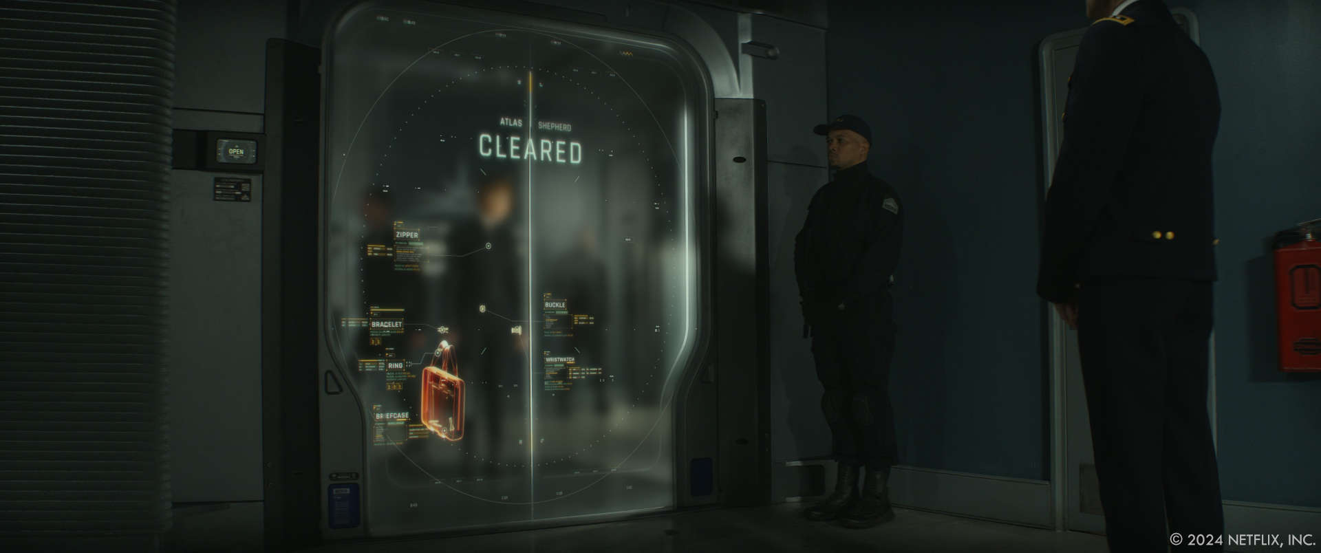
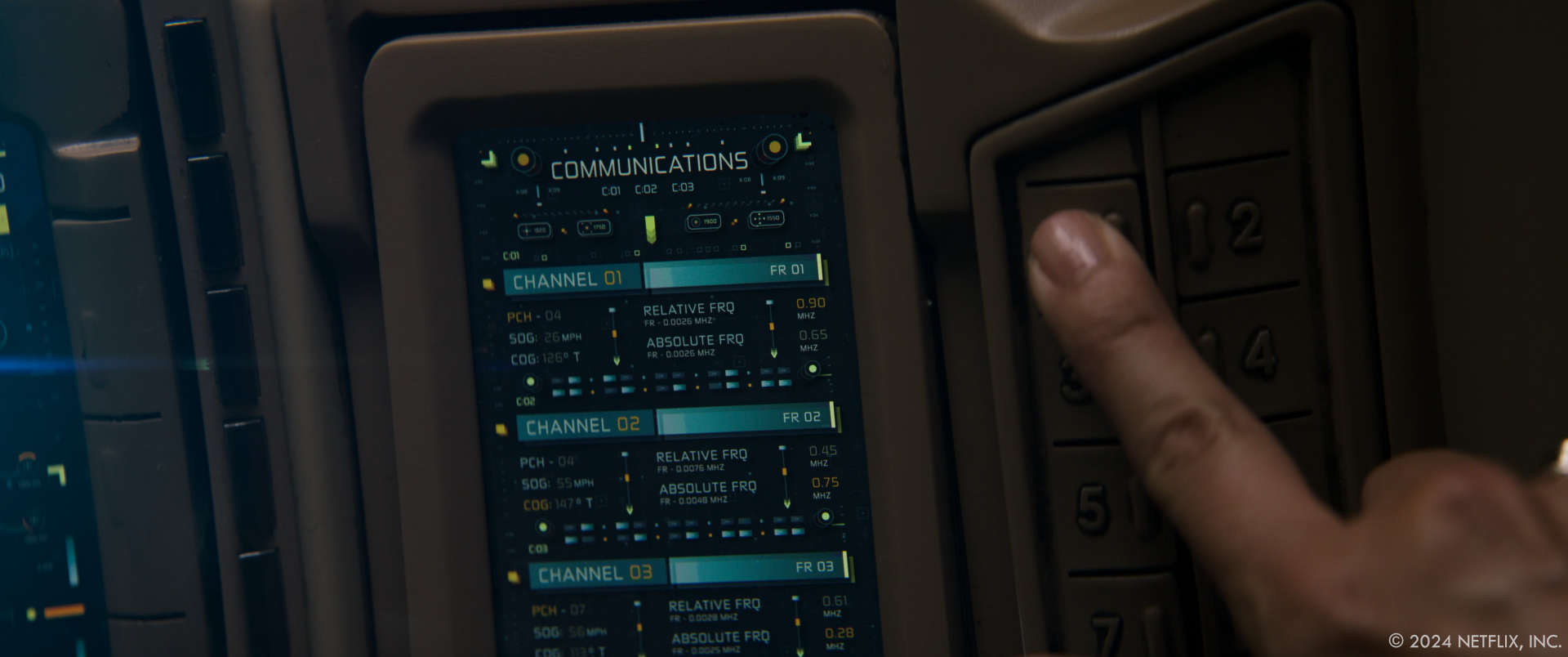
For Atlas, we started working with their Art Department, led by Production Designer Barry Chusid, and delivered over 300 screens for their various sets, including all the technology inside the ARC robots. As we were wrapping Production, Barry started asking us how we would envision the ICN holographic technology inside the ARC robots, spaceships and more, so the team started creating a series of styleframes and designs defining how everything would look, which served as an introduction to the post production team who asked us to scope for all the design assets they would need in post production, resulting in over 300 new assets that were distributed across different vendors including our partners at Cantina Creative in LA.
How was the collaboration with Director Brad Peyton and VFX Supervisor Lindy DeQuattro?
During post production, we were dealing with the film VFX Supervisor Lindy DeQuattro, who was overseeing all the work from all different vendors. Up to 7 vendors were involved with the VFX of the film, and our team was solely focused on designing and animating the majority of 3D and 2D assets that needed to be composited over the original shots in the movie. Lindy was a delight to work with, open to finding new solutions to make sure the story would work across different sequences in a way that the audience could understand and could also excite Brad and his vision for the film.
How did you organize the work with your Producer?
As this was a project that had different phases, we had a Producer that focused on Pre-Production and Production during the first year, making sure the team was fully in sync with the Art Department and all the assets they needed to load in all the screens on set. As for the second phase, the Post Production, we had two different Producers and a Coordinator making sure that Lindy and the rest of the VFX houses in the show had all our animated graphics and toolkits ready for their final shots to be composited together. Producing for such a big show, and knowing that things change along the way, our Producers not only kept our teams honest on timings and spending, but also helped sync with Blondel Aidoo and Willie Marlett who were in charge of the VFX Production on Netflix side.
Can you elaborate about the work made by Territory Studio?
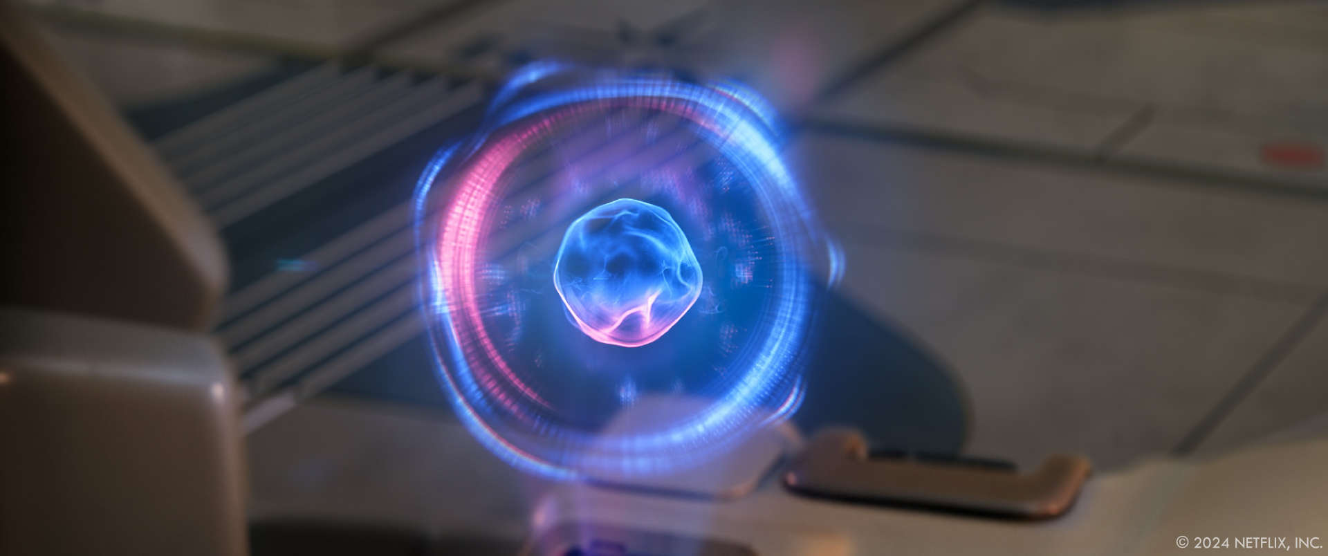
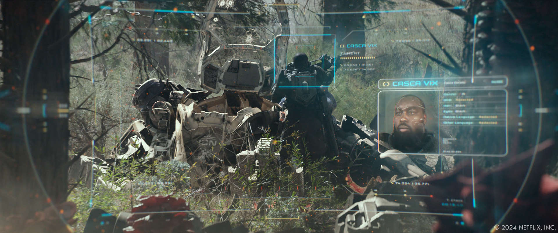
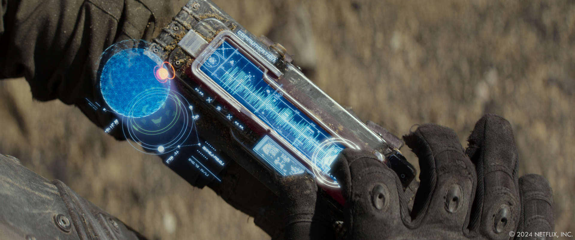
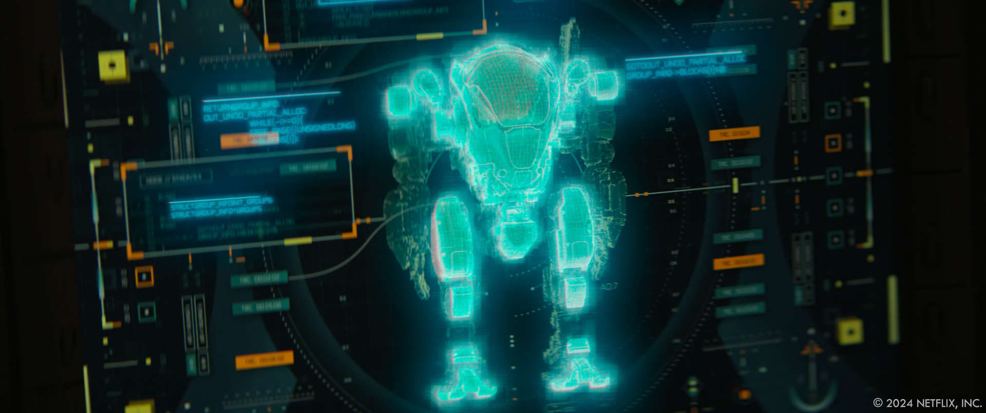
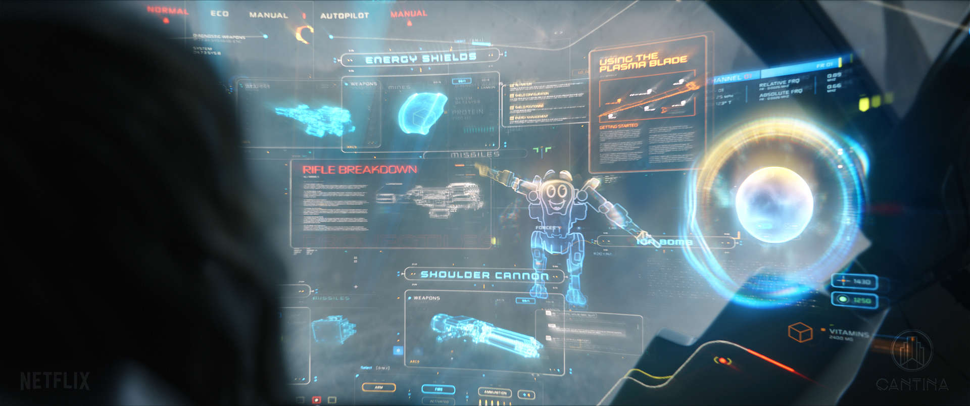
Territory was tasked to design all the technology that needed to be visualised in the film, from User Interfaces and Interactive screens the production needed for their set decoration, all the way to the holographic visualisations inside the ARC robots, spaceships and more. With the supporting actor being an AI powered robot (SMITH), visualising the way the AI entity SMITH communicates with Atlas Shepherd (Jennifer Lopez) was an important role in the movie, and someone had to design what that would look like. From visualising the SMITH’s AI voice all the way to visualising other scenarios like navigation, combat mode, medical analysis…you name it! Everything needed a hologram during the post production process, even the coffee machines!
What was the initial inspiration behind the motion design and holographic elements?
We mainly looked at advanced militaristic technology, and how we imagine the new innovations that exist today looking in 50 years time. From AI to Augmented Reality solutions, we wanted to create a design language that was functional and futuristic, but also rooted into realistic avionics systems we see in fighter jets and space related devices, always with the spatial computing User Experience paradigms we have gained experience with by working in some of the Digital Products Territory Studio is involved with, mainly from the Transportation industry.

Can you describe the creative process for developing the motion design visuals used in the film?
During pre production and for the on set screens, Barry pushed us to research a lot about machine learning and how large AI models are created. Since the film also throws some flashbacks from 2070 to 2040, we designed how data sets were ingested by the model they reference in the film, created by Altas Shepherd mother. This was almost 3 years prior to the big AI craze we then were experiencing at the end of 2023 which continued to grow everywhere. Developing the technology that comes out of the research we see happening in the film, and being very close to the AI technology growth by being involved in real digital product clients at Territory, gives us two points of reference that trace a certain trend line, which positioned us ina better place to be able to speculate how these will evolve in the future.
What were some of the biggest challenges you faced while designing the motion design?
As experts in Augmented Reality real products, we understand how important it is to be sensible around field of view obstructions, but in the film we were shooting with closer lenses and tighter spaces between the talent and the ARC robot HUDs. This sometimes resulted in a lot of the surrounding graphics to be placed in the periphery, allowing the pilots to see in front of them, but when it comes to storytelling you want those graphics to be visible, specially when they become the supporting actor performance which in this case is a voice coming out of a big mech robot. Luckily for us, Brad (the Director) and John Schwartzman (Director of Photography) got to set the cameras and angles, both looking into the ARC cabin and out from Jennifer POV, in a way we could always see the graphics on the side, allowing the conversation between SMITH and Atlas.
How did you ensure that the motion design and holograms integrated seamlessly with the live-action footage?
While the Territory and Cantina teams composed over 250 shots, we were responsible for all the graphical assets and holograms that we designed and animated for the other 5 VFX vendors. Having Lindy DeQuattro on the lead, she was communicating with us on how to best deliver those assets for the other vendors, and established a process for deliveries that included Nuke toolkits, multi-layer EXR deliveries to achieve the right parallax and many other pipeline and color specific solutions that ensured everyone having what they needed, when they needed it. Playing with the right depth of field, lens bokeh and film/color spectrums was the key to achieve a more realistic integration with the live action.
What software and tools did you use to create the motion design and holographic effects?
We designed all the design libraries that included all sorts of controls, buttons, windows, widgets, etc. with Adobe Illustrator, to make sure we were working with a non destructive vector format in order to scale graphics without losing resolution.
Then for the 2D animated graphics we used Adobe After Effects, and for the creation of Holograms and any other CGI element we used Cinema4D and Maya, rendering with Redshift and also directly from Nuke in certain shots that needed that specific pipeline.
The compositing to final shots was all done with Nuke and After Effects.
Any interactive screens were developed in Unity.
How did you approach the task of making the motion design look realistic and believable within the context of the film?
It starts with the Production Designer vision, which kept us focused on research. And then it continues with the VFX Supervisor keeping high standards of quality for both the storytelling and integration in the different shots and sequences.
For us, the focus resides on designing with the futuristic mindset around technology and animating it all so it gels well with the performance of all the actors and actresses. Once that is all achieved, then to composite everything together in a way that seems plausible and cinematographic, we play with (see above) the right depth of field, lens bokeh and film/color spectrums to achieve a more realistic integration with the live action footage.
What role did color theory play in the design of the holograms and motion graphics?
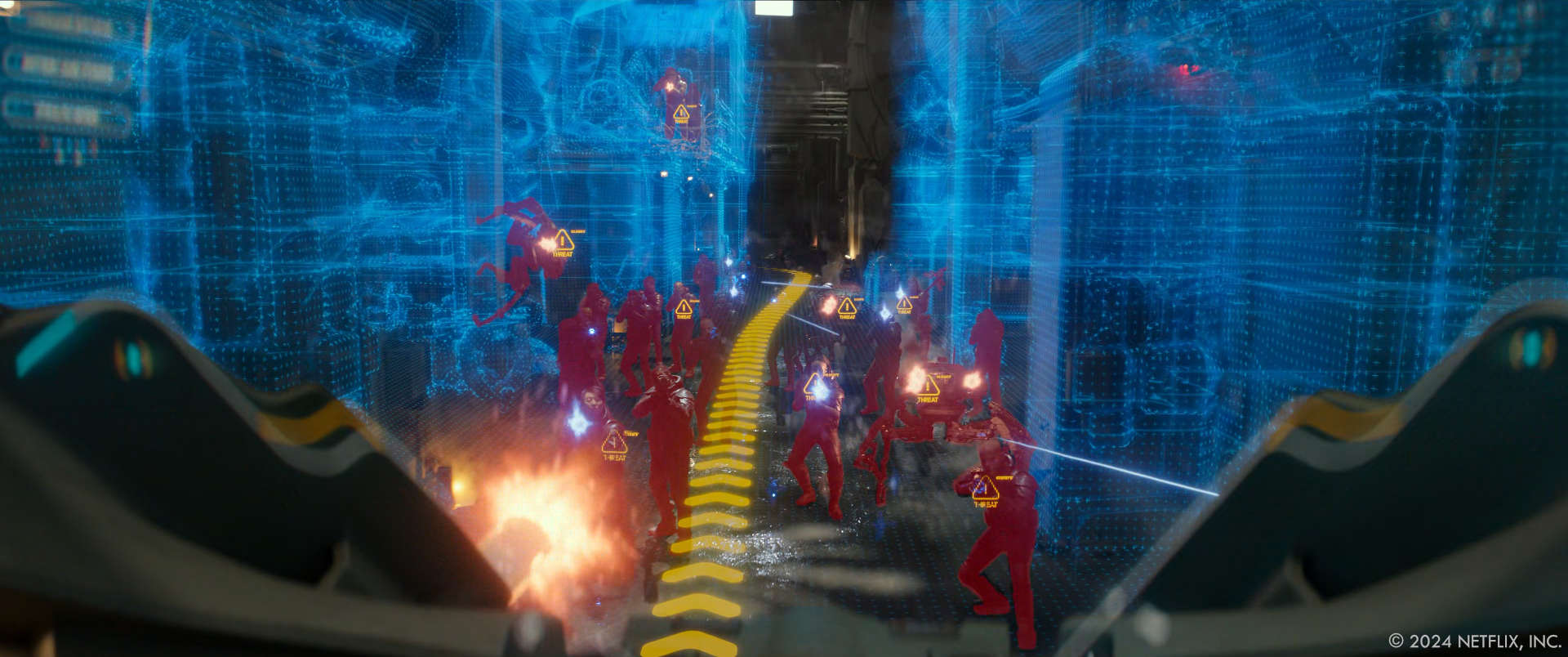
Beyond the “red is bad, blue is good” We had to design ICN technology for very different teams in those divisions, some had to even be Black and White for the Centurions (Harlan army). While the ARC robot systems were showing a vibrant blue, green and white interface for the main system, it acquired an orange tone during “Combat Mode” and a low frequency red tone in emergency situations and when energy levels were low. While working with real AR technology at Territory at present time, we have learned how red is the best color to use in order to preserve energy of a device, but also learned that in an outdoor situation is the worst you could use, as it is difficult to see. From all user testing we have done in the past, white and blue are always the most visible and prefered by users.
How did the director’s vision influence the design and animation of the motion design elements?
Brad’s vision was translated to us via Barry (the Production Designer) and Lindy (VFX Supervisor) at all times. He had a great vision on how to keep things realistic (for 2070) and was very rooted in research and real data he pushed us to go through. While new technology at that level can feel very complex and overwhelming, Brad’s vision was always through the lens of Atlas as a new pilot in the ARC trying to make sense of the complexity of the system, and achieved that by always adding a more personal and human tone to scenes where we see Atlas and SMITH messing around with each other with jokes and sarcasm, so those emotions needed to come through the graphics as well.
Can you explain the importance of lighting in creating convincing holograms?
Both lighting and camera/lens effects are important in order to render and composite holograms in a realistic way. Making sure we had all the camera and lens logs and references was imperative, and the team did a great job at keeping those organised at all times. Rendering a wide variety of render passes for each shot allowed the compositors to have more elements to play with when putting them all together, making sure that the correct looks were achieved, with the right amount of transparency and illumination of the different scenes that were going to get Lindy’s approval.
How did you collaborate with other departments, such as visual effects and cinematography, to achieve the final look of the motion design?
As mentioned above, the collaboration with the Art Department was key during the first year of engagement, for pre-production and production. When in post production we were more connected with the VFX Supervisor and the other VFX shops involved in the project. In this case, having our partners at Cantina Creative be one of these vendors, proved to be beneficial, as we could work together as “one”, allowing the company to take on more work all together.
Were there any real-world technologies or scientific principles that influenced your design choices for the motion design?
Most of it was influenced by innovations we see in the aerospace and military industries, mixed with the influence of AI being the connective tissue of all those technologies embedded in society. From datasets LLM (Large Language Model) and other AI algorithms, to biological hacks, neural implants and more.
What steps did you take to ensure the motion design displays were both futuristic and functional within the film’s narrative?
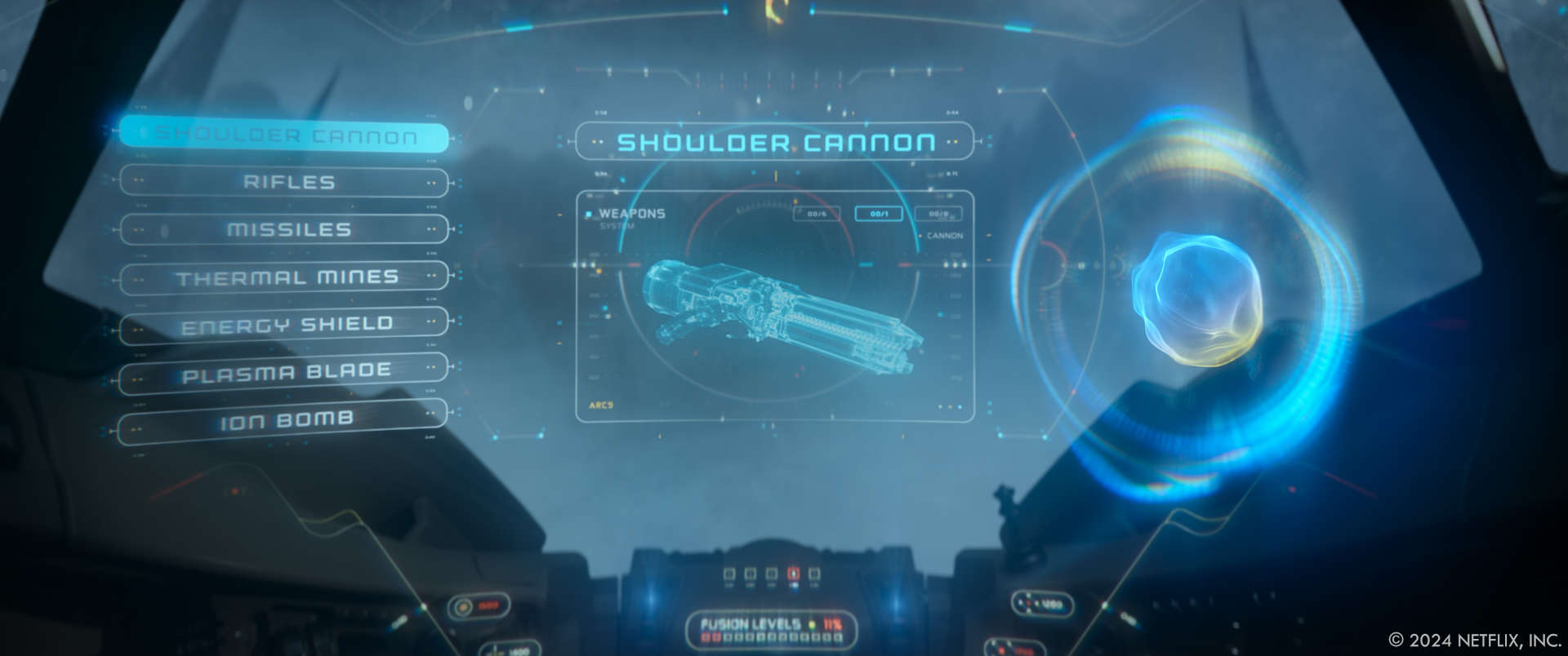
Research on our end was a key factor, for all the areas both Barry and Brad wanted us to learn from. Then when we start design, even if it’s for a film and the system will be just fictional (without the needs of being developed), we always put our UX “hats” on, and imagine how this would work for us if this was something that can be done for real. This helps all these graphics feel a bit more intentional and eventually give them a more plausible look, even if they are imagined in 50 years time.
How did you handle the animation of interactive motion design, where characters interact with the visuals?
When reading the script and discussing it with Barry, we did identify a couple of screens where we would need Jennifer to interact with in certain scenes. In those cases we designed the UI and passed it to one of our engineers, who developed a simple system for particular scenes where the actors could press the touchscreen in order to trigger certain animations. As for the interactive holographic elements in post-production, we animated the graphics reacting to the talent gestures and performances.
What feedback did you receive from the director and other key team members during the design process?
In some cases we went back and forth trying things until they were perfect, and in other times we were hitting things right from the beginning. We were always welcoming critique in order to keep everyone pleased and excited about the graphics, but mainly to elevate the quality of the output with so many great minds involved in the process. It is great to be working alongside so many great talented and experienced people behind those productions, and we are always learning and trying to improve for the next ones.
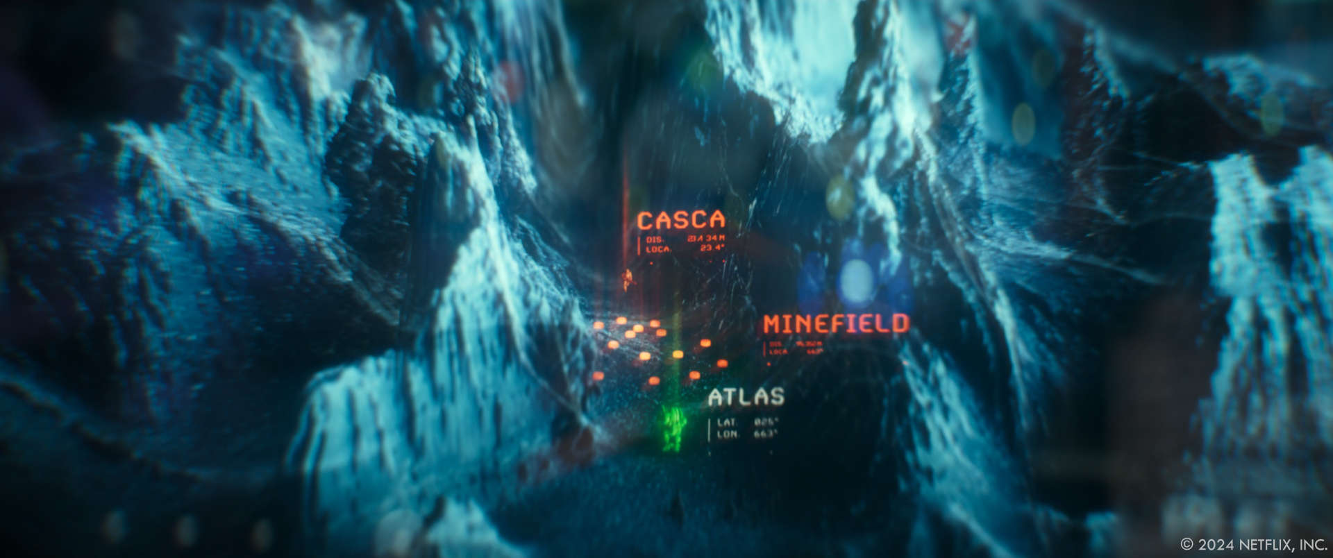
Were there any memorable moments or scenes from the film that you found particularly rewarding or challenging to work on from a visual effects standpoint?
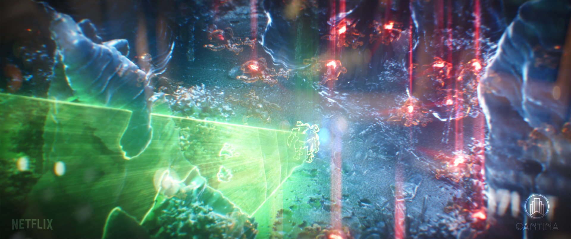
Creating the terrain holographic visualisations in a way that they could feel like a section of some of the terrains we were seeing in the concept art took some back and forth. The key story points cannot change and for example, when you have to create a collapsed cave system that is far below surface and you want to imply the magnitude of the length between the bottom of the caves and show the surface level at the same time, you have to play with zooming in and out of 3D volumes, cutting sections of those terrain volumes that include 3D tunnels and caves proved to be a finicky system.
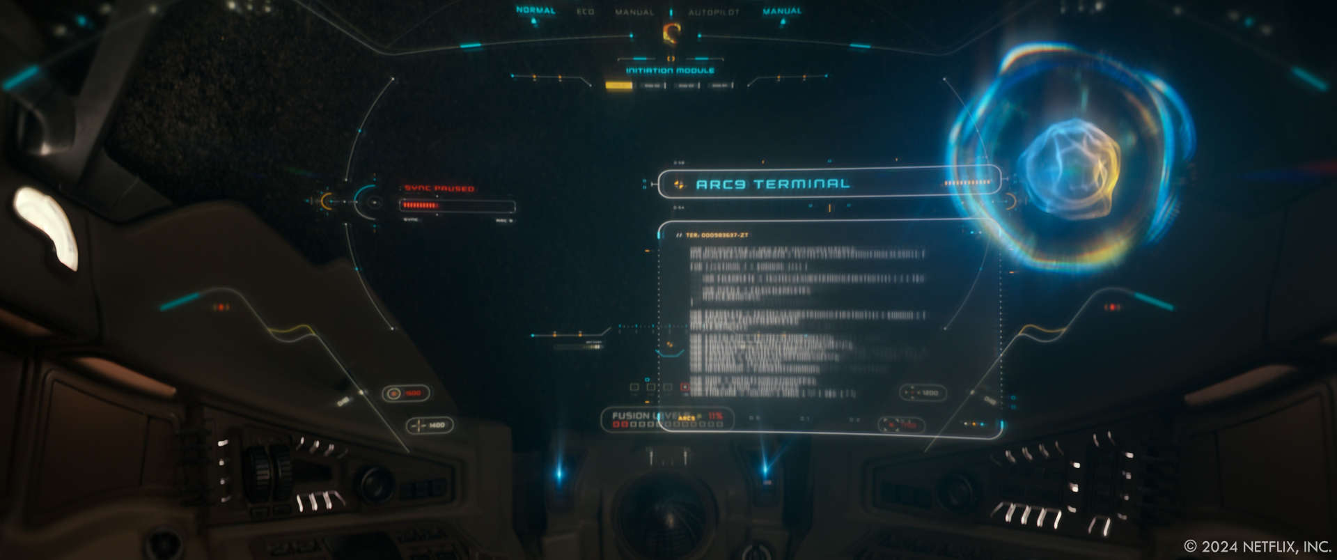
Looking back on the project, what aspects of the MGFX are you most proud of?
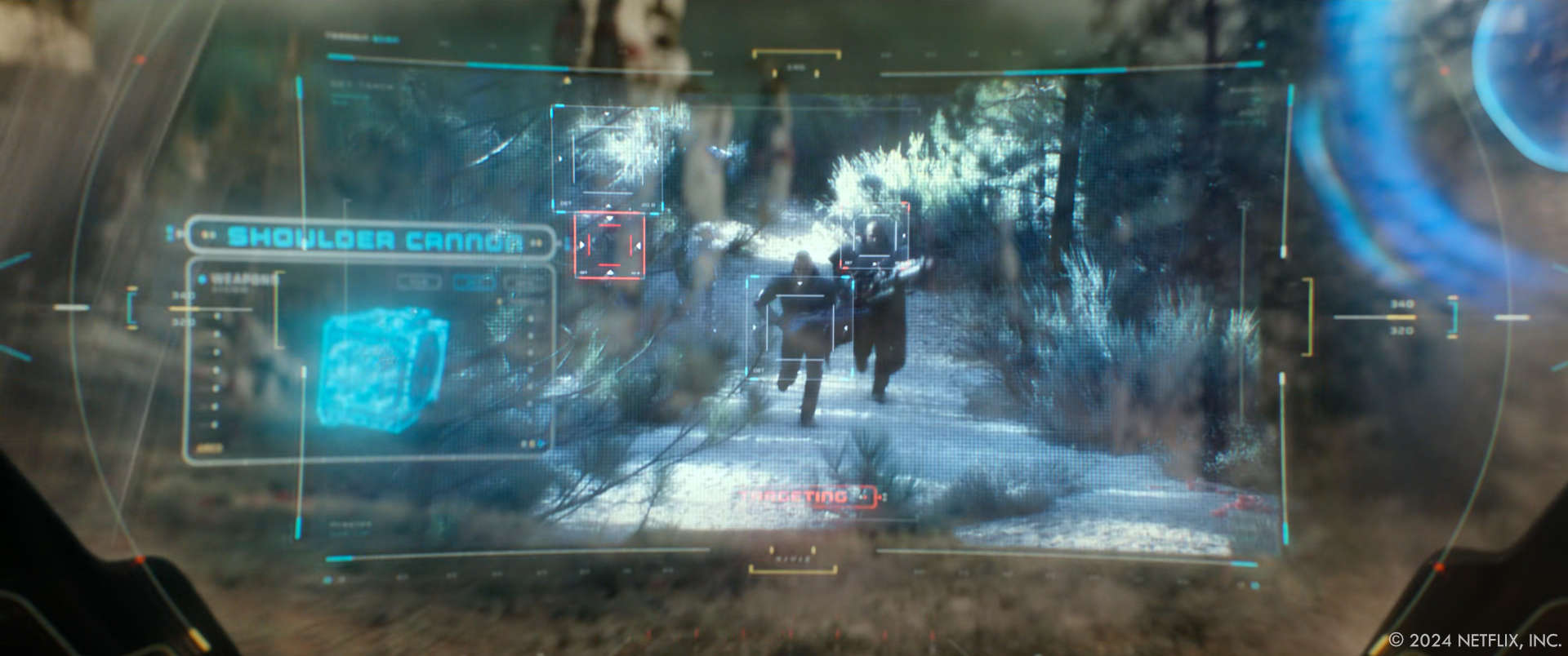
The most rewarding one to see in the film was SMITH HUD controls and voice visualiser, since we created a fully designed and animated system for other vendors to turn things on and off when needed, activate Combat mode (or other modes) and still have the altimeters, tilt oscillators and widgets connected with the footage. We consider that as the “face” of the supporting actor, the AI ARC robot, SMITH, who plays an integral role in the film.
How long have you worked on this show?
2 years and a half in total.
What is your next project?
I wish I could say 🙂
####
Aaron Eaton // VFX Supervisor – Cantina Creative, Los Angeles
What is your background?
Growing up in Washington state, I was surrounded by mountains and forests and water. Out of this proximity to nature grew a fondness for photography and cinematography, as a way to capture and share the beauty of the world around me. As computers and technology grew up alongside me, I was drawn to the technical artistry behind Visual Effects. Following my education in Multimedia and Film at California Lutheran University, just outside Los Angeles, CA., I jumped straight into the industry. I spent a decade honing my skills at Cantina Creative as a VFX artist working on an amazing array of films and series including all of the Marvel Avengers films, The Lord of the Rings: The Rings of Power, Avatar: The Way of Water, Free Guy, Hotel Artemis, Aquaman, Captain America: Civil War, Guardians of the Galaxy, and The Fate of the Furious, to name a few; primarily compositing, while simultaneously dipping into both 2D and 3D design/animation. In recent years, I had the pleasure of supervising talented teams of artists for Atlas, Black Adam, Bloodshot, Red Notice and The Falcon and the Winter Soldier.
How did you and Cantina get involved on this show?
Our initial connection point was having worked with Blondel Aidoo (VFX Producer) and William Marlett (VFX Assoc Producer) on previous shows, including the Netflix film Red Notice. They recommended us to Brad and Lindy, who were thankfully willing to give Cantina a shot, to help fill out the growing VFX needs for the film.
How was the collaboration with Director Brad Peyton and VFX Supervisor Lindy DeQuattro?
Our entire team loved working with Lindy, Brad and the rest of the production team. Before we dove in, we had several initial calls with both Brad and Lindy, where we discussed the overall vision and initial scope of work, which included developing several unique holograms for the first sequence of the film and compositing a large amount of graphics and holograms throughout the rest. For the next 12 months, we mostly interfaced with Lindy and the production team, collaborating weekly on numerous creative choices and discussing additional needs for the project with Blondel and Willie.
Our overall scope of work continued to grow month by month, until we were tracking over 600 shots. Lindy’s incredible balance of efficiency and creativity bolstered a post production environment that was smooth and enjoyable. She was always willing to give guidance when needed and suggest new ideas, but even more importantly, gave us an uncommonly large amount of creative freedom and trust from the beginning. We always felt comfortable suggesting new ideas or ways of smoothing out the workflow. Working with Lindy and the entire post production team was an incredible experience.
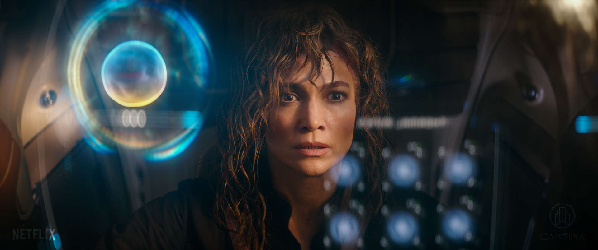
Can you elaborate about the work made by Cantina?
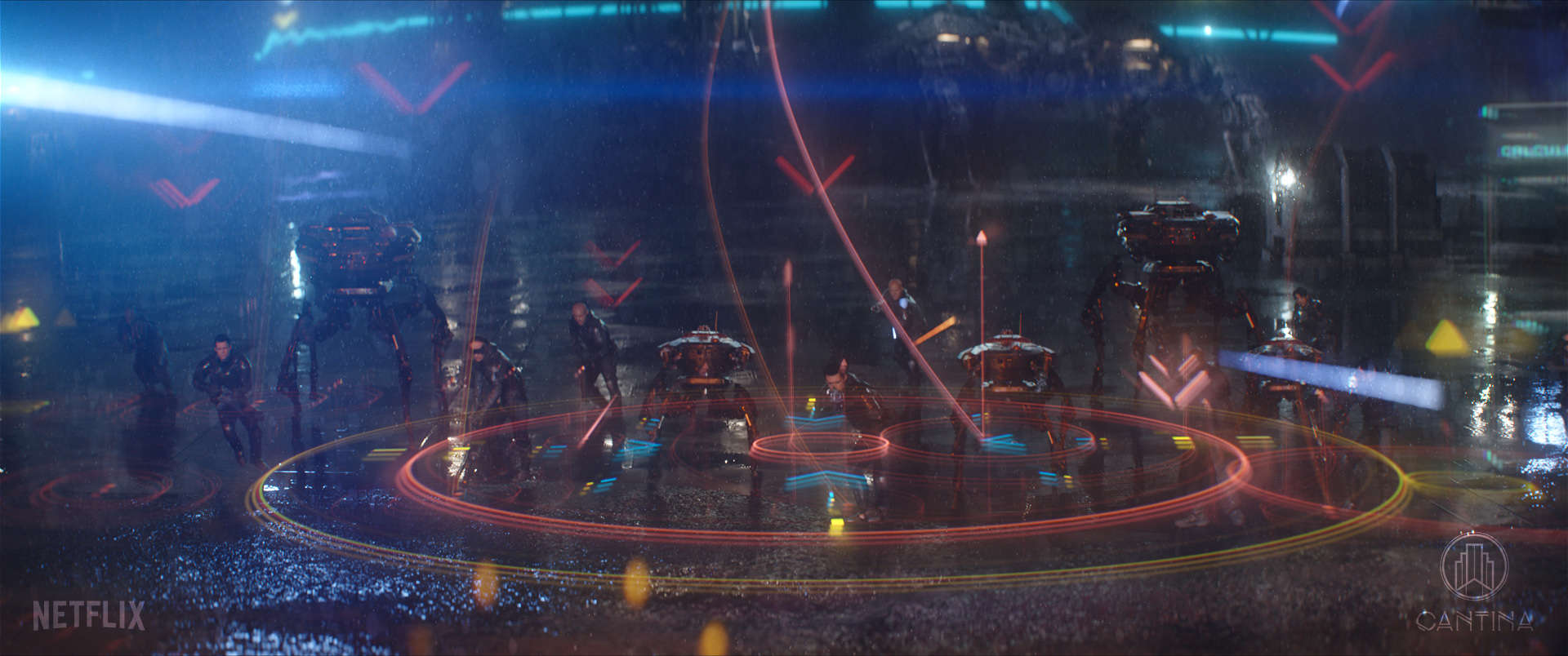
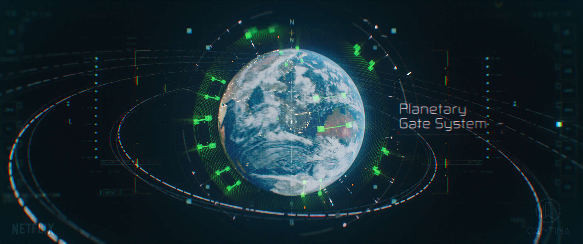
Our work is spread out throughout the entire film. We created more than 12 unique holograms from the ground up, POV HUD graphics based on motion-detection tech, composited a huge array of additional holos, set extension work, CG work, and 2D graphics. We also developed a bespoke, heavily distorted treatment that was used in flashback sequences throughout the film.
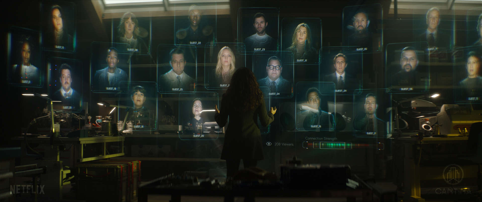
One of the first holograms we designed for Atlas was a “rolodex”-style hologram that could project out “memories” or video recordings. We had a great time playing with the concept of a futuristic rolodex, one that still retains the functionality of a traditional card file system. After trying out a variety of shapes and animations, we landed on a towered stack of 3D cards that animates smoothly upward, spreading apart as they rise. When we showed the director our initial concept, he absolutely loved the design and the treatment that we gave it. This pat on the back, right off that bat, really set the tone for how fun this project was going to be, and the level of creative freedom we would enjoy.
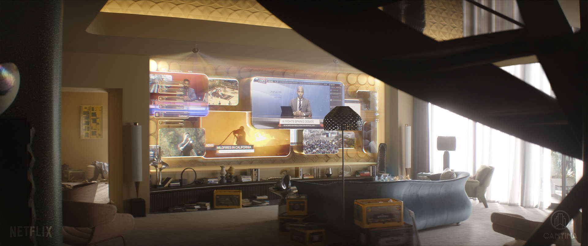
A good portion of our hologram/set extension work is seen in one of the first scenes of the movie where Atlas (Jennifer Lopez) wakes up in her retro-futuristic apartment, makes a cup of coffee, plays chess and watches the news on a giant TV wall. Each of these were uniquely designed holograms; the alarm clock, the coffee maker, the chess board, and the TV wall, all incorporating 3D CG elements to bring them to life in the scene.
We helped establish the finished look and completed final comps for the majority of the close up shots of Smith, the ARC suit’s AI component. For shots being completed by other vendors, we rendered out shot-specific pre-rendered elements with Smith’s animation synced to dialogue that was provided from production.
What was the initial inspiration behind the motion design and holographic elements?
When we first began on the project, a bulk of the design had already been established by our friends at Territory Studios, who did an amazing job of setting the tone and style for the designs and animation of the ARC and Smith holograms. In the holograms that we designed from scratch, we drew a lot of inspiration from the set design and the objects that the hologram is connected with. For example, the augmented reality TV wall in Atlas’ apartment has a moving background pattern of shapes inspired by shapes that can be seen in the wall above. Also, the rounded corners of the TV screens follow the retro designs of the space. Small details like that can go a long way with making the hologram feel integrated in its environment.
Can you describe the creative process for developing the motion design visuals used in the film?
The first step in the creative process was to determine what story the graphics needed to tell, and what the technology was behind it. From there we started simultaneously experimenting with designs/looks, creating styleframes of the graphics both over black and over the plate, to better see the designs in context. Once the client was happy with the direction, we started to animate and composite the element into shots in the scene. We would often focus our efforts on a single “hero” shot, to firmly establish the look and feel, then start rippling it out into the remaining shots. Throughout this process, the director, editor and VFX supervisor would weigh in on the work. Almost all of our graphics were kept “live” in the final composite in After Effects, which meant we had the ability to easily control the element’s design/anim/look on a shot to shot basis, when needed.
What were some of the biggest challenges you faced while designing the motion design?
Sheer volume of shots, and the unavoidable splitting up of work between different vendors ultimately created some challenges. In all of our comps, we had to be extra vigilant, keeping an eye on continuity throughout the sequence, making sure that other vendors had what they needed to match to. At the same time, we were always balancing the goals of the editor, who often had a strong opinion on how the graphics are framed in the shots. Whenever we encountered potential issues with continuity, we would quickly flag it, and work with Lindy to find solutions that worked for everyone.
How did you ensure that the motion design and holograms integrated seamlessly with the live-action footage?
One of my favorite aspects of VFX is the marriage of the imagined and physical world; and using cinematography to drive the look and feel of the graphics/holograms. I’m always searching for the perfect camera angle, often utilizing layers of depth within the hologram or graphics. In the case of the close up shots inside the tight confines of the ARC suit, we had plenty of wiggle room in framing the graphics the way we needed to, and to ensure they were aesthetically pleasing. Another key element in seamless integration is to recreate realistic lens effects. For Atlas, we analyzed the footage from the anamorphic lenses used in principle photography, noting the natural softness (especially around the edges), bokeh shape and lens aberrations that were captured naturally, and we developed a look that matched in After Effects. The top layer of icing on the cake is to add subtle glitches, flickers and texture to the hologram, embracing imperfections and oddities that are inherent in the real world. In the case of the ARC hologram, we also intentionally added an animated shifting offset to the RGB channels, which gave the impression that the hologram was being projected with independent color channels. During action scenes, or whenever the ARC is being jostled around, this look could be intensified, adding to the overall impact of the scene.
What software and tools did you use to create the motion design and holographic effects?
We primarily used Adobe After Effects for our final composites, with several sequences completed in Nuke. For the 3D holograms, we used Maxon Cinema4D to model and render a variety of textures/ looks to then combine in After Effects. For some of the planet holograms, we utilized the Video Copilots Orb plugin, which is a fantastic tool for that specific task. Beyond that, we used Adobe Illustrator for the base designs, and used Mocha and PFtrack to assist with tracking in comp.
How did you approach the task of making the motion design look realistic and believable within the context of the film?
The film takes place in a not too distant future, where sleek new tech is layered into pre-existing older designs which are familiar to an audience of the 2020s. This is reflected in both the set design, and VFX work. By embracing the retro-futuristic look it allowed the graphics and holograms to blend seamlessly into some environments and in others, create an intentionally stark contrast of old and new.
How did the director’s vision influence the design and animation of the motion design elements?
Brad was generally open to whatever creative ideas that we came up with, permitting that it told the story the way it needed to, and fit within the established retro-futuristic aesthetic of the film. From early on we had a good idea of what he was looking for; and more often than not, this entailed adding more and more motion to the elements. In the end, this helped create an atmosphere that really felt alive.
Can you explain the importance of lighting in creating convincing holograms?
Holograms are unique in the way that they both emit light but can also optionally react/integrate with the light of their environment. Arguably, the most important component of the lighting takes place during production, and that is to create realistic interactive lighting on the set/actors, cast from the hologram itself. This alone can do the heavy lifting of making the holo integrate well. But within the hologram itself, often a combination of 2D and 3D elements, there is room to explore with the way that it reflects or aligns with the lighting of the environment around it. At the end of the day, with such a classic sci-fi element, there is always a lot of creative wiggle room.
How did you collaborate with other departments, such as visual effects and cinematography, to achieve the final look of the motion design?
While we didn’t interface directly with editorial, we were still very close. There was a lot of back and forth, with Lindy connecting between. We received a lot of reference including post viz shots, that we would use as guides, especially for placement and timing. Everyone involved was open to suggestions, with the shared goal of making the best film we could!
How did you handle the animation of interactive motion design, where characters interact with the visuals?
The interaction between characters and holograms can often be tricky. In the instances where the actors would touch the holograms, we added an effect that made it look as though the hand or finger was going through the graphics, disrupting the projection slightly. Beyond that, it was just a matter of matching the timing of the animation to react accurately to the characters.
Were there any memorable moments or scenes from the film that you found particularly rewarding or challenging to work on from a visual effects standpoint?
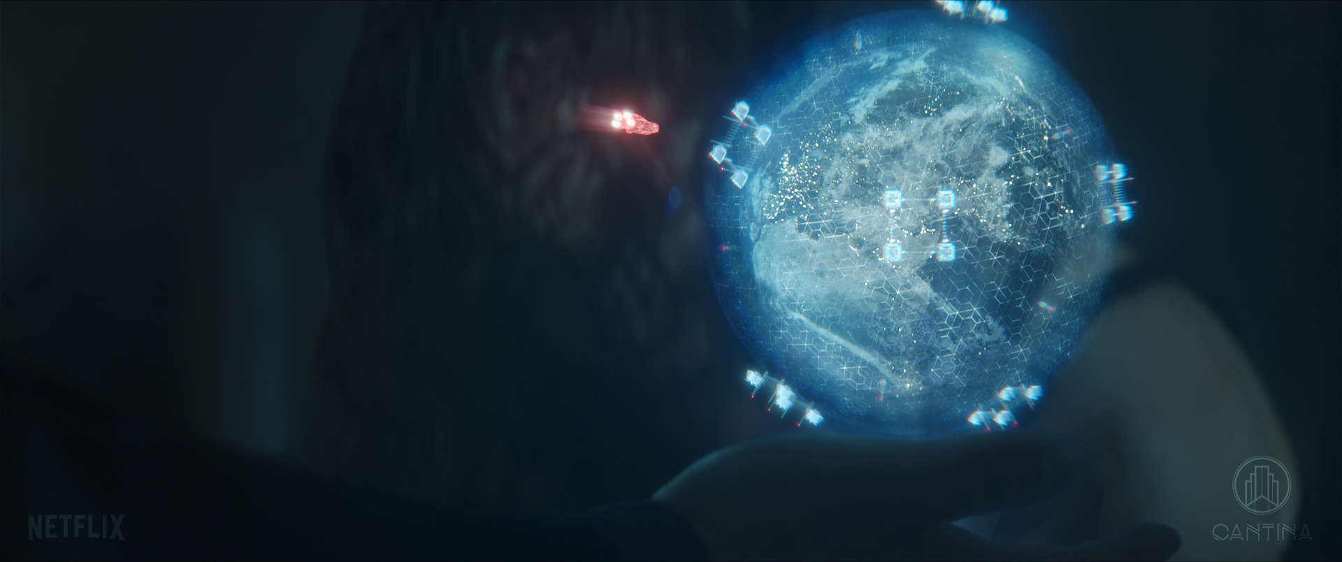
There is a certain shot in the film that I called “Holoception.” In the shot, Atlas is using a holographic rolodex, out of which she extracts a file and throws it into the room expanding into a larger hologram. The camera moves/transitions seamlessly into that hologram, where we see Atlas’ mother giving a presentation in front of an audience of holograms. Atlas’ mother activates another hologram, this one depicting a scene of a child using a device that is projecting a hologram of wildebeests. Truly, a hologram within a hologram within a hologram. It was a fun shot to work on, but also a challenging one, for obvious reasons.
Looking back on the project, what aspects of the MGFX are you most proud of?
I’m very proud of the sheer volume and quality of shots that our team was able to deliver over the course of the project. In total, over 600 shots and roughly 35 minutes of screen time in the finished film. I am also very proud of the variety of holograms we created for Atlas’ apartment; the large augmented-reality video wall, an alarm clock-esque one, a chess board, and a coffee machine. In the same sequence we also did some modeling and compositing of a CG cleaning bot.
How long have you worked on this show?
I worked on Atlas from February 2023 to March 2024, close to 13 months in total.
What are the four movies that gave you the passion for cinema?
This is where everyone usually has their perfect list of ultra-obscure films prepared, but not in my case. Also, apologies in advance, I’m going to break convention and answer with chunks of films, rather than four individual films:
The Lord of The Rings Trilogy – I was already a fan of the books as a young kid, and to see Middle Earth come to life in theaters, in such jaw dropping detail, was life changing. This probably had the largest impact on my interest in visual effects and about the time I started to more seriously consider a career in film as a whole.
A.F.I.’s Top 100 List – During a summer back in high school, my friends and I spent many evenings trying to watch as many films as we could from the list. Even though ranked lists are always subjective to a certain extent, this batch of films broadened our cinematic views and gave us an incredible sampling of some of the greatest works of motion art ever produced.
The Harry Potter films – I was born at just the right time, to grow up along with Harry, as the books and films were released through the late 90s and 2000s. These movies, stuffed full of great story-telling and visuals, captivated a young me.
A big thanks for your time.
WANT TO KNOW MORE?
Cantina Creative: Dedicated page about Atlas on Cantina Creative website.
Lindy DeQuattro: Here’s my interview of Lindy DeQuattro, Production VFX Supervisor.
© Vincent Frei – The Art of VFX – 2024


