In 2014, Simon Stanley-Clamp had explained to us the work of Cinesite on HERCULES. He then worked on many films such as ANT-MAN, THE REVENANT, CAPTAIN AMERICA: CIVIL WAR and ROBIN HOOD.
How did you get involved on this show?
Simon: I became involved at the bidding stage, so pretty early on. I have prior experience of working with Marvel – this was my fourth production.
What was your feeling to be back in the MCU?
Simon: I had just come off of working client-side and over-seeing ROBIN HOOD for Summit Entertainment, so this was an entirely different direction and a very exciting opportunity. My last Marvel production was CAPTAIN AMERICA: CIVIL WAR a couple of years back.
How was the collaboration with directors Russo Brothers and VFX Supervisor Dan DeLeeuw?
Simon: We had no contact with the directors. VFX supervisor Dan DeLeeuw gave all the kick off briefs for our sequences. Once we were up and running we dealt with associate VFX supervisor Mårten Larsson and VFX producer Jen Underdahl, who were both a pleasure to work with. Initially we communicated remotely via cineSync sessions with weekly conference calls. As the project accelerated the number of cineSyncs and conference calls increased and at busiest period during the final push to delivery the supervisor and producers came to London for one to one sessions which were very helpful.
How did you organize the work with your VFX Producer?
Simon: Our work naturally divided into two, so we split the artists into two teams; I had supervisors leading each team for me and both shared the resources of our lighting, FX and assets departments.
What are the sequences made by Cinesite?
Simon: We worked across six sequences, the largest of which were:
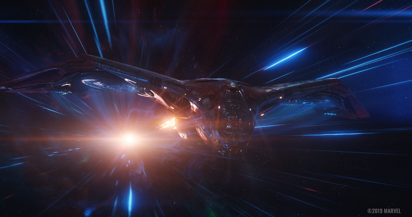
- The opening Lost In Space sequence where Tony is stranded; interior and exterior shots of the Quill’s M-Ship, from Tony and Nebula playing table football to wide shots of the ship in space.
- Nebula, War Machine, Hawkeye and Black Widow visiting the planet Morag.
- New York city 2013 inside the Stark Tower lobby, Tony and Ant-Man’s planned heist to steal the tesseract from a suitcase.
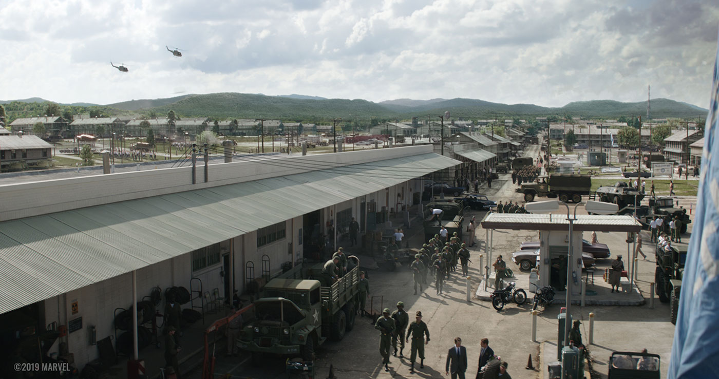
- Tony Stark and Captain America at Camp Lehigh in the 1970s, where Tony meets his father while searching for the tesseract.
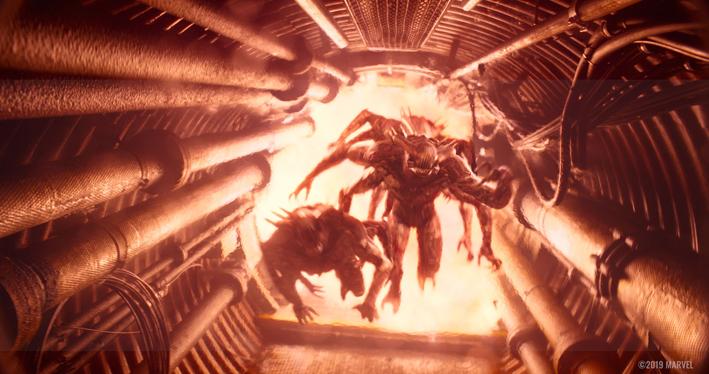
- Following the destruction of the Avengers base, Hawkeye is pursued by Outriders as he searches for and retrieves the gauntlet.
Can you explain in detail about the creation of the spaceship?
Simon: We received the ship as an asset from DNEG. We modified it for the “Lost in Space” sequence, showing more damage and wear and tear from its escape from Titan in INFINITY WAR.
Can you tell us more about the shaders and textures work?
Simon: Our head of assets Tim Potter is best placed to answer that.
Tim: With the Lost in Space sequence we received the ship asset from another vendor and started to build up all the connections between the texture maps in the shaders. As we progressed we found ourselves having to sculpt bespoke damaged areas of the space ship and create additional texture maps, adding further detail in the form of rivets and panelling, dirt and grime, as well as a larger break up to help add a sense of scale. We also created frost maps for the windscreen which were used in various shots. Lookdev were constantly updating the shaders with our news maps and pushing various values to get the best look for Quill’s ‘lost’ ship.
How did you handle the lighting challenge into the deep space?
Simon: We started implementing Gaffer about a year ago as our main lighting tool. Our Head of Lighting Roberto Clochiatti oversaw lighting on ENDGAME.
Roberto: Gaffer gave us a totally different approach, with its more procedural and modular structure. We had a huge amount of scalability to manage lighting scenes and we moved quickly from a one-shot approach to a multi-shot approach. This reduced the workload but maintained consistency within the sequence. We were also able to introduce tools that could be built within the software, without bothering the pipeline department, so that made a big difference to us.
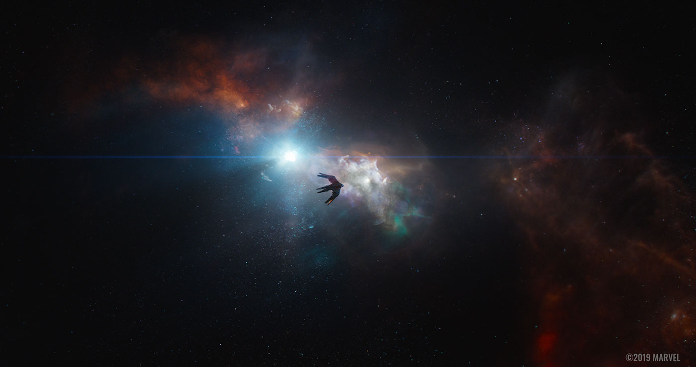
Quill’s M-Ship is floating, surrounded by nothing but distant nebulas and stars. The challenge was to maintain a sense of loneliness and emptiness. We kept the lighting fairly subtle, only using a few lights with mapped stars and distant sources. We used some star-field HDRIs painted by compositing in order to get some plausible reflections, as well to help ground the ship, knowing that we didn’t have any plates to match the lighting to.
Can you explain in detail about the light creation and animation when the ship goes super fast?
Roberto: When the ship goes into hyper drive, we used a combination of lighting techniques. On one side we have the lighting before the jump, with a clear light direction given by the sun. We could reference the planets seen in the background, and once the background was approved it was fairly quick to light the pre-jump part of the shot. The only rule is to always make the ship read easily while it’s moving.
For the jump part, we placed a geometry representing the tunnel of lights surrounding the ship. With values based on what is on screen, we could replicate a fairly complex set of strobing lights and streaks hitting the silver metal of the wings and the body of the ship. Once the “tunnel” look was approved we made sure the lighting was in sync with it by offsetting the animation of the lights passing by, so it would look like Quill’s ship was flying through at high speed.
Can you explain in detail about the design and creation of the beautiful space backgrounds?
Simon: We established the look of the M-Ship early on for the first full trailer and that was used for the rest of the movie. During the Lost in Space sequence, where we see the marooned ship, there are three main shots which show the environment: one close up, one wider and a pullback from Tony in the cockpit. We created several iterations as concept stills which I vetted before presenting 20 or so designs to the client and settling on the final look. Dan wanted to express the loneliness of space and one way we helped communicate that was to progressively show less detail in the more distant shots. The widest shot is almost entirely black space, with small colour accents from a gaseous nebula, so you really get a sense of the ship’s isolation and the emptiness of its location.
How did you create the 1970s version of Camp Lehigh?
Simon: Two of the scenes we were working on were derivatives from previous films. The Morag sequence revisited GUARDIANS OF THE GALAXY, and Camp Lehigh revisited the 1970s and CAPTAIN AMERICA: THE FIRST AVENGER.
The briefs were aesthetic; essentially, we needed to match the tone of the original. For the underground laboratory shots, where Stark finds the tesseract, we extended the interior set pieces in both directions away from the camera. Our build had to match the look of the full-sized set and borrow elements from the original film.
As Tony and Howard leave the laboratory and cross the forecourt, there is a huge camera pan up above them, showing the full extent of the base. Dan supplied us with very specific reference materials from army bases in the US, particularly for the colour ways and layout of the soldiers’ accommodation. I’m pretty sure he said that he spent a period of his childhood on army bases, so he had a clear recollection of how it should look.
What was the real size of this set?
Simon: The foreground portion of the shot encompasses all the live action element of the plate, about 1/3rd of the full base layout.
How did you manage the crowd creation and animations?
Simon: We extended the set by around 70%, adding buildings, vehicles and creating a busy, populated scene utilising production shot bluescreen elements of hundreds of extras. We retimed and repositioned the action on cards and placed them in Nuke to fill out the shot.
Another time period the film revisits is New York in 2013. How did you recreate Stark’s RT interior mechanics?
Simon: This is the sequence where Ant-Man shrinks down to slip inside Tony’s t-shirt and RT chest unit, adjusting the mechanics and causing it to short out. The point of this is to create a diversion enabling a second attempt to steal the tesseract. We based the RT unit designs on IRON MAN 2 and designed and built a 3D environment which mimicked the look of that version. We pitched designs to Dan, who gave preferences which we modified. We blocked out the scene and made minor alternations to the layout to favour seeing Ant-Man convincingly in the macro environment.
Can you explain in detail about the creation of the Outriders?
Simon: We received the model for the Outriders from ILM.
How did you handle their rigging and animation?
Simon: Choreography of the Outriders was key to making the chase sequence work. Hawkeye must never be caught but the Outriders move at blistering speed, so we often have them zigzagging around the tunnels, almost like a skateboarder going up the side of a tube, taking the longest path possible to slow them down. Joint CG Sup Chris Petts can give a more detailed overview of the challenges of this sequence.
Chris: The Outriders were a particular challenge in terms of animation. Drawing on apes, dogs and even spiders for their movement, we were aware that in style, they were both powerful and dangerously fast. We saw in INFINITY WAR that these creatures are capable of outrunning a human easily on open ground, so our challenge was to understand how Hawkeye could keep ahead of them while being chased through the underground tunnels. It quickly became apparent in blocking the animation for the shots, that their strength in numbers was also their weakness within a tunnel environment. They would quickly get in each other’s way in a confined space – each intent on their prey, regardless of the actions of the others.
To begin with, we created a number of animation cycles – running, climbing, crawling and leaping. These were used to block out the scenes, using the appropriate action depending on their position in the shot. As the action within a shot became more defined, the animation was refined for each creature within that specific shot. In the finished shots, bespoke animation replaced these early cycles, as each Outrider interacts so closely with its environment. With eight limbs for each creature and a great deal of interaction between them, this could be particularly time-consuming for the animators. With the Outriders in such close confinement, any change to the animation of one would quickly impact the movement of the others. Every creature also had a simulated muscle rig built by our creature effects department, which was configured to be previewable by the animators in order to see the final body shape within the animation scene itself.
Can you tell me more about the sequence revisiting the planet Morag?
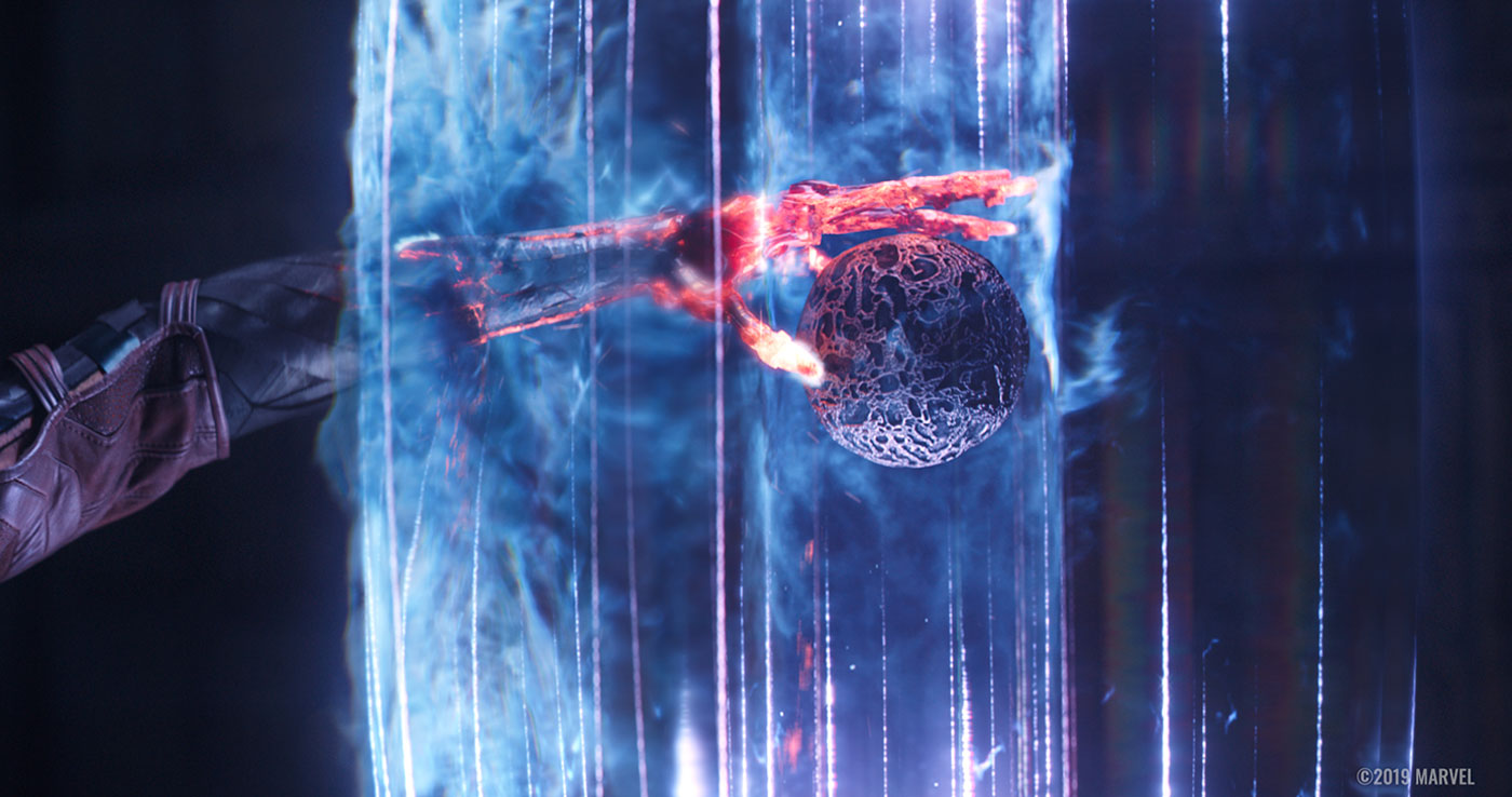
Simon: The sequence on Morag opens with four full CG shots showing the planet from space, then the escape pod being deposited from the M-Ship’s loading bay onto the planet surface. The final shot in this short sequence was an exact match to Quill’s view landing on Morag in GUARDIANS OF THE GALAXY, but with the camera dollied over to screen left to give a slightly different viewpoint. As the sequence progresses the same technique is repeated and we see Quill singing and dancing, as in Guardians, viewed from the War Machine and Nebula’s shifted perspective. We extended the green screen set piece by 100%, adding columns, dripping water and foliage to fill out the environment. Later, still on Morag, Nebula and War Machine enter the inner chamber to extract the orb with the power stone inside from a laser net, again repeating a corresponding sequence from GUARDIANS. Nebula reaches in, partly destroying her arm, which is stripped back to hot, bare metal. She hands the orb to War Machine as the molten metal of her arm cools.
Which sequence or shot was the most complicated to create and why?
Simon: The wide shot where Quill’s ship lands on the surface of Morag used many disciplines, from environment builds through FX, lighting, animation, texturing and comp. It was pretty demanding.
Is there something specific that gives you some really short nights?
Simon: The late finaling of designs for the time suit gave us little room for manoeuvre for the final compositing of some shots. But this was the same for every vendor and late deliveries are the norm in VFX.
What is your favourite shot or sequence?
Simon: I really like the shot mentioned previously, with Quill’s ship landing on the surface of Morag. Although it was challenging, it was well planned and came together well. Seeing it up on the big screen and looking great was ultimately very rewarding.
There’s also a close up of Nebular touching Tony, in the opening Lost in Space sequence, as he drifts off into unconsciousness, the plate is beautifully lit, we added our very subtle space background, very out of focus, but throughout it’s a full CG Nebular arm and you only really become aware of this when her wrist is exposed, as an open space connected by metal rods to her metal hand, subtle but effective.
How long have you worked on this show & what was the size of your team?
Simon: We had about 126 crew, with 40 support, so I’d say around 160 in total.
We started builds for the assets in around September 2018.
What is your best memory on this show?
Simon: We had a great team of people who were a pleasure to work with. We all pulled together and there were lots of moments where, even when it was late in the evening and we were all tired, we managed to retain our sense of humour. I’m proud of the work we pulled off.
What is your next project?
Simon: It’s too early to say, but I’m looking forward to the next challenge!
Roberto Clochiatti – Head of Lighting
Which shots or aspects of Cinesite’s work were you most closely involved with?
I supervised lighting (last 3 months of the project) on pretty much all sequences with characters, vehicles, props and environment, but the environment on the Morag sequence which was done in a non standard way. I was involved in giving lighting feedback to the artists, performed quality reviews before the VFX supervisor, re-organize the lighting crew, maintain the relations between the other departments to discuss technical and organizational aspects, I was present to the morning production meeting and VFX daily sessions.
What were the most challenging parts of that work?
For most of the sequences the workflow was really smooth, a few challenging situations were due to the artistic developments in parts of the complex sequences involving character animations, rendering heavy FX simulation and their interaction with the environment. The design of the pictures went from a very graphic look to the very photo-realistic look, to find a balance point between them took many iterations and development over several different ideas, non the less to achieve it, we needed to change the technical and organizational approach close to the end of the project.
Another challenge in lighting was relative to the delivery of assets (from assets and animation) in a pretty long period of time while the concept kept changing, for the organizational point of view this was a stress test for lighting.
The EBB sequence had a difficult lighting situation, the initial concept was re-thought during the shooting, a very saturated environment did not allowed to show the look of the characters as would appear on a lookdev turntable, so we needed to change lighting and shading to create a more interesting look for the characters.
In the MOR sequence, the characters were shot into a closed set of lights which made them look in a stage rather than in an open environment, the challenge was about trying to integrate the actors shot into a stage with a full cg open environment, many tests were done in order to keep a correct perspective but at the same time maintaining a sense of openness and distance. We should also keep an eye on the references from previous movies and maintain a consistent look as well as a consistent mood.
Can you tell us about Gaffer and whether it was used successfully?
We started implementing Gaffer less than one year ago as the main lighting tool in substitution of maya and maya lighting tools. Gaffer gave us a totally different approach, it uses a procedural and modular structure which it gives us a huge amount of scalability to manage lighting scenes, we moved quickly from a one shot approach to a multishot approach reducing the workload but also keeping the sequence consistent easily and introducing powerful tools that can be built within the software, without bothering the pipeline department. We need to consider that the pipeline integration with gaffer has been continued during all project, which did create some problems, but also give us the real condition to improve workflow and tools, currently I am really satisfied with the progress that rnd and pipeline made, and with our lighting tds which took the challenge very positively.
Second, more detailed answer:
The goal is to make any lighting td in conditions of managing complex scenes, we started organizing the sequences depending on the purposes by grouping the shots with similar artistic and technical challenges, every group of shots was consistently assigned to a lighting artist which was managing it entirely, therefore the lighting team was fairly small. Gaffer gave us a totally different approach, which has a procedural and modular structure. We had a huge amount of scalability to manage lighting scenes and we moved quickly from a one-shot approach to a multi-shot approach, this reduced the workload but maintained consistency within the sequence. We were also able to introduce tools that could be built within the software, without bothering the pipeline department. With Gaffer to share pieces of scripts, macros and solutions is very easy, we are kept working to improve the workflow and tools along all the project, and by the end of the project we made noticeable improvements. To answer the question, Yes it was a success and I am very happy about what the RnD/pipeline team did to integrate and improve the software into the current Cinesite pipeline.
Is there anything else you would like to say or contribute?
In general I am pretty happy with the job done, with all the difficulties we faced I can see an improvement in the procedures, workflow and tools. I am sure things could be done better, although I think we are in the right direction, to improve the final quality and reduce struggles.
How did you handle the lighting challenge in deep space in the Benetar sequence?
For the deep space lighting, we used an early concept to understand what kind of mood was going to be set during the sequence. The Benatar is floating, surrounded by nothing but distant nebulas and stars. The challenge was to get a good representation of that. Trying to maintain a sense of loneliness and emptiness. Keeping the lighting fairly subtle, only using few lights with mapped stars, and distant source, giving some of the greenish/red tint used on the shot where Tony Stark is in the cockpit.
We used some star-field HDRIs that were painted by compositing in order to get some plausible reflection as well to help ground the Benatar, knowing that we didn’t have any plate to match the lighting to. Finding a balance between the Benatar and the background required us to go back and forth to find a good balance of brighter spot behind the ship to highlight the silhouette and play with the shape as well.
Chris Petts – CG Supervisor
Which shots or aspects of Cinesite’s work were you most closely involved with?
My involvement was with any shots involving creature- or human-based effects, including any limb or suit replacements
What were the most challenging parts of that work?
Any human and human-like action can be a challenge in animation. With human-proportioned characters, motion capture, or movement taken directly from a shot plate, can usually be used successfully. But certain characters – although often conforming to the humanoid shape – have sufficient differences from a human to make motion capture impractical, and hand animation a necessity.
The outriders were one such case. In addition to hand-animating human-like movement, the added challenge with the outriders was that they had four pairs of limbs to interact with the environment and with each other. Animating each one was like animating two humans at once.
Can you talk through 2-3 key shots and how you worked with animation to get them completed?
Ant-Man in NYC 4360/4400/4540
These fully CG shots involved Cinesite’s artists designing the interior of the iconic RT, and planning and creating the action of the shots using the available previsualisation and Paul Rudd’s voice tracks as a guide. Several design variations of the RT interior were created by Cinesite and proposed to the client, each drawing influences from the exterior appearance of the RT in other movies. A favoured version was chosen by the clients, and we began laying out shots based on this preferred design.
The action had to be carefully choreographed to the soundtrack, using the tone of Paul Rudd’s pre-recorded voice to guide Ant-Man’s action in each shot. When shots had been sufficiently blocked for camera and character movement, character action could be directly captured using Cinesite’s in-house motion capture system, and this action carefully aligned with the CG set and props. It was important to keep a visual link to the exterior of the RT throughout the sequence in order to tie the action in to the surrounding shots. This was achieved through the use of colour palette – using the pale cyan-blue of the RT as a base colour for the shots – and by keeping the distinctive RT triangle visible in the background of the shots. The shots were given a shallow depth of field to help sell the micro-environment look, and careful attention was made to size and detail-level of components, and types of textures and lighting within the RT to maintain the macro-lens appearance.
Is there anything else you would like to say or contribute?
It’s a rare privilege to be working on such a high-profile and highly-anticipated film.
Tim Potter – Head of Assets
Anything else you can tell me about Benatar or the sequence from your perspective?
This sequence was challenging as we needed to give the Benatar a look that suggested it had been lost in space for a period of time so had picked up damage, but then make sure that it was still able to fly. At first the destruction that we sculpted into the model was difficult to read in certain shots due to the darkness of space so we had to do some shot specific shader work to help bring out this detail, but in the end we were very happy with the look we achieved.
How did you enhance your Ant-Man since his first movie?
The Ant-man costume has gone through a number of upgrades and changes since Infinity War. Our asset was ingested from another vendor, but with our NYC sequence having the suit so close to camera we had to create additional maps to help push the level of detail in the textures and shaders further. In Cinesite’s NYC shots Ant-man shrinks down and goes inside the reactor on Tony Stark’s chest to create a malfunction. We ending up building a large environment inside the RT, and detailed one particular area for Ant-man to land in and cause havoc. We were aiming to create a close, claustrophobic feel inside, as well as giving him room to move around and keep focus on the area of action. As the interior of the reactor environment was very blue it was a challenge to keep the red look of the suit, so we ended up lighting Ant-man with very neutral tones to get around this as it was important to be able to see and read character.
A big thanks for your time.
WANT TO KNOW MORE?
Cinesite: Dedicated page about AVENGERS: ENDGAME on Cinesite website.
© Vincent Frei – The Art of VFX – 2019


