Richard Hoover has more than 25 years of experience in visual effects. He started at Dream Quest Images and then worked for The Walt Disney Company and Sony Pictures Imageworks. He joined Framestore in 2015. As a VFX supervisor, he took care of the effects of films such as ARMAGEDDON, REIGN OF FIRE, SUPERMAN RETURNS and BEAUTY AND THE BEAST.
How did you and Framestore get involved on this show?
Framestore already had a relationship with Denis as we had worked on his previous film, ARRIVAL, when he needed help to visualise the last sequence of disappearing Alien ships.
For BLADE RUNNER 2049, Bill Carraro came by initially to discuss our availability and John Nelson followed a month later. We discussed the work and John outlined his expectations.
How was the collaboration with director Denis Villeneuve and Director of Photography Roger Deakins?
We had a great relationship with both Denis and Roger. I had regular discussions with Denis during the early days of shooting to work out the look and execution of our sequences. Most of my discussions with Roger took place on set. He would outline what he was going for in the lighting/mood of a sequence and how he expected our work to look. We had twice a week reviews with Denis during the post schedule where we discussed all aspects of the film and our shots. Roger joined those reviews at different periods of the post production schedule, usually when he was timing a trailer or during the DI in the final weeks of delivery. Denis was a joy to work with. He likes to explore all options for storytelling in visual effects, so it was very collaborative.
What was their approach and expectation about the visual effects?
The general discussion was about the atmosphere and lighting of the film. The shots needed to be overcast, flat, bleak. Per Roger, the sun never came out and there were no hard shadows. Everything was to be quite flat and even. Compositionally, Denis wanted vast landscapes with a tiny spinner to reinforce the bleak oppressive feel of the film. He often used the word “brutal” in reference to the conditions of this world. He also wanted every shot to be perfect, visually. We worked on this scale relationship often throughout post, creating many examples and experiments to achieve the right look and feel for each shot.
Can you tell us more about your work with VFX Supervisor John Nelson and VFX Producer Karen Murphy?
John and I worked together at Robert Able and Associates in the 80’s. I believe that gave John a level of trust from day one for what Framestore would create. I had never worked with Karen before, but we often discussed the project details and I found her to be a good producer.
What are the sequences worked on at Framestore?
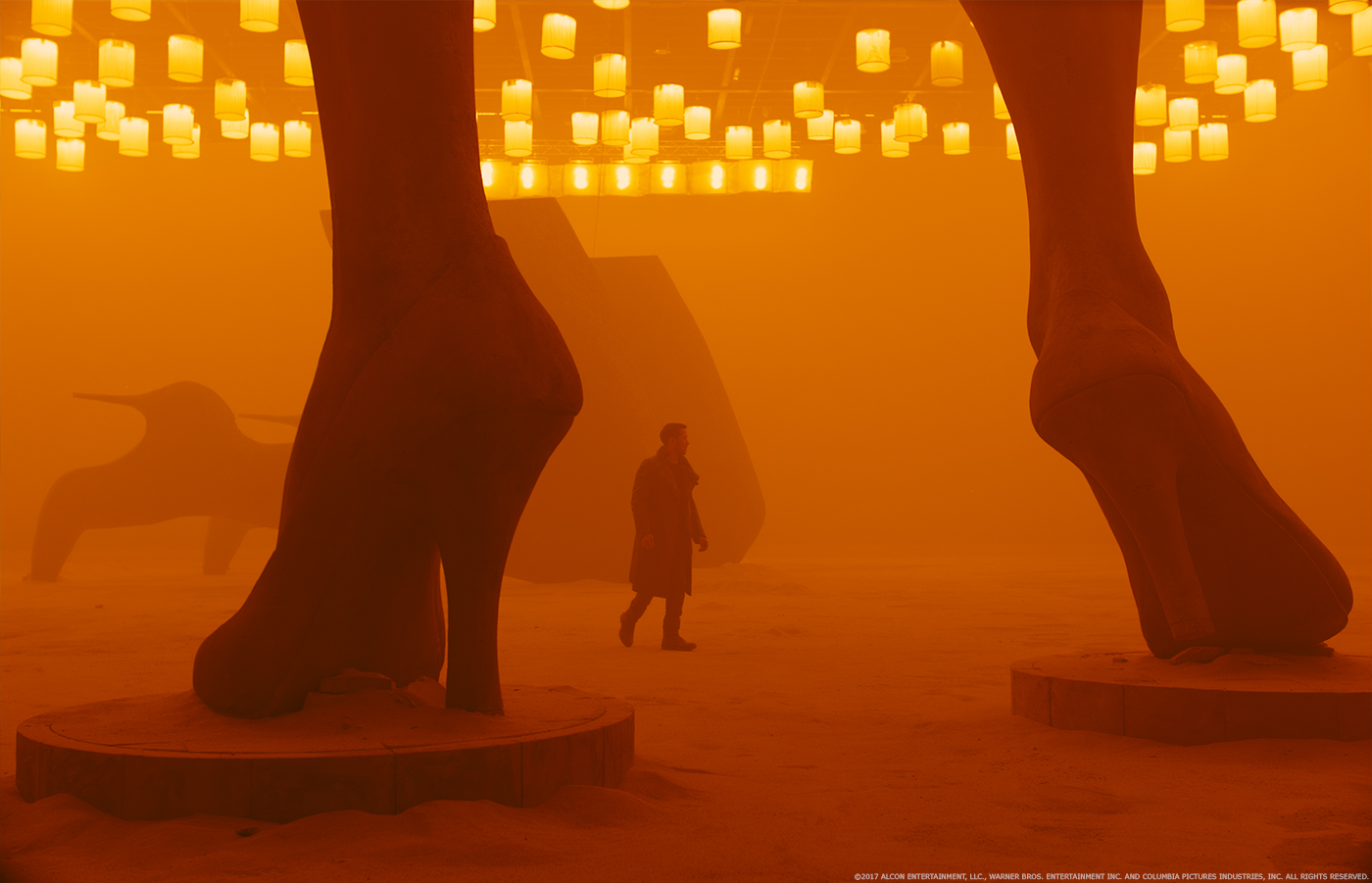
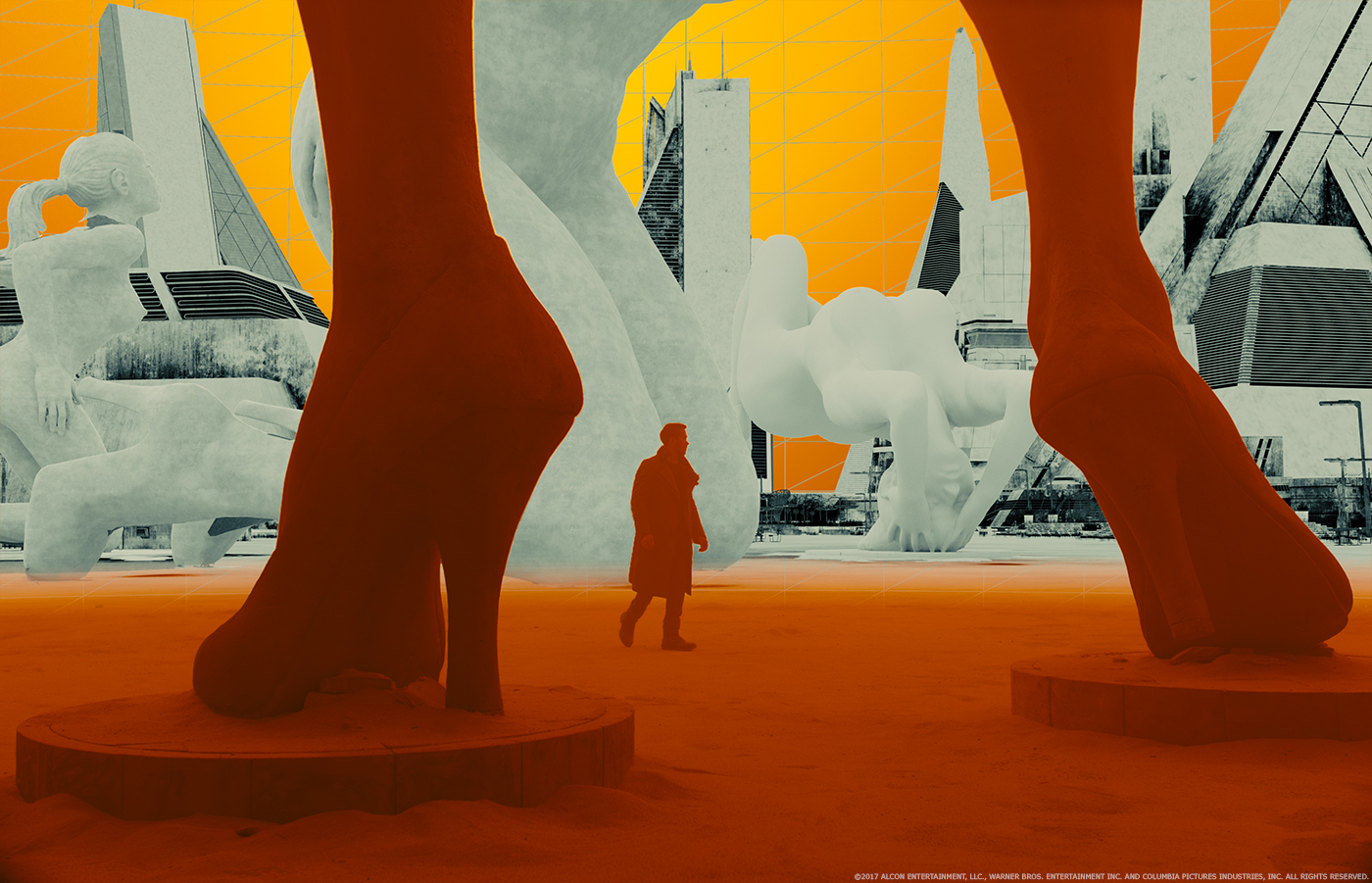
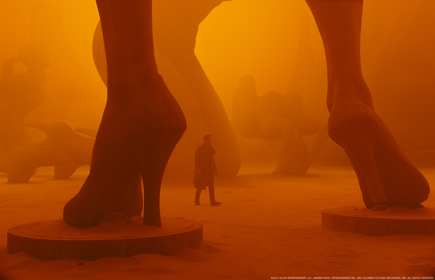
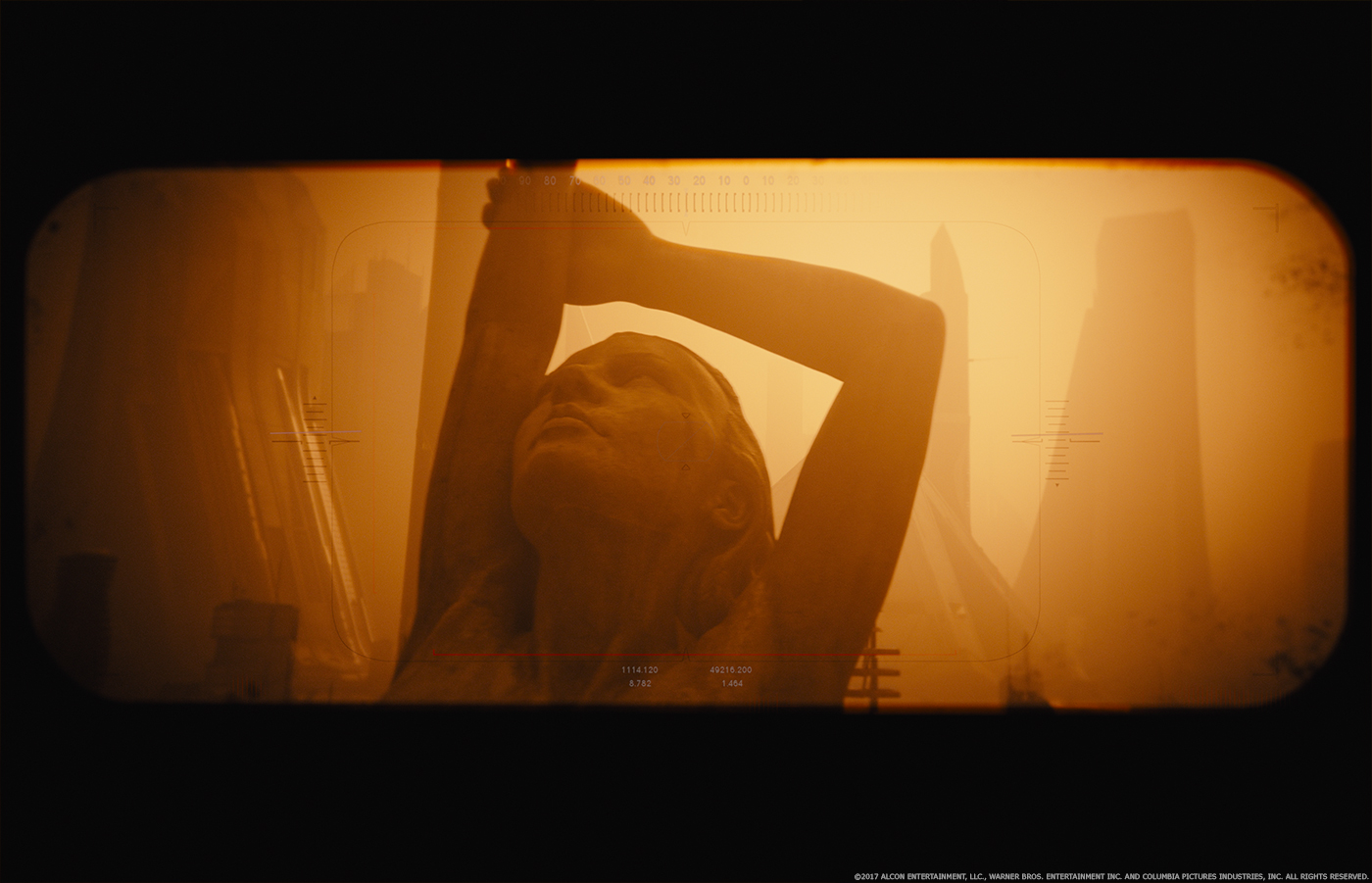
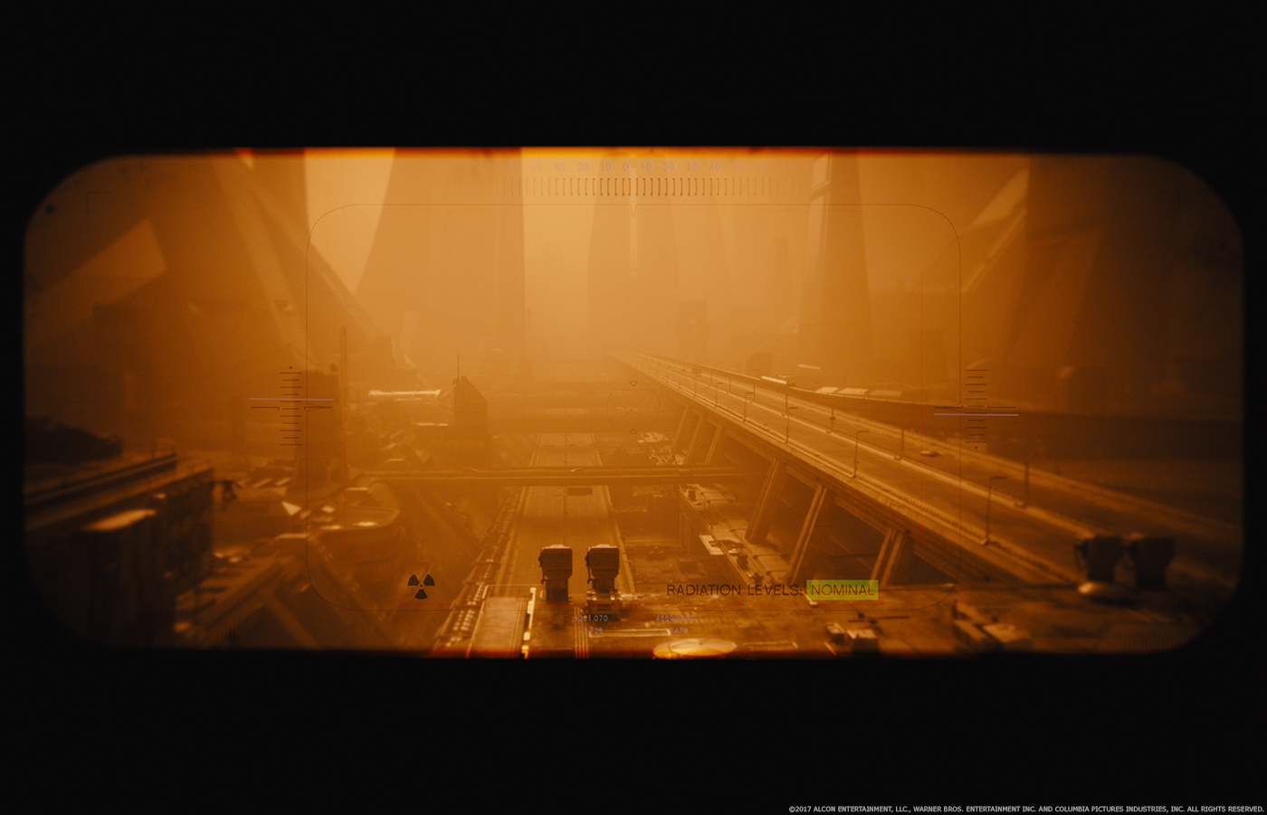
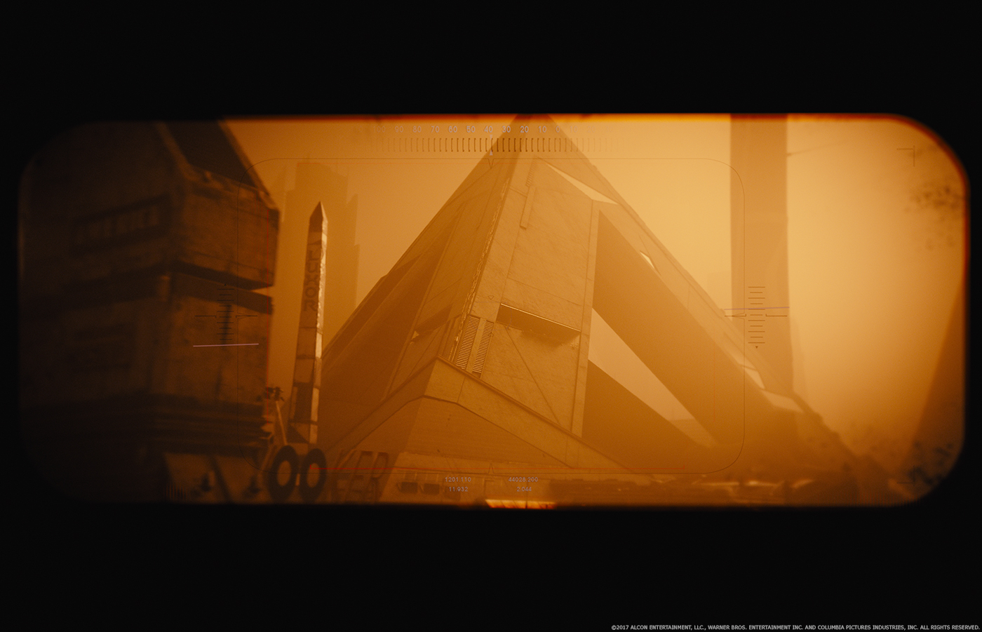
We were awarded the opening sequence from the eye to K walking up to Sappers door. The Las Vegas sequences, drone POV, K’s walk through the statuary and the shots looking out of the hotel to the Vegas background. Lastly, the Trash Mesa portion of the film from leaving LA through the shipyard, K crashing his spinner up to his finding the Orphanage.
How did you organize the work at Framestore?
It was a fairly traditional organisation; we did a fair amount of overlapping work between modelling, environment, texture and dmp. Many shots varied in how they were executed within these departments. However, the biggest challenge was that we were working to find the perfect final images, until the very last minute. This paid off visually but requested a tight organisation.
How did you feel reworking the iconic Spinner?
I didn’t really think about it, it just needed to get done. I think we spent more time trying to make the design be functional and realistic than reflecting on whether we were being true to the first film.
Can you explain in detail about the creation of the Spinner?
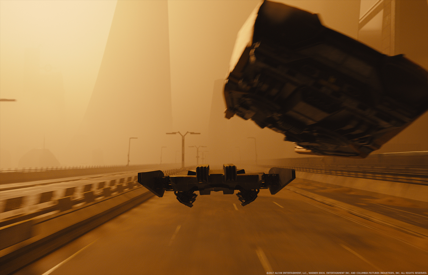
We photographed the constructed spinner prop for texture and photogrammetry. We also lidared the spinner, but we thought the photogrammetry worked better for us. The bottom of the prop spinner was not complete, concept art was created and we modeled from the approved designs. There were several updates to the initial design based on how the shots were working. The most dramatic was the detail lights and their flashing to make the spinner follow conventional aircraft.
The Spinner flies over a massive environment, Trash Mesa. Can you tell us more about the creation of this vast location?
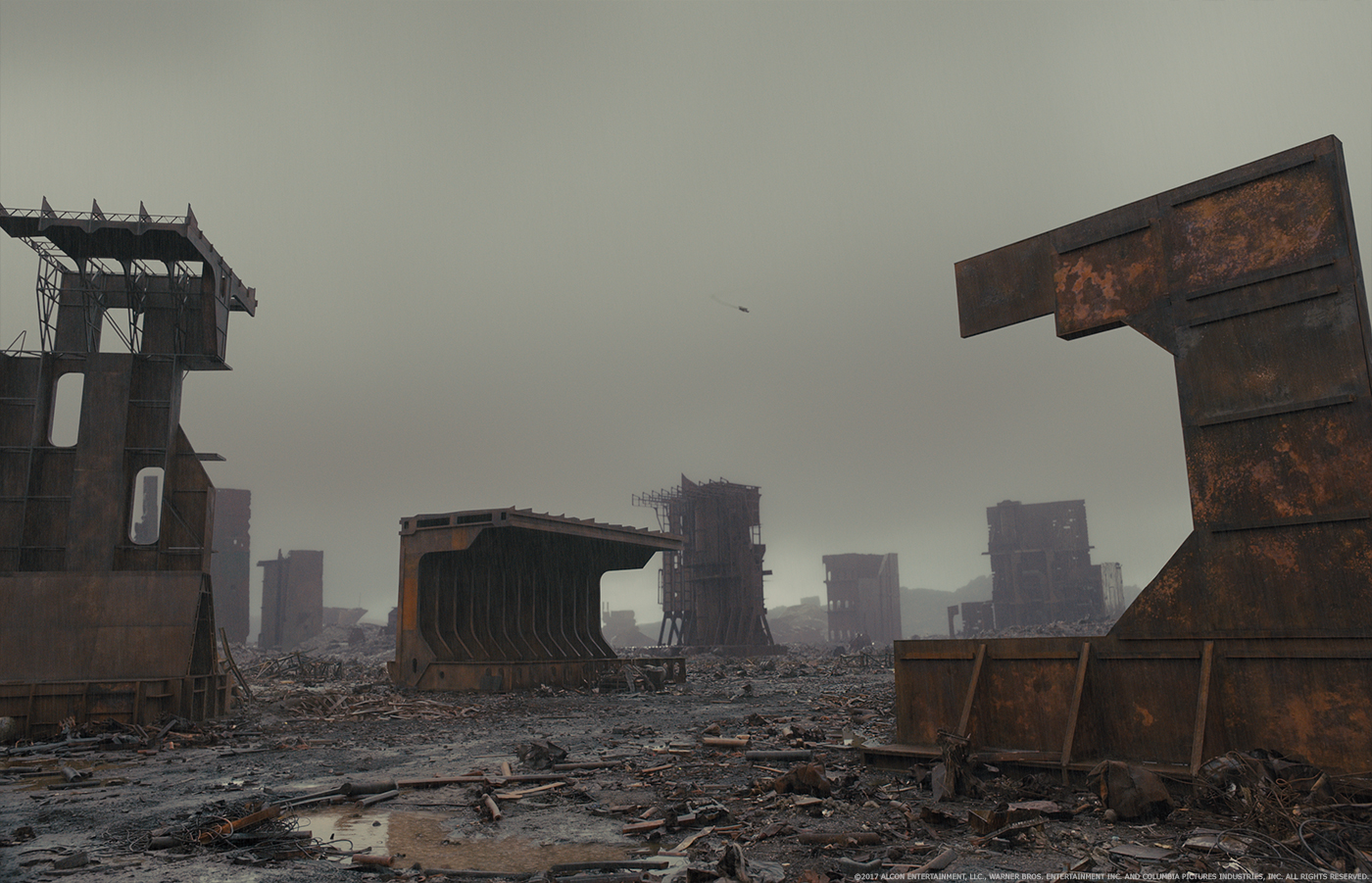
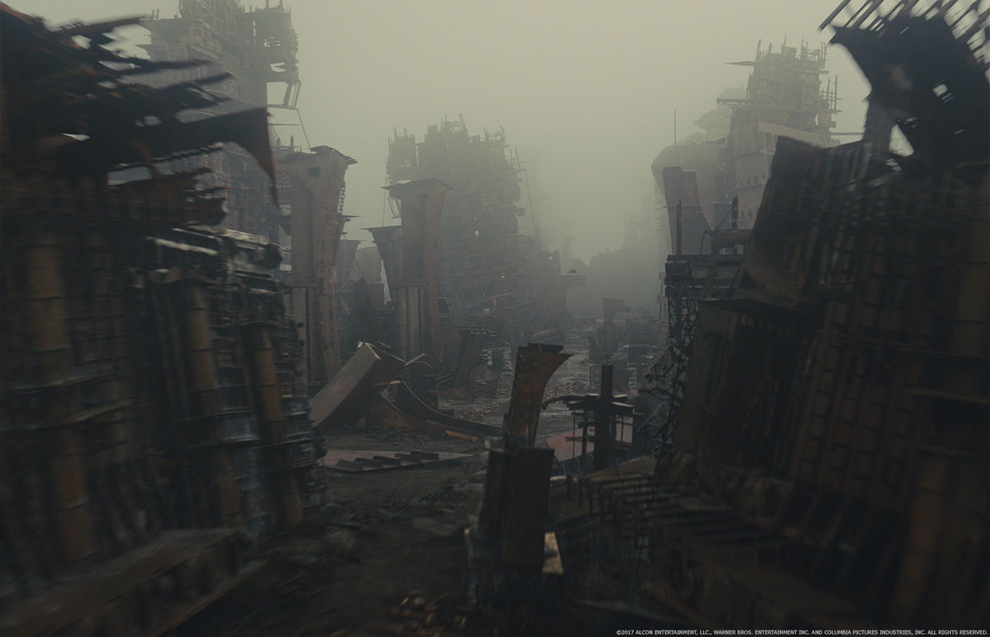
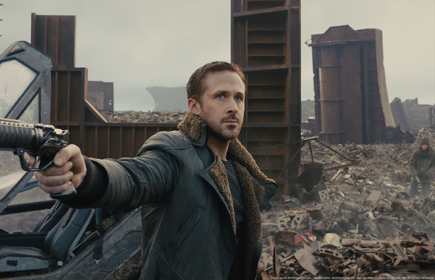
We began by recording movies of our Google Map scouts, simulating how the camera ship would fly over the terrain. These were used to show Denis how the beached ship area would look and where we would shoot plates for the crash set extensions. A low res landscape was built of the photographed areas to begin the construction of the CG environment. Portions of K and Joi’s flight through the ships were planned as miniature photography to be augmented with CG from the start of post. However, the scale of miniatures reached a limit within the stage space to achieve what was ultimately wanted. The models then became texture and build designs for CG builds. Photogrammetry of the sets were extensively used to begin the process of constructing an entirely CG landscape. Although the plan was to build one environment to achieve all the shots, each shot layout was altered based on the master plan for most of the sequence up to the crash of the spinner. There were several individually designed shots at the beginning of the sequence as well. We relied heavily on dmp to design and execute these shots with some environment work to dimensionalise artwork.
The crash site was a large scale set with several ship pieces and a debris covered hill in one corner. A 3D extension was built from lidar scans of the set that extended the environment and included many ship pieces. The far distance was completed by a dmp sych using the sky and distant mountains from the Iceland plates. We ran procedural slop comps of every shot to see how the composition and continuity of the sequence would work, then changed things shot by shot where we needed to.
All of the shots of Trash Mesa had levels of atmosphere added. We generally rendered two volumes, one very even overall and one keeping lower to the ground.
How did you manage the animation of the Spinner?
Animation was handled traditionally. We used YouTube videos of actual aircraft for reference and a lot of trial and error to get things right.
How did you handle the crash of the Spinner?
The crash approach was a CG spinner intercut with interior Spinner buck Green screen shots. The approach background was shot with a drone camera system. The crash itself was a Spinner buck on rails and attached to a hydraulic cable pulley system. Foam debris and peat moss was dressed in its path for ground interaction. The Spinner had 3 cameras mounted on it, one inside and two outside. SPX provided rain for the crash area with an enormous rain bar system. The camera rigs were removed by blending in a CG spinner. CG effects elements of dirt, smoke and debris were carefully worked into the plates keeping as much of the photography as possible.
Can you explain in detail about the creation of the hologram Joi?
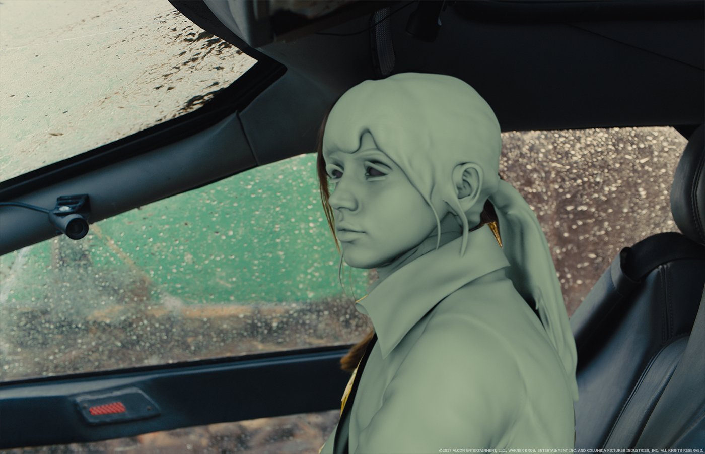
John Nelson, Paul Lambert and I met just about every Saturday during principal photography to discuss and explore ideas of how to achieve Joi. We each created our own slop comp versions using shots from a test sequence John directed prior to principal photography. We looked at all kinds of still images for texture and volume. We tried superimposing those images over the test footage to get a feel for what worked and what didn’t. We theorized what rules she would have to work for the story, the direction Denis had given us and to support the relationship between K and Joi. How to create the hologram while being real enough to support Joi as a lover to K was always at the heart of the discussion.
Ultimately, Paul came up with the image of her back side which Denis responded to as a way to show her volume. This worked well for her interaction with Mariette in K’s apartment. The texture of Joi’s dress on her backside moving against the front side worked well to define her volume in a pleasing way. This effect combined with sync motion between the two actors blended well and supported the story clearly.
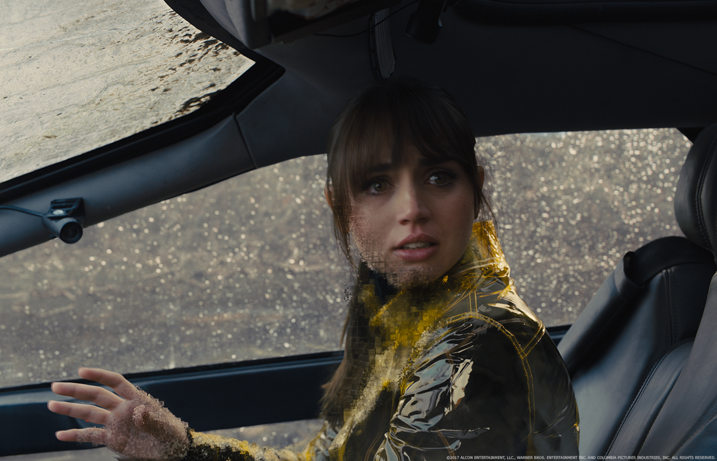
For us at Framestore, Joi’s costume was completely different and did not offer the same detail to see this parallax effect. Further, Joi’s was wearing a transparent yellow jacket. The transparency of the jacket was often confusing as a backside image at the same levels as DNeg used in their sequences so we had to find another way to see her image yet follow the same rules.
In our discussions from the beginning I was always pushing for something within her to visualize her volume. We ultimately came up with a cubist structure to her volume. This element was created in Houdini with transparency to the background and selectively blended into her plate in comp. We also rendered her backside with the transparent yellow jacket and kissed that into the comp to keep her look similar to what the audience had seen earlier in the film.
How did you handle the FX for Joi?
Our effects supervisor, Lucas Janin, created an animated volume made up of cubes. The body tracked motion from the plate drove the movement and change in the cubes size and transparency. The color of the cubes came from her plate and the background environment.
The movie then moves to Las Vegas. How did you approach this huge environment?
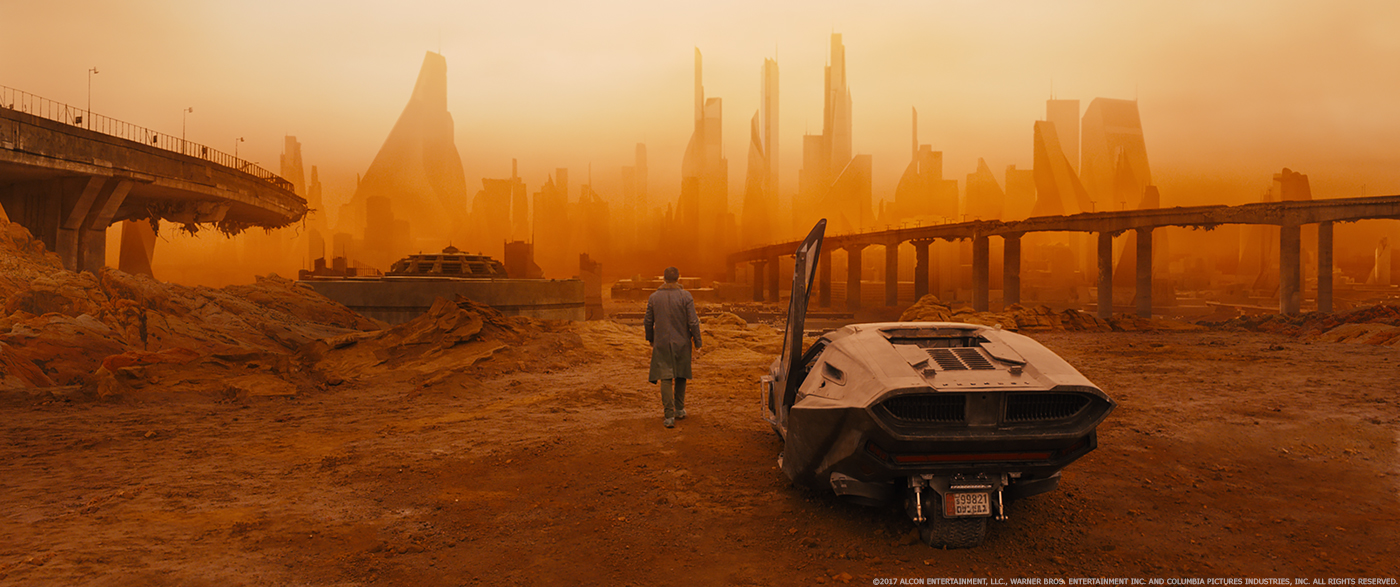
We began by creating a CG landscape built from USGA data of that area and incorporated simple models of the buildings as they are now. The production art department had built a futuristic version of the city using simple models of their building designs positioned over a current day city plan. Some of these buildings were Syd Mead designs and some were from the Framestore’s Art Department who were commissioned to produce concepts for particular sequences in the film. This model was layed over the existing city plan to start the final design process.
Key camera positions at different points during the camera move were established and the Art Department created concepts based on those simple renders. The concept art was then used to further detail the construction in modeling and used as reference for the texture team. This process went on for months and included reviews with John and Denis. Sam Hudecki also contributed in the design process, mostly concentrating on the human aspect and details to the layout we were creating. He often also sketched or drew over our renders to show ideas for discussion with Denis.
We broke up the city plan into areas for construction. Within each area we had 3 levels of completion based on the proximity to the camera. As the camera move was worked out we increased the level of each buildings model often altering the design to some degree and increased the level of texture as needed.
The final layer of the build used greebles to populate areas with human scale props and details to realize the scale of the city.
Can you explain in detail about its design and its creation?
The opening gate area went through many months of design. Sam and the Framestore art department worked extensively on this area with Denis. Much of the tiny details created are not fully seen in the film as a good portion of the initial shot was cut in the last weeks of post. The shot was originally 2’400 frames long and is seen at about half that length. Many props, kiosks and vehicles were designed and modelled to populate the city. The idea was to show a city where people left in a hurry.
What was the real size of these sets?
For the exterior, part of the statuary, like the head, was built on set, but that the rest of the city is entirely CG.
Did you received specific indications and references for Las Vegas?
We did have Syd Mead sketches commissioned specifically for this film and I shot helicopter footage over the city so we had real reference for lighting and texture.
The city is seen through a very specific lighting conditions. How does that affects your work?
The orange filter Roger used to shoot Vegas was established during the statuary sequence. John and I thought it was equivalent to a Kodak 23a correction filter we used at Robert Able. Its properties are that it gets very yellow when bright and orange when dark and eliminates all the blue wavelength of light.
Between the orange filter and the amount of haze we had a very difficult time making our images right. There was endless discussion about what was needed to make the images feel real. It became apparent that part of the problem is one of perception. We are not used to seeing things in a orange sand storm so what we expect is influenced by what we are used to seeing. The best reference we had were Internet photos of a Sydney sand storm. We studied every aspect of the specular, diffuse and ambient levels of these images to exhaustion.
Our reference for reality became to render in white light where we could see what the color and texture really looked like and then accepting what happened when adding the filter and haze as our reality.
Which sequence or shot was the most complicated to create and why?
It’s probably a toss up between Vegas and Trash Mesa because both are so large and complicated.
What is your favorite shot or sequence?
There are too many great shots to have one.
What was the main challenge on this show and how did you achieve what you wanted?
This was a difficult show, really hard work, all of it. We were given big difficult sequences, the easier shots went elsewhere. I think hard work equates to large challenges which equates to great work.
What is your best memory on this show?
Being on set the first day and realising how much fun it was going to be.
How long did you work on this show?
A little over one year.
What’s the VFX shot count?
301 shots.
What was the size of your team?
175 crew member were involved from start to finish. We peaked at 100 at the same time on the show.
What is your next project?
I am working on a Tim Burton movie for Disney.
What are the four movies that gave you the passion for cinema?
LAWRENCE OF ARABIA, THE BRIDGE ON THE RIVER KWAI, STAR WARS, ….
A big thanks for your time.
// WANT TO KNOW MORE?
Framestore: Dedicated page about BLADE RUNNER 2049 on Framestore website.
© Vincent Frei – The Art of VFX – 2017




I could watch Blade runner all day every day.
blade runner is the best science fiction movie in the last year for me. it’s artwork, the music, the question about being human, all those refernces to the first film. it was truly an amazing experience to see the movie in cinema.