Sven Martin began his career in visual effects in 2001 as a compositor. In 2008, he joined Pixomondo and worked on films such as SUCKER PUNCH, HUGO, THE HUNGER GAMES or STAR TREK INTO DARKNESS. He won three VES Awards and two Emmy Awards for his work on GAME OF THRONES.
What is your background?
I studied at the Filmakademie (Baden-Wuerttemberg, Germany) with the main focus on animation / visual effects. As I could never really decide between animation and compositing, I worked in both fields, freelancing for various companies afterwards. My first job as visual effects supervisor was in 2004, for a Hungarian movie delivering invisible effects for a WW II scenario with matte paintings and set extensions. I joined Pixomondo in 2008, where I was working on a various projects, from visual effects driven shows like STAR TREK, SPIDER-MAN and SUPER 8 to arthouse movies like MELANCHOLIA.
How did you and Pixomondo get involved on this show?
Majority of the principal photography took place in Germany and Poland, which prompted to hire Pixomondo as a Germany based company. Also the production would be able to benefit from Baden-Wuerttemberg’s (Germany) subsidy support.
Can you tell us more about your collaboration with director Steven Spielberg?
Spielberg has a big trust in his long time collaborating team, therefore a lot of the communication was running about these guys. On a shooting day, right before the start of a new scene, all the HOD’s would gather around Steven while he is explaining the scene and defining the camera angles. Afterwards all departments started prep the set while he was working with the actors. I first met Spielberg in New York and I really enjoyed watching him work with the actors when rehearsing. You could really feel his long time experience here. Standing often close to his monitor setup while the camera was rolling, I was always very much impressed by his precise eye to every detail.
What was his approach about the visual effects?
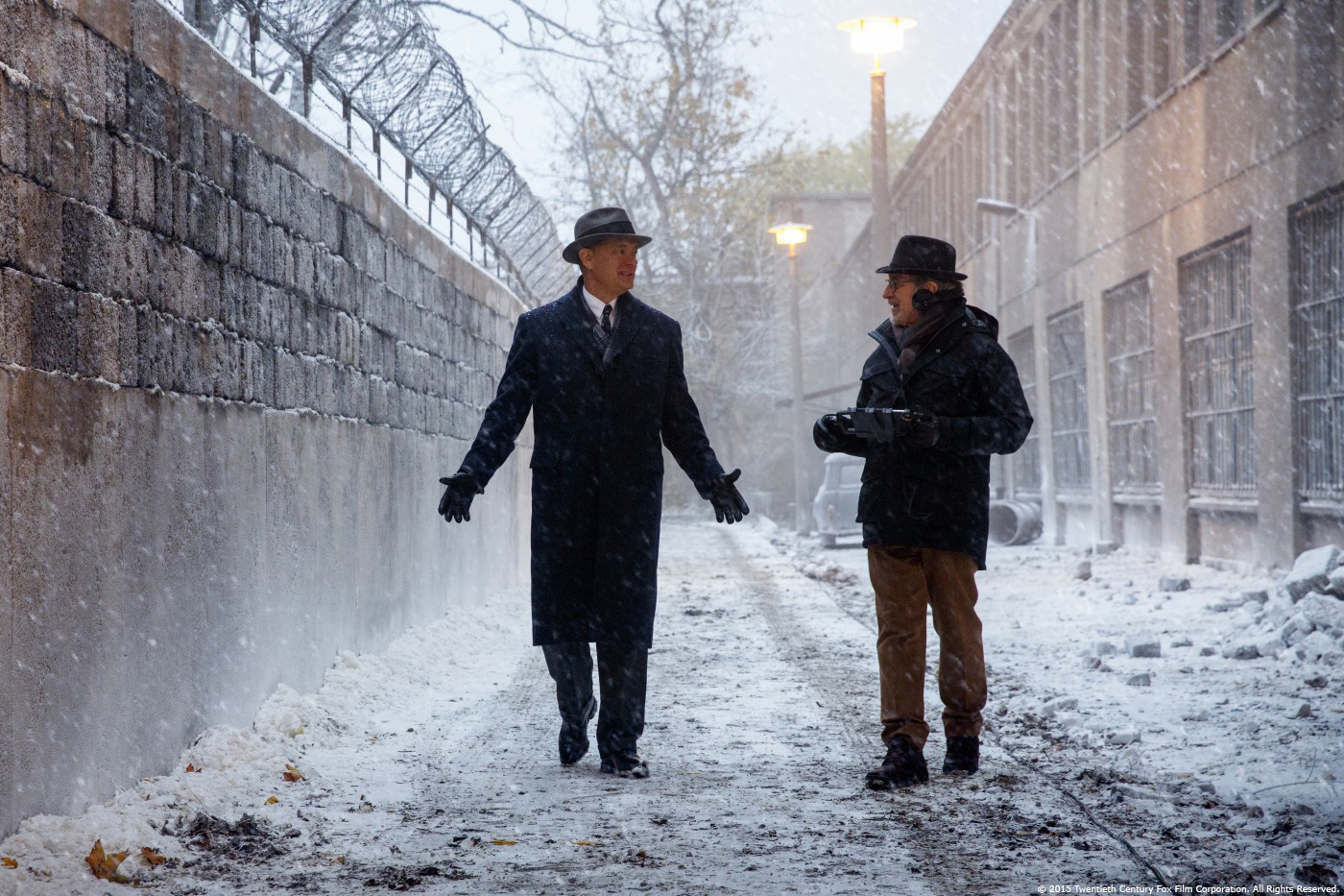
When I joined the pre-production there were no fixed plans about the realization of the vfx scenes. The main task was to create a period East Berlin and New York and we explored different ways to accomplish this. We knew that the subway scenes will be shot against blue screen, as for the car scenes we also considered making it the traditional way, on a trailer. The realization of the ‘death strip’ was thought as a full digital solution along with a blue screen element of running people, but I suggested building the foreground and extending it from a certain distance on to capture all the lighting, snow interaction and bullet hits for real.
Based on a concept by the production designer Adam Stockhausen, I setup a previs scene for the location by re-projecting the painting onto geometry that was based on satellite images. With this, I could early show how the scene might look like and we could play with the different speed variations for the virtual S-Bahn train crossing the border.
What are the sequences done by Pixomondo?
The entire show was divided between us and Double Negative. Dneg was working on the plane crash and we took care of the rest. Main tasks included the creation of a period New York, East Berlin, all of the subway scenes, plane and car rides, snow extensions, crowd replication, digital cosmetics as well as retouches. Most of the shoot took place on location, but there were also some sets built on the soundstage with the blue screen backdrops showing, for instance, either NY or the motel environment.
Can you describe one of your day on-set and then during the post?
My day was often divided between 1st unit and the background photography with a splinter unit. As the camera angles were defined shortly before shooting the scene only, even though we knew which shots were planned, setting up a proper blue screen in short times was a real challenge. While Janusz, the DOP, and his team were setting up the light and during the camera rehearsal, I was constantly checking the blue screen coverage making sure that no lamps or rigs were showing up behind windows and in reflections. I am a big fan of using all the art department dressed patina and dirt on windows, as it produces these nice flares and light refractions.
I was supported by a data wrangler and we collected all necessary data and measurements of the sets. With our small splinter unit we shot backgrounds for the various subway, rolling plane and car scenes. When we were shooting in New York we drove several times over the Manhattan Bridge to collect various angles and sun directions. We were accompanied by a police car that was driving in front of us, as we were shooting in the usual day to day New York traffic. The biggest challenge was to maintain a constant speed that was needed for the proper subway background. With the foreground elements scheduled to be shot later and the background not finally defined, I had to make sure to get the coverage of all possible angles and directions. With a splinter unit available we could also shoot comp elements in addition to the background photography.
How did you approach the creation of East Berlin?
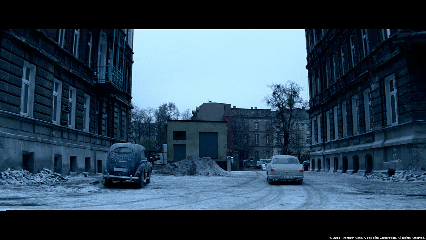
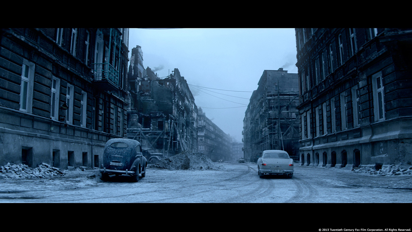
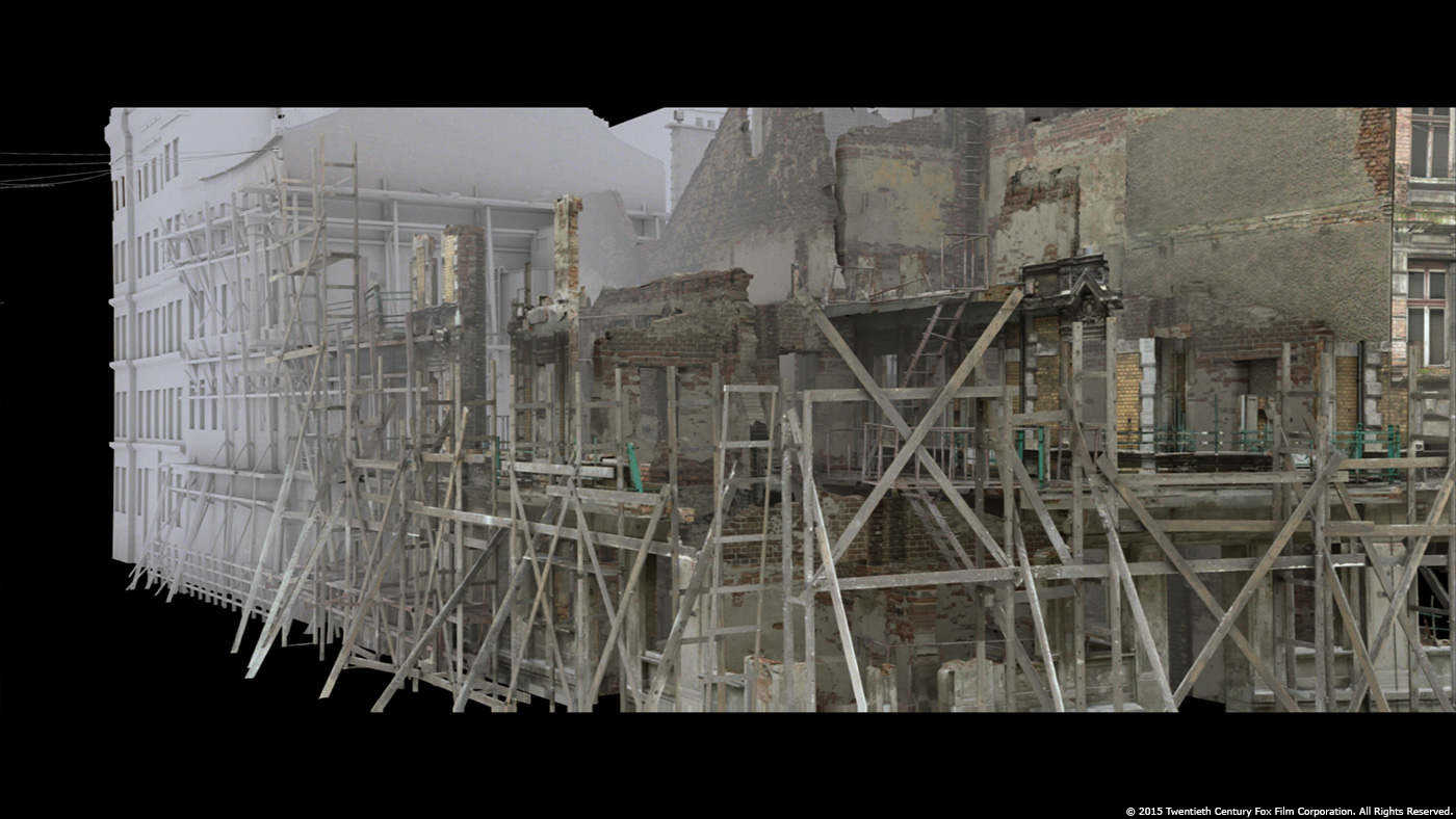
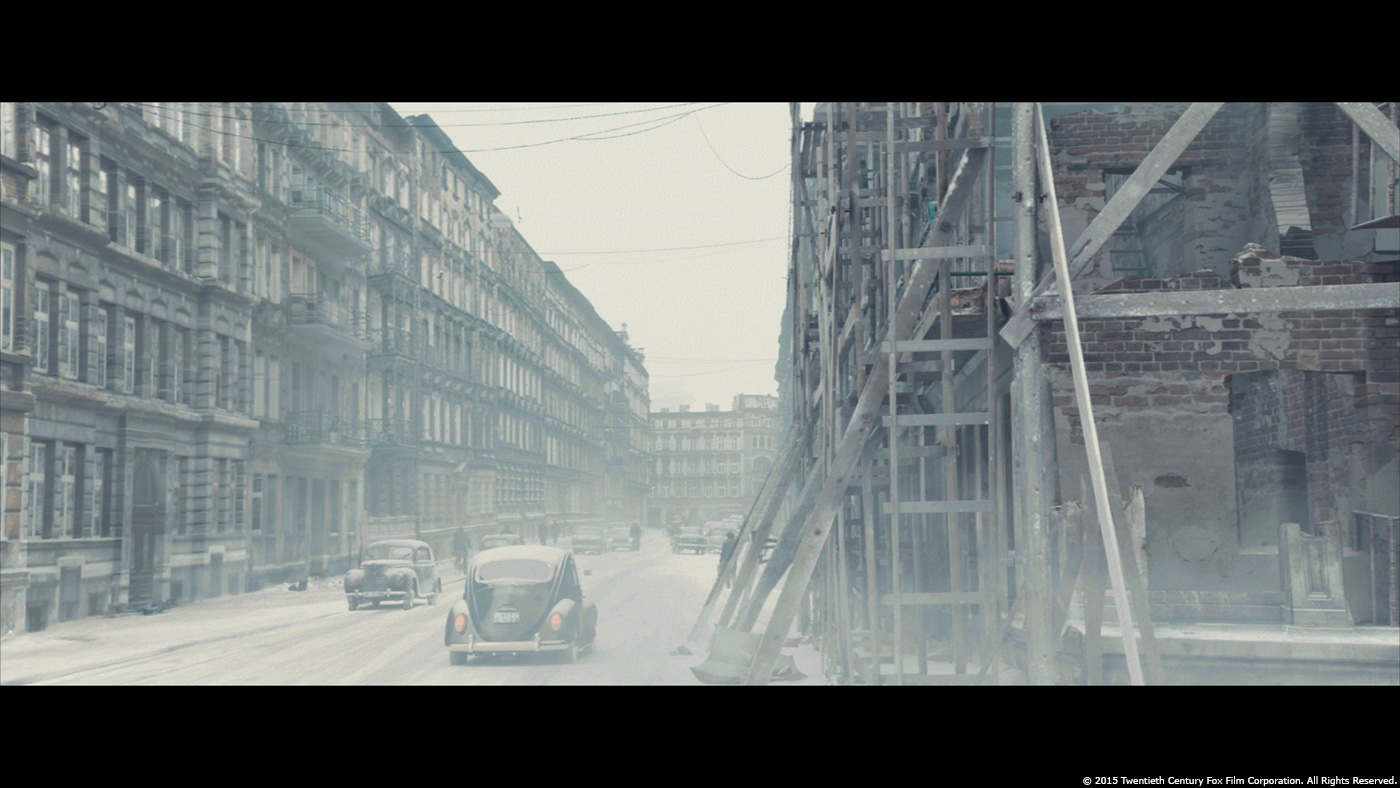
Under the environment supervison of Adam Figielski, we took the art department layouts as a basis and did some extensive research on this particular period, looking for photographs and documentations of that time. We didn’t go for a full city build as we wanted to layout the houses specifically for the shots. We were able to re-use the CG buildings in the different shots with a new distribution. As we had to extend the dressed up streets, the main source for the digital models was the set survey taken during the filming in Poland.
For every shot we produced a quick Photoshop layout based on image material of the research. After director’s approval the layout was rebuilt with 3D geometry to get proper parallax and to create correct lighting passes for the environments in day and nighttime situations.
Can you explain in details about the creation of this huge environment?
We varied the complexity of the CG models based on their appearance in the shots. This means, for instance, we had a very detailed construction with revealed interiors for a scene where Donovan (Tom Hanks) is looking at a torn down ruin. The neighbouring houses, on the other hand, have already reduced detail and carry the textures taken from the survey in Poland. The far background buildings are mainly the matte paintings projected on low resolution geometry. The digital sets were then filled with digital cars and pedestrians, trees and various props.
What was your method for the backgrounds for the car and S-Bahn shots?
As mentioned before, all cars and trains were shot standing still against blue screen. Shooting schedule demanded to shoot some backgrounds beforehand, so I had to ensure the coverage of all possible angles. One shot shows Donavan escorted in a car driving through a snowy East Berlin at nighttime. During the blue screen shoot, director came up with the idea of a long shot starting in the rear, going over the side into a front view through the windshield. This required a 180° environment showing a continuous background passing by. Usually you would take out all the car window glass to prevent any unwanted reflections from the studio and light rig, but I decided to keep the back window and the windshield. I wanted to get these beautiful refractions and light flares created by the moving light rig and the water drops and icing on the glass. We took out the two side windows towards camera, as they would have shown a full reflection of the camera and operator. To get proper reflections back on the car, we rendered a correct digital reflection pass of the environment.
To capture a 180° background, the camera department built a rig based on our technical previs. This demo helped us to define the best lens and angle setup for the camera rig. Four ARRI Alexa cameras were mounted on a steel plate that was fixed to the camera car. I could define sets of shots with similar perspective requirements for the foreground plates shot upfront to limit the amount of drive-by’s. One out of the four cameras got selected as hero camera, covering the main angle to prevent any unwanted distortions. This can appear around the connection borders of the plates, due to the fact, that we decided to use pretty wide lenses to cover the needed ~180°. These plates got matchmoved, stitched and projected onto a simple geometry representing the street. This allowed us to move the camera freely in a 3D environment, which we also used to render the digital snow. We removed all modern elements from the plates, however, as most of the backgrounds where put in defocus, it was less work than expected.
Can you explain step by step about the creation of the death strip between East and West Berlin and how did you manage the various different light conditions?
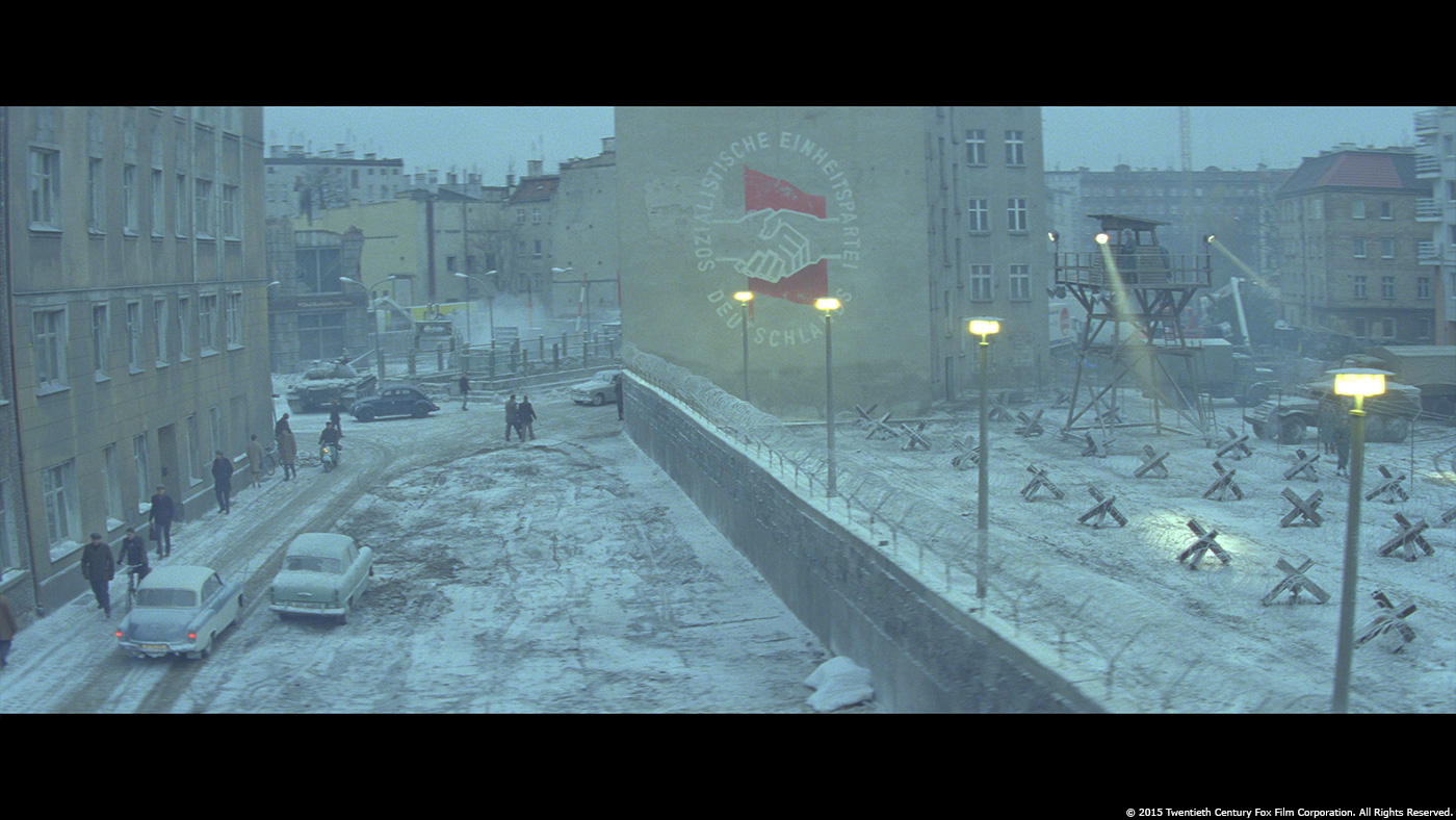
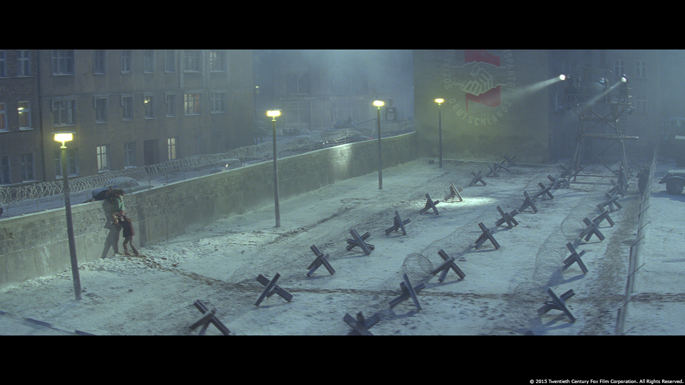
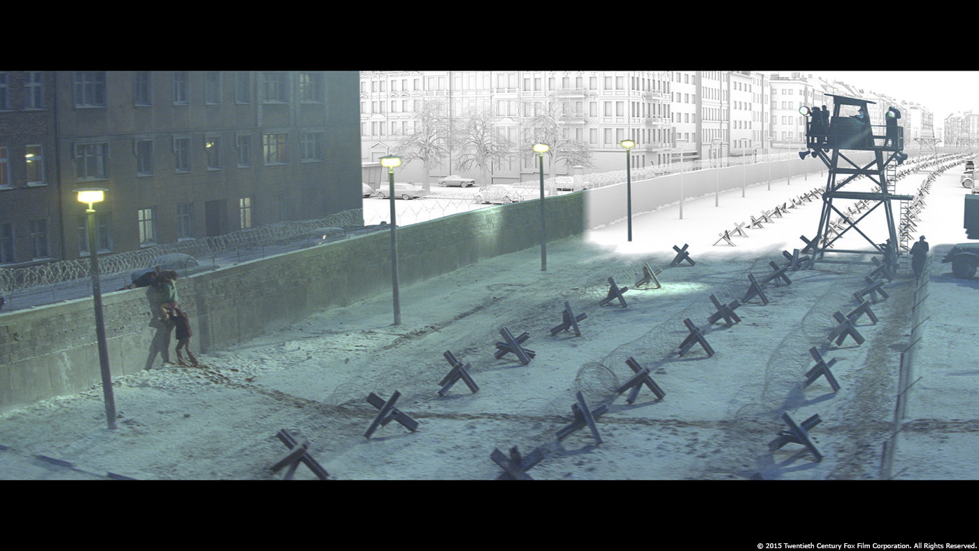
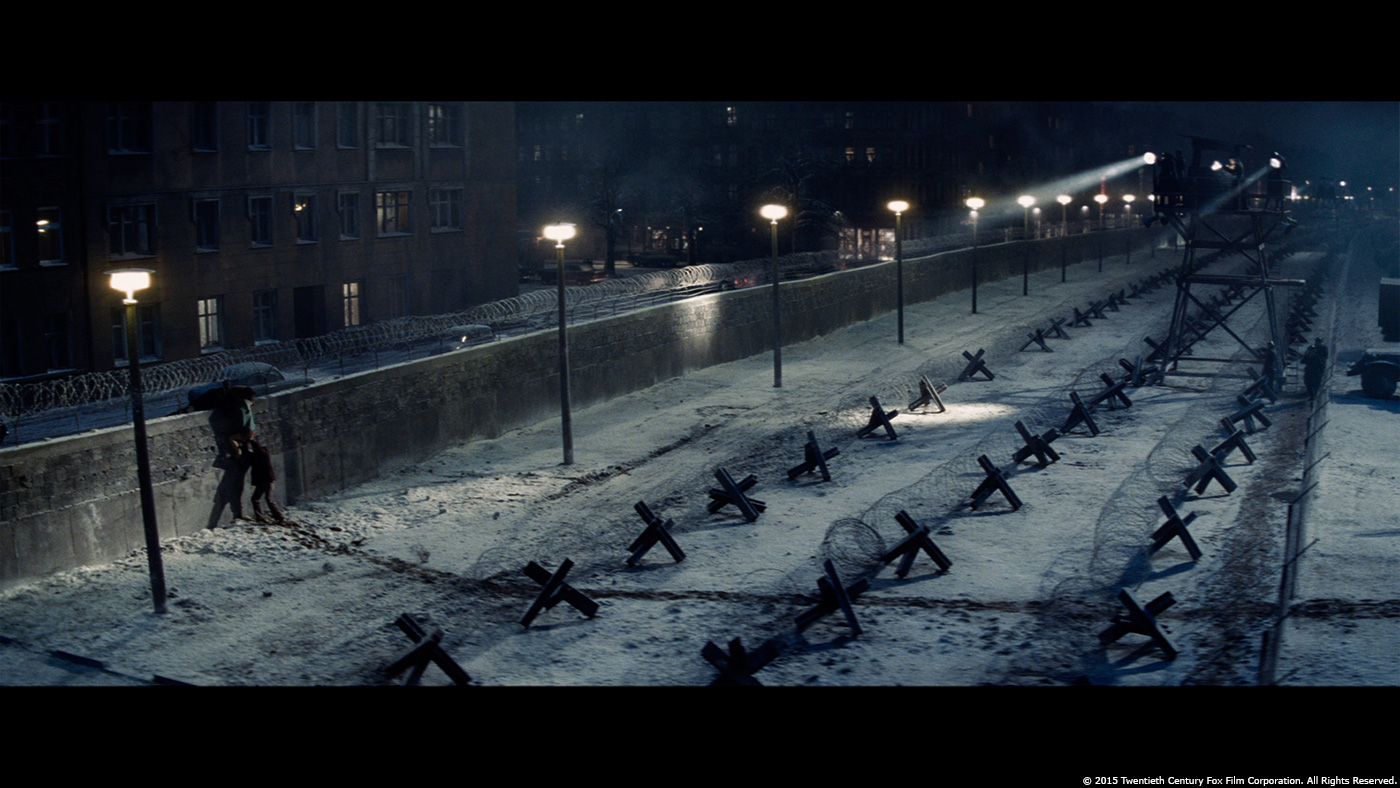
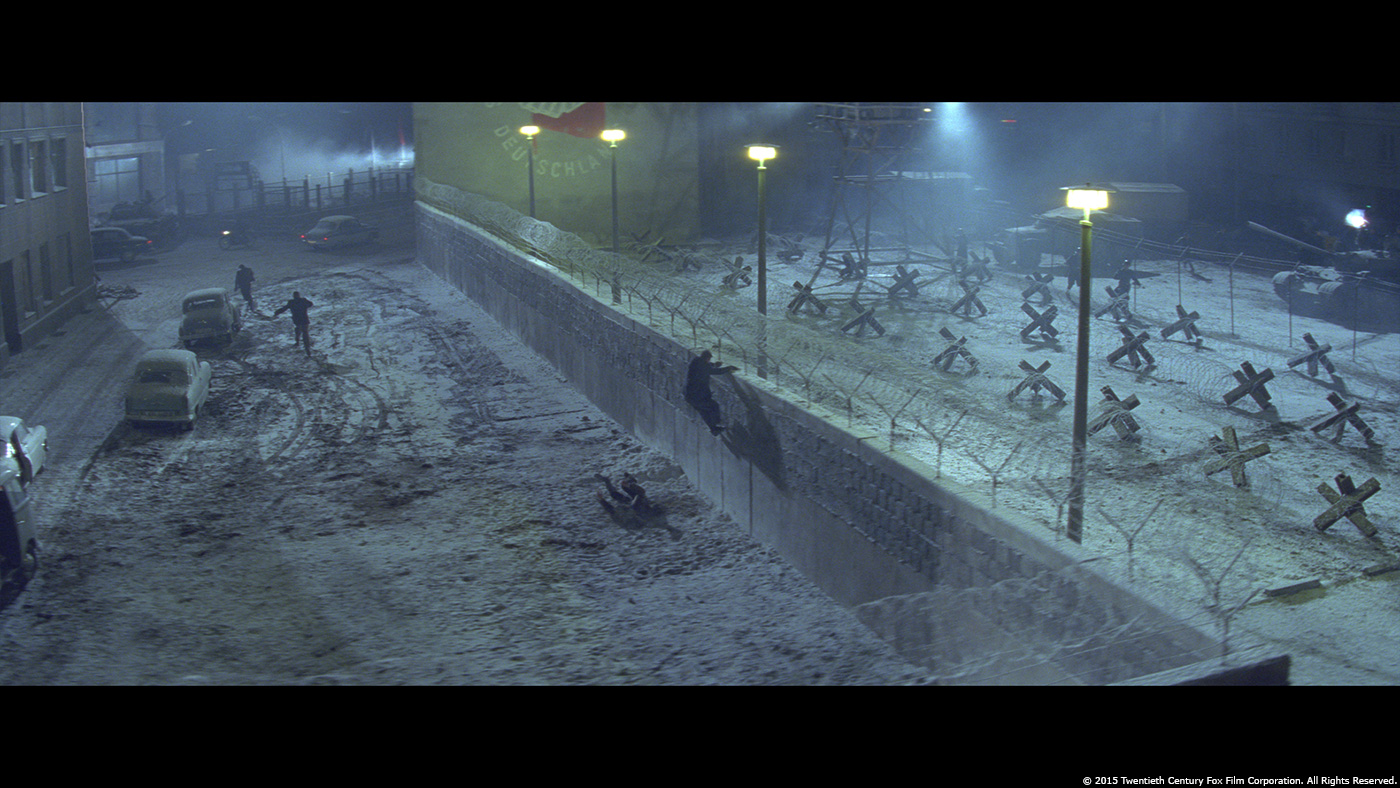
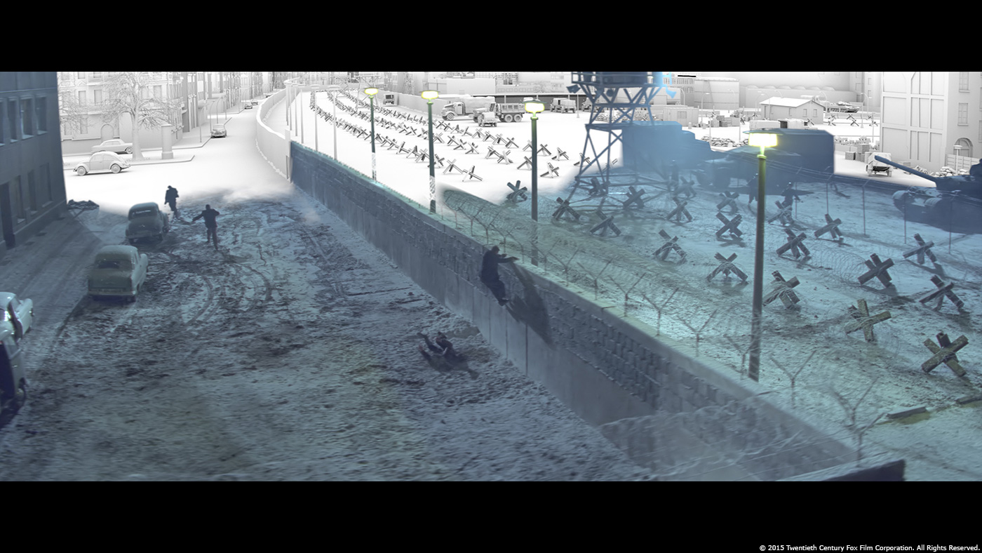
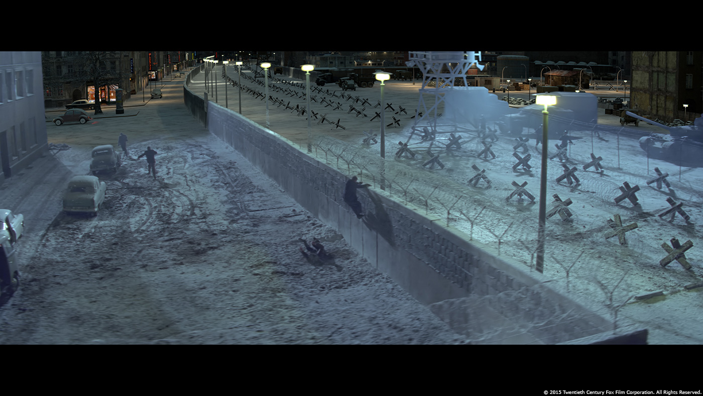
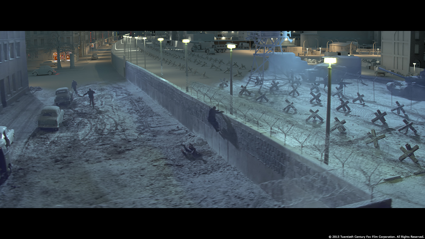
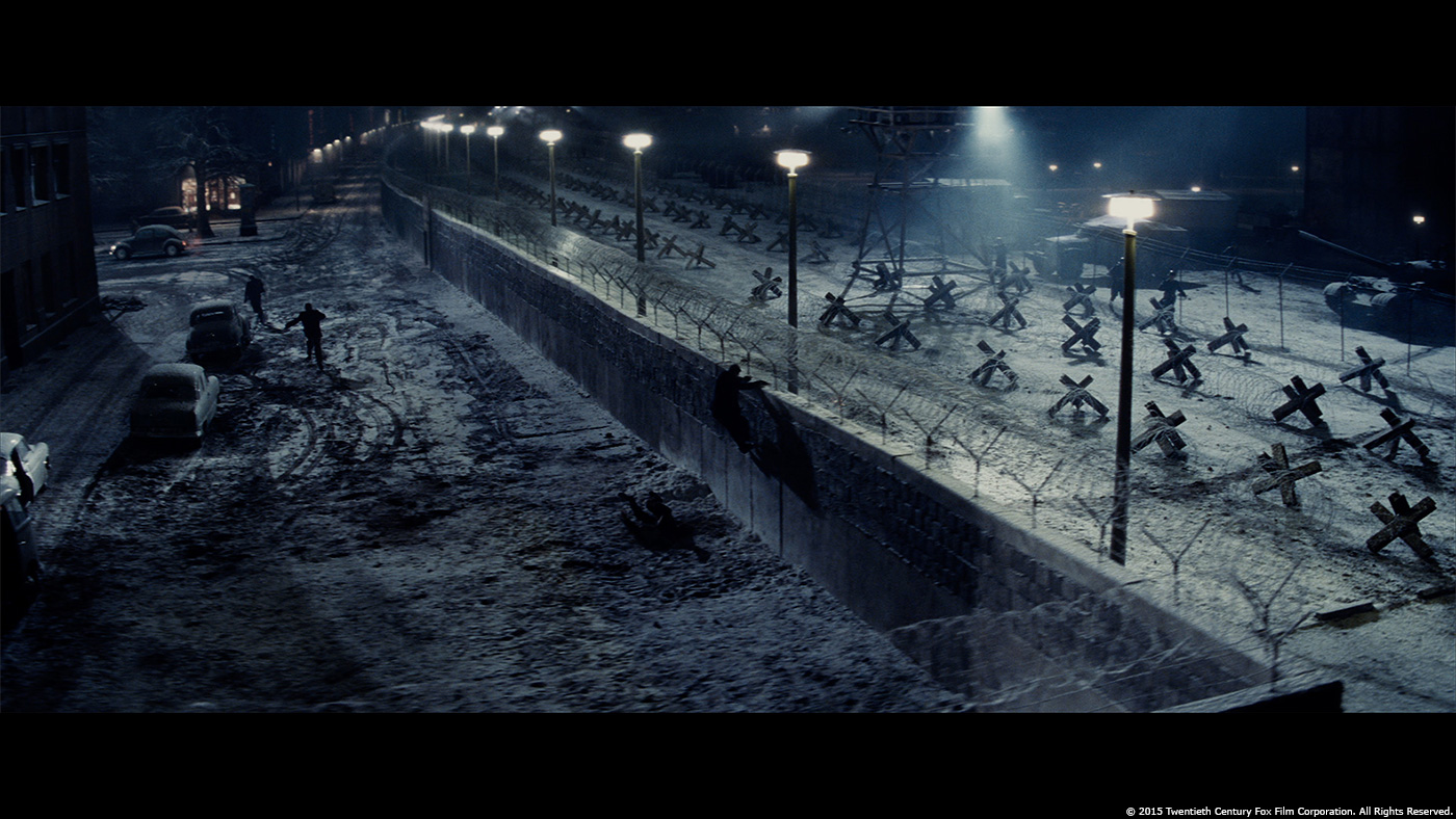
The decision during the pre-production going with a partially build set gave us a great start. We took a lot of references and textures on set to rebuild the guard tower and to extend the wall and lamps. As we needed this environment during both day and nighttime, we shot textures in the correct lighting conditions. The art department provided us with a day time concept and we adopted it for the night look with the additional light sources. I wondered if the shots at night might become quite dark after the final grading, so we placed the light sources carefully to always present a readable environment.
For the death strip area, we wanted to show the very different life situation in East and West Germany. While the eastern side is dominated mostly by military houses and industrial zones, the western side shows shops, neon signs, a kiosk, etc. There are pedestrians on the street, trees and cars driving around in the West, while the eastern sector shows military vehicles and soldiers guarding the wall.
Based on the first concept we prepared a more detailed version based on photo references. After approval, the layout was rebuilt with 3D geometry carrying enough detail to catch the digital light for the night scenes. In addition to the render passes, the CG environment got a 2D paint-over to add even more detail, dirt and irregularities.
As the original location was also used for other scenes with a different set dressing, we had to remove a big building right in the center of the frame. There was no way for us to construct such an enormous green screen to cover all elements. So I planned for roto work right from the beginning. It was a very complex task, especially with the fine structures of the tower and all the atmosphere and light flares in the night plates.
Comp had to merge all elements together and they put a lot of effort to get the atmosphere back into the plate using smoke cards placed within the 3D environment, in order to get the proper parallax. To match the anamorphic film material, we had to ‘reduce’ the quality a lot towards the lens edges, adding chromatic aberration, blurs and distortion.
Can you tell us more about your work on the New York environment?
Apart from some interior shots, most of the scenes were shot on location. The opening shot shows Abel (Mark Rylance) painting a self-portrait, a set built on a soundstage with a blue screen coverage behind the windows. For the outside we used a 2,5D environment based on plates we shot from a rooftop right beside Manhattan Bridge. This location was also used for the scenes where Able is leaving his studio. The street was beautifully dressed by the art department with cars, shops, old signs and garages. It was a great source of texture for us that we used to transform other plates back in time. We removed modern elements and replaced them with period houses, props and, in particular, period advertisements.
Did you want to reveal to us an invisible effect?
In a movie like this, by all means, all the effects should be as invisible as possible. Production wanted to be very much historical correct when setting the story back in time. One of the heavier retouches was the removal of the yellow safety line at the subway’s platform edge, something not existent in the period time. It was a steady cam scene on a crowded platform, so a lot of legs had to get roto’d to remove the line.
What was the main challenge on this show?
The main challenge was to make the visual effects shots not fall out of the movie. It is all about the characters and the acting and the environments are the supporting role. I really enjoyed the very organic style during making the movie – nothing was dead locked. Some shots were designed on set, some shots dropped or added – the challenge was to be prepared for everything. As much as vfx people want to have everything defined as early as possible, I think a good movie has to evolve during the making.
Was there a shot or a sequence that prevented you from sleep?
The car rides made me ponder the most, actually. This type of visual effect is very much standard, but I’ve seen some of them being not always successful in other movies. With lots of long dialogs during the car scenes, the audience would have time to analyze the image. I didn’t want to underestimate the complexity of the real world appearance but compositing lead Falk Hofmann did a fantastic job.
What do you keep from this experience?
It is always worth to capture as much as possible on film and not taking the shortcut to CG too early.
How long have you worked on this show?
I joined the show at the end of July 2014 during the pre-production and we wrapped at end of August 2015, so slightly over a year in total.
How many shots have you done?
Overall about 200 effect shots, with a total running time of about half an hour.
What was the size of your team?
The team size varied as we progressed. Our producer Sebastian Meszmann scheduled starting with a bigger temp team, going over to the usual crew size during main production and ramping up towards the end for the additional shots that were coming in from editorial. With all the supporting team members we had about fifty people working on the show.
What is your next project?
Currently I’m working on the highly anticipated new season of GAME OF THRONES. Unfortunately I cannot say anything about the upcoming feature, but it seems to be a great show.
What are the four movies that gave you the passion for cinema?
THE SHAWSHANK REDEMPTION is one of my favorite classics. From the times I was younger, I’d say E.T. and STAR WARS, and later JURASSIC PARK revived this very special movie magic. It seems like my taste has been very much influenced by Steven Spielberg, hasn’t it?
A big thanks for your time.
// WANT TO KNOW MORE?
– Pixomondo: Official website of Pixomondo.
© Vincent Frei – The Art of VFX – 2016


