In 2017, Paul Butterworth explained the work of Animal Logic on GUARDIANS OF THE GALAXY VOL. 2. He then worked on ALIEN: COVENANT.
In 2011, Jason Bath explained the work of Fuel VFX on CAPTAIN AMERICA: THE FIRST AVENGER. Then he worked on many films like THE AVENGERS, PROMETHEUS, IRON MAN 3 and GUARDIANS OF THE GALAXY VOL 2.
How did you and Animal Logic get involved on this show?
We have worked with VFX Supervisor Chris Townsend on his previous three Marvel projects and he asked us again to be part of the VFX team on CAPTAIN MARVEL which we were very excited about.
How was the collaboration with directors Anna Boden, Ryan Fleck and VFX Supervisor Christopher Townsend?
Our collaboration is with Chris directly and it’s a very good relationship built up over a number of years through the various challenges that he has thrown our way. Chris knows we are very good at conceptualising and solving unusual creative briefs and he assigns us work accordingly. He’s great at communicating the intent of a scene and the directors’ preferences and guiding us towards creating something that can hopefully exceed expectations.
What was their expectations and approach about the visual effects?
It was clear the directors wanted an in-camera, organic approach to the visual style of the film and for the performances to take centre-stage and not be over-whelmed by the visual effects. Lens artefacts and flares, optical effects, film grain were key aspects of the Mindfrack Memory sequence we designed the treatment for; and physically-based light beams, water sims, and atmos were the themes for the Supreme Intelligence Chamber – though those rules get bent near the end of that sequence though as the environment starts warping and collapsing.
How did you split the work amongst you?
We usually have a lot of different creative elements to solve in our package of work on Marvel films so the team we put together is multi-skilled and comfortable with iterating. That way we can progress the various look dev tasks in parallel with each other and jump on exploring new ideas quickly.
What are the sequences made by Animal Logic?
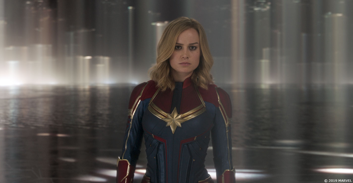
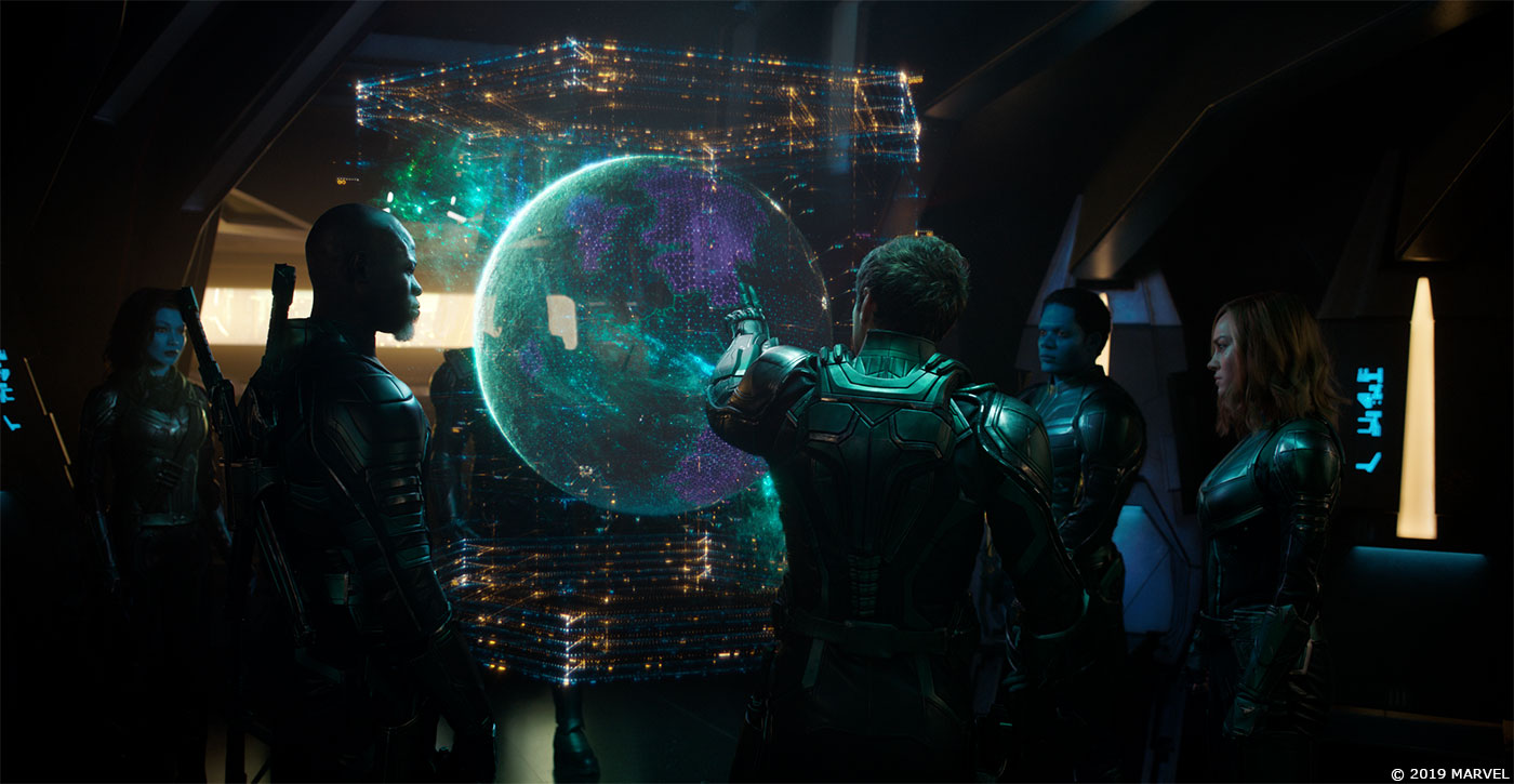
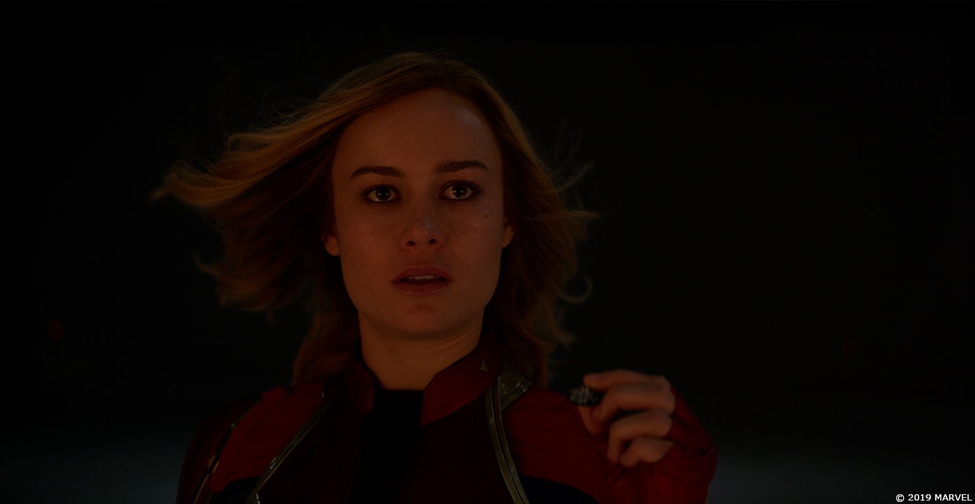
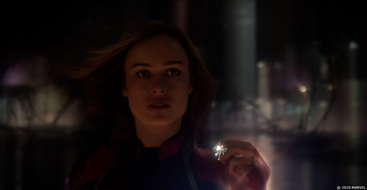
We looked after the Supreme Intelligence Chamber, the virtual space where Captain Marvel meets with the Supreme Intelligence (SI); the Mission Briefing hologram where Yonn-Rogg outlines the plan to extract Soh-Larr from Torfa; and we designed the treatment of the Mindfrack Memory sequence shots where the Skrulls are scanning through Carol’s memories.
Can you explain in detail about the creation of the Supreme Intelligence Chamber?
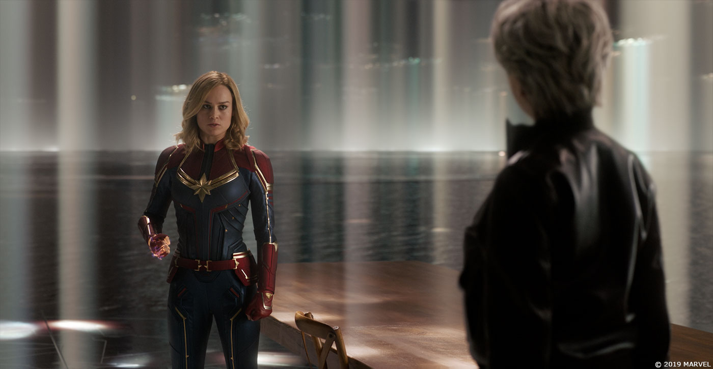
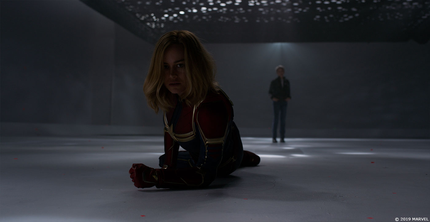
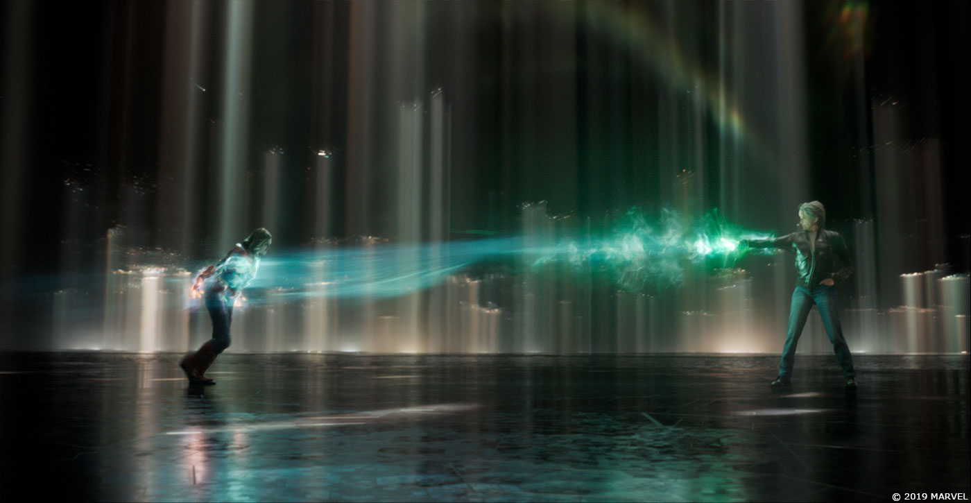
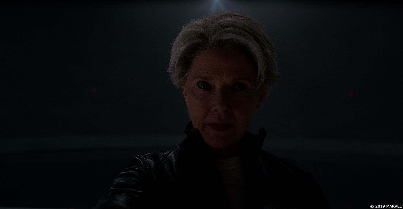
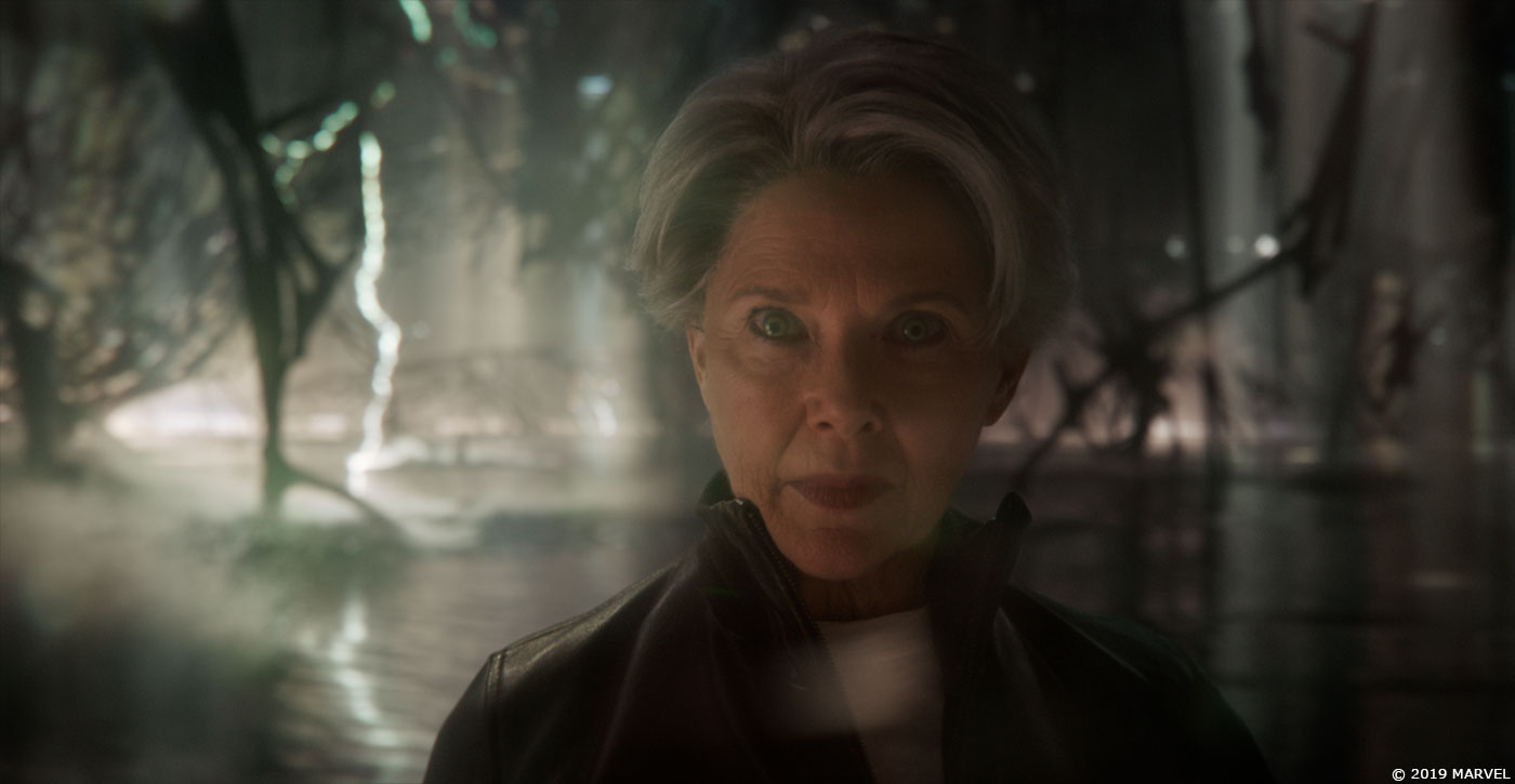
The Directors were keen on a single photograph of the Louvre in Abu Dhabi as inspiration for the look of the SI chamber. What we took away from the image was you could see the environment was significant in scale, quiet, had a very subtle colour palette and relied on soft light playing through its high ceiling to illuminate the space.
This was the starting point for Animal Logic to develop the look of the set extension. Chris was keen to explore creative options around this image and did not want us to just mimicking this structure.
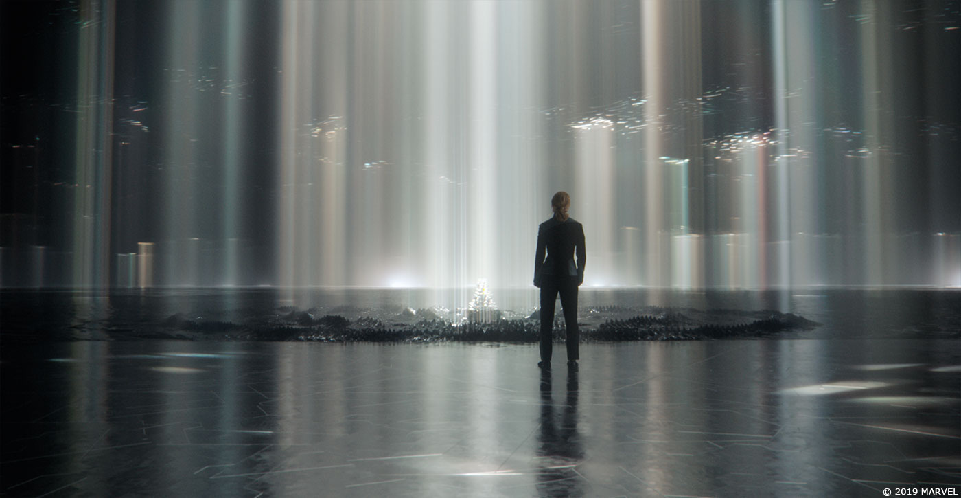
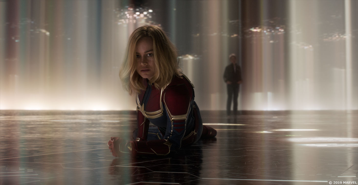
So we created a lot of concept frames and procedurally-generated models that explored different architectural forms for this infinite space. We investigated folded Gehry-inspired structures; a ceiling that was formed using viscous fluids to build dendritic patterns and filigree; and looked at Voronoi fractals to construct organic frameworks.
We also submitted more ‘left of field ideas’ where the characters were on an island surrounded by a gaseous nebula, or in a vast desert dressed with partially formed objects from Carol’s memories, through to a folded Esher-like landscape that challenged the audience to question which angle they were looking from.
Through this process we narrowed back in towards the final look you see in the film which still has some inspiration from the initial Louvre Abu Dhabi reference.
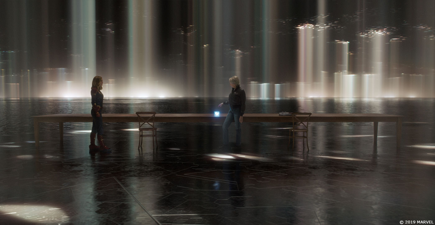
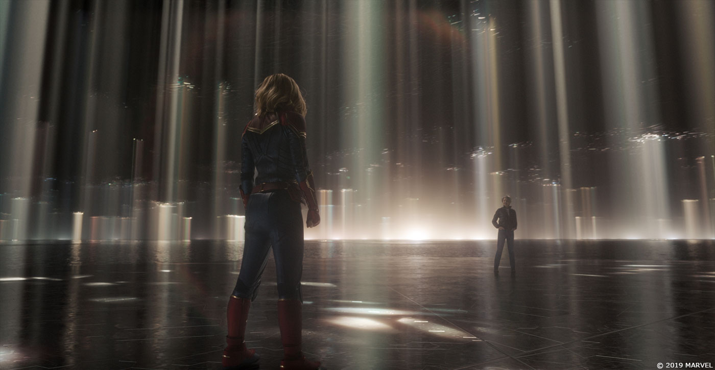
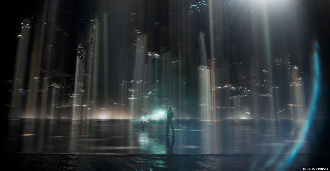
For the light beams Lighting Supervisor Francesco Sansoni undertook a multitude of motion tests to determine how many there were and at what speed they should move. This sounds simple enough but the look and mood of the scene could change dramatically based on these variables – we probably did at least 30 variations. The look of the horizon was also researched to ensure the space felt vast and infinite and was designed with variations in brightness as you panned around it to ensure visual interest in the camera coverage.
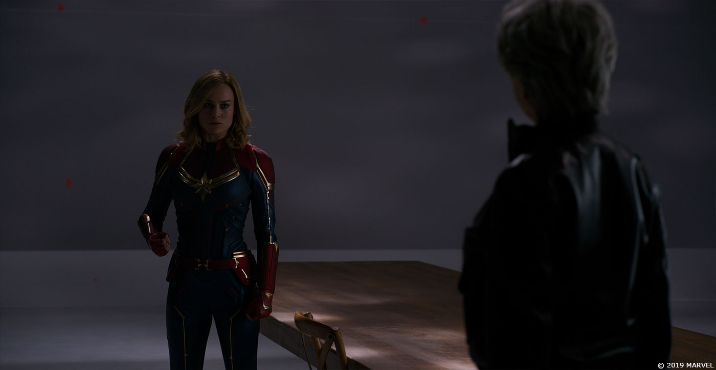
The exposure and colour grade of the Chamber was well considered. The Directors’ wanted the first scene to have a bright, crisp look that was calm and unthreatening. The second scene was to feel a bit warmer with it becoming darker and more menacing as Carol confronts the SI. Our Comp Supervisor Alex Fry created a lot of colour wedges to help set the grade and exposure of both scenes.
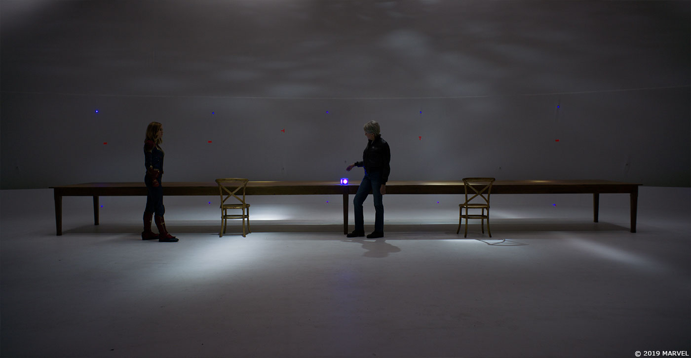
To give the white studio floor a little more texture we explored adding some flecked details into it but after presenting an option of a polished reflective surface, it became evident this was preferred and we would be replacing the studio floor completely. We used the opportunity to carve a subtle texture pattern into the new CG floor that referred to Kree hexagon patterns employed elsewhere in the production design of the film.
Initially there was just a single pool of water in the centre of the room. But among the concept explorations was the idea that the characters were on an island surrounded by an expanse of liquid that had other islands floating out into the distance that the studio really liked. These islands were laid out in the same Kree-inspired hexagonal patterns found on the floor.
How did you handle the lighting challenge?
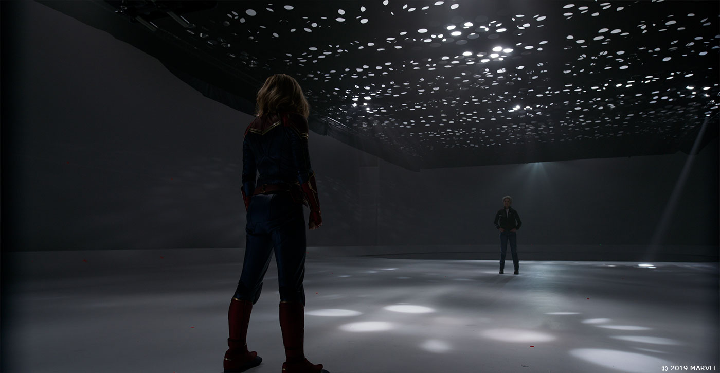
Initially, the brief was to approach the construction of the SI Chamber as a set extension with the Directors wanting to capture as much in camera as possible and then enhance where required, which is a great approach as there is a sense of reality for the actors to work with and for the VFX artists to embellish later on.
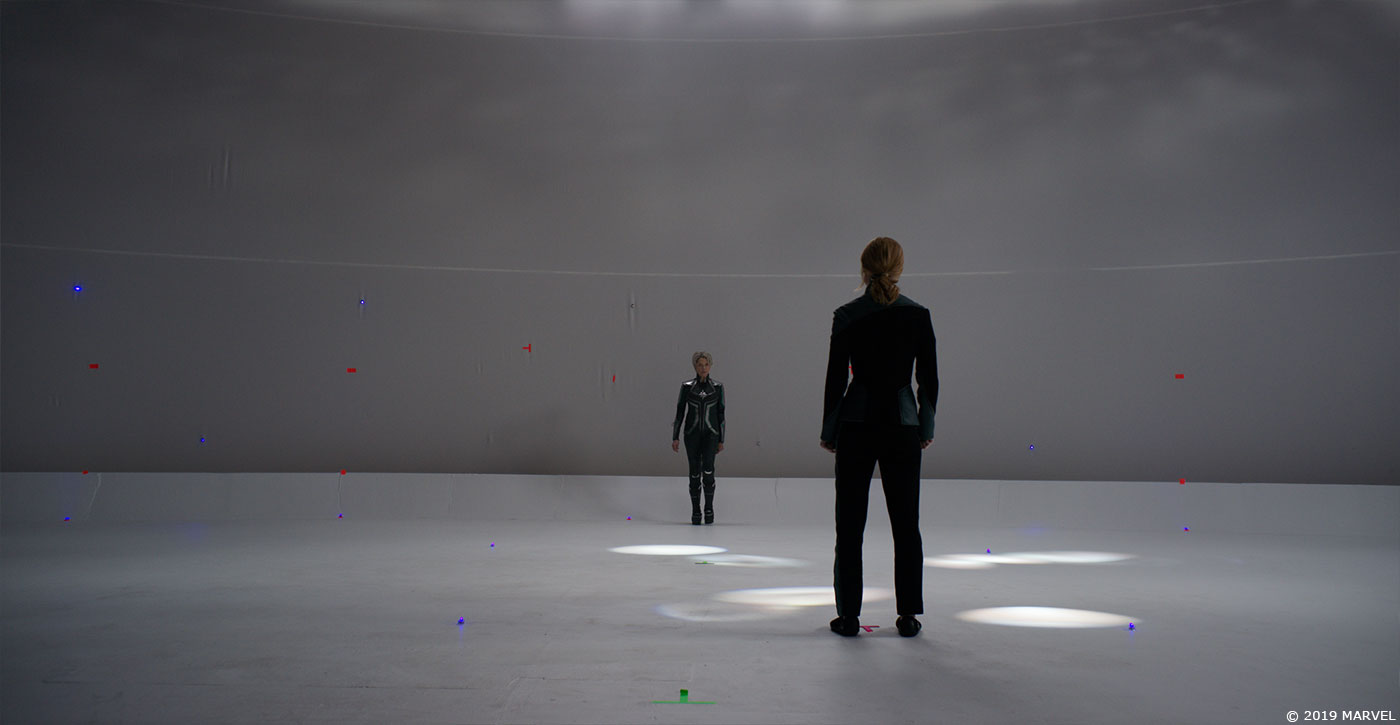
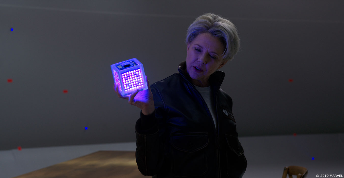
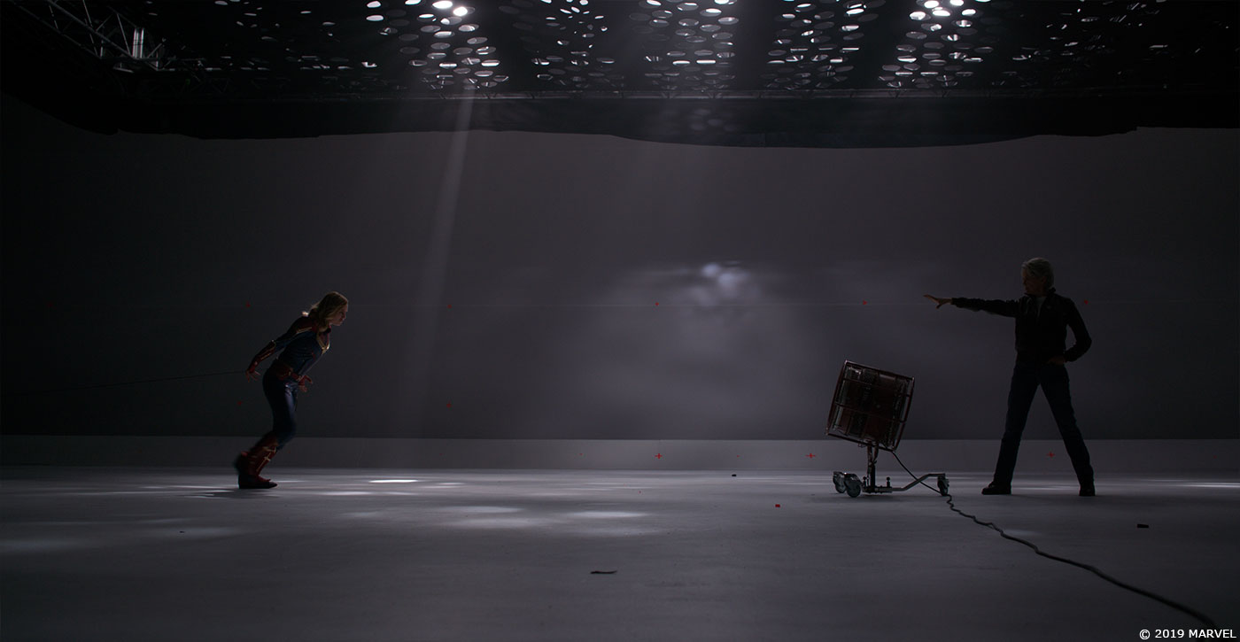
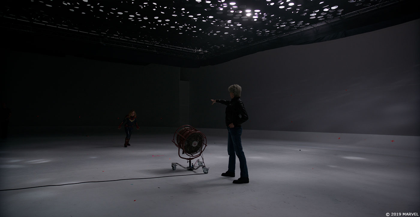
Our plan was to paint out the light rig, extend the walls, the floor and the practical pool to an infinite horizon and then dress in light shafts and atmospheric smoke where required. Based on this the cast were filmed with an elaborate overhead light rig with evolving gobo patterns and servo-controlled lighting in a white studio cyclorama environment.
Once it became evident that we would be exploring more elaborate looks for the Chamber it inevitably meant we would need to rotoscope the actors off the footage and composite them into a CG set.
This required very detailed work for all departments. Everything from camera tracks, asset creation and surfacing, animation work, lighting set-ups, roto and compositing had to be highly accurate so we could match the performances and lighting of the actors with digital doubles, and add a virtual set and FX elements. Once we had the look, layout and motion of the light beams sorted out we created a system where additional single light beams could be added into the set extension by the compositors. This way they could add beams to justify existing in-camera lighting interaction on the actors and also add beams as per art-direction by client. In those cases we would then add our own interactive lighting on the cast.
Can you tell us more about the FX work inside the Chamber?
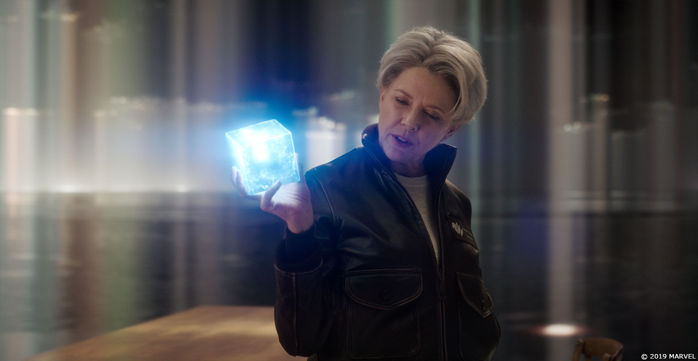
There are over a dozen different FX elements that needed to be developed for the Chamber scenes including hair sims, water sims, set destruction, energy blasts, fiery hands, the tesseract, a sticky-liquid wall, and a vortex of memories.
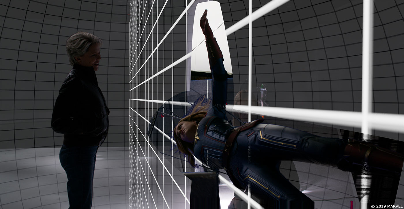
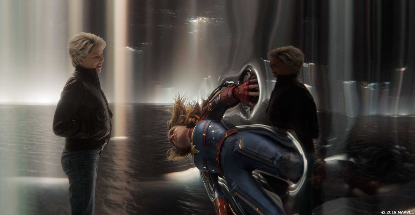
For many of these FX there are no real-world references to go by so we were undertaking our own exploratory look dev. For Carol being thrown against the ‘sticky-wall’ the challenge was to create a surface that was only revealed on impact and behaved somewhat like a liquid through which she would slowly sink and emerge out the other side. The tests we did on non-Newtonian fluid simulations got the best response from Chris so we refined that look as we investigated whether the wall should look milky, clear or reflective – settling on a mercury-like quality for the liquid surface.
The throwing shot is a combination of stunt actor transitioning to a digital double which then had a live action face element projected onto it. So another FX component was the simulation of CG hair. This was handled by FX artist Adam Katz who needed to simulate 3 different states of hair within the same shot – realistic motion as Carol is thrown sideways; hair splayed out and partially trapped against the sticky-wall surface; then hair floating in the zero-g world on the other side of the wall.
A lot of the success of the hair sims was also due to our artists painstakingly matching up our digital hair to the live action reference: the assets team recreating the clumps and curls of Carol’s hairstyle in the CG groom on the digital double, and the compositors working with the renders to get the right colour balance and sheen.
Once Carol has moved through the sticky wall she finds herself in a black void, eventually tumbling through a vortex of her memories. These were created in Houdini using a combination of live action elements volumetrically projected and then layered at different intensities by compositor Alex Coble.
As with a lot of the luminous elements in our shots we experimented with giving memories an ‘optical’ and analogue quality that we knew the Directors would respond well to. To achieve this, we combined real optical flares that we had filmed in-house along with temporally splitting the rendered passes, so the light evoked a more ‘prismatic’ quality.
For the finale of this sequence we see Carol chose to stand and fight; her fists charging up with energy as she withstands the force of an energy blast from the Supreme Intelligence and the Chamber begins to warp and collapse.
The hand energy look was a set-up developed by Trixter which we adapted for the needs of this sequence. As Carol fights, this energy grows along her forearm to represent her building towards ‘going Binary’. The Binary FX was developed by ILM so similarly, we adapted their set-up to add the flaming energy to her forearm in our shots.
For the SI blast, FX lead Matt Ebb worked closely with compositor Matthew Wynne to design and simulate a wide range of elements that were combined in various ways to explore what this blast could look like. Chris was keen on the beam being a combination of refractive energy that could bend and distort the space like a fluid but was more aggressive like a directed air-blast.
When the beam hits Carol, we see her absorb some of the energy and deflect parts of it around her like a corona. To achieve this effect, we carefully rotomated Brie’s performance for each of these shots and simulated fluid energy elements to run across her body from the blast impact point. We then rendered the digital double with this interactive light on, so that the comp team could combine both the SI blast and interactive energy on her costume with the live action performance.
The last bit of look dev for the sequence was the collapsing Chamber environment. The brief was that this was not to be a standard destruction sim – this is a virtual environment that Carol is wresting control of away from the Supreme Intelligence so the laws of physics need not apply. With that in mind we again turned to liquids for inspiration and FX artist Luke Gravett developed how the ceiling structure could start to melt and droop like taffy, with any pieces that fell into the water creating large slow-motion waves and plumes.
As the Chamber starts to fail Lighting artist Herbert Heinsche developed a darker, moodier look for the environment with the previously vertical light beams now drifting off-kilter at all angles; flickering lights were created by the compositing team to complete the look of the final chaotic moments inside the Chamber that ends on a slow-motion FX explosion of the control device that Carol removes from her neck. This effect was developed to refer to the look of the energy core explosion seen earlier in the film.
Can you explain detail about the creation of the various holograms?
We created the Mission Briefing hologram which showed the positions of the various combatants on Torfa and identified the key players in the combat. The GUI of the hologram was designed in our art department by Designer Toby Grime then it was set-up as a master asset in Houdini by 3D generalist Aevar Bjarnason. This included a ‘cage’ that was the boundary of the projection that had animatable elements of 2D graphics and 3D widgets as well as major assets such as the Skrull soldiers and various depictions of the planet, all of which had a point-cloud look. Aevar handled all the hologram animation and rendering out of Houdini, using deep-image renders for the shot where Yonn-Rogg walks through the hologram.
We have a lot of experience with creating Marvel holograms – ensuring they have a nice sense of volume to them, are visually interesting, and communicate the necessary plot-points so it was great to be able to draw on that.
How did you manage the interactive lights with the actors?
For the Supreme Intelligence Chamber, the actors were filmed against a white cyc with a moving gobo above them that was used to create some practical light beams. The original intention was that this environment would be quite under-stated and ethereal and that some shots, particularly on short lenses, might be able to be captured fully in-camera. However, as look dev on the Chamber progressed it became apparent we would need to fully extract the cast from the live action plates, including replacing the floor. Rather than fight the practical lighting though we worked with the existing light interaction on the cast and props by art directing the CG light beams accordingly.
How was choreographed the actors movements with your holograms?
Marvel is very experienced at filming these sorts of scenes so the actors had very good guidance on set and we were fine to structure the hologram animation around the live action performances in the plates.
Which sequence or shot was the most challenging?
The shots first revealing the Supreme Intelligence resolving out of the water were very challenging. Chris loved the idea that the beams of light from the ceiling interacted with the water surface in some kind of way and, like a three-dimensional printer, the surface reacted and swirled to form and reveal the SI.
We approached this as two tasks. FX artist Heather Cardew developed ferro-fluid inspired simulations of the water surface rippling inwards that triggered a procedural structure to grow upwards while fellow FX artist Jayandera Danappal focussed on the twisting, crystalline formation of the human silhouette of the SI which begins to walk forward.
Blending both Jay and Heather’s work together was still a considerable challenge for compositors Alex Lay and Matt Wynne who were encouraged by Chris to continue to use the light beams throughout the reveal, refracting both the FX crystal form and the live action element of Annette as the beams coalesce. A considerable amount of FX elements were rendered for them to experiment with and discard as these shots were some of the very last to be finished and we needed to have the flexibility to develop the look of this effect while we were moving towards finishing the shots.
Is there something specific that gives you some really short nights?
Not really. While we were very busy in the final months of the schedule and we had many different look dev items to solve we felt we were always headed in the right direction and were reassured by Chris and the Marvel VFX team that we were on track.
What is your favorite shot or sequence?
My favorite section is Captain Marvel’s being thrown against the sticky wall and slowly sinking through to the other side. It’s when that scene starts getting a bit trippy and it involved a whole range of skills for us to pull off – digital double animation, CG hair sims, unusual fluid sims, live action face projections, excellent comp work.
What is your best memory on this show?
Working with Chris – he’s so rewarding to work for and is genuinely supportive and respectful of everything we do.
How long have you worked on this show?
We were on the show about 12 months.
What’s the VFX shots count?
Around 300.
What was the size of your team?
We had about 60 artists on the project
What is your next project?
PETER RABBIT 2 will keep Animal Logic very busy in 2019!
A big thanks for your time.
WANT TO KNOW MORE?
Animal Logic: Official website of Animal Logic.
© Vincent Frei – The Art of VFX – 2019




I love the vfx work done by whole team.