In 2013, Lindy DeQuattro explained the work of ILM on PACIFIC RIM. She then worked on DOWNSIZING.
How did you and Mill Film get involved on this show?
Mill Film was already engaged before I came on board, but I got a call that they needed a production side VFX Supervisor to work with James Bobin in London on DORA THE EXPLORER and I was already in after that first sentence. James is well known for his comedies and I was excited to see what he would do with this franchise. My kids were huge Dora and Diego fans for many years when they were younger, and who wouldn’t want to spend a few months in London? After I read the script, I was even more excited because I loved the way they turned Dora into a really endearing character who captured the spirit of the cartoon but was smart and independent and a leader. I’m always looking for projects with strong female characters.
That’s the first big show since the rebirth of Mill Film. How did you approach this challenge?
Obviously, there was some concern about trusting such a big project to a brand-new facility so props go to Stephanie Allen and everyone at Paramount for giving us the chance to step up to the challenge. I think one of the things that gave everyone the confidence to move forward with Mill Film was that MPC London was setup as a partner on the project. With both companies being under the Technicolor banner, we had no issues with proprietary software or incompatible pipelines, etc.
How was the collaboration with director James Bobin?
James is amazing! He’s really easy going, a super nice guy, very patient, and has a great sense of humor. He moves really fast: he talks fast, thinks fast… you really need to be on your toes to keep up with him. There were a few sequences in the story that he felt weren’t reading well to the audience and I was able to throw out some ideas to clarify those moments. For example, during the sequence where the kids travel through the field of giant pink flowers, the test audiences thought the beginning and end of the field were the same location and they didn’t understand that the kids had traveled all the way through the field before Alejandro hit the flower and released the pollen. We were able to clarify that by adding a high angle shot of the whole field showing the kids approaching the end. I found a high angle plate of the kids that we re-purposed for the shot and the rest of it was CG. There was also some confusion on the tilting hallway inside Parapata where it didn’t really look like the hallway was tilting because of the way the plates were shot. We re-projected the footage on to some rough geometry of the hallway, did the tilt in 3D and patched in the missing bits that were revealed in order to make that gag more obvious to the viewer. In general, James is very articulate about what he’s looking for, and he didn’t really waiver too much from his initial direction.
What was his expectations and approach about the visual effects?
James was mostly focused on the animation since Boots and Swiper were critical to the overall comedy in the film. Our animation supervisor, Matt Everitt, and his team of animators did an amazing job bringing their personalities to life. In every sequence, they blocked out a lot of different ideas before settling on the final action for these characters, and we frequently went back and added additional moments to punch up the comedy or add a comedic ‘button’ on the end of a scene. In terms of some of the other effects like the underwater whirlpool, the destruction of Parapata, or the princess transition, he really left that in my hands to a large extent. I showed him concepts and he chose the look he wanted to achieve. Then I showed him progress as we moved forward, but he didn’t really nitpick once we settled on the overall look. He was mostly concerned with the effects looking real and telling the intended story point, and he left the minutiae up to me. I spent much of my career as an FX TD doing a lot of particle work so I think he knew that it was in good hands.
How does his animation director background help him for this show?
James has a lot of experience in both animation and comedy, so he knew exactly what he wanted to see, and he has an excellent sense of comedic timing. He was able to give very clear feedback on the animation and he was very decisive about whether the animation was working or not in a particular sequence which was extremely helpful. We were able to be really efficient with our resources because we didn’t do a lot of ‘searching’ for the right look or the right action.
How did you organize the work with your VFX Producer?
I worked with VFX Producer, Roma Van Den Bergh on this project and she was great. She has a lot of experience with big VFX projects and she was really critical with creating the turnover and delivery schedules and making sure that James had enough time to iterate on the animation. We also had a lot of test screenings, which is not uncommon for a comedy, so she had to constantly adjust for those deliveries as well. We also had multiple vendors working on the project, including in-house teams of compositors and previz artists so she certainly had her hands full with all that, as well as interfacing with Paramount. I worked mostly with James Bobin and with our editor, Mark Everson, as well as with the VFX Supervisors at each of the vendors.
Can you tell us more about the previs and postvis process?
We used a great postvis tool on DORA called SketchVis. SketchVis artists are classically trained 2D animators who use a custom program on a Cintiq-like setup to block out the action as hand-drawn characters on top of the plates. It was really helpful in that it gave the editor something to cut to in terms of timing, it not only blocked the action but did so in a much more expressive way than classic CG previz, and it allowed us to begin our test screenings much earlier than we otherwise would have been able to, because we didn’t have to wait for 3D animation to be completed before bringing our characters to life. It was also tremendously helpful to our 3D animators because they not only had timing and blocking already worked out for them, but they also had key expressions and mood for the characters. We also used some classic CG postvis on the more action-oriented sequences.
Can you explain more about Boots and Swiper’s design and creation?
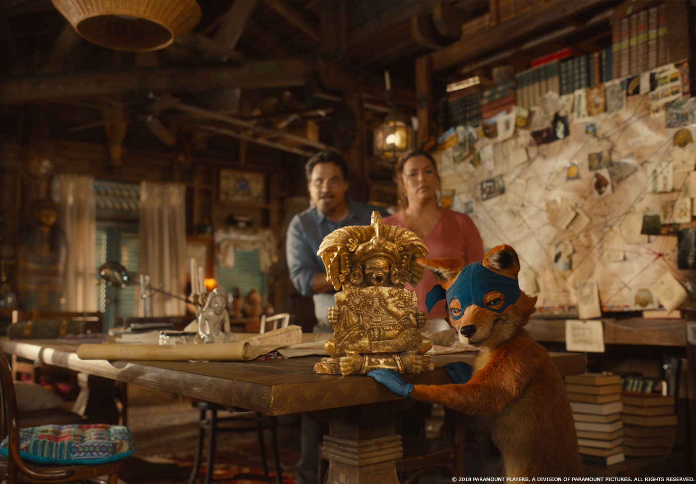
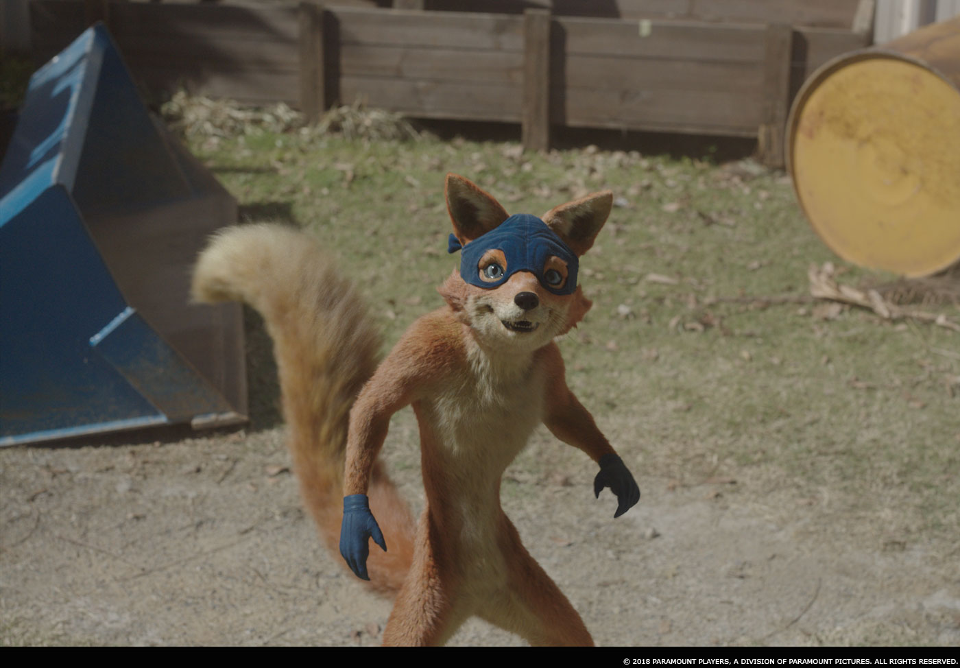
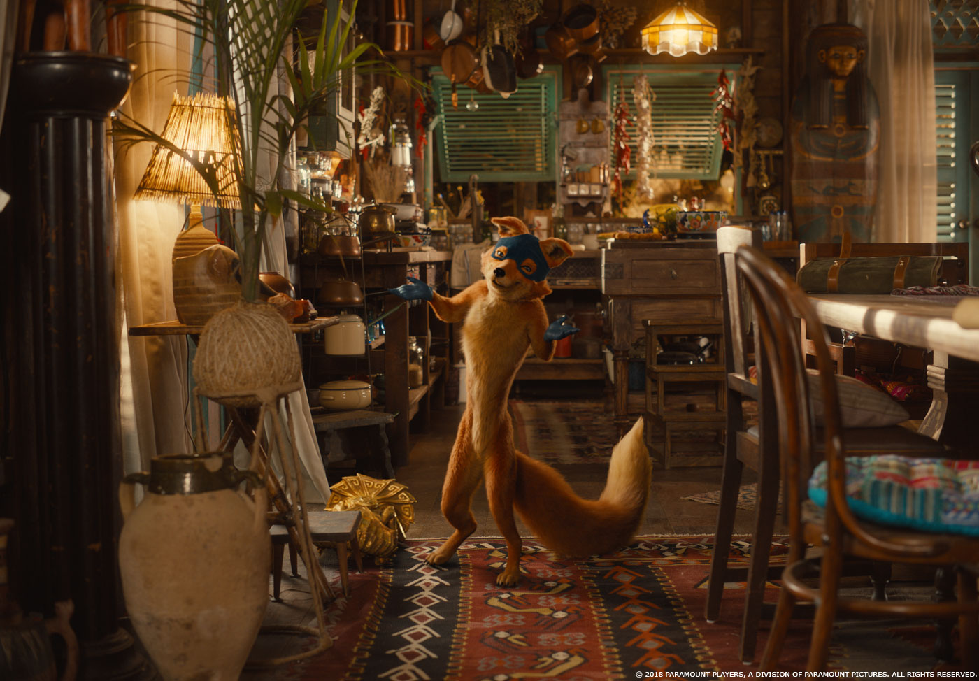
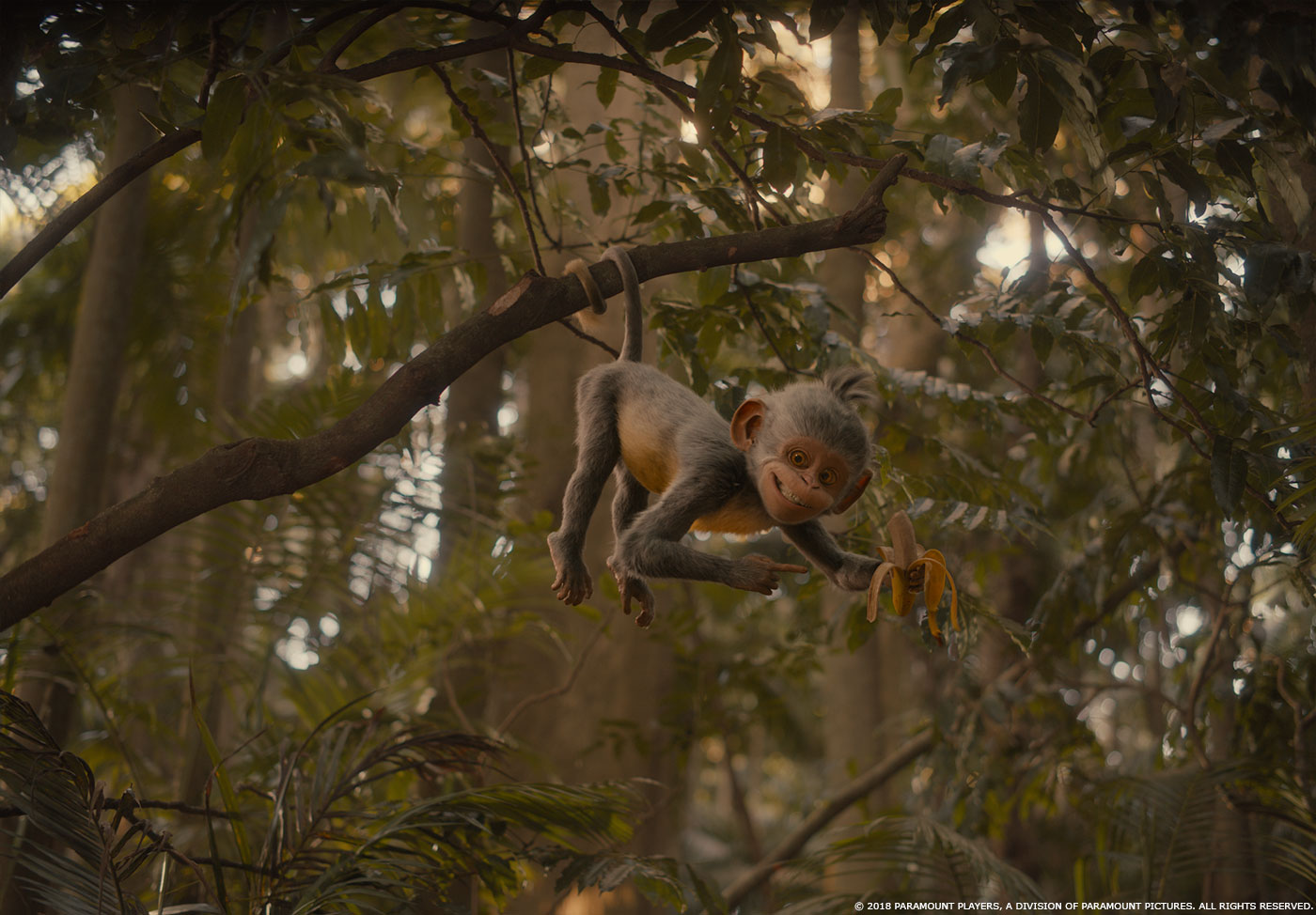
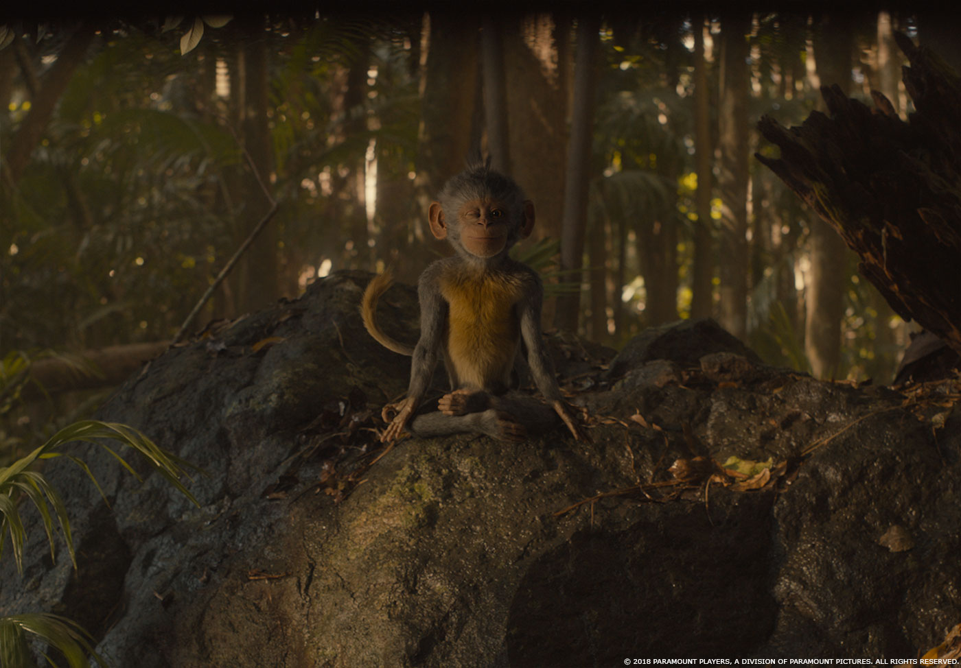
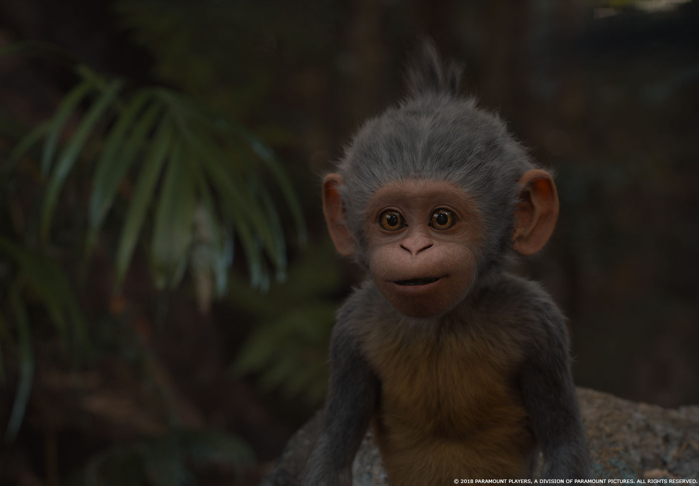
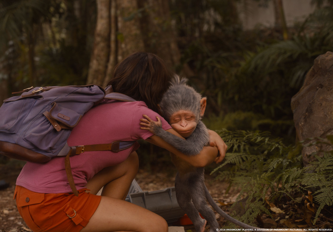
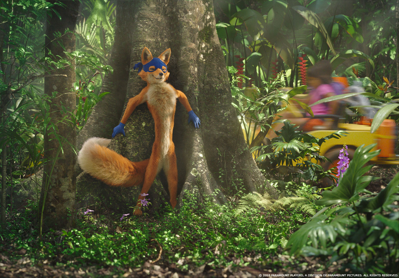
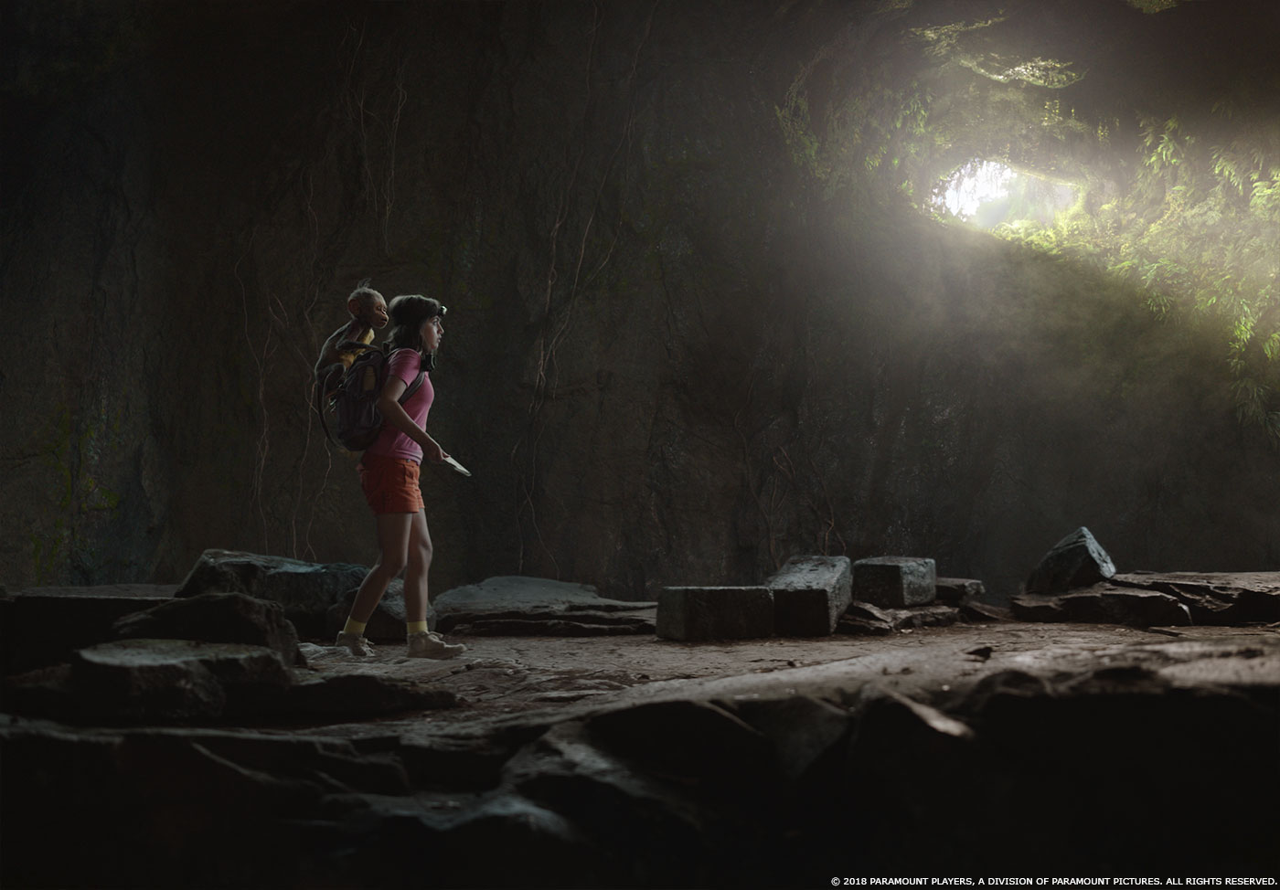
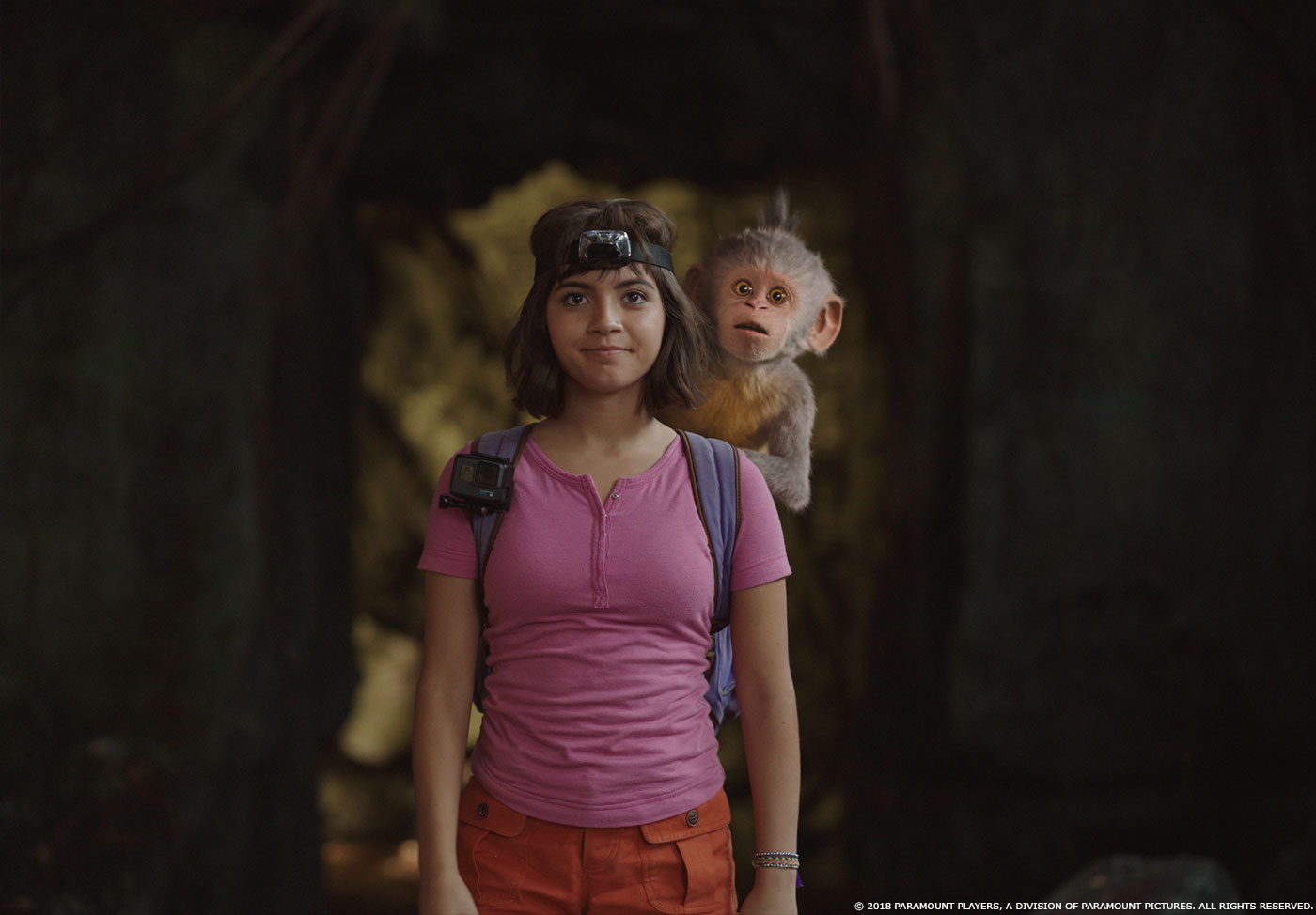
When I started on DORA, the first thing I did was work with the asset team to tweak the design of the two main characters: Boots and Swiper. The early versions of both characters were extremely photorealistic and needed to be both cuter and more appealing than the real thing. They had been matched extremely well to reference of a wild spider monkey and a red fox which made the fur quite matted and the skin wrinkly and very translucent on Boots. I worked with the asset team to tweak the design relatively early on. The tweaks brought back more of the cuteness from the original cartoon, but at the same time allowed the characters to fit into live action plates with live actors. To achieve the looks, we smoothed out the skin of both characters, minimized skin discolorations, and gave them both a rosier overall skin tone. We really held off on tufting fur and gave them more of a “freshly washed” look. Then we tweaked the fur colors to be a bit more saturated. The overall result is two really cute and recognizable characters from the cartoon that still fit well into our plates and sit well with the actors.
Can you tell us more about their rigging and animation?
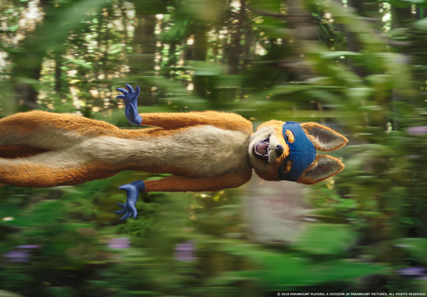
After we’d nailed the look, we needed to tackle the animation. Swiper in particular was very challenging, because in the original cartoon, he moves with an almost snake-like motion. Because our original rigs were based on a real monkey and a real fox, our characters were somewhat constrained in what they allowed us to do with the animation. We went back and gave ourselves more flexibility in terms of their squash-and-stretch capabilities and allowed our quadrupeds to walk on two feet. Matt Everitt and the Mill Film animation team went though many iterations of our rig and completed a lot of additional shape work, which gave us better movement of our characters and great 2D animation quality which really harkens back to the original cartoon.
Beside the original cartoon, what kind of references did you receive for the characters?
We looked at all kinds of reference for Boots and Swiper. We looked at a lot of Looney Tunes animation for some of the more cartoony stuff. We referenced Tom Cruise’s signature straight-backed run for Swiper running upright. We looked at the recorded performances of Benicio Del Toro (Swiper) and Danny Trejo (Boots) for a lot of the facial work. Production had also hired an actor to ‘perform’ as Boots and Swiper and we referenced a lot of their actions especially in our early blocking phases. One thing we rarely referenced was a real red fox or a real monkey as Boots only occasionally acts like a monkey and only when he’s over-acting.
Can you elaborate about the fur and hair work?
One of the key identifiers for Boots from the original cartoon is the trio of hair tufts that sits on top of his head. At first, the tufts just kind of sat there and we only had them reacting to physical forces in the scene, like wind and gravity. But then Matt Everitt, our animation supervisor, had the great idea to have the tufts mimic Boots’ expressions and mood. When Boots is happy or excited or full of energy, the tufts stick straight up, but when he’s sad or scared, they droop or curl up. It was actually really tricky to execute because even though the tufts were animated, they had to go through the fur pipeline and sometimes the sim stomped on the animation or vice versa, but eventually we sorted it out and it’s a great addition to Boots’ character.
How did you handle the eye-work challenges?
Getting the eyes to emote and look realistic was a major consideration on this film, especially for Boots as he’s a main character. Boots has several scenes where he is very close up and he sometimes looks directly into camera. We looked at a lot of reference of not only monkey eyes, but also human eyes. We leveraged existing MPC technology for Mill Film that had renders automatically spit out all the passes that were needed. Those renders then had to be dialed in by the compositor to get just the right look per shot. James liked to always have a pinpoint spec kick in the eyes, so we added that to our generic and then it was mostly a matter of balancing reflections and spec with diffuse color while not letting the eyes get too bright and glowy. We also had to keep an eye on Boots’ iris color which had a tendency to sometimes go too yellow or too brown when it should live somewhere between the two. For Swiper, he had fewer closeup moments, but we did start by giving him slightly orange irises and then James had us change them to blue about half way through post which turned out to be a good call. There were a couple of shots that were up for final and then we’d notice that Swiper still had his old orange iris color and we’d have to kick it back to fix.
Boots and Swiper are seen in various light conditions. How did you manage this aspect?
Lighting was certainly a big challenge with Boots, we found that his look was extremely sensitive to lighting direction. Lighting him using mostly sun direction would cause the down light to blast the top of his muzzle and simultaneously make his eyes very dark. This happened because his muzzle sticks out quite a bit and has an abrupt change in surface topology from the rest of his face. we found that his look was extremely sensitive to lighting direction. By the end of production we ended up naming that particular lighting situation, and I’d catch myself saying, “oh this shot has ‘scary Boots’ again, let’s add a beauty light on his face and lower and soften the key”. When it comes to Swiper, he actually dropped into all the shots pretty cleanly. We always turntable the characters in multiple lighting environments before we begin shot production and Swiper dropped in as expected based on that look development.
Can you tell us more about the opening sequence?
The opening sequence was really a one-off from the rest of the film. It’s supposed to be a bit of a fantasy for young Dora so the look of the jungle is a bit magical: more saturated than in the rest of the film, more flowers, pink in the sky, a bit of sparkly pollen floating around near the ground. We added a promist effect and a slightly shallow depth of field. The idea is to immediately link the film back into the original cartoon for the audience. That’s also the only time in the film that you see baby Boots and Swiper has a slightly different look in those shots as well.
The movie takes us to exotic locations. Can you elaborate about their creation?
For Parapata, we really wanted to be as accurate as possible to Incan architecture and culture so we pulled a lot of reference of Machu Picchu and other Incan ruins. We had a rough blue print of the city from the production designer and we used that as our starting point to actually build out the city in 3D. We created all the buildings and went through a few iterations of different layouts until the travel of the characters through the city (as dictated by our plates) made sense with our build. Once we had the models, we began to texture everything, and then added set dressing like trees, grasses, the marketplace stalls, flags that blew in the wind, statuaries, etc. Because we see Parapata in many different lighting environments and we also see it destroyed and put back together, it really only made sense to approach it mostly 3D. Only the background panoramas were added as matte paintings.
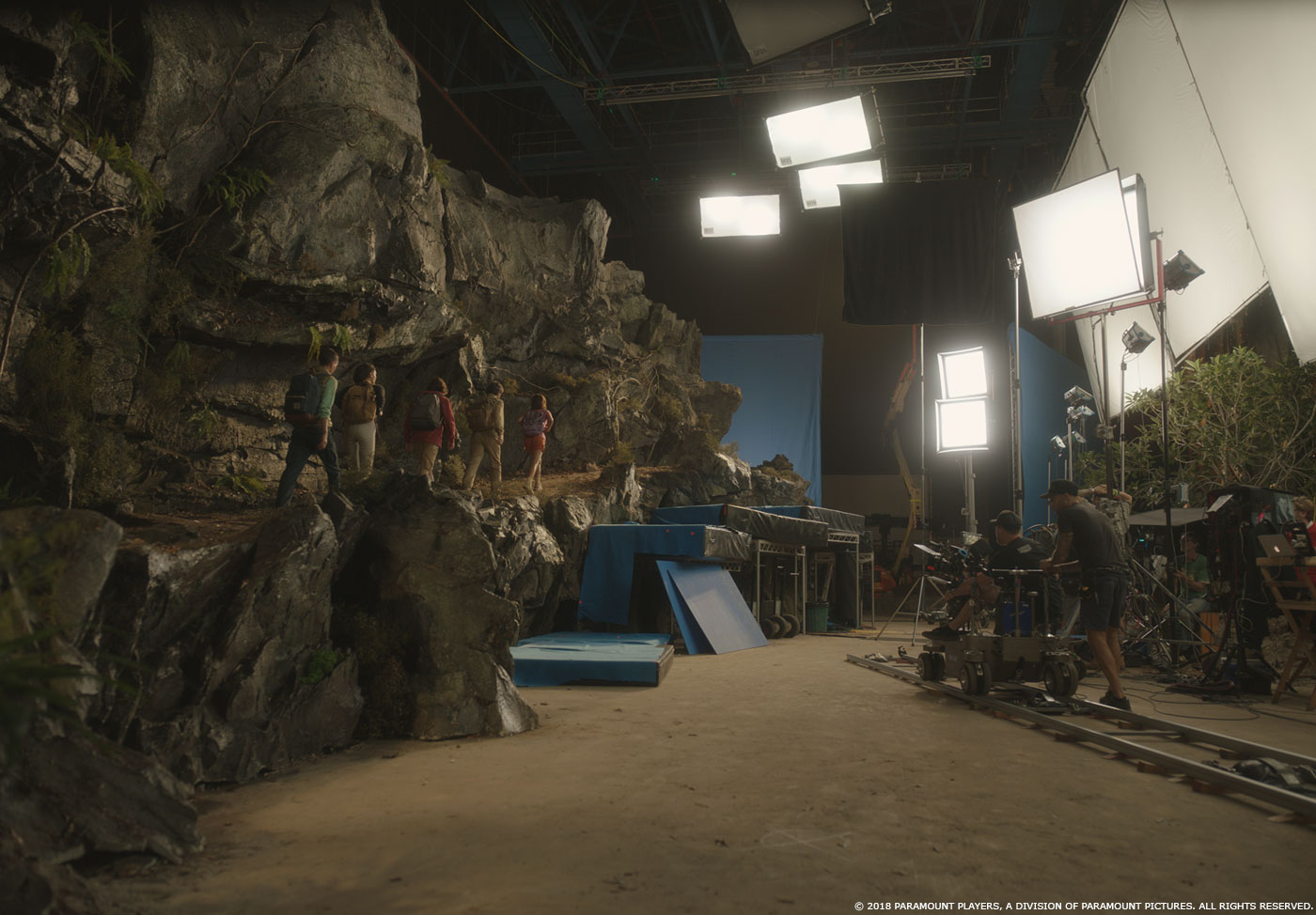
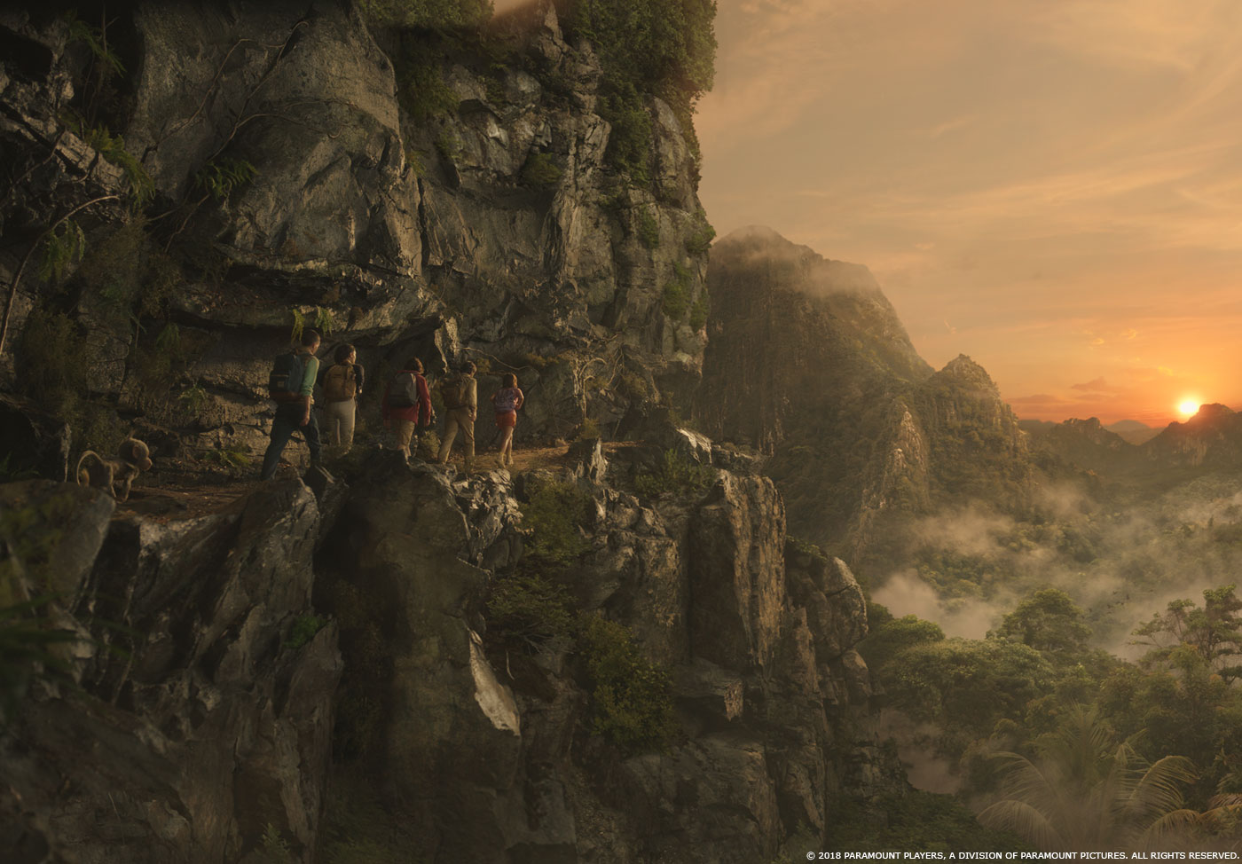
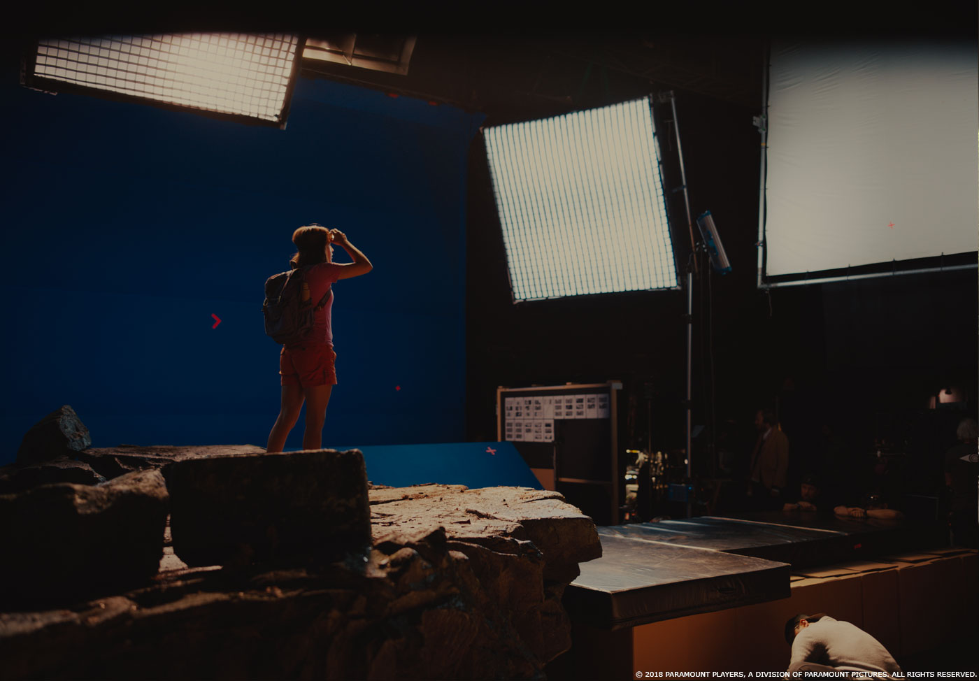
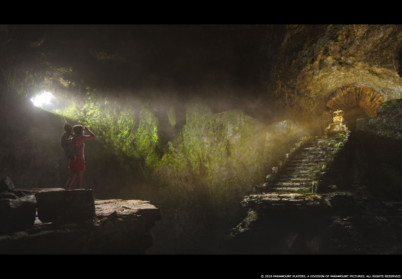
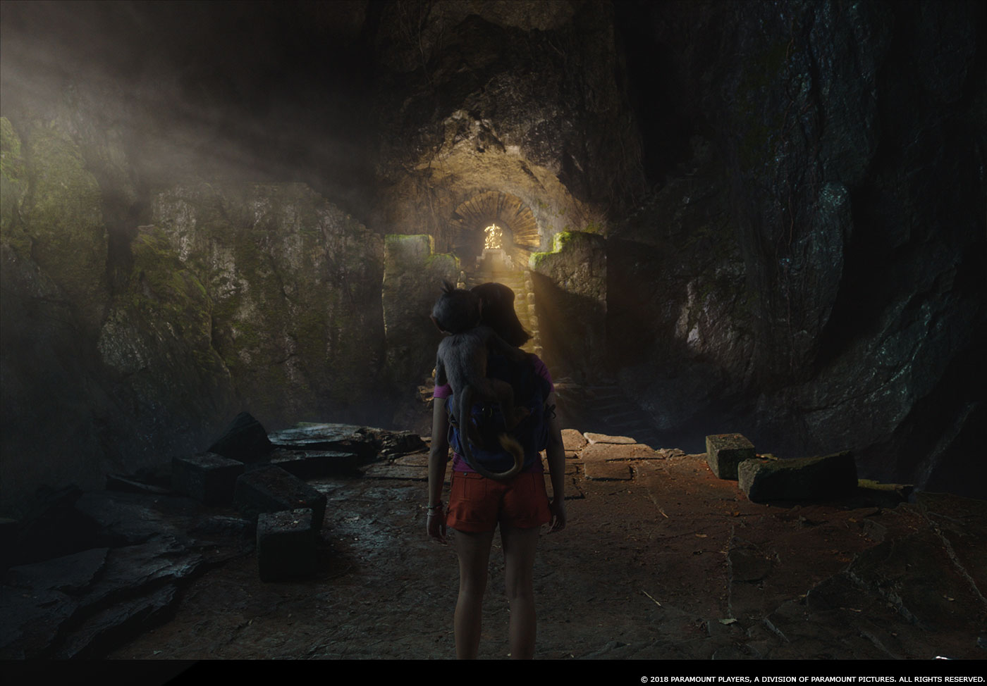
The production designer also set the look for the jungle, and then we used that as our jumping off point for the VFX work. In general the jungle needed to be very lush and green. The plates were shot throughout Australia which is far more arid than our target look so we made the foliage greener and more saturated, and we added a lot of mist to make it feel more damp. We also added additional vines and flowers in several sequences. In the sequence where the kids travel through the giant flowers, there were only a handful of hero flowers built on the set and then we built the rest of them in CG and created the surrounding environment. The pollen was CG although there was some pink powder dusted over the actors faces and clothing in some of the later shots.
Which character was the most complicate to create and why?
Even though Boots is in a lot more scenes than Swiper, Swiper was more complicated because of the way he moves. Sometimes he scampers on all four legs, sometimes he runs upright, and sometimes he almost slithers through the frame. We saw some early takes where his joints appeared to be popping inside out because the animation was pushing the rig beyond its initial design, but the Mill Film team did a great job adjusting our rig to eventually allow for all those different types of motion. Swiper is also in some ways the villain in the film, but at the same time we wanted the audience to like him. That’s a complicated line to straddle, so making him look cute and appealing and slightly clueless was how we balanced out his actions. He’s a fox and he’s just doing what comes naturally, but he doesn’t really mean to hurt anyone.
How did you split the work amongst the VFX vendors?
Mill Film was the primary vendor on the project. They handled more than half of the Boots and Swiper animation as well as the environments and FX in the first two thirds of the film. MPC London did the Parapata environment and most of the work in the last third of the film. There was also a sequence done by Cinesite, and postviz done by Proof and SketchVis. We had Cheapshot in house doing some of the standalone composites, and Blink did the 2D animation hallucination sequence.
Can you tell us more about your collaboration with their VFX supervisors?
I worked very closely with Richard Little from MPC London and with Adam Paschke and Andrew Brown from Mill Film as those were the two facilities that did the bulk of the work. I was super lucky to have such strong internal VFX Supervisors at each of the facilities. They were all very collaborative and open to my input. We all spoke constantly. Rich and I had dailies together every day and I was able to email or text Andy and Adam whenever I had a thought or suggestion. Because we had several shared sequences and assets, the internal supes from both facilities spoke regularly to ensure that we had consistency of look and animation. For me the brainstorming and collaboration with the other supervisors is one of the highlights of post production.
The vendors are all around the world. How did you proceed to follow their work?
We had a lot of cineSyncs and video conference sessions which would allow us to talk about the work and still see each other which is helpful for animation so we can gesture and perform if needed. I would hold dailies at MPC London every morning and sometimes we would pull up the Mill Film work as well. All of our director reviews were joint sessions with both facilities but took place at MPC London.
Which sequence or shot was the most challenging?
The shot where we transitioned from the old crone to the princess was the one that had me losing sleep toward the end. We made really good progress at the very beginning and nailed the overall look in time for the first test screening, but the more we tried to refine the effect, the more it fell apart. At the very end we had to split up the work among multiple artists working simultaneously, and we had to really strip it down and build it back up from scratch one layer at a time. I was very happy with the end result but there were a couple weeks in there that I was starting to worry.
Is there something specific that gives you some really short nights?
I’ve found that it’s never the shot you think is going to be the hardest that ends up being the hardest. I’ve decided it’s because you really plan and prepare for the challenging work and you assign it to the most experienced artists. It’s the work that you thought was going to be easy that can sometimes surprise you, and it’s those shots that sometimes keep me awake at night during the course of a show.
What is your favorite shot or sequence?
I love Boots dancing in the sparkly boots at the very end of the film. I’m a sucker for anything sparkly and I love the animation on Boots in that shot. The way he hams it up for the camera is so cute and so Dora.
What is your best memory on this show?
The first time I screened the film. I had just arrived in London in early February and went to a temp screening with James, the editors, the entire production crew, the producers, some Paramount folks, etc, etc. The film was still pretty rough and there were almost no VFX shots represented but everyone, including me, was laughing at loud and really loving it. I just remember really enjoying the film and thinking to myself that this was something special and I was really excited to be a part of it.
How long have you worked on this show?
I was on the show from Feb-July of 2019.
What’s the VFX shot count?
Because of omits I’m not sure of the final shot count, but we were in the neighborhood of 800+ shots.
What was the size of your team?
This is always a tough question to answer because we had so many vendors and artists come and go over the course of the show, but I would guess we were around 300 core artists.
What is your next project?
I’m taking a few weeks off to spend time with my family after being in London for five months, and then I’ll see what’s next.
A big thanks for your time.
WANT TO KNOW MORE?
Mill Film: Dedicated page about DORA AND THE LOST CITY OF GOLD on Mill Film website.
MPC: Dedicated page about DORA AND THE LOST CITY OF GOLD on MPC website.
Cinesite: Dedicated page about DORA AND THE LOST CITY OF GOLD on Cinesite website.
© Vincent Frei – The Art of VFX – 2019

