In 2016, Arnaud Brisebois talked about the work of Rodeo FX on Fantastic Beasts and Where to Find Them. He then worked on many projects such as Paddington 2, Fantastic Beasts: The Crimes of Grindelwald, IT: Chapter Two and Chaos Walking.
How did you and Rodeo FX get involved on this show?
We were called in quite late onto the show compared to most other key vendors, sometime before Xmas 2020. Production was looking to find a home for a single, yet considerably challenging asset: Trantor’s Scar. Even though the Scar was not redundantly featured in all episodes, it was a crucial part of the story, an important pivotal point and it played a huge role in this first season. It was originally intended to be built as a miniature, but early versions of the miniature quickly proved it was not going to offer enough of the flexibility needed for the amount and type of shots the showrunners wanted. And so we came on to build a CG version of it. Easy. (^_*)
What was your feeling to work on an such an iconic show?
I’m a sci-fi addict. Anything in that genre is very appealing to me, so the opportunity to contribute to Foundation came as a blessing. Additionally, the fact that this was meant to be Apple TV+’s flagship series and that David S. Goyer was running the show were signs that the challenge of finally bringing the classic Asimov novels to the screen was taken quite seriously. That meant, at least for me, that we were going to be allowed the means to achieve quality visuals and that’s always motivating.
How was the collaboration with VFX Supervisors Chris MacLean and Mike Enriquez?
I was mainly interfacing with Mike and sometimes getting written notes from Chris and/or David. I would say that the relationship itself was extremely fluid and transparent. We were given a lot of freedom. I always felt I could speak openly about an idea, that I could question and even at times reconsider things and propose alternatives. Everyone was very open-minded and allowed for ideas which would make things better. It’s great and quite unusual for such large scale projects to have the chance to be a part of the creative process that way, and to feel your proposals are always welcomed and appreciated. This is where the project was special; The briefs would be precise in what the basic requirements were, but would leave a lot of room to propose ideas.
What were their expectations and approaches to the visual effects?
Well, as we came on at the bidding stage for the Scar, my long-time accomplice Fabrice Vienne (CG supervisor) and I broke down our methodology in order to help Mike and his team visualize and anticipate how everything was going to be achieved. So in terms of their expectations, I can only say that the fact of being very transparent about the process probably felt reassuring to them as it was for myself and the team. I mean, the Scar was a big asset, relatively complicated technically and we did not have much time so every step had to be thoroughly planned out. There was no room for error, obviously technically but also artistically. As for the other sequences we were involved with, it was a matter of grasping and respecting the show’s identity, its design ground rules.
Production design was pretty thorough and the show’s aesthetics were very clear. It felt straight forward enough to only extend beyond those base guidelines when assessing design for either an asset or a shot. For anything editorial, we were usually provided with simple yet clear previs which was a useful springboard to take things further. In other cases, we had only simple sketched boards which were enough to understand the spirit of a sequence or shot. In other cases we had nothing else than a verbal brief from Mike. I loved when we had as little visual information as possible because this meant we almost had “carte blanche” and that we could propose something completely unexpected.
How was split the work between the Rodeo FX offices?
The show was done during pandemic lockdown, so, everyone was working from their own “Rodeo Offices”. (^_*)
What are the sequences made by Rodeo FX?
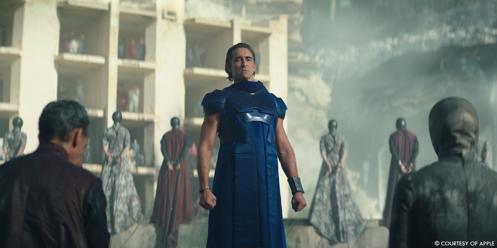
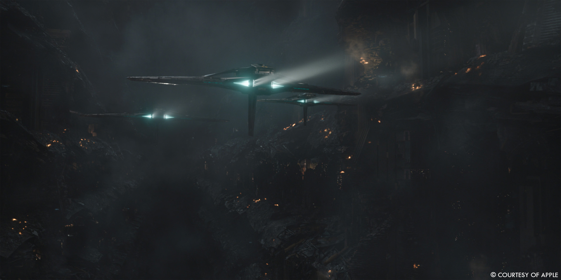
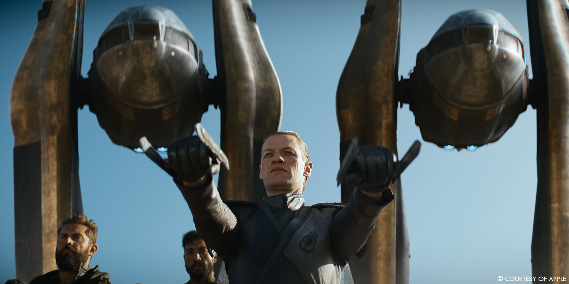
When we first were approached by Addie Manis, the show’s VFX producer, it was only going to be about Trantor’s Scar which is featured in episodes 1 and 2, and then seen briefly in episodes 7 and 10. But as we started showing asset and shot progress on the Scar, confidence grew in our ability to achieve quality work in the delays. And since there were so many high-quality shots needed, other long term vendors lacked capacity, so their production came to us for more work. We started with an involvement of 1 asset to be featured in 4 episodes, and we ended up creating shots for 7 of the 10 episodes of season 1. We built Trantor’s Scar, as I mentioned, we did the Aegis ship crash in episode 5, the Hugo message from the asteroid field in episode 8, Phara’s ambush on Terminus for episode 9 and 10, for which we built the Thespin Lancer ships, and shots of the Imperial Stag from episode 10 which we designed from scratch. We were offered work on many more shots, but due to capacity, we simply took on what we believed we could achieve successfully as quality was our priority. As it always is.
What was your approach to create and to destroy massive environment like Trantor?
Well, let’s start with what Trantor is. Trantor basically is a city like Shanghai or Hong Kong in architectural density, but that spreads over the full surface of the planet. Then, it’s layered in depth of about 200 city levels of approximately the same urban density.
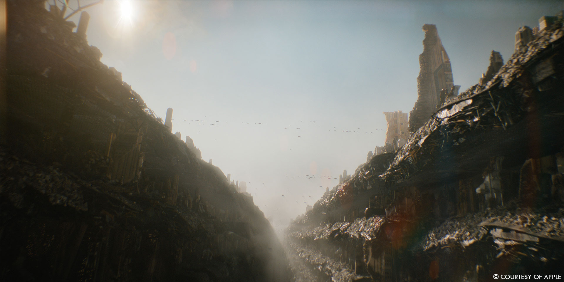
Call it a big sci-fi environment. But the trick is that nowhere is this layering really ever shown in its entirety on the show, other than from top most surface level “holes” through the platform which hints at levels below. Otherwise, a level is shown but again, as its own “single” city floor with “holes” through its ceiling and/or ground partially evoking more floors above and below. Now for the Scar, it’s a completely different story. The space elevator cable ruptures and collapses from space onto the planet, tearing through hundreds of city levels, creating a ginormous gash in the planet. So essentially, the Scar is like a cross section of the planet where you can actually see the whole stack of those 200 city levels. Just for scale, it’s hard to imagine even with the above description. I remember asking my EP Jordan Soles “Riiight, so…. how many floors is this cable cutting through again?” (^_*)
Our workflow went like this:
We would get a collection of building builds from DNEG who were handling Trantor. For each of those buildings, we generated 6 destruction variants, from barely wounded to completely collapsed. We generated shading attributes through FX’s destroyed areas which would be procedurally picked up in lookdev to define various areas of each building’s destruction “age” or affect from destruction either partial or full. We built a megafloor (city level grounds) collection the same way. We designed and built mega floors to scale, with hundreds of internal structure parts (you can imagine something similar to a supertanker cross section, but 10 times larger) which we would then destroy in FX, providing lookdev with the same type of destruction attributes. From there we would set dress in Clarisse, using the most destroyed variants of assets being the closest to the scar edge, and progressively less destroyed as they got further from it.
We also built ourselves an extensive library of loose debris and rubble to add further destruction details on top of our urban dressing. For FX stuff like fires, smoke plumes and atmospherics, we proceeded in a similar fashion where we simulated extra long range collections of those in various scales which we then set dressed through Clarisse.
We worked from DNEG’s original asset resolution so every single building we were destroying and lookdeving we could review at full frame or about. We spent a lot of time and effort working on single assets, making them highly detailed and it took a while before we could see the fruit of our labour assembled. It was amazing when we first saw set dressed assemblies because the resolution and level of detail was simply incredible. You could drop a camera anywhere, near or far and it would still look awesome. Once there, making shots was mainly camera work and lighting, and results were always super satisfying. I’m quite proud of our workflow for this one, and really proud of our asset, FX, lighting and comp team for making it all come together nicely.
Can you elaborates about the creation of this environment?
Well, from a purely artistic point of view, for Trantor Scar, I wanted to first make sure to convey scale which meant a lot of detail and secondly, I wanted everything to make sense and not just be randomly scattered debris. One of the first things I did was gather reference images of every aspect or dimension of what the Scar was: collapsed architecture, fire damaged buildings, smoke plumes, etc. and then walked Mike through all of those to describe my intent in design and how I felt things should look. It was a good way to establish design guidelines early and to agree on direction. For instance, I assembled a catalogue of earthquake damaged cities. I looked for references where buildings had not been bombed or blown up but had rather collapsed under their own weight. This type of damage would work well to convey the idea of the tether having crashed down onto buildings, ripping them open but with a strong vertical pull.
For megafloor destruction I gathered a catalogue of collapsed bridges which was the closest thing. This would show how huge iron structures bend and tear under their weight. Also looked at Beirut’s port explosion from 2020. The chemicals gave out spectacular smoke plumes which I provided as reference to the FX team. Also, obviously, some 9/11 images since again here, there was a dominant collapsed aspect to the destruction. 9/11 images of the hours after the event, or even a few days after gave excellent reference for the air density and limited depth cue having a very large amount of dust in the air. We also referred to those for how dust settles on all upper facing surfaces and bleaches everything, like a nuclear snow. For surfacing of damaged buildings, I referenced The Grenfell Tower in London which was one of the most important highrise fires in history. Because of the importance of the event, there were tons of images and they were perfect to analyse and deconstruct the various stages of burn damage, from how the burnt insulation looked to how the exterior cladding changed color and so on. Lots of studying.
Can you elaborates about the lighting work?
I can’t say it was simple lighting such large scenes and even less so with night shots. For the sake of optimization, we took the necessary time to bake assets to reduce their data footprint. The amount of geometry, especially from the destroyed buildings was quite a puzzle to deal with and a challenge on its own, not to mention the amount of textures which was really difficult for our servers I/O, so reusing textures on multiple assets was another way to streamline it. Additionally, the amount of volumes needed posed yet another hurdle especially with the number of lights used. In many scenes, we ended up with over 3,000 lights, having to illuminate our main areas but also to light up the numerous city levels. Since everything was already difficult enough to light, and due to time constraints, we found we were spending too much time actually lighting streets, and basically designing urban lighting by hand. So to speed things up a little and also offer more control on design, we added structure lighting to our buildings, making a few variants per asset and baking those as emission maps into our look dev. This would result in main landmarks having street lighting or “underlighting” basically coming for free, both from a design and render optimization standpoint.
Did you use procedural tools for the buildings?
Not tools per say, but procedural set ups, yes. The thing to know about the DNEG building assets is that, even though they were of a good resolution and level of detail from a geometric standpoint, they were hollow shells, not meant to be destroyed. So we first had to adapt modeling of all buildings to allow for destruction, meaning cleaning up any criss-crossing faces and/or geometry inside the models. We then built an internal item library, like floors, walls, partitions, pillars, etc., of various heights and sizes, all tileable to allow organizing them to form smaller or larger surfaces. Our FX supervisor on the show, Omar Meradi, then built a procedural set-up which would evenly scatter these items within a given building volume. Items would then be showing up where tears and gashes in the buildings would be painted, or be deleted anywhere else for optimization purposes. From there, we would apply rigid body simulations to the now exposed internal structures to obtain our collapsed look. The same FX attributes we had set up for the building’s outer shell shading were also spread onto those internal items so that lookdev would be coherent inside out. It was a fairly responsive set up and allowed for quick iteration which was key for us having so many building variants to generate.
Can you tell us more about how the shaders and textures work?
As mentioned, we tried working as procedurally as possible given the number of building variations we wanted to output. Our workflow was fairly straightforward. We generated a collection of tileable textures, all at proportional scale, for every single construction layer meaning insulating foam, concrete, iron, exterior cladding, etc. Then another collection of damage related textures, like scratches, dirt, burn stains and so forth. FX would then provide damage attributes which lookdev would pick up to reveal: 1- the proper construction layer or material and 2- it’ damage level or age. Lookdev would then work with various procedural noises to add an extra level of detail and break up to FX attribute maps and complexify transition areas. We spent some time bouncing between textures, lookdev and FX on a single destroyed building variant until we felt satisfied with the visual result and once there propagated to every new destroyed building variation.
Which location was the most complicated to create?
I’d say the environment seen in the hanging scene from episode 2. Not so much for the CG aspect of it, since our Scar asset was now well set up and ready for pretty much any full CG shot, but for the live portion and how everything had to be organized in order to work. See, this sequence was shot on location at the Jerma Palace Hotel which is a former four-star hotel in Marsaskala, Malta which closed down in 2007. The building has gone derelict since then and was an excellent choice of location for this scene, being a sumptuous palace now in ruins. Even if it looked great, the choice of location posed a few challenges from a layout and lighting standpoint. The building itself or rather the area chosen for shooting consisted of a pentagonal central terrace surrounded on 4 of its side by 5 or 6 stories towers resulting in an almost enclosed, curled up onto itself “G” shaped arena. This essentially made it extremely difficult to maintain lighting continuity onset, especially given the fact of this scene wanting to be in direct sunlight at an approximate 5pm sun azimut meant very few hours to shoot. The footage ended up being very inconsistent between key angles, and it made it quite a puzzle to try and figure out a CG set extension which would somewhat serve and unify all of them in sequence. Adding difficulty was the need for seeing the far side of the Scar in the distance which could not simply change lighting from angle to angle. It would have been quite jarring in sequence to do so as it often covered large portions of the frame. So we first started with the 3D concept using the set lidar as core which we extended below bringing it to about 50 stories high relative to floor level. And by floor I mean, that single city floor as this building we decided to also put at the 22nd level or about to be closer to the top floor and allow for a better chance of getting direct light and more skylight contribution.
We then played around with this new resulting building and placed it near the Scar edge and found a rotation angle which would allow for light to hit it in an average direction which would serve all plates while making sure that sun direction would also favor lighting the far side of the Scar. Once there, we laid out destroyed building assets around our center piece carefully so that it looked nice from a compositional aspect but also to avoid huge extension buildings casting long shadows onto the set area. Even though the area view onto the south Scar side has the arena in shade, while the reverse angle looking at the arena is in direct light, I think the lighting in the scene ended up looking quite coherent generally and made lighting discrepancy between key angles look like an artistic choice rather than a shooting constraint. A fun puzzle.
How did you populate the environment?
We built a Trantorian agent library from production provided reference images. I don’t recall having been provided scans for any of those. We picked a selection of various costumes both male and female, built clothing assets which we dropped on our in-house generic humans. Skin color and hair color variations were set in look dev. Those lookdev variations along with measurements variations would then be randomized in Golaem.
Can you elaborate on the Aegis ship crash?
That sequence came in just as we were finishing the Scar work on episode 2, and we were super excited to have a stab at it, being of a completely different type of work.
Instead of gigantic large and heavy CG environments, here was this agile, single subject sequence with dynamic FX which felt refreshing, kind of like shifting weight. As mentioned earlier, we had limited capacity at that point and we were being careful about what we would agree to take on, but also really wanted to remain on the show and keep contributing. This crash scene from episode 5 felt just right, being only a few shots but of interesting scope and difficulty level. We were given the Aegis Imperial ship from Scanline which was actually modeled from the miniature scan. A nice asset with a good level of detail which again, as for the DNEG Trantor buildings, we adapted for our FX destruction work. Most of the shots for that sequence were full CG so we also built a CG Terminus terrain to allow for ship interaction. From there it was really just about getting cool camera work and figuring out good speed and timing for animation to convey the right scale.
We had been provided a rough previz for the sequence but used it mainly as a framing reference since we were now working with proper scale and speed which had to be revised to be accurate, mainly to ensure good control over sim forces and such. Once layout and anim was complete, we simply got into bold RBD and fluid sims which our FX artists, Omar Meradi and Etienne Devillee, really took home. The early shots in the sequence are more about the missile impact, so a bit simpler but were still fun to design. For these I referenced 9/11 for how the explosion shot out of the opposite side from the impact point with strong push forces. The crash shots themselves were a little more complex due to ground interaction and supplementary explosions. What was interesting to design here was the rhythm of events in sequence, meaning; The ship’s missile damaged fin first colliding with the ground, raking and churning the soil forcing it to tear off, then the main ring coming down under the ship’s weight and starting to collapse, forcing interior structures to explode causing a chain reaction to finally reach the jump engine at the core of the ship. I wanted something new to happen every moment of the shots. Also, since it was not clear (at least to me) how these ships are powered, it was hard to justify explosions. I mean, is it fuel, or battery cells, or solar energy capacitors? It was important to know a bit about this so we could use some of these cues to further design our explosion types, fire color, etc. to tell a more interesting story. We proposed that the jump engine at the core of the ship would blow up with blue flames, to somewhat differentiate the jump technology power cell explosions from the rest. Omar and myself choreographed things in circular fashion so that explosions would first circle the exterior ring, then reach the jump engine ring and travel back to front to finally reach the cockpit which we’d actually see explode. The note we got for our first WIP version of these shots from David S. Goyer was “That’s awesome. Like a spaceship Hindenburg!”
How did you manage so many FX elements?
Omar Meradi, who worked on the main crash shots, built an extremely clever event based system in Houdini which would procedurally trigger geometry fracturing, deformations, explosions, as well as secondary debris like fine shrapnel, glass and dust. The set up worked off a simple point cloud containing all the choreographed data, explosion forces and timings, allowing to visualize things simply through color coded geometry. We would be able to review and discuss all aspects of the FX using fast preview which was simply incredible from an iterative perspective.
Can you tell us more about the creature work?
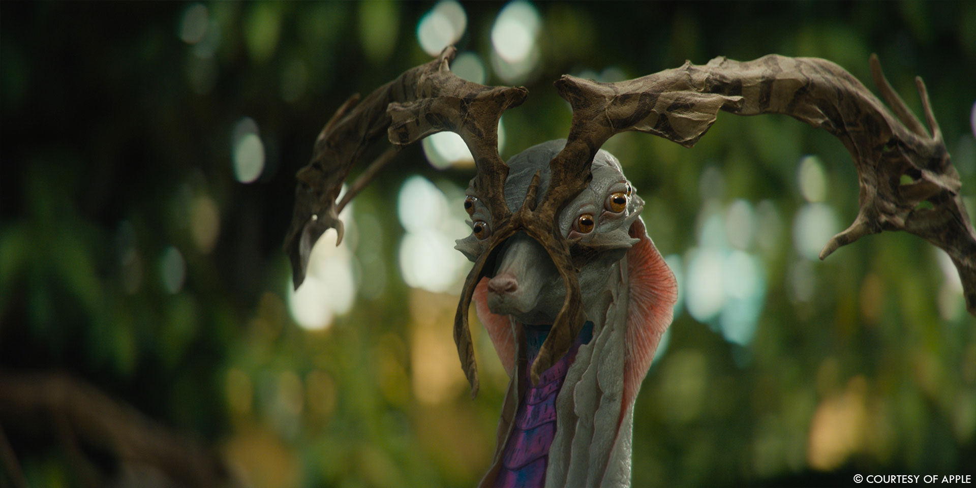
Well let’s call our creature work contribution for S1 minimal, as we did only 2 creature shots featuring the Imperial Stags in episode 10. These creatures were never planned for, even less so were the shots featuring them. In late July, we were sent a bidding cut for a single shot with a clean forest plate and Mike asked if we could design and build the Stags to be featured in this shot.
We had close to no information as to what it needed to be other than David wanting something of a Cervidae typed creature with pale skin and iridescent features. So, I made anatomy studies and sketches which my friend and modeling artist Pillip Harris Genois then quickly sketched in Zbrush. We bounced anatomy details and refinements together during a few days and proposed something which David liked right away. It felt a little sad to be designing and building a cool alien creature for a single shot, and as I looked at the cut, our stag shot felt a little long. So as we were in animation blocking, I thought of setting up an extra CG cam starting from the plate camera, only super telephoto like a 300mm, blasted that and proposed an insert shot. Vendors rarely are the ones proposing “more shots” but this felt like the perfect opportunity for a cool “wildlife documentary” typed shot for our asset, and it didn’t require any editorial change. Mike and David were happy with it and the shot made the cut. It’s a good example of just how open the relationship was on this show.
Is there something specific that gives you some really short nights?
As I said earlier, there was no room for error, so we made good plans and stuck to them. That being said, I can say that coming up with our Scar workflow, anticipating our various needs and rethinking the process at the bidding stage did make me nervous. It was a somewhat risky endeavour considering the time frame, and since we were called in to help out, I really wanted my approach to make sense to Mike and Addie and for them to feel confident in our ability to deliver this. So yeah, for those few weeks of simply thoroughly thinking about it all, I did have active nights and a light sleep, let’s put it that way.
What is your best memory on this show?
There isn’t any specific moment really. The whole experience was truly great for the team and myself and we just had a good time. It was challenging but interesting work, the spirit within the crew was at its best, the relationship with Mike was good and we felt appreciated. I don’t think you can ask for anything better in terms of VFX experience.
How long have you worked on this show?
We worked on S1 from January to August 2021.
What’s the VFX shots count?
114 shots.
What is your next project?
Well Foundation Season 2 of course! (^_^)
A big thanks for your time.
// Foundation – VFX Breakdown – Rodeo FX
WANT TO KNOW MORE?
Rodeo FX: Dedicated page about Foundation on Rodeo FX website.
Chris MacLean & Mike Enriquez: My interview of Chris MacLean & Mike Enriquez, VFX Supervisors on Foundation.
Apple TV+: You can watch Foundation on Apple TV+ now.
© Vincent Frei – The Art of VFX – 2021


