Laureline Silan has over 15 years’ experience in visual effects. She has worked in a number of studios including Mikros Image (now MPC), Nozon, Cinesite and Framestore. She has worked on projects such as The Predator, Murder Mystery, Army of the Dead and Fantastic Beasts: The Secrets of Dumbledore.
What is your background?
I studied Multimedia in Belgium and specialised in Compositing. Since graduating I have worked on feature films, commercials, episodic projects and feature animation. My projects for Framestore include the VES and Annie-nominated Flora and Ulysses for Disney+, Fantastic Beasts: The Secrets Of Dumbledore and, most recently, Foundation s2 for Apple TV+. Having had the chance to work across all these forms has greatly broadened my approach to a project.
How did you and Framestore get involved on this show?
I was already interested in the series, because Foundation was considered a complex adaptation. Additionally, the quality of the imagery and the modernization of the content was quite alluring. When the project was presented to me, I jumped at the opportunity. The final assignment was confirmed right before Christmas 2021, and I joked that it was the best gift I could have hoped for.
What was your feeling to enter into this science fiction series?
I was very excited. We had a large scope of work, presenting several technical and creative challenges. The concept art was beautiful and the story powerful. We were preparing to work with almost every department in Framestore and that made it all the more complete.
How was the collaboration with VFX Supervisor Chris MacLean?
It is always great to work with someone who is ambitious about what visual effects can contribute to the story. Quite quickly, it became clear that he knew where he wanted to go, he had worked concepts and extensive previs with our FPS team (Framestore Pre-Production Services). He also gave us room to be creative partners and bring ideas to the table. We did a lot of vis dev to present our creatures, environment and FX work.
What are the sequences made by Framestore?
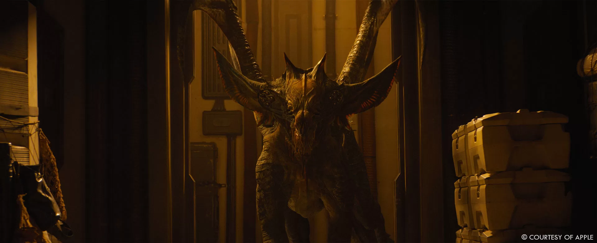
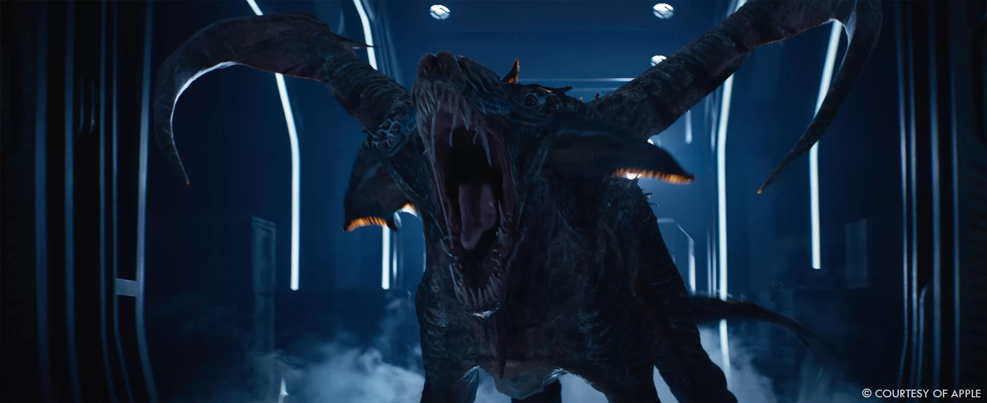
We worked on nine episodes, all of them with a completely different scope of work. We started with Beki, the Bishops Claw, the asset has been passed from season 1 but required a significant rebuild. Beki was originally conceived for a very limited appearance, but in season 2 we were tasked with making her a full character. From there we moved on to build the Stone Eaters together with the desert and cave in Oona’s world. Aside from the creature and environment development, this also required a vast FX research, regarding sand dynamics and weight reaction.
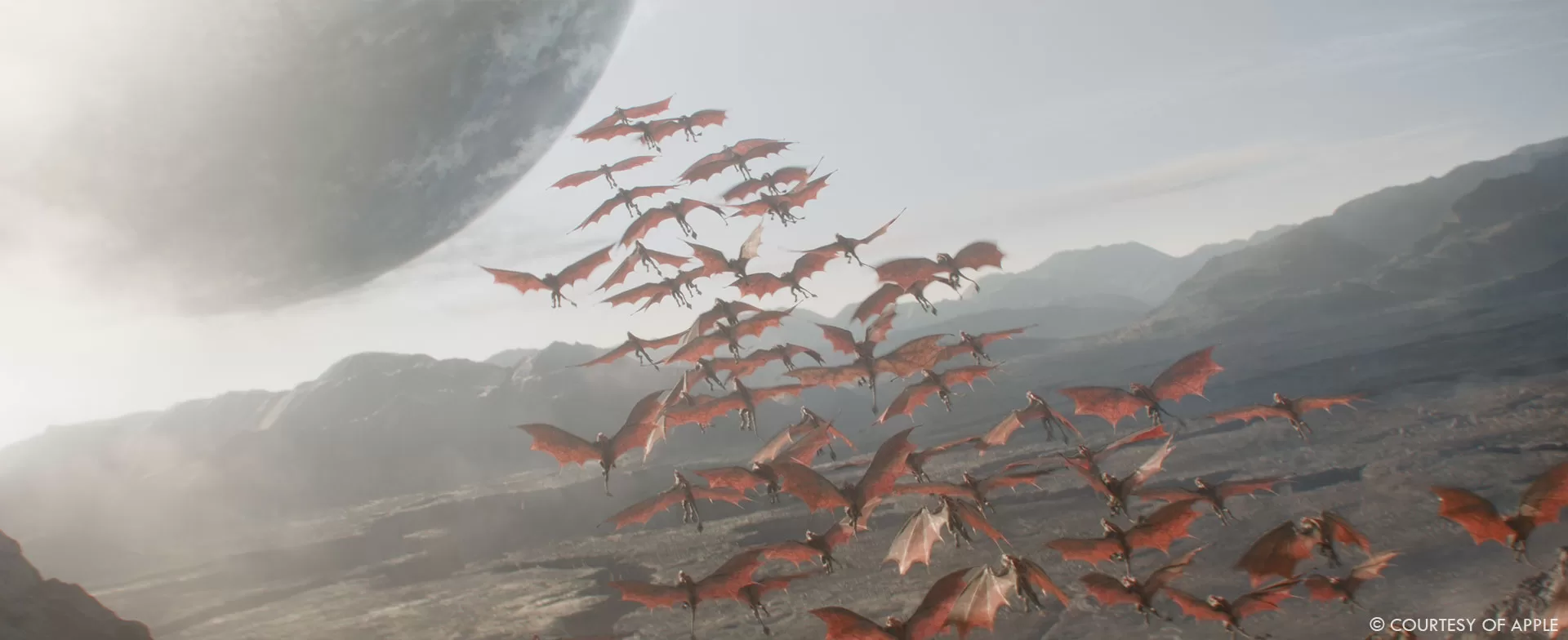
The next step was to conceive a herd of Moonshrikes, with both hero and crowd variations as well as the environment for Helicon. Additionally we worked in a few holograms and sandograms and background effects for episode 8 and 10.
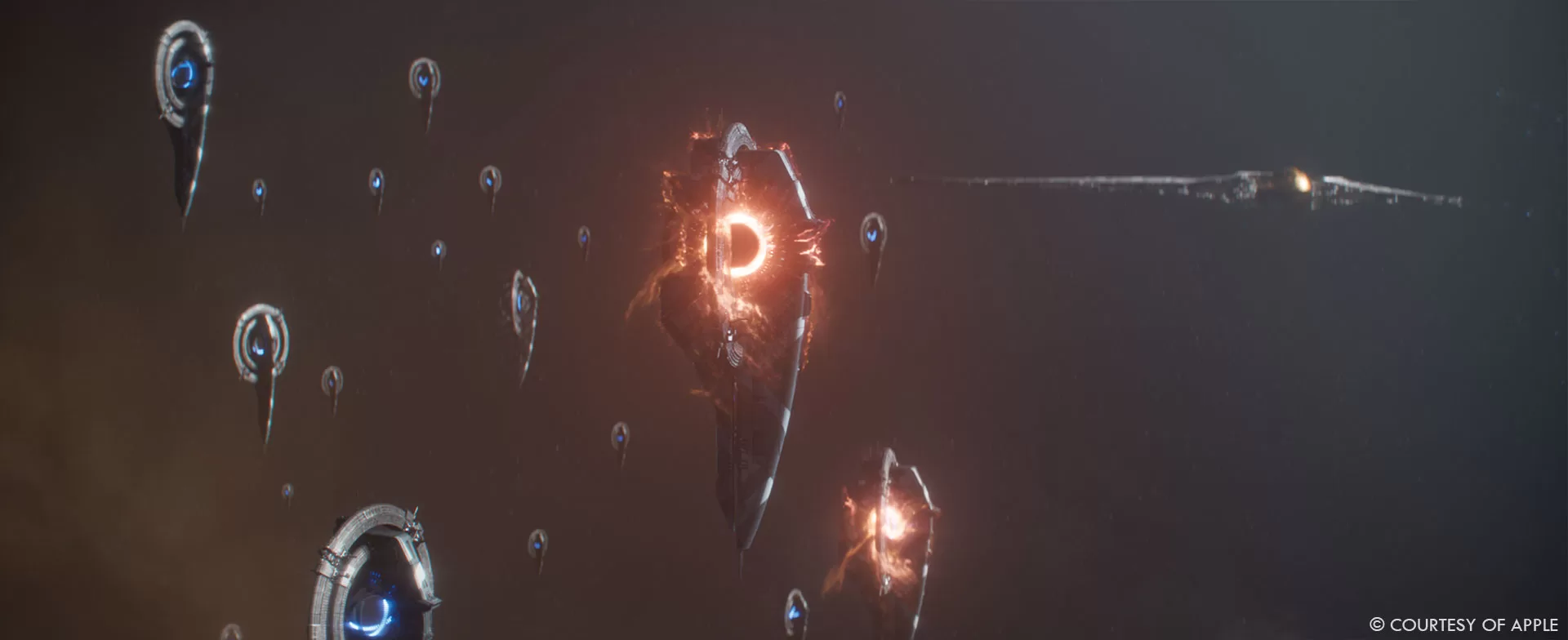
The final stage of our involvement in season 2 was the space battle near Terminus, with the intricate ship and camera animation to portray the scale and synchronicity of the FX-led explosion chain in episode 10.
Can you elaborate about the design and creation of the Moonshrikes creatures?
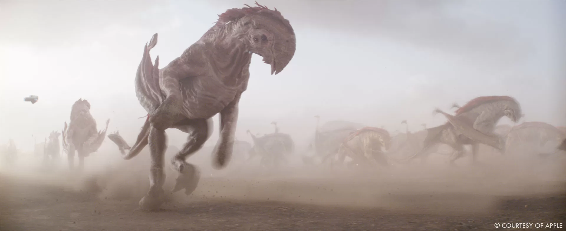
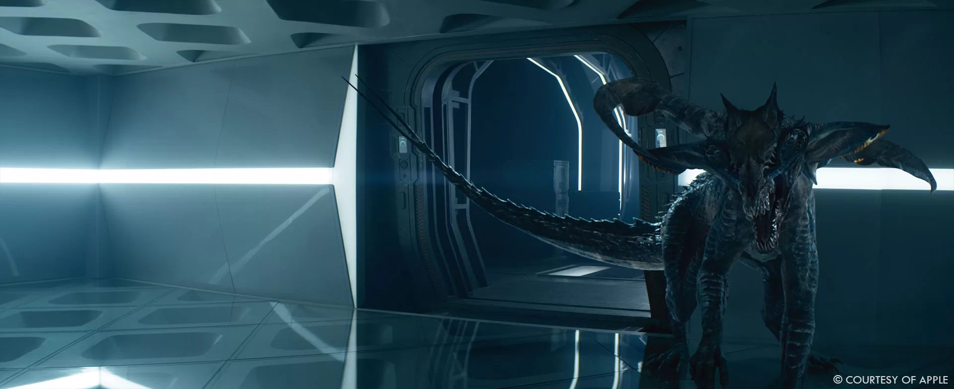
The original concept came courtesy of Framestore’s Art Department in London, and we kept their model as a base. The client wanted them to have a skin resembling that of an elephant with a stiff feel to it. To make it believable, we designed a dry skin, almost burnt by the sun. Our aim was to make sure we could easily create variants from it, for crowd diversity. If you look at our asset in detail, you can see several layers of discoloration, dirt, sand residue, burns and areas damaged by friction. The red crest is the aerodynamic system of the Moonshrike. It’s a triple piece of skin with spikes embedded in it. The spikes were built in modelling like little bones growing inside of the skin. The mouth and the front arms were not an easy part to deal with. The mouth has a double jaw: it’s a mouth inside of a mouth with a large spiky tongue inside and the eyes are on the lower jaw. We put a lot of thought and research into parts of the asset that are barely visible, because of the nature of the scenes and crowd work.
How did you handle their wings animations?
Aside from the complexity of their anatomy we had to think about how these creatures would move. The arms while running and flying were a significant part of the challenge. By design, the Moonshrikes should resemble a herd of prairie herbivores with the particularity that they would fly off planet into a moon for grazing. The challenge arose when analyzing their anatomy and subsequent animation. We turned to nature for examples of buffalo run cycles and for bats’ wing deployment. Now that we had those two very different references, we had to devise a way to make them work seamlessly.
Additionally, our client preferred to limit the visibility of the wings while the Moonshrikes were running. They wanted to keep it as a surprise for when the wings expanded. Our teams in rigging and animation worked out a fluid way to transition from the running to the flying state which accommodated both the technical and creative challenges.
Can you tell us more about the creatures’ interaction on set with the actors?
Now that we had the herd, we moved on to figuring out the way in which we would bring them into the filmed plates. The actors had been filmed in a desert which provided a great reference for the environment but little in terms of light and dust interaction and variation. To achieve these scenes, we did a body track of the actor, rendered light interaction and occlusion as a starting point for compositing. We then tweaked the plates’ grading to give us a sense of the galloping Moonshrikes and the dust lifted by the herd.
How did you manage the crowd shots with the creatures?
We divided the work up between several hero agents, all of which were subject to several iterations of animation cycle development. We put the creatures in situations where they would have to run, turn, avoid, tilt to the left and right. Once we were satisfied with the individual cycles, we put them in a crowd. The original result was quite chaotic which led us to further refining. Looking at real-world references of herd stampedes, we saw that our original result was accurate for other animals but not for buffaloes. A distinctive quality of these animals is that they all move in the same direction, without being disturbed by others. We tried a full simulation with parameters to have the agents react in a non-disruptive way. The visual result was quite monotonous. So we decided to have a creative compromise, we mixed the appropriate buffalo behaviour in the center of the crowd, but included a few disruptive agents towards the margins.
Can you elaborate about the design and creation of the robotic giant spiders?
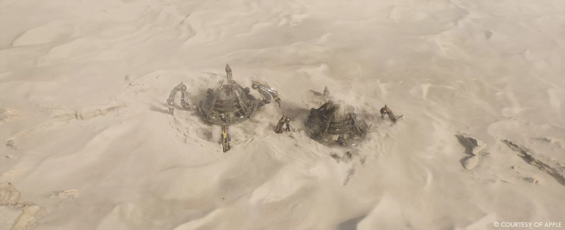
The original concept was done by Framestore’s Art Department in London and FPS took care of doing motion studies for how they would walk. The Stone Eaters were abandoned extraction machines, programmed in Season 2 to take down any kind of human activity on the planet. They are massive 200-meter-high artifacts, composed of large to minute pieces found in any kind of machinery. To make sure the scale was perceived adequately, we had to question how far we needed to go when it came to the details. We did extreme close up takes to ensure that no matter how close we got, we could always find the correct level of detail. We needed to dig deeper into the concept of the carapace. We also checked online to see what the biggest machines ever built in the world were. Our client provided some reference of the kind of mechanics they expected to see. They wanted each piece to have a purpose; even if it wasn’t included in the rig, it needed to make sense. We conducted extensive research on how the different mechanisms would have been conceived and how they would embed into each other.
How did you handle the weight and scale for the spiders?
The Bagger 293 – a giant, 96-metre excavator – became one of our favourite references. Not directly linked to the shape of our Stone Eater, but if you look at the pictures, you basically have the same type of scale we were dealing with as compared to humans. This gave us an indication of the relation to detail . For instance, at this scale, a big bolt would be almost imperceptible. Of course, we didn’t model each piece separately, it would have been too heavy to render. Modelling took care of the main pieces and mechanisms: legs, pistons, ball joints, cables, pipes, extrusion in the main pieces to design the rounded shapes, eyes and laser mechanisms, etc. In the meantime, our MTL vis dev team were focusing on designing secondary details that could be handled either in modelling or texture. As a third modelling pass, we added greebles to almost every part. Very small, light details to give extra shape and scale.
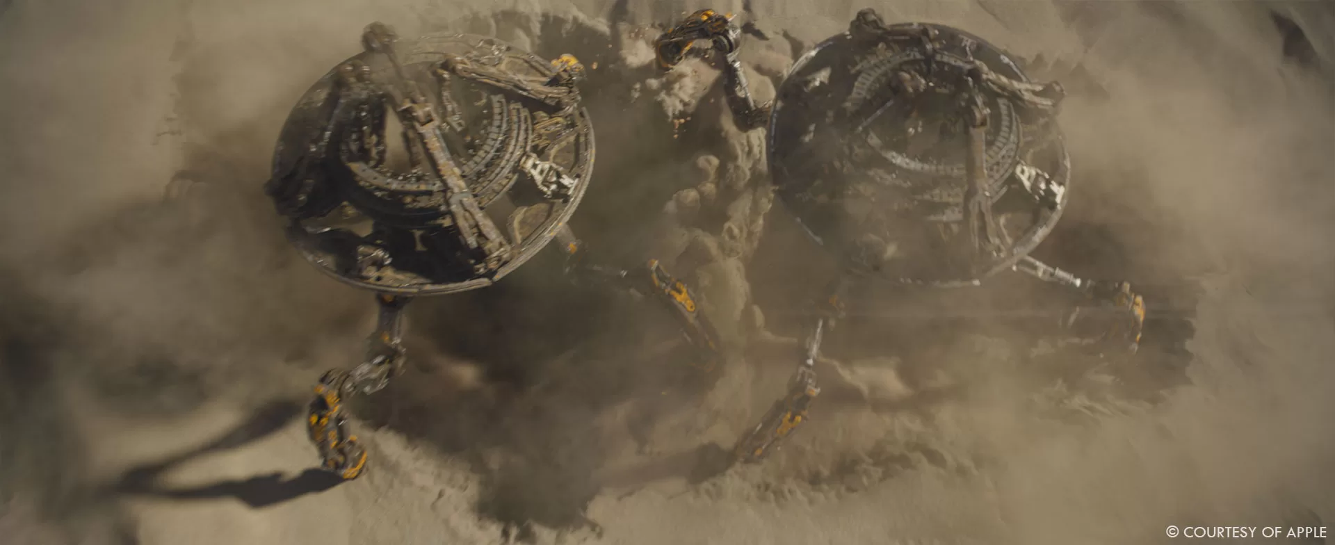
Our talented texture artists created a procedural detailed texture to cover the body and most of the bigger pieces. The differentiation was achieved by utilizing separate mapping for each type of piece. Part of selling the scale was also in the little details in the texture, like scratches, damage, discoloration, because those machines were abandoned in a cave for a very long time. The last -but not least! – pass was done by FX. The FX department literally sprayed sand over the creatures and we baked the result in the model. For ease of iteration, animation worked with a lighter model and rig, which was then swapped to the full version for lighting. Due to the optimization work that was done during the asset development, we were able to easily render it and include a lot of significant interaction with all the FX work that was required on the sequence.
What was the main challenges with the various creatures?
Knowing when to stop. There was so much space for creativity and elaboration that we could have continued on all the details for months. The reality of episodic production schedules pushed us to focus on what was really important and relevant. For each of our creatures we had a unique challenge.
Beki had to achieve compassion and attachment from the viewers as well as being perceived as a threat. We focused on highly detailed and colourful texture variation as well as her animation. The Stone Eaters had to feel massive and believable. The key was in adding details to the proper scale. The Moonshrikes had to feel like a cohesive crowd while still having individual variation in the stampede that would eventually lead to them flying off world.
Can you elaborate about the environments work?
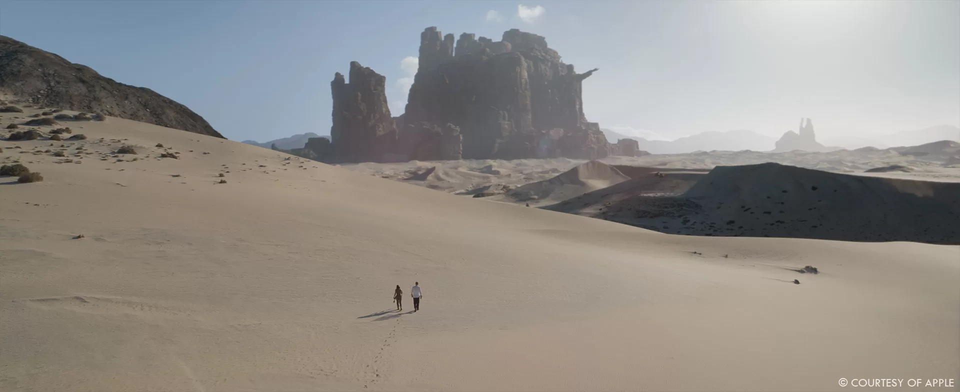
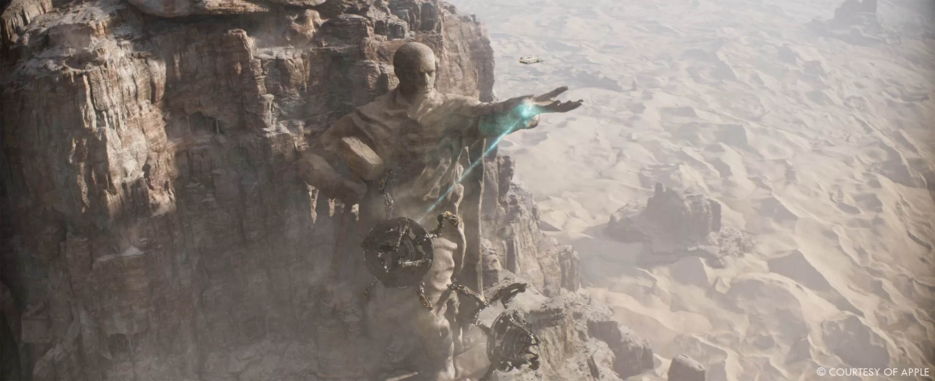
We were tasked with a vast array of environments: Helicon Canyon for the stampede, Terminus for the space battle, Siwenna seen from space and finally Oona as seen from space, descending into the planet to the wide desert landscape containing the Monument of Industry, and finally the descent into the cave.
Which location was the most complicate to create?
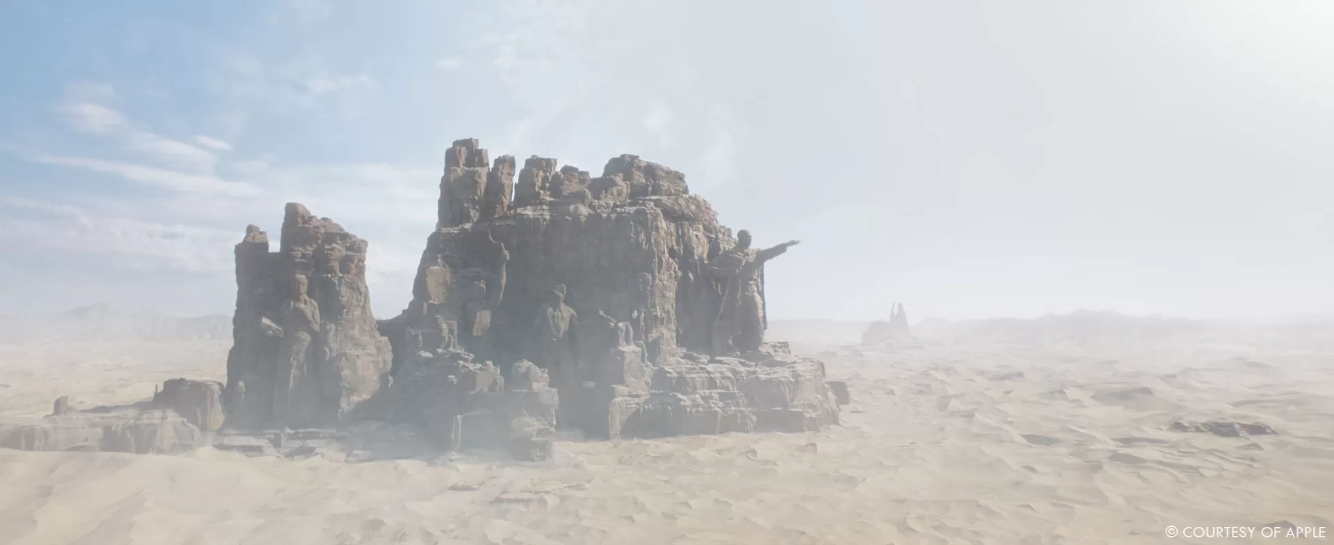
The biggest was of course Oona’s world and the Monument of Industry. Designing an endless dune was a feat of technical and artistic collaboration. You can very quickly have an image that feels unflattering or moves into the wrong scale. Inside this vast world, we had to develop the caves that would contain the abandoned Stone Eaters. We researched rock and mineral formations that were likely to be found in desert conditions to make it all cohesive. We also had to include the Monument of Industry, with detailed carving in rock to be perceived both from a wide distance and extreme close ups. Our FX department was also involved in the sand dynamic reaction to the Stone Eaters. We ran simulations to find the proper dynamic between fluidity and resistance. We needed to have a firmness that would allow the heavy machinery to move while keeping the possibility of digging through.
Can you explain in detail about your work on the space battle?
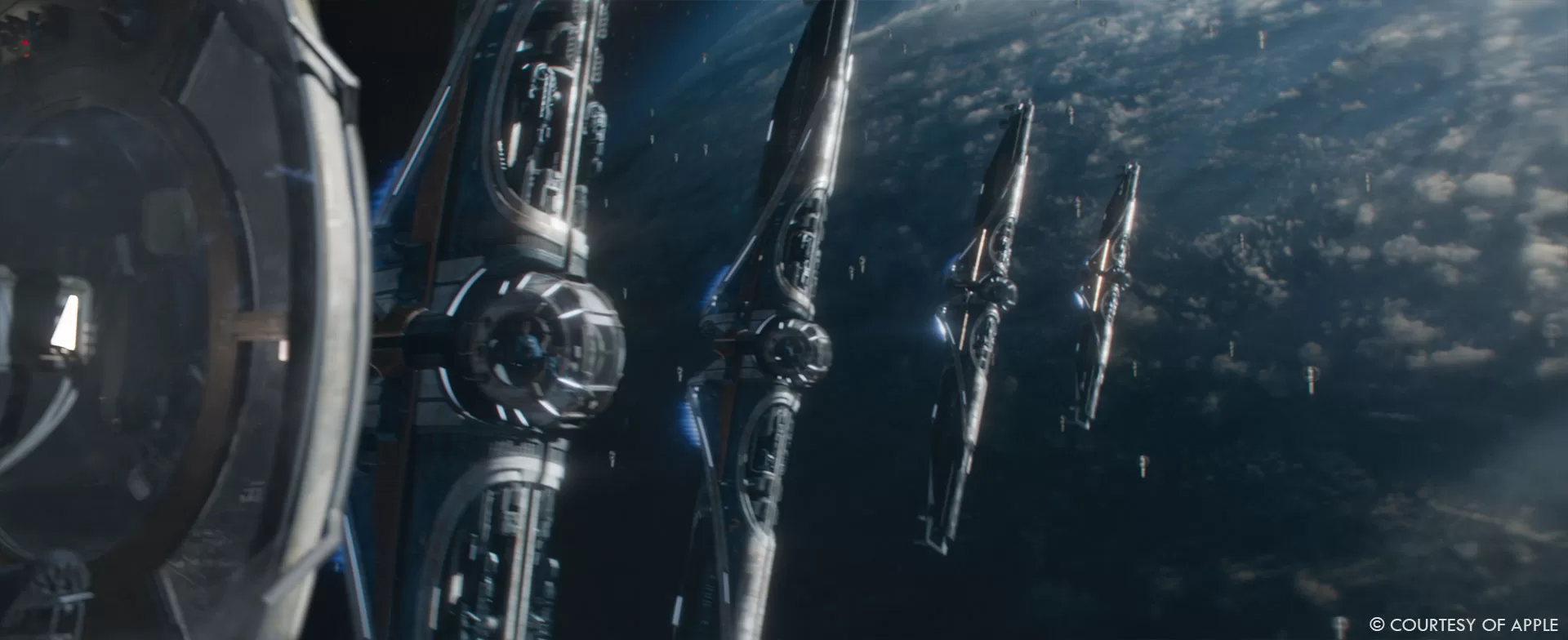
We worked on asset and shot level builds. We created the Imperial Fighter, enhanced the Terminus planet for render quality and light volumetric interaction with clouds. We then moved on to the choreography. Animation took over the work provided by FPS and brought together the dynamics and focus for cameras, ships, and explosions timing. Once we were locked on this, we moved on to FX and lookdev for Weapon of Destiny, with its beam of light and sun arcs. This led to the victory of Destiny over Invictus.
In the following episode we continued the consequences of the space battle with the jump in-jump out of the Aegis ships as well as the chain of explosions, and the final explosion of the Destiny ship.
Which shot or sequence was the most challenging?
The scope and quality of the work we had to achieve in a limited timeline. We had two organic creatures, one huge piece of hard surface machinery, and several environments, accompanied by complex camera animations, crowd and FX simulations.
What is your favorite shot or sequence?
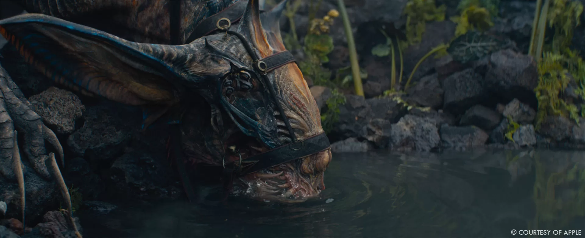
With such a wide array of work, it is hard to choose but if I have to pick only one it would be Beki drinking water in episode 2. I love the creature work and story in that specific shot. This is a very simple daily moment that reveals much about Beki and Brother Constant. Looking closely into Beki, you can sense every muscle involved in her drinking, what she is looking at, the light brings out the high amount of detail in her skin. Beki truly feels alive and connected to Constant.
What is your best memory on this show?
The team surrounding me. They were all involved and motivated. They had tons of ideas and they all wanted to be an active part of the project. It is motivating and it makes you want to always push further, make them proud of their contribution and the result that goes with it.
How long have you worked on this show?
I spent a bit over a year on the show. I took over from FPS and the Art Department. I started with reference work from season 1, sci-fi shows, sci-fi books from the ‘50s, work of well known sci-fi concept artists, different biology and zoology books. Then moved on to the main work once the team was ready to join.
What are the four movies that gave you the passion for cinema?
I grew up in a literature-oriented household. It was during my teens that I discovered cinema as an art form. I watched hundreds of movies all at once. I had catching up to do. It’s the entire film history of the 20th Century that made me want to work in the industry.
A big thanks for your time.
WANT TO KNOW MORE?
Chris MacLean: Here’s my interview of Production VFX Supervisor Chris MacLean.
Framestore: Dedicated page about Foundation – Season 2 on Framestore website.
© Vincent Frei – The Art of VFX – 2023


