Axel Bonami began his career in the VFX in Paris in 2001 at DURAN to work on THE NEST and IMMORTAL (AD VITAM). In 2006, he joined DUBOI to work on L’AUBERGE ROUGE and ASTERIX AT THE OLYMPIC GAMES. In 2008, he joined MPC and worked on numerous projects such as L’AUBERGE ROUGE, DARK SHADOWS, GODZILLA and X-MEN: APOCALYPSE.
What is your background?
I studied mathematics, physics and Telecom engineering in Paris before deciding to concentrate on production and postproduction at Ecole Superieur d’Etudes Cinematographique. I graduated in 2001 and accepted my first job as a Flame Assistant and Digital Compositor at DURAN working on feature films THE NEST, IMMORTAL (AD VITAM), as well as high end advertisement campaigns for Coca Cola, Legsy and Halifax.
In 2004 I left Duran to work as a freelance Compositor at a number of studios on films and advertisements including RENAISSANCE, TAXI 4 and HIS MAJESTY MINOR. 2 years later I accepted the position of Compositing Supervisor on L’AUBERGE ROUGE at DUBOI, and carried on as a sequence Compositing Supervisor on ASTERIX AT THE OLYMPIC GAMES, for which I was sent to Chenai, India, to supervise some of the work. In 2008, I joined MPC London to work as a digital compositor at MPC on THE CHRONICLES OF NARNIA: PRINCE CASPIAN followed by HARRY POTTER AND THE HALF BLOOD PRINCE, GI JOE: THE RISE OF COBRA and PRINCE OR PERSIA: THE SANDS OF TIME, then Lead Compositor on Ridley Scott’s ROBIN HOOD followed by HARRY POTTER AND THE DEATHLY HALLOWS: PART 1 and PART 2.
Building up my technical and creative skills and leadership, I went on to become one of MPC’s 2D Supervisors, and have led the team on shows including JOHN CARTER, DARK SHADOWS, TOTAL RECALL, SEVENTH SON, GODZILLA and MONSTER TRUCKS on which I got even more involved in the overall process, supervising on set 2nd Unit visual effects work.
I then moved to DFX Supervisor on the latest X-MEN movie, X-MEN: APOCALYPSE, and got to supervise a unit of 500 shots. I was MPC VFX Supervisor on GHOST IN THE SHELL working alongside MPC’s Production VFX Supervisors Guillaume Rocheron and John Dykstra and MPC Montreal’s other VFX Supervisor Arundi Asregadoo.
How did you and MPC get involved on this show?
MPC got involved early in the pre production stages with MPC’s Production VFX Supervisor, Guillaume Rocheron overseeing the show. Our LA concept team were also working on the art work.
I jumped in in may 2016, just after the X-MEN delivery and started the asset work, and preparing our core team for the challenges we would be facing to create this entirely new world.
How was the collaboration with director Rupert Sanders?
I met Rupert on a set visit back in May in Wellington and noticed straight away the strong visual background he has. I was impressed with the set design and the pre production work he had put into bringing a new vision to such an iconic manga movie. Our collaboration was on a regular basis, through Guillaume Rocheron and John Dykstra, and on many occasions directly with Rupert who would come to our review sessions. It was clear from the start we would have to build a very strong visual background to serve the story and that there would be an on-going creative process with the director’s collaboration to build the foundations of this new world.
What was his approach and expectations about the visual effects?
His approach to visual effects was it should seamlessly serve the story. The expectations were pretty high and so were ours. There’s not much of a margin for error when dealing with such an iconic movie. You knew the work would be compared to many other excellent science fiction movies like BLADE RUNNER or DARK CITY.
How was your collaboration with VFX Supervisors Guillaume Rocheron, John Dykstra and VFX Producer Fiona Westgate Campbell?
I’ve known Guillaume for some years now, and we had already worked together on Gareth Edward’s GODZILLA. We have a great understanding of each other and the same visual references, so it was great to work with him on this one. This is my fourth film with John Dykstra (SEVENTH SON, GODZILLA, X-MEN, GITS), so I am quite familiar with his work and approach. It is always a great and inspiring collaboration. This was the first time I had worked with Fiona, and with such a tight production schedule it was important to feel we had a strong VFX-production support, and it was indeed great to feel Fiona had our back and supported us all the way.
What was your feeling to work on the adaptation of this cult anime?
That I would make a lot of my old friend jealous! I discovered GHOST IN THE SHELL back in 1999, around the time THE MATRIX came out. Back when I worked in telecom engineering, my flat mate was a huge fan and a human movie encyclopaedia, so we had countless nights discussing all of these influences. It was part of the reason I decided to make the move into visual effects back then, so to work on GST adaptation was some sort of time loop. I did feel a “tad” of pressure!
How did you organize the work at MPC?
One of the challenges was the amount of little parts that needed to be created, adjusted and put together. We had to create a full world building language, creatively but also technically, and in a short amount of time. So after couple of months of asset work and after the shelling sequence, we split the show into 3 units, under the supervision of Arundi Asregadoo, Aleksei Chernogorod and myself. Each unit concentrating on their respective sequences. Some were also shared like the tank battle sequence.That allowed us to concentrate and deliver the huge amount of shots in a shorter amount of time.
Every day we had meetings and reviews with each department and their respective supervisors. As we had to pull out around 100 shots per week week, we had daily reviews with John, Guillaume and VFX production so we could get quick feedback.
Can you explain in detail about the opening sequence that recreates the iconic sequence of the anime?
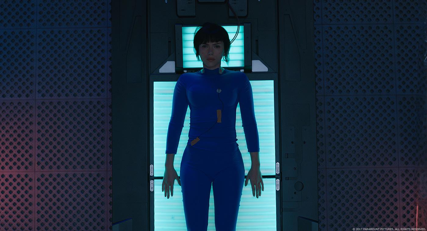
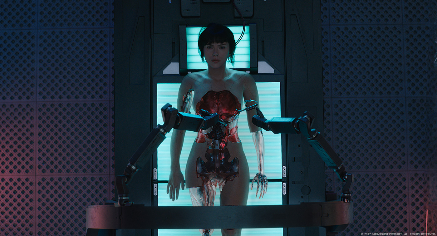
We started the work based on a previs, which was very descriptive of the framing and the mood of the sequence. Internally we looked at the original sequence to get the feel of it, but then tried to detach ourselves from it so we could add a new touch and photorealism to it. Pretty much all of the shots of the shelling sequence had some live action footage, shot with Weta’s prop of the skeleton, body cover, coming out of the white liquid, mannequin rising up, and Scarlett Johansson in a jumpsuit for the last shots. This material was a pretty good base to lay down the full sequence.
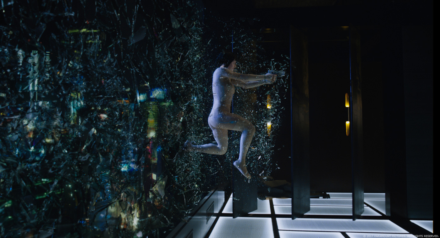
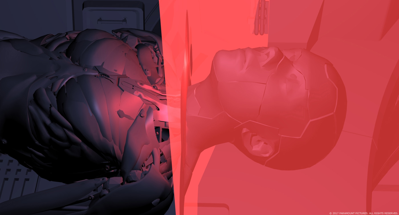
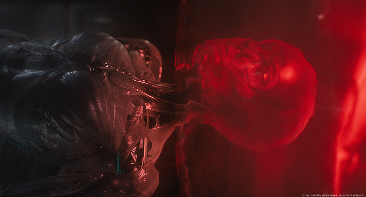
MPC recreated a CG version of the skeleton, its muscles, the ballistic gel cover, and the nude version of Major with the visible panel lines. We used these assets in many other sequences so we built, shaded and rigged them, to work for multiple uses. That allowed us to have more creative control on the framing, and especially the shading. The whole sequence becomes a blend between CG enhanced practical props to full CG shots. As we had flex control of the muscles on our CG version of the skeleton, we used full CG shot to introduce more complex animation and poses that you couldn’t do with the more fragile practical props. We also adjusted the camera and lighting.
When the brain is being pulled into the skull cavity, the shot uses a practical prop with CG environment, volumetric lighting and particulates, another one, with a practical skull, CG casing and CG brain to improve the more organic nature and slight movements of the brain itself, to full computer generated shots. The data tendrils were a combination of animation driven tubes with techanim and FX to add the slight pulse along the surface. They introduce the idea of digital data pattern, blending into DNA helicoidal shapes as they connect.
When the skeleton enters the red liquid chamber, we deviated from the prop footage to full CG to adjust the camera and the first red coating effect of the ballistic gel. We used Houdini to create a mesh around the skeleton as it travels though the red liquid. The body as it rises towards the white surface to meet its reflection is a very strong visual and iconic. We used the full CG approach here as well be we wanted to introduce more scatter through the envelope to see the skeleton silhouetted inside its shell, and to emphasize the frame composition and the body animation, using the practical footage as lighting, intention and material response references.
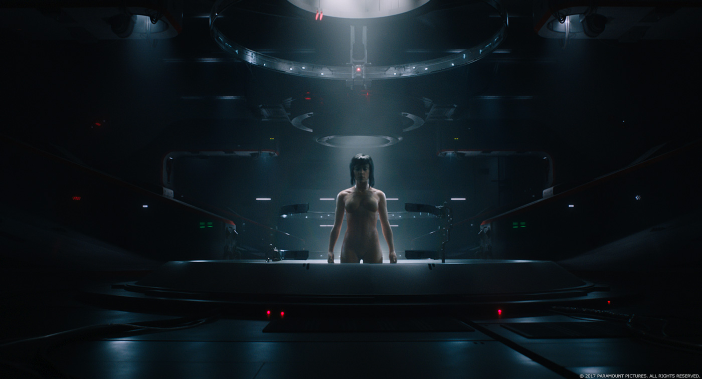
The colour palette in the shelling sequence is very iconic and the result of a close collaboration with Rupert Sanders and Andrew Proctor, internally created with the comp team under the compositing supervision of Ruslan Borysov. The reveal from the white liquid is again a combination of practical with lighting enhancement to partial practical with CG liquid dripping addition, to full CG. The petals peeling effect was a challenging effect because we had to keep precise control of the size, speed and spread the get the right composition in camera and accommodate the cut. It was created using a combination of Houdini and our tech anim team under the CG supervision of Jerome Escobar. The rising up of her naked form was fully computer generated so we had full control on lighting and shading, some shots using live action footage for framing intentions, and we use face tracking in Nuke Optical flow to place Scarlet face back onto the CG model.
How did you design and created the Major’s Thermoptic Suit?
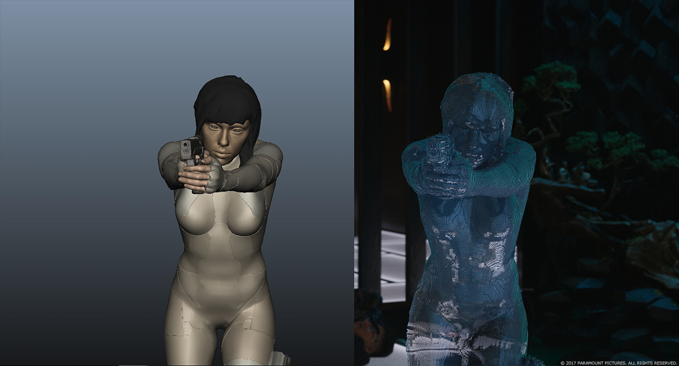
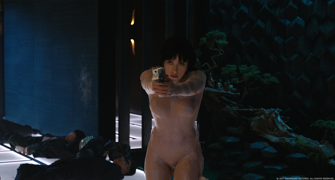
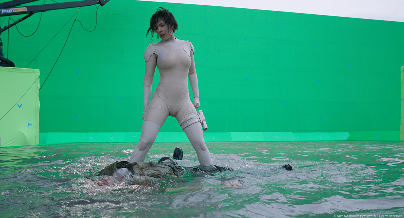
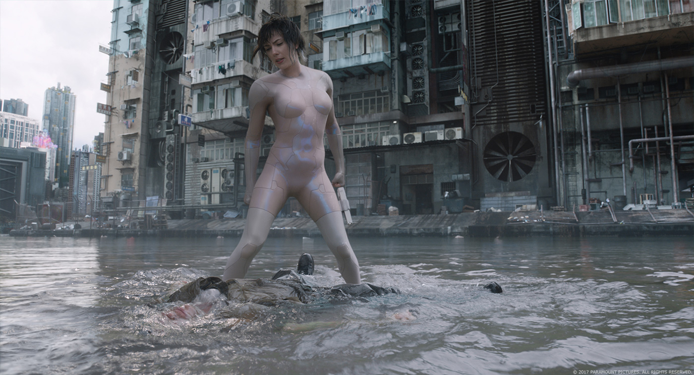
Major’s thermoptic suit was originally designed and built by Weta Workshop and was meant to be a practical effect. At the start we began to build a CG version of it for some of the sequence’s incredible stunts like jumping from the roof top of the Maceij Hotel, and running along the walls. We also spent time working on the invisibility effect, and its transition in and out of it, as well as an adding iridescence to the suit. We knew from the start we would have to roto anim Scarlett performances to do the work, but due to extreme body motions involved in the fight scenes, we ended up with some unwanted folds and creases on the practical suit, and following some tests to remove it, we all decided it would be better to replace the whole practical suit instead. It also gave the director the opportunity to have some refinements made to the design. We wanted to keep the iconic nature of the suit, so we tightened up the features so it was as close to the body as possible. Shading was pretty much in line with the practical silicon suit with the addition of very slight grid pattern and the iridescence controls. This was all worked on by our asset and lookdev team under the supervision of Patrick Harboun.
With the full CG approach to the suit, we now had full control to add the voxel based invisibility effect.
Can you tell us more about the invisibility effect and how you created it?
The invisibility effect was another challenge because its been done before in movies, but with the transitions in a less visible manner. We wanted to see the full transition from visible to invisible, so we had to come up with a new technique. In collaboration with Guillaume and John, we worked on a technical physical principle of its effect. As we were developing voxel grids for the Solograms with our FX lead Timucin Ozger, we used similar language for the invisibility. The voxelisation allowed us to generate a sort of 3 dimensional voxel grids of small cube pixels that could be activated by proximity. We were able to control its size, life span and could introduce digital artefacts around the subject. So it’s as if Major is generating a field of 3 dimensional pixels around her that can then have different optical responses: reflectivity, refractivity, self-occlusions and opacity. We generated maps for the different panels of the suit so we could then play around with the different stages through panel glitches. The invisibility became a combination of reflective, refractive, opaque, and fully transparent and colour compression artefact, using velocity maps to combine the whole.
Let’s talk about the bad guy, Kuze. How did you created the various CG parts of it?
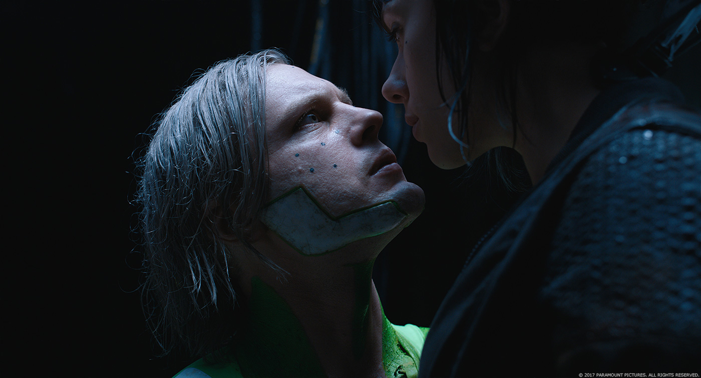
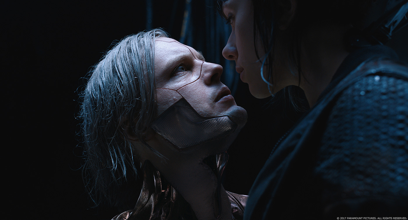
Kuze was first designed with a slightly different look than the final version. The original design and our first build of Kuze had china panels to cover his exposed under layer. Michael Pitt was shot on set with the 3D printed china look panels on top of a green suit as well as make up panels on his face. Only one arm was covered with a skin layer blending into make up scars where it connects to the plate. However on our first test shots, it appears that he looked too much like he could be wearing a china panel suit and his reveal was therefore less impressive in the particular lighting environment for the sequence. So we started stripping down the panels to introduce more of the skeletal muscles under layer, so we could have as much negative space and internal reflectivity as possible. An important story telling panel on his chest was replaced with a skin one, and the drawings that were on the china plate replaced by a tattoo. That made the whole Kuze silhouette thinner, and in the specific sequence lighting, the holes and negative spaces in his body added a lot of dimensionality and character to it.
Shots were precisely roto animed so we keep the entire Kuze performance. Under the supervision of Aleksei Chernogorod, Kuze was then fully CG rendered, and for the most we kept the hair and the arm. His face was a blend of CG with live action, using Optical flow for face track refinement on the CG part of his face to match Michael’s facial performance.
Can you tell us more about the Geishas?
The Geisha design and physical build was made by Weta Workshop, and the entire first part of the sequence was shot with practical masks on top of which we added couple of blinks and touch ups. We replaced parts of the face when it starts opening to shoot CG hacking cables out of their mouth, and ended up with full CG replacement when it turns into spider mode with extended limbs and climbing up the wall as well as when she opens her face one last time, plus a couple of exploding CG heads.
The whole sequence is successful because it blends practical, partial CG and full CG and you can’t tell which is which. Sometimes we even just kept a practical hand, or a practical piece of cloth into our full CG version to maintain the illusion.
Did you use procedural animation for these cybernetics parts?
No we did not, there were a limited number of shots, and it was all rigged and hand animated. Even when the face opens we had rigged internal pieces of the mechanism so animators could add additional motion to the inside of the mechanical face.
How did you create the abstract sequence of The Deep Dive inside the Geisha?
// Answered by VFX Supervisor Arundi Asregadoo: The deep dive sequence which journeys into the Geisha’s mind, begins when Major falls into a dark void to find out who was hacking into the system. The director, Guillaume and John wanted to explore the most effective way to move in and round around the “Data”.
During production Guillaume prevised the sequence depicting the journey. They setup elements using Phantom cameras, filming oil and water. This was the basis together with the glitch references that formed the look for the Deep Dive.
For the first part where Major enters the Geisha’s mind, the team blocked out Major falling into a digital version of the Yakuza club. We used references of people diving into deep water, together with images of a bullet fired into biolistic gel. The FX team created fluid simulations that surround the Major and then to make it feel digital, a glitch treatment was applied.
The Major falls into a digitized version of the geisha head, as she travels through the digitized cubes and the environment is transformed into a stylized version of the Yakuza club. The scene shows a fragmented memory of the club from the Geisha’s point of view. MPC were provided with high-resolution scans of actors in mid-action. The 27 actors had to freeze, holding their poses as the camera moved around the scene. The director’s idea was to show these figures decaying. We used a combination of treatments to the rendered figures, the effect was created by MPC Montreal’s FX team lead by CG Supervisor Damien Stumpf. Its particle system gave the team ability to help Rupert create the vision he was after. These rendered CG elements were then released to our compositing team.
In the final stage, Major falls into a mountain inhabited by monks. We applied a similar treatment to the monks but the flow of the breakup was reversed. We also enlarged the crowd of monks using MPC’s proprietary crowd tool Alice.
The movie takes place in a futuristic world. How did you work with the art department to create it?
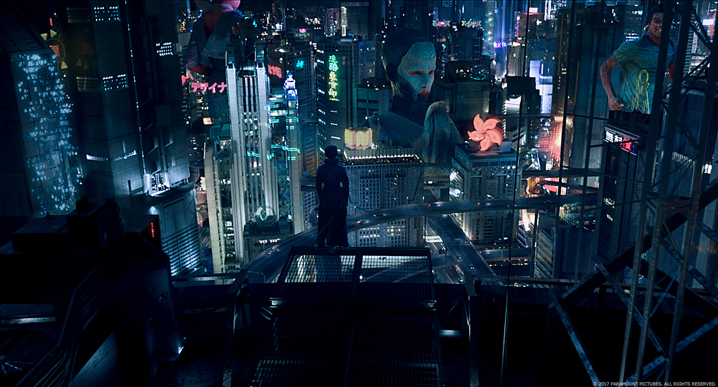
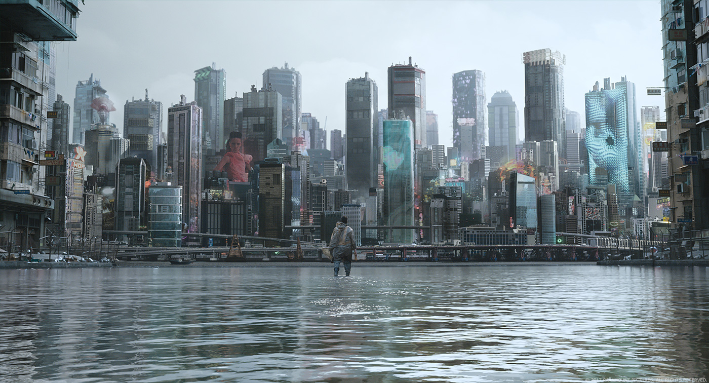
Creating the GHOST IN THE SHELL futuristic world was indeed the most challenging task. It went through multiple stages of concept art. The artwork introduced the mood and the idea of a layered city built on top of another. Although it’s set in the future it still had to maintain a retro look. A lot of it is still wired connected, and even though the world has developed, it is very grounded, and presents high tech mixed with low tech. The whole creation process was very interactive because of the multiple parameters that needed to be assembled. One of the big features of the world are the Solograms (solid holograms), and to recreate the concept art created, it needed to have many assets built to populate the world. We continued concepting throughout post-production and there were many pieces of graphic designs and Sologram assets involved which were continuously being created.
Can you explain in detail about the creation of this massive environment?
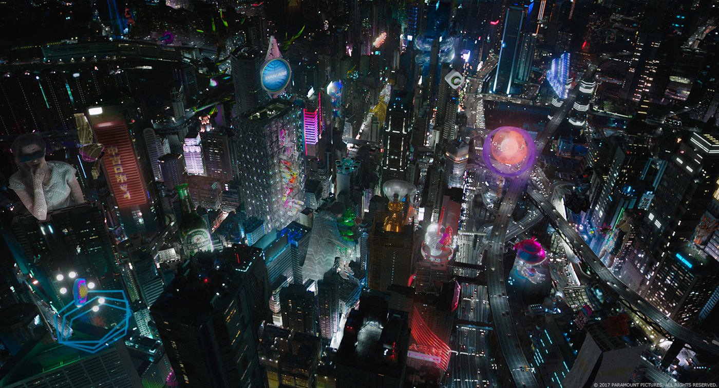
The environment representation was a combination of aerial establishing shots, the 5 “ghost cams” which were very long fly over shots of different parts of the futuristic city (each around 1 min long), and the street level. This involved a huge asset creation of buildings, apartment blocks, highways, pillars, street dressings, as well as matte paintings, top ups and Sologram/holograms created under the lead of our Environment Supervisor Pier Lefebvre, It was the most difficult and the longest part of the project to achieve. For a 1-minute shot where you fly over the city, you cover couple of miles of ground level, and it has to look busy and alive.
We have our layout stage where we setup cameras and start laying out the blend of old and new buildings. These were based on real Honk Kong locations so we could start from a real layout of a city. The shoot in HK had given us the opportunity to shoot stills of different parts of the city. Guillaume had worked in pre-production on location planning and a previs of the trajectory of the camera. The original idea was to have some drone footage, but in the end due to the huge distances covered and HK city laws it was not possible. So we sent our team, spending nights on as many rooftops and condors as possible to photograph as much as reference material as they could.
We started building onto the real city layout, adding hundreds of our city assets. Once we got the camera approved, we had the help of VFX production to lay out the key story telling Solograms, while we worked on laying out the hundreds of street dressing holograms, and built up our city texturing, lighting and shading.
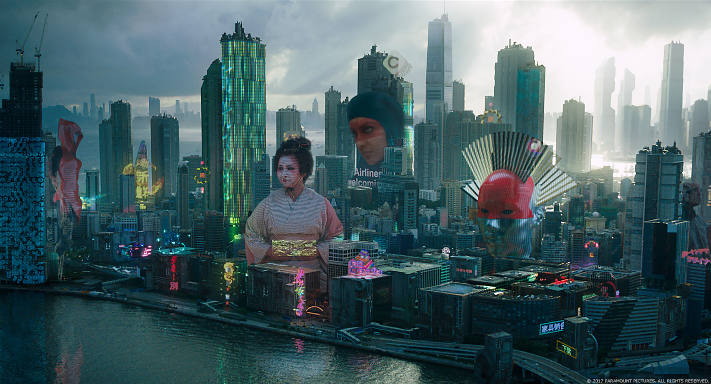
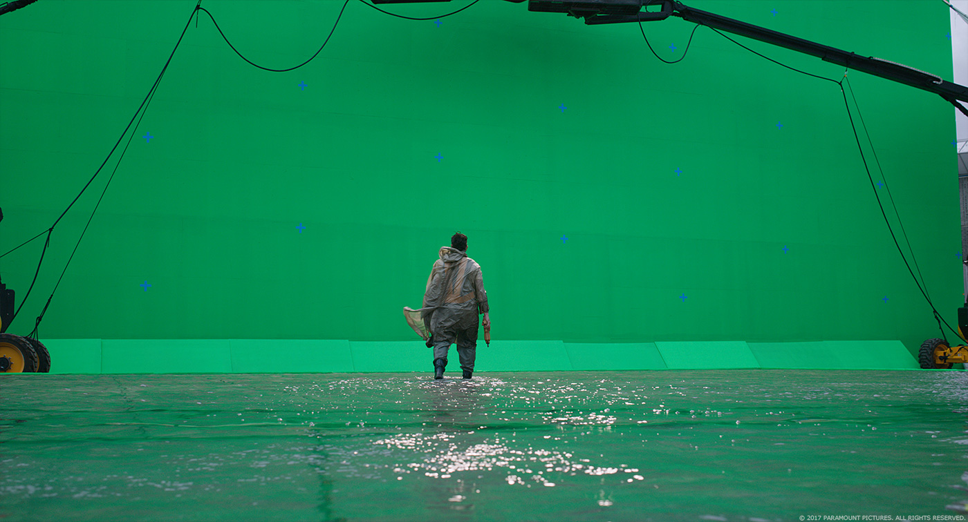
We use our crowd system Alice to populate shots with thousands of people, and adapted it to generate car traffic as well as multiple levels of highway. Street level shots used a mix of plates with computer generated building blocks, matte painting top ups, and a combination of fully rendered lit Solograms and comp generated holograms, using Nuke Renderman for the latter to generate interactive and reflection passes. We had around 400 individual pieces of graphic design/holograms/Solograms, from multiple vendors and MPC to ingest, combine and layout into a fully computer generated city.
How did you manage so many elements?
We had our software team build a specific Asset Manager tool to deal with the huge amount. It is one thing to build huge complex geometry like a city, but we’re familiar with that. Creating, ingesting, tracking, converting and putting the Sologram/holograms into shots was a challenge and needed a tool built specifically. Because of the complex nature of the Solograms our process included creating proxy versions so layout could work with the huge number. That allowed us to cover iterations and get approval on the Sologram’s layout, before we moved into high quality rendering.
Can you tell us more about the creation of the Solograms?
The Solograms are a combination of footage of real people combined with graphic advertisement designs. The footage of people was recorded with Digital Air’s rig of 80 synced HD video cameras. We then used photogrammetry to process the 400 frames clip, there are around 60-70 assets processed this way. The photogrammetry generates a mesh with textures baked in for every single frame. We then ran the voxelisation process, which we created using Houdini. This converts the meshes into a 3D voxel grid that keeps the info of the texture; we can then control the density and the size and behaviour of the voxels. We setup an internal naming convention so we could link the voxel quality to the type or location of Sologram, some being high tech and high res, others being low tech and glitchy. Later we combined some of these Solograms with graphic design logos and advertisements and placed them into shots.
What kind of references and indications did you received for these holograms?
We were building something new so it had to be a combination of references, like old computer generated wireframe images, DivX artefact, Sochi Olympic faces, Lidars look and so on.
The final battle involved a massive tank. Can you tell us in detail about its creation?
The original tank concept was built by Vitaly, and was our starting point. We made a few changes along the way to accommodate story telling and the animation needs, but it was very close to the original material
How did you handle its rigging and animation?
The rigging is pretty straightforward on a rigid body model. It has lots of pistons and gears, so the focus of the rigging was to make sure we gave the animators, under animation supervision of Kenneth McDonald, the required controls and kept the mechanical parts working together. We studied the motion of large and heavy objects and had tests running on how it would operate its legs, head movement and firing recoils. Once the actual character and weight of the tank was established, we added the asset to the shots.
Can you tell us more about the various FX such as fire, explosions or smoke?
For a complex movie like this, that was probably the most straightforward part of the production, as MPC has gained a lot of expertise in blowing things up. One of the challenges was to accommodate the on going cuts of the sequence and to turn around the destruction FX in a shorter amount of time. We used our MPC’s Academy Sci Tech award winning destruction tool Kali for some of the bigger shots and Houdini, under the CG supervision of Damien Stumpf. The final output combines computer generated FX rendered elements and live action footage of secondary explosions, debris and smoke put together by Compositing Supervisor Laurence Lok and Ruslan Borysov and their team.
Did you develop new tools for this show?
We did have a lot of RND research and software developments for the Sologram asset managements and the processed for their creation as well as and a lot of customized Houdini setups to create the voxelisation
What was the main challenge on this show and how did you achieve it?
As is often the case with VFX, the main challenge is time. There were many many pieces that went into building this new world, to make sure we created a believable environment that served the story and the Director’s vision. We achieved this by combining our best core team talents, a strong production support, and a lot of hard work.
Was there a shot or a sequence that prevented you from sleep?
No not really, there was always a lot to get done, but the night’s sleep were pretty deep.
What do you keep from this experience?
Each show is always a great learning experience as the challenges are always different, and each time it’s a new adventure in which, no matter what, you’ll learn something new. And even though it takes a lot of energy and work to get to the end, when it’s done, you just want to go back in.
How long have you worked on this show?
11 months.
What’s the VFX shots count?
Around 990 shots finaled, and worked on something like 1200.
What was the size of your team?
Up to 600 artists for the final months.
What is your next project?
I can’t tell right now, but very excited about it. We’ll talk again soon.
What are the four movies that gave you the passion for cinema?
For cinema, and not just for visual effects, the classics like 2001, A SPACE ODYSSEY, and THE GOOD, THE BAD AND THE UGLY for shot composition, AMADEUS, and a very surprising one, don’t laugh, Georges Miller’s BABE 2: PIG IN THE CITY. I could have a long conversation on that last one to explain myself…
A big thanks for your time.
// WANT TO KNOW MORE?
MPC: Dedicated page about GHOST IN THE SHELL on MPC website.
© Vincent Frei – The Art of VFX – 2017


