Coming from Sweden, Mattias Lindahl began his career at Lego, then he left for London where he worked at Jim Henson’s Creature Shop and at Double Negative in 2001. After nearly 10 years at Double Negative, he returned to Sweden this year and works at Fido.
What is your background?
After graduating “Computer Graphics for Media Applications” in Skellefteå, Sweden in 1997. I started my 3D career at the digital department at LEGO in Denmark. I then moved to the UK where I joined Jim Henson’s Creature Shop in 2000. I started working for Double Negative in 2001 with the submarine film, BELOW. I stayed at Double Negative for a long time, up to February 2010. I returned to Sweden this year and joined Sweden’s largest VFX firm Fido in Stockholm.
How was your collaboration with director Matthew Vaughn?
I already knew Matthew from having worked with him on STARDUST. I worked closely with him from the very beginning of previs when we began KICK ASS, back in summer 2008, all the way through shooting and to the very last day before the film was shot out in February 2010. It was a long job…!
What was the challenge on this project?
The challenge was creating nearly 850 shots for an independent film on a tight budget. We had to always come up with cost effective solutions.
Can you explain in detail the opening scene?
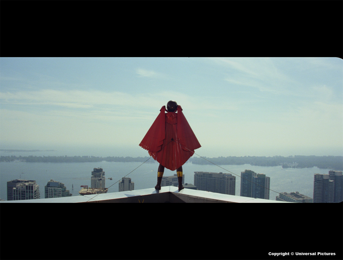
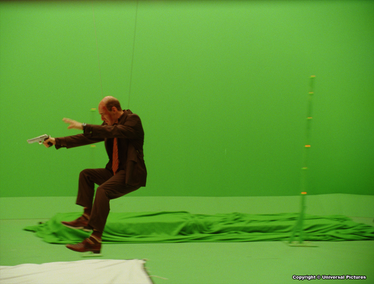
This was the first sequence that we prevised. It was great for me since the shots that we created in previs (compositions and actions), were pretty much what ended up on film. All the plates where shot in Toronto so a big part of the job was to make it look like New York City. Sam Schweir (Double Negative) and I spent a week on top of skyscrapers in New York taking thousands of stills (for various scenes) to be used as backgrounds and 2.5D projected matte paintings. All the stills where taken at 3 exposures, stitched together and baked in to open EXR format. The stuntman was later shot on greenscreen. For the shot where he leaps over the edge we ended up replacing the legs in CG since the real ones didn’t really work for the action. The shot where he crashes in to the car is built up out of several elements: a SFX wired car on location, greenscreen crowd, CG building and a greenscreen stuntman that we dropped in to a bunch of boxes.
 |
 |
Can you tell us how you have conceived and achieved the animated sequence at Fido?
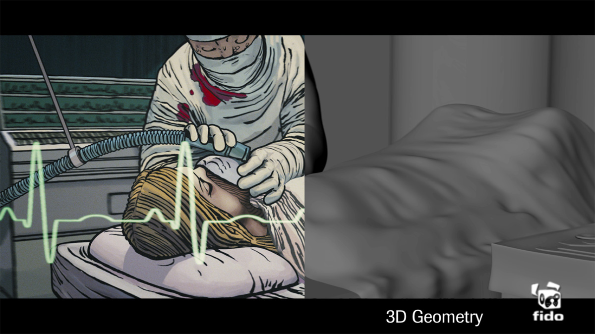
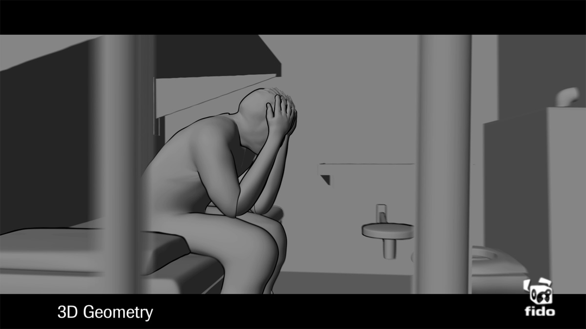
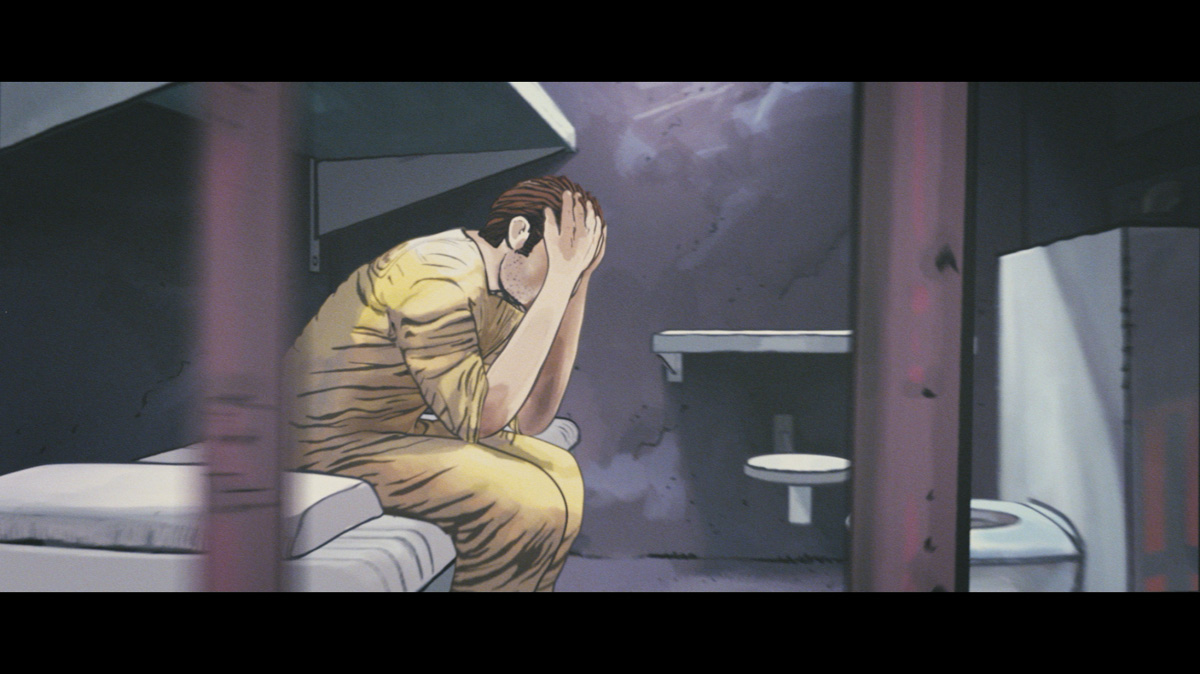
A 2,5D technique was used throughout to realise the Comic Book sequence. From the very beginning the idea behind the sequence was that you where meant to be able to stop the sequence on any frame and it should look like a frame from the graphic novel. So it became apparent early on that we had to work together with John Romita Jr and his team (Tom Palmer and Dean White).
 |
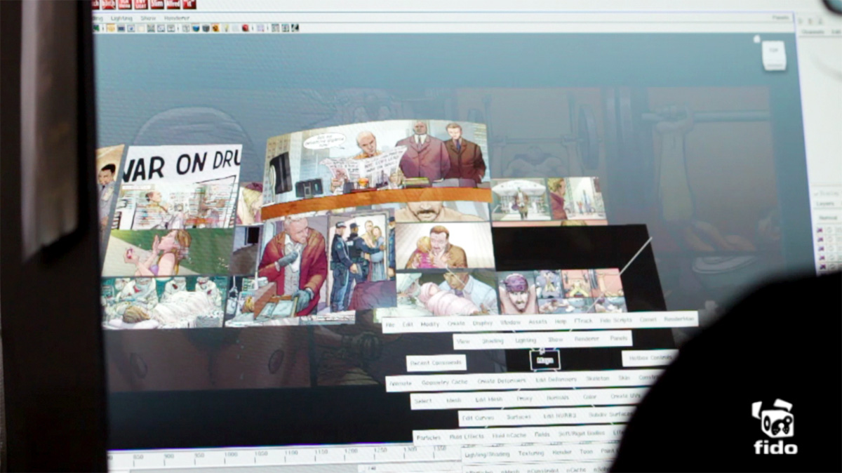 |
John created a set of storyboards based on the lines from the script. We then took the boards and created an animated previs. A lot of work went in to the storytelling and the use of 3 dimensional moves through the comic book world. Once the previs had been approved by Matthew I flew over to see John in New York. Final tweaks where done to the compositions of each frame in conjunction with John. Once John and his team had finished the artwork, the team at Fido built and tweaked the geometry around to fit John’s drawings. The artwork was then projected on to the 3D geometry to allow us to travel around it in 3D space.
This sequence was what first got me excited about this project. It really was great to work on this piece together with John. He is such a legend in his field and getting the opportunity to bring his iconic artwork in to a cinematic experience was a great honour.
 |
 |
How did you design the sequence of first person view?
The idea was to create a Doom style effect with Mindy’s POV shots. It was created and shot by 2nd unit. Tim Maurice-Jones and Peter Wignall was very much instrumental in the making of this sequence. Wyld Stallyons designed the IR goggles interface and I put the shots together at The Senate.
What were your references and influences to the building and the apartment of Frank D’Amico?
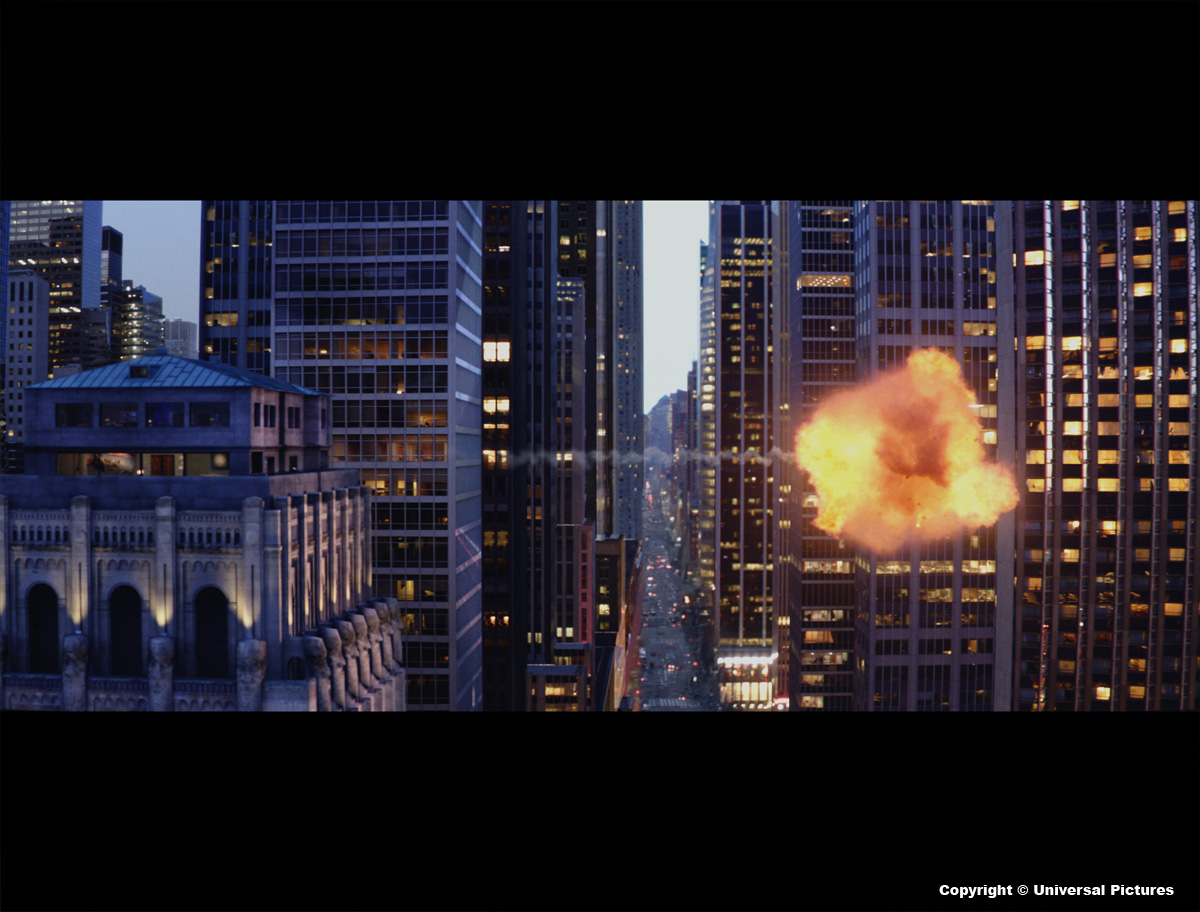
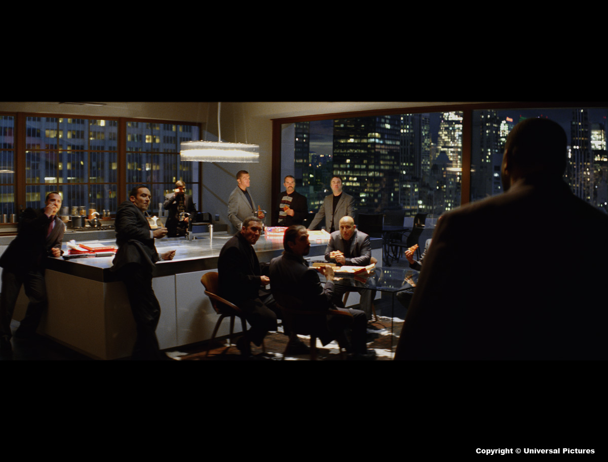
Matthew wanted Frank’s apartment to be a 1930 style high-rise. The idea was that this building would have been one of the taller buildings in Manhattan, but many much taller and more modern buildings have been built since. So whenever looking at the building it would be dwarfed by the new enormous skyscrapers. The building itself was modeled on “Commerce Court North” in Toronto, which was the first high-rise to be built in Toronto in 1930.
 |
 |
How did you create them?
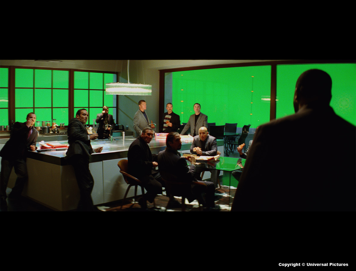
For the exterior, plenty of reference images where taken on location in Toronto. We also carried out an extensive survey of the building, using a TPS Total Station. We actually ended up doubling the width of the building, since it became clear that the interior design of Frank’s apartment would not fit inside of the building. All the views out of the apartment where created using the photography acquired in New York. The team at Double Negative (headed up by 2D Supervisor, Peter Jopling and 3D Supervisor Stuart Farley) created the look development and Lipsync Post made the composites for the largest bulk of the shots.
 |
 |
What did you do on the final confrontation in the apartment?
When Mindy runs wild in the corridor, all the blood hits are shot elements composited. I headed up a 4 day elements shoot. We shot loads of blood hits, exit and entry wounds, fire, smashing glass, muzzle flashes, bullet hits, etc. We also created a CG knife, rope, gun clips and gun.
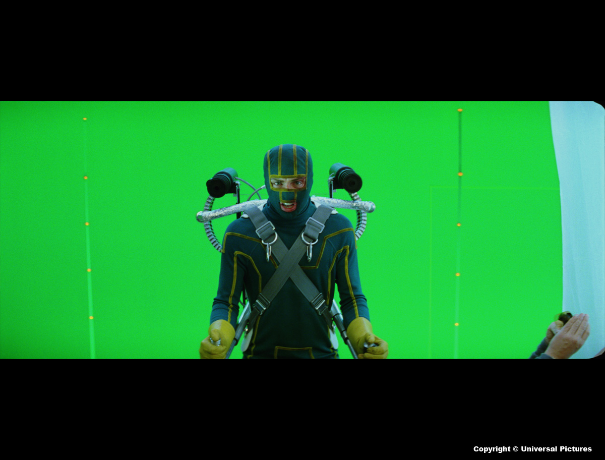
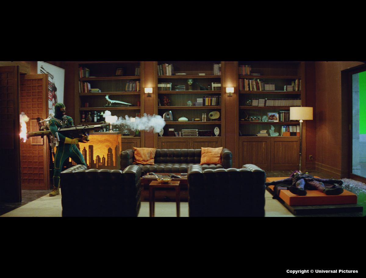
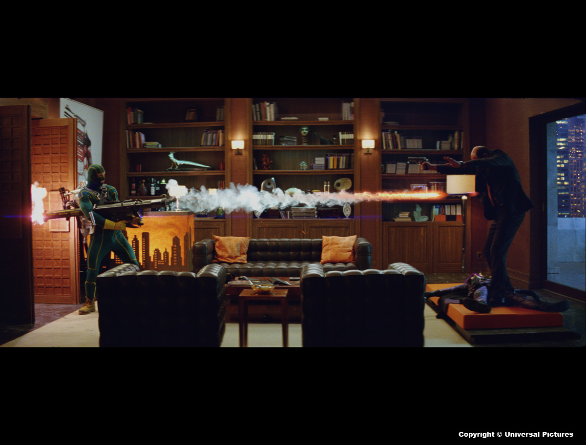
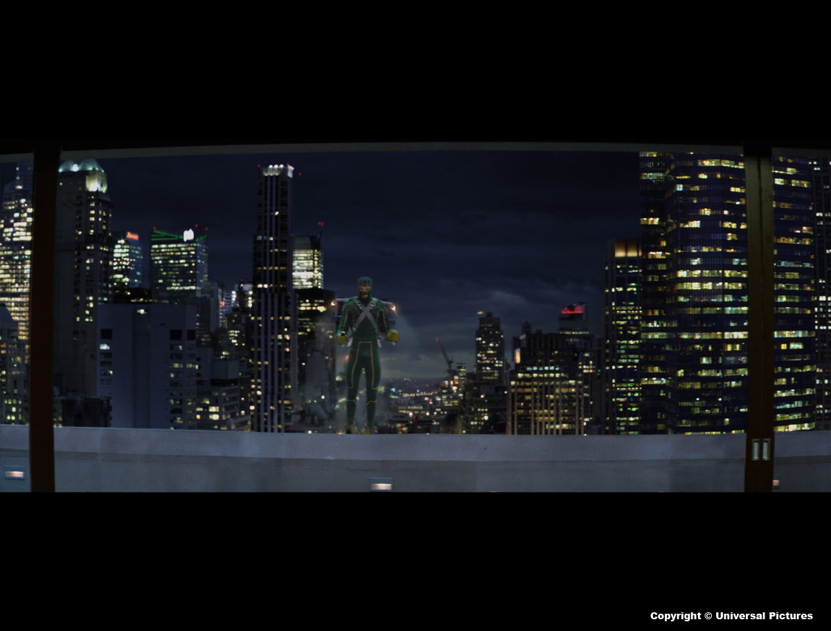
When Dave shoots the crap out of the apartment there were greenscreen comps of the New York exterior, tracer fire from the gatling guns, CG shells from the gatling guns, CG breaking glass, jet-pack effects, set extension on Frank’s apartment and additional smoke and debris.
 |
 |
Can you tell us about the flight scenes of the final sequence?
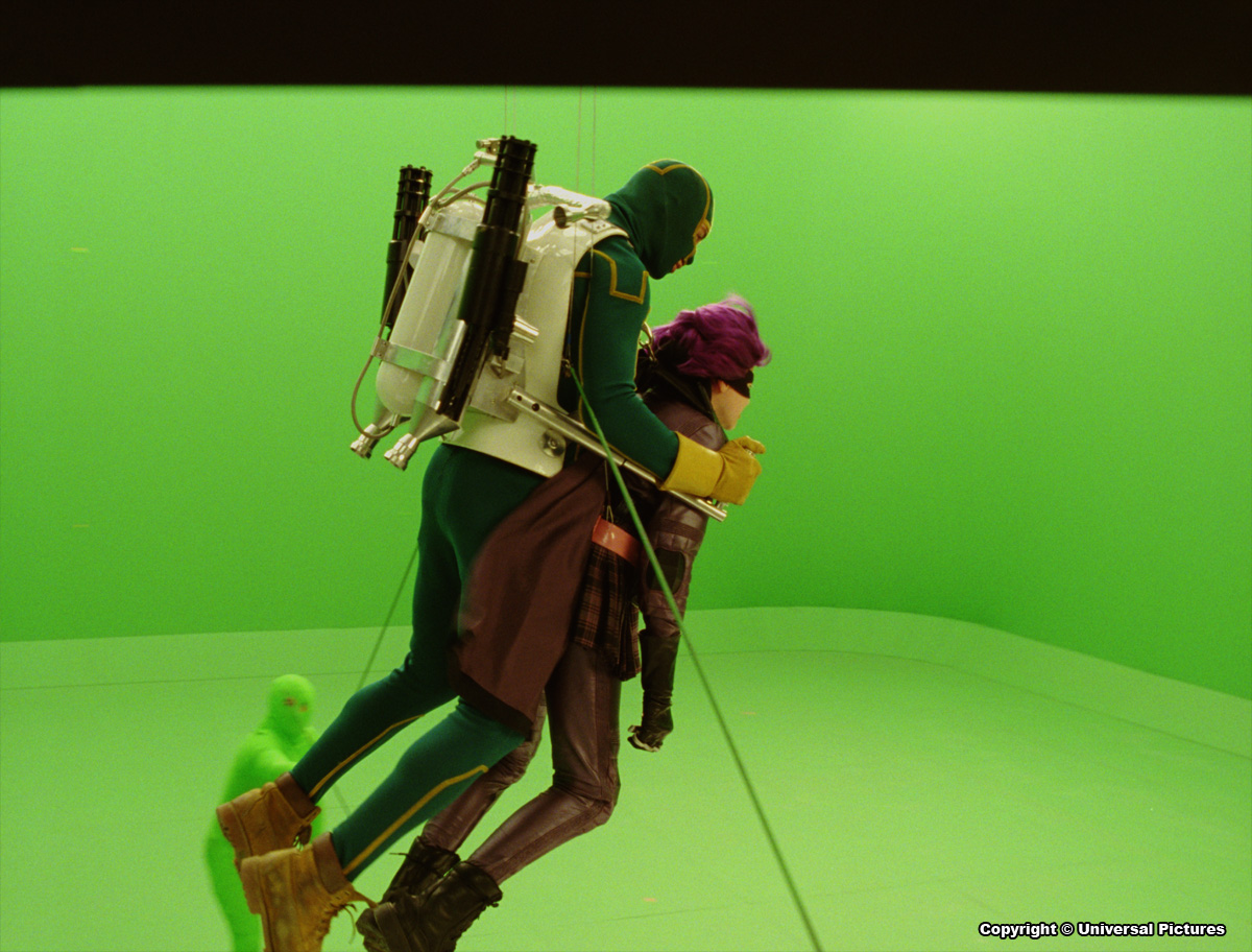
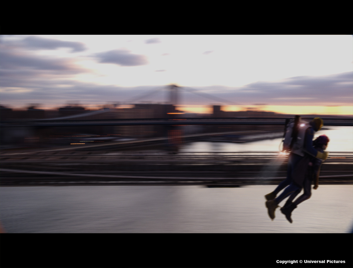
It was all shot motion control. We shot helicopter plates in Toronto and New York. These plates where then tracked and previs characters where animated to get sign off on flight of the characters. This animation then formed the basis for the motion control shoot. There were some big fly-by’s in the sequence and the moves where far to big for us to be able to shoot it at 1:1 on the greenscreen stage. So we used a system called aim-cam that we have developed at Double Negative. It basically allows you to take out the z-depth out of a move. This is what we shot. We then reverse engineered the moves and put the z-depth back in the comp with 3D information passed on from Maya to Shake using a propriety tool called dnplane-it.
In some flight shots, the motion blur is sometimes very strong so we don’t see the characters. Did you have some problems with those shots?
I suppose it is just the nature of an object flying past camera at high speed shot at 24fps. If we where not to use the right amount of motion blur, we would have ended up with a strobing effect.
 |
 |
In the final sequence, the light passes from night to day. This has been a puzzle to connect all right?
Yep, you could say that again. It was tough, but it was a great challenge set by Ben Davis (DOP). Ben had this idea that it’s just before dawn when Mindy arrives at the apartment. When Dave turns up on his jet-pack there is a little bit of light in the sky. Magic hour arrives when Dave and Mindy enters Frank’s study and the full sunrise happens as our heroes escape on the jet-pack. Because of this elaborate change of light throughout the sequence, I had to make sure that we where covered when we did our stills shoot. This meant that each location that we went to in New York, we had to photograph in daylight, dusk or dawn and night. Because we took all the stills bracketed (3 different exposures) we then had a huge range to grade the backgrounds to fit all these subtle light changes throughout the sequence.
As a production VFX supervisor on the film, how did you chose sequences that would be made by other studios?
I had to look at the various vendors strengths and give them the work that I felt comfortable they would finish to the highest standard. As with everything in this world it’s also about the finance. So Andy Taylor (VFX Producer) had to make sure they could deliver on budget.
 |
 |
Can you explain to us the sequence’s distribution in the other studios?
Double Negative:
The Armenian opening sequence, all Frank’s apartment exterior shots (CG building), Atomic Comics street extension, Dave hit by car, Look Development for Rasul’s interior and rooftop, Look Development for the views out of Frank’s apartment, The warehouse set extension for New York background, Russian getting nuked in the microwave, Dave shooting up the apartment on his jet-pack, Frank shot by Bazooka, Dave and Mindy escaping on the jet-pack, Mindy’s roof top, Dneg also did all the previs.
The Senate:
Atomic Comics exterior views, Rasul’s interior and rooftop, warehouse on fire, Mindy’s POV fight in warehouse and Big Daddy on fire.
Lipsync Post:
Dexter Fletcher in car crush, Mistmobile interior driving shots, Mindy goes wild in Frank’s apartment, Exterior views out of Frank’s apartment.
Ghost:
Screen inserts, cinema sign, car crush New York extension.
Fido:
Comic Book Sequence. A 1.5 minute long full CG sequence that tells the backstory of how Damon and Mindy became Big Daddy and Hitgirl.
Wyld Stallyons:
Screen insert artwork designs for computers, mobile phones and security cameras.
How many shots were done by Double Negative?
150ish
 |
 |
What was the sequence that prevented you from sleeping?
The Comic Book Sequence. It was such an important sequence to get right. Both visually and from a storytelling point of view. It went through many different iterations before we got something that everyone was happy with.
What did you keep from this experience?
Never give your phone number to John Romita Jr. (laughs).
What is your next project?
Some very interesting highend projects at Fido. But it’s too early to discuss.
What are the four films that gave you the passion for cinema?
THE GRADUATE, THE BIG BLUE, THE ABYSS and NATURAL BORN KILLERS.
Thanks a lot for your time.
// WANT TO KNOW MORE?
– Double Negative: Dedicated page to KICK ASS on Double Negative website.
– Fido: Dedicated page to KICK ASS on Fido website.
© Vincent Frei – The Art of VFX – 2010


