Back in 2018, Sean Konrad explained the visual effects work done by Method Studios on Deadpool 2. He then worked on various shows su as Welcome to Marwen, The Witches, Loki and Ms. Marvel.
How did you get involved in this series?
I was approached in 2021 by Peter Phillips at Legendary who had been talking with Pier Lefebvre (who ended up being the overall Rodeo FX VFX supe for this project) about people in Vancouver who might be a good fit for the show and he suggested me. I was extremely intrigued by the script and had a great meeting with Chris Black and Matt Fraction and it seemed like we were all very much in alignment about what the show would be.
What was your feeling about being back into the Godzilla universe?
I worked on Godzilla 2014 as an artist and then helped out on King of Monsters on one scene at Method Studios – both projects were incredibly challenging but they were both very creatively satisfying. Godzilla is one of those rare pieces of media that has this legacy as being one of the most important pieces of allegorical filmmaking ever made – and no matter how that diverges into the more bombastic and fun movies later in its run, there’s still that core that’s important to honour, so I don’t take it lightly.
How was the collaboration with the showrunner and the directors?
I was involved very early when we only had one script, so I was able to get in early and talk about creative challenges, like what were the monsters going to be and how could we pace the VFX in a way that made sense for the show and its budget.
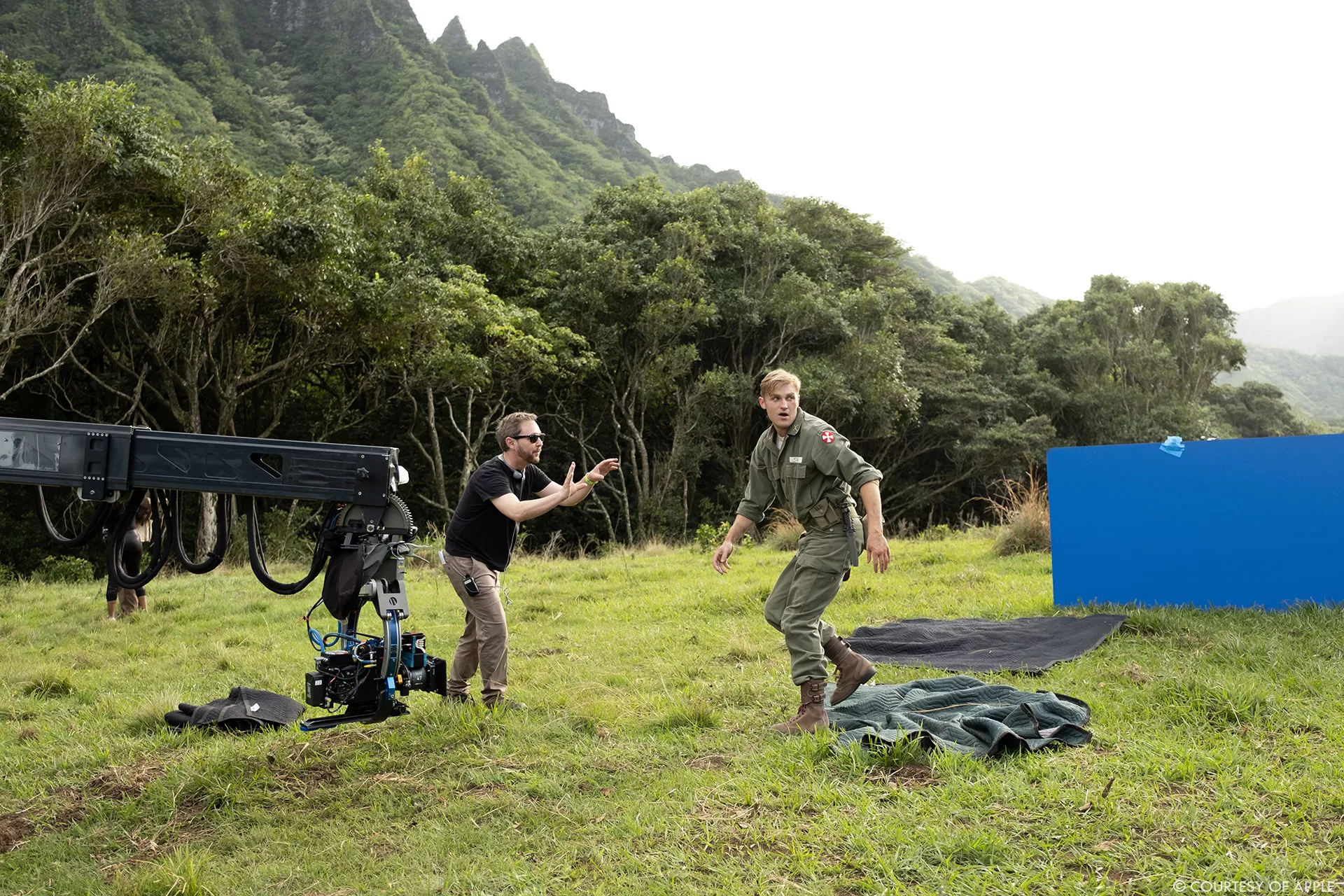
Once directors were involved, they would take the major VFX sequences and storyboard them, we would then take the boards and send them either to our in-house team or The Third Floor (TTF) to previz. We would have a first pass at the sequence and then identify places where the previz supe (Jourdain Biziou) and I felt like we were missing coverage or the storytelling wasn’t clear and show those as options to the director. All of our directors / DoPs were very collaborative on set and receptive if we were concerned about coverage. Most of the directors moved onto other shows once they were done with their cuts, but Matt Shakman was able to stick around for his episodes and review everything with us and Chris Black.
What was their approach and expectations about the visual effects?
Chris and Legendary were very adamant that this couldn’t be the budget version of the Monsterverse, so they were expecting film quality VFX to be our aim. It was also clear that we needed to support the human drama as much as possible, which meant going back to a lot of the philosophy of what worked in Godzilla 2014. Specifically, we would embrace a human/subjective PoV wherever possible, and if we needed an objective shot for storytelling this would only happen after ‘earning’ that in the sequences. The way I like to think about this is that our action scenes aren’t set pieces that we build the script around, they’re punctuation marks in the emotional stories of our characters.
How did you organize the work of your VFX Producer?
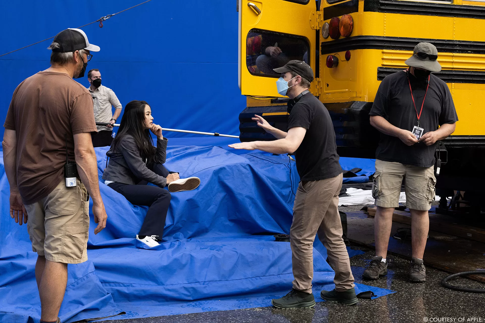
Jessica Smith came on board around the same time as me and dived right into figuring out the budget and working through scenarios with various vendors, and also started figuring out how we were going to manage our on-set team. Because we had a lot of vendors and a challenging schedule, we had to figure out how to multithread things as much as possible from an early date.
We knew we needed an on-set supe because we were shooting multiple units concurrently, but she identified early on that the expectation was going to be that our department would be shooting two units and scouting on any given day, all while putting together postviz, getting work to vendors, and finishing concepts, so we brought on a second on-set supe to help cover the gaps. Those two ended up being Steven Tether and Jed Glassford, but there were even some days where even that barely covered us so Jes also stepped in and helped wherever she could while also trying to figure out all the schedule things in the back end.
How did you choose and split the work amongst the vendors?
We ended up with a large number of vendors on this show and a lot of that was just simply because we had such a diversity of work that needed to be completed concurrently and we wanted to avoid bottlenecks. On top of that, there weren’t a lot of vendors who had huge capacity availabilities so we stuck things where it made sense.
Our major creature houses ended up being Framestore (strong history with quadruped creatures and a generally robust creature pipeline), Rodeo FX (FX and environment accomplishments), Weta FX (they are able to take on big 3rd act challenges and deliver high quality VFX of any kind), and Rising Sun Pictures (we needed a vendor who was strong with water and creature work, and I was impressed with what they did on Jungle Cruise).
On top of that, I’d worked at MPC during Godzilla 2014, and we were doing a scene that basically recreated the bridge sequence from that film so that was an easy choice. Outpost VFX and Distillery VFX both delivered a large amount of comp/environment and some complicated low volume FX work.
TTF was our primary previz and postviz vendor, with an in-house team taking that and postviz, and then Proof handled a few additional sequences.
Storm Studios, FuseFX, Crafty Apes VFX, Mr. Wolf, all handled some odds and ends that didn’t have logical homes, and then Bot did a lot of production fixes that our in-house couldn’t handle because of volume. There’s also a chunk of deaging work we did with Vitality VFX – but I can’t talk about that yet.
Your vendors are all around the world. How did you manage the time difference and the consistency of work?
4 companies worked on Godzilla so yeah, consistency was hard, but fortunately that was the only shared creature asset we had and we only had a few shared assets on top of that, so vendors could basically focus on their own bits. And fortunately for Godzilla there are 3 films where we know what he looks like and how he moves, so that made things simpler.
For the time differences – it wasn’t really that bad. PST is well situated for overlap with all our vendors except for Storm, and I don’t mind getting up early to have some cross over. I am very much the kind of person who wants to jump on calls as soon as critical notes come in, so we were often having 2/3 smaller calls a week with vendors rather than giant 3 hour deep dives, and I think that’s a lot easier to schedule and manage.
Our great production team kept things buttoned up, and our platform from Redesign was intuitive to use, so it wasn’t hard for me to find things if I couldn’t exactly remember a note from 6 weeks ago. Craig Seitz (DFX Supe) also handled all of the production cleanup stuff separately from me and did a vast majority of our tech checks, so even though I’d look at most of it I was fortunate in not having to chase many tech notes.
Can you elaborate about the design and creation of Godzilla and the various Titans?
Godzilla was fully designed for this show so we didn’t really do the design for it – although I know a lot about that history of the various paths that were attempted in the 2014 film, and that helped make sure we didn’t do too many things that would be out of bounds with Toho or Legendary.
For the other creatures in the show (not all technically Titans) the process varied wildly depending on the creature. In some episodes we’d have a vague descriptor of what the creature should be (insect-like, many legs, like a millipede) or we’d have more elaborate descriptors (star nosed mole crossed with a pangolin). There were other scripts where we’d have a scenario and a general idea of what the creature needed to do, but no specific idea what it should be.
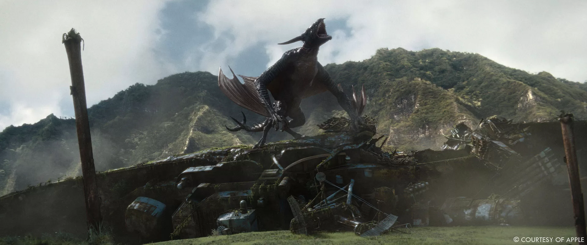
With all of them we’d usually start with a zoom call where I’d share a keynote deck of weird animals from the natural world and then we’d decide throw images that people reacted well to or thought were gross into another reference deck that we’d discuss with our concept artists. We had a few freelance concept artists like Dennis Chan and Jamie O’Hara we worked with directly, and we used MPC for the Ion Dragon, but a vast majority of the creature work was done by the team at Weta Design.
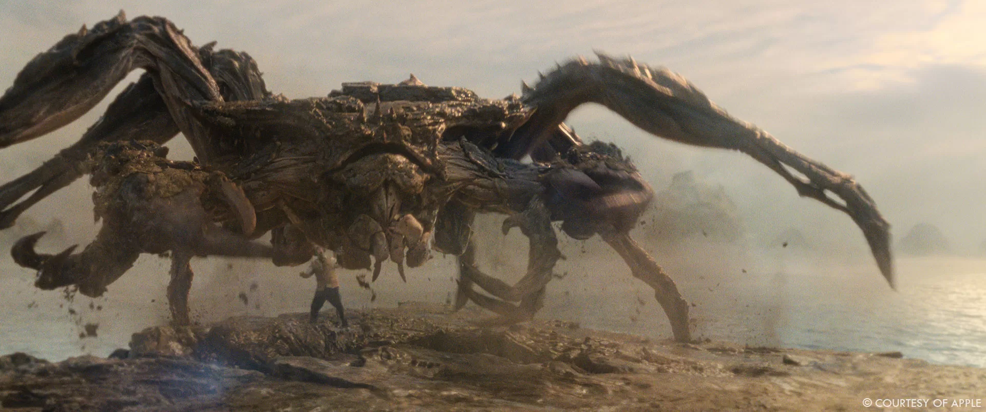
Usually, we wanted the creatures to feel like they could be part of the environment they were in. In the case of the Mantleclaw (giant crab at the beginning of episode 1), its carapace is literally made out of the volcanic rock where it’s situated, but in episode 2 when our creatures encounter a monster in the middle of a jungle, we wanted to design something that felt incongruent with the environment it was in, so it has aquatic features that don’t make sense for the foliage around it.
Once we designed the creatures, we’d put them into previz and postviz – and in a few occasions we looked at the work and realized that the design didn’t sell something about the scene so we’d go in and tweak further. And when the vendors got involved, invariably there’d be something anatomical in the design that didn’t make sense (size of glute muscles, wingspan, angles of legs, etc.) so we would let the vendors drive those decisions.
We’ve already seen Godzilla in many shows. What’s the main difference with yours?
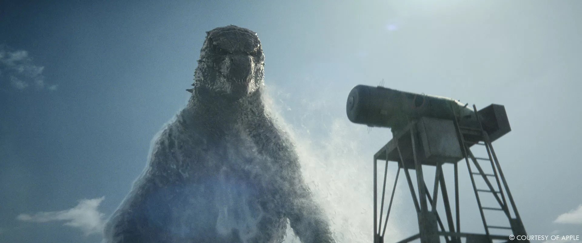
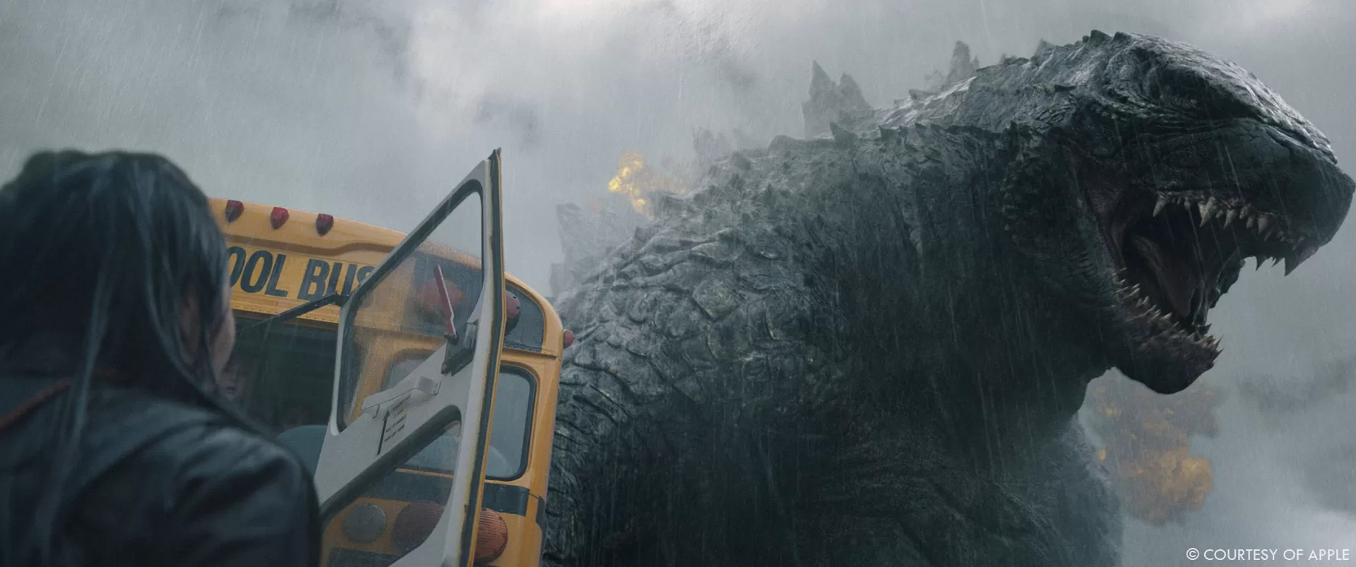
Godzilla in our show is literally the same assets from 2014 for anything in that era and earlier, and KotM for anything in 2015; we strove to make him feel coherent with the films. The main differences are that we’d uprez things if the textures weren’t working for how close we get or we’d add dust/water on him if that made sense for the environment. However, a lot has changed in how things are raytraced from the 2014 film, so invariably some things work a little better these days, so we have some fun full daylight scenes that really shows off the details that have always been in the asset.
How did you handle the animation’s challenges especially with their massive size?
Having a giant creature doesn’t mean they move slow, it just means that they have might take time to build speed, and once they have that momentum they may take a bit more time to slow down. A lot of our creatures are not 300 feet tall Godzillas, but many of the same challenges still apply.
Usually, it would become fairly evident from a walk cycle if the weight was working, so whenever possible I like to start with that kind of approach. You could dial how much certain joints were absorbing the concussive weight of the creatures steps and figure out where you might want some jiggle or other things that could enhance the realism.
The Ion Dragon was a particular challenge, when Weta did an initial flap cycle with the asset, it became abundantly clear that our first design had legs that were too big and humanistic and it looked unbalanced. The wings were also too small to make it look like it stay aloft.
Our creatures also don’t need to be super expressive, they’re oscillating between curious and pissed off, which means that means you don’t need a full set of FACS shapes to sell the emotion, but you still need to have some range in there. Fortunately, our most expressive creatures (outside of Godzilla), were the Ion Dragon with Weta and the Frost Vark with Framestore, and both vendors have a long history of making expressive digital characters.
How did they simulate their presences on set for the actors and the crew?
For line of sight and physical presence, it depends on the creature – with the Frost Vark, TTF had an app where we could scan the set with an iPad and drop in key assets, which didn’t change much about how we shot things but did give us an idea of how big the thing was going to be. In other cases, it’s a lot of the usual tricks like a tennis ball on a painter’s pole. For Mari (Keiko) in episode 1, when she’s being swarmed by the endoswarm, we had a boot with a cable on her leg that the stunt guys would swing around and pull on so it gave her a much more visceral performance. In one Godzilla scene, we actually flew a drone to approximate where his face would be as he stood up.
Beyond that we’d also just make sure to share the previz with the actors and that would often be enough for them to go on. I was reading a thing about Roger Rabbit the other day, Bob Hoskins used to be able to perfectly target 3 feet for his eyeline, but in one scene he was looking at his own eyeline so the animators made Roger stand up on his tiptoes and grip the wall like he was frightened. That shot ended up being used in a lot of marketing material and is a very iconic moment in the film. This is all to say, if things aren’t quite what you planned, there are still plenty of solutions for how you can make your actors feel engaged with the creatures.
Our first AD for episodes 1 / 2 / 7 / 8, Jim Brebner, did a Godzilla roar that was 50% a very good approximation of the real roar, and 50% so ridiculous that I don’t know how all of our cast didn’t break whenever he did the effect, which I guess is a sign you’re working with professionals. But I think when that’s all you’re hearing over the PA system, it ends up commanding attention.
Which creature was the most complicated to create and animate?
The Ion Dragon was tough because we went through so many permutations of what it could be, there’s an entire article on newsweek about that so I won’t go into too much here.
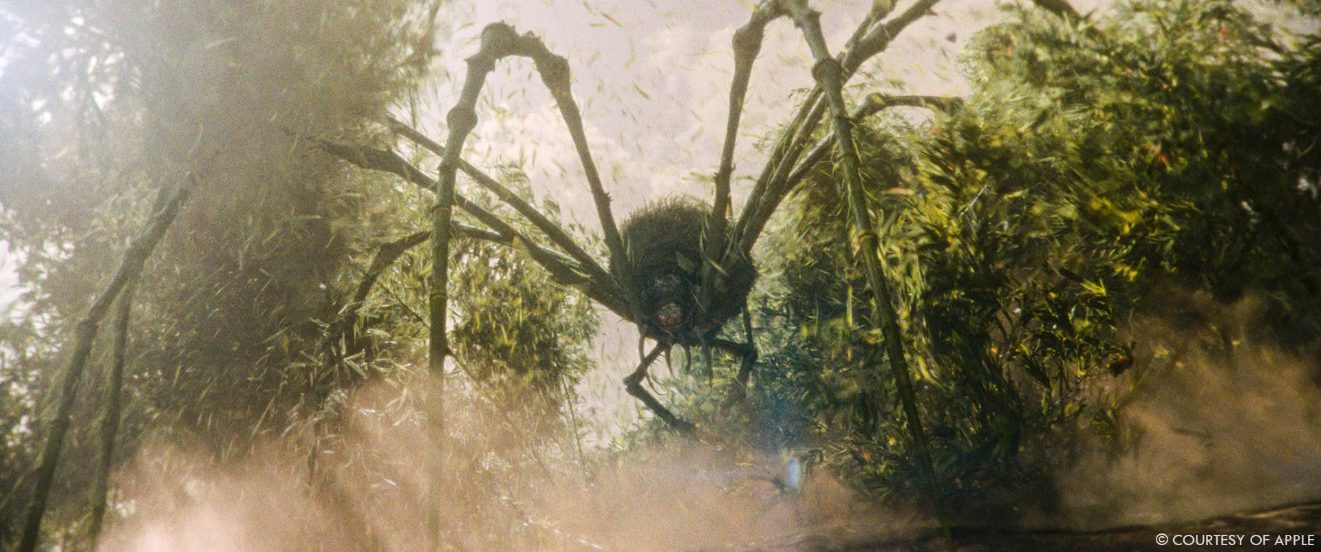
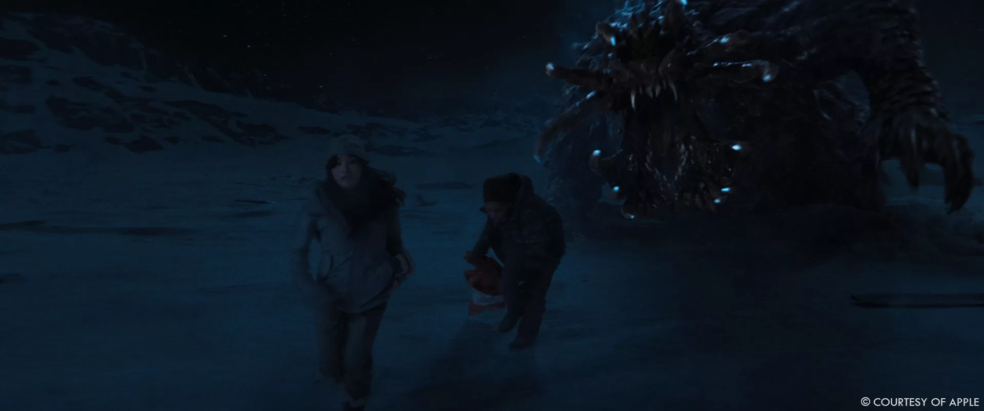
The Frost Vark from episodes 3 and 4 was also insanely challenging. As I mentioned above, we had a clear idea of what this should be, a pangolin mixed with a star nosed mole, and after some conversations with the filmmakers what they wanted to have this armoured creature that used the star nosed mole facial appendages as a way to sense heat sources in a freezing environment. We did a design that really worked well on the page by making the face mostly about the appendages, but after postviz, the consensus was that it wasn’t scary enough. We really liked that the mole didn’t really look like it had a traditional face, but when you have something just looking at the camera without eyes, there was a disconnect in how we wanted the audience to react. To make this sell better, we gave it giant teeth and cloudy white eyes, and then made it darker and spikier, and put a ton of damage and snow detritus on it so that it looked like it had been through a few battles.
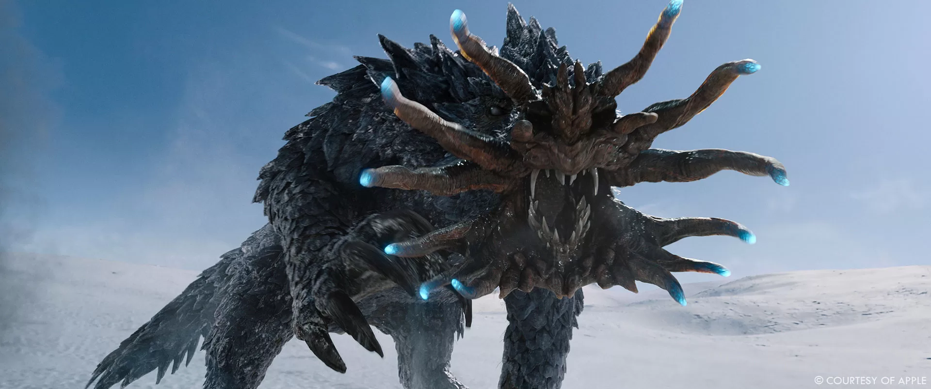
This ultimately worked better, but what sold it was Framestore’s animation. We’d originally envisioned this thing being blind and slow moving and the fear kind of coming from the inevitability as the heroes became more and more exhausted and hypothermic. But this was a lot less scary than something that’s constantly aggressive. The philosophy we took is that every shot should characterize the creature as being angry/hungry/feral – that kind of per shot characterization was a thing that Jye Skinn (Framestore’s anim supe) and I did a lot on The Witches, so we had a good language for that.A real trick with this creature is that you’re not just simulating hair and muscle/fascia/fat, etc. which are all really well tread territories for CFX departments – in this case you’re simulating muscles but also simulating collisions for the scales that are very dense in the geometry and not something that can be instantiated because the individual geometry conforms to the folds and nooks of the creature’s body and has per scale variances. There are of course tools to simulate collisions of geometry, but creating a system that’s interactive enough for a character FX artist to actually use is incredibly complex and ultimately a lot of sculpting needed to be done.
On top of this we also knew that it needed to have freezing powers – in one of our early storyboards the artist drew a bonfire swirling around in a tornado/funnel shape, so we knew we wanted something in that vein, but making that feel natural was really tough. Plus, it burrows and displaces snow with every step it takes, and snow is very challenging to get right, especially if your audience is me, a person who grew up in Winnipeg where we had snow on the ground for five to six months of the year. Snow clumps, it sprays particulate and mist, it has RBD qualities to it but also grain qualities, it’s hard to systematize at human scale, never mind something that’s 40 feet tall. I think this creature ended up being my favourite though.
Can you elaborate about the environments work?
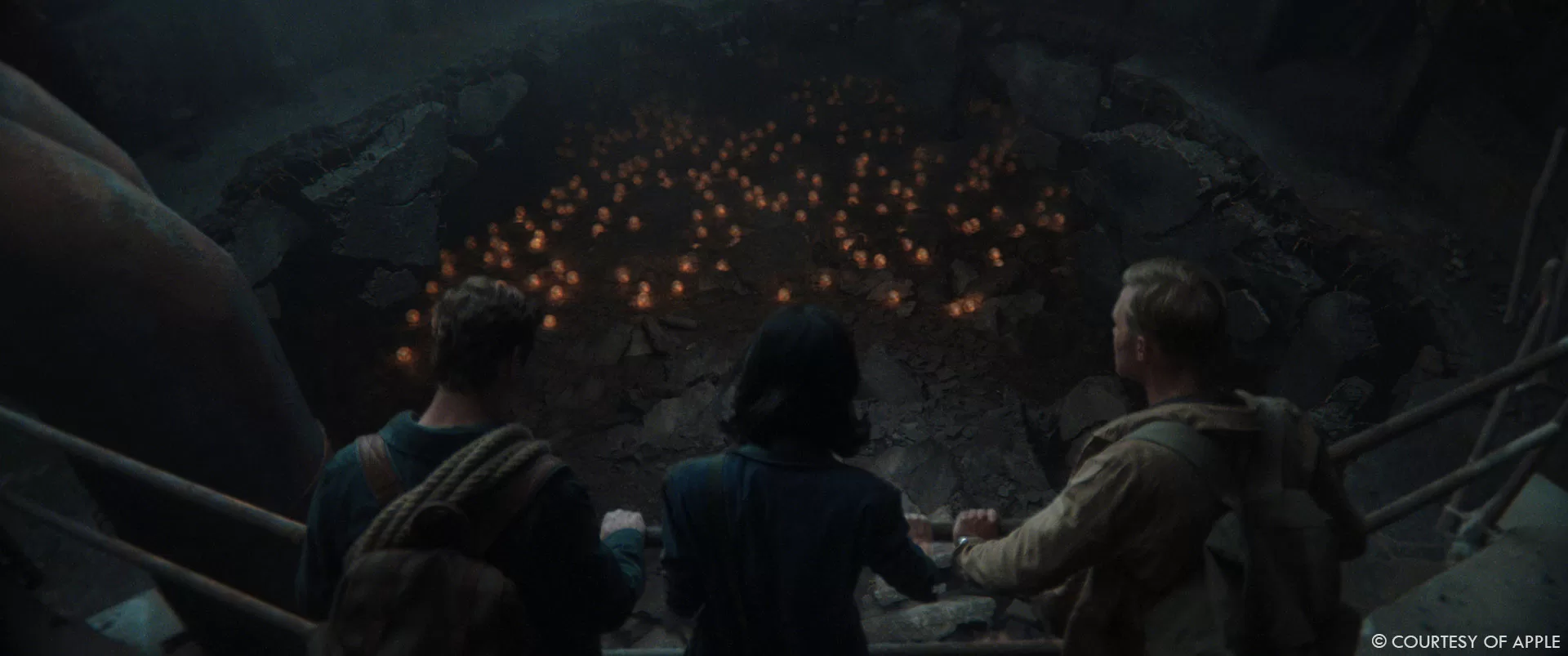
There are a ton of environments – in episode 1, we have digital extensions for Skull Island done by RSP to add bamboo as well as adding haze and limestone karsts to the horizon to make it feel like we’re on Skull Island. We see missile batteries on top of the Rainbow Bridge to give texture to post G-Day Tokyo, done by Fuse. We recreate the golden gate bridge scene from 2014, which we shot in a parking lot with a limited set. We see post-destruction San Francisco from a phenomenal drone shot that Distillery did, and then from the ground level. We see a destroyed Plutonium Plant through a burned forest, done by Outpost, and then we go inside of that plutonium plant for the finale scene in the episode. For that scene, which was done by Rodeo, we did a pretty significant set extension for the plutonium plant – we had two chunks of set for the upper and lower areas and needed to extend and augment those pieces, and then ultimately stitch them together with a bunch of refractive eggs scattered through the environment. They did a great job of making that environment feel ominous and scary.
We have a ton of other environments in later episodes. We shot on a glacier in episodes 3 and 4, but we had to take the night work for episode 4 back to the stage, so that was really challenging to match up, Distillery and Framestore handled that work.
One scene that I haven’t been able to talk about a ton because it doesn’t fit into this framework was the gallery in episode 4. In this scene we flashback to Kentaro on the opening night of an exhibition he’s featured in, and the idea had been they wanted to do this abstract artist statement about how overlapping images can sometimes reveal something new – this mirrors Kentaro’s journey where he realizes that parts of his anger at his Father have nothing to do with the secret family, and more to do with the way that his expectations turned him into this person who struggled to find his own place in the world. The art department started this task, but our production designer came to me shortly before we were going to shoot and was concerned that they weren’t going to have what they needed in time for the shoot, and because we’re talking about projected light, we were weighing out whether it was better to have something physically in the scene that we could reference, or if it was better to just keep it blue. I didn’t want a whole bunch of lighting that didn’t match to be something we contended with so we pulled that idea and did it entirely in VFX.
The script had originally conceived these as Noh Theatre masks. We wanted to project different faces onto the masks and then have pieces glitch in and out. This was problematic because Noh theatre masks have very defined features, and if you have 100 faces you’re projecting onto that geo it means that you’ll have alignment issues with the eyes, mouth, etc. As Kentaro’s character was developed the mask idea felt increasingly incongruent, Matt Fraction felt like large abstract polygonal forms might work better and be more in line with the themes that we see in his character’s artwork elsewhere, and these would also be more appealing as objets d’art (as we were proposing these were mini-installations people would buy). I did a lot of abstract polygonal forms on Ms. Marvel, and from that experience I knew that it can be really hard to get a bunch of triangulated faces to look appealing and descriptive. We did some early mood boarding, this let us explore what kind of forms we liked for the pieces – we then did more specific contextual concepts with RSP’s art department to help us further develop the ideas. After things were filmed, we sent the material to a motion graphics artist, Ben Radatz, and he helped us figure out this glitchy language for the projections (we were still working with masks at the time) and nail down some storytelling beats. RSP then took the spirit of those motion graphics reels and reinterpreted them with the new geometry. A lot of the room in these scenes is replaced, because we had a very reflective floor to contend with.
We have a ton of others on the show – we go to San Francisco and see the destruction from the ground level. We go to the desert, and while a lot of that is in camera, digital versions needed to be made. We also return to other locations from earlier episodes but in different timelines. And then the finale episodes have some big environment work as well.
What are the main challenges with the environment work set in the past?
There isn’t a ton of historically specific stuff that we had to do, more often we were just painting out modern signage, but one interesting one is that our modern timeline is 2015. We had a scene that takes place on freighter taking used cars from Japan to Korea. Outpost found some great pre-2014 Japanese vehicles and populated the deck of the ship with these.
In the same episode, Outpost produced a giant footprint of Godzilla that we see in a giant hangar and an extension at the back of the set. Our art department did a ton of research into how this would have been built and mounted so we tried to use that research.
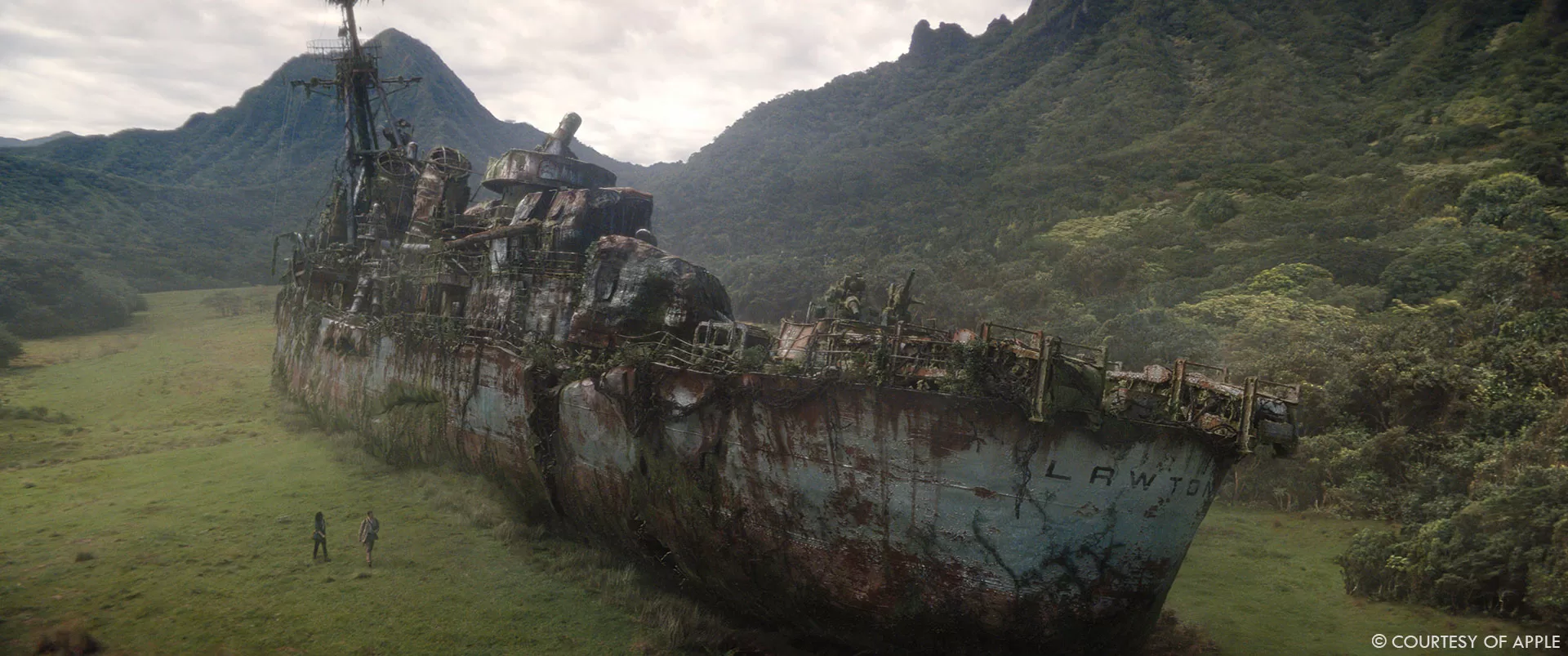
One other key thing was the USS Lawton exterior – our showrunner wanted to correct the type of ship that was used in its appearances in previous films to be more historically accurate. That build was interesting because we knew it needed to be rusted and damaged, but we wanted it to mostly be intact when we first see it so that we could destroy it later.
Which location was the most complicated to create?
We have an environment in episode 9/10 that was conceptually very challenging, but I can’t really talk about it yet.
Which sequence or shot was the most challenging?
Generally anything where simulated FX needed to do the storytelling was a huge challenge, and this was because continuity is inherently challenging with sim. Animators naturally work on things in an edit, but as we get further from that discipline, artists tend to work in the shot modality and that work is often decontextualized from the sequence. So, for example, a giant creature stands up and simulated debris comes off his back – where does that debris need to be 4 cuts later? You can do a master scene and then cut that together, but once you’re past the RBD step you want to go into procedural setups for elements like dust and particulate for efficiency, but a lot of times that just doesn’t look right from a continuity PoV. And then you’re also dealing with time cuts where we’re fudging geography in the principal photography so a continuous sim would be impossible – it’s inherently difficult. I think the solution is to try to do as much visually in animation as you can, but that stuff can be hard to translate in a pipeline capacity.
But in terms of what’s released, here are a couple of shots that were nice little challenges:
In episode 2, we had this scene where our heroes Keiko and Billy are exploring a ship interior. As they get further into the bowels of the ship, they see this dried glowing material everywhere, which was from a practical set build but enhanced by Fuse. We shot a scene where they come across a dead crew member, preserved in this nacreous material, and it didn’t really give you the scale we needed so our director Matt Shakman wanted to revert to a version of the script where we see a lot of dead bodies in an alcove. This had been cut because we didn’t have the capacity in the schedule to build that physical set and it was a huge expense, but for two shots it was financially achievable to do in CG. This was decided very late and we didn’t want to keep this episode open, so casting this with 12/13 weeks was tough. Fortunately, I was watching The Last of Us when this problem came up, and saw a LinkedIn post from Alex Wang highlighting an amazing shot that was largely CG and had a lot of similar complications – that work happened to be done by Storm Studios in Norway. So, we called them up and they were down to give it a go. We had some postviz and it was helpful, but we still wanted to concept things in a bit more detail. They did some speedpainting stuff and that helped us do the layout. Meanwhile they did some tests to figure out how desiccated we wanted the bodies to be underneath the material. We wanted to give the impression that they were slightly mummified, but body parts that were outside of the splash zone of the nacre (limbs) needed to be fully skeletal and rotted. Once we got into the shot work it was a tough balance of figuring out how to get the impression of a bunch of dead bodies covered in this goo without it becoming cluttered, we also wanted shafts of light and atmospherics to tie into the rest of the scene. One of my favourite details is there’s an arm hanging from the ceiling. There are even some bugs crawling around the dead bodies. It was great to work with them, because they work in a very generalist approach. A shot like this would’ve been possible 10 years ago, but not on that timeline.
Is there something specific that gives you some really short nights?
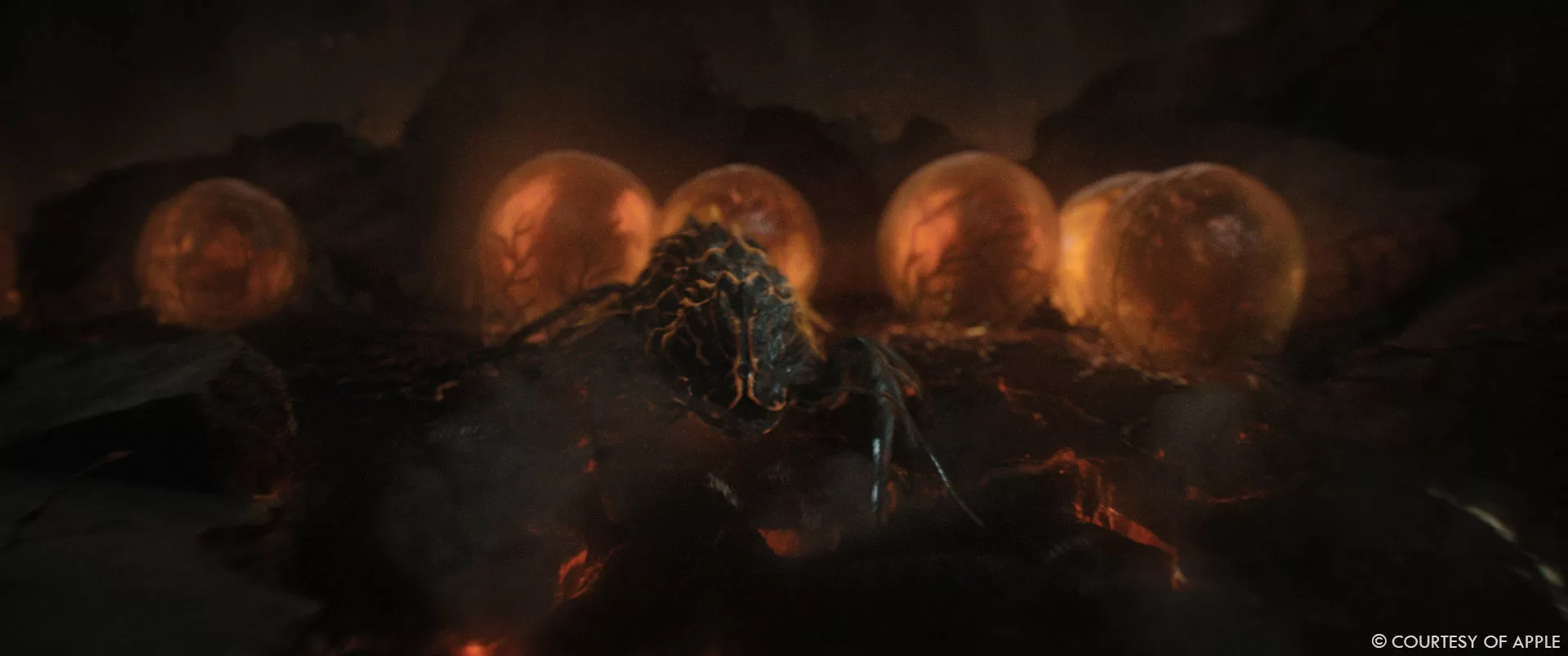
The entire endoswarm scene in episode 1 was concerning because of the crowd element. We had a huge number of creatures creating a pyramid up to Keiko and we needed it to feel like they were building that volume from the outside in. Rodeo ended up needing to devise a crowd simulation system for this that I think is completely novel. They took a volcano of jellybean-shaped primitive geometry, and dropped this – then played it in reverse to get the sense that the tower was building. Once they figured that out, there was still a ton of cleanup to do with intersecting legs and other issues, but it gave a solid direction for the sequence.
We did some deaging work that hasn’t been previewed anywhere yet, and it was significant enough that it might have made sense to do an AI approach – but we didn’t have the training data on the actors as younger people to really make this work without experimentation and time, it probably would have been a research project because of the variety of sources we’d need to pull from. We ended up approaching Vitality who did a more traditional 2D approach, they were great because they did some mockups before we got too deep and we were able to get buyoff from our creative executives ahead of committing to an approach. It’s one of those things that audiences tear apart if it’s wrong so I’m always concerned about whether it’ll land, and part of me is still nervous. But I was happy when Leo (our composer) told me that the deaging work was the VFX work in the show he was most blown away by in the show.
Beyond that, I’m the kind of person who stresses more about creative problems than logistical ones. The Frost Vark stuff was one of those situations I was very worried about because we’d redesigned the creature kind of late in the process and it was going to be extremely challenging to get right – but once we had one of the critical sequences at 70%, the rest of the work felt doable even if we still had a big challenge in the logistics side. We were really fortunate that we had Arek, Kelly, Jye and the Framestore team leading that effort.
What is your favorite shot or sequence?
We have a shot near the start of episode 4 with the Ice Titan tearing apart a plane that I love. We’d had a ton of issues with the concern over the creature not feeling sufficiently scary, and I knew that once I got it to the vendor side, we could make it higher energy and scarier. Before I could turn anything over, I had to prove that idea. We got TTF to take a pass at this, almost channelling Kong’s anger, which I think allayed a lot of fears. And then once Framestore got into it with the new design, beyond figuring out how to make that aggressive animation feel real and scary, they did a great job of taking a PoV VFX shot look photographic – clean PoVs are a thing that often clang for me personally, and it’s a rarity when they pass muster. In this case it doesn’t just pass, it’s a totally incredible shot.
What is your best memory on this show?
That’s a tough one, I think maybe when I watched the first episode fully scored and audio dropped in, I was at Rodeo in Montreal, so I was able to bring them into the room and show them the scene and I genuinely got a shiver from the moment Keiko disappears. From that point I think I realized the show was going to work.
How long have you worked on this show?
I started on a consulting basis just over 2 years ago but wrapped VFX in October, but I am still doing bits of marketing now. So yeah, a long time!
What’s the VFX shots count?
Just shy of 3000.
What is your next project?
I have some baseboards in my place that need replacing, so my main projects are house related for a bit. Everything is nebulous post-strikes, so I’m just taking a beat before I jump into anything.
A big thanks for your time.
WANT TO KNOW MORE?
Framestore: Dedicated page about Monarch: Legacy of Monsters on Framestore website.
Rodeo FX: Dedicated page about Monarch: Legacy of Monsters on Rodeo FX website.
© Vincent Frei – The Art of VFX – 2023


