Ciaran Crowley began his career in the visual effects more than 20 years ago at DNEG. He joined Milk Visual Effects in 2018. His filmography includes many films such as THE DARK KNIGHT, INCEPTION, THE ASH LAD: IN THE HALL OF THE MOUNTAIN KING, THE PROFESSOR AND THE MADMAN.
What is your background?
I’m a VFX Supervisor at Milk – I joined in 2018 to oversee the VFX creature shoot for FOUR KIDS AND IT – Dan Films/Kindle Entertainment’s recent feature film for Sky– based on Jacqueline Wilson’s modern-day variation on E Nesbit’s classic novel Five Children And It – for which the Milk team created the protagonist CG sand fairy character, voiced by Michael Caine.
I’m originally from Ireland and graduated from DIT Dublin. I initially followed a design career but was always obsessed by VFX – which led me to a Post Graduate VFX course at NFTS.
How did you and Milk Visual Effects get involved on this show?
We were invited to work on CURSED by Overall VFX Supervisor for the show Dave Houghton. Milk works regularly with large networks such as Netflix and Amazon on high end episodic TV shows such as CURSED.
How was the collaboration with the Showrunners and VFX Supervisor Dave Houghton?
It was a great pleasure to work with Dave Houghton, Frank Miller and showrunner Tom Wheeler. It was very clear what they (and the episode directors including Zetna Fuentes) wanted style wise especially for the wolves – specifically a very dialled up, larger than life wolf. Of course we had his illustrated novel for reference and he wanted the wolves to feel like those. There is one particular wolf from ‘300’ that he was keen for us to channel. We adapted some early concept designs based on this, and our treatment of them, including the lighting, was adopted into the lighting style of the wolf sequences by the DOP, as well as throughout the VFX.
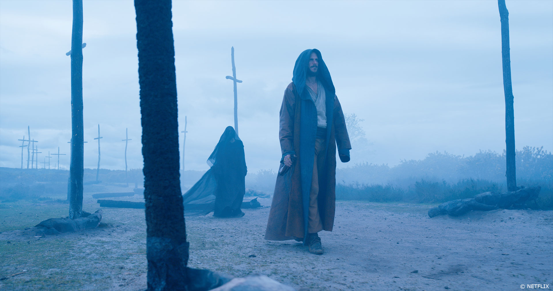
Early on we created a wide range of concept work for Dave, Frank and Tom not only for the wolves but also the fey fire, the waterfall, the Leper kingdom, the Cailleach (cave environment) and Culzean Castles. Frank wanted all of the ‘magic’ to feel elemental rather than ‘hocus pocus’ and so we designed our lighting bolts, fey fire and sword glow accordingly.
How did you organize the work with your VFX Producer?
I worked closely with Jenna Powell (our Milk Visual Effects Producer) who is extremely experienced in this type of episodic production with a variety of different VFX (from environments to creatures to FX). Myself and Jenna had a great relationship with Rebecca Vujanovic the series VFX Producer; which was essential, given that delivery was not sequential episodically.
What are the sequences made by Milk Visual Effects?
Milk handled a variety of work on CURSED, creating 390 shots encompassing a pack of CG wolves developed from concept through to animation, as well as a forest environment in which Nimue fights with them; and a dramatic waterfall environment where a combat sequence takes place at the climax of the final episode.
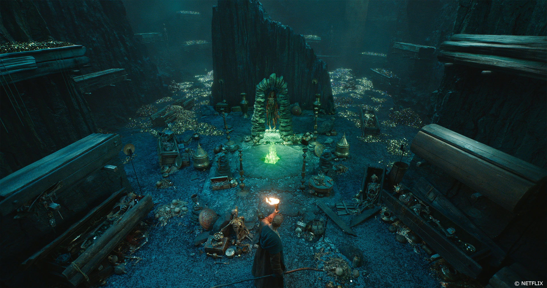
Milk’s brief also included a number of environments: the CG Culzean Castle and subterranean world environments for the Leper Kingdom; the underground chasm at Cailleach; digi-doubles of heroine Nimue and the Paladins for the waterfall sequence; the green Fey forge fire; and the glow and effects on the sword. The studio also created additional environments and effects, including chopping off the hands of the character Bors.
Nimue is attacked by a pack of wolves. Can you explain in detail about their creation?
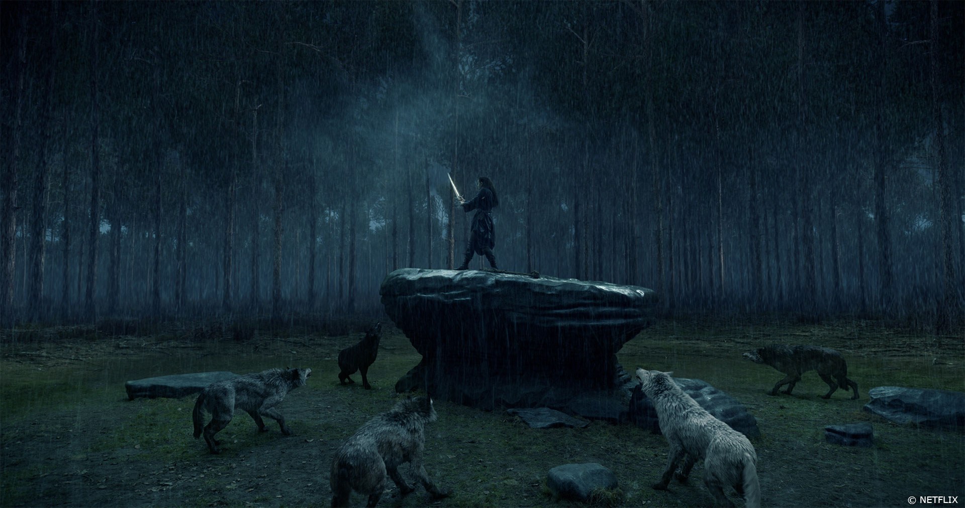
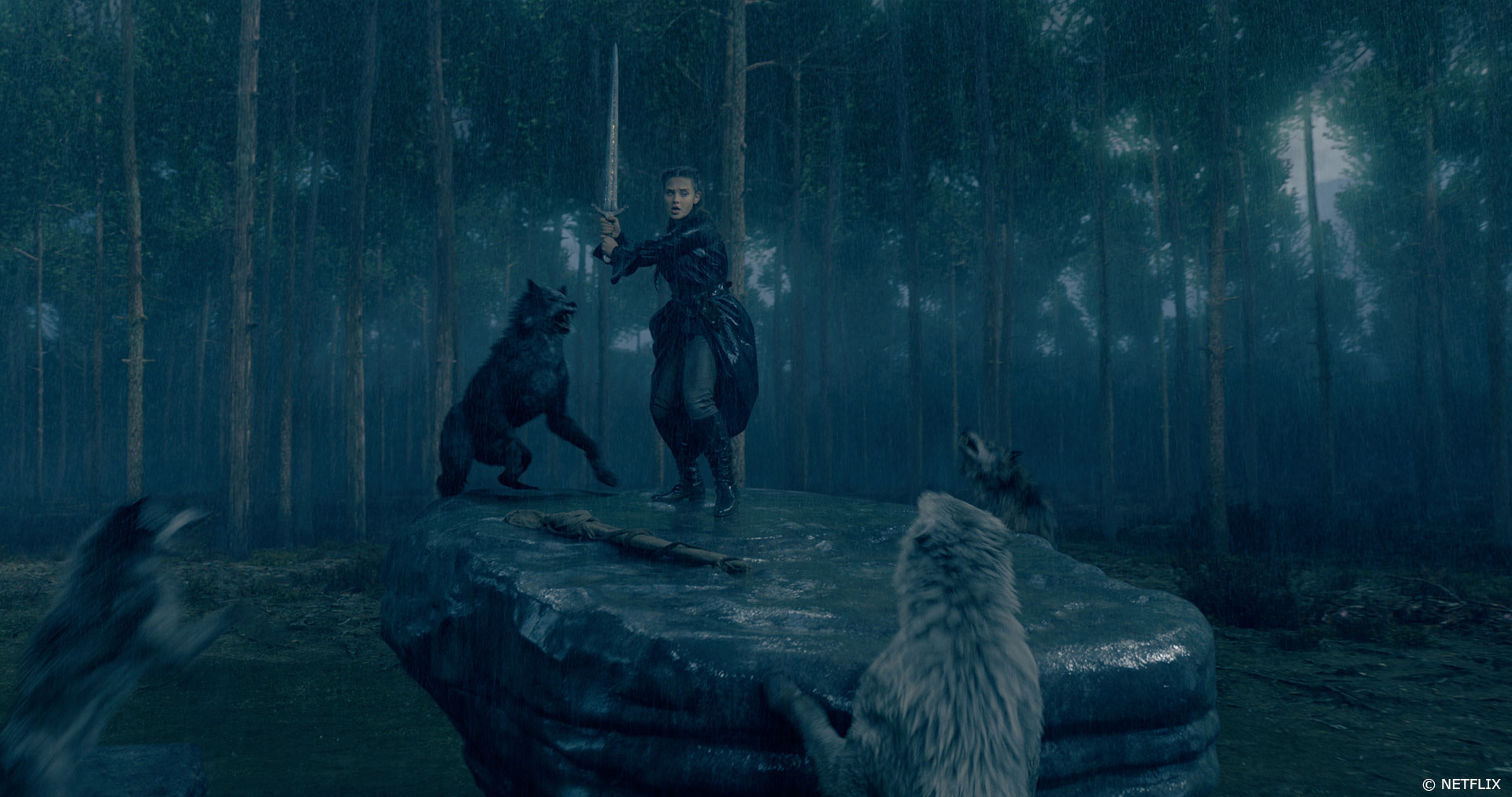
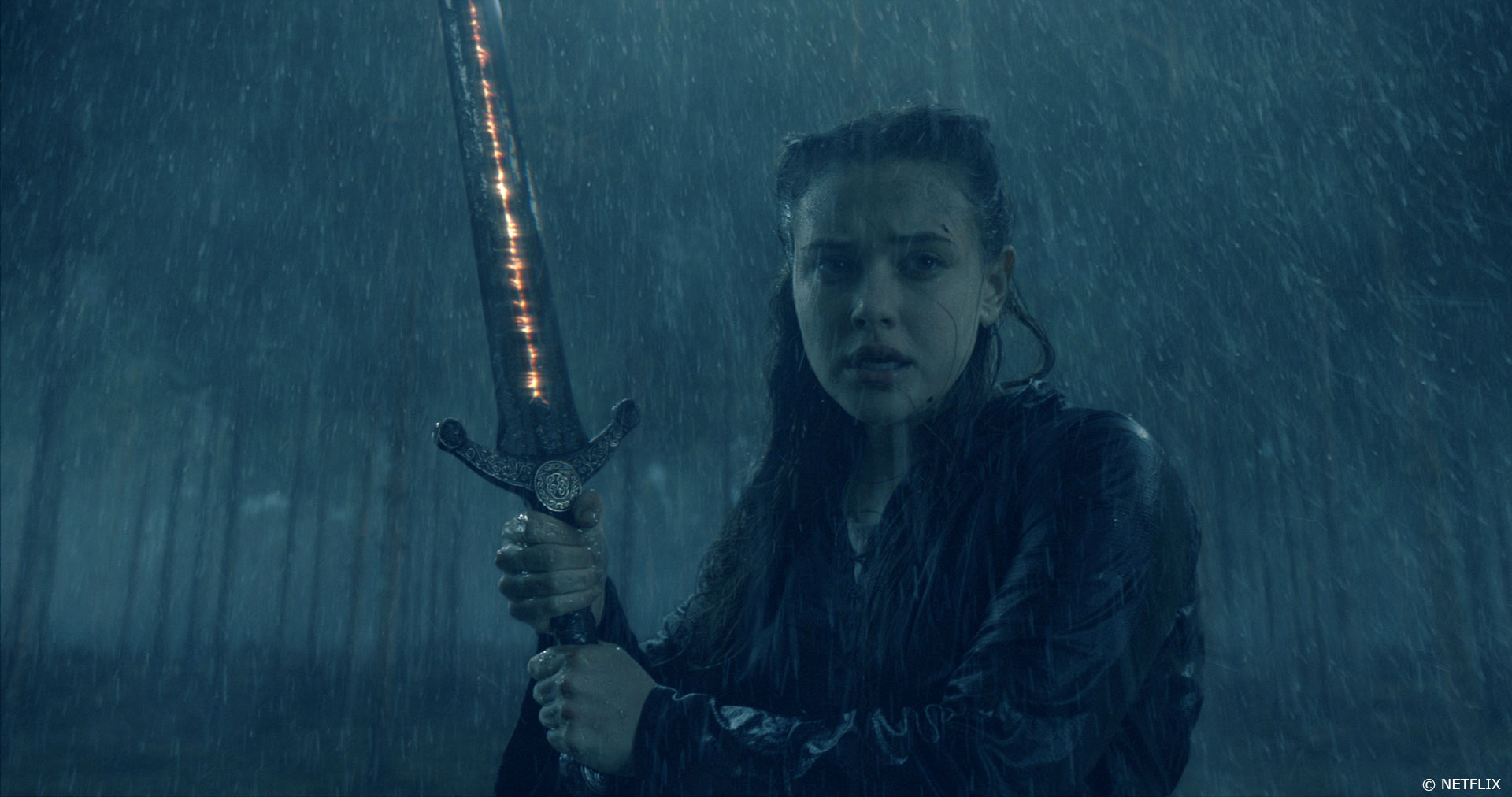
The wolves and wolf sequence were overseen by 3D supervisor Adrian Williams along with 2D Supervisors Robin Cape and Fernando Ferrer and 2D lead Alvaro Cajal. One of the most challenging aspects of the overall job was the wolf scene in episode one, in which the Paladins dispatch five (CG) wolves to hunt down Nimue as she is carrying the wrapped sword to Merlin. The beasts trap her, and during the fight, she climbs onto a rock and uses the sword to slay the beasts one by one, beheading two – one in spectacular Frank Miller style. Like the wolves, the environment in the scene is completely CG, with the exception of the actress and rock, which were filmed on greenscreen.
The wolf sequence was shot in the studio, and just prior to the scene, Nimue (Katherine Langford) is running through an actual forest and comes into a clearing, which was essentially a greenscreen studio space with just the rock set in the middle. Milk then had to add the whole of the forest environment around it.
Our team designed the look of the wolves from scratch, and the lighting style and atmosphere they incorporated into those concepts (which included backlit lighting, driven from Miller’s signature comic style) was subsequently used as lighting reference by the DP and director on the shoot. The team referenced Frank Miller’s wolf from his comic “300” and created concept designs for several types of wolf, in both naturalistic and fantasy styles, with the final creatures having a more realistic look but are larger than a typical wolf, to make them more menacing.
The artists began crafting the beasts by first researching wolf fur textures, colouring, and behaviour. Sam Lucas, head of modeling, built the wolf models in Maya, then used ZBrush for the finer details around the paws, face, and mouth, as well as muscle definition. The group used Peregrine Labs’ Yeti for the groom, giving the artists flexibility to play with the look and feel of the fur, and Ziva’s rigging and animation software for the muscle systems.
“The alpha female wolf needed to be white; the second in command, black, and the other three variations were selected from real-life wolves by the client – these were gray and two variations of brown,” explains Crowley. “Since wolves’ fur colour is typically made up of multiple shades, we incorporated three colour maps to drive the initial variations for one wolf’s fur, using root, mid, and tip colour maps that would stipulate how a single hair strand would be shaded. We also added randomised mutant hairs and melanin in the shader to push the individual looks. From there, we also had to make two grooms for each wolf: a dry groom and a wet groom.”
It was imperative that the fur looked and flowed naturally with the dynamics. Likewise, it was important that the bulk and mass of these huge beasts were properly portrayed in the renders with the multiple lighting setups.
Animating the wolves
Chris Hutchison Milk’s Head of Animation oversaw the animation of the wolves with Neil Roche overseeing rigging. Says Hutchison “After receiving the first edit of the sequence we asked our tracking department to give us some very rough tracks to begin our early blocking animation with. This helped with the layout and positioning and to make sure that the tempo and pacing of the sequence would flow and feel as energetically and ferociously as possible. Sliding a basic rig around and putting a very early run and walk cycle on the creatures let us see what would and wouldn’t work cut / pacing wise and allowed us to figure out the world space of the wolves and to make sure that the whole sequence flowed, making sure that the wolves wouldn’t disappear in one shot and suddenly appear in the next. Once Dave Houghton had signed off our early blocking and layout, the official plates came in and we could get started on the full animation and tracking of the sequence.
We sourced hours of video reference and watched as many documentaries about wolves as we could to find snippets of live action reference that we could animate and use in our shots accordingly to make the creatures feel as realistic and believable as possible. Looking at the reference we found some fascinating wolf behaviours and mannerisms that we could use, that related to our shots, especially with wolf pack behavioural patterns and mentalities of the group that we could use as a base to build a library of wolf animation for all of our shots. This helped with consistency amongst the animators and to save time (as we could reuse certain aspects of our library of animation) but also helped us figure out the mechanics and fully explore the physicality of the wolves. We would have a template to start from and could then work the finer details and nuances of the wolf behaviour into the shots as the shots progressed making each shot unique and as threatening as possible.
Even after using real world reference, Frank Miller emphasised that he wanted the wolves to be as intensely vicious and ferocious as possible and wanted us to reference his wolf from ‘300’ with its head down in a strong menacing and intimidating pose. So, with that in mind we finessed our animation to give Frank the performance and look he wanted. In short, the wolves needed to be big, bad and fuelled with a load of aggression and ferocity.”
How did you create the forest environment?
Due to shooting schedules the forest sequence was shot on an interior greenscreen stage with Nimue standing on the altar rock as she fights the wolves. The altar rock was then moved to an exterior set location, so we lidar scanned this whole interior stage area with the rock in place. That was the basis for our forest environment.
It is raining in the sequence – and so we created CG rain (thanks to Merlin’s magic on the weather!) and we created a CG forest foreground for context with a DMP mountain background – to cope with the high level of camera movement in this fight scene.
The sequence is seen by night and under the rain. How does that affect your lighting work?
We were given the lighting plan by production and we recorded the lightning set up on the stage in the rig on a 360 camera array. This allowed Adrian Williams and his team to match the lightning in the shots.
Can you tell us more about the power of the sword?
The fight scene with Nimue wielding Excalibur is a key story point as it is the moment in which the audience realises the magic power of the sword. Frank always said that we should think of the sword as being ‘alive’ as reference guidance.
When Nimue holds up the sword we see the ‘glow’ of the intricate rune patterns for the first time. Our brief was to create a golden glow, like molten steel which reacted as if the sword were alive. Almost like a forcefield.
Merlin takes the green fey fire. Can you elaborate about its design and creation?
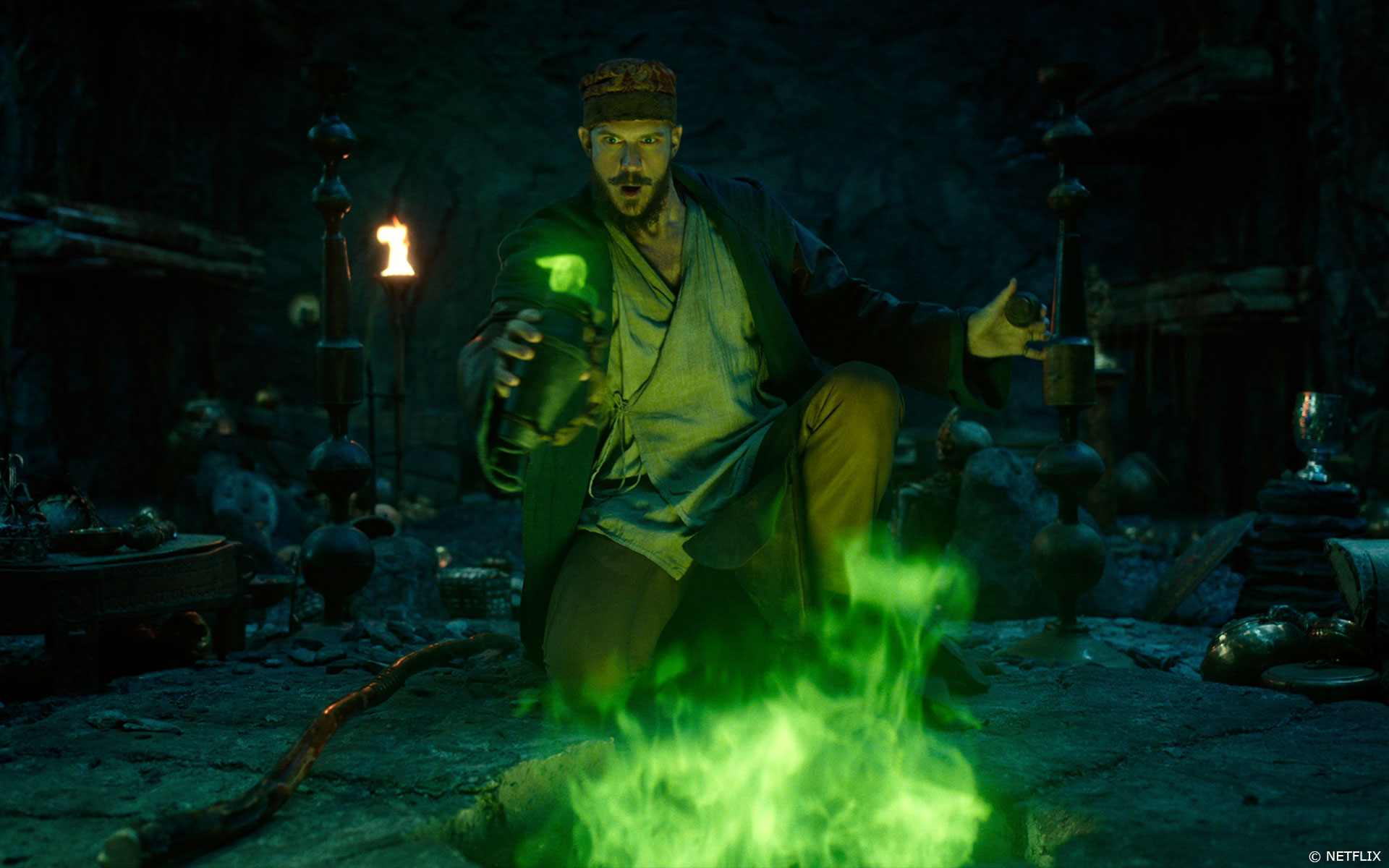
We developed several looks for the fey fire. Subsequently a more naturalistic looking design was preferred by production. Frank and Tom wanted all of the ‘magic’ to feel elemental rather than ‘hocus pocus’ and so we designed our lighting bolts, fey fire and sword glow accordingly.
How did you approach your various environments creation?
We got great reference from production for the environments. This was the starting point for our concept artists to develop extensive ideas for approval by Dave Houghton and the creative team.
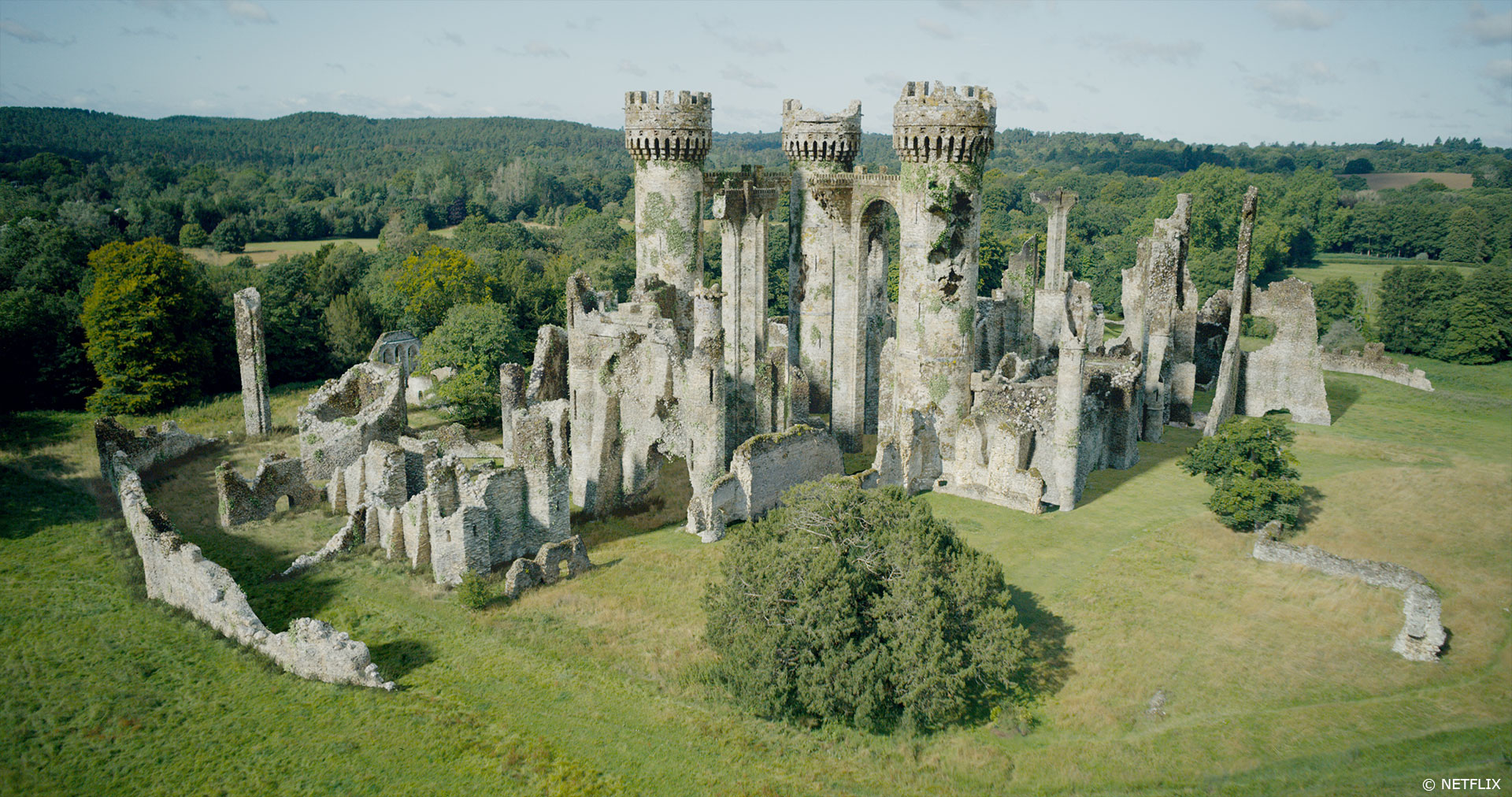
Culzean Castle – In one revealing scene, the sorceress Yeva casts an incantation that enables Nimue and Merlin to virtually meet for the first time, at Culzean Castle. Here, Nimue is given a look at the past and Merlin’s connection to the sword.
The sequence was filmed among the ruins of a small monastic castle site, which Milk developed into a larger, grander build of the ruins. There was only a little bit of wall standing and so most of the castle was a CG set extension. Therefore, the look and textures of the digital castle needed to match the unusual texture of the existing monastery ruins that appear in the plates. The challenge was building an environment that could sit in many different shots and angles without Milk having to make bespoke separate builds.
Subterranean environments – Milk also built the subterranean environment for the Cailleach, an evil-filled underground chasm where Morgana encounters a spider while retrieving the sword for Nimue.
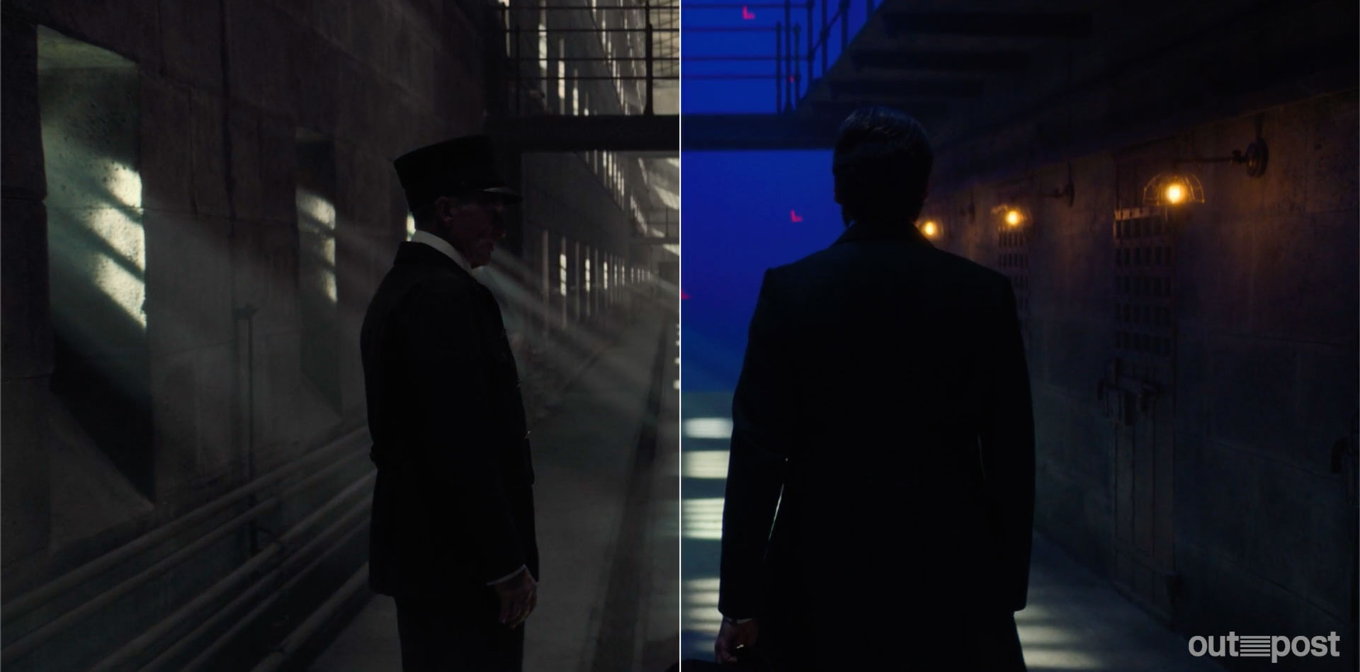
Milk also built the subterranean environments of the Leper King, which was mostly filmed on a small set and then digitally extended. Says Crowley of the Leper King caves. “These were quite challenging to build, as we had to integrate some floating set walls within the design of the environment. The throne room was imagined as a vast cathedral with a touch of backlighting – with a direct reference to Frank Miller’s comic-art style.” Meanwhile, the artists filled the treasure room with Celtic queen Boudicca’s skeleton along with coffins and copious riches. They also crafted the green Fey forge fire, which Merlin steals.
Which one was the most complicated to create and why?
The waterfall definitely.
Can you explain in detail about the creation of the waterfall environment?
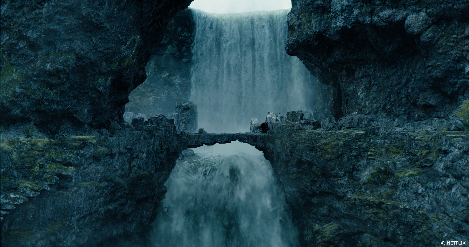
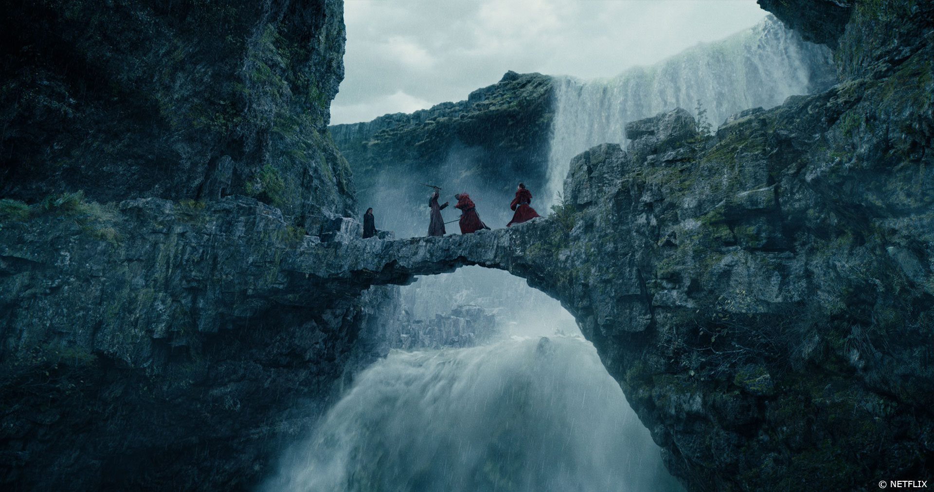
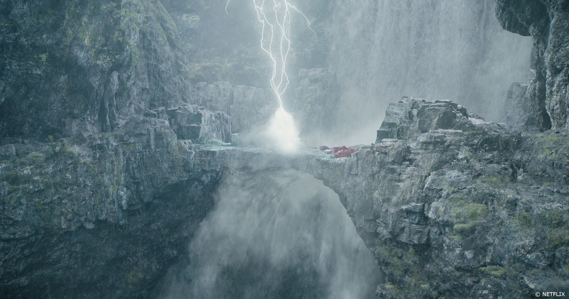
Milk’s culminating sequence in CURSED has Nimue, Merlin, and Morgana trying to escape the Paladins. As they are crossing a narrow footbridge above a huge waterfall, the sword slips from Nimue’s hand and is out of reach, leaving her defenseless. She is shot with an arrow and eventually tumbles from the bridge into a pool of water far below. Not only did Milk create the waterfall and the environment around it, but also the digital takeovers required in the scene. It is a big drama scene in a tiny space, which made it more challenging – with most of it completed and delivered in lockdown”, says Crowley
The sequence was shot outside on a backlot against bluescreen. The set build consisted of the bridge, with everything else created digitally, including the waterfall, digi-doubles of Nimue and the Paladins, the rain, and Merlin’s magical lightning bolts from the storm he whips up as he slowly regains his power.
The artists developed the 3D asset of the environment, while the FX team – lead by Dimitris Lekanis – created the water simulations and the waterfall (in just seven weeks during lockdown), as the latter was broken up into several layers of simulation, including water surface, foam, spray, and mist.
For the digi-doubles, scans of the actors playing Nimue and the Paladins in the scene were provided by production and rigged and groomed, with cloth sims applied to the clothing. These were used in wide shots and for takeovers when the characters fall into the water.
“We wanted to cover all bases in terms of character detail, and what helped us massively was having a full-3D scan of Nimue for our assets team to begin modeling her digi-double. All of the base mesh was done in Maya, then we moved to ZBrush to get all the extra detail in the skin and clothes. The textures were made in Mari and were either hand painted or derived from on-set element reference, with lookdev done in Maya using Autodesk’s Arnold,” Crowley explains. “We then passed the character on to our creature FX team, which handled all types of character deformation, such as cloth and hair simulations; the groom for Nimue was achieved using Yeti.”
In terms of Nimue’s fall, actress Katherine Langford was shot against bluescreen on the backlot on a harness with crash mats; Milk removed the rigs and added the CG waterfall and the CG set extension at the bottom of the waterfall. In addition, the studio did some digi-double takeovers for the dramatic point when Nimue loses her grip on Merlin’s hand and plunges down into the mist. The artists also made digi-doubles for the Paladins that are killed and fall from the bridge during the fight, allowing CG takeovers in several of the shots with added blood splatters in the vein of Frank Miller’s comic art.
Is there something specific that gives you some really short nights?
Probably the waterfall sequence – which we delivered during lockdown.
What is your favourite shot or sequence?
For both myself and my VFX Producer Jenna Powell, the Waterfall sequence was our favourite–it’s the climax of the show! We completed 105 shots on it, all within the lockdown period. Visually Frank said it was his favourite sequence in the series! Which, of course, was lovely to hear.
What is your best memory on this show?
Meeting Frank Miller and finding out he was part of the O’Neill clan (an Irish clan). I hail from Ireland so this struck a chord with me!
How long have you worked on this show?
We began work on CURSED in February 2019 and delivered in May 2020 during lockdown. The whole Milk crew had to transition to working from home within a ten-day period at the end of March! Of course we had to adapt how we worked but our amazing systems team transitioned us brilliantly and they worked extraordinarily hard to make sure everyone was able to work quickly from home. We all adapted quickly into a different routine.
We changed the way we communicated and paid great attention to how we corresponded with the team about creative decisions from remote dailies. We relied more heavily on the HODs disseminating information to the teams. I really enjoyed our morning check ins! We all had to just keep talking a lot!
Shooting took place throughout summer 2019, and post from end of August.
What’s the VFX shot count?
390 shots.
What was the size of your team?
88 – including supes, production, editorial and artists!
What is your next project?
I’m currently working at Milk on a film project. It’s very different from CURSED! (Sadly I can’t say any more about it)
What are the four movies that gave you the passion for cinema?
Anything Norman Reynolds worked on!! (Set designer for SUPERMAN, STAR WARS, RAIDERS OF THE LOST ARK, EMPIRE OF THE SUN). Likewise set designer Nigel Phelps (BATMAN).
I’m also a big fan of Terry Gilliam’s BRAZIL.
A big thanks for your time.
WANT TO KNOW MORE?
Milk VFX: Dedicated page about CURSED on Milk VFX website.
Dave Houghton: My interview of Dave Houghton, Overall VFX Supervisor.
Netflix: You can watch CURSED on Netflix now.
© Vincent Frei – The Art of VFX – 2020


