In 2017, Eric Robinson told us about the work of Mr. X on RESIDENT EVIL: THE FINAL CHAPTER. He then worked on projects such as XXX: RETURN OF XANDER CAGE, HOW IT ENDS and CREED II.
How did you and Mr. X get involved on this show?
The RBW production reached out to us in the spring of 2019. They needed more help as the scope of the show was so big and growing and at that time they were still shooting in South Africa! The connection came because Ridley Scott has done a lot of his recent work with MPC, and with Richard Stammers there, but at the time MPC didn’t have an episodic division to take on the work. Richard acted as an advisor to Mr. X for the first month or so, to help us get up to speed with working with Ridley. This was a huge help! With Mr. X being a part of the Technicolor family, the teamwork between Mr. X and MPC was natural.
How was the collaboration with the various directors and VFX Supervisor Ray McIntyre Jr.?
Through almost all of production we were working directly with Ray. It was a really positive working relationship. Ray was great at knowing when to give notes, vs. when to promote to the showrunners. This ensured that we didn’t chase our tails, only to get a slew of notes later from up the chain. We would discuss direction or analyze references or concepts on cineSync, and then we’d go away and make some versions to send back. As this was happening while the shoot was ongoing, we had a lot of leeway to offer up ideas to Ray. It resulted in the highest amount of creative freedom I’ve ever had on a project!
There were many times that we were pitching wild and crazy looks to Ray. He would let us know if something had merit to go up the chain, or if we had to go back to the drawing board. For example, the Necromancer scream effect, we did an internal “comp-off” to come up with designs. We must have sent in 30 ideas on what it could look like – and then dialed in the final look!
What was their expectations and approach about the visual effects?
With Ridley Scott as a key creative on the show, we were not surprised about the very high expectations! The insights from Richard, who’s experience working with Ridley gave us a head start with our first rounds of concepts, asset designs and early comp temps were great. We hadn’t worked with Ray before, but we got off to a great start with the Ark attack hallway scene.
How did you organize the work with your VFX Producer?
Ha! The relationship between a studio’s VFX Supe and VFX Producer really sets the tone for a project. This was my first time working with Sam Banack on a full-scale project. It was great! Sam brings a lot to the table, and always had my back when it came to getting the show the resources needed to make it a success.
How did you split the work amongst the Mr. X offices?
We did almost all the work in the Toronto (my location) and Bangalore studios. A couple of tasks went to Montreal when we had to find the right casting for a specific task. Being a part of a studio spanning three continents, there is always a wealth of talent to draw upon. Compositing for example was split between Toronto and Bangalore. I’m very proud of the contributions from our Bangalore team! We have some top-level compositors there. Our show comp supervisors, Jose Narvaez in Toronto and Vinay Thakur in Bangalore coordinated to get best practices in place across our sites, aligning the look of the work between studios. A consistent approach to the work reduced note cycles and allowed for artists in either studio to pick up work easily when needed. Super helpful to me when I might dig into an artist’s scrip to help set a look or provide feedback. Animation and lighting and FX were largely completed in Toronto, DMP and assets were a mix, while paint/roto and tracking work was done in India.
What are the sequences made by Mr. X?
We worked on 8 of 10 episodes, so there are too many to list! Our involvement built out from the first block of two episodes. This got us working on the opening lander crash and associated environment work, The Necromancer, Destroyed Boston environment and fight. We continued with the Boston flashbacks through the season, except for the Stadium INT shots. Episode 10 was huge for us! It was like working on a feature all on it’s own. EP10 work included the Golgotha environment, the four stages of Serpent growth and the lander flights, including FX clouds, and re-entry effects in the tunnel through the planet.
How did you work with the art department for the look of the Necromancer?
We didn’t connect directly with the show’s art department. We did receive concepts and references as we picked up new work/scenes, and some CG WIP tests.
What kind of references and influences did you receive for her look?
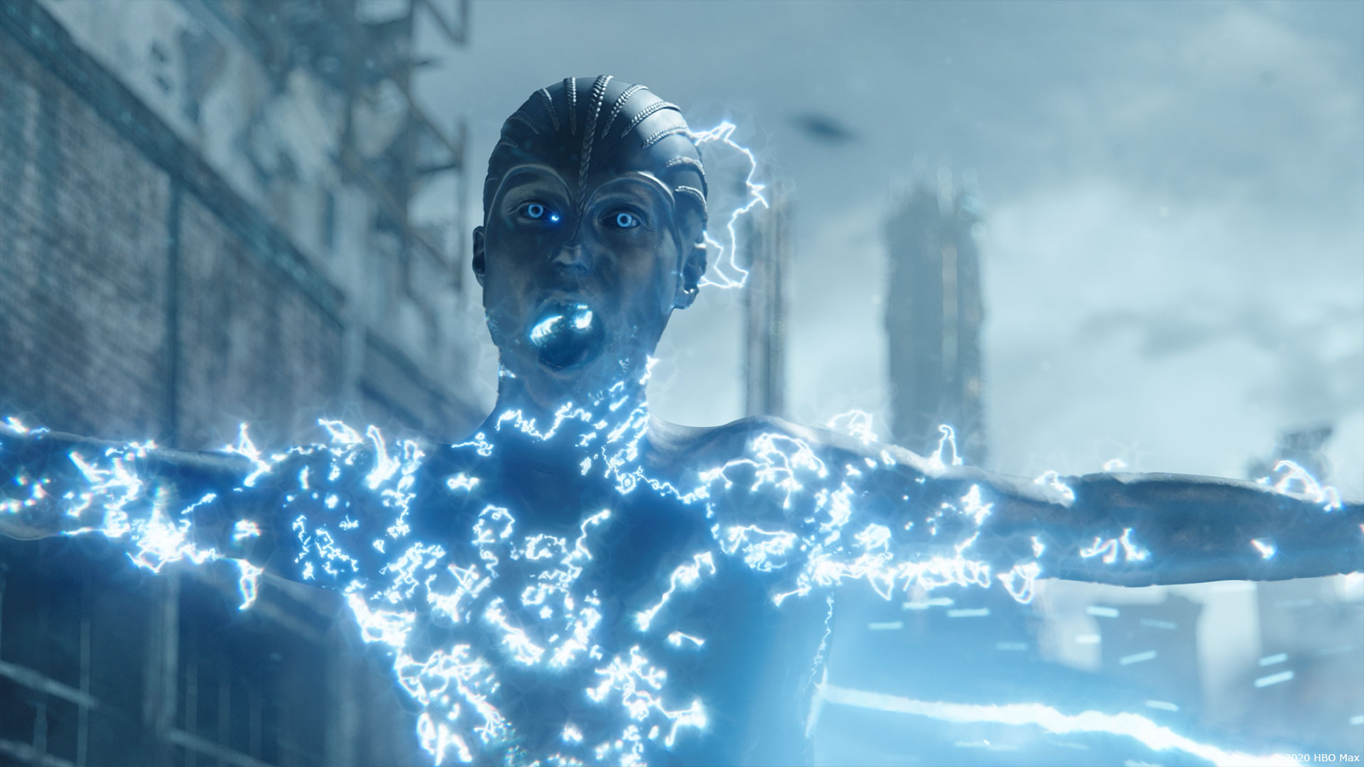
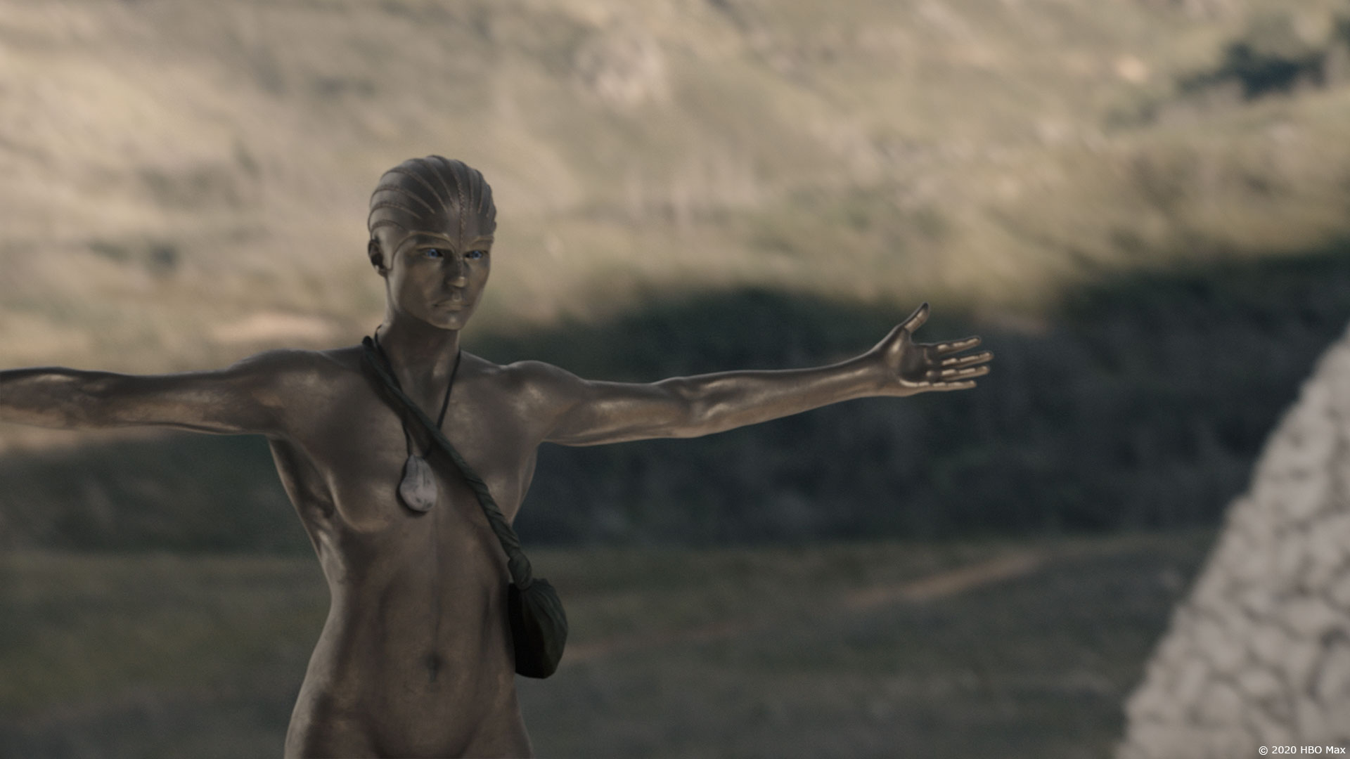
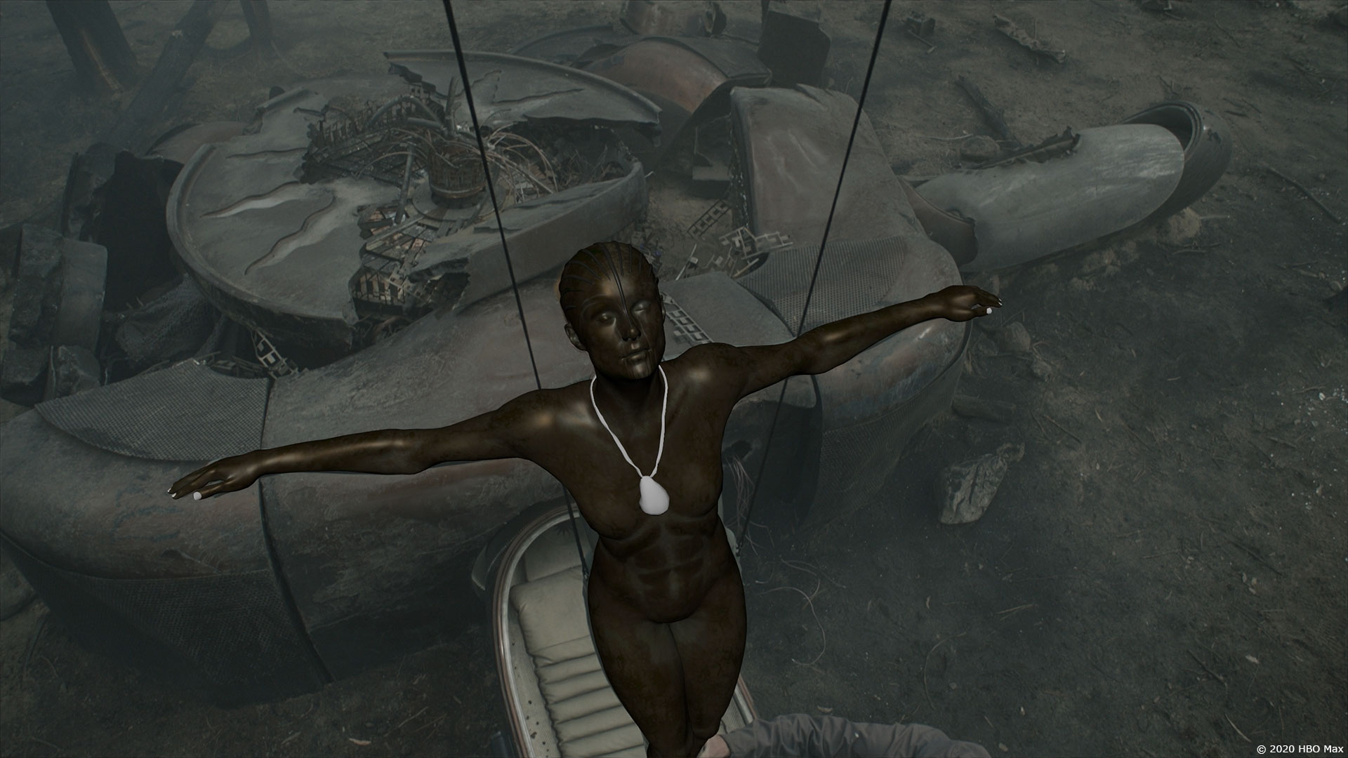
The main reference for the bronze Necromancer was the Atlas Statue in Rockefeller Center. It was great to have a specific goal for the look of the bronze. I just wish I had been in NYC to photograph it myself. Daylight vs flash really drives the look of the statue. We needed the Necromancer to look interesting in a lot of different lighting scenarios, and after a few rounds it really felt like we got there.
Can you explain in detail about the creation of the Necromancer?
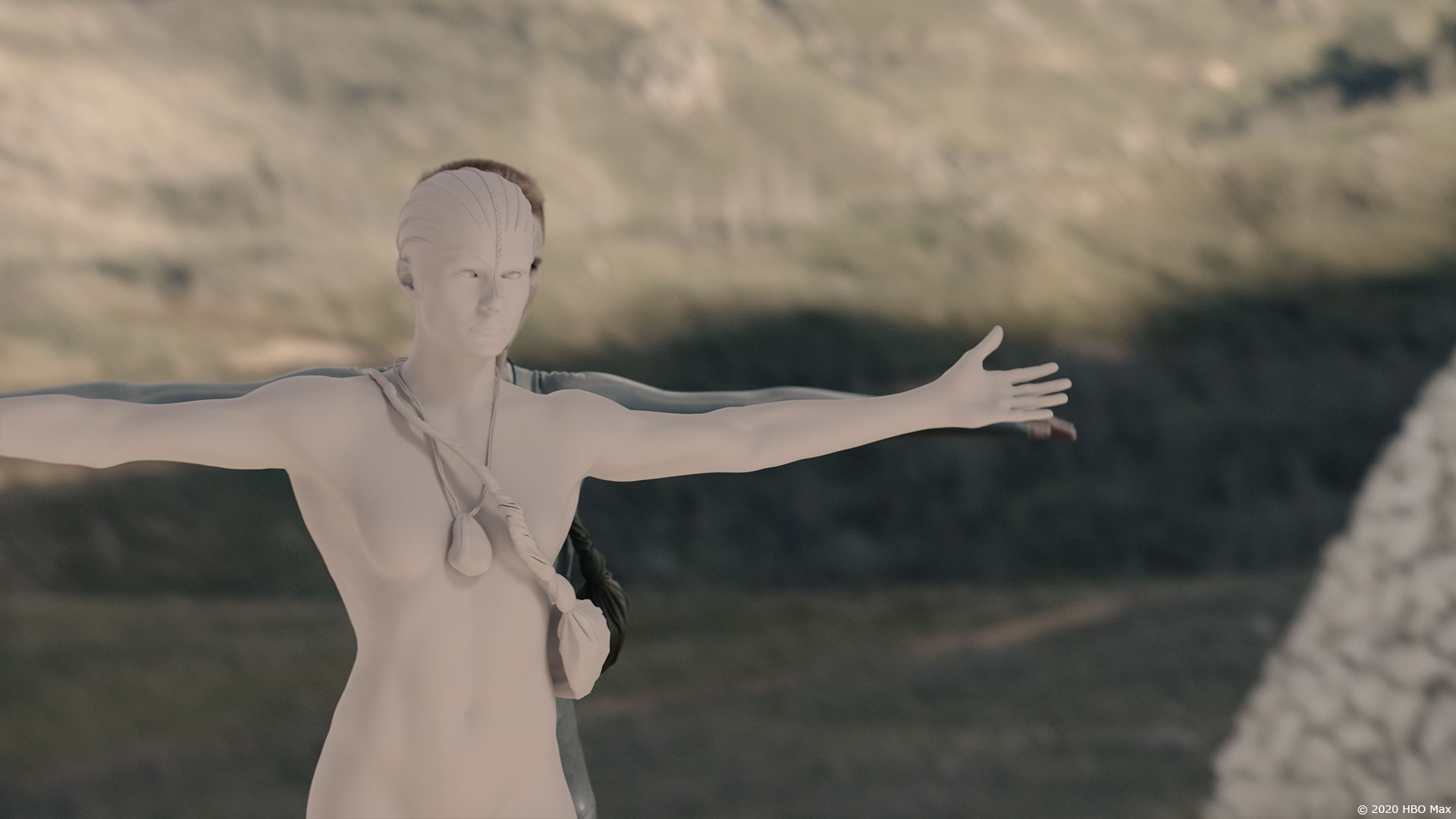
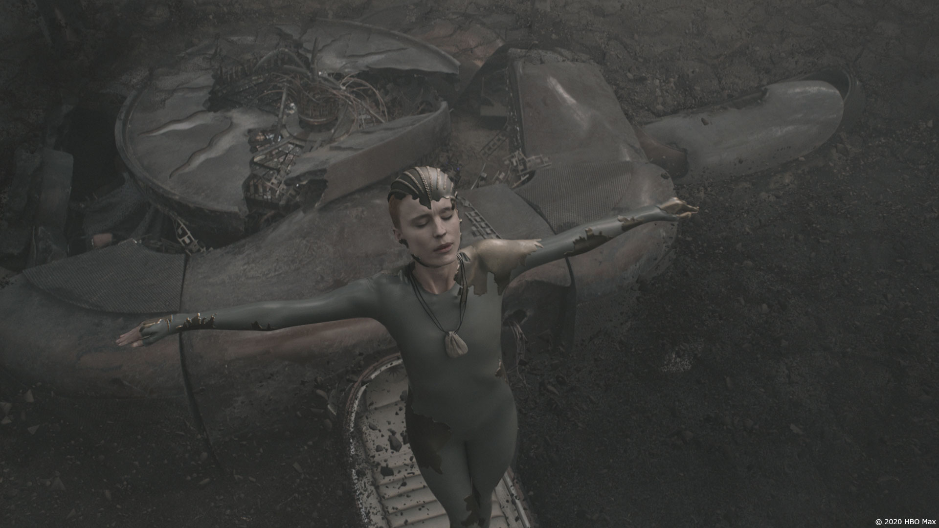
Since we had to do transitions between Mother and Necromancer, we needed to be close to the actor’s (Amanda Collin) silhouette as a starting point. The Black Ginger VFX team in Cape Town did scans, including FACS for facial animation. The trick was that the Necromancer is an idealized, stronger form of Mother. The Necro has bigger shoulders and arms, smaller waist, is overall more sculpted (pardon the pun). But joints and pivot points remained the same. After getting a basic signoff in a turntable, we had to show the model off in shot context. Two very different worlds between a TT and a real shot. Getting the abdominal muscles right were a deal, strong and defined, but not overly chiseled. This part of the sculpt had to balance with texture and lighting to work in a variety of environments. Slightly smaller muscles in the model, with slightly more patina in the recessed areas through texture/lookdev was the path that got us to a final look. We did occasionally break away from the on-set, photographed lighting to better flatter the Necromancer with raking light. The patina, scratches and weathering were a challenge. What might look great in a wide would be too roughed up in a closeup. We ended up with a lot of mattes to fine tune the look per shot.
How did you handle the transition between Mother and her Necromancer look?
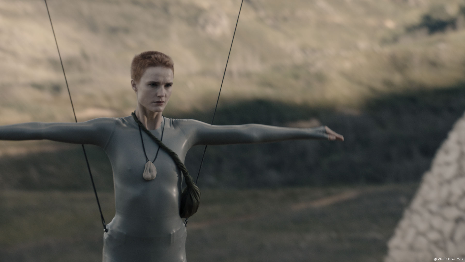
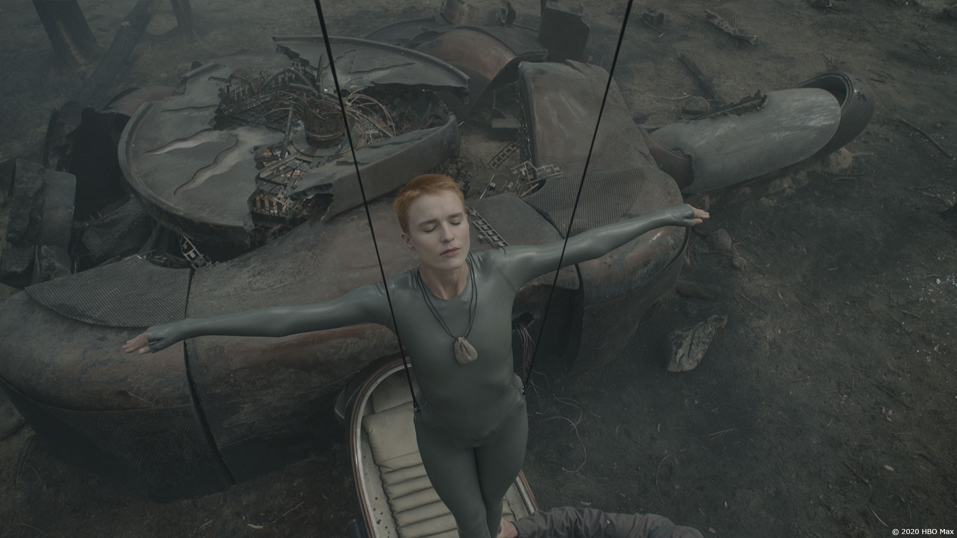
The transition mattes were generated through a Houdini sim. We needed to have nice contouring through the transition. This resulted in applying the sim to both a Mother and Necromancer models, so that the edges work in the in-between moments. The overall alignment – having two silhouettes – was always an issue, that was solved through a lot of comp warping in Nuke. The shoulders were the most obvious area we had to nudge into shape. In general, the transitions were 15-25 frames long, but would be tuned to the scene as needed. We did have two cases where it played a lot longer, which required some custom setup to achieve. In EP01, Mother is “dreaming” about being back on Earth. This one was filmed with Amanda on wires in the red domed nursery. It was especially tricky, as it’s not only Mother transitioning, it’s the world going from Kepler to dream flashback of War-Torn Boston. We augmented the practical camera move to get us into the dream world, and this broke the connection between the practical photography of Amanda, which we had to compensate for.
The second long transition was at the end of the Forest Fight. Mother slowly rises and transforms. For this one, we wedged out thicknesses for the metal Necromancer edges, to catch some light and give more definition to the work.
Can you tell us more about her animation especially when she is flying?
The flight animation was based on Amanda’s wirework. I’m a big fan of giving camera operators something to shoot, so I was happy that production used this approach. RS had a vision for the flying pose, which is super strong. We would smooth out some of the bumps in the wirework, but we had to remain close to the photographed material. We did experiment to find a “language” to the mechanics of her flight, how she used body motion to indicate how she was going to move. Palms up and hands up for rise, lead motion and changes of direction with the shoulders. I did a bunch of mimed action for the animators to riff off of for this as it wasn’t present in Amanda’s performance.
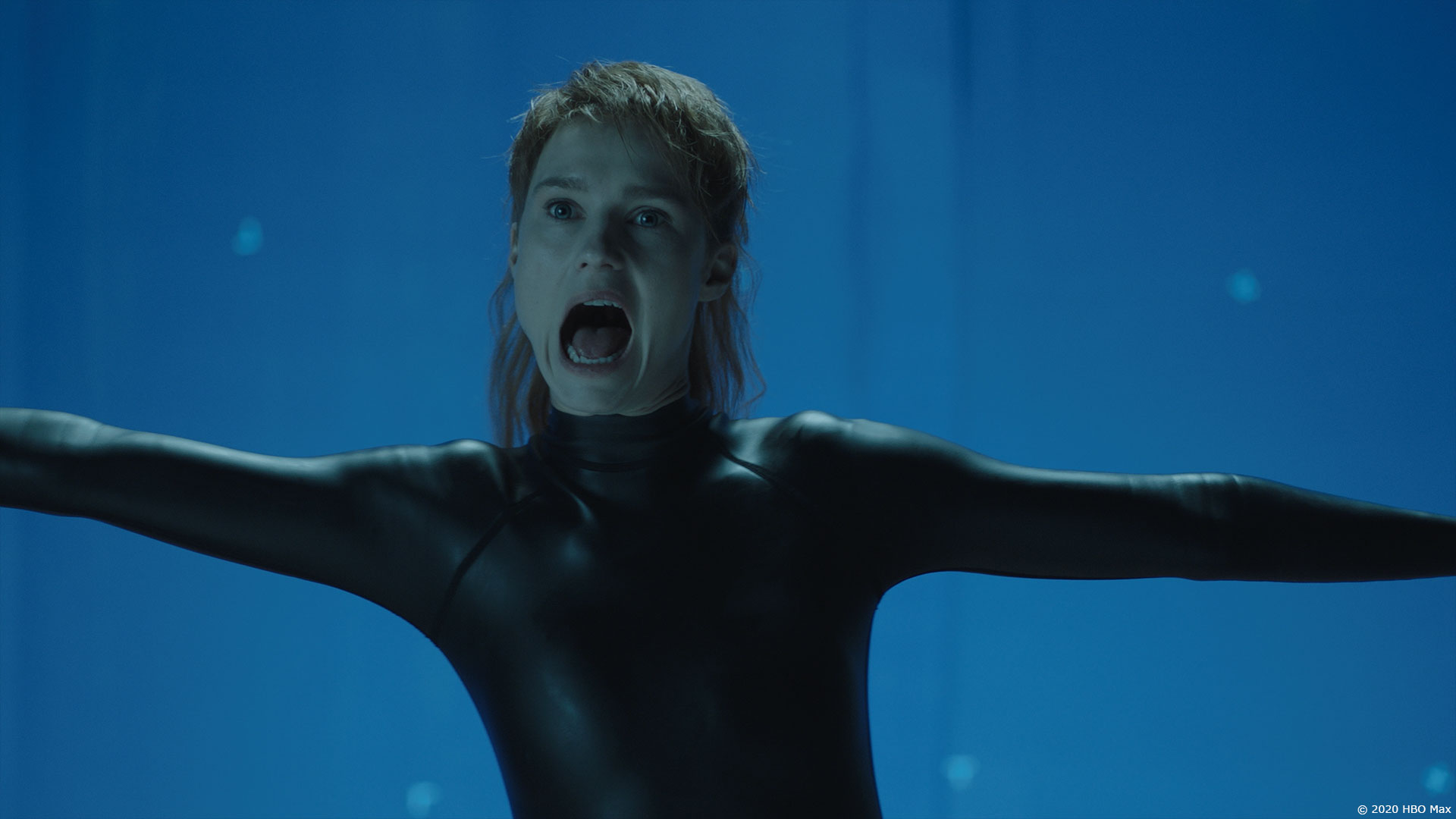
There were a couple shots of lip sync, and a few more of screams, which relied on the FACS scan and rig setup that went beyond what Amanda could do. The mouth would open 1-2cm more than the actor. The extreme scream had a significant trickle-down effect for the muscles and tendons around her neck.
Can you elaborate about her terrifying powers?
There are so many! Scream, cauliflower heads, explodifying people. Where possible we tried to keep our work based on the same principles. The scream needed to have a wide vs. tight approach since other Necromancers were attacking jets over War-Torn Boston.
How did you create and animate her scream?
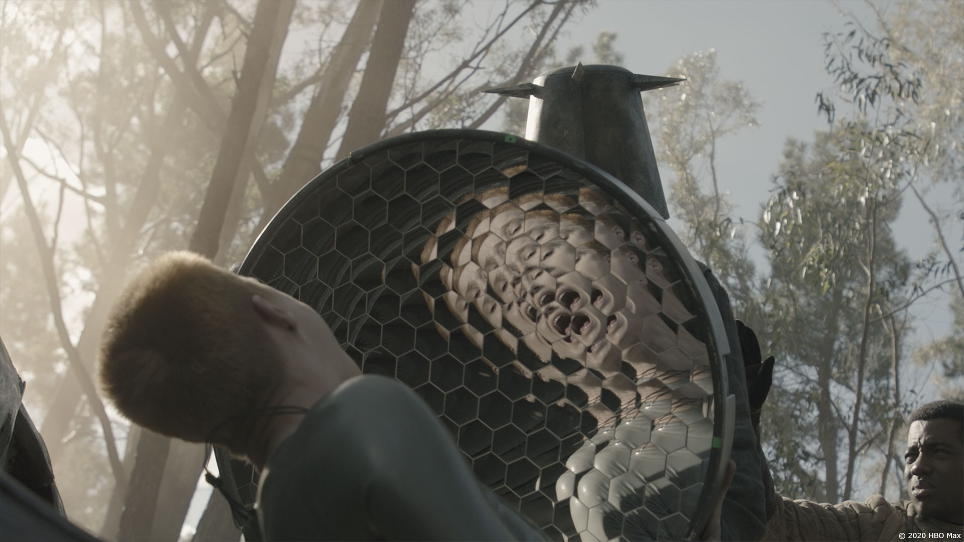
During a scream, both as Mother and Necromancer, her mouth opens bigger than a typical human can. There is a fine line between too little, and too much! Imhotep from THE MUMMY (1999), we learned quickly was too big! The scream kinda comes from her whole face, not only the mouth. This is part of why the android eyes come in to play in the story. We had to make something that wasn’t overly “sound waves” but still had force and directionality. Particle like dots of light, almost like flying gems was at the heart of the effect. Time-echo, double image, idistort were used, we were throwing as many layers and ideas at it as we could, to make it complex and richly detailed.
In an impressive sequence, Mother attacks the ark. How did you create the various deaths?
We learned a new word on the show “Ridleygram”. RS will sketch up his ideas for shots, that strongly convey the form, layout and mood. The Ark attack started with a sketch like this. The recipients of the scream attack are eviscerated, not quite turned into mist, but definitely not chunky slabs of meaty gore. The sketch had a lot of dots and dashes of aerial blood. We needed to find an internal logic to keeping blood in the air for as long as possible, keeping the hallway dirty and maintaining the high contrast between the white walls and red blood. In our minds, the scream attack’s force would sort of act like it’s own zero-g zone. The initial blood tendril explosions were Houdini sims where gravity was not normal, and then retimed to be even more uncanny. Residual blood tendrils floated through the hallway, ever so slowly descending through the scene, so that it wasn’t a continuity problem later!
The on-set team filmed exploding blood bags, where the source had to be painted out, this resulted in lovely patterns of red on the walls. We did some cleanup on the wall blood, as well as DMP additions to help blood continuity. Victims were often repo’d to be closer to the practical blood bag, and then painted out to help the total obliteration effect.
How did you handle the various damages on her?
The transformation between Mother and Necromancer had a reset like effect, so that gore on Mother didn’t carry over to her Necro version, and vice versa. It was fun doing the partial Necromancer moments, where she remained mostly Mother, but a patch of Necro would pop up to allow her to be bulletproof! Matchmove, light, render and then we used mattes driven by comp to design the patches. We did add some subtle edge illumination to make the patches more readable. It was fortunate that the mattes were done in comp, as we had many rounds of notes on the scale and position of the Necro patches.
Can you elaborate about the environment work and especially the devastated Earth?
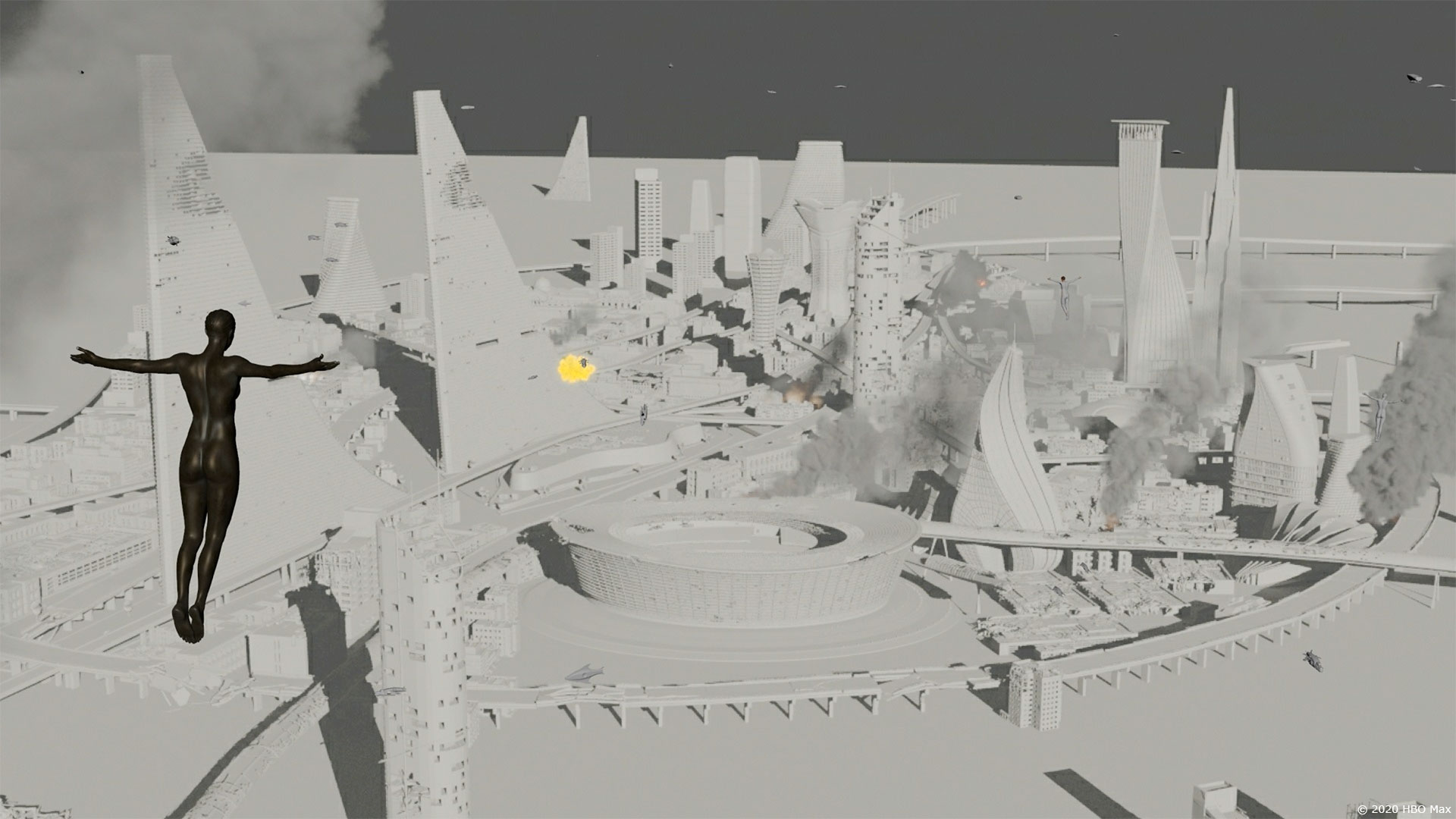
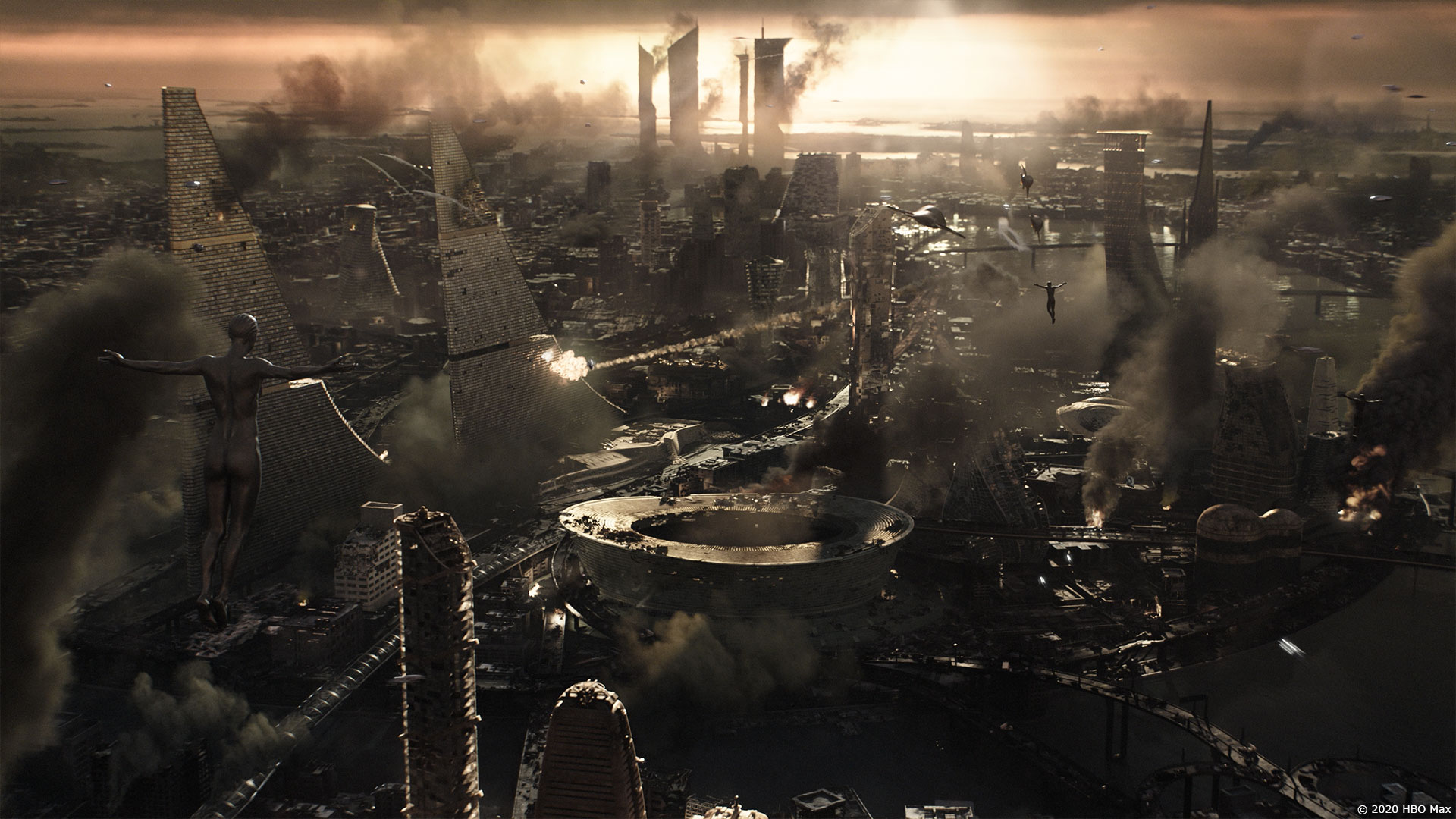
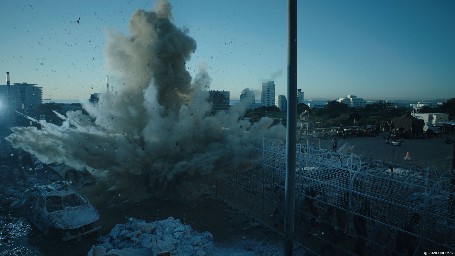
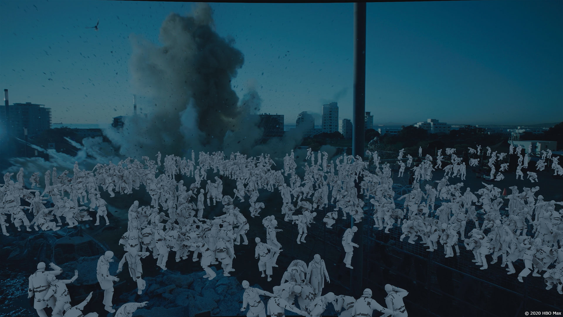
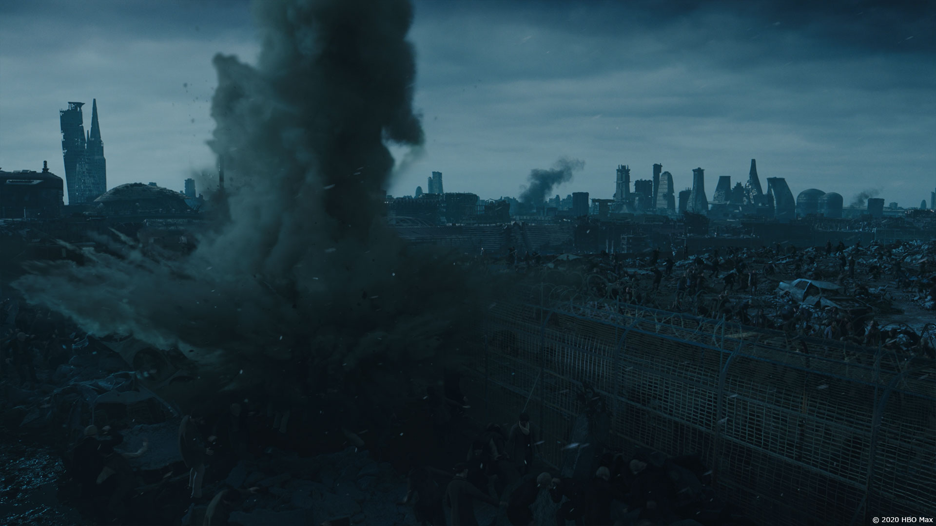
The environment for War-Torn Boston in the flashbacks were twofold. Firstly, in EP01 we had the wide aerials in Mother’s “dream” of flying as a Necromancer. There were concepts to build from, but with such a wide scope-y view, there were a tonne of details to add. The “Shark-fin” buildings were the visual anchors to these wides, along with the Stadium that would be featured later in the season. I love the post-apocalyptic genre, so was very excited to get to build a world like this! Another huge team effort, with FX water, smoke, explosion sims, DMP background and sky, CG destroyed buildings, aerial animation. We even pitched zero-g levitating buildings, but that was too futuristic. The Stadium build is based on the Greenpoint Stadium in Cape Town SA. We seeded in some historical Boston buildings where we could as well.
The build for the wides gave us a library of buildings for the ground level shots that come later in the season. Story wise, the Stadium was the key feature, as it plays in the BG of other shots, and is near the EP02 ground fighting. Ground level shots had a large practical component from the South Africa shoot. Chaos was key! Rubble, debris, torn up battlements were the story point to convey with the supporting CG work in those scenes. As well, telling how the Earth is so devastated and covered in ash and dirty snow.
How did you create and animate the Ark crash and its magnificent explosion?
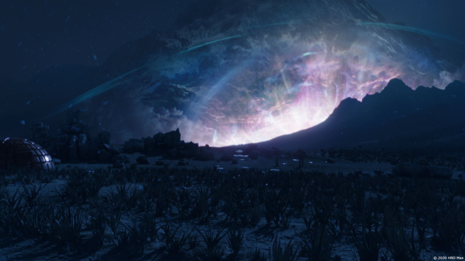
Mr X. did the “dark-plasma” explosion, and another vendor did the falling Ark. For the explosion, the direction was that it wasn’t a typical fiery blast. I have a plasma ball on my desk, so that was part of the inspiration for the look. We blew up Tokyo in RESIDENT EVIL: AFTERLIFE back in 2010, so there was some of our own previous work to draw upon.
We created DMP concepts to get the initial design in front of Ray, and then kept going and going. It needed to be richly dimensional, colourful, so that it tied into the set photography of the actors. Many DMP layers were projected, warped, and retimed to get the final shot. At the same time, to help convey the massive scale of the explosion event, the BG mountain needed to be interactively illuminated by the event.
Can you explain in detail about the design and the creation of the flying snake?
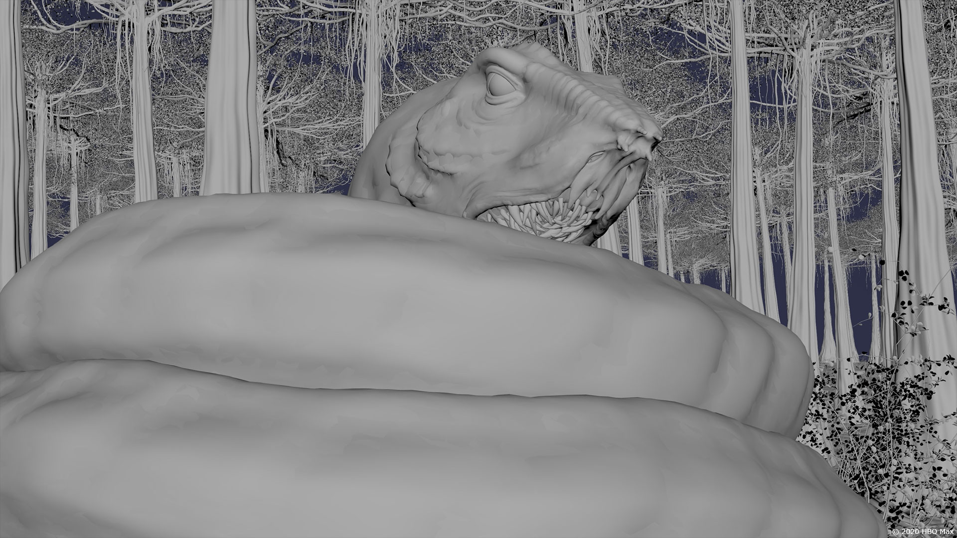
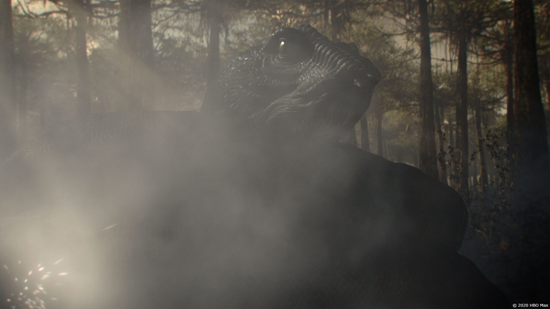
Four stages of fun! The Serpent is a sci-fi hybrid of a hagfish and a more typical snake. On set, the team used a rubber model of a snake for Mother’s interaction and feeding, which we then replaced with our model. The first 3 stages of Serpent size were small evolutions of the model/texture/lookdev work. Stage 4, being 200 metres long was it’s own asset.
With each new stage of growth, the face became more and more gnarled, rougher, and bonier. Some of the shots required multiple sections of Serpent to get the coils to line up, without the rig to be overly bendy.
Which sequence or shot was the most challenging?
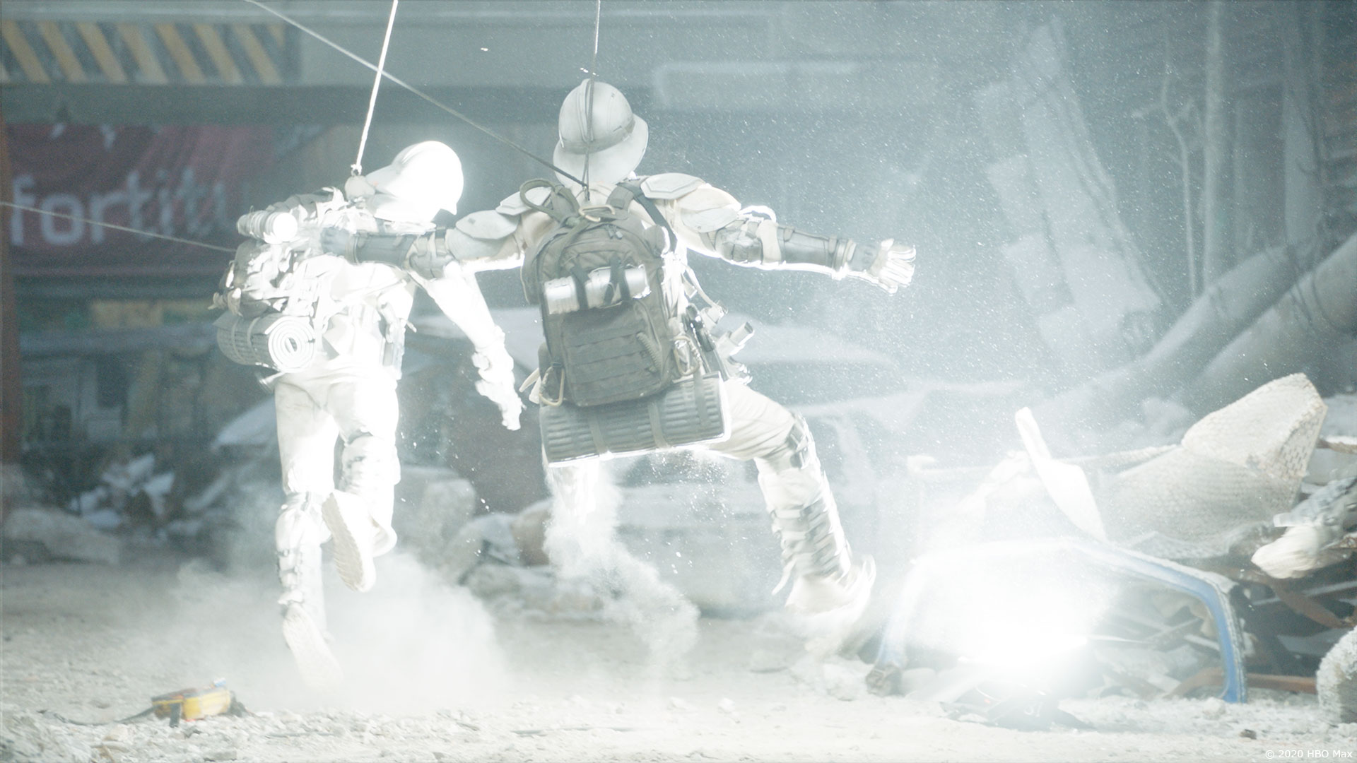
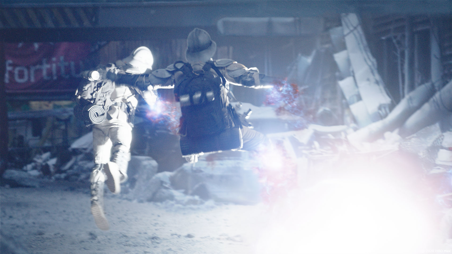
In one of the flashbacks, a powered backpack is overloaded and used as a grenade – it then destroys three bad guys. The comp team used a particle setup in Nuke to pull the soldiers apart in a very sci-fi way. This was tied into the look of the Mithraic Ark “Dark-Matter” explosion, with a semi-sphere of influence consuming the soldiers. The design was use for only one moment of the series, which weighted it heavily in the effort vs. screen time work balance.
Is there something specific that gives you some really short nights?
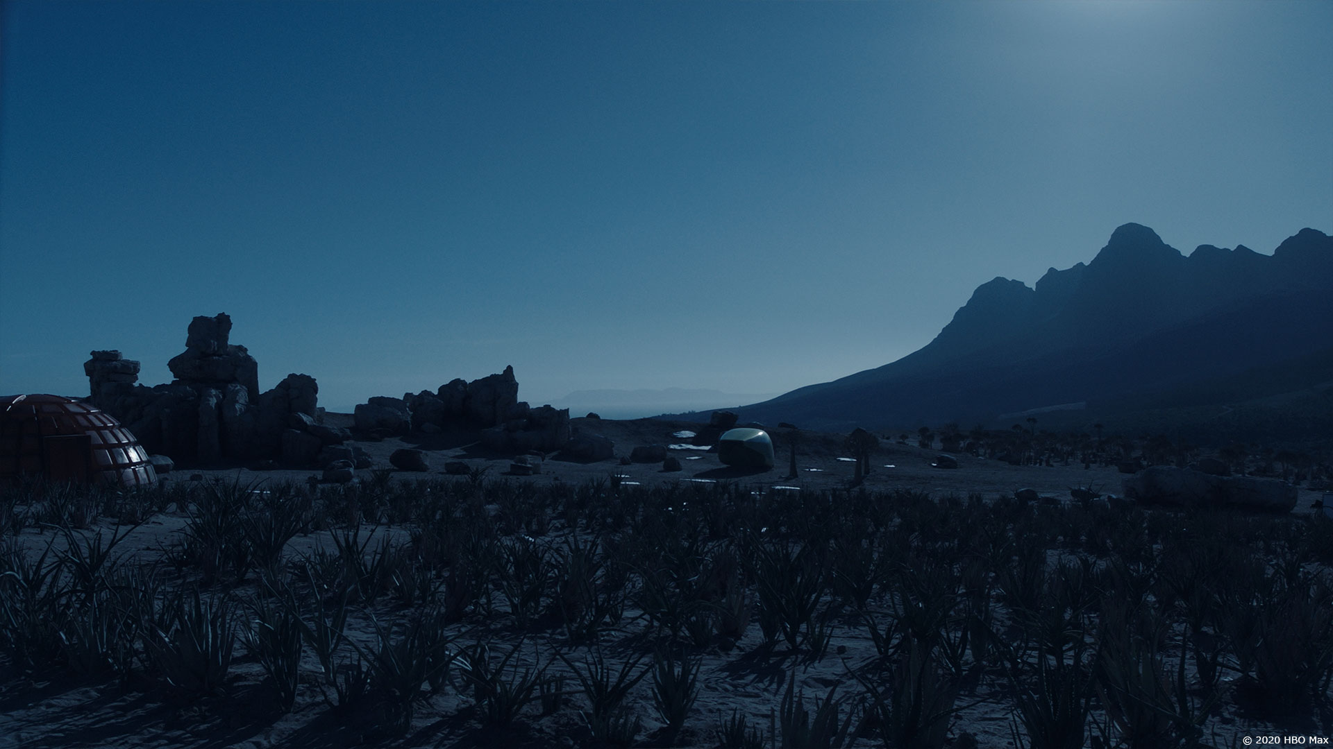
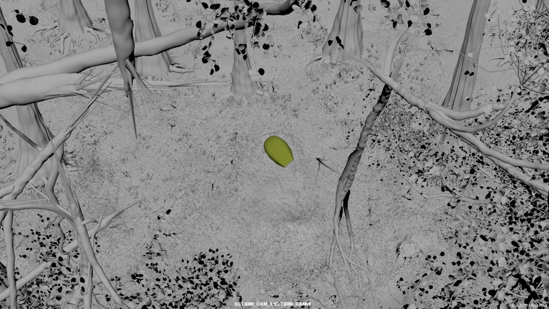
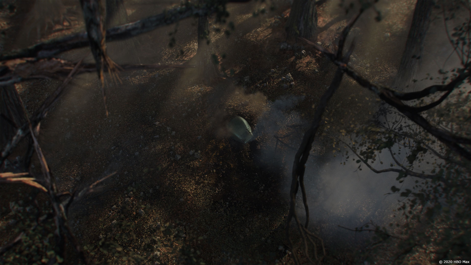
The end of episode 10 was a fright! This was an additional scene added pretty late in the post schedule. RS did boards for the scene, which we took to previs, to further camera design and understand the flow of the scene. It ended up being six all CG shots, that were in unexplored parts of Kepler. Ray shot some lighting references while in South Africa for re-shoots, but the Kepler “Tropical Zone” needed it’s own look, distinct from Earth. We pulled refs from redwood forests, to help with the overall scale, and the way that redwoods can dominate the forest and suppress undergrowth that would have competed visually with the crashed lander. These shots were HUGE team efforts. FX artists doing breaking glass, smoke, sparks – assets building a big set, wind in trees, falling leaves. And an extremely large Serpent! Our CG Supe Mai-Ling Lee did fantastic work getting all these individual efforts onto the screen.
What is your favorite shot or sequence?
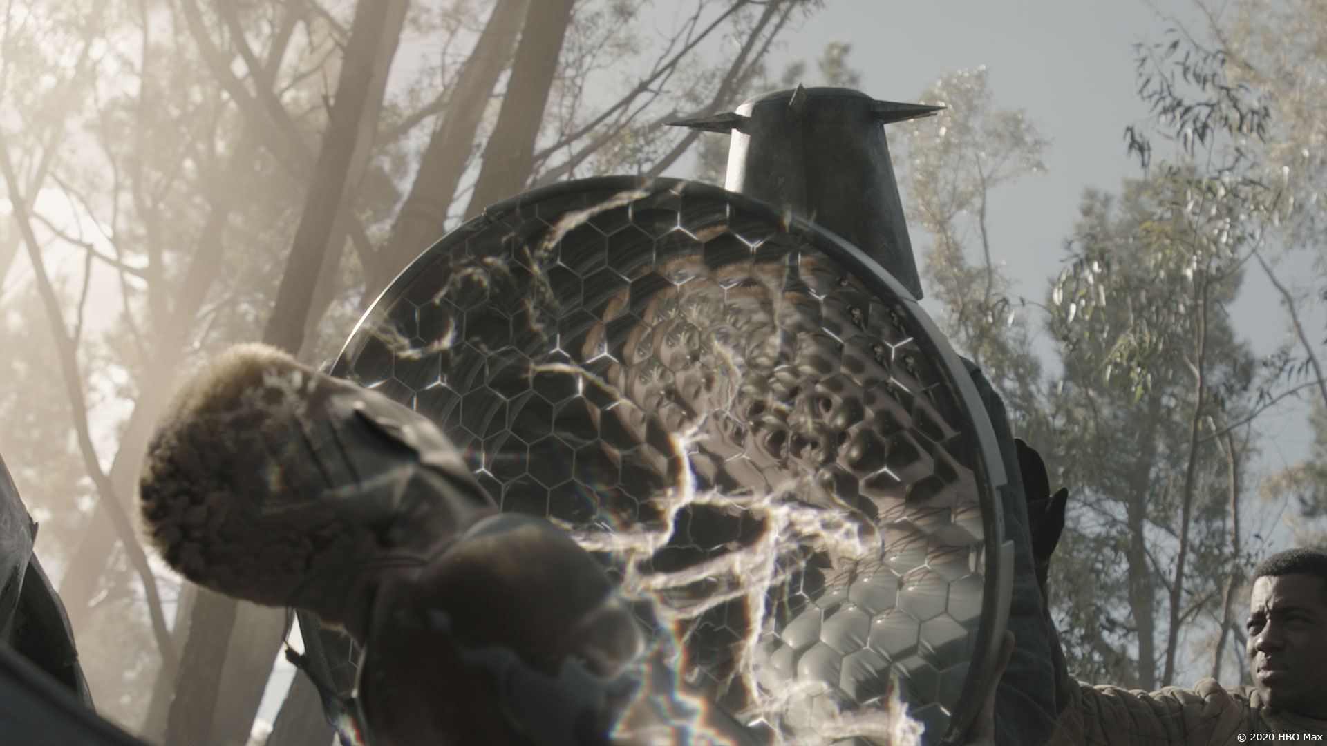
The Forest fight, with the dark energy mirror vs. Mother. We were really happy with the look of the “energy” contouring around Mother as she’s trying to transition into her Necromancer self, so she could fight back. This was another moment where we were able to pitch ideas, and flex creatively. So many fun things to do in that scene! Levitating pebbles and rocks, which culminated in a wave of debris pushed by an electro discharge from Mother.
What is your best memory on this show?
Ark hallway Ridleygram! Being given a still sketch from the master, developing the idea into something that moves, carrying the story, being gory without real gore.
How long have you worked on this show?
From June 2019 to pretty recently!
What’s the VFX shots count?
Mr. X did 476 – incl over 30 all CG.
What was the size of your team?
Super awesome size! Working at a dynamic international studio like Mr. X, we can draw upon artists for a single shot when needed. We can cherry-pick the casting for a task, so that we can get going as quickly as possible. The core team was around 40, but over 400 were involved over the duration of the project.
What is your next project?
Netflix feature with some really cool ______ that I can’t talk about!
A big thanks for your time.
WANT TO KNOW MORE?
Ray McIntyre Jr.: My interview of Overall VFX Supervisor Ray McIntyre Jr. about RAISED BY WOLVES.
Mr. X: Official website of Mr. X.
© Vincent Frei – The Art of VFX – 2020


