Trained at the Royal College of Art, Henry Hobson joined Prologue where he created the titles of many films such as SHERLOCK HOLMES, THE WALKING DEAD or THE THING. In the following interview, he discusses his work on RANGO.
What is your background?
An english designer, hailing from Stonehenge. I studied at the Royal College of Art, and a long history working at Why Not Associates in London; primarily on motion projects that use handmade or analog processes. I crossed the ocean to work at Prologue Films becoming creative director soon after.
How do Prologue got involved on this film?
Prologue was asked to to get involved because of projects including SHERLOCK HOLMES, ROBIN HOOD and ROCK AND ROLLA, also because we had worked for Blindwink (Gore Verbinksi’s company), designing and producing their studio logo animation.
 |
 |
How was your collaboration with director Gore Verbinski?
Gore’s faith and trust was amazing, he put absolute power in myself and my team, allowing us to really have fun. He simply said after choosing the design: “I want it like that, exactly like that don’t change a thing, now go away and make it!” which is pretty great.
Have you received any specific indications or references from him?
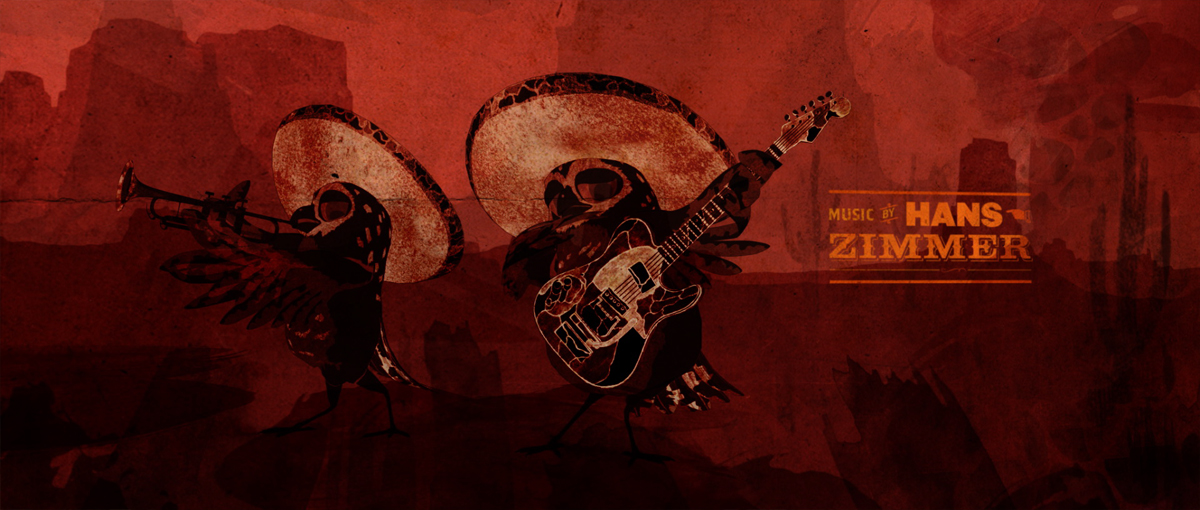
The one key area that he really wanted to make sure happened was the inclusion of the animated mariachi’s, these sections allowed me and the 3D team to play with the classic moments from rock history, from the two smashing their guitars, a hendrix mariachi owl burning his, windmilling, sliding on knees, and of course the overt tribute to Dick Dales Misirlou at the very beginning of the sequence.
 |
 |
What was your approach for these titles?
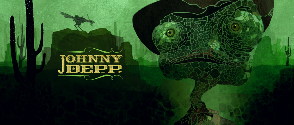
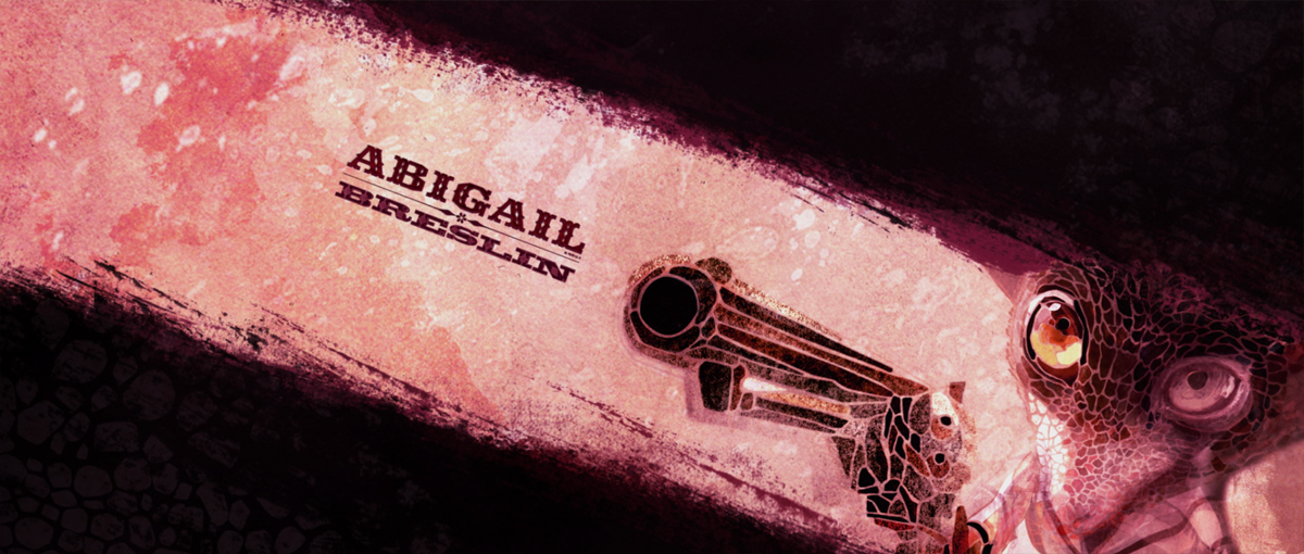
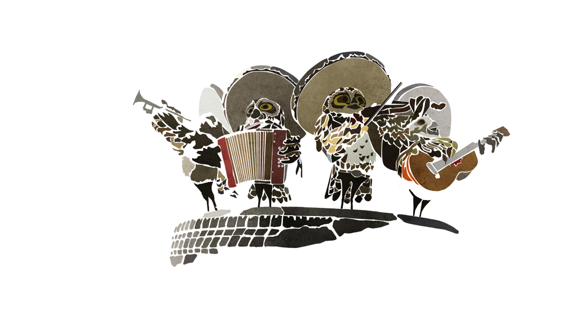
Building on classic spaghetti western cinematic moments, a vivid color palette and the key scenes from the film it was to capture the fun and energy the film has. My vision for the main-on-end title sequence involved a visual that was constantly shifting in and out of the environment, while retelling the story in a very cool, fun way. Each character was represented by their main characteristics – i.e. mustaches, eyes, cacti, accordions, desert elements – all set against the vibrant score which was a perfect image to Dick Dales Misirlou.
 |
 |
How was the assets exchange with Industrial Light & Magic?
For us it was getting the 3D character files, these were great as we got them pre-rigged allowing us to spend all the time having fun with the animations. The most insane file we got from them was the canyon, we got this amazing 3D replica of the grand canyon, absolutely huge just stunning detail.
How have you created and reinterpreted the characters and the different locations?
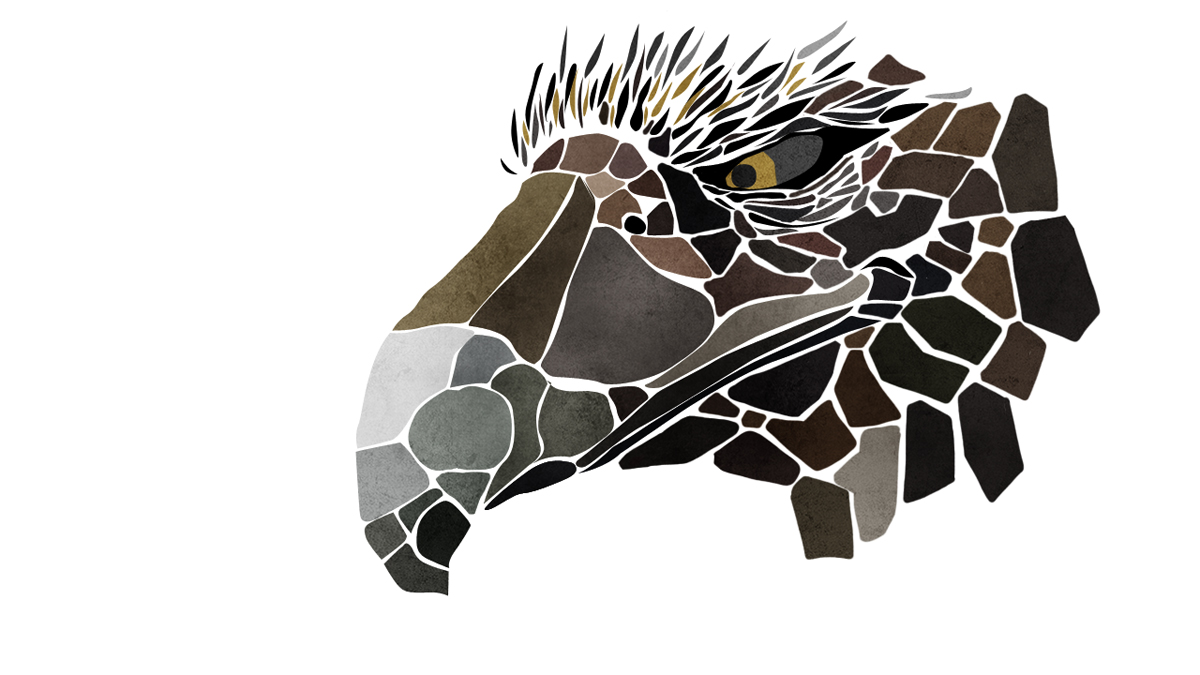
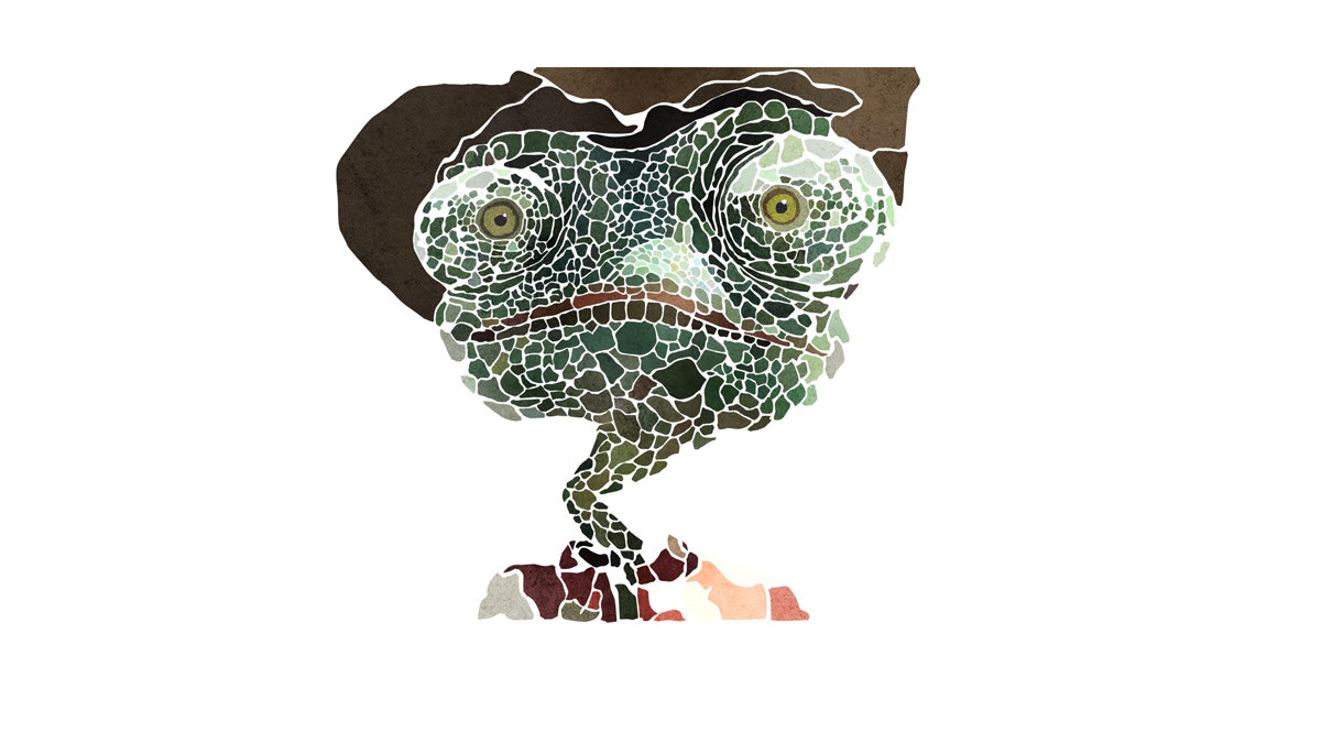
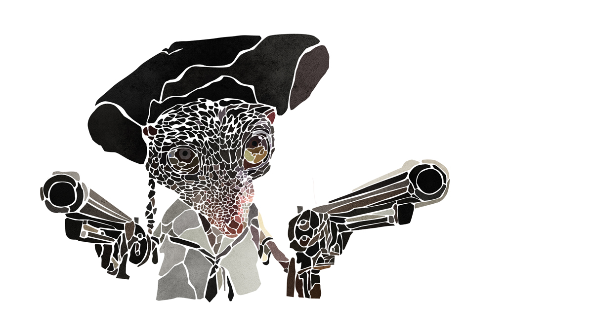
Firstly we choose a scene, whether it was a iconic cinematic moment, a fun freeze frame or something that allowed for an interesting fresh take on the magnificent visuals already constructed in the film. Then this was broken down, simply illustrated, tagged with a motif from the film, sunsets, cactus and such like that. From this a typographic look was designed by hand for each of the cards and finally the characters were intricately broken into a pattern of scales. The process ranged from hand drawn and painted typography, through detail character illustrations and layers of scanned in textures and papers to build the background elements.
 |
 |
Can you explain in detail the creation of animations?
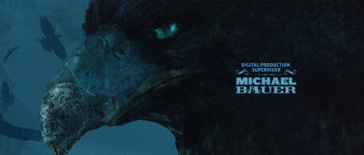
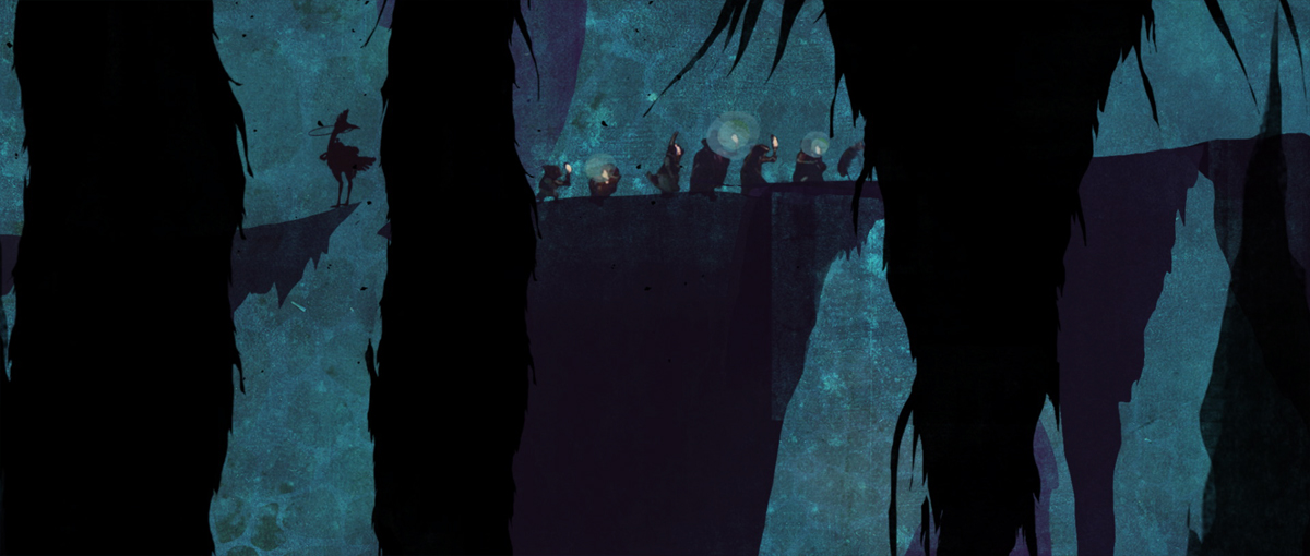
The character animations were done in two ways, some 2D character animations with simple graphic character moves alongside some 3D mariachi moments which acted as fun ways of playing with the camera. The 3D characters allowed for us to show the classic rock guitar moments in a great way. The other elements, backgrounds environments etc, we have built layers of paper and scanned textures to create a cut out colorful world, in which the characters could interact.
 |
 |
How did you manage so many elements for this long animation sequence?
The key for this was to have one central location, a folder which contained the layered photoshop files that everyone was working from, layered in a particular way so that when a file is updated the animations were immediately updated. A separate folder worked in the same way with the typography, so that we could keep updating credits (as well as extra languages) right up to the last minute without dramatically affecting the animators workflow.
Can you tell us about the creative process that brought you to this beautiful style and render look?
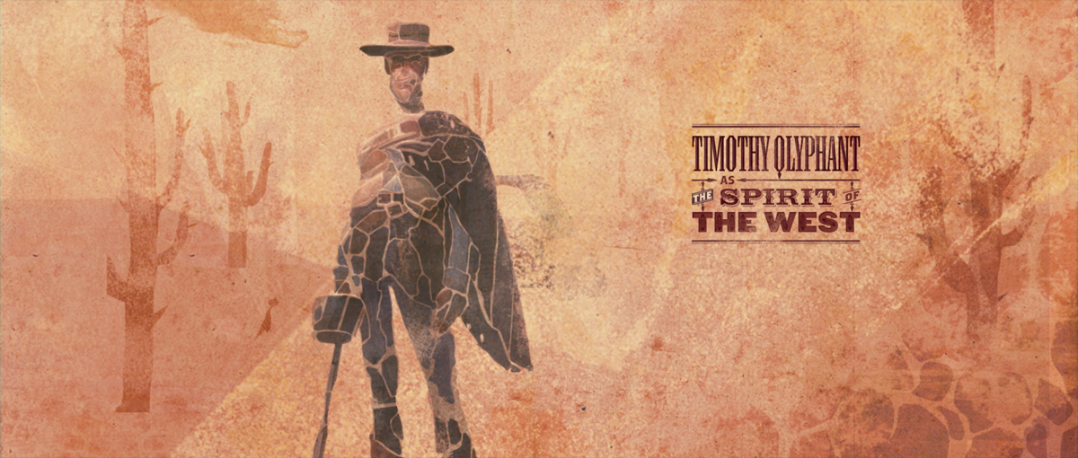
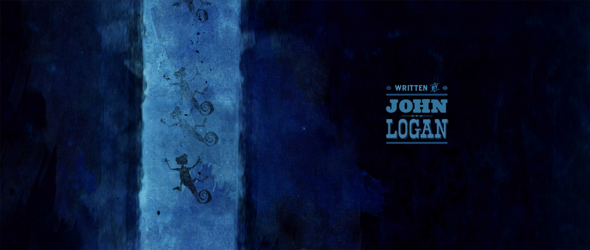
The reason the sequence is so colorful is as a direct reference to the chameleons changing color palette, so we could have Rango moving through scenes changing color to reflect each new place. From this colorful base I then looked for scenes and sequences that the colorful environments would work with, underwater, cacti worlds, epic roger deakins sunsets canyon flythroughs and cantina bars.
 |
 |
What was the biggest challenge on this project?
Without a doubt the biggest challenge was the time, with a very supportive client, time was the biggest enemy. Only five weeks to turn around a full sequence. Of this it was the 3D scenes that slowed us down the most, our 2D elements fitted together pretty easily which left us spending most of the time to work out how to best integrate the two animation techniques.
How long have you worked on this film?
5 weeks with a few weeks of preparation and design, before that the project had laid dormant for nearly a year!
What do you keep from this experience?
I now have some beautiful handmade typographic illustrations on my desk!
What is your next project?
I’ve just finished some very simple sequences for a few films coming soon, THE HELP, THE THING as well as creative directing a host of elements in X-MEN FIRST CLASS. But the most interesting for me is the new sequence for FRIGHT NIGHT.
What are the 4 movies that gave you the passion of cinema?
THE 39 STEPS, THE THIRD MAN, THE LADYKILLERS (1953) and ALIEN.
A big thanks for your time.
// WANT TO KNOW MORE ?
– Prologue Films: Dedicated RANGO page on Prologue Films website.
// RANGO – END TITLE – PROLOGUE FILMS
© Vincent Frei – The Art of VFX – 2011


