Matt Aitken joined Weta Digital just after its creation in 1994. He participated in all major projects of the studio as THE FRIGHTENERS, the LORD OF THE RINGS trilogy, I ROBOT, KING KONG or AVATAR. He won two VES Awards for KING KONG and THE LORD OF THE RINGS: THE TWO TOWERS. In the following interview, he talks about his work on THE ADVENTURES OF TINTIN.
What is your background?
My background is in a combination of filmmaking and computers. I’ve loved movies from an early age and used to make short films in the Super 8 format. Then when personal computers first became available I was immediately drawn to them, I particularly loved programming computers to create images. I studied film, mathematics and computer graphics systems programming at university then joined Weta Digital in 1994 when the company was just getting started. Since then I have had the privilege to work on some fantastic projects here including LORD OF THE RINGS, KING KONG, AVATAR, DISTRICT 9 and now THE ADVENTURES OF TINTIN.
How was the collaboration with director Steven Spielberg?
Steven was fantastic to work with, always enthusiastic about the work and incredibly astute on what changes needed to be made. We reviewed the work with him via video conference calls, by the time we got up to speed with the show we were doing these calls with him daily. He might’ve just been being polite but on more than one occasion Steven said that these calls were the highlight of his day. I found it fascinating to watch him in action, within a few seconds of seeing a clip he would come back with very specific notes that were always bang on the money and ultimately about ensuring that the story he wanted to tell was clear. And if there were no notes, he would say “put it in the movie!” which we always loved to hear.
Can you explain to us the preparation and design process?
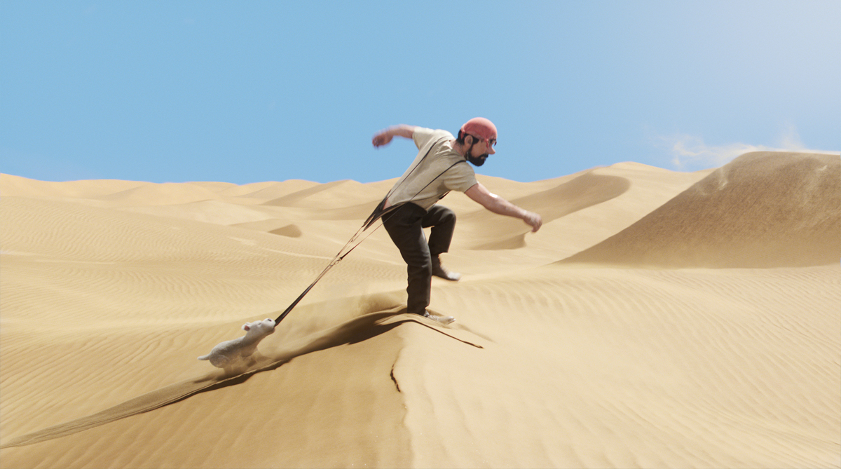
Weta Digital formed its own internal art department for the first time on THE ADVENTURES OF TINTIN. We realized that as our role on this film was wider than usual, Weta Digital was effectively the production company for this film, an art department was crucial if we were to realize our goals of making the film look as rich and beautiful as possible. Building on early concept work from the Weta Workshop design team under Chris Guise, the Weta Digital art department under art director Kim Sinclair embarked on the process of designing interior sets, buildings, vehicles, furniture, props, weapons and costumes for all the characters. There were 2 primary points of reference for the movie’s design: Hergé’s original panel art and reference of actual locations and items. In practice these two weren’t hard to bring together into a unified design aesthetic because Hergé himself drew his environments very accurately, often basing his panel art on photographs of actual locations and vehicles. Translating this reference into textured, shaded digital models we used the flexibility offered by working in an entirely cg space to build on reality. Whereas Hergé translated the scenes in his reference photos into his signature ‘ligne claire’ drawing style, distilling each panel into an image of high graphic impact, we were able to use the tools we had developed over the years to present not so much a stylized version of reality but more an idealized reality. So Tintin’s home town is a picture-postcard version of a northern-European city. The idyllic ocean dawn that breaks over the heroes in the longboat is particularly beautiful, one that a live-action shoot might have to wait days or weeks to capture. And the desert can manifest itself as an infinite stretch of pristine golden sand.
Have you created previs for the whole movie?
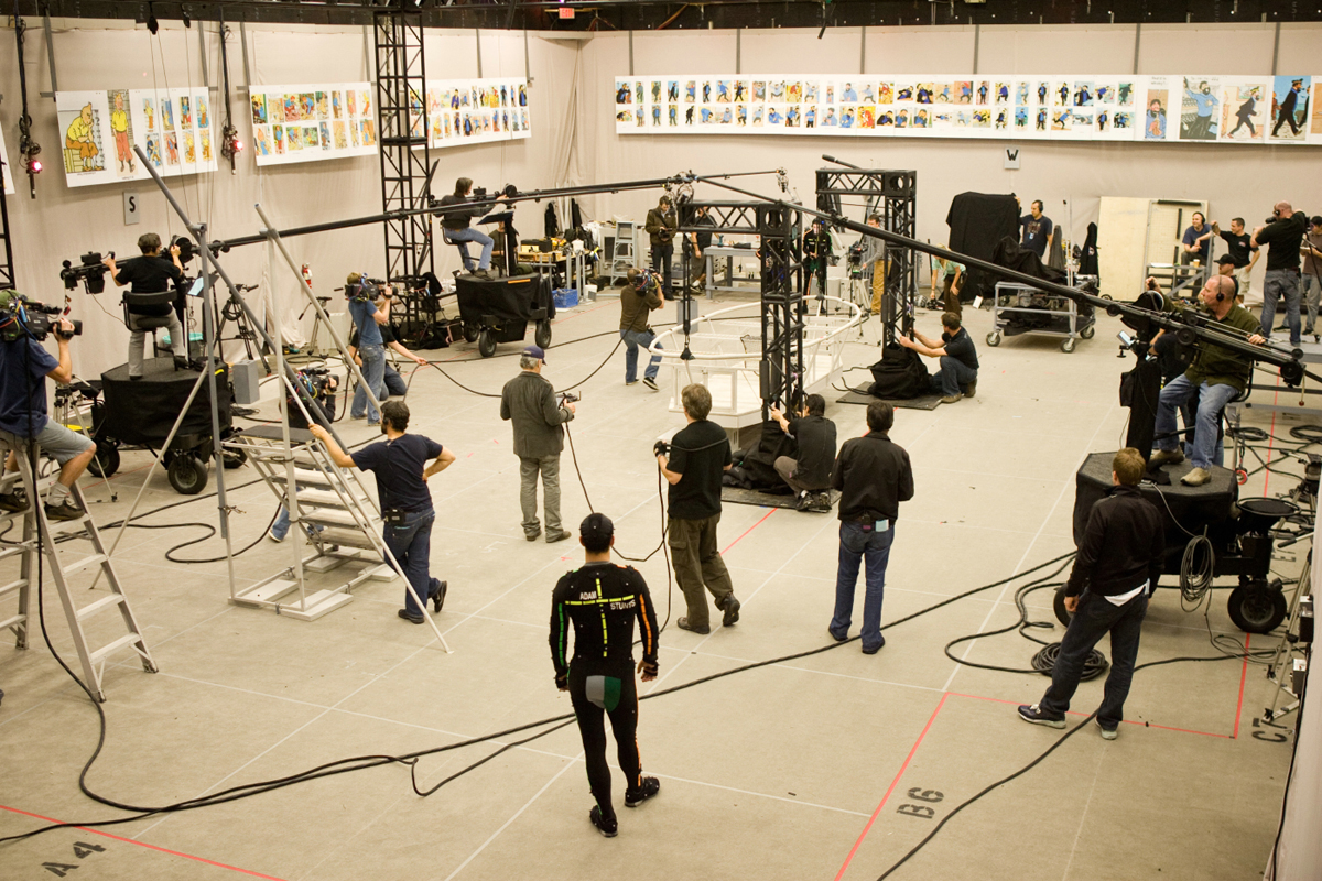
A “template” version of the whole film was created out of a combination of cg from the performance capture shoot and keyframed digital previs. Typically the action sequences were prevised while the more performance-oriented scenes came off the motion capture stage. Our previs artists relished the opportunity to contribute original ideas to the film. These action beats, gags and chase sequences would be presented and discussed in review sessions with the director, Steven Spielberg said that he found these sessions, which took place early in the production process, to be amongst the most creative times he had had on any project, I think he found them to be huge fun! Previs also informed the performance capture shoot, particularly in more complex sequences. Steven Spielberg edited the resulting footage into a blueprint of the whole movie and turned that over to us as individual shots, the starting point for our detailed animation, lighting and fx work.
Can you tell us the process about the look and style of the characters?
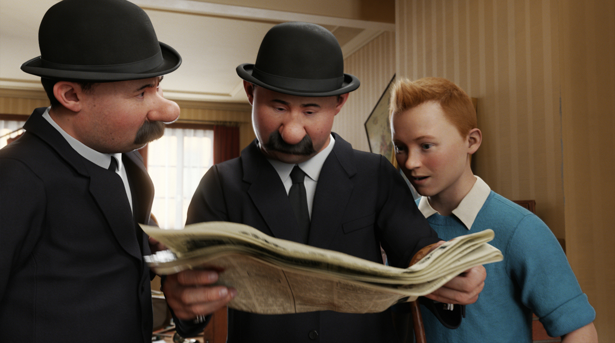
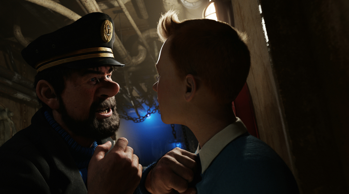
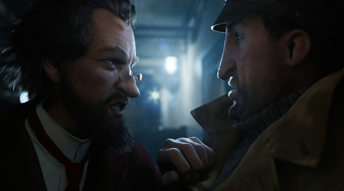
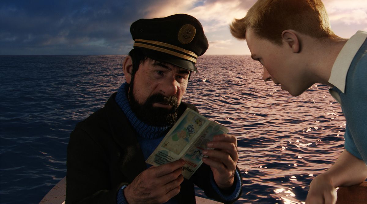
Getting the look of the characters right was one of the big challenges of this production. Right from the start we wanted to honor the design that Hergé created for his characters, that signature look. But our characters also had to believably exist in the world we were creating for them: a highly detailed world of idealized reality. We used exaggerated facial features and the proportions of the comic book characters with their oversized heads and hands to carry the look of Hergé’s characters on into the world of the film. But we made the details of the characters natural: their skin textures, the way their faces moved when they spoke and especially their eyes are much closer to real humans than their overall form.
How did you decide with the director what should be the final look?
Our early review sessions with Steven Spielberg involved a lot of discussion about the look of the characters, with us responding to requests from him and also showing him proposals for how we thought the characters should look, move and perform. Our goal throughout was to create characters that could convey the range of emotions that the director needed to tell his story, with a high degree of subtlety and nuance in their facial performance. This process overlapped with our work delivering final shots for the film, there are key close-up shots for each character that are the ultimate proving ground for all the character design decisions we had made.
What were your references for the lighting?
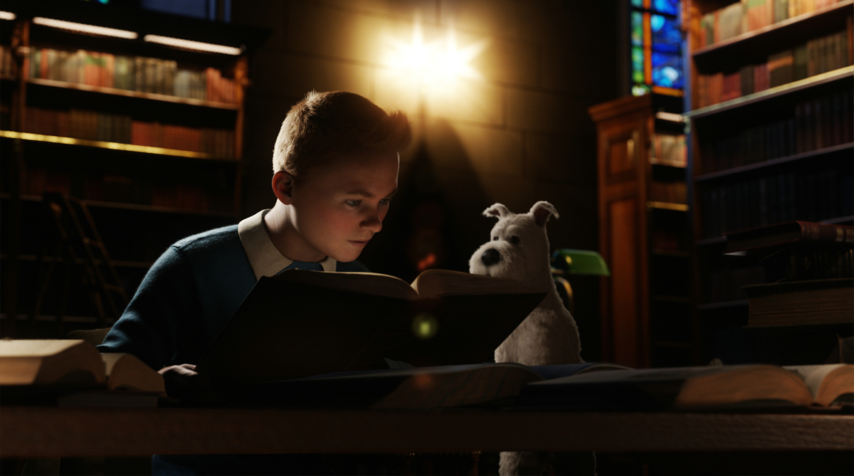
Steven Spielberg gave us detailed lighting notes at the start of each sequence, in fact he has a credit on the film as Lighting Consultant. He has a cinematographer’s eye for how to light a shot to emphasize the essence of the storytelling that has to happen in the shot and it was great being able to draw on that experience. As with other aspects of the visual design of the film the lighting aesthetic could be described as ‘idealized reality’. Our basic lighting setups were derived from the practical lights in the scene and resulted in a natural lighting look. But we never limited ourselves to that and if the initial result made it hard to read an action beat or a nuance of performance then we would have no compunction about bringing in an extra light off camera to clarify the point. The trick was to do this in such a way that didn’t interfere with the natural feel of the lighting we had established. We referred a lot to scenes from Steven Spielberg’s live-action films as a guide to this, MUNICH, WAR OF THE WORLDS and especially the original RAIDERS OF THE LOST ARK.
Tintin takes us to a lot of different sets and landscapes. Can you explain to us your references for them and how you create them?
One of the things I love about THE ADVENTURES OF TINTIN is the huge range of locations we go to in the film, and their different moods and lighting. From the soft light of a northern European city, to the bright colours and harsh sunlight of a north-African port town, from the ocean at dawn to a night-time docklands we are always racing from one location to the next. The design of these environments was a collaboration between previs and the art department. For action sequences such as Snowy chasing the red van and the chase through the streets of Bagghar previs determined the overall layout of the environment to support the action. For other environments like the Karaboudjan cargo ship and the docklands the art department lead on the design. The art department amassed a large library of photographic reference to ensure that architecture was period-correct and material textures were accurate to a highly detailed level. The digital build for the environments involved constructing more of the locations in geometry and less use of digital matte paintings than previous vfx projects we had worked on. This is partly because the film is presented in 3D stereo, and so more of the environment needs to be created in true 3D space. But also the film is an old-school road movie, we are constantly moving through the environments and see them from an ever-changing perspective.
The movie features a lot of reflections and refractions. Can you tell us more about their creation?
The film includes many shots where characters are seen reflected or refracted, many of these originated in work from the previs artists. Visually these shots bring elements together in a single frame without having to cut from one to the other. The first time we see the model Unicorn it is reflected in a dozen mirrors in a market stall. And our first look at Captain Haddock is as a comical distortion refracted through an empty whiskey bottle, giving us the opportunity to introduce him as a facsimile of his comic-book appearance. We decided early on that the only way to get these shots working effectively, especially in 3D-Stereo, was to render them in a physically accurate space using ray tracing. We are fortunate in that a lot of our rendering pipeline is built on ray tracing architecture so our processes lend themselves easily to working this way. As an example there is a shot towards the end of the film where the Captain holds a whiskey bottle in which we can see Sakharine reflected, holding a lighter flame up to the scrolls. A pre-rendered image of Sakharine could have been texture-mapped onto the bottle but it wouldn’t have moved across the surface of the bottle, as the Captain moves the bottle through space. By raytracing the reflection of Sakharine we get a correct spatial relationship between the bottle and Sakharine, and consistent 3D-Stereo across the shot as a bonus.
Can you tell us more about the creation of the beautiful Ocean?
The ocean is a full fluid simulation throughout the film. Building on techniques we developed for AVATAR our water simulation software has developed and can now handle much larger events. This meant that we could create calm ocean scenes like the seaplane sequences, as well as the storm-ravaged ocean of the pirate battle. Another key development was enhancements to our toolset for simulating the interaction between objects and the ocean. This includes bow waves and wakes around ships, down to the splashes when characters fall in the sea. These smaller events are in many ways the most difficult to achieve: the shot where the Captain falls off the longboat and creates a big splash is the most complex water simulation event ever calculated at Weta Digital. In conjunction with the simulation work the shaders that we use to render water have also been enhanced and now incorporate a more physically accurate light scattering model to great effect.
Can you tell us more about the impressive continuous shot at the end of the chase?
This shot lasts over 2 and a half minutes and is one of the most complex shots we have ever done at Weta Digital. Previs was the key to designing the shot. The shot was prevised over a 5 year period, starting late in 2006 and previs for the shot was eventually approved in April of this year. In several intense periods over that 5 year span our animation supervisor Jamie Beard worked with his team to shape the sequence in close collaboration with the director. Different gags were explored, the timing and camera work were refined, motion capture was used to help shape the action where appropriate. Once approved and turned over into animation and lighting a “divide and conquer” approach was taken to making working on the shot manageable. The shot was split into 17 sub-shots of a more typical shot length. Care had to be taken to ensure that the transition from one sub-shot to the next was invisible, so the transitions were placed at times where the camera was moving fast to help disguise the switch. Added complexity came from the large and up-close water simulations featured in the sequence and the need to subtly change the key light direction so that the action was well lit no matter what direction the camera happened to be pointing.
How did you manage so many elements?
Our work on AVATAR taught us that it is crucial to get the tracking of assets correct from performance capture on. So on Tintin we had asset management tools in place so that if the director called for a specific prop in the middle of a motion capture session, the use of that asset in that scene will be tracked from then on. All assets are entered into our proprietary asset management system as they are created. If we didn’t do this, the world of Tintin, where every item in his apartment, every leaf blowing around on the street and every basket of fruit in the marketplace of Bagghar is a unique digital element, it would become impossibly complex to manage.
What was the biggest challenge on this project and how did you achieve it?
Notwithstanding everything I’ve mentioned above, achieving great performances out of our digital characters is always the one single thing that we take most seriously here at Weta Digital. We knew that the success of this film hinged on the characters having great performances, anything less would detract from the emotional resonance of the film and distract the audience from the story the director wanted to tell. To achieve this, Weta Digital built on the performance capture processes it has been running since creating the character of Gollum in THE LORD OF THE RINGS, employed to great effect recently in AVATAR and RISE OF THE PLANET OF THE APES. As always our goal is to ensure the actor’s on-set performance is clearly conveyed in their character’s digital persona. Key to achieving this is a highly developed facial motion capture system. But that in itself is not enough, we have always found that the ability to enhance the performance that we get “out of the box” with keyframe animation is crucial. To this end our facial rigs have been set up to allow input from both captured motion and keyframe animation of the facial controls together. This fine layer of finessing that we are able to add on top of the captured motion can make all the difference, it brings the artist’s craft to what would otherwise be a procedural system and somewhat paradoxically enables us to create a performance that is more true to the actor’s original performance.
Was there a shot or a sequence that prevented you from sleep?
There’s always one! For me it was the climactic docklands battle. This sequence was the last one to be turned over to Weta Digital and we didn’t have much time to finish it. Work on the sequence was further complicated because there was a lot of complicated destruction work for our fx department . And a lot of the destruction was sequential: dock buildings and in particular Haddock’s crane are subjected to blows that change their appearance significantly over a series of shots, so the destruction work for those shots had to be done in sequence which slowed things down. Detailed planning got us through and we ended up delivering the sequence of 100 shots a few days earlier than scheduled.
What do you keep from this experience?
I loved working in an entirely computer generated space on this project. Our vfx work usually involves us ensuring that our cg matches the lighting in the plates we are delivered from production, and there can be an element of compromise involved there. With projects like THE ADVENTURES OF TINTIN we have complete control over all aspects of the production: the look of the characters and environments, the animation of the camera and particularly the lighting. So we could make things look as beautiful as possible. I relished that freedom.
How long have you worked on this film?
Off and on since April 2004, that was when we got involved with testing a digital Snowy for a live-action THE ADVENTURES OF TINTIN which was Steven Spielberg’s initial plan. In 2007 I spent some time in Los Angeles preparing for the performance capture. I supervised work on the show through 2009 when most of the rest of Weta Digital was busy finishing AVATAR. And I spent the last year of production working full time on the show.
How many shots have you done?
Weta Digital completed nearly 1300 shots for THE ADVENTURES OF TINTIN.
What was the size of your team?
At the peak of production crew size was over 800. In total around 1100 Weta Digital artists worked on the show throughout the production.
What is your next project?
Weta Digital is returning to Middle Earth with Peter Jackson, I think I hear Gollum calling me now!
What are the four movies that gave you the passion for cinema?
2001 A SPACE ODYSSEY holds a special place in my heart for the poetry of its visual effects, and some very early computer graphics. STAR TREK II: THE WRATH OF KAHN for the Genesis Effect sequence, there was a shot that could only be achieved with computer graphics. The light-cycle chase in the original TRON for the dynamic use of a digitally animated camera. And JURASSIC PARK for the creature work, that film changed cinema for me.
A big thanks for your time.
// WANT TO KNOW MORE?
– Weta Digital: Official website of Weta Digital.
© Vincent Frei – The Art of VFX – 2011





hi, my name is anil, being a part of animation sector, i want to know the basic techniques of lighting and texturing sector so that i can learn about new things.