Last June, Brendan Taylor explained the work of Mavericks VFX on the TV series WHAT WE DO IN THE SHADOWS. He is coming back today to talk about Amazon Studios’ THE BOYS.
How did you and Mavericks VFX get involved on this show?
I had been a fan of the comics… they are very dark, sure, but I also really like the take that if superheroes were real, they likely would be more like rock stars than benevolent saviors. I knew we’d be competing with shops 10 times our size, so we did a concept of “The Seven” headquarters that we ripped from the comic book. I was really happy with it. They ultimately went with a tower, for The Seven headquarters, but I think the concept showed that we had chops.
How was the collaboration with the show runners and VFX Supervisor Stephan Fleet?
Great. Stephan had us on set a few times, covering set when he was tied up with directing second unit, or supervising one of the other units. In post it was great, because he really knows his shit. Sometimes he’d just mock stuff up in Cinema 4d, Nuke, Photoshop, MS Paint (just kidding), to get his point across. It also felt like we were in the same boat… there was never a “you guys” etc, it was always a “we”.
We didn’t speak directly with the show runners very much, as it made sense for everything to go through Stephan. Stephan and Erik had worked together a number of times and there was really mutual understanding and respect.
What was their expectations and approach about the visual effects?
Expectations were high (as you can see in the finished product).
How did you organize the work with your VFX Producer?
Mike Kowalski was the Mavericks VFX Producer. We opted to split into teams. We were in charge of monitors and graphics, the Tower of Seven and crowds in episode 103. So each team had a lead and a few artists.
What are the sequences made by Mavericks VFX?
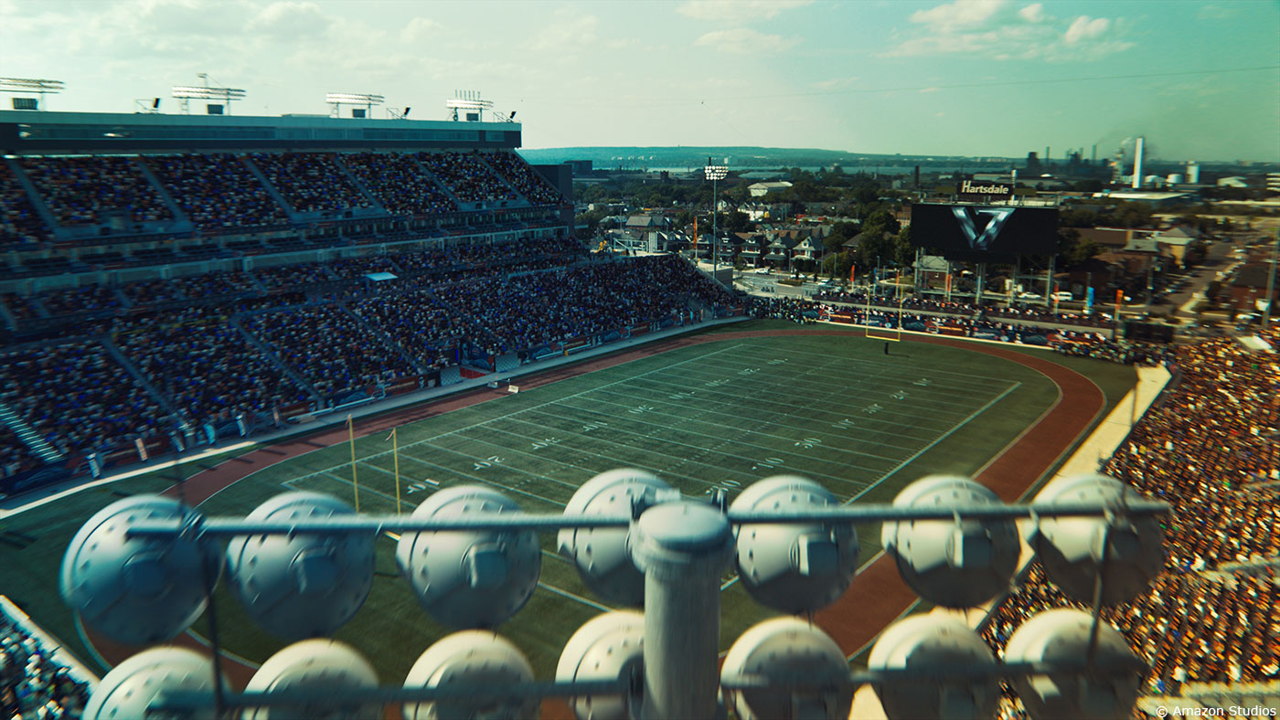
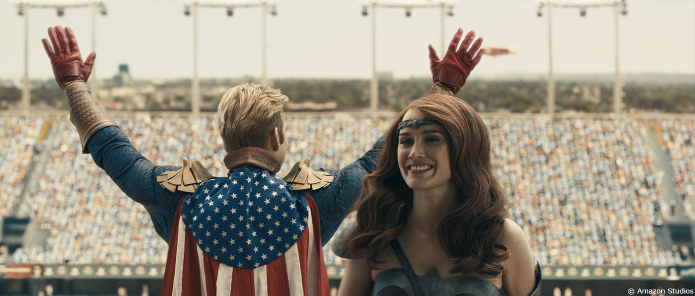
Monitors/Graphics, The 7 Tower and the crowds in the Race of the Century.
Can you explain in detail about the design and creation of 7 Tower?
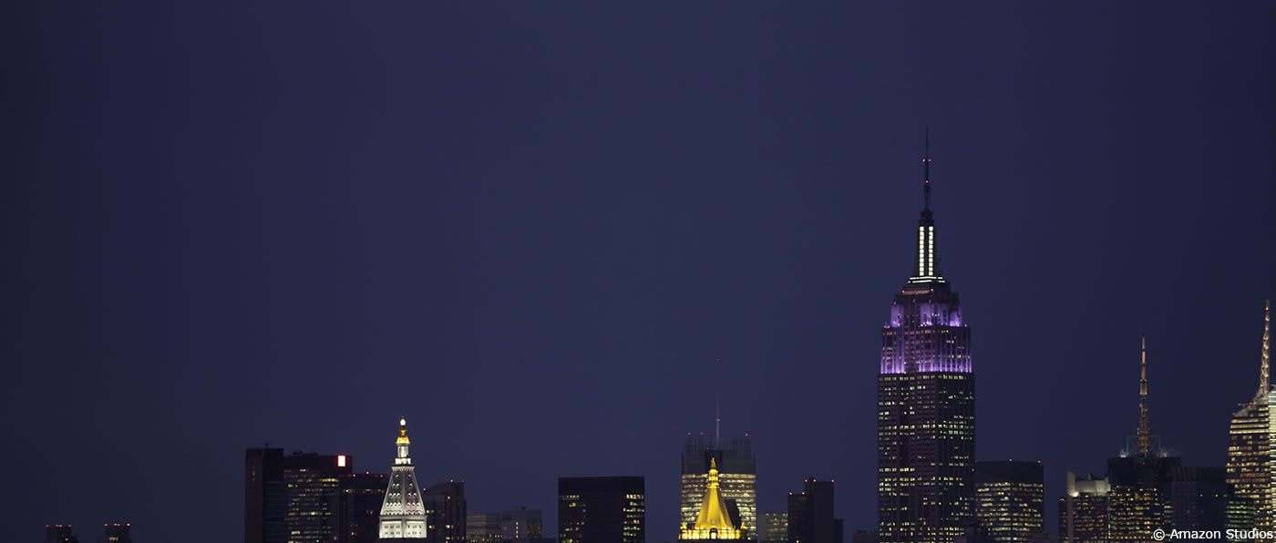
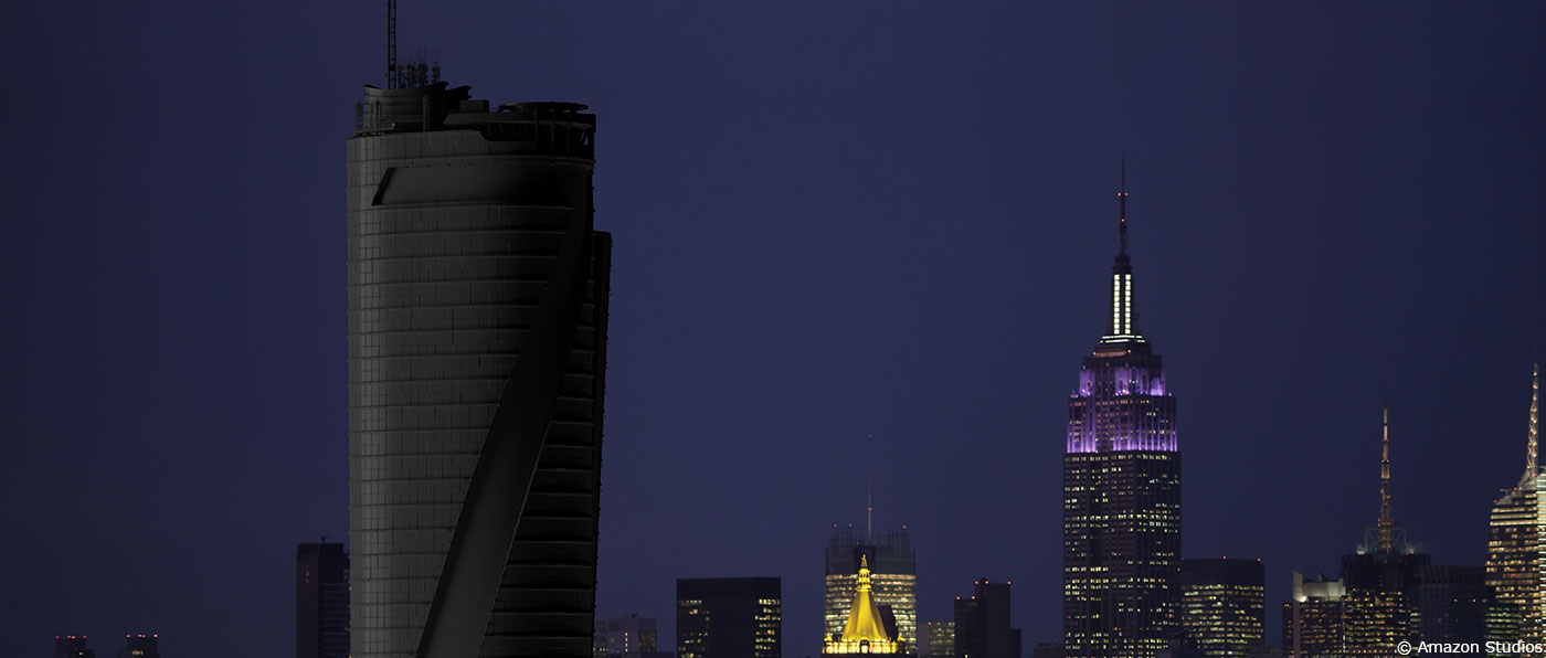
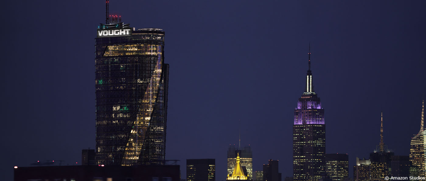
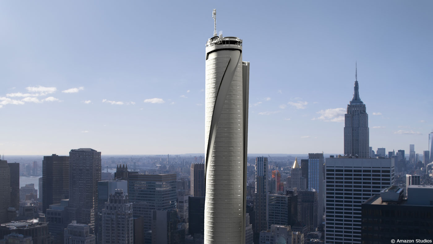
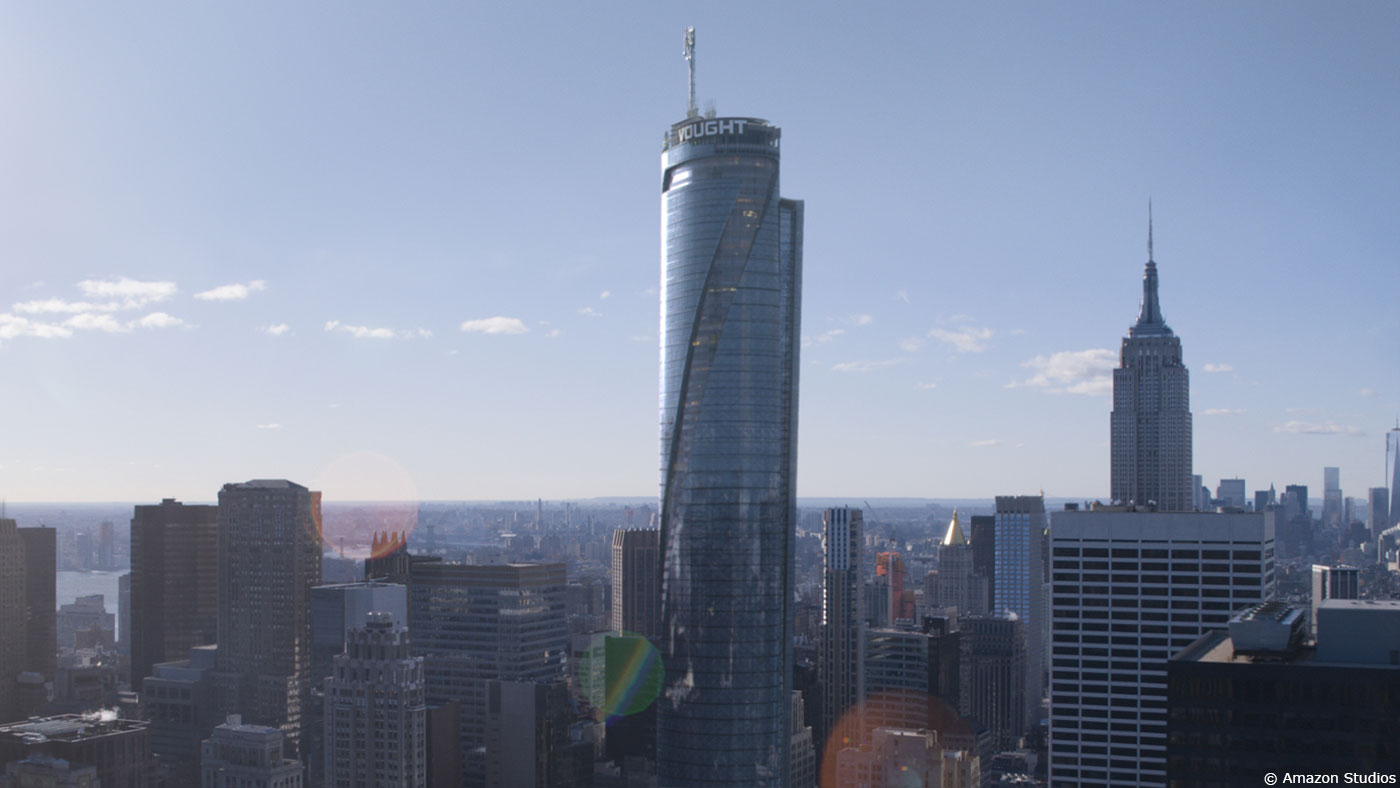
The design was very well fleshed out by the art department. It was REALLY nice. So we just went about building it. We needed to get a few things ironed out first. Some of the physics of it didn’t quite line up. The base (which was Roy Thompson Hall in Toronto) was too small for a tower of that size. Additionally, some of the shots, like the tilt ups, wouldn’t frame up that nicely if we stuck to the 77 floors of the concept. It was a big and complex asset so we couldn’t really revise the model on a shot by shot basis. Stephan understood this and there was a lot of back and forth about the size of the tower. We settled on a height and then went about building it. We based a lot of our work on Zaha Hadid’s tower in Beijing.
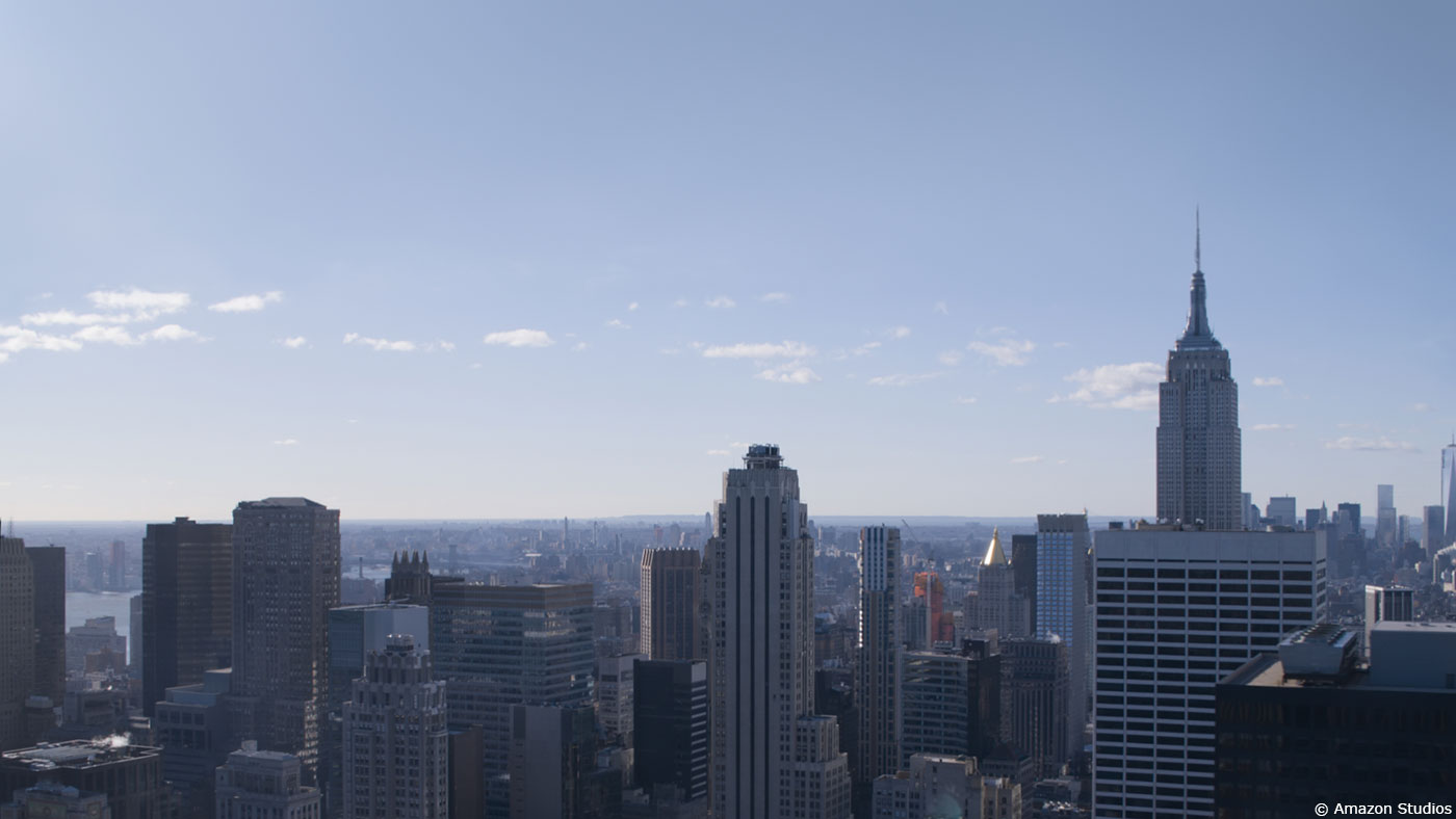
In building it, we needed to have a few versions for different circumstances. The model was consistent, but the shading and texturing needed to be different depending on the situation. So we had a day version, a night version and a far away version. The day version was focussed on reflections, refractions and re-projection of the surrounding environment. The night version was mostly about the interior lights. We did need to reflect the surrounding environment on the tower, but could not find an HDRI of a city like New York at that height, at night. Lucky for us, there is a highway in the middle of downtown Toronto called the Gardiner Expressway that cuts through the central business district and is about 40 feet high. So we drove along the Gardiner, pulled over to the side and did an HDRI. My years of having first ADs yell at me to hurry up with the HDRI came in handy. The final version of the tower was for wide shots it would be a CG version of the tower that was then touched up in matte painting (modo and photoshop – to get the reflections moving properly).
For the exterior it was mostly shader work, as we had a very reflective surface. The trick was in getting the reflections to play in a realistic and believable way. We often rendered versions of the reflections with small changes in the geo. We also obsessively referenced high res stock footage we had found of buildings in New York and the Zaha Hadid building.
To get the interiors, which were only really seen in the night shots, we kit bashed offices out of previously made models. These were lit with practical seeming light sources on desks and lights in hallways. It may seem small, but those touches really helped sell the realism.
Can you elaborates about your work on the Graphic Montage for the Race of the Century?
We called it the “hype” reel. Editorial created the initial reel for timing and general imagery. Leo Bovell, Mavericks VFX supervisor, found some great ESPN hype reels. Erik and Stephan really liked the lens flarey, floating debris feel to it. We hired a compositor we’ve worked with a lot named Rob Del Ciancio who absolutely KILLS at this kind of stuff. He also barbecues really good ribs. Erik and Stephan really liked the early versions so we kept refining and sweetening it. But the initial presentation got it started off really well. The reel had some 3d in it, but it was a lot of elements and 2d cards.
How did you create and animate the crowd for the Race sequence?
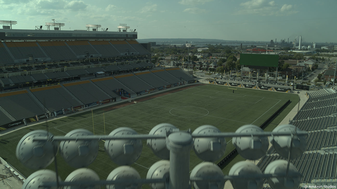
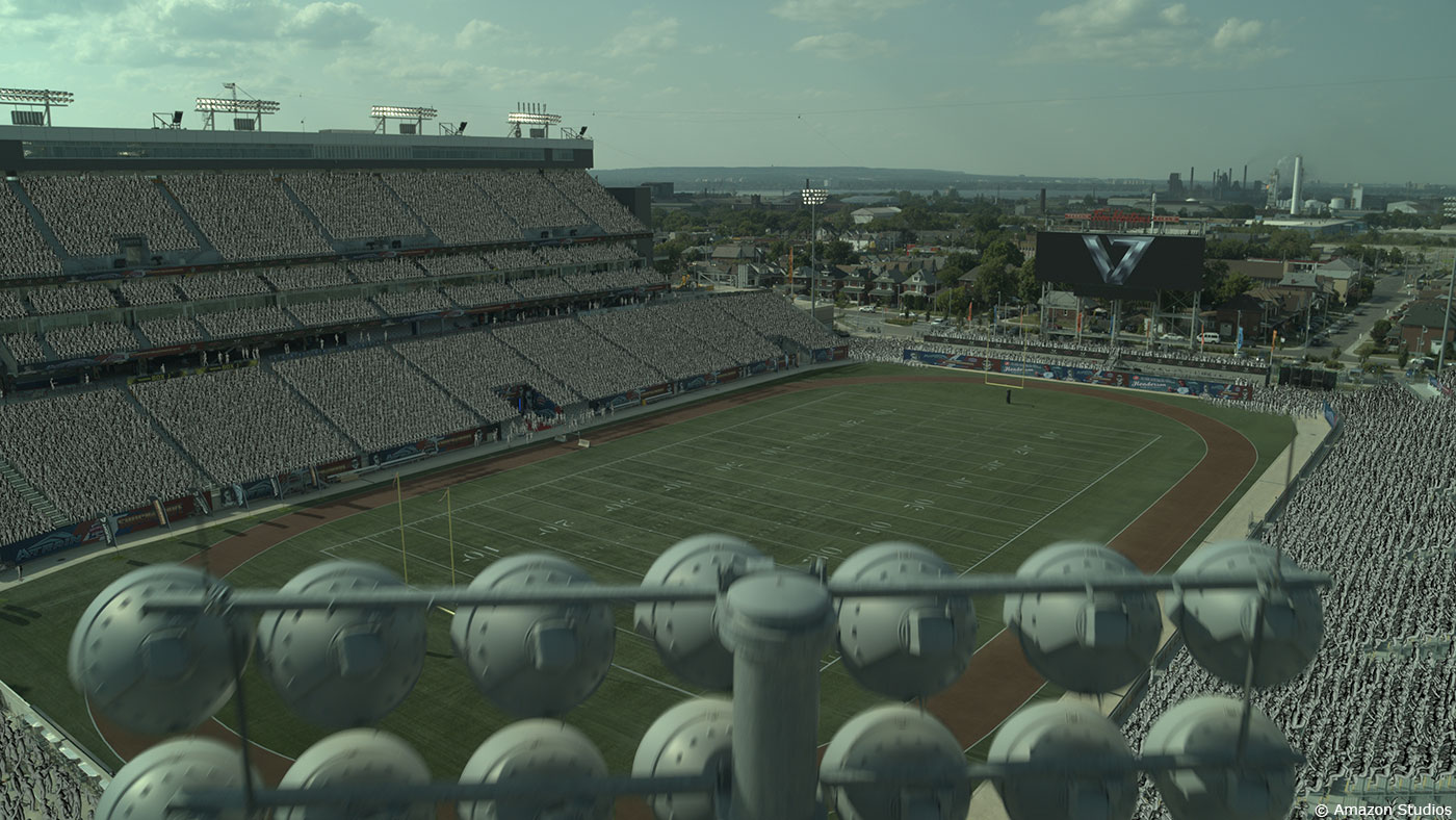
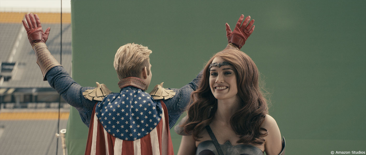
So this was complicated… we looked at a number of crowd programs and settled on MiArmy. First, we had to build the stadium and the seats to put the 3D crowd in. It had to match perfectly, otherwise the crowd would look like they were floating. We used mocap data for the crowd animation. In a few cases, we key frame animated the crowd, but due to the size, we really needed a lot of variation. The mocap data needed to be ported into MiArmy and then we needed to run the simulation. Due to the complexity and extreme hardware demands of cacheing and rendering, we opted for very low res animation for approval. That ended up being problematic, because it can be a bit misleading if it is too low res. We were able to get timing approval this way. We would then take a small section and render that a little higher res for animation approval. Because the show was 4k and we were dealing with 30,000 agents, the cacheing was a nightmare. There were only a few workstations in the studio that could handle it. It wasn’t something we could outsource to the cloud either. I have to hand it to Leo Bovell and Josh Clark who either stay very late or come in at 3am to check in on and launch the caches. We did work with MiArmy to get the cache times down, and they were really great to work with, but you can’t fight reality. The reality being: these were large, complex scenes. There was no magic solution in this case, just brute force, late nights, diligence and care. Due to the cacheing and rendering timelines, we ended up making changes to the t-shirt colours with mattes and color correcting as opposed to re-rendering. The id mattes were pretty versatile and allowed us complete control.
Can you tell us more about your work on the monitor comps?
They were challenging because in addition to the monitor comps, we also needed to design and animate the lower thirds. That in itself is not tricky, but the show used the television and news as a method of delivering the exposition. So we needed to be aware of how we were delivering information. Things would also change a lot, late and tweaks were often made to language. It’s part of the process, though. As the edit starts to come together, changes need to be made to these comps in order to make sure the story flows. I actually really liked doing the monitor comps, as I like the story telling component to it. What can I say? I’m a nerd.
Which sequence or shot was the most challenging?
The crowds.
Is there something specific that gives you some really short nights?
The crowds.
What is your favorite shot or sequence?
The crowds.
What is your best memory on this show?
Not the crowds.
How long have you worked on this show?
We started in May 2018 and finished in February of 2019.
What’s the VFX shots count?
270.
What was the size of your team?
46.
What is your next project?
We are working on QUEEN AND SLIM, IMPULSE – Season 2, MADAM C.J. WALKER and a Canadian film called SLASHBACK.
A big thanks for your time.
WANT TO KNOW MORE?
Mavericks VFX: Official website of Mavericks VFX.
© Vincent Frei – The Art of VFX – 2019


