Gareth Edwards, known for his work in visual effects, transitioned to directing with notable films such as Monsters, Godzilla, and the highly praised Rogue One: A Star Wars Story, before taking the helm of the excellent The Creator.
Jay Cooper entered the world of visual effects in 1994 at Cinesite, later moving on to positions at Sony Pictures Imageworks and Rhythm & Hues. His journey led him to ILM in 1998, where he has since contributed to a variety of films such as Starship Troopers, The Perfect Storm, Avatar, and Space Jam: A New Legacy.
Andrew Roberts is no stranger to the visual effects industry, boasting an extensive career spanning over 25 years. Having worked across multiple studios and taken on diverse roles, he joined ILM in 2020 and worked on Obi-Wan Kenobi, Babylon, Killers of the Flower Moon, and Haunted Mansion.
After starting his visual effects journey at Framestore in 2004, Ian Comley transitioned to ILM in 2014. His filmography boasts notable titles such as Gravity, Guardians of the Galaxy, Star Wars: Episode VIII – The Last Jedi, and Aladdin.
Charmaine Chan became part of the ILM team in 2007, where she has since lent her talents to a wide array of projects, ranging from Warcraft and The Mandalorian to The Stand and Andor.
How was the collaboration between you all?
Ian Comley // our close collaboration with Gareth on The Creator is something to call out and celebrate. We were considered a core member of the filmmaking team throughout; entering this indie approach to filming, lightweight data collection and downstream shot briefing with eyes wide open. We were fully sold on Gareth’s vision, and our partnership ultimately allowed us to get the most ‘visual value’ out of each VFX shot.
Charmaine Chan // It was established from the start that Gareth, James Clyne (Production Designer), and the ILM team would be working closely on a daily basis. We all first flew out to San Francisco to meet with Gareth and see the first cut of the film. From there we set up a pretty strict plan of action tackling our visual effects shots. On the ILM side we had the San Francisco, London, and Sydney offices working together under our Head of Department, Jay Cooper. Between myself, Ian Comley, and Jay Cooper, we presented our work to Gareth and James daily with very open dialogue and discussions. Because we were so integrated in with Gareth, we turned things around fast and efficiently.
Jay Cooper // It was pretty much as you would expect. Daily calls, and frequent meetings before, during, and after our shoot. We hosted Gareth at our San Francisco campus for a virtual camera session, as well as met him in virtual reality when we were designing the biosphere and NOMAD. One thing I really enjoy about Gareth’s process is that he wants to engage with the artists as directly as he can. As an artist himself, he enjoys the visual effects process and I think it’s a little bit of a vacation from some of the other pressures of filmmaking to engage so personally with the visual effects team.
Andrew Roberts // During our pre-production calls Gareth was deeply invested in every department, and how we would complement each other for key action scenes. This mindset continued during principal photography with constant communication, with everyone embracing Gareth’s indie approach.

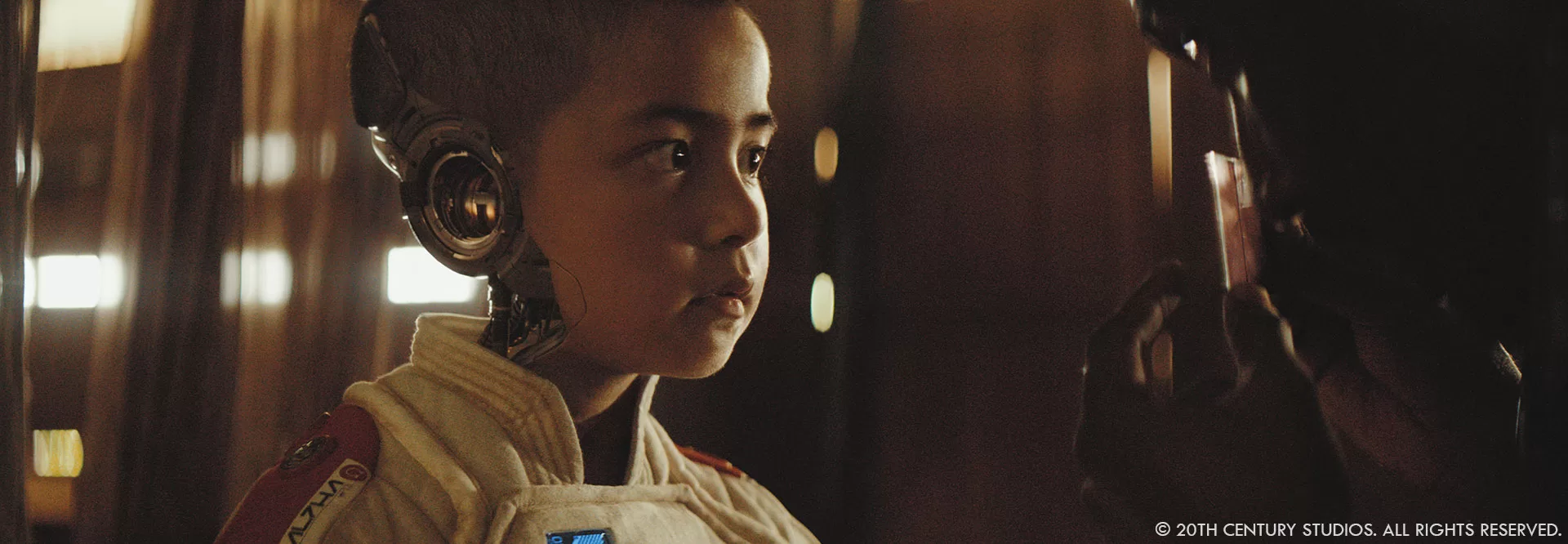
Gareth Edwards, how did you use your experience in visual effects to your advantage for The Creator?
Gareth Edwards // One of the main jobs of the director on a big sci-fi film is to help decide what things you actually film, and what things you do with visual effects artists in post. I think having a background in visual effects means you make better choices about that divide. Some things are really not worth the expense of creating on set, as it’s so much easier and more flexible to do in post, whereas other things might sound like a good idea, but are a complete nightmare to do with CGI and will cause a world of pain later.
Also, I think it helped give ILM a comfort level to show VFX shots early in their evolution, whilst it was still just wet clay on the table. So they would show shots when they still looked rudimentary, as you’d know what to ignore and what to give feedback on. I think sometimes VFX companies can be afraid to do this with some filmmakers as it can cause a freakout when things don’t look ‘good’ yet. So I think that also helped.
I guess the last thing would be feedback. Being able to take images into Photoshop and play around with them rather than giving pages and pages of notes. A picture speaks a thousand words, it’s way faster to do a paint-over with James Clyne or myself one night than it is to try and explain how to make something look more how it is in your head.
Can you elaborate about the shooting and how you integrated the visual effects?
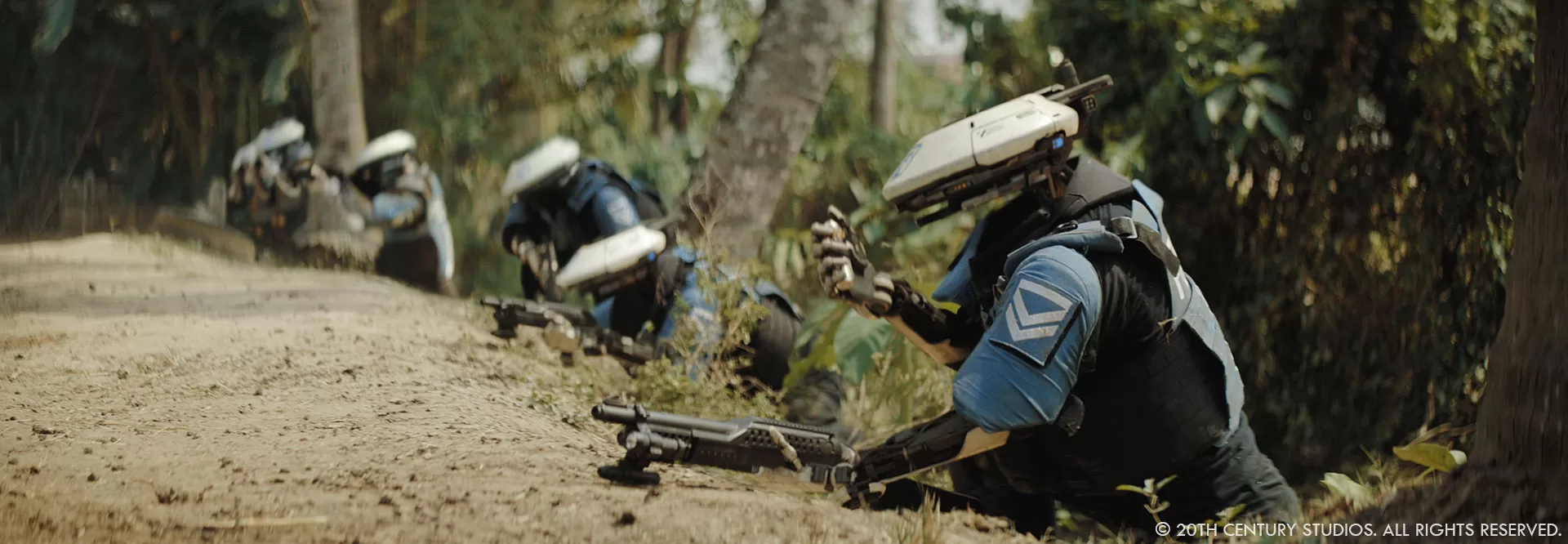
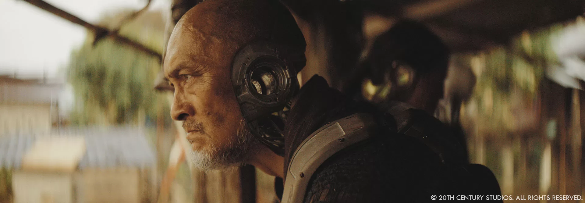
Ian Comley // Andrew Roberts was a one-man-VFX-unit on location which, combined with the lightweight shoot methodology, made it a significant challenge to come away with a full complement of standard lidar, hdri, green screens and clean plates. What we did get from the shoot was ‘gold’. We leveraged every piece of set information and practical element, but everything else required rather ‘old skool’ detective work; finding integration cues/clues directly from plate. Thankfully, with such strong photography and amazing artistry from the team, we were able to reconstruct a detailed CG lighting environment for each bespoke moment, including additional sources and bounce in close proximity to the simulant headgear, robot heads and arms, and array of props, vehicles, sets and digi-doubles.
Charmaine Chan // Oren Soffer shot a good majority of the plates in Asia with such a distinct style and look. And because Gareth comes from a VFX background, when he was shooting these with Oren, he knew what was going to be VFX pieces: whether that be a giant monolith behind the hills or a robot running away from camera; he composed his shots in a way that allowed us in VFX to layer it in pretty easily but still ground it to reality because we have things already in the shot to match to.

Jay Cooper // This was a very unconventional shoot. For a show of this scale, we had an extremely small vfx footprint. Andrew was thrown into the deep end,with the following mandate: Help Gareth Edwards make wise decisions with respect to VFX shooting methodology and get as much data as you can without slowing him down. Gareth wanted to shoot each location with complete camera freedom. This required a extremely small guerrilla crew on set. This approach had its strengths and challenges. Gareth was able to have more time with his actors, and more improvisational freedom with camera choices. For us in VFX, it meant less understanding of what the final shots would look like and less supporting reference materials. Ultimately, it made the movie stronger visually as the high shooting ratio gave Gareth more options in the edit. We were also careful to shy away from ‘walls of bluescreen’ whenever possible. Even in cases, where the environment would be significantly altered, we always wanted to start with a real location. The trick for us was how to lean into the idiosyncrasies of our phenomenal plate photography and extend our futuristic world. I think its a bit of a magic trick. If you keep just enough of the original plate it becomes more difficult to detect where the seems are located.
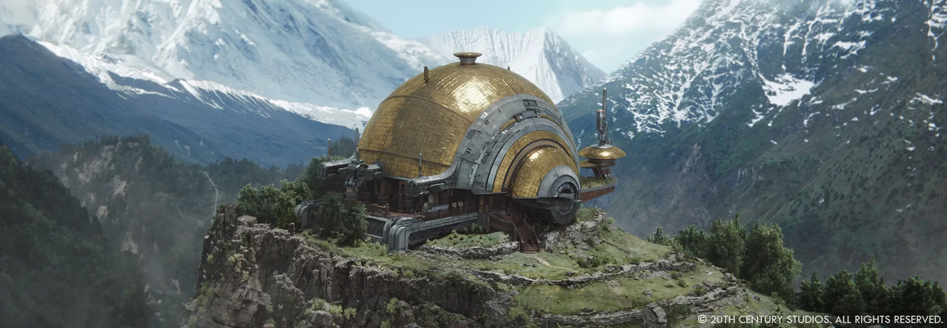
Andrew Roberts // Gareth shot in rolling takes, having the actors reset and repeat their performances while he hunted for the perfect angle. He would shoot for up to 45 minutes, adjusting from low-angle close-ups to profile, to over-the-shoulder views. As Jay pointed out, this resulted in unique, memorable footage which gives the film Gareth’s signature look. It also meant I needed to cover larger areas for background reconstruction and set measurements. Whenever possible I would capture the set’s lighting conditions with an HDRI, grab reference of practical light positions with a 14mm lens, or fire off a few 360° images with a Ricoh Theta camera. I carried a small drone on set with me, which was great for capturing the overall geometry of sets like the floating village, checkpoint, and mountaintop temple. There was never enough time for me to capture everything I wanted, so I tried to focus on the one or two items that seemed most important and relied on our amazing team at ILM to take us home.

What were your main sources of inspiration when creating the visual effects for this film?
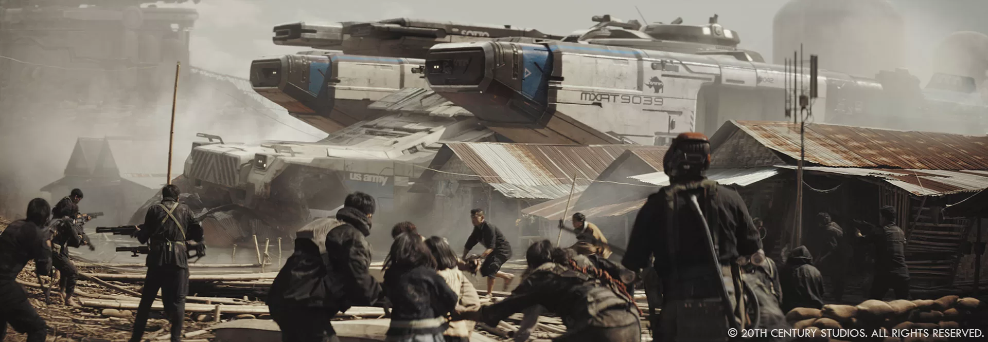
Charmaine Chan // Gareth pulled a lot of films from the past as reference, from Baraka to Aliens to Apocalypse Now. A lot of our artists had already seen it or watched them for research to ensure the feeling of those films lived through in our assets and environments. There was also a lot of references to tech from the 80s such as the Sony walkman or the original Nintendo. We used a lot of shades of gray with accent pop colors such as reds and oranges throughout our environments, props, to even our giant nomad ship.
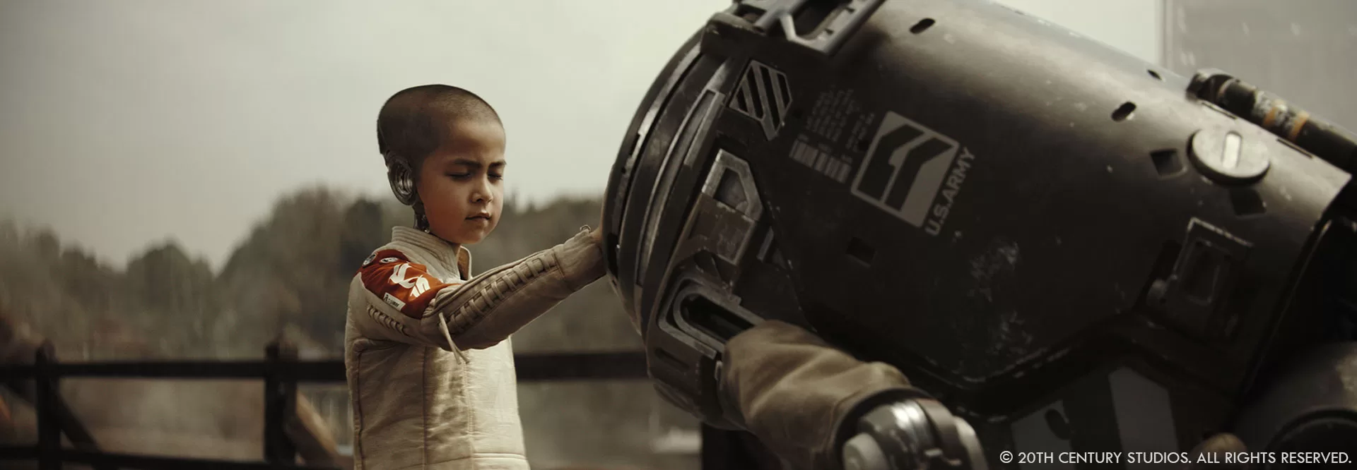
Jay Cooper // Charmaine nailed it. Gareth would say, “Imagine the design had evolved from 1980s Japanese product design, what would that look like?” For us that was a lot of plastics and metals that slot into each other in a designed way. You see that in Alphie and our robots. Alphie is made up of a number of different plastics and metals. It’s futuristic but also you can understand that their is a blueprint in how all the bits go together. It’s not a singular milled piece of alloy.
I think we also wanted to live in a dirty and ‘lived-in’ world. Star Wars obviously does this so well. As far as our buildings and interiors, James Clyne, our production designer did an amazing job of defining the world of the creator. He established a design aesthetic that had soft curves and paired large forms with smaller detail elements for scale. There is a bit of Syd Mead’s futuristic aesthetic, but with a less angular forms and more of the ‘product design’ look that Gareth wanted.

Were there any specific technological innovations that you adopted during the shoot and the post?
Andrew Roberts // During the shoot, I worked closely with Oren to integrate dynamic lighting onto our actors. This often involved me creating animated content, blending multiple motion graphics elements together, and running that imagery through projectors. We used this technique while Joshua scans for life forms at Ground Zero, when he’s watching the holographic reenactment of his betrayal, and on the holograms themselves. In the third act, we see Joshua clinging to the exterior of a missile, being dragged at high speed toward the launch chute. Our mission was to project animated shadows onto John David, who was harnessed to a 30ft tall practical missile set at Pinewood. I extracted architectural elements from ILM’s real-time NOMAD asset and animated them to match key story points of Joshua’s journey on the missile carousel. The resulting animated gobo was streamed through a 12K Christie projector onto our actor & set, and in post extended onto the digital NOMAD asset.
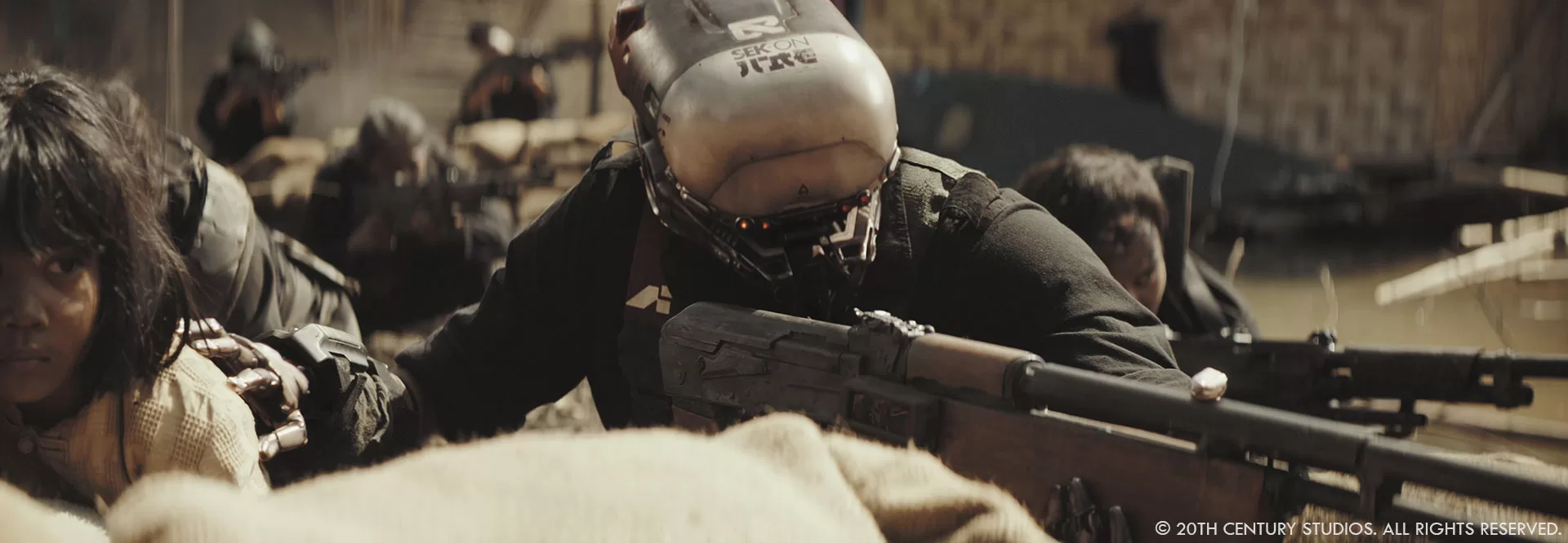
Charmaine Chan // During post, we knew we would be tackling a high number of shots that needed robots to be inserted in. Our plan was to always matchanim and render our hero foreground robots, but any robots in the mid to background position would actually be tracked and rendered out via Nuke by only our compositors. This saved us a lot of time and made turnaround for approval of even quicker.

What techniques did you use to make the visual effects as realistic as possible while supporting the film’s story?
Jay Cooper // I think the techniques that we’re using are pretty traditional at this point. ILM has, of course, a robust pipeline for creating hard surface assets, and emulating natural phenomena. The best technique employed for realism was starting with a real location whenever possible.
When we couldn’t find a real location, we used ILM StageCraft to build two environments on the LED volume at Pinewood Studios.

How did you manage coordination between the visual effects teams and the other departments?
Jay Cooper // ILM has a fantastic production team that supports the visual effects supervisors. There are many moving parts to a movie of this size.
Can you tell us about the importance of lighting and texture in creating the visual effects for this film?
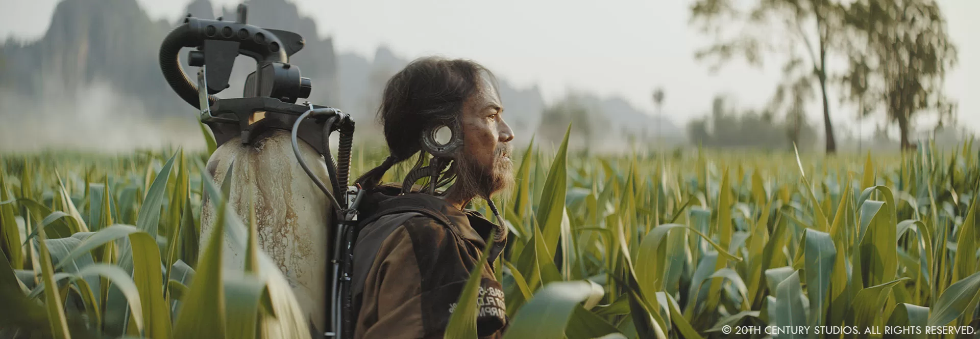
Charmaine Chan // As mentioned before, we always referenced whatever was shot in the plate photography. To achieve the most realistic robots and simulants, we matched the metals and plastics to things like the beige backpack the farmer was wearing, or the old school analog tv that was on the set. But anytime we didn’t have any HDRI’s we relied on the clothing the actors were wearing to create the reflections and color tone of our robot/simulant gear.

What were the main challenges with the robots on set and in post?
Ian Comley // Gareth shot the movie without telling any supporting cast or extras who was going to be a Robot. It was a brilliant move to secure very natural, anthropomorphic performances— and offered great flexibility during the edit—but did present us with the challenge of producing unassisted match animation and clean plates! Luckily, our Layout and Paint teams are top-tier and unflappable, so as the edit evolved and we started locking (and changing!) which characters in a shot would catch the eye and therefore be ideal candidates to become Robots, they kept delivering perfect head/body tracks and reconstructed plates with amazing positivity. For background characters, we were also able to leverage real-time rendering of Robot heads and arms. This handy tool allowed Nuke compositors to position, 2D-track and light pieces from our hero Robot asset kit, when camera and performer were (relatively) still; bypassing large sections of the pipeline, and increasing the overall ‘robot count’.
The movie offers a blend of visual effects and natural landscapes. How did you work to balance these visual elements?
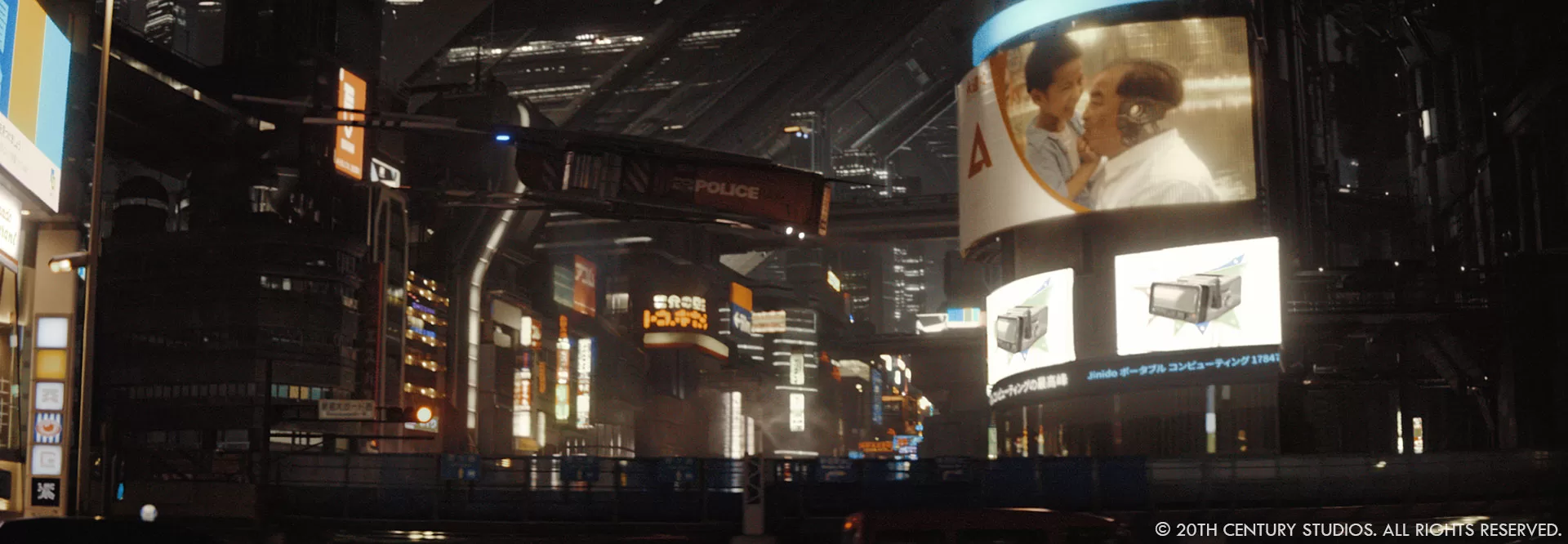
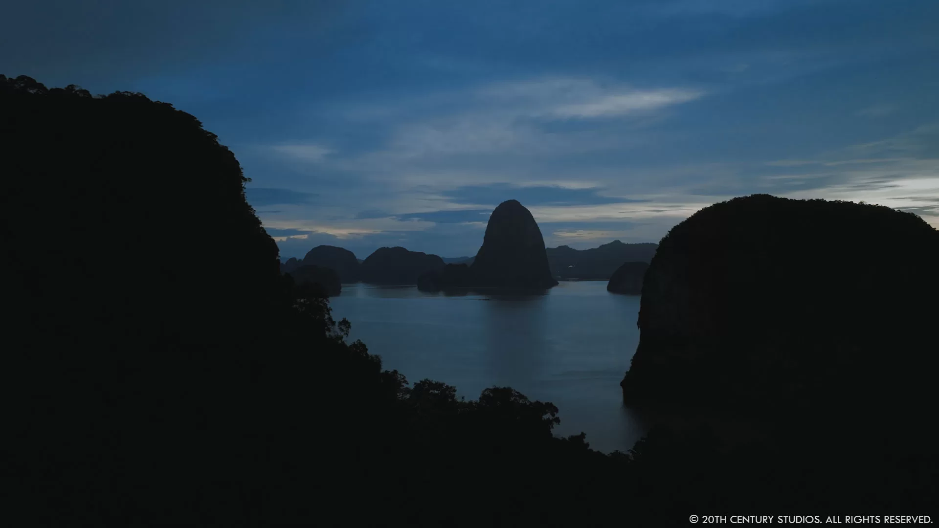
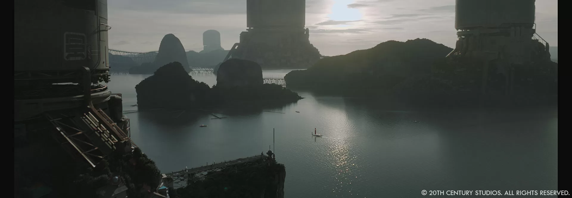
Charmaine Chan // When it came to our environments process, what usually happened was once the plate was shot, James Clyne would take a still of that shot and do a quick paintover of the additional environmental elements we’d be adding in VFX. He’d pass those concepts over to us, and for environments used in a whole sequence or beat we’d build out that set, or for the bespoke one off environments we’d go the quicker DMP method. These environment pieces tended to be extensions of buildings that already existed (such as the checkpoint). Or pieces that organically flowed with the layout of the location (such as the pipes running down the hills to the river).
The NOMAD station is a visually impressive element of the film. Can you tell us more about its design and digital creation?
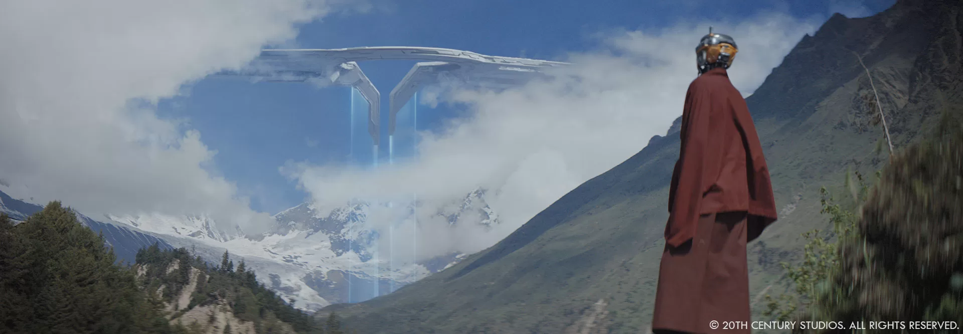
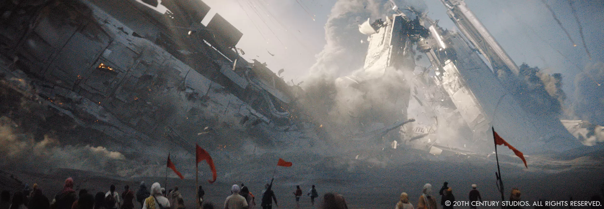
Ian Comley // Gareth and James Clyne refined the striking silhouette and key features of the NOMAD through early concept and previz. It’s a menacing presence throughout the film, looking through clouds to the looming 4.4km-wide wingspan or seeing the targeting lasers cross the ground. We knew it would be ‘up-close and personal’ in the final Act, so fleshed it out into a highly detailed, 1.3TB asset, allowing for fully-CG 360 degree exterior shots at all distances, with further interior sections built to augment plate/StageCraft -based VFX shots. Early NOMAD concepts positioned it very much in space against the stars, but to justify more complex lighting and to align the scale and readability for both ground and aerial shots, we brought it to a lower orbit, where the laser fangs could catch the tops of clouds. My concern with fully-CG NOMAD shots was replicating the style of the beautifully-gritty, naturalistic location footage, but we conducted many tests recreating the grain, vignetting, astigmatisms, flares and contamination. We also worked with Gareth to ensure that CG camera moves gave the presence of a human operator; e.g. a camera operator discovering and framing for the unfolding action, while hanging out the door of a fast plane more likely to travel in straight lines or gentle curves.

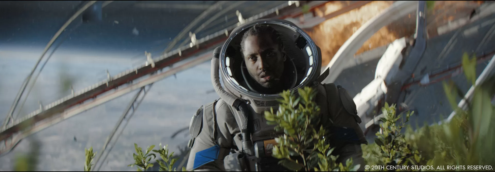
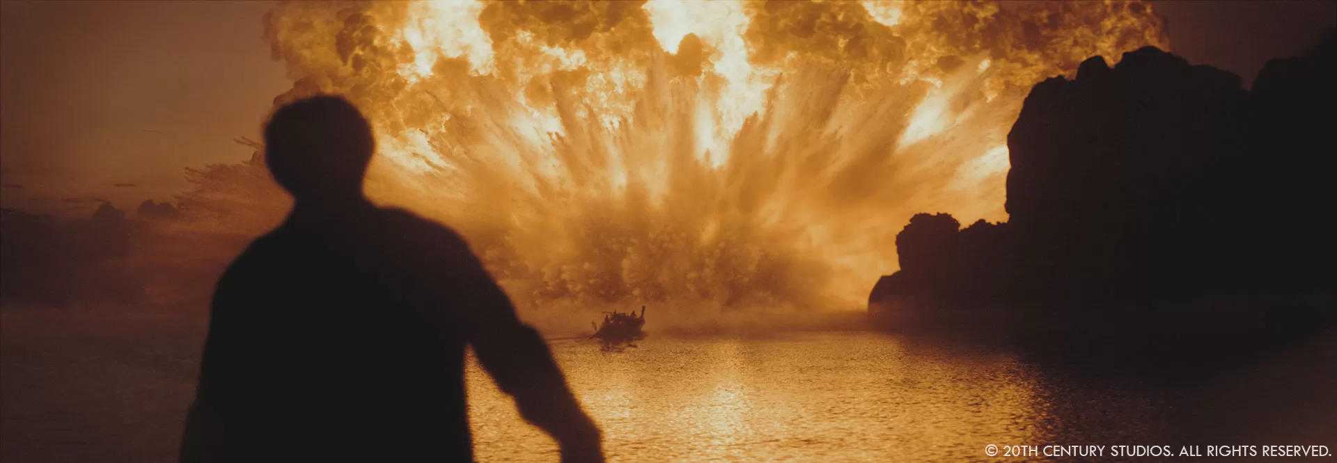
Charmaine Chan // As Ian mentioned, we used StageCraft for the interiors of the NOMAD. This included the airlock beat with the utility robot and escape pods, and then again for the biosphere for our final moment of Joshua reuniting with Maya again. We decided to use StageCraft as we couldn’t actually shoot up in space, and it gave us the ability to emphasize the scale of the NOMAD from the inside perspective. The airlock was designed to be a round rotating utility base that housed the escape pods. A gantry connected the two ends and appearing to be floating in the middle of this rotating room. Using StageCraft we were able to show the rotating rings for almost 270 degrees, the obvious replacement needed was the floor as the rings had to extend down to complete the round room. We then added the utility bot in post which was quite large in size and once again helped us tell how vastly large the NOMAD was to have a single room of this scale. The biosphere was designed like a giant greenhouse, big windows everywhere looking out to the ends of the NOMAD, with lots of garden greenery on the inside. On set we had a limited amount of practical trees brought in, we then used StageCraft to extend the endless rows of trees and establish the frame/structure of the inside of the NOMAD. We also needed this moment to show all the explosions happening outside. There was a crescendo of explosions we created in post which tied in perfectly with Joshua and Maya running towards each other.

What aspect of the visual effects in The Creator are you most proud of?
Charmaine Chan // The fact the first question was about collaboration is what makes The Creator such a unique experience for visual effects. It’s not often we, in VFX, find ourselves working hand in hand with the director and production designer everyday til the very last shot delivered. It’s this relationship and trust in creative suggestions that allowed us to deliver such impactful shots. You could almost freeze frame anywhere in the film and each shot can stand beautifully on its own. And while it was obvious what components were not real, the VFX never stole the attention away from the story, it became part of the story.

Were there any sequences where the visual effects had to be significantly modified or adjusted during the post-production process?
Jay Cooper // Nope! But I will say we iterated on design on many fronts during the production. Alphie’s design of course was critical to get right, so we took a few passes at finding the design for that. Ultimately, we did an interactive sessions with Gareth and our Model Supervisor,
Bruce Holcomb, to refine the silhouette of Alphie’s mechanical cutouts. We would make a change, spin our model around, then another, etc. We got deep into the weeds tweaking every curve to make the best of it from all angles.

A big thanks for your time!
WANT TO KNOW MORE?
ILM: Dedicated page about The Creator on ILM website.
Disney+: You can watch The Creator on Disney+ now.
© Vincent Frei – The Art of VFX – 2024


