In 2018, Peter Eszenyi explained the work of Territory Studio on PACIFIC RIM: UPRISING. He then worked on JOHNNY ENGLISH STRIKES AGAIN and BLACK MIRROR. He talks to us today about his work on the prologue of THE DARK CRYSTAL series.
How did you get involved on this show?
I was invited to be a part of this show by Alex Reinach, the VFX Producer, whose task was – amongst producing episodes for the show – to deliver a prologue. We have worked together before so it was great to join forces with him again.
What was your feeling to be part of this iconic universe?
It was fantastic to be working on such an classic, one-of-a-kind project. I was really surprised by how much emotion the series can create, and I am really thankful for being a part of that.
How was the collaboration with director Louis Leterrier, the showrunners and Overall VFX Supervisor Sean Mathiesen?
I have worked from the same office as Sean, and we had a daily ongoing conversation about what is the best way to tackle this task. He was always extremely helpful, and his ideas and creative solutions were always spot on, it was real pleasure to be on the same project. I mostly communicated with Louis via Sean and Alex, but on the few occasions I talked directly to Louis he was always really thoughtful and very precise about what he’d like to see in the prologue.
What were their expectations and approach about the visual effects?
The task was quite challenging, with my team I needed to create a CG based animation that fits into this very analogue world of the Dark Crystal, it needed to introduce very abstract concepts to an audience that would not necessarily know about the ins and outs of this world and be not too distracting to distract from the premise that this is a unique project with puppets.
How did you organize the work with your VFX Producer?
I have worked with Alex previously, and I can always rely on his meticulous approach to problem solving, and his creativity when it comes to a project like this. As I was based where the production was set up, daily reviews and feedback was very easy.
How did you work with the art department for the prologue?
The art department wrapped up by the time I got onto the show, they were already deep into the last part of the post process. I had access to most of the art department material and it was extremely useful for us to understand the intricacies of the world of the Dark Crystal. The amount of they researched and connected was astonishing and we relied on that for our part of the show.
What kind of references and indications did you received?
We studied the world of the original film and the work of Brian Froud, as we needed to recreate some of the intricate graphics he created. Sean and Alex had shown me parts of the show that were relevant to what we were doing and some concepts were already laid out by the brilliant artists at DNEG TV, so it was really helpful in a way that certain directions could easily be eliminated from this creative conundrum. We knew that we do not even want to try to mimic anything from the show, no animated puppets and recreation of environments from the series.
Can you explain in detail about the creation of the big travel in Space to Thra?
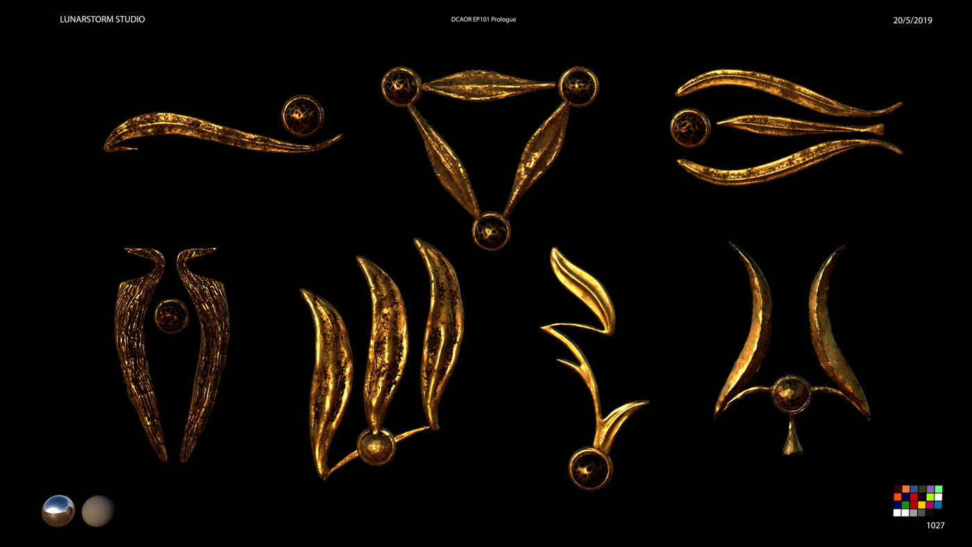
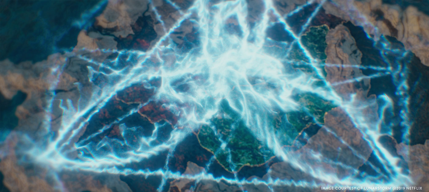
The concept was already in progress when I got there, DNEG TV was doing the big space opener, the very first shot of the series. We needed to augment that with a touch of graphics, based on Brian Froud’s artwork, that fits into the space environment and acts as a key element. It introduces the world to the new viewers and acts as a reassuring nod to the hardcore fans of the original show. We received cameras and layout renders from DNEG TV and animated our graphics to fit into the camera angles and movements designed to this shot. We had a few versions where we fine tuned what elements to use, the speeds of their individual animations and we have worked up a look that could be tweaked in the final comp to accommodate any last minute changes. We experimented with adding some realistic space dust and particles around the graphics, but we decided against using them as the very unique graphical elements were meant to be the main heroes of the shot.
How did you create and animate the various FX elements?
I have created some initial concepts and style frames about how these elements could fit into the opening shot, then size and animation versions were tweaked through numerous layout renders. We have recreated some of the original artwork in a slightly more streamlined version, and repurposed a lot of small graphics elements such as Skeksis alphabets and similar, to work as a part of a library which we could deploy where an area in the shot needed a bit more interest. We imported these into Cinema4D where most of the work was done by GFX artist Ferdinando Spagnolo, and we set up a procedural system where we could change almost everything in a very short amount of time. We rendered the shots with Redshift and exported numerous AOVs that the comp department requested at DNEG TV.
Can you tell us more about the creation of the graphic elements?
I personally think the original graphics are phenomenal, and they certainly have a very hand-drawn aesthetic. Instead of trying to mimic those qualities, we decided to trying to simplify them, keeping as much as the original intent as possible. But the realities of the production of the shot meant that we had to create splines instead of relying on something hand-drawn. It was a lot of work recreating these.
Can you explain in detail about the creation of the map and the big fly over?
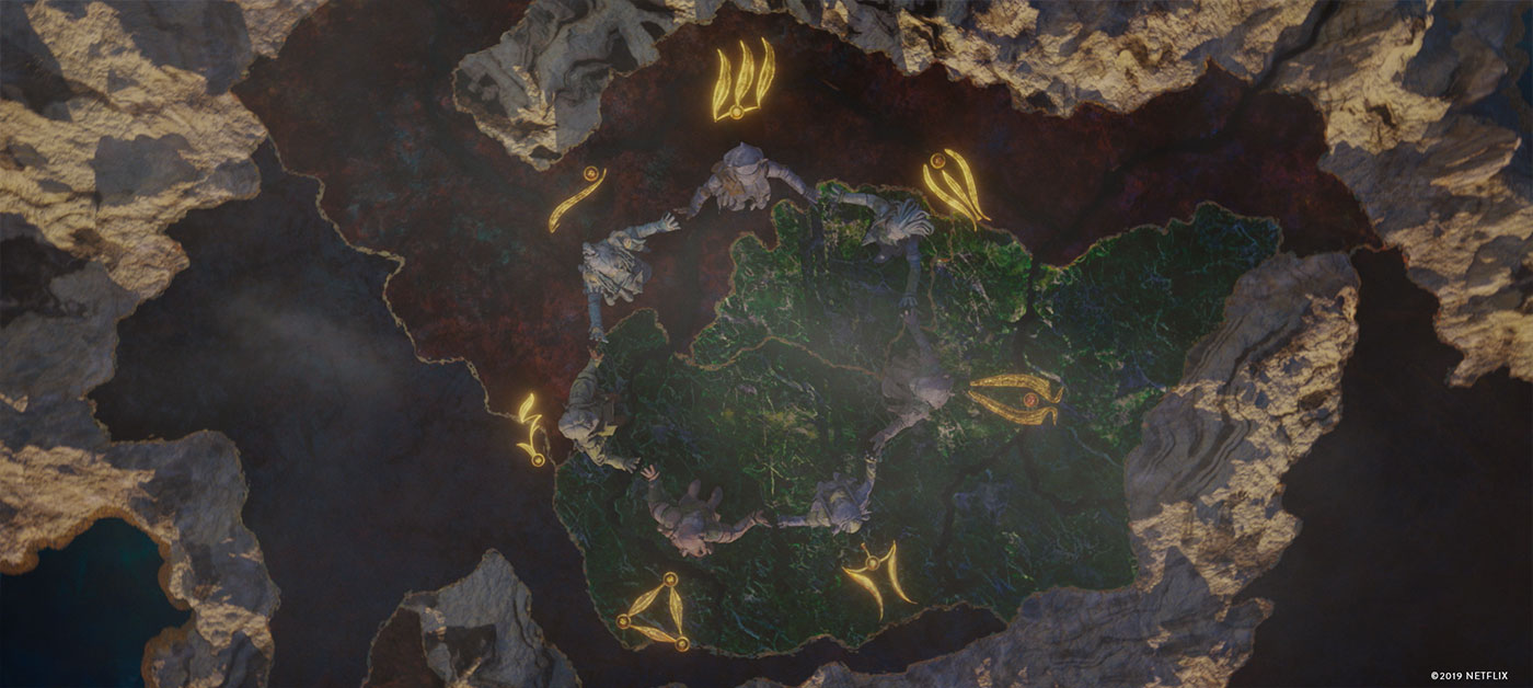
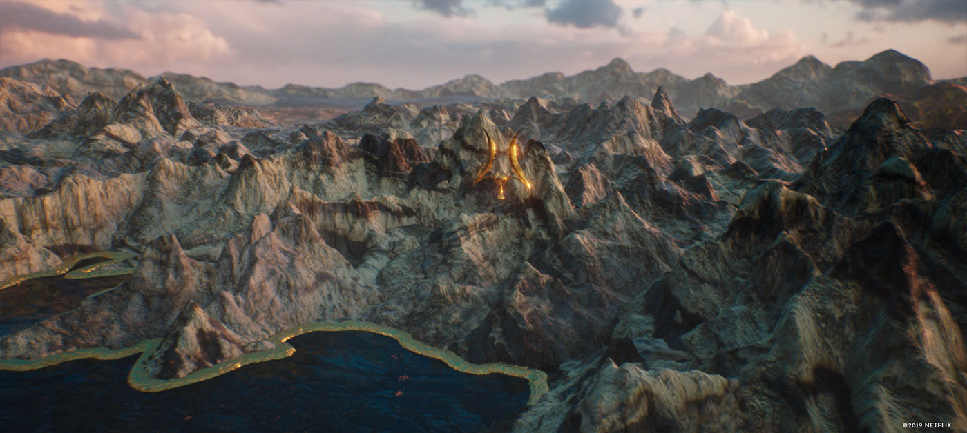
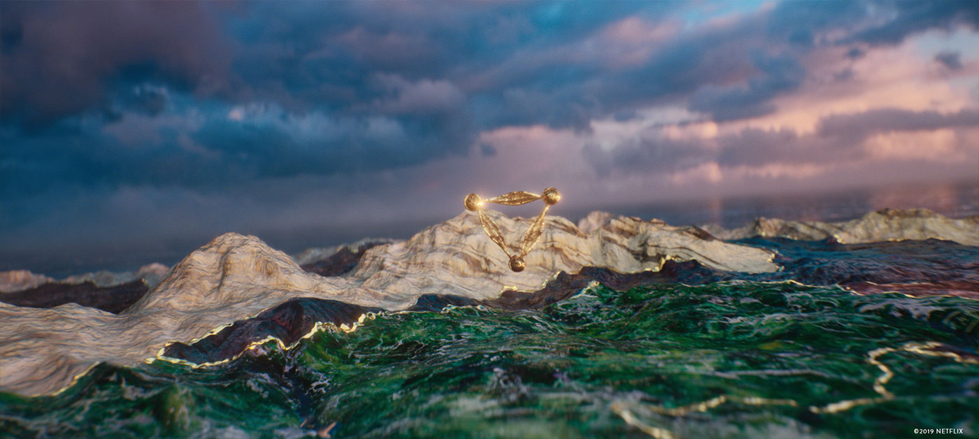
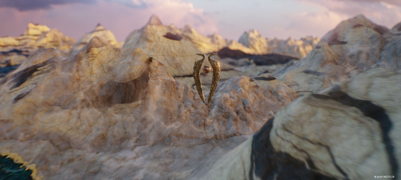
The map as a concept was established very early, and being able to discuss things with Sean and Alex directly meant that we decided to go with the 3D sculpted version fairly early in the process. A partial map existed for the original film, and Sean and the production designer created a full world map of Thra and mapped out where the clans lived. That was really helpful as well as all the concept art that we had access to. I sculpted a rough version really quick in the early days and that model was used to establish the key concepts of what this map is going to look like. As there is no reference in the series about any maps, we had a fair bit of creative freedom when it came to the materials, and the direction we all liked meant that this map would be something like an art piece, something that is abstract, but physical enough to be understandable. We picked materials that belonged to Thra, distressed copper, marble, wood and through a lot of concept work we have managed to find a balance and worked out how the map is going to look like. When CG artist Roland Lukacsi came on board, he was tasked with reworking the map sculpture to a very high resolution, sculpting in elements that resembled some recognisable landmarks and then he created all the textures and shaders for this element. As for the flyover animations, we did a lot of versions, Louis – filming some of the show himself – was very keen on getting specific camera movements and speeds that tell the story the best, and Sean – who is an amazing animator himself – helped us to translate this into shots. The editorial team created versions of the shots with speed changes, these needed to be plugged back into the CG camera moves.
How did you create the various environments?
Parallel to the creation of the map I started to experiment with lighting setups and ideas for the maps shots as well as the Aughra and Skeksis shot. Some of the shots required very specific segments of the map, and Roland and I created little bespoke segments, that were sculpted to an even higher level of detail, and were tailored to the requirements of the shot. If you will, besides the original map there are at least a four partial, really detailed versions in existence. Along the asset development work by Roland I have started creating comp setups to see how much of the extra elements can we do in comp rather than rely on CG only. Clouds, particles, various atmospheric elements were used throughout the shots.
Which one was the most complicated to create?
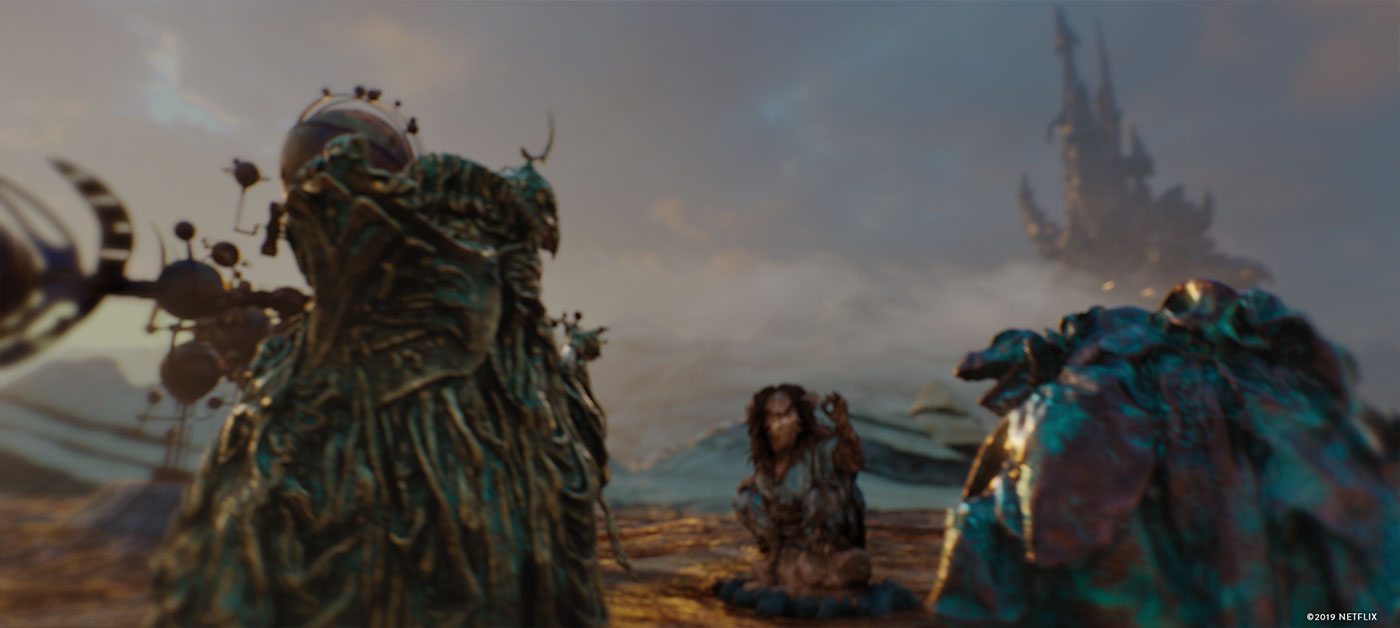
Definitely the shot with the Skeksis and Aughra. Narratively this was really important, it needed to show how this peaceful world of Thra gets corrupted by the Skeksis, and what is the reason Aughra is not aware of the intent of those vile creatures. We needed to come up a visual solution that illustrates this change, introduces the Aureyal as a symbol of unity, shows us the Orrery — which is the reason why Aughra is more interested in all things stellar rather than the evil Skeksis — and we needed to introduce the Skeksis themselves. Lots of particles to be simulated, lots of materials to be created and the camera move needed to fit into the following shot, which is from the series, so yeah, that was a challenge!
How did you create Aughra and the Skeksis?
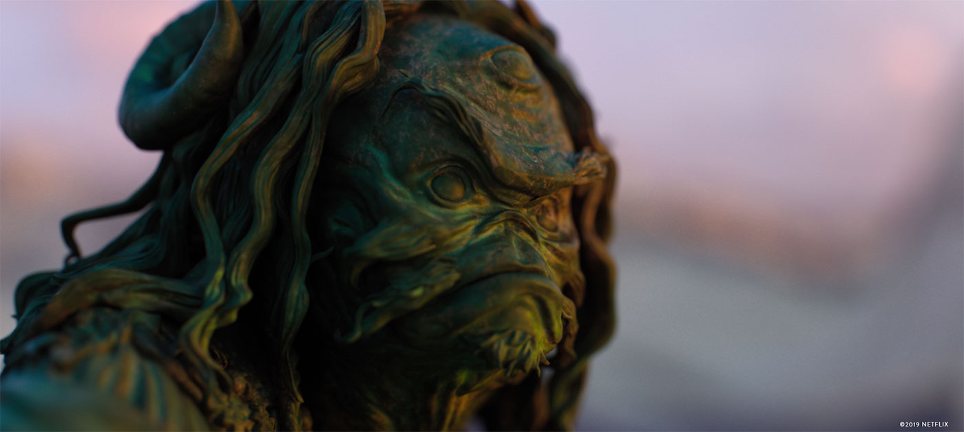
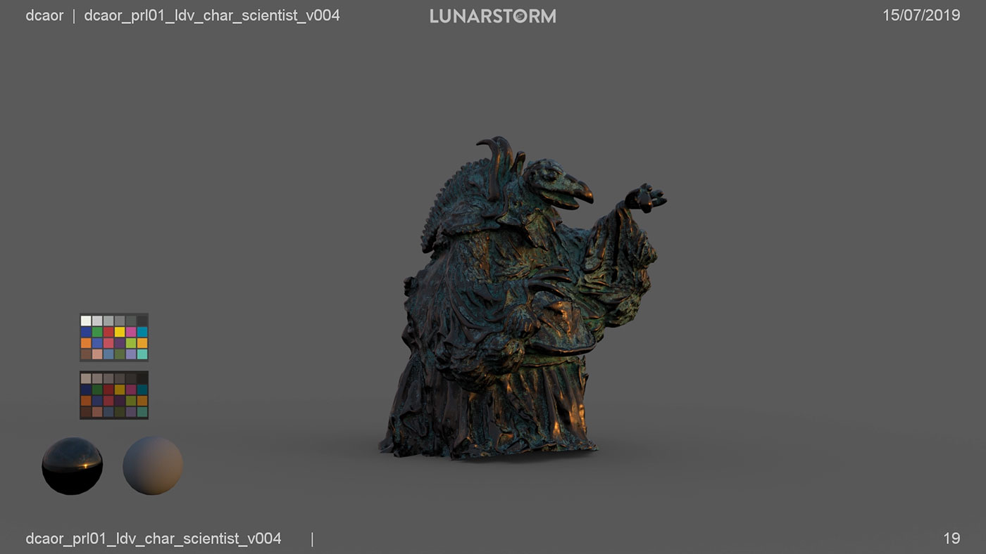
Initially we were not planning to get too close to them, as the models we had access to were fairly simple art department models, but Alex managed to get the beautiful, super high-res models from Weta Workshop, and that meant we can get the camera nearer to them. We needed to tweak these, to retopologise and create a lot of texture and shader variations until we found the ones working. Alex came up with this idea how the ancient Roman and Greek statues had been originally painted with colours, and how that wears down through time, and that was the idea behind the look of the Gelflings. Sean suggested some warmer material, like wood for Aughra, and we knew the Skeksis needed to be something that is majestic and threatening at the same time, so we went with various distressed metals. We wanted these materials to play a part of in the narrative.
Can you elaborates about your collaboration with DNEG for the assets sharing?
I have worked with DNEG before on other shows, and It is always really great to work with them. They are always really supportive and when it comes to technical challenges we could sort those out really quick. Andy Hargreaves, the DFX supervisor on the show was always great and the DNEG TV production department was superbly helpful, massive thanks for their help! The process itself was fairly straightforward, we set up our comps and sent it over to their comp department where those were plugged into their setups. We received the Gelfling assets as well as the intricate Orrery model, cameras and layouts for shared shots and we converted those to fit into our pipeline for this show.
Which shot or sequence was the most challenging?
Most definitely the shot with Aughra and the Skeksis. Very long one and it featured a huge amount of particles, and crazy camera moves.
Is there something specific that gives you some really short nights?
The short timeframe was a bit concerning, but nothing I have not experienced before. In fact, thanks to the close proximity to Sean and Alex, the process was really smooth.
What is your favorite shot or sequence?
It must be the one with the Orrery and the Skeksis because of its complexity. I also really enjoyed trying out different materials and sculpts for Aughra’s face to make her solemn, younger than in the film, but still very powerful.
What is your best memory on this show?
Oh, we had a few moments which were absolutely brilliant, mostly thanks to the crew in the production department as well as everybody who was in the same building with us. A lot of good moments shared with those people.
How long have you worked on this show?
About three months.
What was the size of your team?
3. I had two brilliant guys, Roland Lukacsi and Ferdinando Spagnolo, both of whom I had worked with before, they are amazing.
What is your next project?
There is a couple of films I am working on at the moment, but they are all under NDA.
A big thanks for your time.
WANT TO KNOW MORE?
Peter Eszenyi: Official website for Peter Eszenyi.
© Vincent Frei – The Art of VFX – 2019


