In 2019, Pete Dionne explained the work made by MPC on Pokémon: Detective Pikachu. He then joined the teams of Method Studios in 2021 which became Framestore in the meantime.
Matthew Twyford has over 25 years of experience in visual effects. He has worked on many films such as Gravity, Edge of Tomorrow, Doctor Strange and Project Power.
How was the collaboration with Director Taika Waititi and Production VFX Supervisor Jake Morrison?
Pete Dionne [PD]: Taika is a fire-hose of ideas and vision, Jake is a great collaborator and such an experienced VFX supervisor, the pair of them were truly a treat to work with. And Jake’s entire production-side VFX team were so organised and on the ball. Top-to-bottom, it was a great group to work with!
Matthew Twyford [MT] – Jake and Lisa’s team were fantastically supportive and good humoured. This allowed us to have some fun and present more light hearted creative options like the screaming goats and cheekier character developments. Taika and the MCU team responded well and in turn kept us laughing and entertained. The collaboration felt fast, open, and thoroughly enjoyable.
What were their expectations and approach about the visual effects?
[PD]: Jake awarded us among the biggest set pieces in the film, with very intimidating expectations for each one to be an absolute spectacle. Fortunately, Jake and Taika also brought very clear focus, vision, and collaboration from the start, so it was a fun ride to be part of.
[MT] – With our longstanding relationship I think the expectation was always for us to take ownership of the VFX work, bring our extra magic to the story and manage the delivery in a way to support Jake and his team. We approached the visual effects always in mind that the story was the main driving factor. The planning and methodology was focused on getting working material to editorial as soon as possible so the big creative decisions could be settled early. We then ran rolling refinements through to final delivery so there were no last minute surprises.
How was the work split between the Framestore offices?
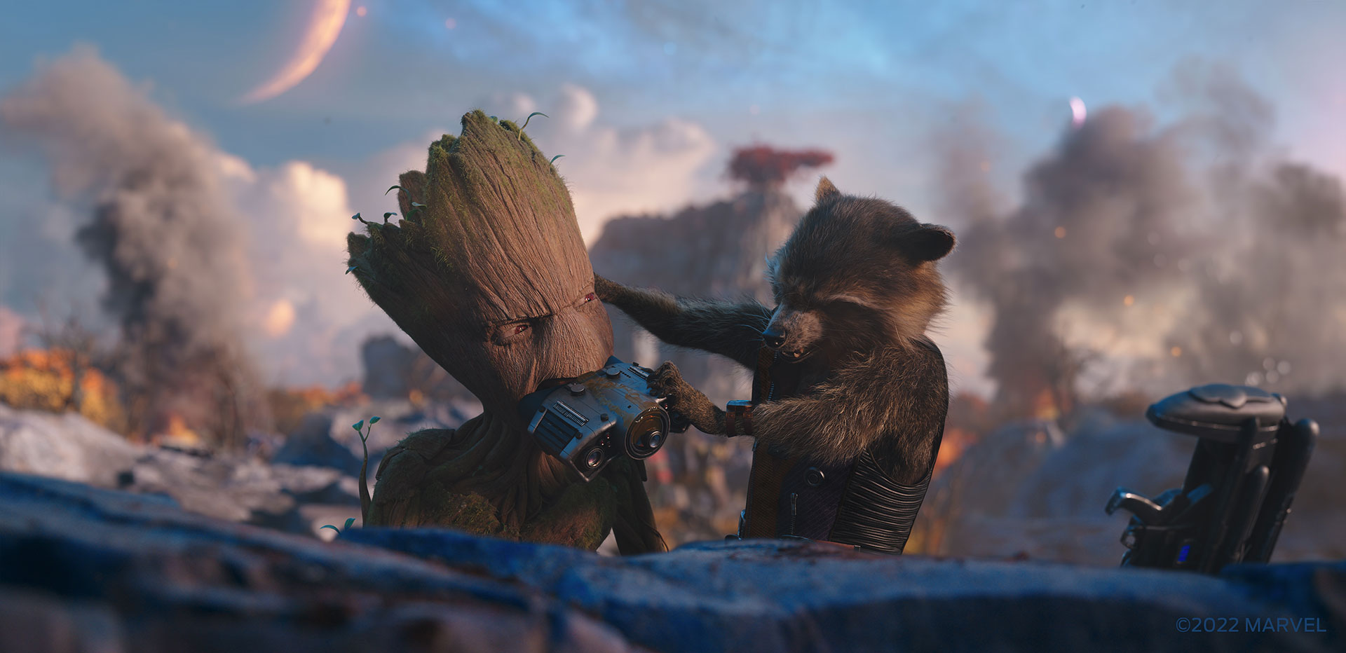
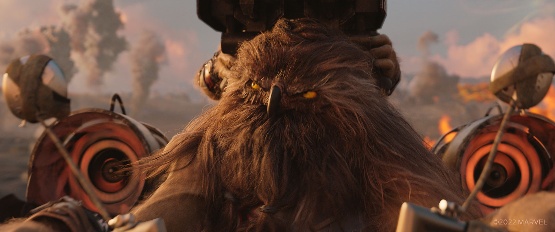
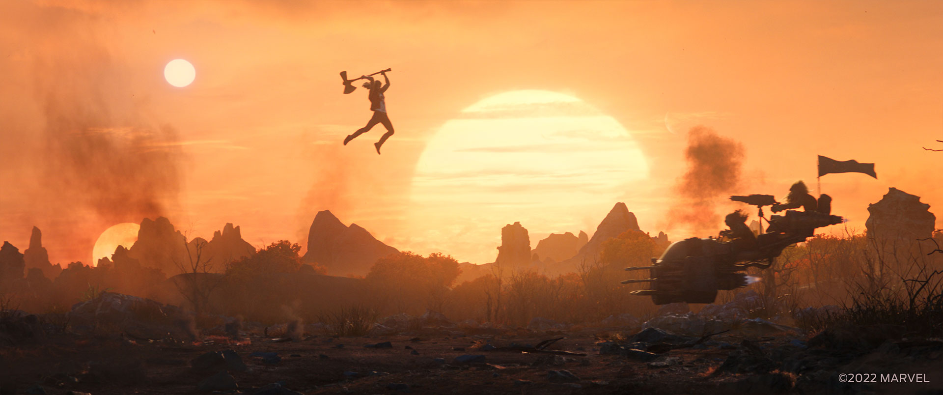
[MT]: Our London and Mumbai studios worked on the battle sequence on planet Indigaar, where Thor and the Guardians of the Galaxy fight the owl-like biker gang. We also made the goats that Thor is gifted, and shared the assets with the other vendors so they could appear in more than just our sequences. Montreal and Vancouver, at the time Method Studios, delivered Omni City and the Moon of Shame scenes, respectively. It’s such a broad spectrum of work that really allowed all of our global teams to show off their skills.
Can you elaborate about the design and creation of the various environments, and especially the Omni City?
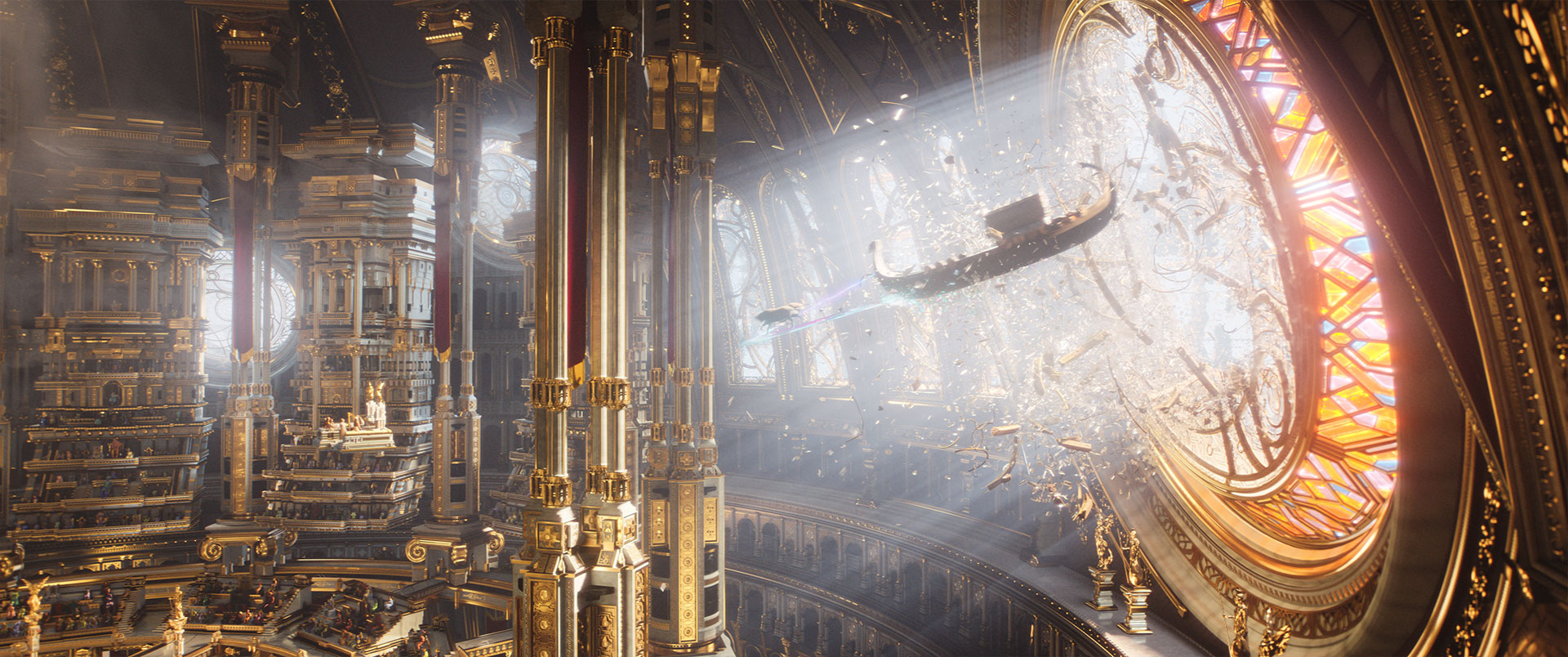
[PD]: From the wide city views through to the interior of the Golden Temple, the CG environment build for Omnipotence City was massive. Production designer Nigel Phelps and the art department at Marvel handed us some really inspiring designs and artwork, so our job was to pick up where they left off, rather than needing to design the entire city from scratch.
We based the establishing space view of the city on how it was illustrated in the original comic book, but with a few design liberties to avoid it from simply appearing as a big space station in deep space. Taika had us reference religious Renaissance art, like the Sistine Chapel ceiling, to emphasize the Godly vibes of this ancient and awe-inspiring city. We placed Omni City in a bed of nebula clouds, back-lit with godrays shining down on the audience, as if looking up above towards the heavens at our glorious city. Our FX artists even designed our nebula cloud shader with a textural quality of three-dimensional paintbrush strokes, to really hit Taika’s reference on the nose.
For the sequence of the heroes arriving and making their way to the Temple, we were handed great concept art which really captured the level of excess and density that one would expect from this billion-year-old city of the Gods. The execution though required a very tactical approach due to the insane amount of instanced assets needed to hit this level of complexity and density. For the main floating tower and bridge structures, we used both procedural and hand-placed distribution techniques, and designed these structures to be very modular, so the layout of our city was also quite directable in-shot when needed. To dress these structures, we created a very robust library of moving fountain sims, waterfall sims, rustling foliage, fabric banners and awnings blowing in the wind, and a crowd system for both the God population as well as birds and flying chariots, then distributed these ‘signs of life’ elements from foreground to background into every possible corner of the city we could cram them into!
The interior of the ‘Golden Temple of the Gods’ required quite a thorough environment build as well. The plates themselves were shot using a very minimal practical set footprint, and therefore we were tasked to build the entire environment in CG. We really went to town with the complexity of this environment, meticulously instancing extreme amounts of ornate CG model detailing to every surface, nook, and cranny of this vast temple. We put a lot of time and refinement into our texturing, shading, and lighting, as well as setting up robust Katana and Nuke templates. To be honest, if this were a shorter sequence, the level of complexity and detailing we put into this environment build would have been total overkill, but in a sequence of over 200 shots, it was great being able to drop a camera anywhere in that temple and have it come out the other end looking fantastic.
The city is full of gods. How did you create them?
[PD]: Bringing life to the city and temple environments required hundreds of unique background gods, with much more variation than we would normally build into our CG crowd system. We started with high quality digi builds of about a dozen generic bipedal gods, based on scans of the practical costume gods on set. We conformed these god assets to each other in a way that allowed us to swap costumes between them, as well as vary their hair styles. To make them feel more alien-like, we created a library of skin shaders to randomly pull from, varying in colour and patterns, as well as including natural, matte, and metallic shading qualities. To further add variation in their silhouettes, we designed dozens of hats, head pieces, and props to randomly distribute into our crowd system. Our crowd system then varied our gods in scale between six to 15 feet tall, as well as applied non-proportional scaling to give some of them funky features like long necks, short legs, wide shoulders, things like that.
In addition to our background gods, we built around a dozen truly unique gods, featured throughout the temple sequence. A few of my favourite CG Gods that we created are the two Celestials we created by dimentionalizing the Jack Kirby illustration style as faithfully as we could, the floating Eyeball god, the golden remix of the Great Protector Dragon from Shang-Chi, Queen Falligar, who we created as the regal counterpart to the fallen Behemoth, Bao the Dumpling God, and the Kronan God, who basically looks like a stalkier version of Korg, but with David Letterman’s beard.
How did you handle the crowd creation and animation?
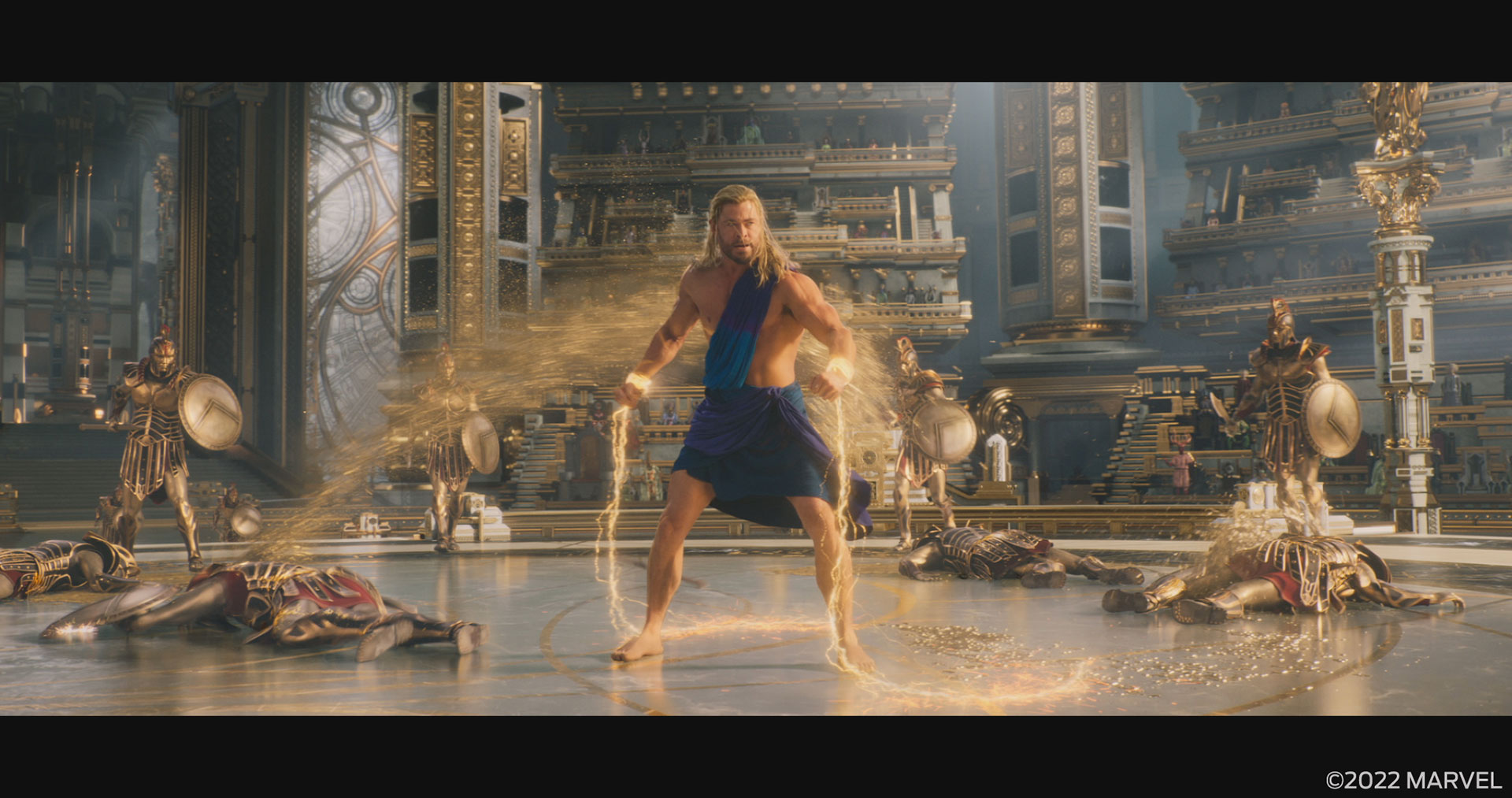
[PD]: The background gods were all based on mocap clips, while the featured gods varied between mocap and hero animation. During the fight sequence between the heroes and our CG Golden Spartans, the battle vignettes were well choreographed between the stunt actors and our heroes on set, so our CG Spartans dropped into the plates over top of the stunt actors fairly seamlessly. Of course there were moments where we further embellished the animation beyond what was captured in-camera, but between the mocap captured from the stunt actors themselves, our internal mocap captured with our Xsens suit, our killer animation team, and very robust digi double builds of Thor, Valkyrie, Mighty Thor, and Zeus, we had no significant problems creating authentic battle action and choreography across the sequence. What made this battle really fun for us though was the Spartan golden bloodbath which ensued. Our goal was to have ‘Kill Bill’ levels of blood, but to keep it ridiculous rather than letting it become gory. We gave the blood a sparkling gold material quality, we avoided showing wounds, and we really tried to recreate the physics of practical over-the-top special effects blood sprays in our FX sims; impossible volumes of blood, sustained high-pressure spray, emission sources the circumference of a garden hose, every gag in the book!
Can you tell us more about the impressive Moon of Shame sequence?
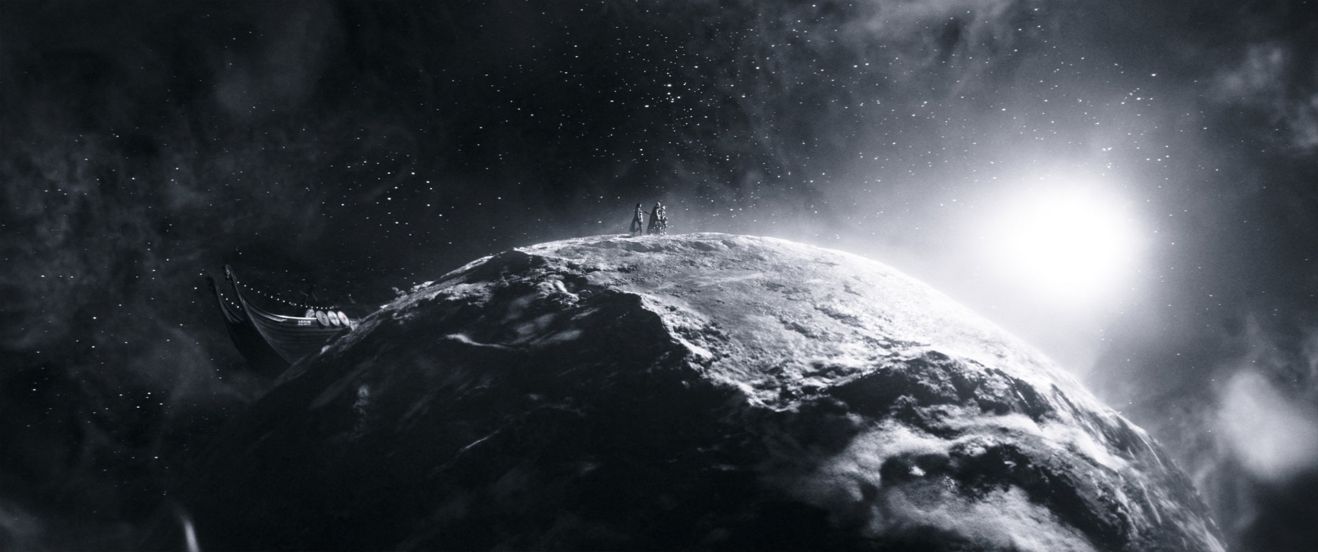
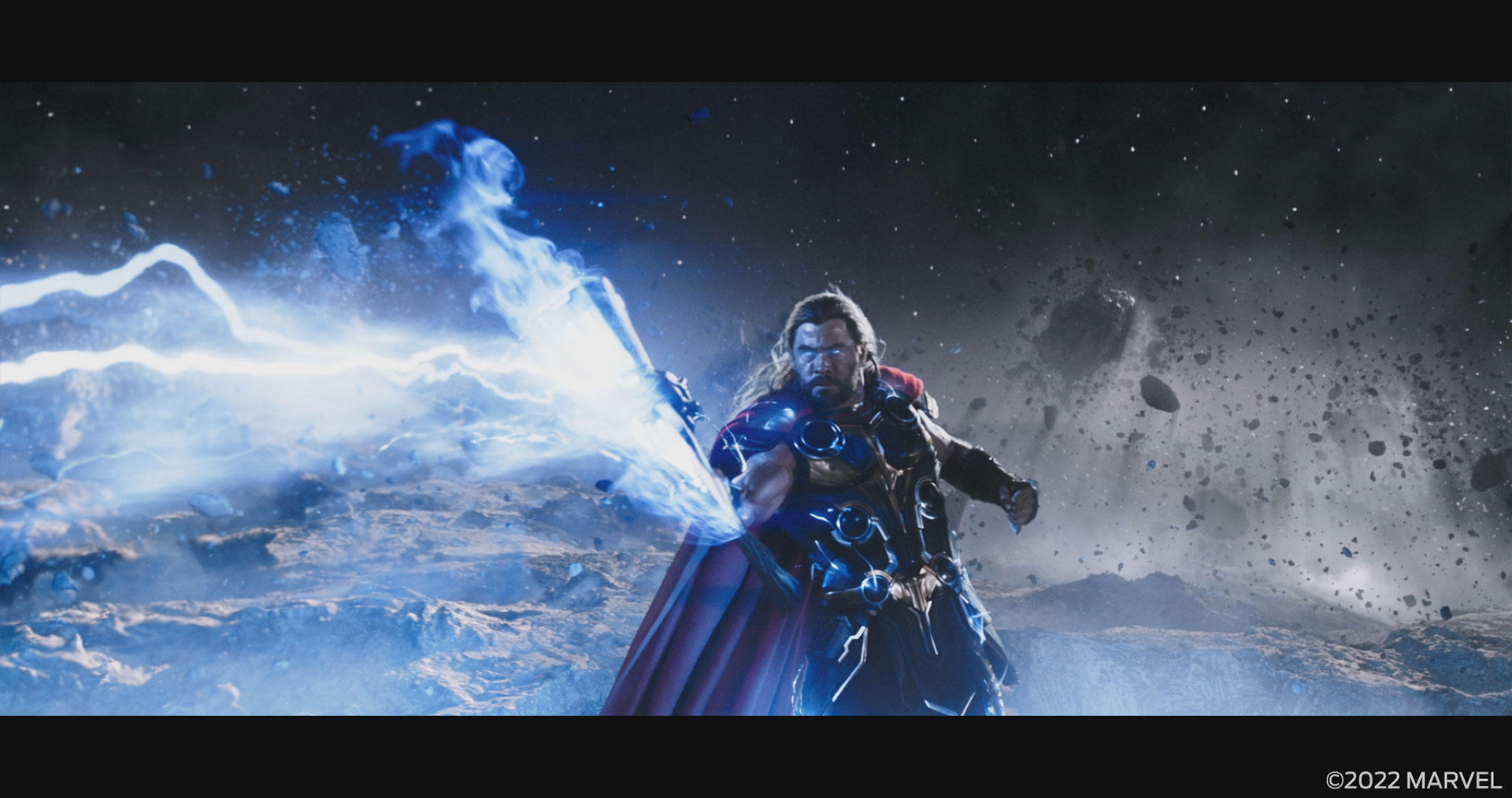
[PD]: The black and white Moon of Shame sequence was certainly the most creatively challenging, due to the amount of design and development required by the Montreal team to craft it into the final product we see on the screen. This sequence takes place on a tiny spinning low-gravity moon, complete with miniaturized terrain features like a one-metre high Andes mountain range, and with a 20 second orbit of the sun. Part way through the sequence, an incredible surge of power from Stormbreaker violently fractures the moon into broken slabs of crust and mantle, which then leads to a show-down battle between Gorr and our Heroes amongst the destruction.
Jake and his team provided us with blue screen plates of the actors doing their thing, but to accommodate the fast moving sunlight, he shot them in a very clever and unique way. Rather than simply wheeling the key light on set with a fixed trajectory, speed, and timing, the plates were shot with six different static light positions, with each light flashing on for 1/600th of a second, in sequence. This was then synced up and shot with a Phantom Onyx camera at 600 fps, allowing the high-speed frames for each of the six light flashes to then be shuffled out into six individual plate sequences with matching action but different light positions. This allowed us to animate our CG sun at essentially whatever speed and whichever direction we wanted to, and then blend between the six sets of photographic plates to match the practical lighting on the actors to the moving CG lighting. This was a pretty wild concept, but in execution it worked brilliantly, and provided the sequence with such dynamic lighting.
Our moon surface was created using a mix of procedural shading and lidar terrain models, along with open-source DEM maps of large-scale earth terrain features to emphasize the miniaturized feel of our moon. Post-destruction, we used a fractured version of our moon as a starting point in our layouts, though we ultimately ended up composing the destroyed moon slabs in each shot specific to the camera angle and the travel of the sun, for maximum interest in our composition.
The motion of the moon proved to be our biggest challenge. The brief was simple, to have the entire sequence take place on a spinning moon. Unfortunately, positioning the camera on the moon surface while the background starfield whizzed by proved to be very disorienting, as there was just too much disparate movement between our foreground environment and the background stars. It was clear that we needed to manufacture some midground motion to bridge the gap. We added depth and parallax into the motion of our stars so that the closest layers moved quicker than the furthest layers in depth, as if looking out the side of a car window. We also loaded our environment up with layers of dust, floating debris, and blowing ash motes, all drifting in the wind in the counter-direction of the moon’s rotation. And probably my favourite visual element of the sequence, we added heavy volumetric shadow rays wherever we could motivate them through the dusty haze, which emphasized the travel of the sunlight and really completed the vibe of our moon environment. This all added up to a strong sense of movement and travel throughout the scene, without the audience ever feeling disoriented.
How did you handle the black and white challenge?
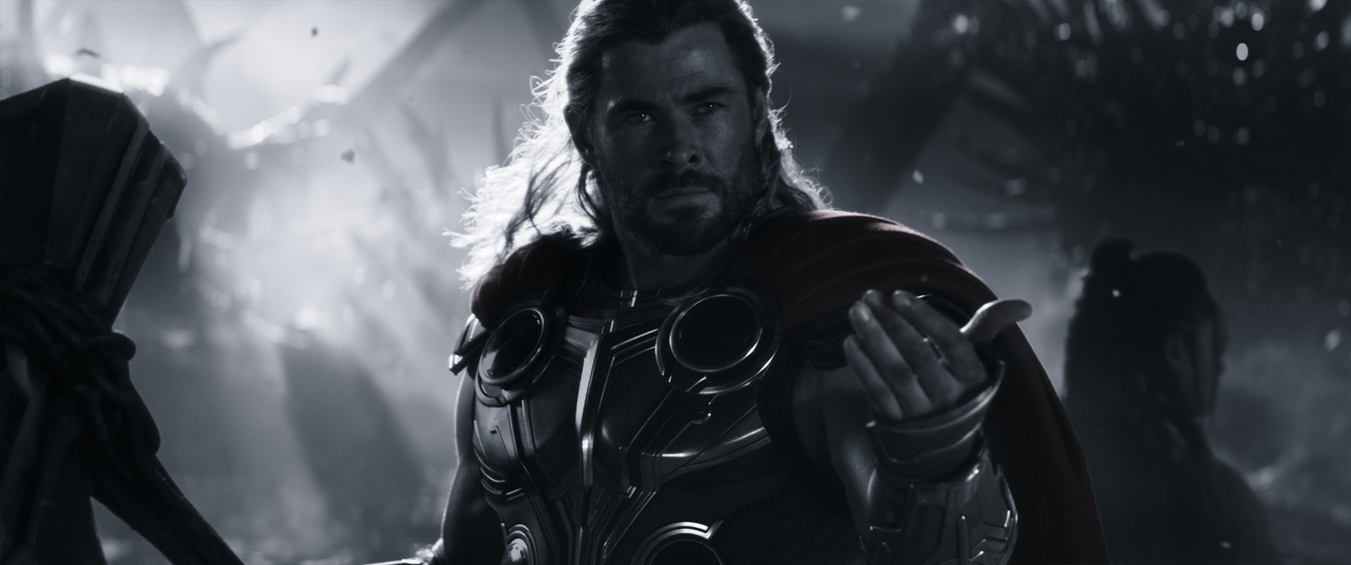
[PD]: We rendered and composited all aspects of the work in full colour to ensure healthy final comps for DI to work with, though we also devised a clever matte workflow to approximate the look of the final DI grade as we developed the sequence. This was much trickier than simply applying an overall LUT to the images, as the weapon effects and interactive lights needed to retain their colour, and in some instances, animate up and down in saturation. But with our procedural matte set-up and bespoke colour workflow, we were able to easily toggle between the raw colour and our dynamic stylized grades, which was crucial as we balanced our lighting and comps.
Which environment was the most complicated to create and why?
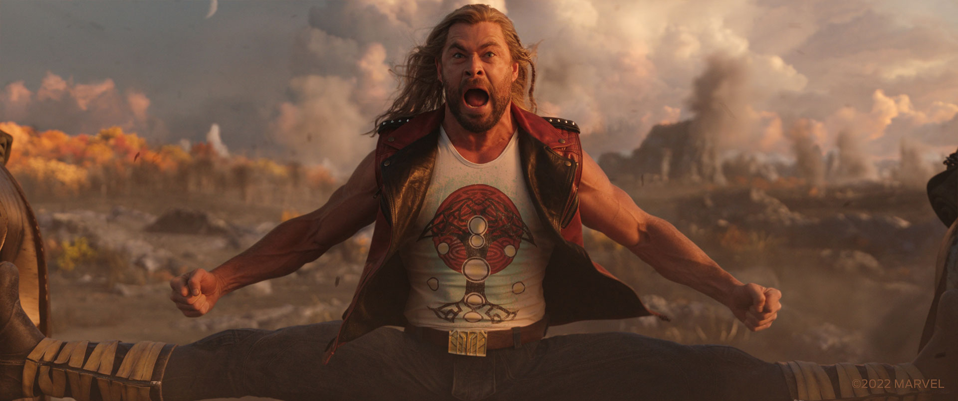
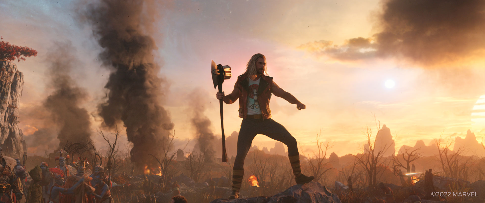
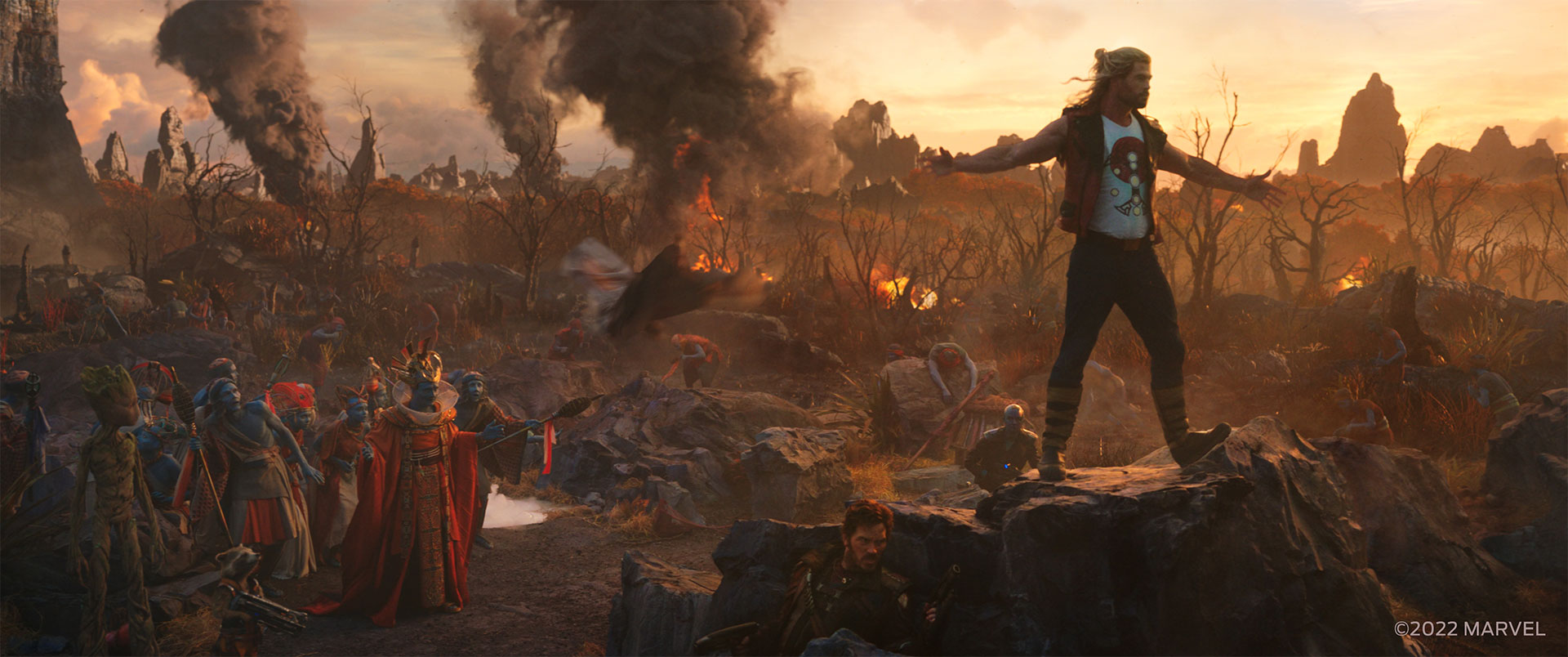
[MT] – it might not be the most obvious but the Indigarr Battlefield was a new sort of challenge for us. The plates had been shot on ILM’s Stagecraft volume with a beautiful environment to showcase the idyllic paradise ….. we were then asked to carve a great swathe of destruction through the middle of it! The elements we used to tell the battlefield story were dotted over many square kilometres of the environment and included the crystal temple, defence structures, hoverbikes, tanks, trees, bushes, explosions, fires, over 1000 crowd assets, craters and hundreds of gunfire and squib hits. Placing these 3D objects into a photographed 3D render projected onto a volume challenged all of our skills, not the least our tracking team as the photographed environment was not true 3D or true reality. Exceptional work from our environment team managed to get our enhancements blending and interacting seamlessly with the ILM volume plates with amazing integration from the compositing and prep team.
Can you tell us more about the various creature work?
[PD]: Early in the Moon of Shame sequence, Gorr summons creatures to aide him in battle, formed from the shadows of the destroyed moon surface. Taika’s vision was to design these Shadow Creatures based off of crayon drawings of scary monsters, which were created by the children of the cast and crew. This resulted in some pretty wild features and proportions which no adult professional designer would ever think of, though it was fun for our animators and creature design team to then take these concepts and bring them to life! An unintended consequence was that once fully lit and animated, these creatures were almost too adorable to then be massacred by our Heroes, so in-shot we strategically kept them very dark and shrouded in dust to keep them creepy and unsympathetic.
How did you create and animation the beloved Rocket and Groot?
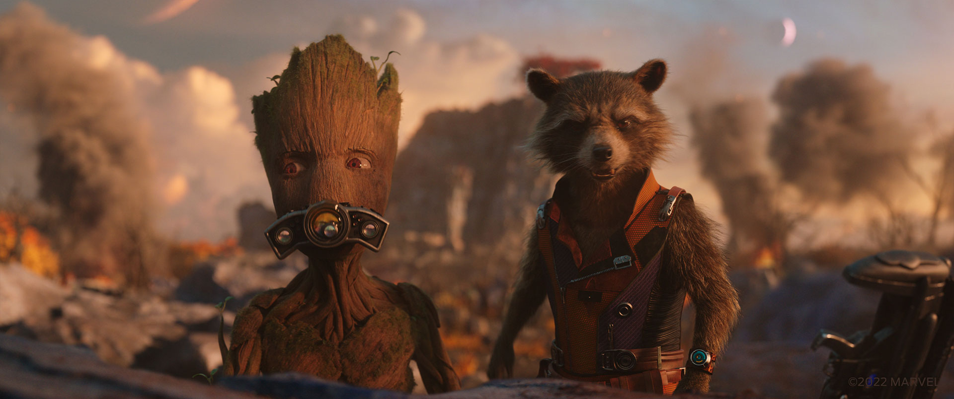
[MT] Rocket and Groot have been regulars at Framestore all the way back in 2013 in the first Guardians of the Galaxy film. It’s always so much fun to work with these characters and all their various incarnations – we actually have a new version of Groot in this film, aged up a bit from the moody teenager in Avengers: Endgame, and slightly singed from battle. Each time we work on these characters we use the previous incarnation as a base and then update with the latest tool developments, then they go off to texturing and lookdev for specifically requested look updates like greying, stubble or more wrinkles. Finally the updates to costumes and props are matched to production art and wardrobe department references.
Animation for Rocket and Groot has always been keyframed by our animators using their extensive knowledge of the characters. We also regularly use poses and imagery from the original comic books, have fun iterating on known characteristics in previous productions and there is also rarely a day in the office without animators rushing around filming themselves in superhero poses and acting out scenes giving us cues for all those small details, subtleties and imperfections that make them more real and grounded.
Is there something specific that gives you some really short nights?
[PD]: There definitely was! After spending a year designing and building our massive Omni City and Temple interior environments, and loading them both up with as much detail and complexity as possible, having to actually render these environments into hundreds of shots was the most nerve-racking aspect of all! It was a high-wire act for the team that managed optimization, render farm capacity, and schedule to push these mammoth environments through without sacrificing scope and quality, to say the least.
What is your favorite shot or sequence?
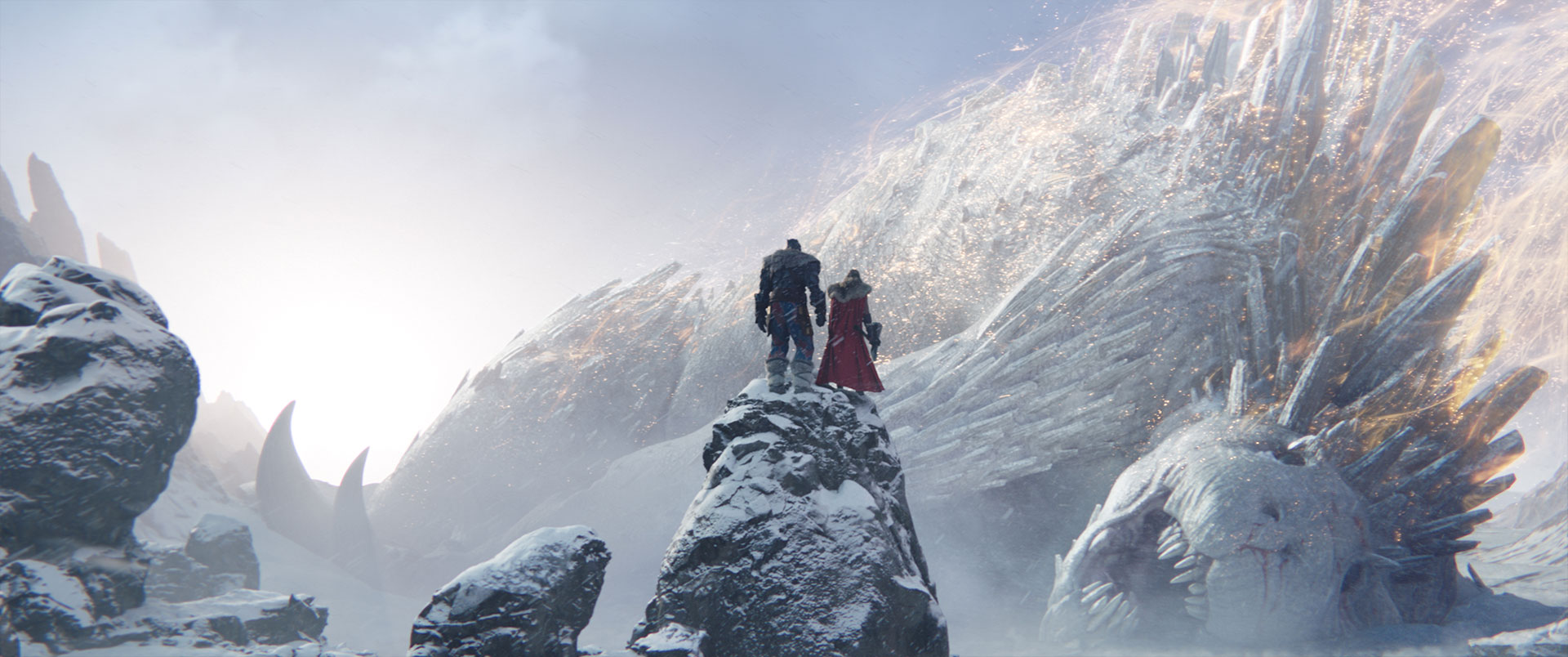
[PD]: The Ice Planet Falligar sequence was short but one that I really enjoyed working on, and especially the hero shot of Thor and Korg at the top of the cliff staring down at the fallen Behemoth. The brief for that shot was to match a specific panel from the comic as close as possible, which we used as an explicit guide when building out our Behemoth creature and the environment across the entire sequence. It was a fun challenge to dimensionalize a comic illustration so faithfully, and the shot looks great!
[MT]: For me it would be the wide of the Thor splits shot in the Indigaar battlefield. This one always garned a laugh in dailies yet showcased work from every single department in the team.
What is your best memory on this show?
[PD] Sitting in the cinema, watching our final visual effects on the screen. We had a heck of a team, and we’re all very proud of the work that we created.
[MT] Watching a quick cheeky edit put together by our in-house VFX editor Adrienne Underwood to showcase our character development for the goats. She had mixed it up with a Taylor Swift track and some screaming goat sounds from the web and we were all in tears laughing ….. I took a gamble and sent it onto the production VFX team to enjoy and the next thing we hear is the screams are now the reference soundtrack for the goats!
How long have you worked on this show?
[PD] In total, I spent 18 months on this show.
What’s the VFX shots count?
[MT] We delivered 600 shots for the film – 154 from London and Mumbai, and 446 shots from the teams in Vancouver and Montreal.
What is your next project?
[PD] Unfortunately it’s not something I can share at this moment, but I’m looking forward to talking about it in the future!
[MT]: I’m continuing my journey in the MCU, and that’s all I can say about it!
A big thanks for your time.
WANT TO KNOW MORE?
Framestore: Dedicated page about Thor: Love and Thunder on Framestore website.
© Vincent Frei – The Art of VFX – 2022


