In 2018, John Likens explained to us the work of Method Studios on the opening and end titles sequences of DEADPOOL 2. He talks to us today about his work on the main title sequence of WARRIOR.
What is your background?
I studied Graphic Design at the College of Design at Iowa State University. In my senior year I realized I wanted to pursue the film and television industry, so I taught myself how to animate, applying my graphic design education to motion based projects. I eventually cut a reel and used it to get my foot in the door at various design studios in New York City as a freelancer. After a successful 5 year run as an independent designer, I decided to go staff at Method Studios in late 2014, where I now serve as Creative Director.
How did you and Method Studios get involved on this show?
Post Supervisor Chris Arruda had been recommended to Method Studios from one of his industry connections that had seen some of the other title design work that we have been doing and referred us over.
How was the collaboration with showrunner and Executive Producer Jonathan Tropper?
The best collaborations are the ones where the show creators and directors trust you to do what you do best. That’s exactly what Jonathan Tropper and his team allowed us to do. He was very specific about certain aspects of what he wanted but didn’t put too many restrictions on the creative in the beginning design/concept phase. He trusted that we would craft up something perfectly suited for his show.
How did you organize the work with your VFX Producer?
Our excellent Producer Emily Schaeberle made sure this project went off without a hitch. One of the things she does best is structuring the project in a task based manner so the creatives have a full overview of where we’re at in terms of the overall sequence, as well as what’s going on shot to shot. Additionally, there was a lot of material that the showrunners wanted us to have access to and she made sure everything was in a proper place that made sense for the designers to access it all in the most time-efficient way possible.
How did you split the work amongst the Method Studios offices?
All the work was created with a very small but fiercely talented team in the Method NY office.
What was your approach about the creation of an opening title?
Like most of our title sequence work, we have to go through a pitch process to get the clients on board with our creative solution. It’s during this phase that we get to do a deep dive into the world of the characters and research the culture of the story. This is the single most important part of the approach to creating a successful title sequence, because it allows you an understanding of the show and enables you to generate the most appropriate creative ideas for the show.
Can you explain in detail about the design and creation of this title?
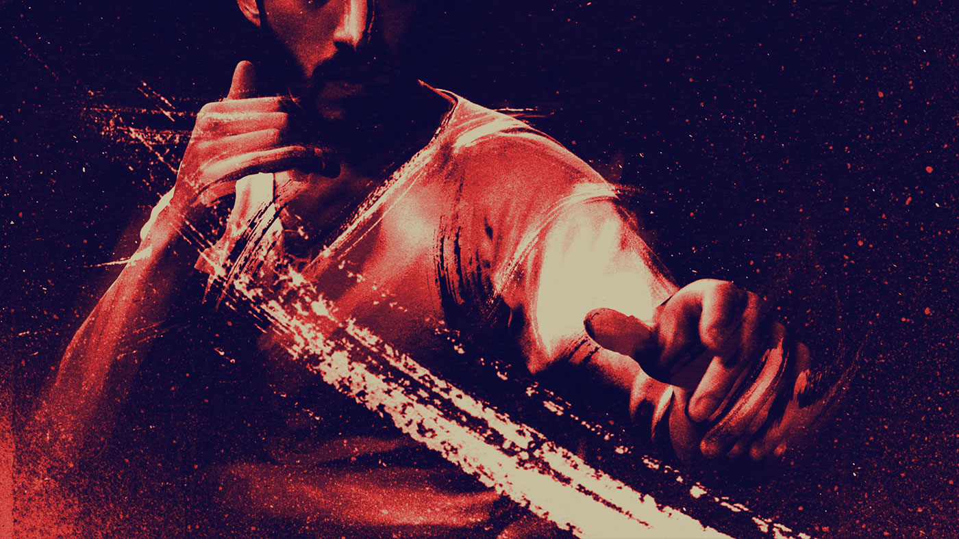
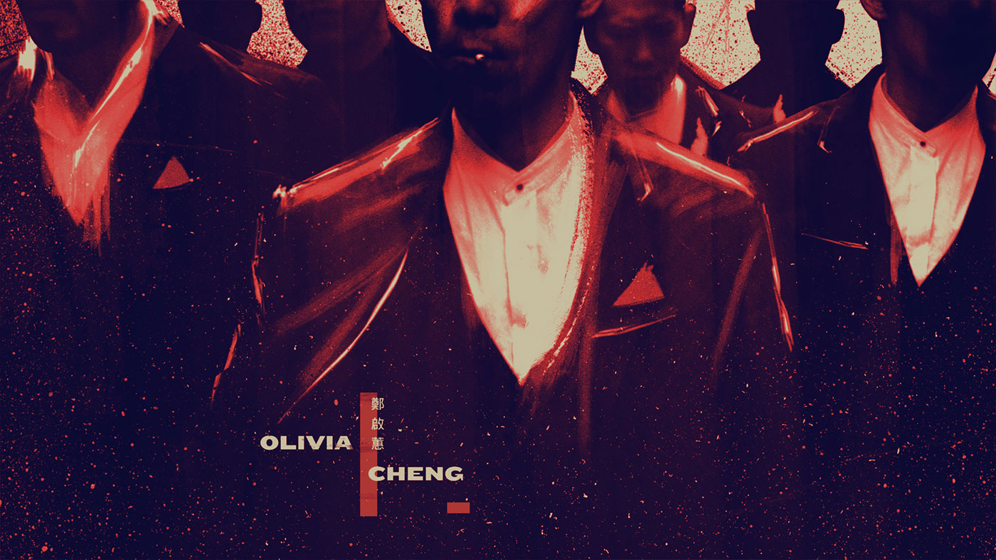
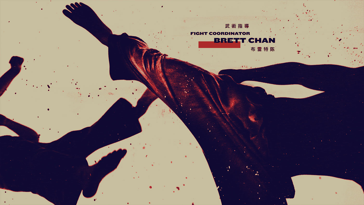
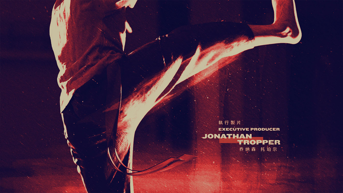
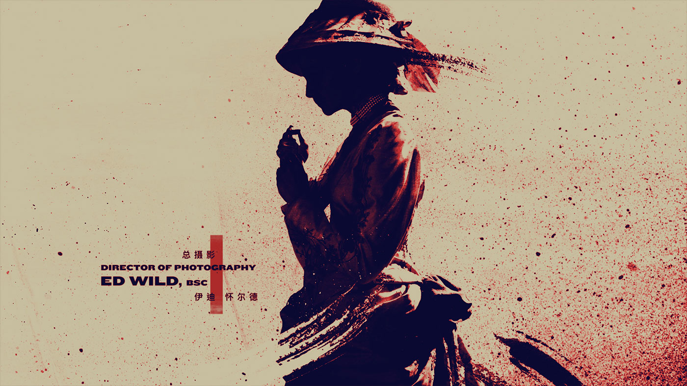
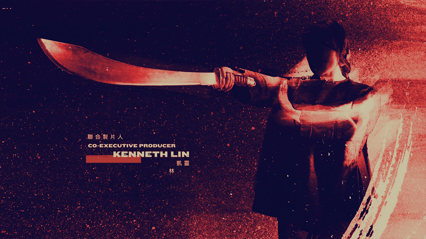
On this particular project, I had the privilege of collaborating with the extremely talented designer, Arisu Kashiwagi. She was the lead designer on the project and came up with the heavily-stylized aesthetic similar to that of a graphic novel. Arisu established the minimal and controlled color palette, gritty textures, and the high-contrast look that was inspired by referencing retro Kung-Fu posters as well as contemporary illustrations.
We knew early on that we wanted to feature some Bruce Lee-esque, high-energy martial arts combat shots. To execute this, I developed a technique of using motion capture data of real kung-fu movements, simulated cloth dynamics on top of the animation, and dimensionalized all of the paint strokes to accentuate the close-quarters combat moves. My long time collaborator and good friend, Wesley Ebelhar, was also instrumental in bringing this sequence to life with his unmatched design and animation skills.
Can you tell us more about the shooting of the various elements?
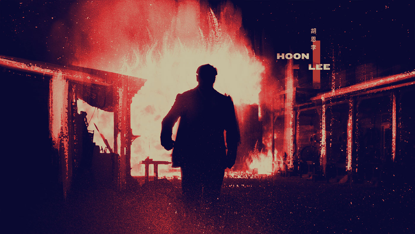
We were lucky on this project because the production team in South Africa, where they shot WARRIOR, took an extensive amount of photos of the set and the actors. This proved to be massively helpful to us in terms of generating images based on characters and locations. Once we established our stylized look and composition, we built custom geometry and used camera projection techniques to give a real sense of dimension and depth to our scenes.
Can you explain in detail about the design and the creation of the various fonts?
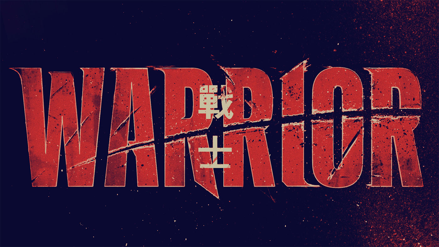
An interesting style choice they do with WARRIOR is how they include contemporary elements into their historical setting of the show. It’s set in the late 1800’s but they’re using modern curse words, as well as hip-hop beats and electric guitar riffs sounding off at various times. We wanted to do the same thing with the typography in WARRIOR, featuring a contemporary look to the type to contrast the historical aspect of the visuals, both with the Chinese characters and the english.
How did you handle the various transitions between each situations and names?
Utilizing the painterly aspect of our aesthetic, we developed a system of animated paint strokes that allowed us to generate transitions in a very stylized fashion. I also wanted a balance of hard cuts and transitions, didn’t want to over use the paint stroke transition effect.
How did you work with the edit team for the tempo and rhythm for the sequence?
Knowing that I specifically wanted to feature many quick action shots mixed in with some slower more graceful shots, I edited the sequence myself. Once the music came in from the composers, I adjusted certain moments of the visuals, to work with the crescendos and various musical cues in the track.
Is there something specific that gives you some really short nights?
Sometimes when I have a big 3D scene and I send it to render overnight. I’ll have this feeling through the night that it might crash and I’ll have nothing to start comping together in the morning. When that happens, it doesn’t really bode well for quality sleep.
What is your favorite shot or sequence?
There’s a moment in one of the transitions, the woman with the hat into the cops walking down the street shot. The two visuals work together in a near double-exposure effect. This happened by accident when I was putting together the transitional elements. Sometimes it’s the surprising things that you don’t plan for that become your favorite part of a sequence.
What is your best memory on this show?
Playing with Kung-Fu motion capture data and using it to simulate cloth dynamics in Marvelous Designer was a huge learning process and a lot of fun to figure out. I always love the chance to develop a new technique that I hadn’t previously had the chance to execute.
How long have you worked on this show?
4 weeks production.
What was the size of your team?
The core team of artists was only 3 people.
What is your next project?
Can’t say all that much at the moment, but it’ll be released in theaters soon!
What are the four movies that gave you the passion for cinema?
TEENAGE MUTANT NINJA TURTLES (1990)
SE7EN (1995)
REQUIEM FOR A DREAM (2000)
THE DARK KNIGHT (2008)
A big thanks for your time.
WARRIOR – Main Title Sequence
WANT TO KNOW MORE?
Method Studios: Dedicated page about WARRIOR on Method Studios website.
© Vincent Frei – The Art of VFX – 2019





This is nice main title sequence.
As to how the show uses modern curse words and modern slang, I find it distracting as it immediately takes you out of the show. Makes you wonder if the writers are incompetent in researching the era and setting.
The final logo of the title has Traditional Chinese characters, while the rest, the cast names, use Simplified Chinese characters, which I find odd, because unlike the era depicted in the show, these didn’t exist until the 1940s. Odd choice, like suddenly seeing Helvetica in an American Civil War movie…